Noles Cafe & Studio: Brand Identity & Logo Design

Zeynep Ekim


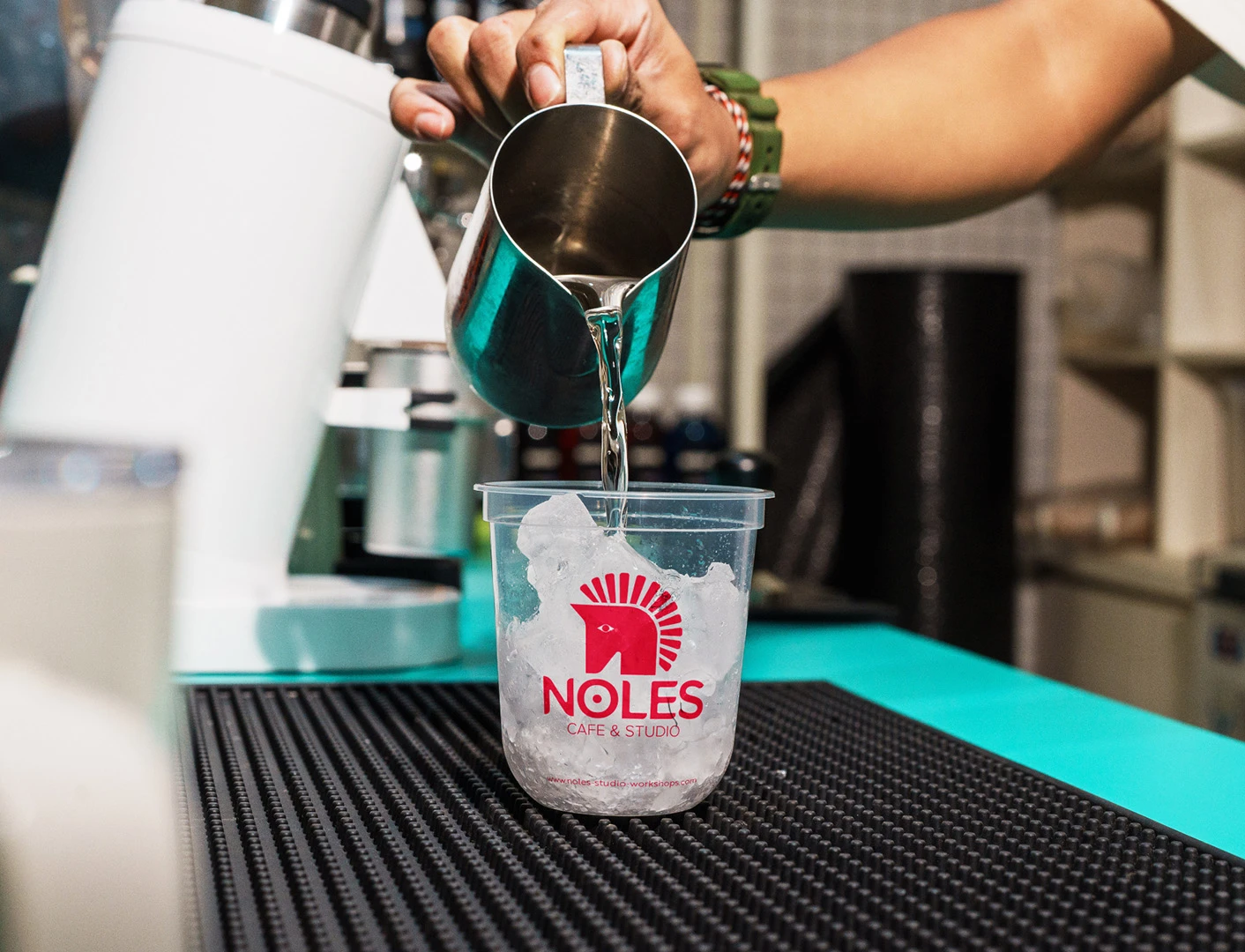
Noles Cafe & Studio is a hybrid concept space where specialty coffee culture intersects with visual arts, design, and creative practice. Functioning simultaneously as a craft cafe and an active creative studio, Noles serves as a sanctuary for ideation, collaboration, and community. The brand identity was developed to embody this duality.
Rooted in the founding partners' connection to Chicago, the central mark avoids clichés like skylines or city stars. Instead, crafted upon the client's vision it draws inspiration from traditional Native American toy horses, paying homage to the indigenous origins of the region's heritage. The stylized silhouette, notched mane, and centered eye translate folk-art craftsmanship into a clean, modern logo symbolizing freedom, movement, and playfulness. And my custom geometric sans-serif typography design anchors the mark. The rounded forms and unique dot accent in the "O" complement the icon's curves, delivering a contemporary studio aesthetic.
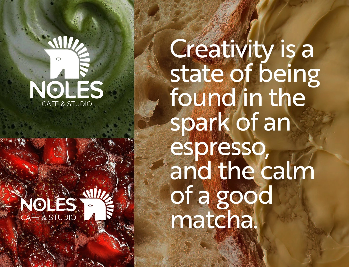
Logo Variations & Brand Motto
Serving as the primary accent hue, this vivid red commands attention across packaging and injects dynamic energy, warmth, and modern edge into the identity, while subtly nodding to traditional Native American folk art pigments. Deep green introduces a natural, grounded element behind collateral graphics evoking ceremonial matcha, organic coffee production, and calm focus while complimenting the red.
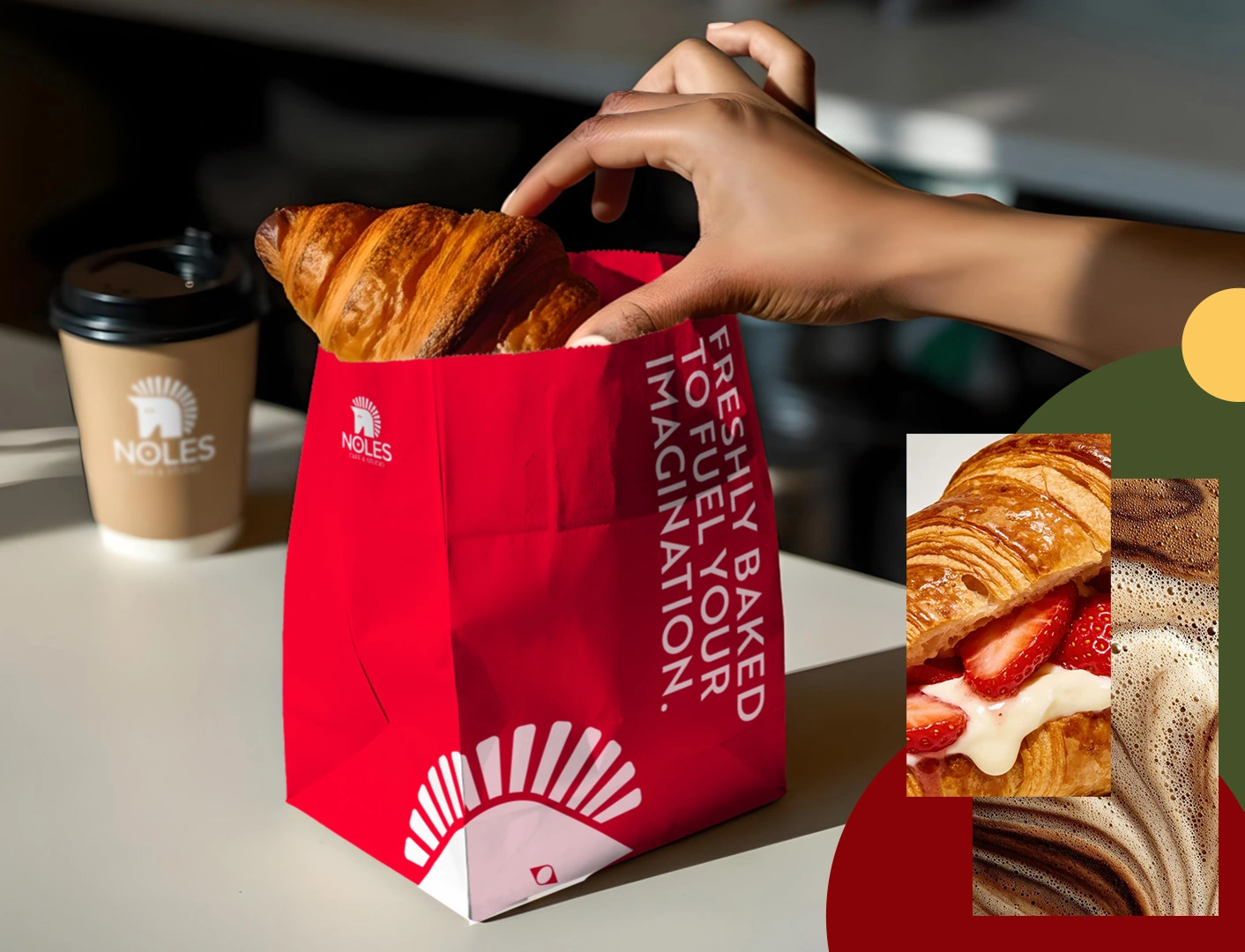
Brand Bakery Bag Mock Up & Moodboard
Like this project
Posted Oct 7, 2026
Created a logo design and brand identity for Noles Cafe & Studio where specialty coffee culture intersects with visual arts, design, and creative practice.