Check out how we cooked

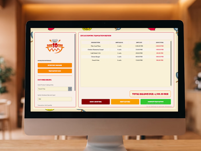
Check out how we cooked up the complete visual identity for Dine So Fine! 🍔 We designed this fast-casual brand to pop with energy, flavor, and a playful vibe that makes you hungry just looking at it.
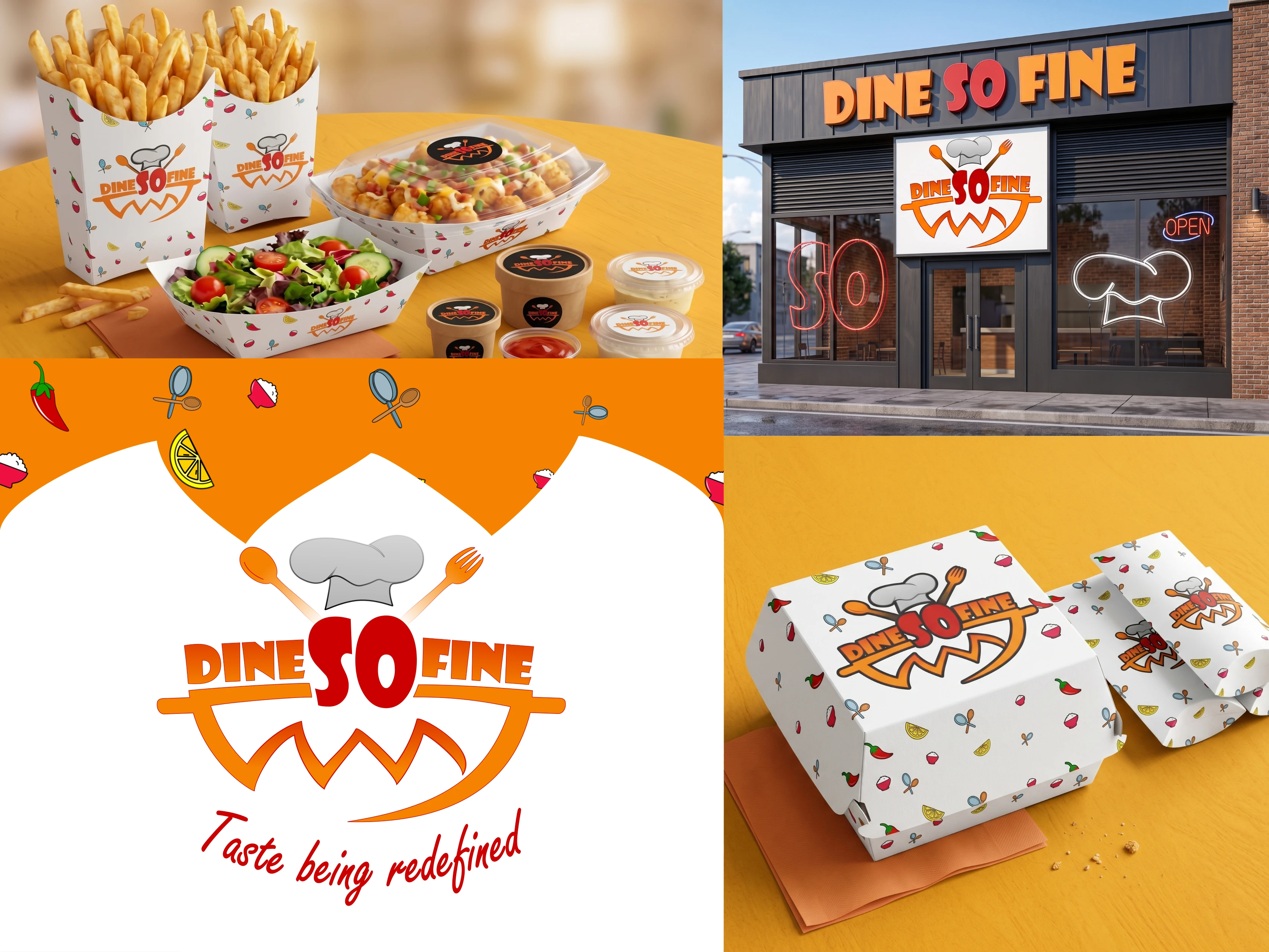
🧑🍳 The Core Identity: We crafted a bold, appetizing logo that puts the spotlight right on the name, integrating a chef's hat, spoon, and fork right into the typography. Beneath the text, an orange smiling swoosh adds a welcoming touch, all tied together with their signature tagline, "Taste being redefined," in a flowing red script.
🌶️ The Aesthetic: To keep things fresh and fun, we built a bright, high-contrast color palette of vibrant orange, striking red, and crisp white. We then designed a custom, repeating pattern scattered with playful food illustrations—like chili peppers, lemons, and fresh herbs—to give the brand a lively, dynamic feel.
🥡 Real-World Application: We rolled this identity out across a massive fast-food packaging suite, applying the custom pattern to fry boxes, burger cartons, salad boats, paper bags, and sauce cups. We even mocked up a full physical storefront featuring neon window decals and bold exterior signage to show exactly how the brand commands attention on the street.
This project was all about bringing high-energy, mouth-watering visuals to life.
0 likes · 0 views · Oct 5, 2026
Check out how we cooked up the complete visual identity for Dine So Fine! 🍔 We designed this fast-casual brand to pop with energy, flavor, and a playful vib...