Kaevo - Tech Brand Identity
Ahemad Raza
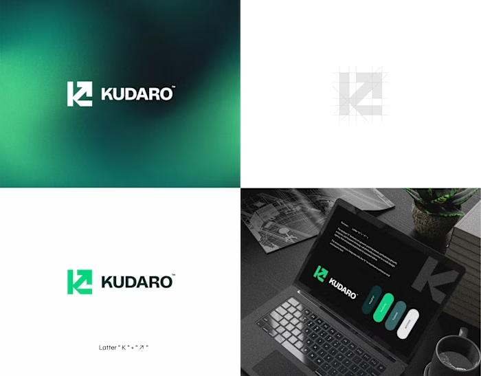
Kaevo - Tech Brand Identity & Logo Design
The stylized “K” uses sharp geometric cuts to create a sense of direction and movement. Paired with a strong sans-serif wordmark and a deep navy–green palette, the system stays clean, bold, and highly legible across digital applications.
Currently working with tech and digital-first brands
📩 ahemad.design@gmail.com
📞 +91 73831 25219
Ahemad Designs
Brand Identity Designer | Tech & Digital Brands | India
Like this project
Posted Mar 28, 2026
Kaevo - Tech Brand Identity & Logo Design The stylized “K” uses sharp geometric cuts to create a sense of direction and movement. Paired with a strong sans-s...