Azzurro Brand Identity Development
Monserrat Vazquez
Verified
Project Summary
Azzurro is a luxury destination wedding creative studio founded by Chiara Ferrari, designed for couples who seek the extraordinary. They create intentional, immersive experiences that are equal parts emotional and editorial - where bold design meets heartfelt storytelling.
I was brought on to translate their vision into a compelling visual identity that captures their unique positioning: unconventional, Mediterranean-inspired weddings rooted in authenticity, elegance, and edge. Grounded in a brand strategy provided by their team, I expanded and interpreted the strategy into a distinctive visual language. From initial moodboard concepts to final brand guidelines, I led creative direction, developed the full identity system, and guided the visual narrative to ensure cohesion across every touchpoint.
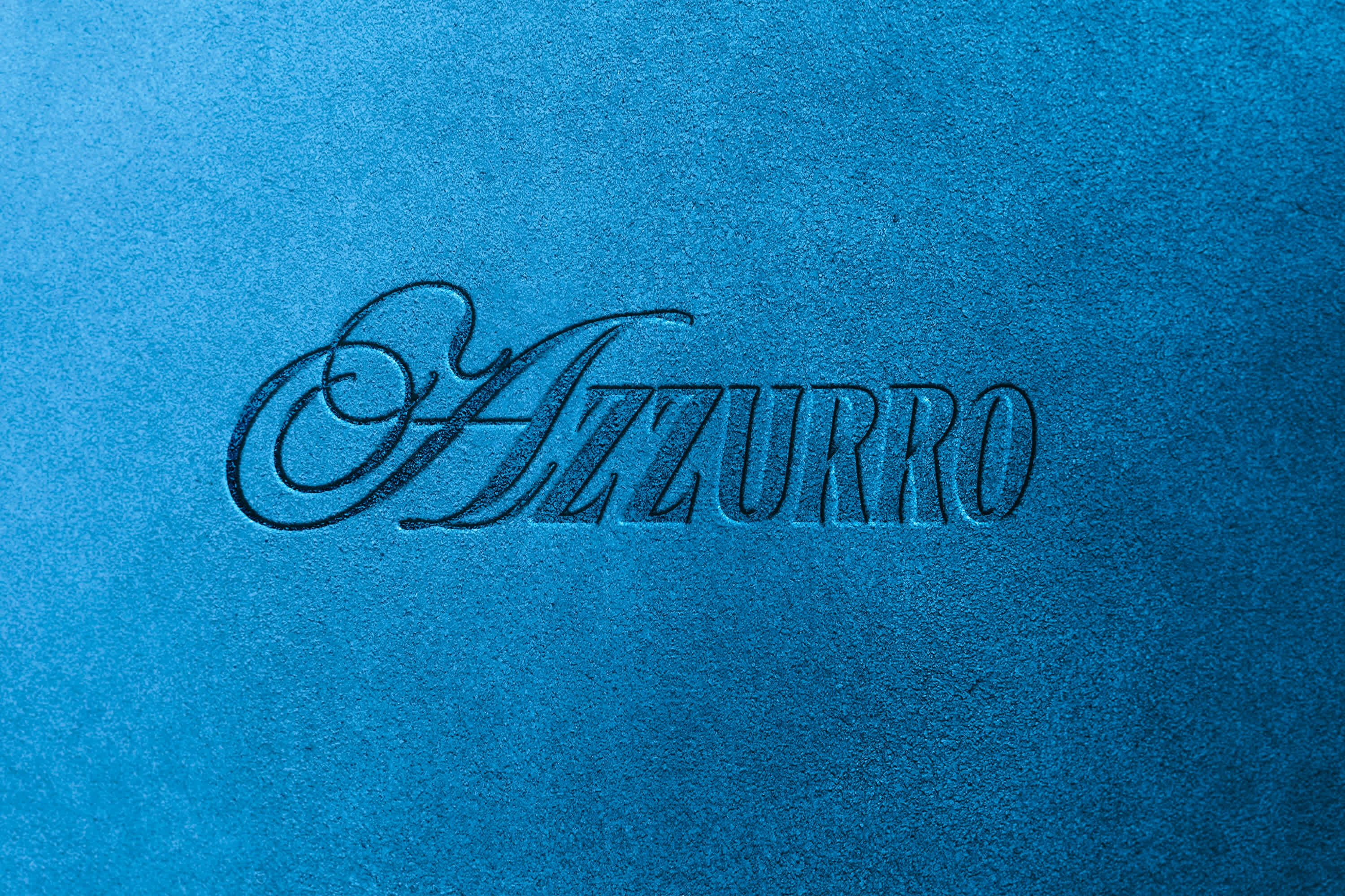
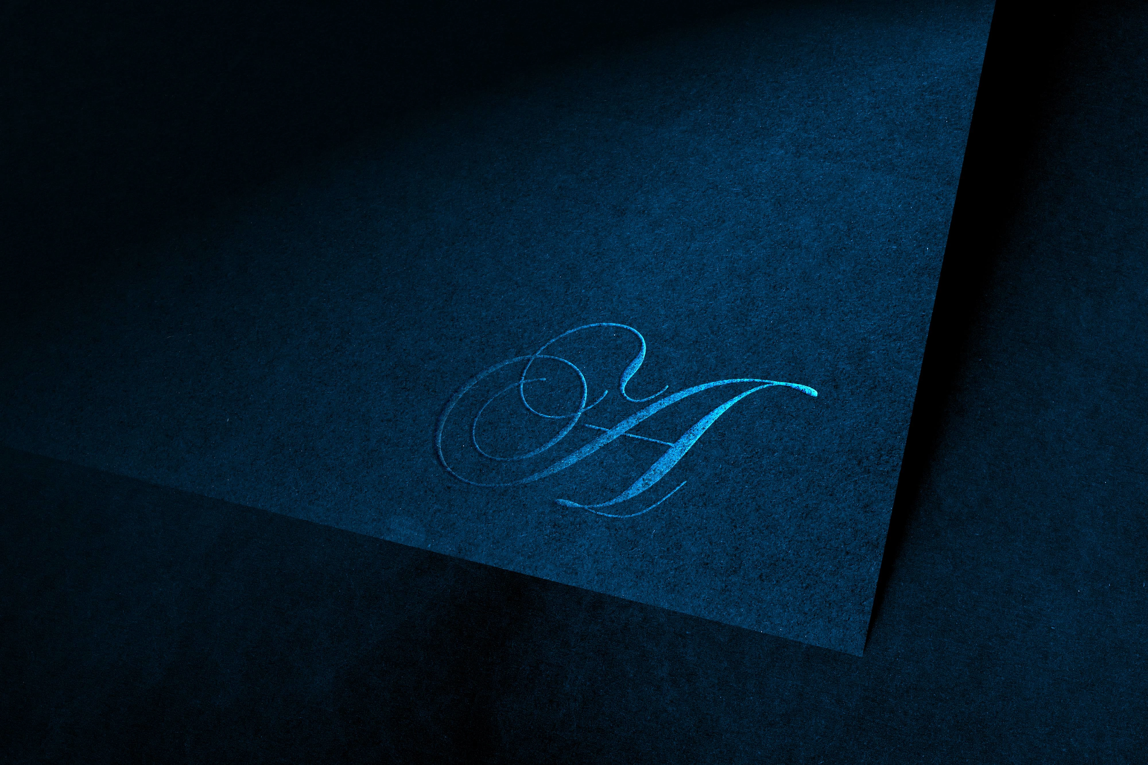
LOGO SUITE
My Role
As Brand Designer and Creative Director, I led the development of Azzurro’s visual identity. My responsibilities included:
Interpreting and expanding upon the provided brand strategy
Art direction and moodboard development
Logo and monogram design
Color and typography systems
Texture and pattern curation
Photography Direction
Finalization and delivery of a comprehensive brand guide
Throughout the process, I collaborated closely with Ben & Chiara to ensure every design choice reflected their values and vision.
The Challenge
Azzurro needed to carve out space in a saturated wedding industry while preserving their sense of intimacy, purpose, and emotional depth. The challenge was to create a brand that felt premium without being stiff, modern without being trend-driven, and emotional without slipping into cliché.
Visually, the identity had to bridge a series of nuanced tensions - structure and spontaneity, softness and grit, romance and rebellion. It also needed to reflect their Mediterranean roots without leaning into the overly literal or editorial, striking a balance between timeless heritage and contemporary edge. Ultimately, the goal was to build a brand that didn’t just showcase a service, but evoked a feeling - a bold, lived-in elegance that speaks to adventurous, design-savvy couples around the world.
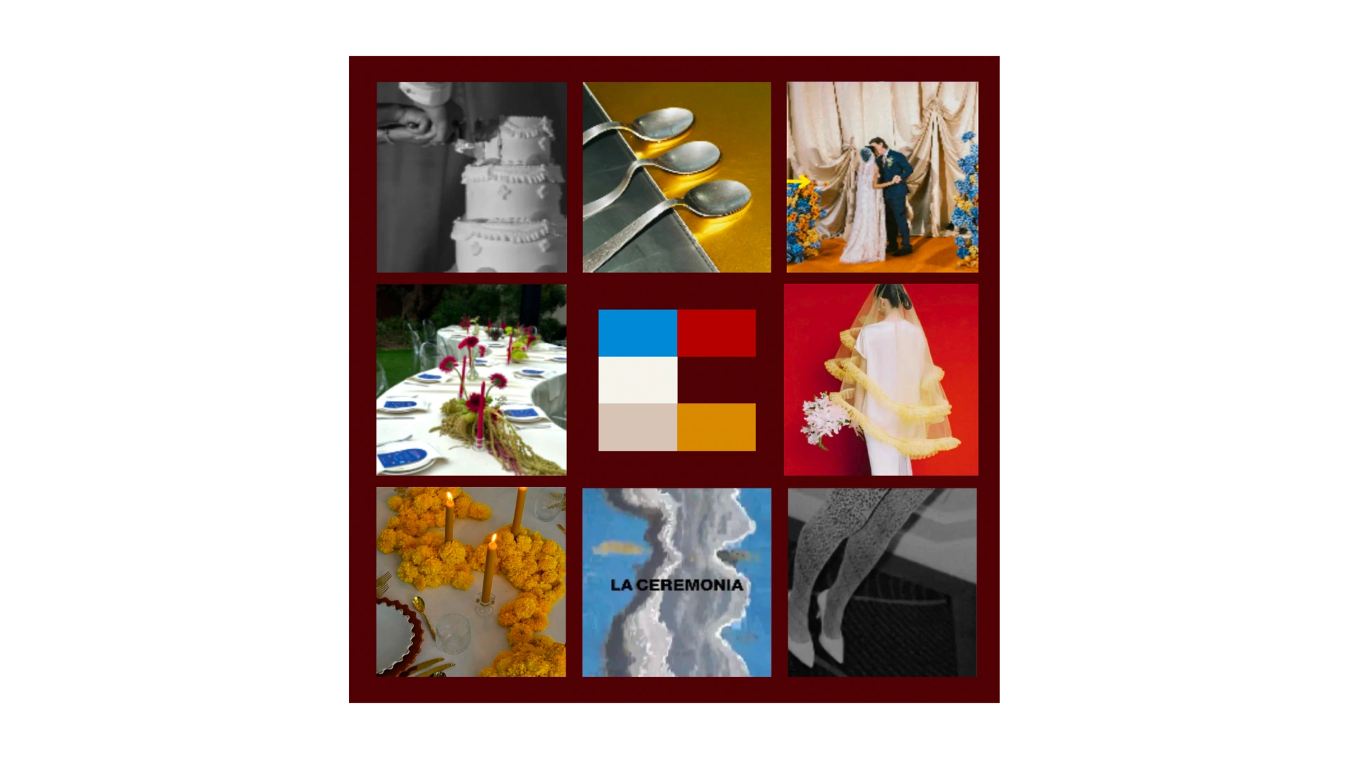
MOODBOARD - (Credit to Photographers)
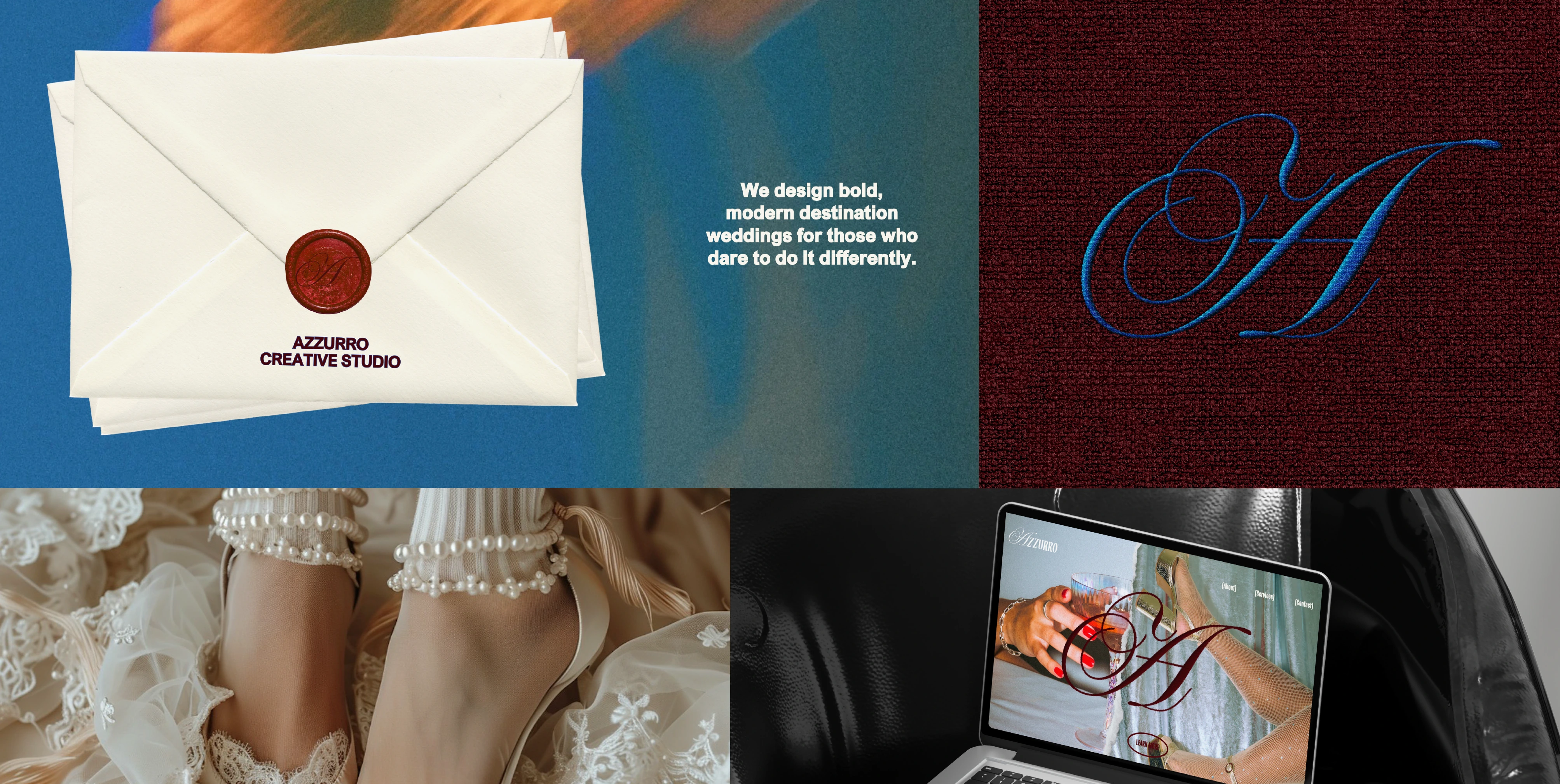
BRAND GUIDE PREVIEW
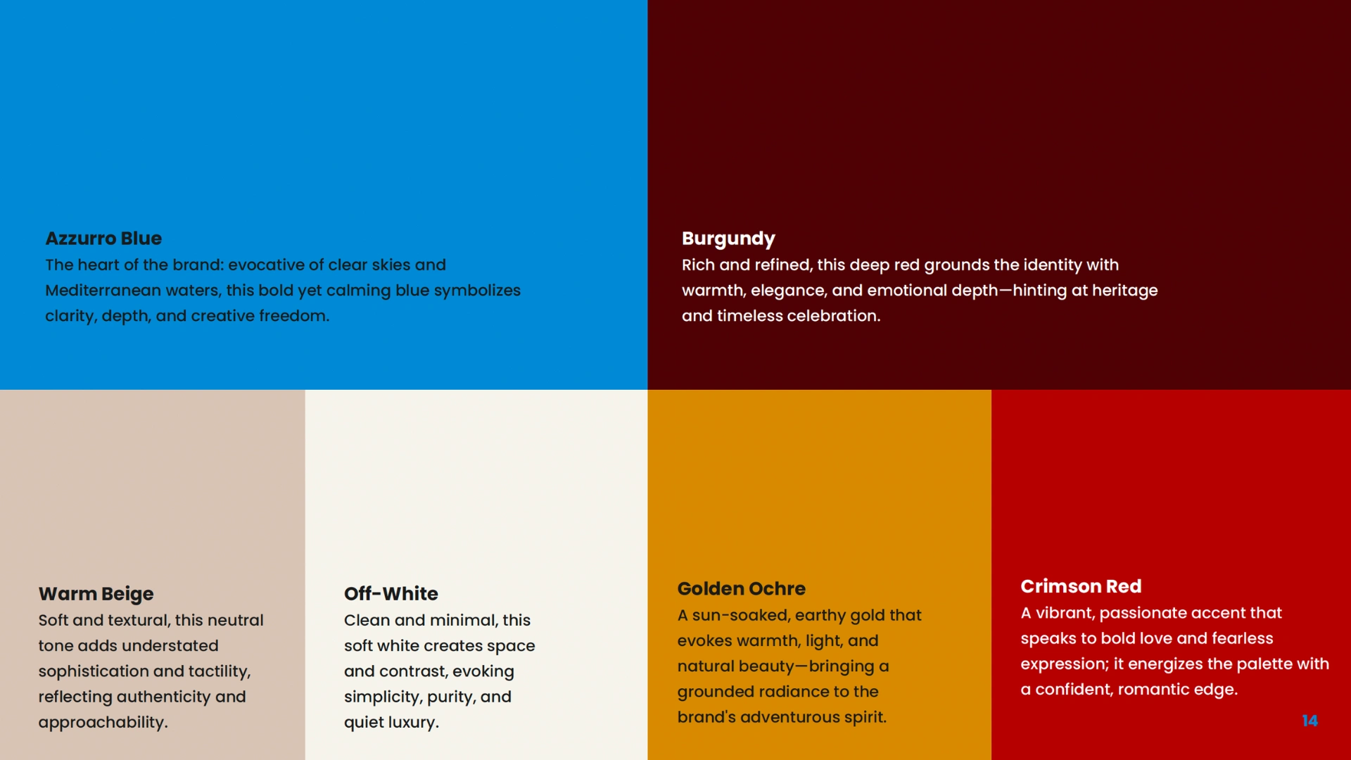
COLOR PALETTE
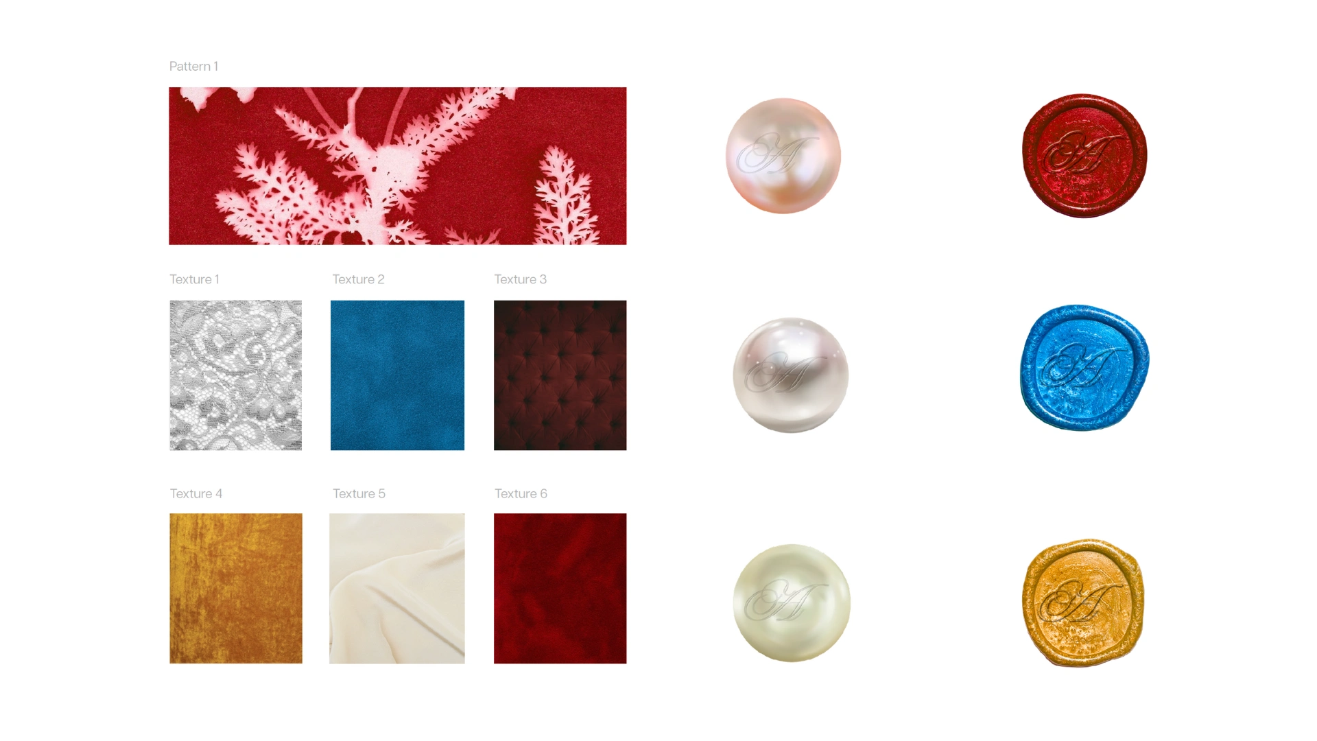
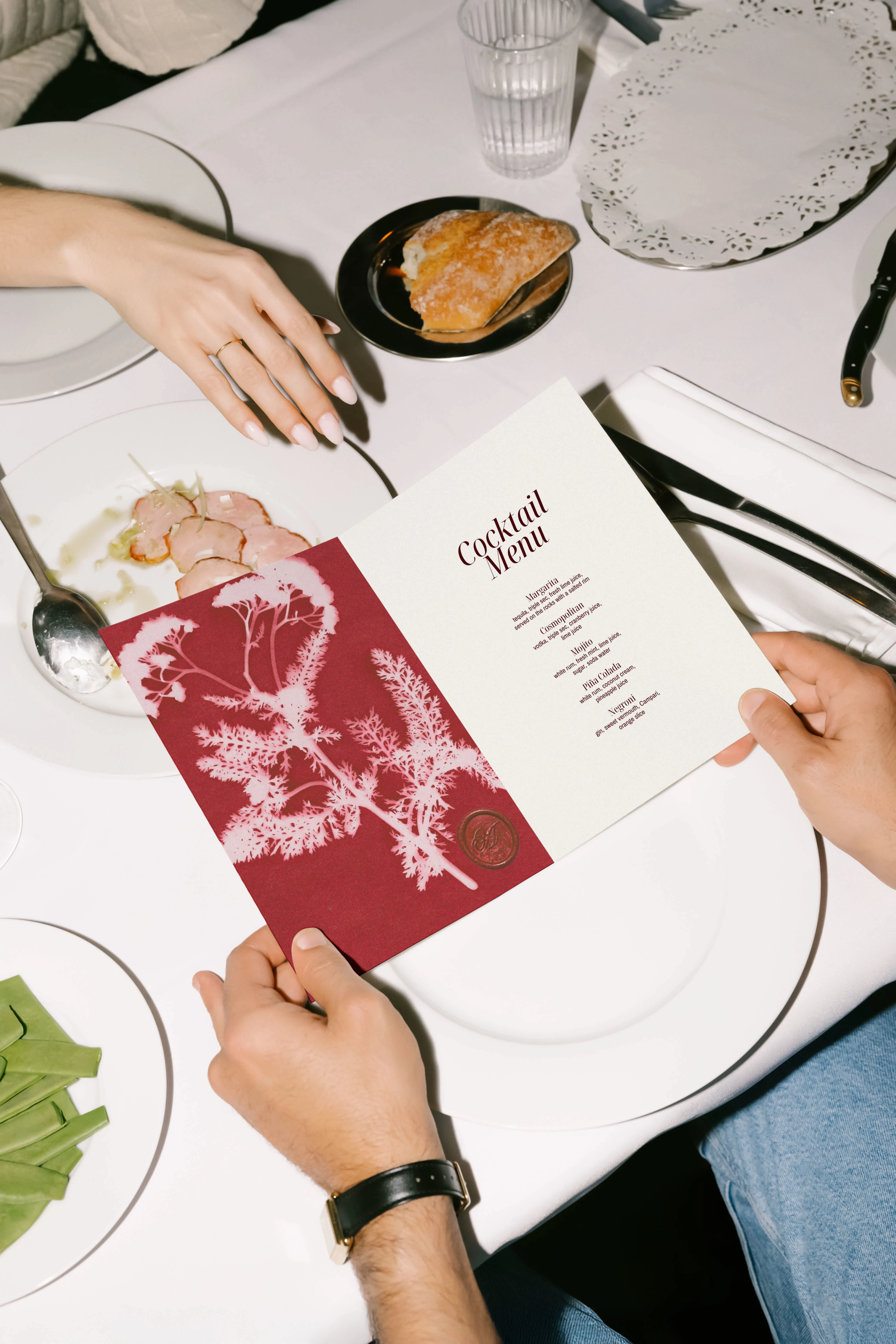
The floral signature brand pattern can be used across print, packaging, and digital to add romantic, handmade character. The six icons to the right serve as versatile accents—ideal for layering into social posts, web layouts, or printed pieces to create a refined, collage-style feel. The pattern and textures to the left bring tactile richness, perfect for backgrounds, moodboards, or event materials that echo Azzurro’s sensory, elegant aesthetic.
Art Direction
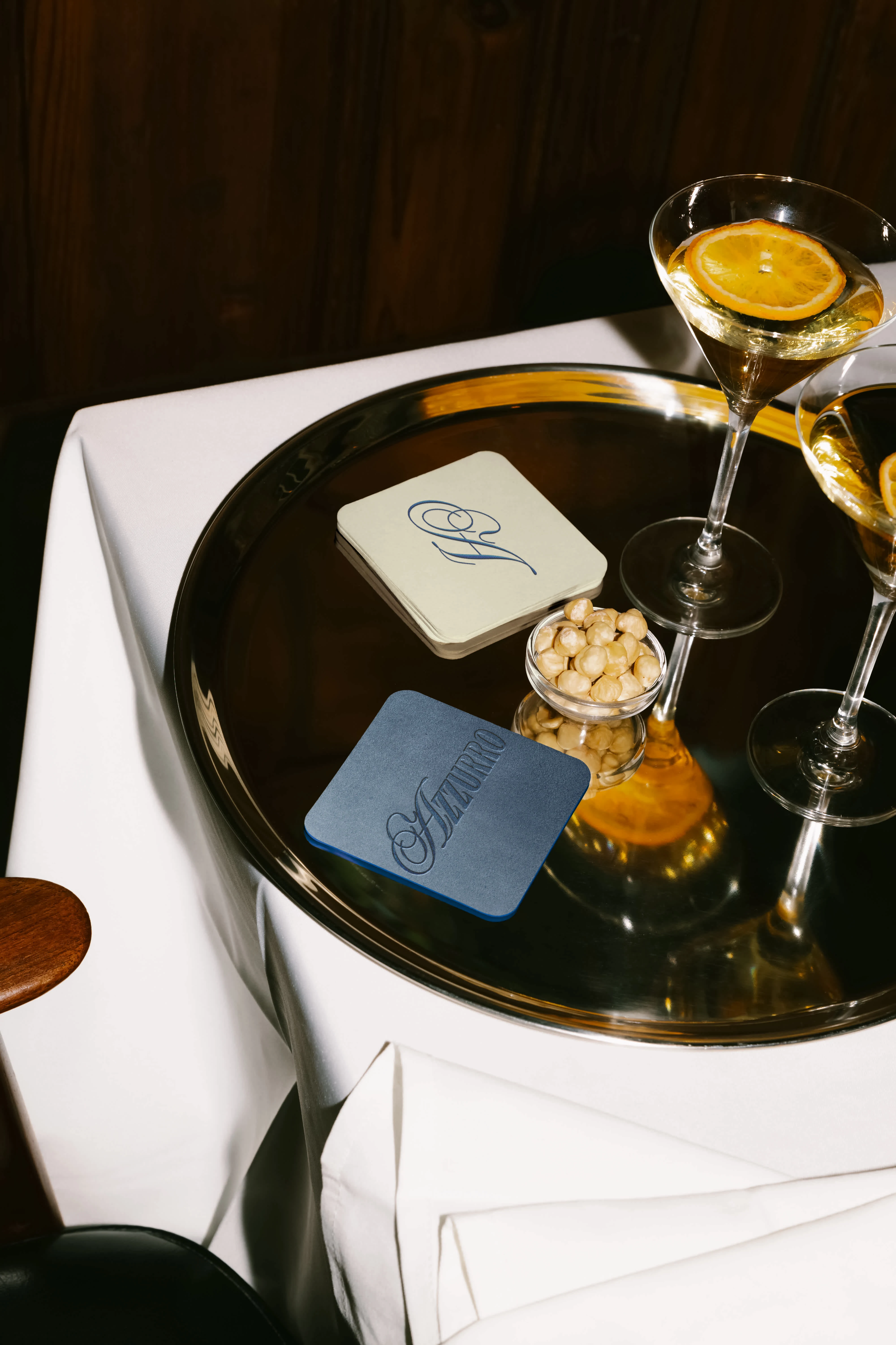
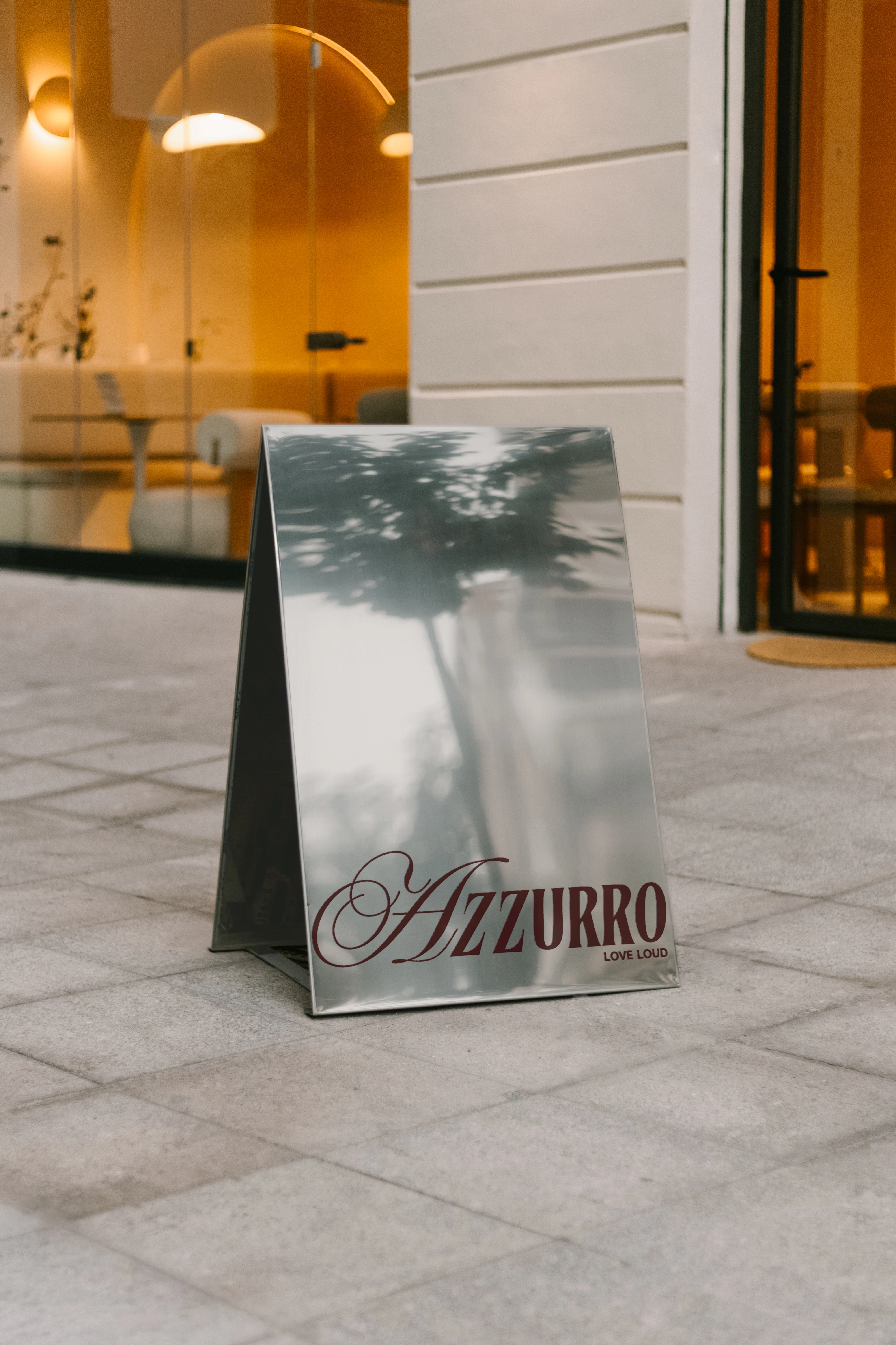
The art direction was rooted in tactile minimalism and textural storytelling. We leaned into contrast - mixing refined serif typography with hand-rendered graphic elements and inky stamp-like icons. Pops of Azzurro blue and red added energy and personality to a grounded, neutral base.
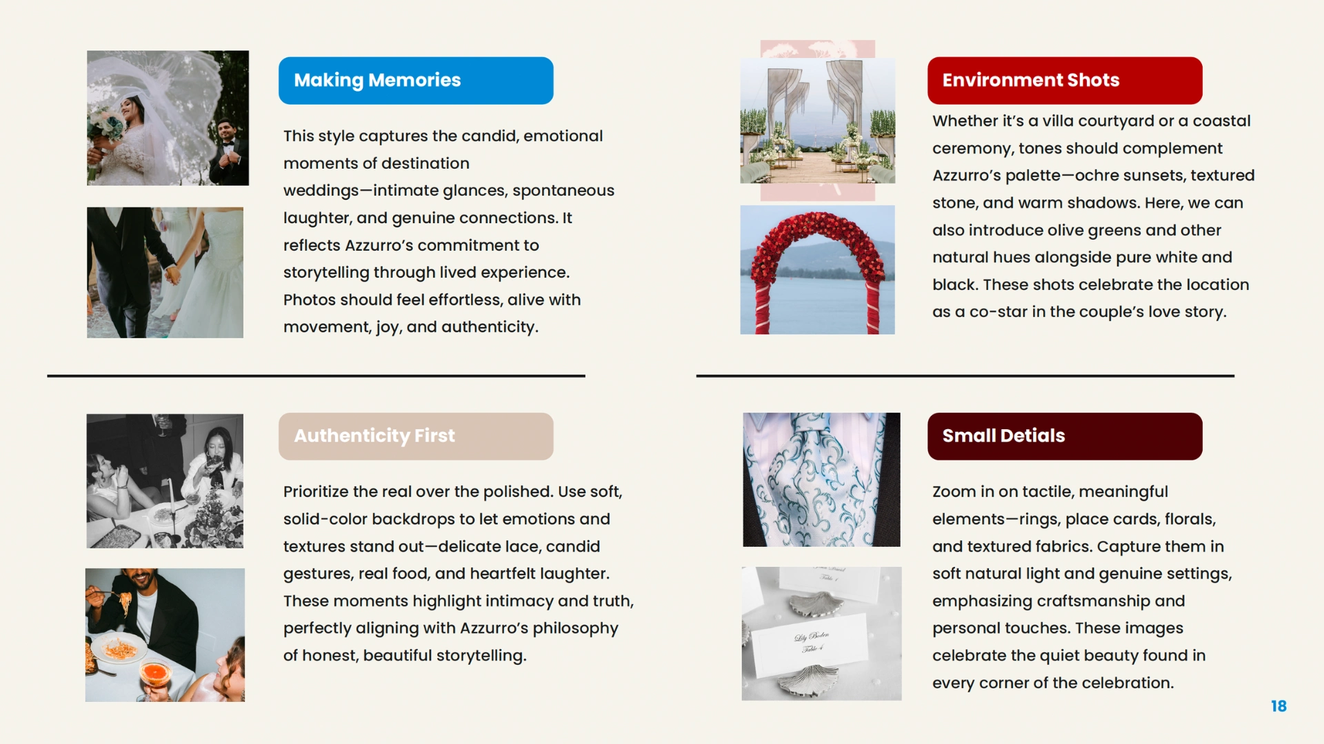
Photography direction prioritized candid, emotionally resonant moments over posed perfection - images that feel sun-warmed, kinetic, and real. The use of textures like suede, velvet, satin, lace and leather helped evoke the sensory richness of Mediterranean locales and the intimacy of the experiences Azzurro creates.
PHOTOGRAPHY DIRECTION(Credit to Photographers)
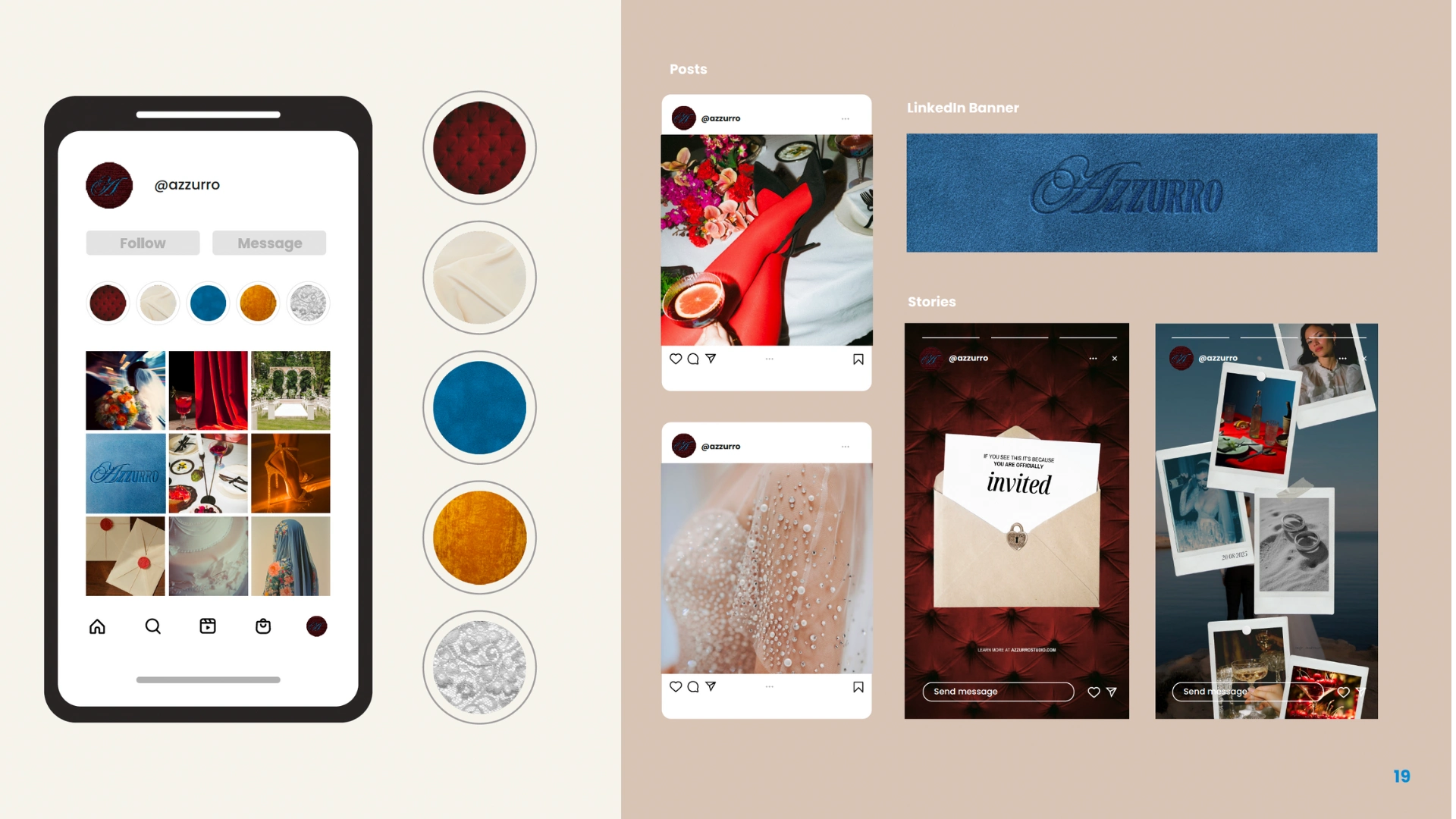
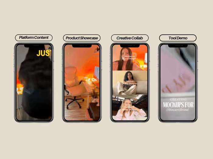
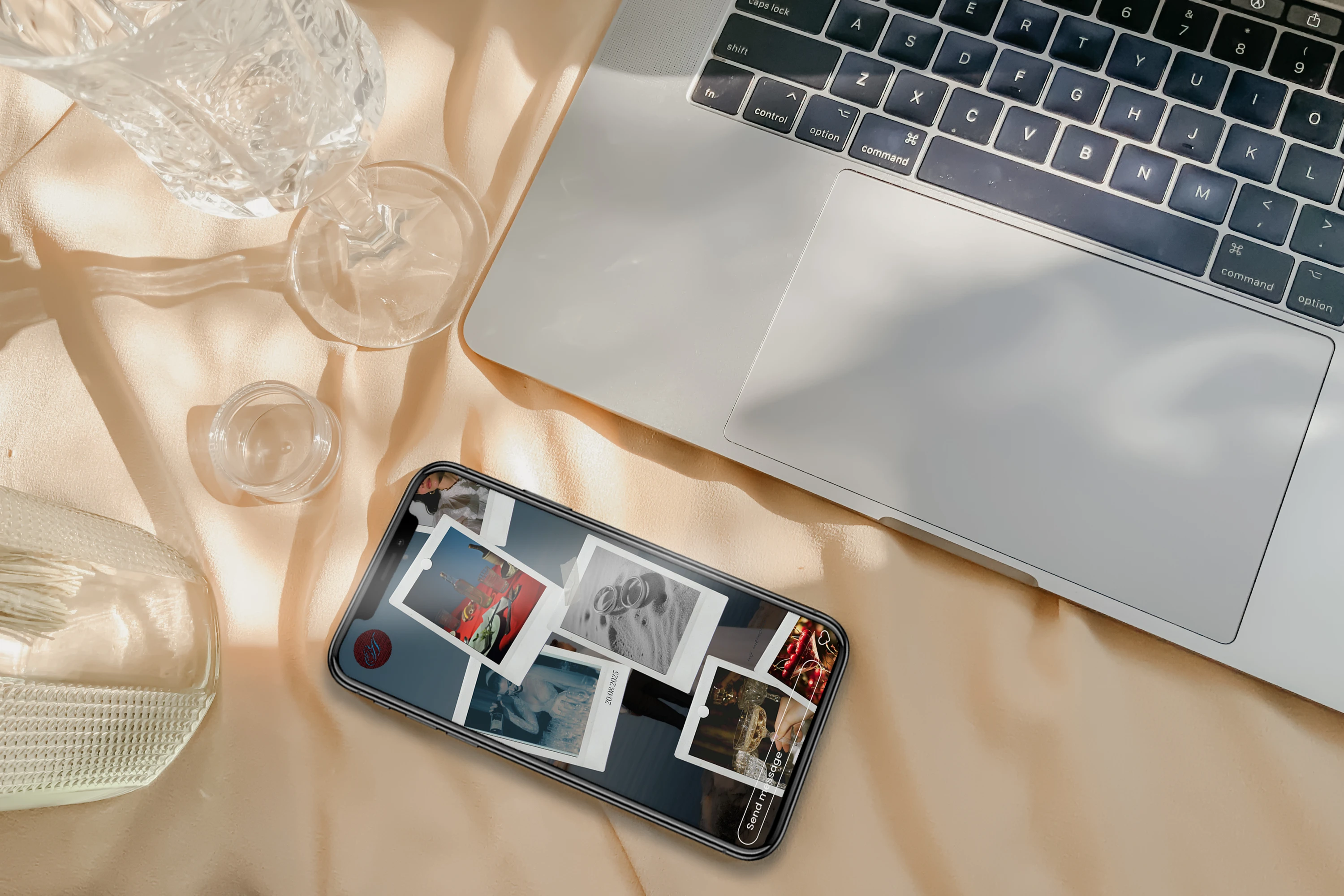
SOCIALS
Brand in Action
Results & Impact
The brand identity has laid a strong foundation for Azzurro to confidently enter the market with a bold, differentiated presence. With a visual system that balances refined elegance and creative edge, the brand now clearly communicates its values and stands apart in the high-end destination wedding space.
As we approach launch, our partnership continues to evolve - currently focused on bringing the brand to life through a custom website, managing social media art direction, and building out key collateral pieces. Azzurro already has two client weddings lined up, a strong signal that the brand is resonating with the right audience and gaining traction even pre-launch. The work so far has sharpened their positioning, deepened audience connection, and set the stage for aligned, intentional growth.
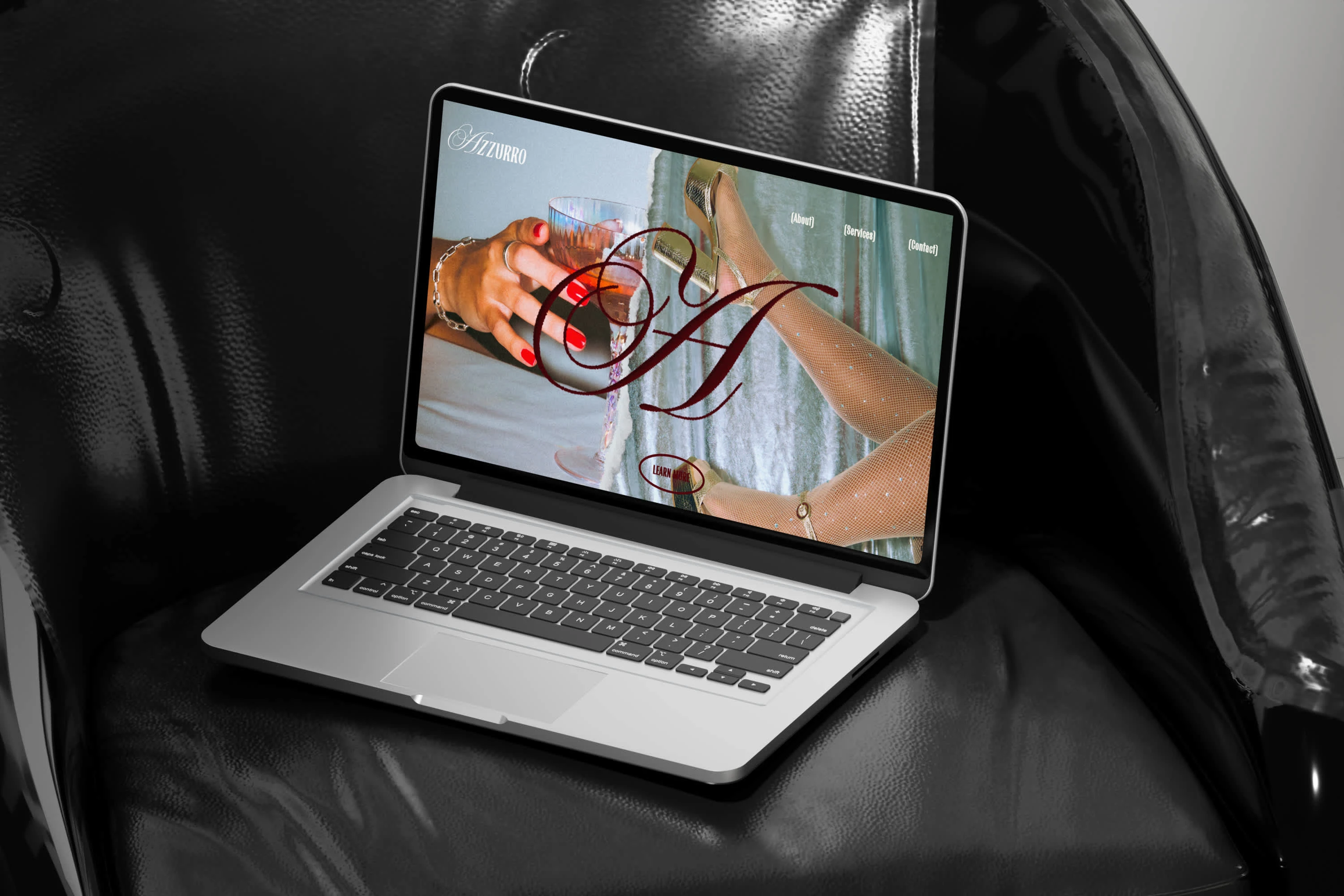
WEBSITE CONCEPT
STORY POST
Key Takeaways
A clear, well-developed brand strategy is a powerful foundation - but it’s the creative interpretation that brings it to life.
Texture and imperfection, when used intentionally, can elevate a brand beyond surface-level luxury.
Design systems that hold both structure and flexibility allow a brand to grow while staying true to its essence.
Collaborating with founders who know their audience and values unlocks creative alignment and depth.
Like this project
Posted Jun 15, 2025
Designed Azzurro’s identity, crafting a visual language that balances sophistication and artistic edge for couples embracing artful, unconventional weddings.
Likes
52
Views
506
Timeline
May 12, 2025 - Jun 10, 2025
Clients
By Azzurro