Carfidant Label Design System
Yurii Horbachov
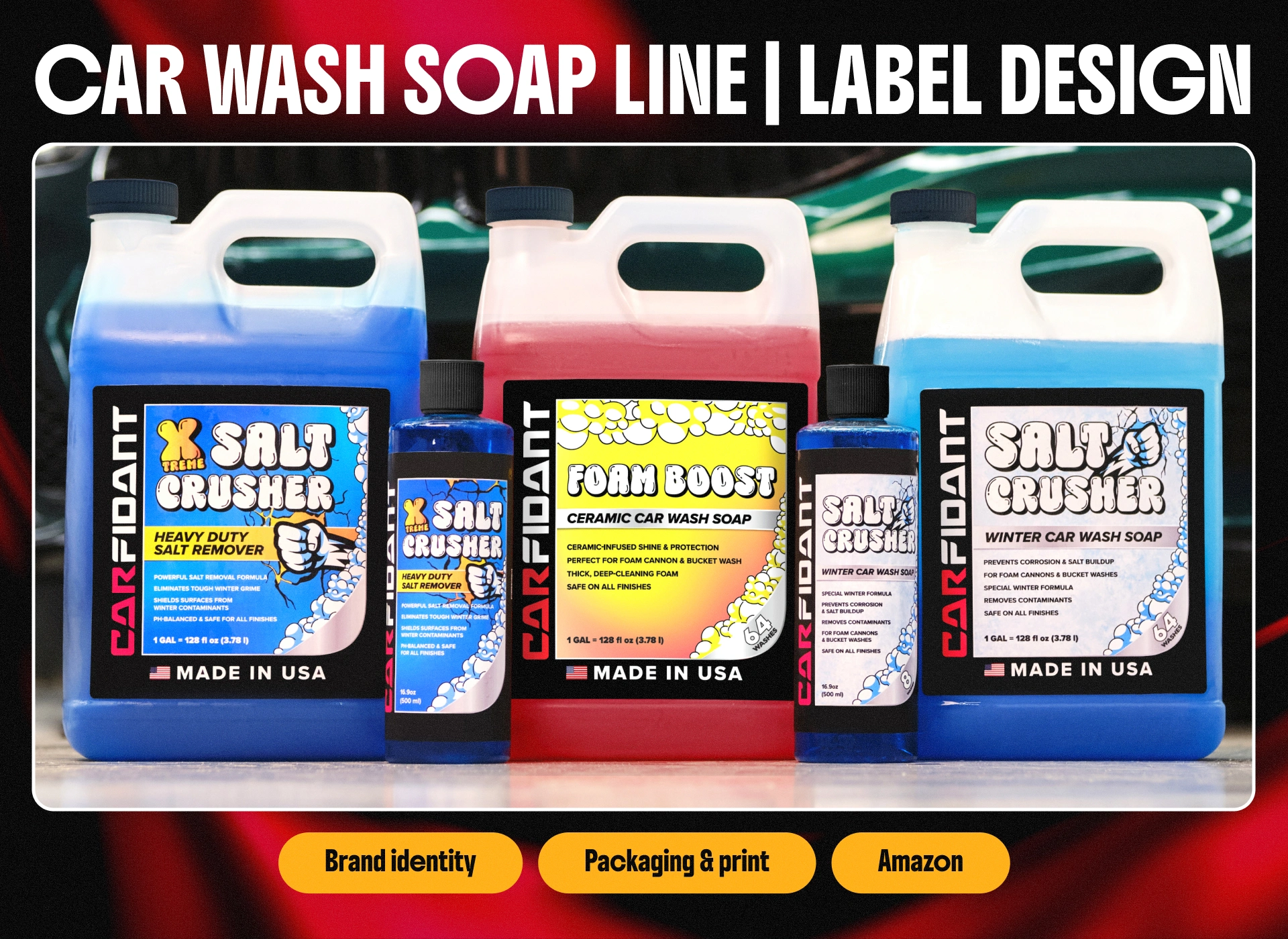
A complete label design system for Carfidant, a US-based car care brand, created for their line of car wash soaps and detailing products.
A key part of the identity is the custom foamy lettering used for the product names. The rounded, bubbly typography was chosen deliberately to communicate the core selling point of these products — extra-thick, high-foaming formulas. The letters themselves look like they're made of suds, reinforcing the promise before a single word of copy is read.
Across the line, the layout keeps a consistent structure — bold name lockup, clear product subtitle, scannable benefit bullets, and a prominent "Made in USA" badge — so the labels scale cleanly from large gallon jugs down to 16.9 oz bottles without losing legibility or brand recognition.
The challenge was to build a family of labels that feel cohesive on the shelf while letting each product communicate its purpose at a glance. The line is built around two clear seasonal stories.
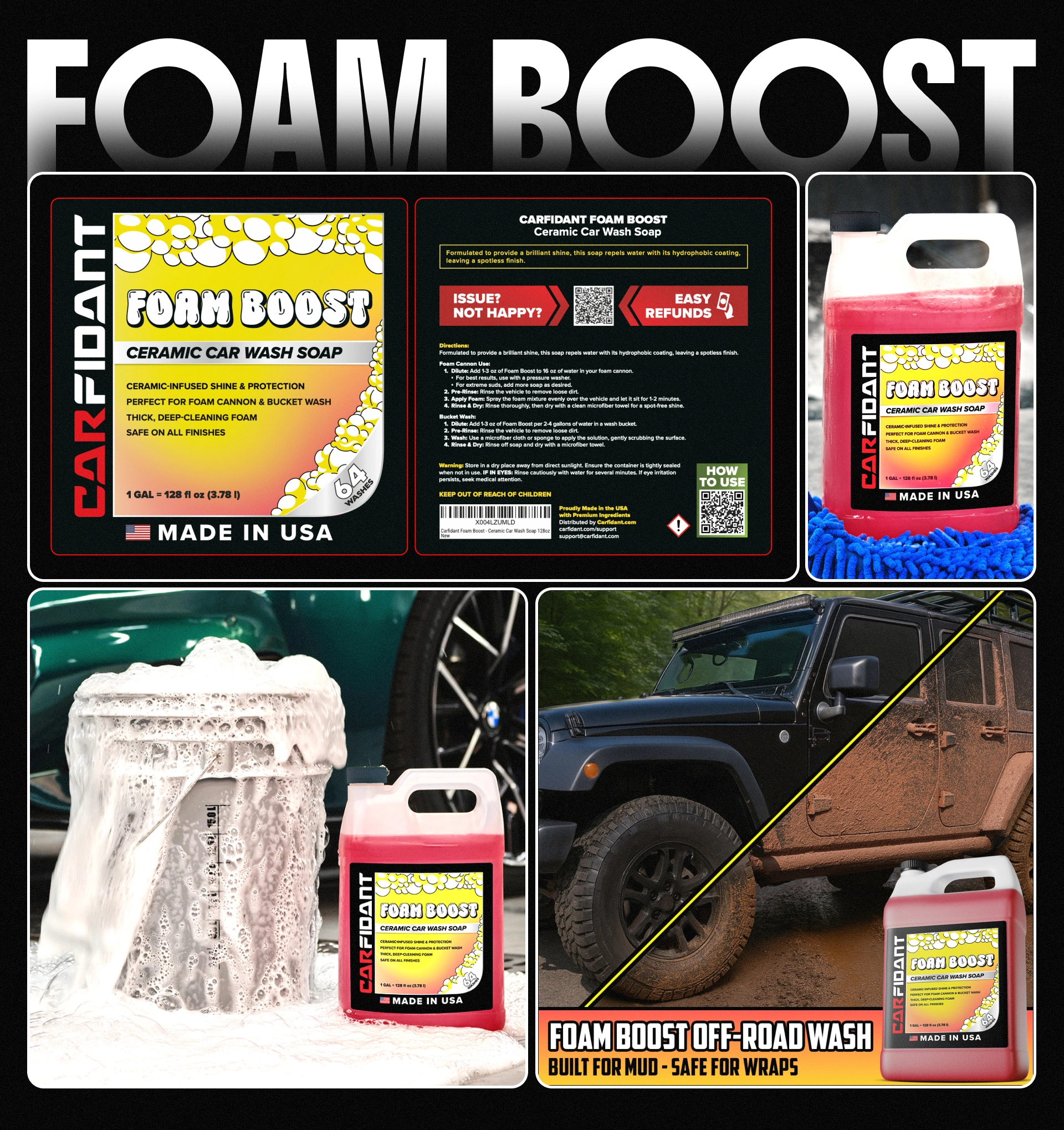
🟠 Foam Boost — the brand's everyday, summer-season soap. To set it apart from the winter products, I leaned into a warm color palette (sunny yellows and oranges), giving it an energetic, bright, all-season feel that reads instantly as the "regular" hero product of the line.
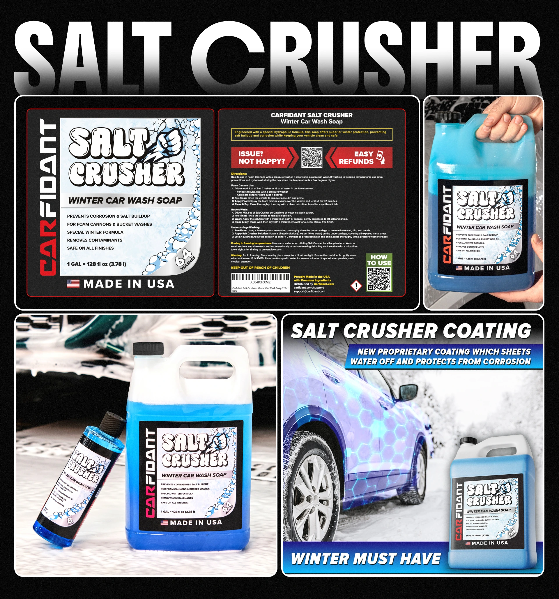
⚪️ Salt Crusher — the core winter soap, formulated to fight road salt and corrosion. It uses a cold palette of icy blues and crisp whites, visually tying it to winter, frost, and protection against salt deposits.
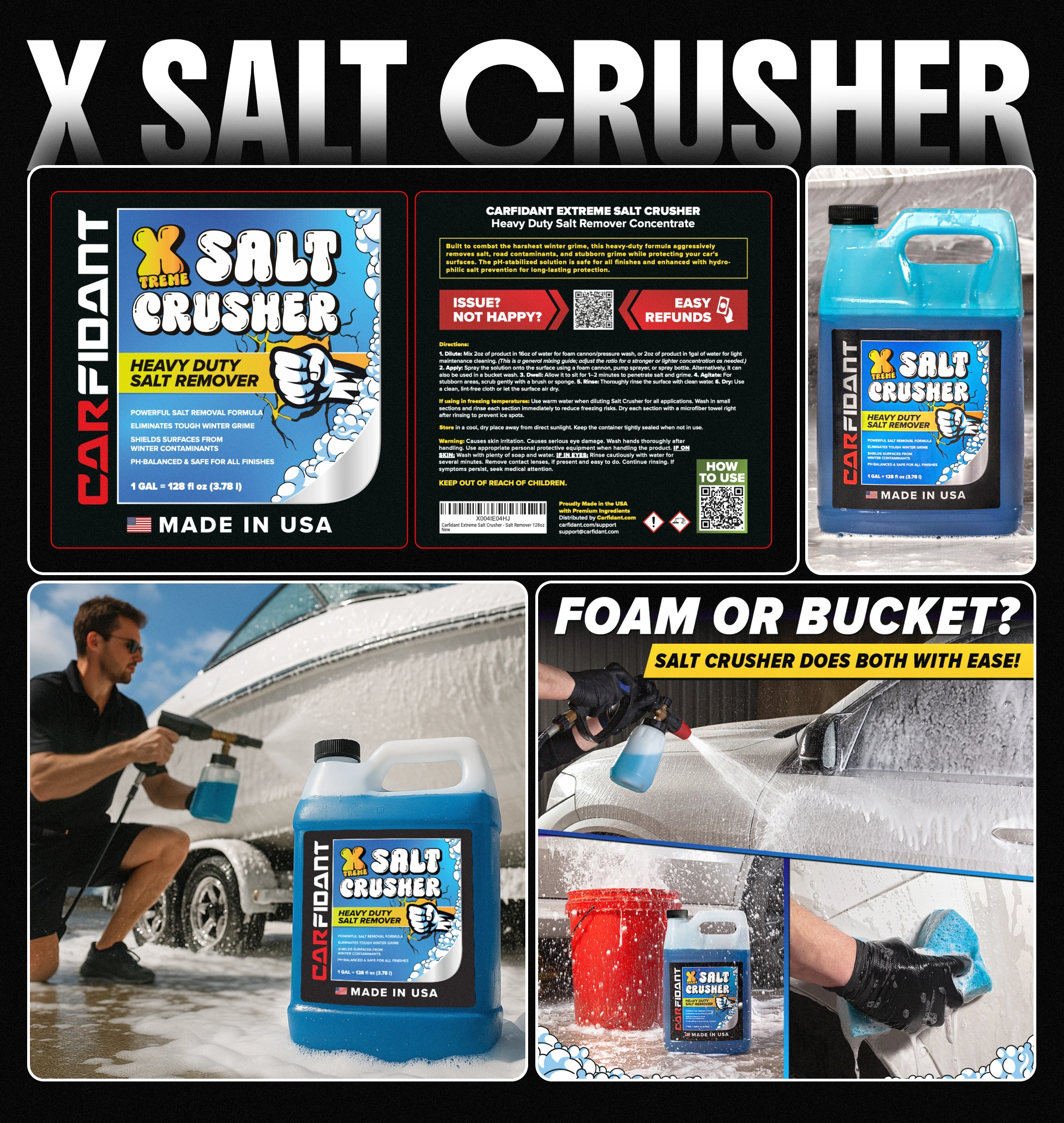
🔵 Xtreme Salt Crusher — the heavy-duty step-up. It keeps the same cold blue palette, but here the blue does double duty: it's both the cold of winter and the blue of water. Because this formula is also suited for marine use — yachts, jet skis, and other watercraft fighting constant salt exposure — the blue ties the product to two worlds at once, working as a "2-in-1" cue for winter salt protection and marine salt protection alike. The "Xtreme" treatment dials up the intensity while staying within the same visual family.
Like this project
Posted Jun 17, 2026
Designed a cohesive label system highlighting Carfidant's foamy formulas.