Fueld Brand Identity Development
Yurii Horbachov
Overview
Fueld is a U.S.-based car care chemistry brand built around a simple idea: help everyday people keep their cars looking great without paying bodyshop or professional detailer prices. The brand puts pro-level results directly into the hands of car owners.
I developed the complete brand identity and its commercial application — from the logo and visual system to retail-ready packaging and Amazon presence.
Scope of work: Logo & brand identity · Product labels (3 products) · Packaging · Amazon listing images · Product positioning · Marketing bullet points
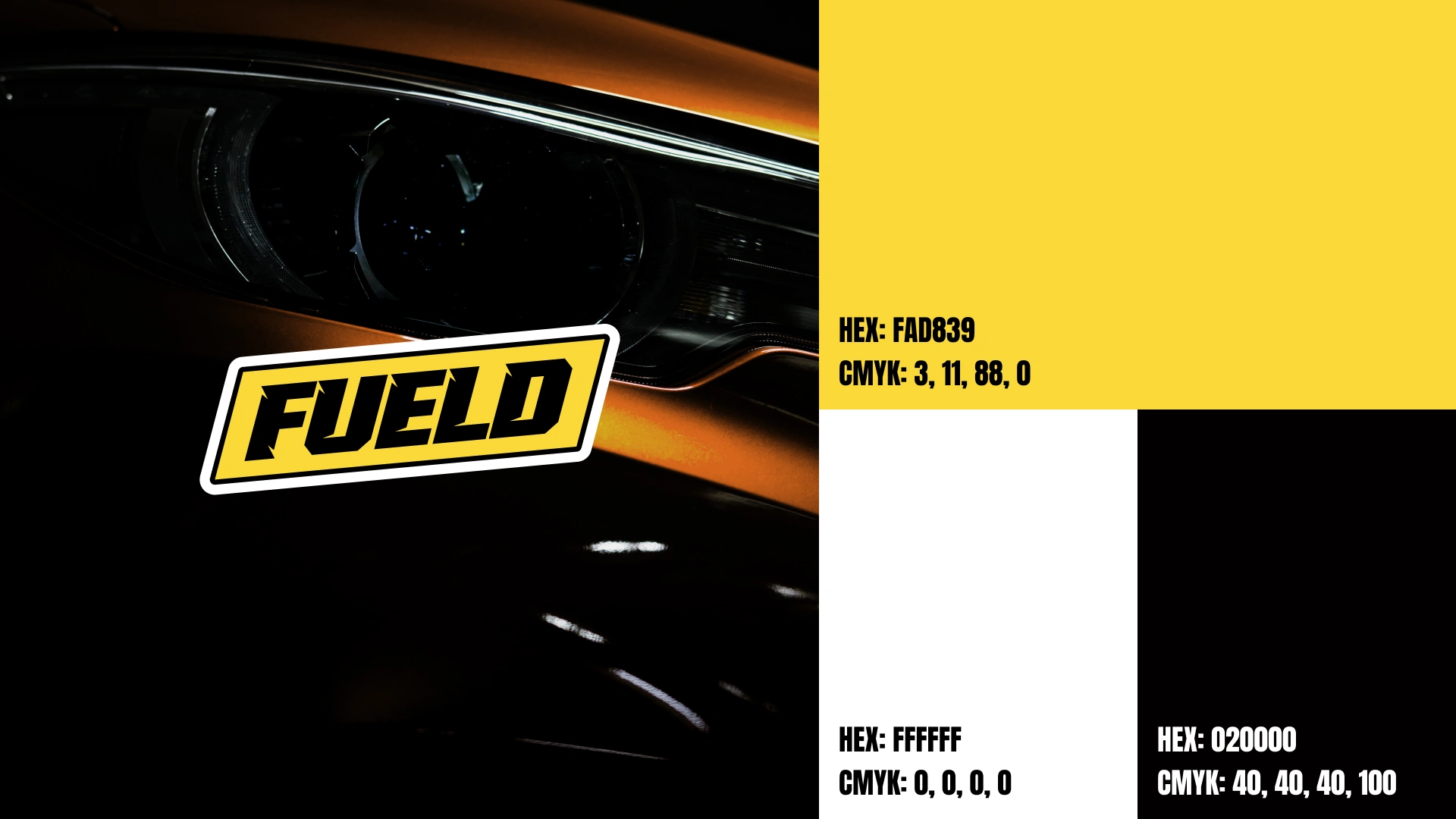
The Name
Fueld takes the familiar word "fuel" and reshapes it into something new — an abstract, invented word that still sounds instantly recognizable. It keeps the energy and automotive association of the original, while standing on its own as a distinct, ownable brand name.
The Challenge
The car care category on the shelf and in Amazon search looks remarkably samey. Competitors fall into one of two traps: quiet, minimal labels that disappear, or loud, cluttered designs that feel cheap. Neither earns trust at a glance.
The goal was to make Fueld look confident and professional in a crowded search grid — while still feeling fresh and on-trend, not like everything around it.
Visual Direction
The answer was a high-contrast system built on black, yellow, and white, paired with bold, brutal typography. The palette cuts through a sea of muted and busy thumbnails, while the heavy type gives the brand a sense of strength and reliability.
The result reads as premium and self-assured at thumbnail size — exactly where the buying decision happens on Amazon — without sacrificing a modern, current feel.
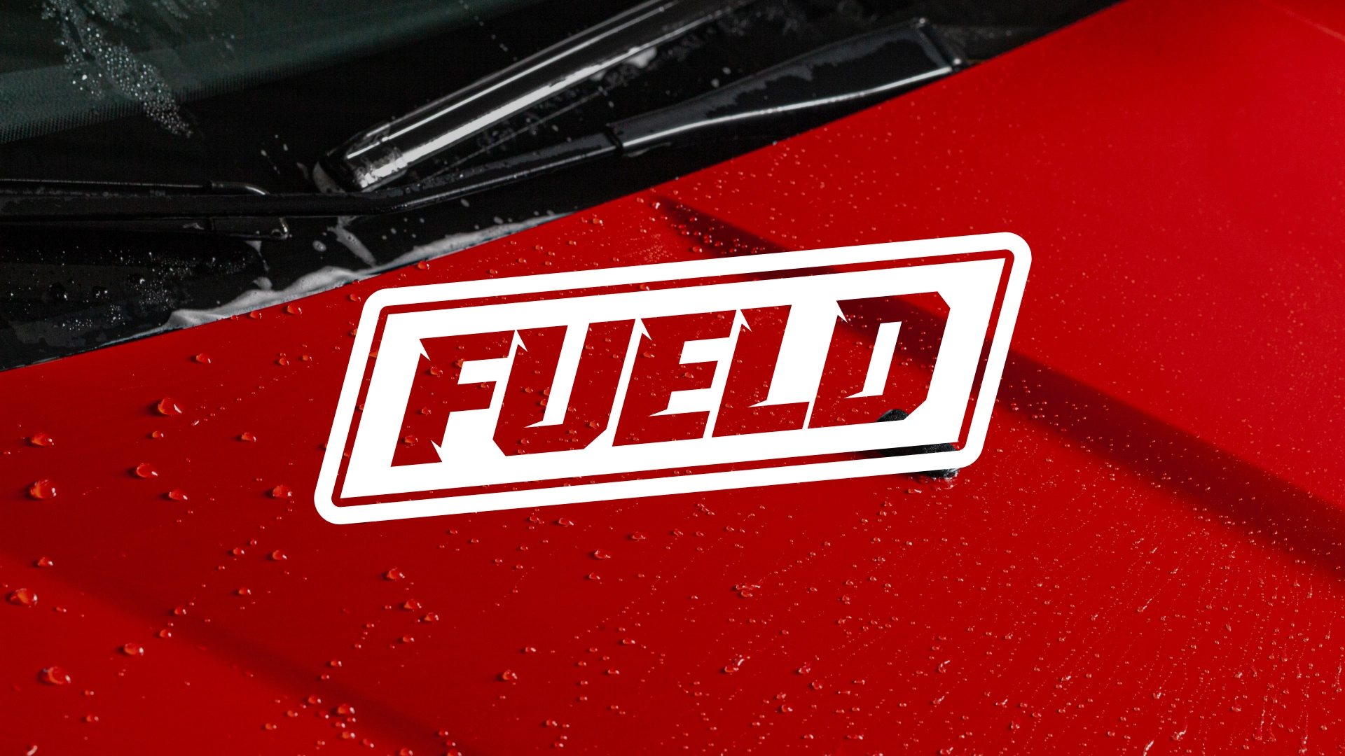
Logo
The logo carries the same confidence as the rest of the system: bold, direct, and unmistakable in black and yellow. It's built to hold up across every touchpoint — from a small bottle label to a full-width Amazon banner.
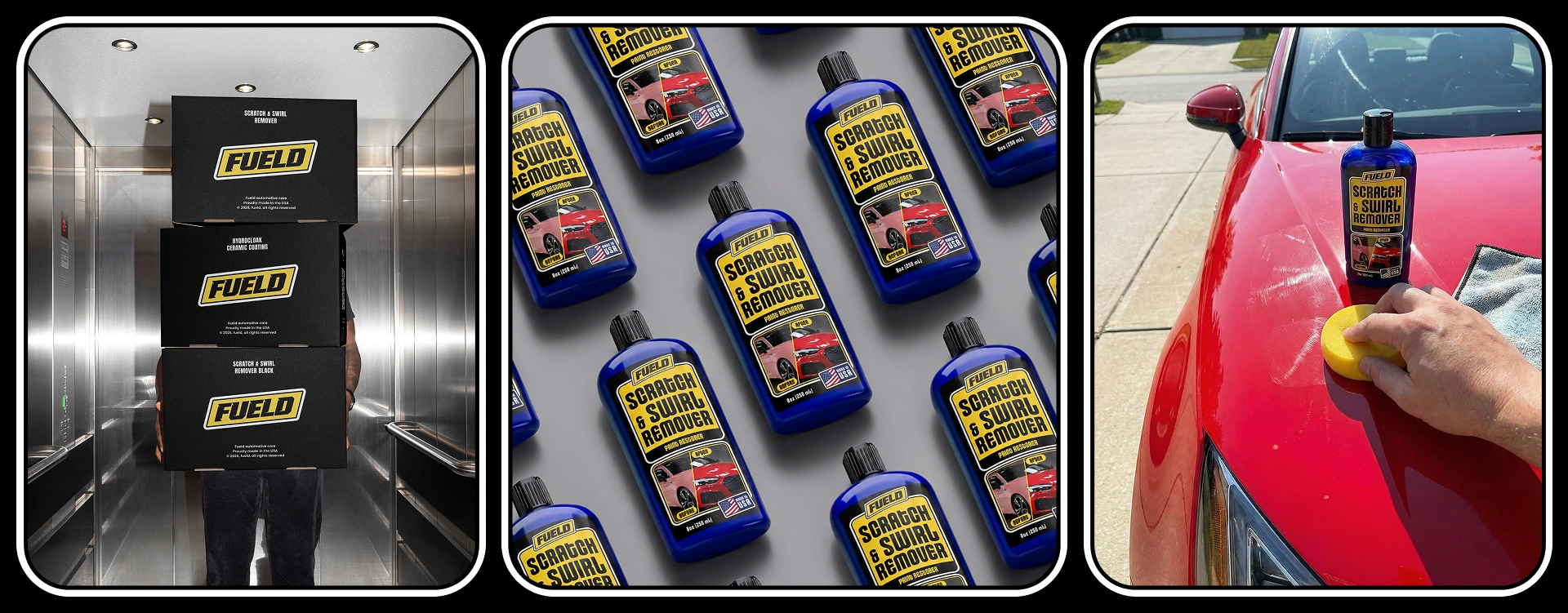
Packaging & Labels
Three products make up the launch line:
Scratch & Swirl Remover — Universal
Scratch & Swirl Remover — Black Paint Edition
Ceramic Coating Spray
The labels share one strong visual system, so the range reads as a family on the shelf while each product stays easy to tell apart.
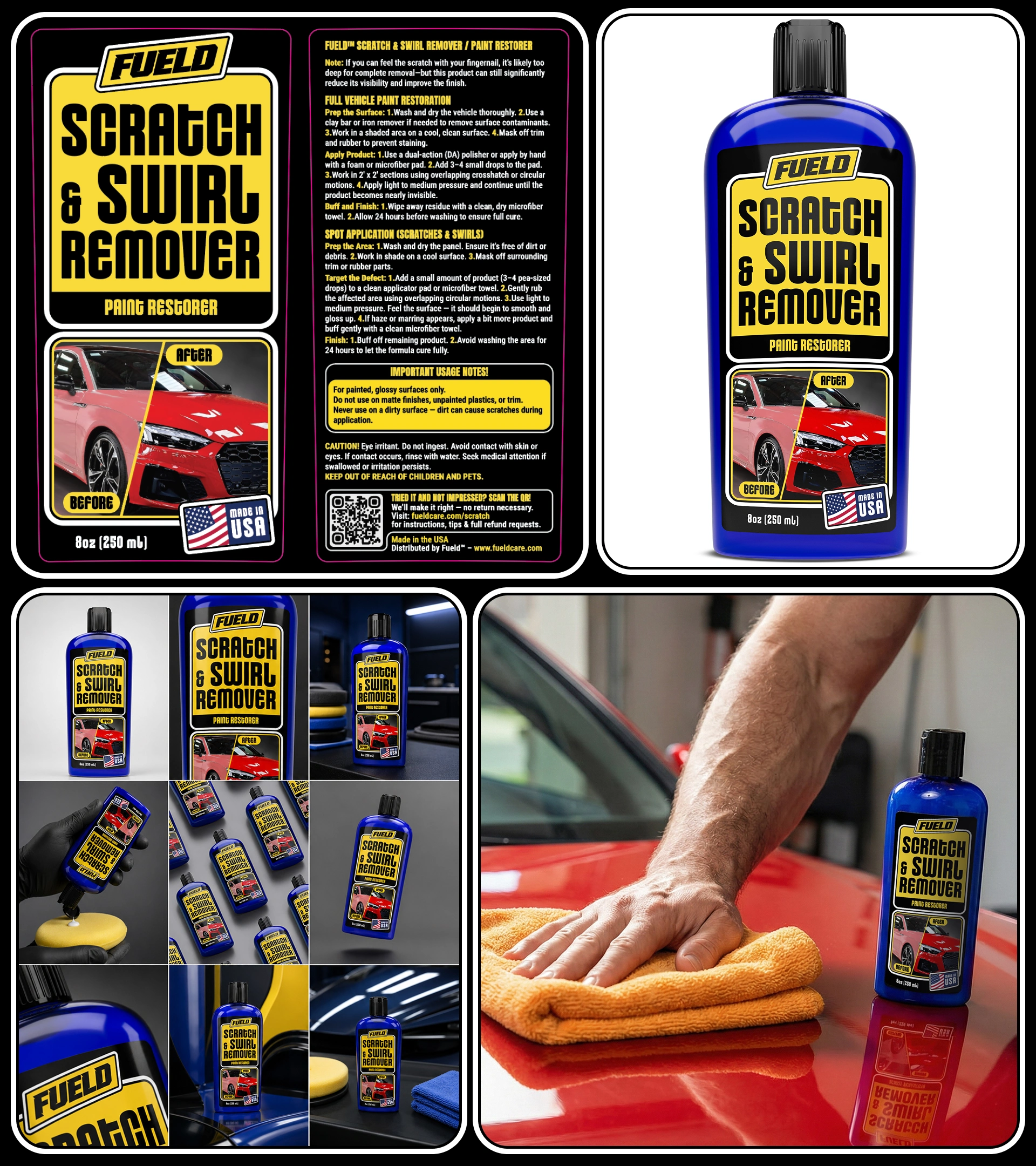
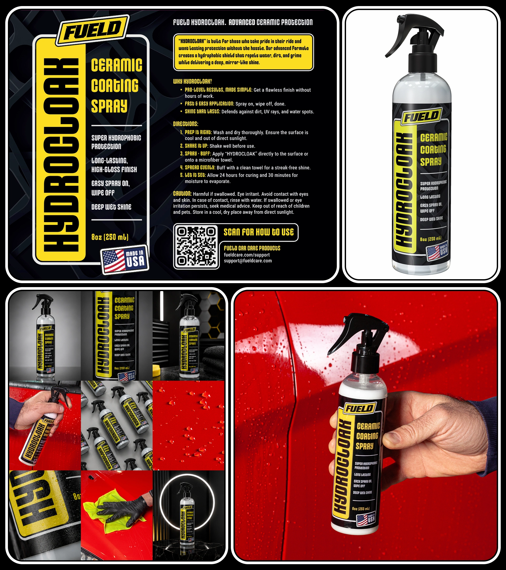
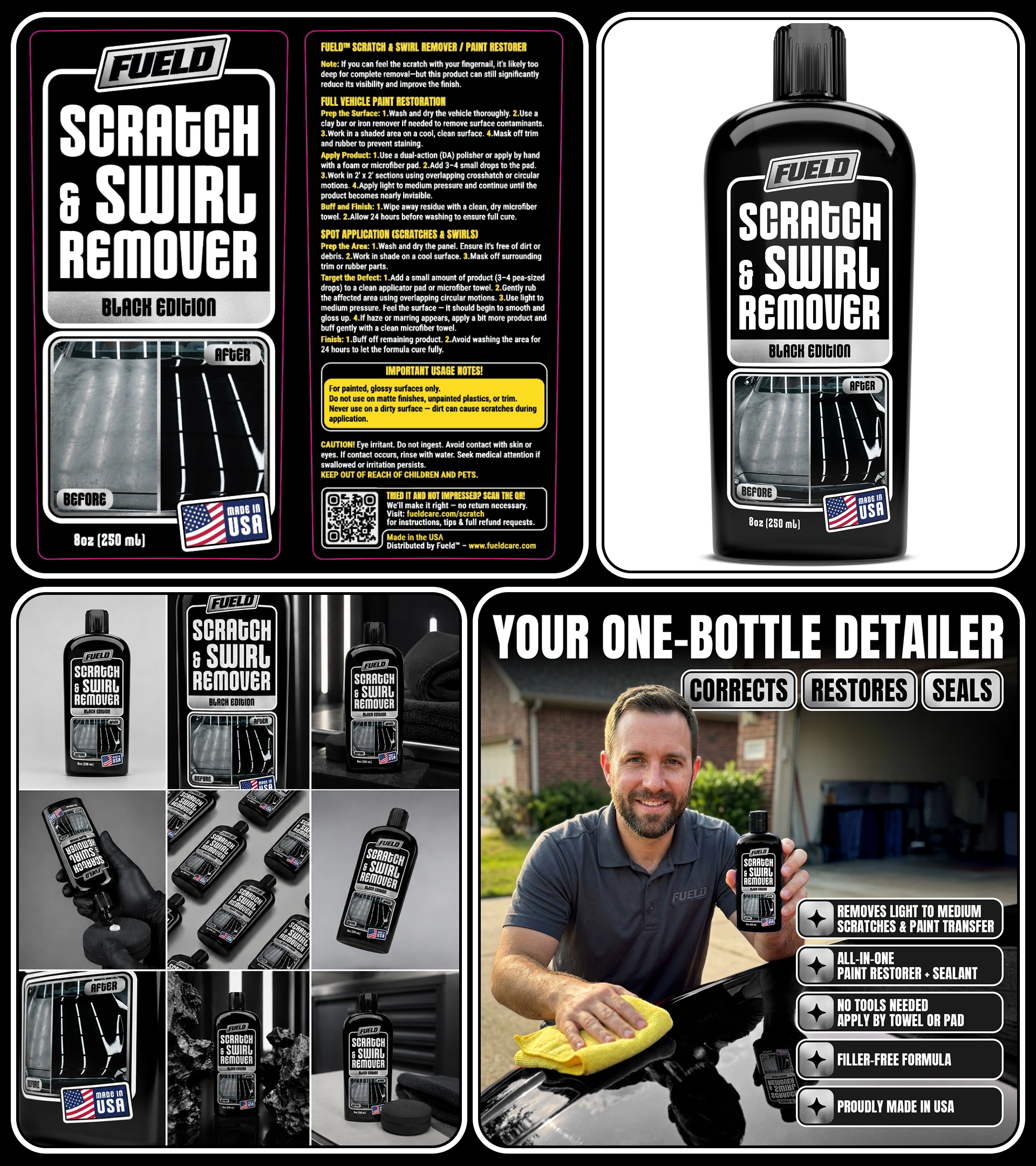
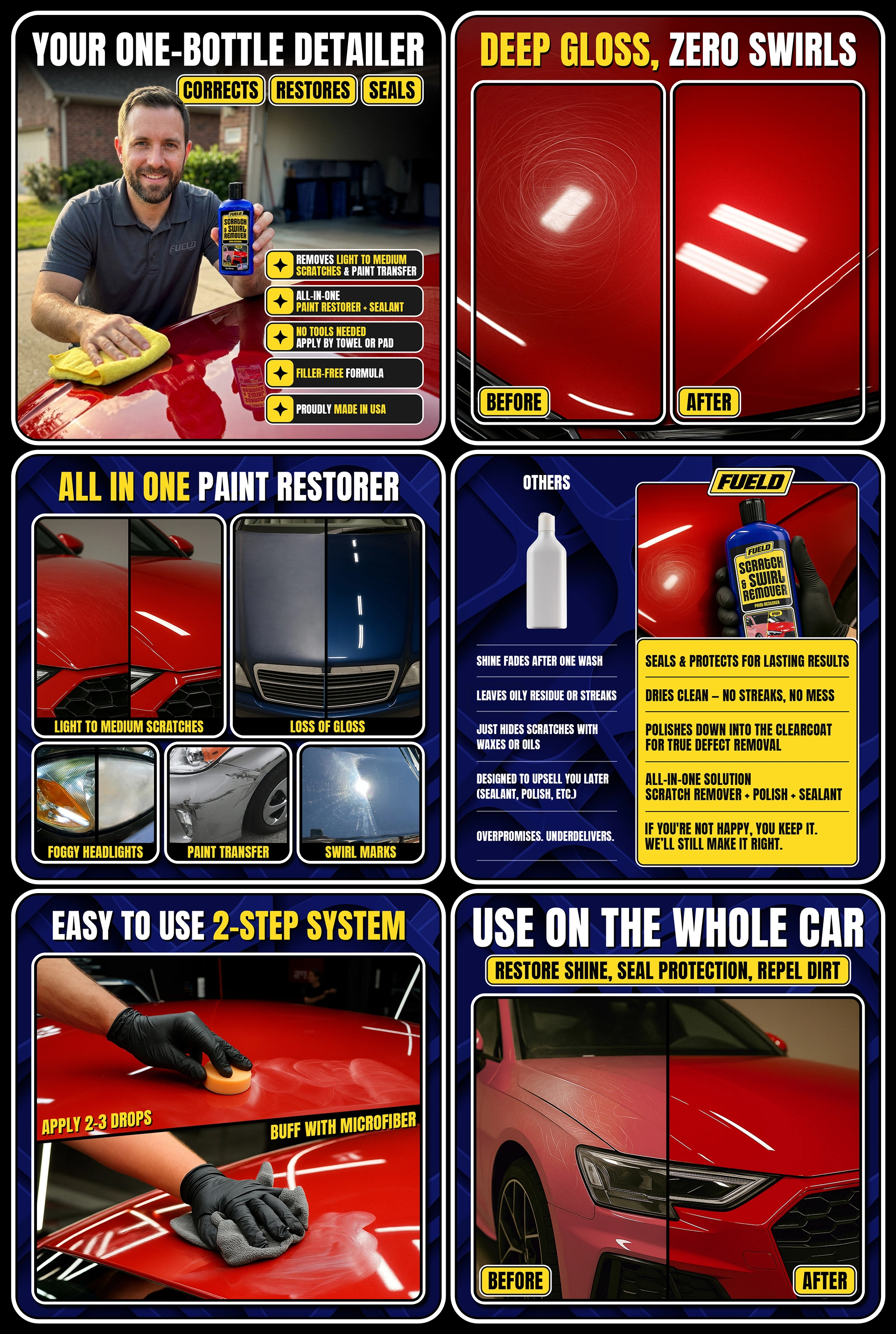
Positioning & Marketing Bullets
Beyond the visuals, I shaped how each product talks to its buyer — defining the positioning and writing the marketing bullet points for every product. These translate technical features into clear, benefit-driven reasons to buy, tuned for the way people scan and decide on Amazon.
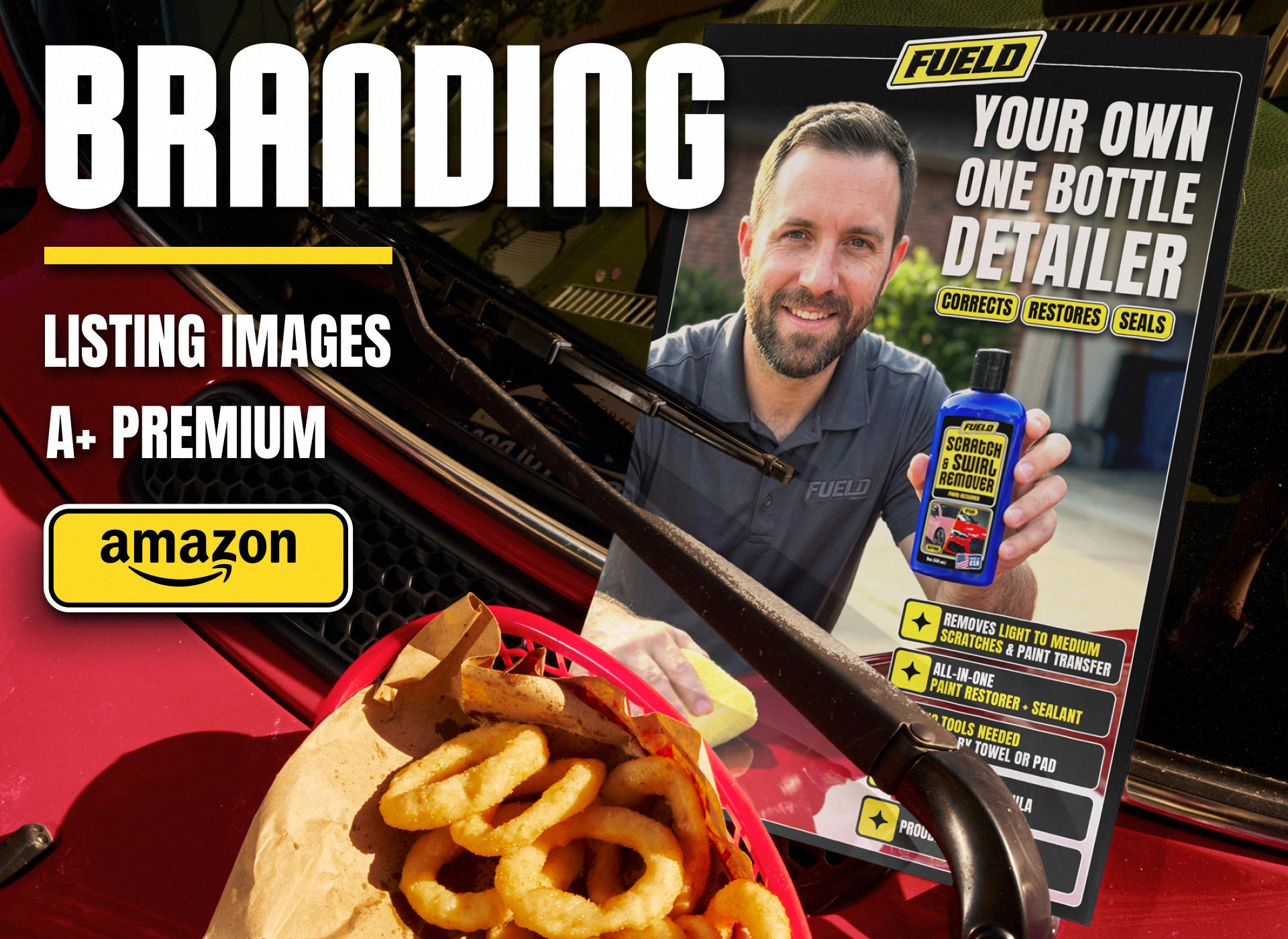
Amazon Listing Images
This is where the identity proves itself. The listing images carry the brand into its real environment — the Amazon search grid and product page — where high contrast and bold type help Fueld stand out and convert.
Like this project
Posted Jun 15, 2026
Developed brand identity, packaging and Amazon listing design for Fueld car care products.