Honey Haze Cannabis Co.
Lauren Bradford
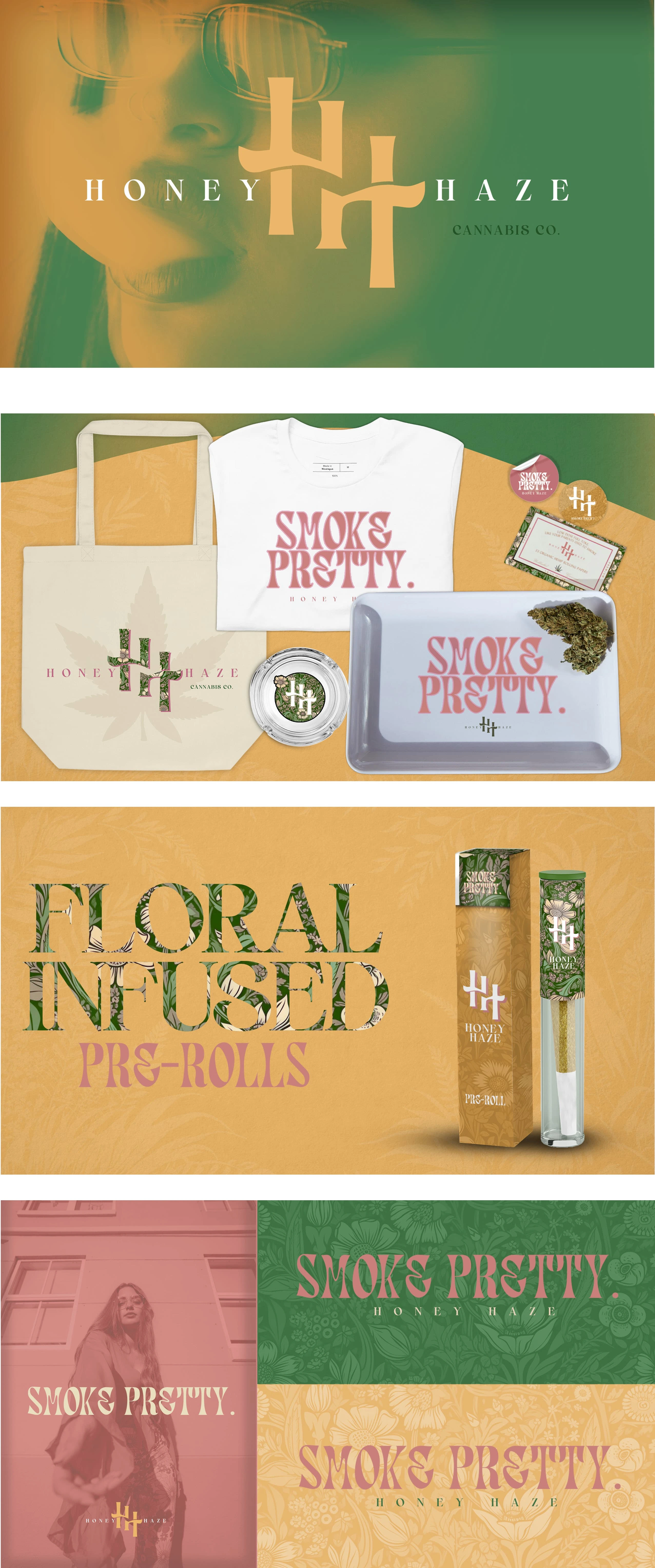
This project was all about brand design, creative direction, and bringing a vision to life—from the logo to the merch and packaging. I had so much fun blending vintage 70s inspiration with a sleek, modern feel, proving that cannabis branding can be both cool and unapologetically feminine.
Honey Haze is a cannabis brand with a feminine twist—modern, a little retro, and full of good vibes. I wanted to break away from the usual look of cannabis brands while still keeping it familiar, so I stuck with classic green and gold but added a pop of pink to make it feel fresh and playful for the target audience.
Like this project
Posted Feb 6, 2025
Honey Haze blends modern cannabis branding with 70s nostalgia. I crafted the logo, merch, and packaging—mixing green, gold, and pink for a fresh, feminine vibe.
Likes
0
Views
4