Design System & Branding Guidelines
Priyanka Patel
Design System & Branding Guidelines
Project Overview and My Role
I developed a full design system and brand guidelines package aimed at creating a unified, scalable visual identity for digital products. The system ensures consistency across UI components, typography, colors, spacing, and interaction styles—making future design and development cycles faster and less prone to inconsistencies.
Why This Matters & What Needs to Be Solved
Challenges addressed:
Inconsistent look & feel across screens: different button styles, typography choices, spacing, and color usage.
Inefficiencies in design handoff → developers having to guess edge cases or create duplication of elements.
Onboarding new designers or contributors → no standard reference for styles, components, or interaction behavior.
What I Built
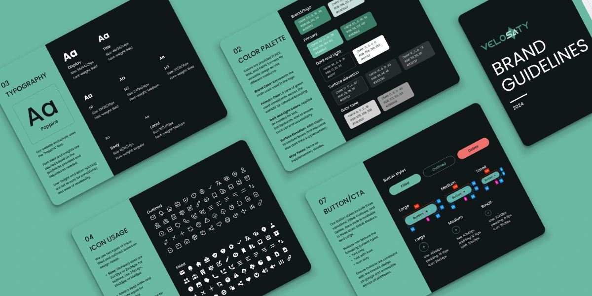
1. Core Style Tokens & Branding Elements
Created reusable design tokens for colors, spacing, and shadows to unify visual language across devices.
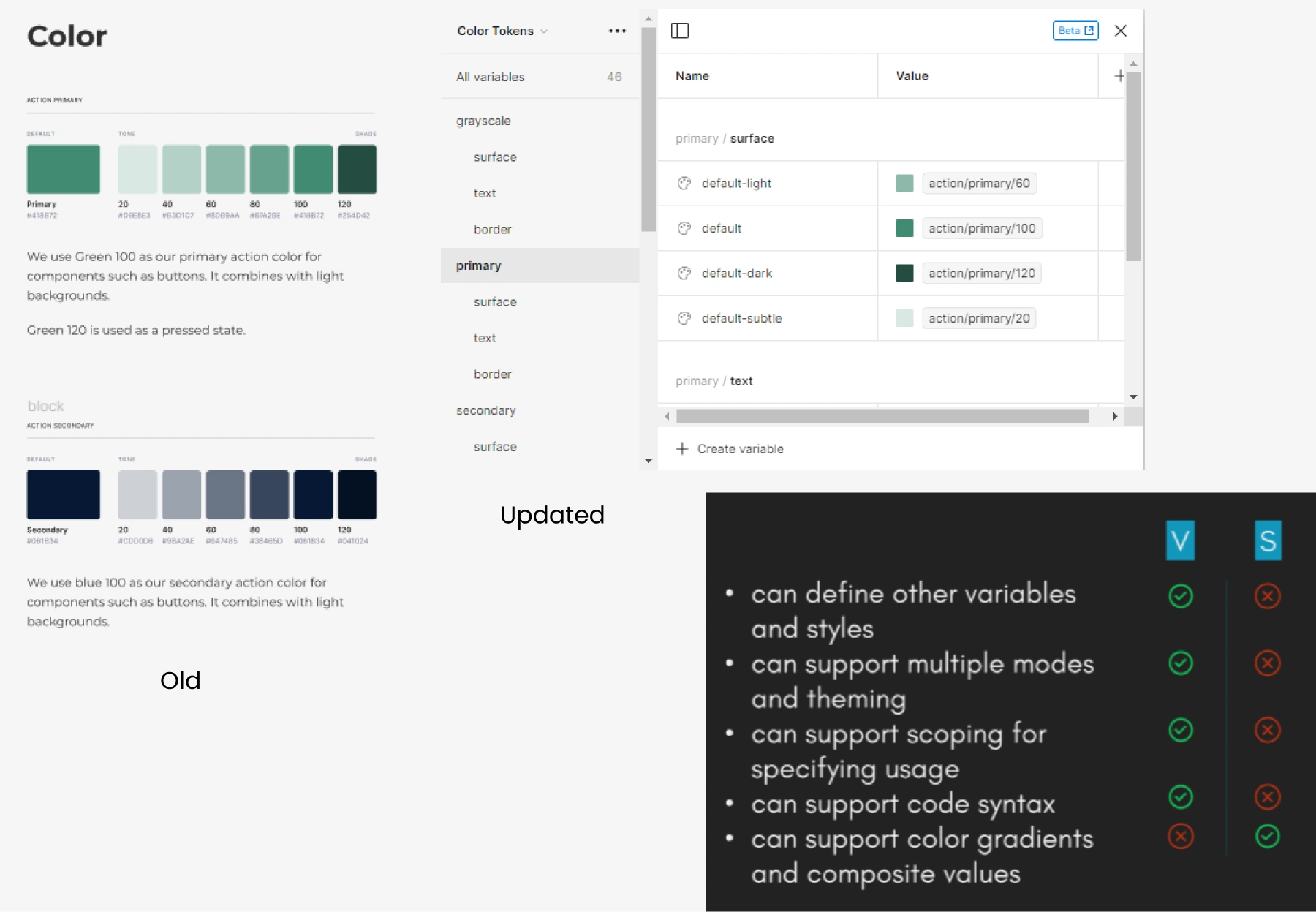
Color System
2. Typography System
Established a hierarchy of font sizes, weights, and line heights for accessibility and readability.
Defined rules for when and how to use heading levels, captions, and body text.
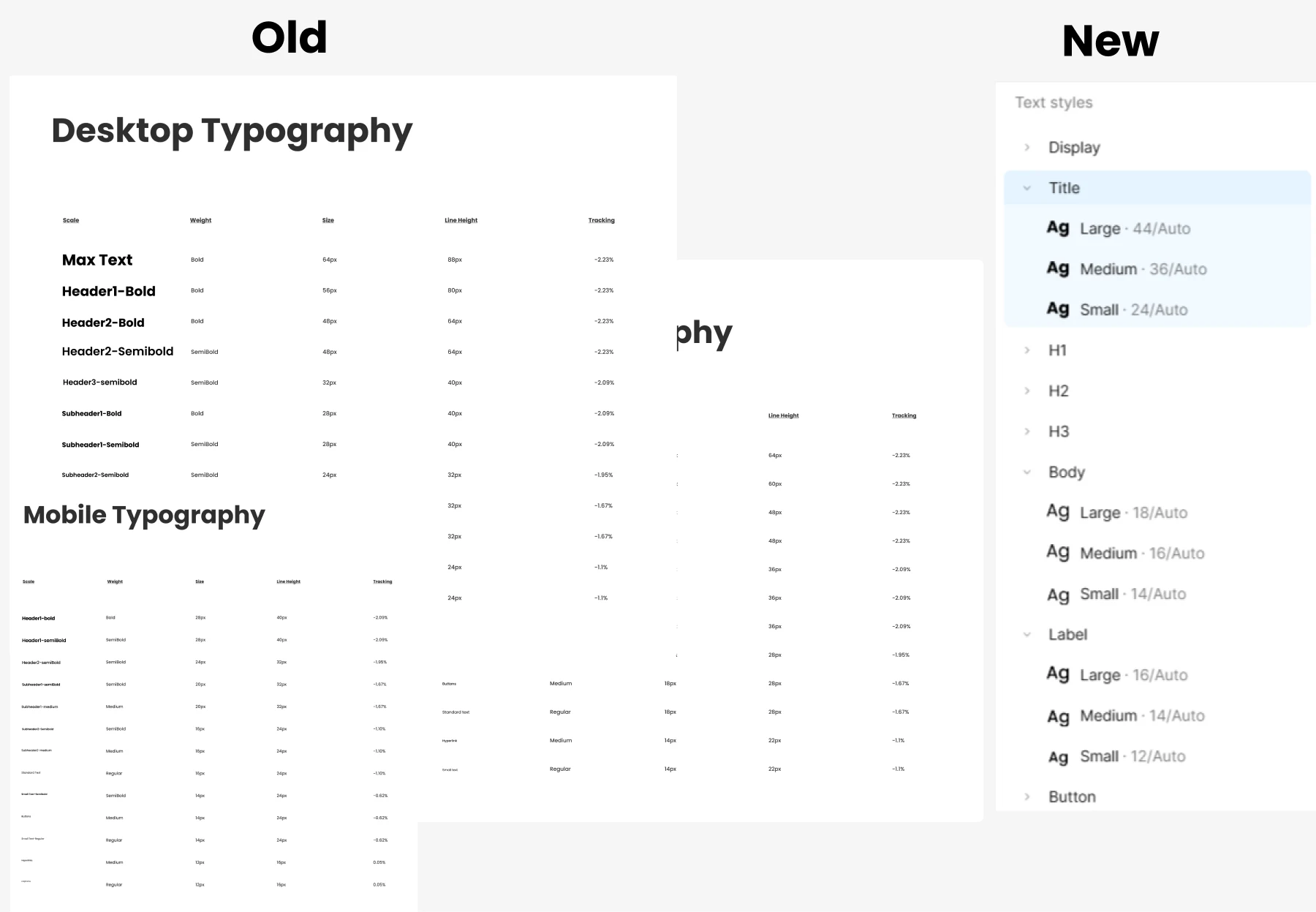
Typography System
3. Component Library
Designed and documented reusable UI elements with multiple states. primary UI components with variants (active/disabled/hover), icons, form fields, modals, and other reusable parts.
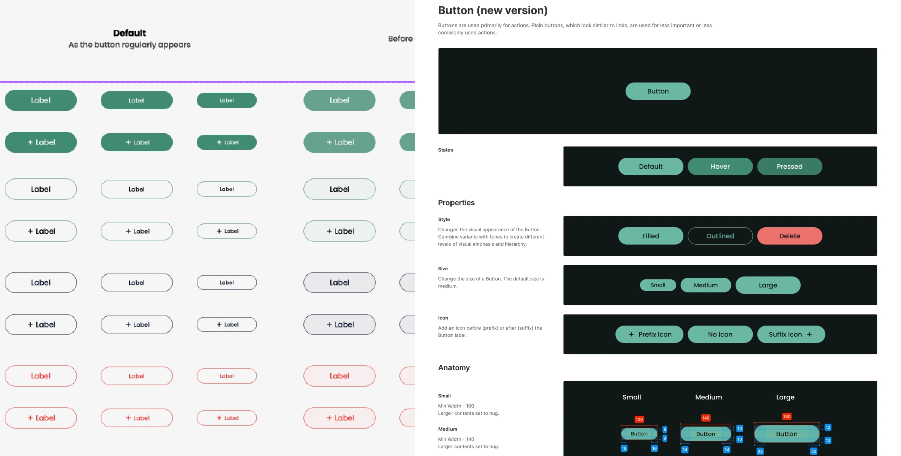
Button Component
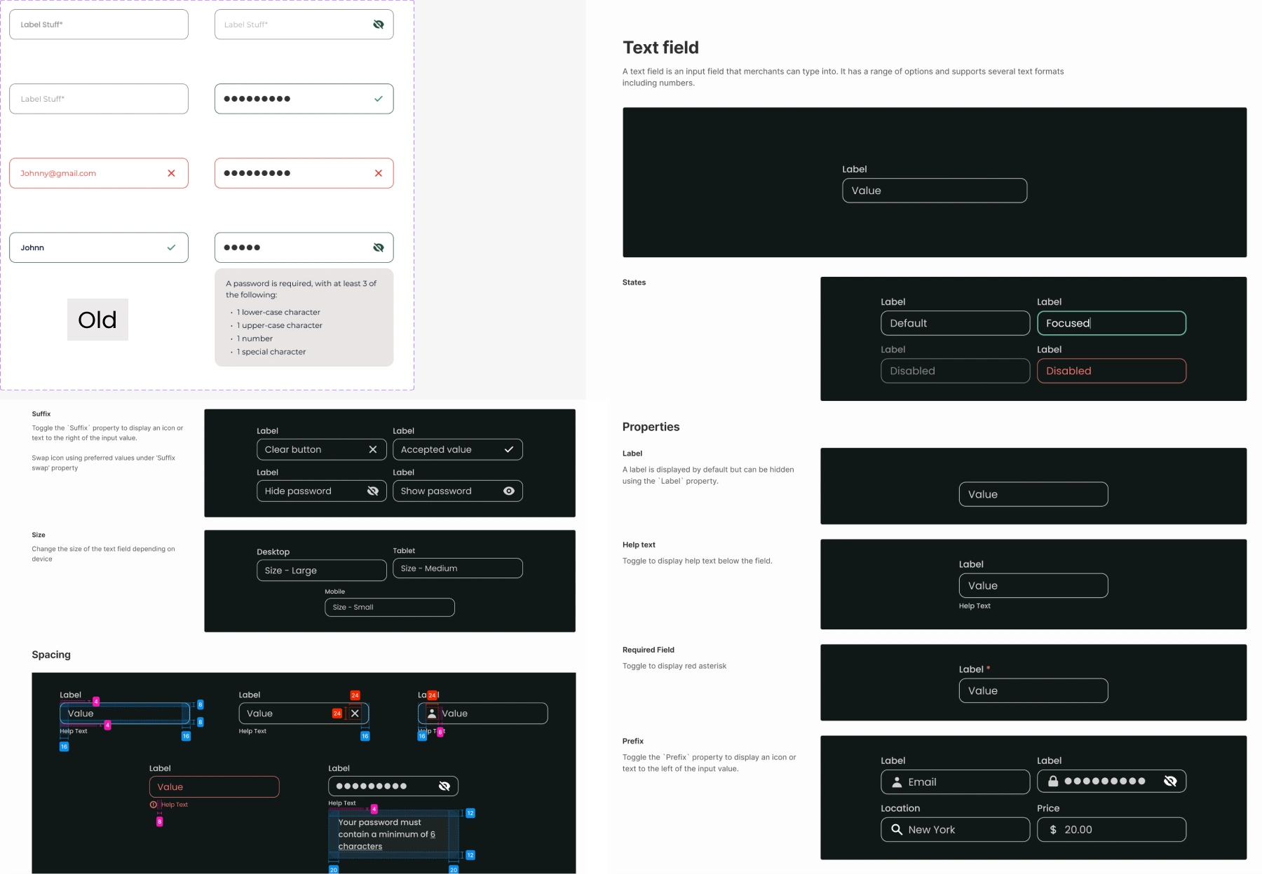
Input Field Component
4. Guidelines Documentation
Rules for usage: color contrast, button states, typography hierarchy, icon style, spacing rules.
5. Example Applications & Demonstrations
Applied components & tokens to real screens to showcase how designs maintain visual harmony across features.
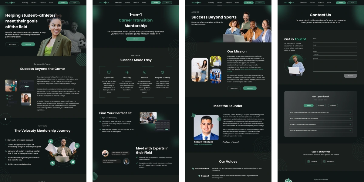
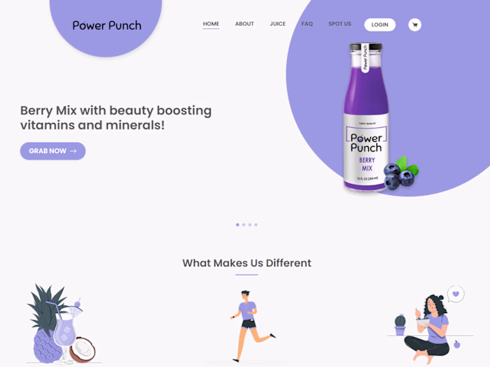
Landing pages
6. Collaboration & Versioning
Set up versioning strategy, component naming conventions, and a process for updating the system with feedback.
Regular syncs with front-end developers to ensure all styles/components translate correctly into code.
Impact & Benefits
Reduced design cycle time by ~30% because designers reuse components and don’t rebuild styles from scratch.
Improved handoff clarity → developers report fewer UI inconsistencies during implementation.
Enhanced brand trust: consistent visual cues, spacing, and typography increased perceived professionalism.
Scalable design asset library that can support future features or product expansions without redoing core UI.
Like this project
Posted Sep 17, 2025
Built a comprehensive design system and branding package; streamlined developer handoff, reduced UI inconsistencies, and improved design clarity.
Likes
2
Views
18