WTFAST: Increasing User Activation by 400%
Fernando Ruiz
WTFAST: Increasing User Activation by 400%
Overview
WTFast, a leading GPN for gamers, faced an unsustainable trial-to-paid conversion rate. New users were churning within their first session, failing to experience the product's core value. I initiated and led a UX initiative to diagnose the root cause and redesign the first-time user experience (FTUE). The solution—a simplified onboarding wizard paired with a critical bug fix—directly resulted in a 400% increase in user activation and a 3x lift in paid conversion, significantly impacting company revenue.
Objectives
My hypothesis was that the business was focused on the wrong problem (feature optimization) instead of the critical one: initial user activation. My self-initiated mandate was to:
Diagnose the Root Cause: Go beyond user surveys and use behavioral analytics to understand why new users were abandoning the product.
Design for a "Magic Moment": Create a frictionless onboarding flow that guides the user to a successful first outcome as quickly as possible.
Validate with Metrics: Measure the solution's success not by opinions, but by its direct impact on two key metrics: user activation and trial-to-paid conversion.
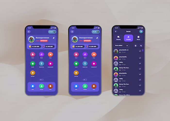
Key Features
Behavioral Analysis
Instead of relying on biased feedback from existing users, I analyzed over 2,000 session recordings of users who churned. This revealed that 70% were getting paralyzed by a complex manual setup, causing them to abandon the app in under a minute.
Critical Bug Discovery
My analysis of user sessions uncovered a systemic bug where the app was displaying false data and routing users to suboptimal connections. This finding, escalated to the CTO, proved the product wasn't just confusing—it was functionally broken for new users.
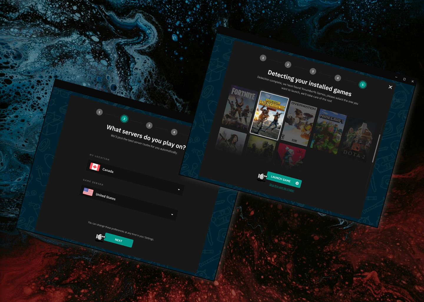
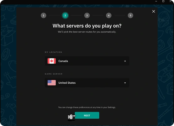
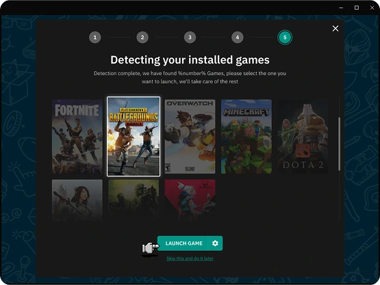
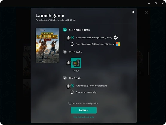
Linear Onboarding Wizard
The solution was to replace the overwhelming dashboard with a simple, linear wizard. By automating game detection and simplifying choices (applying Hick's Law), the new flow eliminated decision paralysis and guided every user to a successful first connection.
Data-Driven Validation
The new design was A/B tested against the original. The results were conclusive, showing a 400% increase in the number of users successfully activating the product and a 3x increase in the trial-to-paid conversion rate, proving the design's direct business impact.
Project Gallery
Key Takeaways
User Behavior Reveals What Surveys Conceal
This project was a crucial lesson in the hierarchy of user feedback. Relying on the opinions of our existing, successful users would have led us down a path of optimizing features that our churning new users never even reached. The real problem wasn't in the core product, but in the first 60 seconds of the user journey. By analyzing thousands of session recordings of users who left, we bypassed subjective feedback and observed objective behavior. This data-driven approach was the only way to uncover the crippling effect of decision paralysis and pinpoint a critical, system-level bug that was invisible to both our support team and our established user base. It cemented the principle that to solve for early churn, you must observe what users do, not just listen to what the survivors say.
Design's Impact Extends Beyond the Interface
A designer's curiosity must not be confined to the UI layer; true product improvement happens when design acts as a holistic partner to engineering. During the session analysis, the ping data presented to users "felt wrong"—an intuition that pointed to a technical problem, not a visual one. By trusting this observation and collaborating directly with the CTO to investigate, we unearthed the critical bug that was actively sabotaging the product's core promise. This discovery fundamentally shifted the project from a simple interface redesign to a joint UX-and-Engineering initiative, proving that a designer's responsibility is to protect the end-to-end user experience, even if it means questioning the underlying system logic.
Onboarding is a Race to the "Magic Moment"
The primary goal of a first-time user experience isn't to showcase features, but to deliver the product's core value as quickly and effortlessly as possible. The original WTFast experience overwhelmed users with choice, demanding they become network experts before they had experienced a single successful connection. The redesigned linear wizard was built on a single principle: eliminate all friction on the path to the first "win." By automating game detection and drastically simplifying choices (applying Hick's Law), we created a "magic moment" where the user's problem was solved with a single click. This relentless focus on delivering an immediate and tangible success was the key driver in our 400% activation increase, proving that a user who feels powerful and successful in their first session is infinitely more likely to become a paying customer.
Like this project
Posted Sep 21, 2025
Redesigned FTUE for WTFAST, boosting user activation by 400%.
Likes
0
Views
11