Makeup App
Makeup App
Case study
UI/UX Design
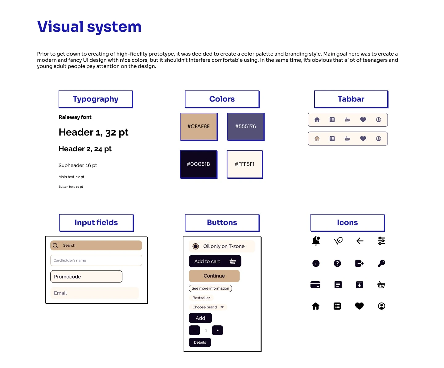
Visual design
Problem solving
Glamify is a makeup app that helps users try on different makeup looks, get personalized product recommendations, and learn more about suitable skincare.
Overview
My role
UX Designer, Researcher
Visual Designer
Duration
2 months
Tools
Figma, Google Docs
Description
Glamify is a mobile application that provides users with a range of tools and resources to help them experiment with makeup and take care of their skin. With features like virtual try-on, product reviews, and personalized recommendations, users can easily explore and discover new makeup looks and products that suit their style and skin type.
The virtual try-on feature allows users to upload a photo of themselves or use their device's camera to see how different makeup looks would appear on their face. It also offers a wide range of makeup products and personalized recommendations based on their skin type and skin tone
In addition to makeup, the app also provides skin care advice and product recommendations to help users maintain healthy skin. By providing ratings and reviews from other users, the app helps users make informed decisions when choosing skin care products.
Problem Statement
Now people use makeup almost every day - even if we don’t talk about decorative cosmetics, but skincare becomes more and more popular every day as well. The market of makeup product is crowded by a lot of itema and sometimes it can be difficult for people to find a suitable product, especially if they have problems with skin or their skin behind “beauty standards”. When your skin have an uncommon tone or problems like acne, choosing of right product can become a real challenge.
Goals
Main goal of this project is creating an application that will help all people with selection of suitable products regardless of their skin condition and appearance. It should include not only people who fits beauty standards but people who have specific problems with skin as well.
Users should be able to buy their favorite products or find something new that fits their skin and appearance.
Users should able to see how product will be look on their face in prior to buy it.
Users should be able to choose products that help their skin or fits their appearance.
Design Process

Design process
User Research
It was decided to conduct the interview for best understanding users’ needs and pain points. Data that I gained gave me some insights about how people attitude to makeup apps, how they use apps and what is really important for them.
Customers want to leave and view comments, see the country of manufacture and product composition, and check for potential allergens before purchase. They also want separate sections for skincare and decorative cosmetics, with information on how products will look on their skin and recommendations for similar products. They want to save data about their skin type in the app and receive free delivery for orders above a certain amount, promotions/sales/promocodes, and the ability to track and choose the delivery time.
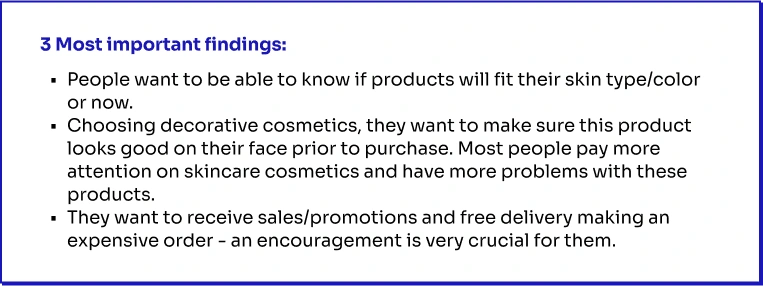
Main insights
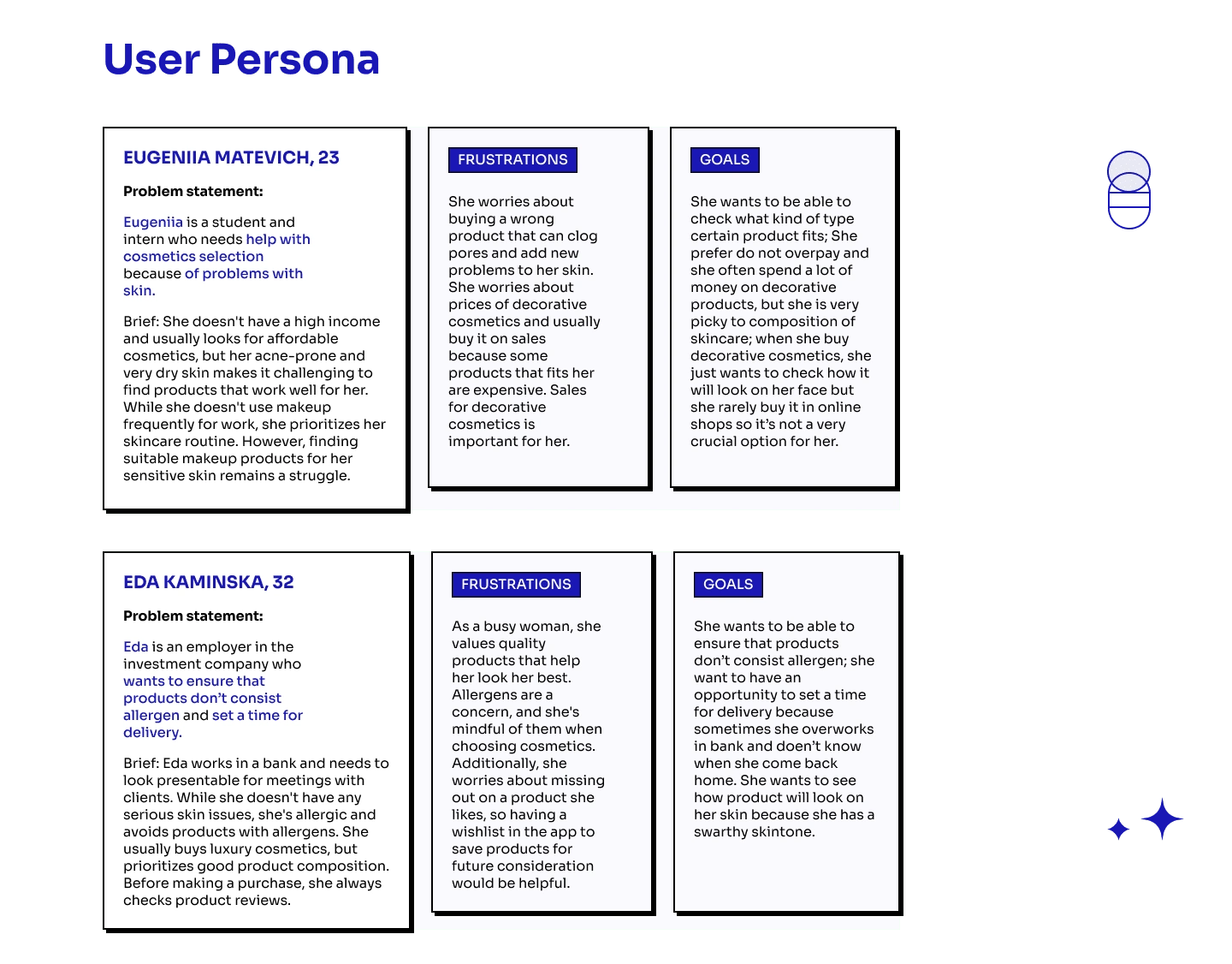
User Persona
User Journey
User Journey was created, based on data gained during research phase and data about User Persona. It shows a journey that user go through from the moment when they realize their needs to the moment after making a purchase.
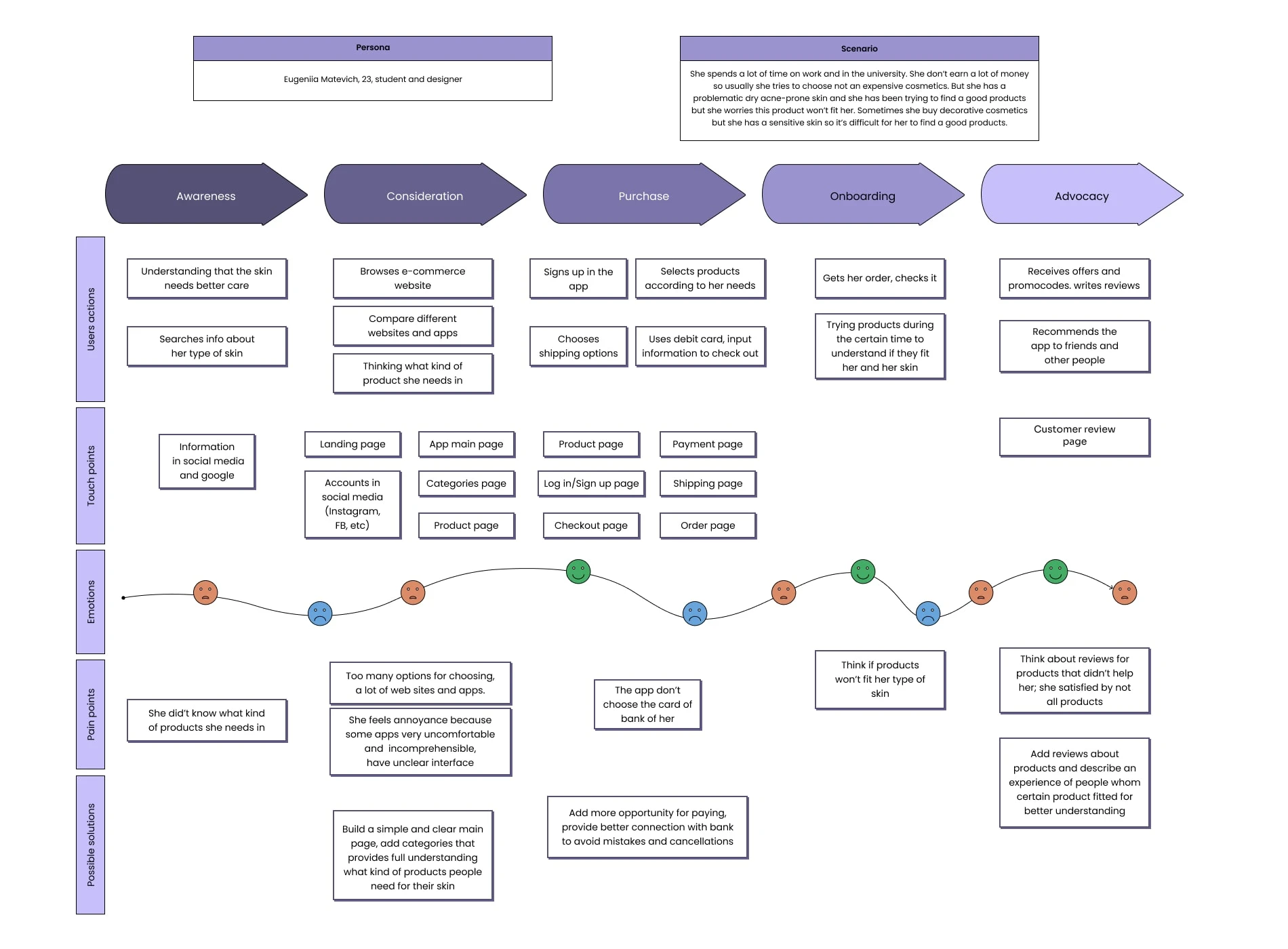
User Journey
Information Architecture
User Flow
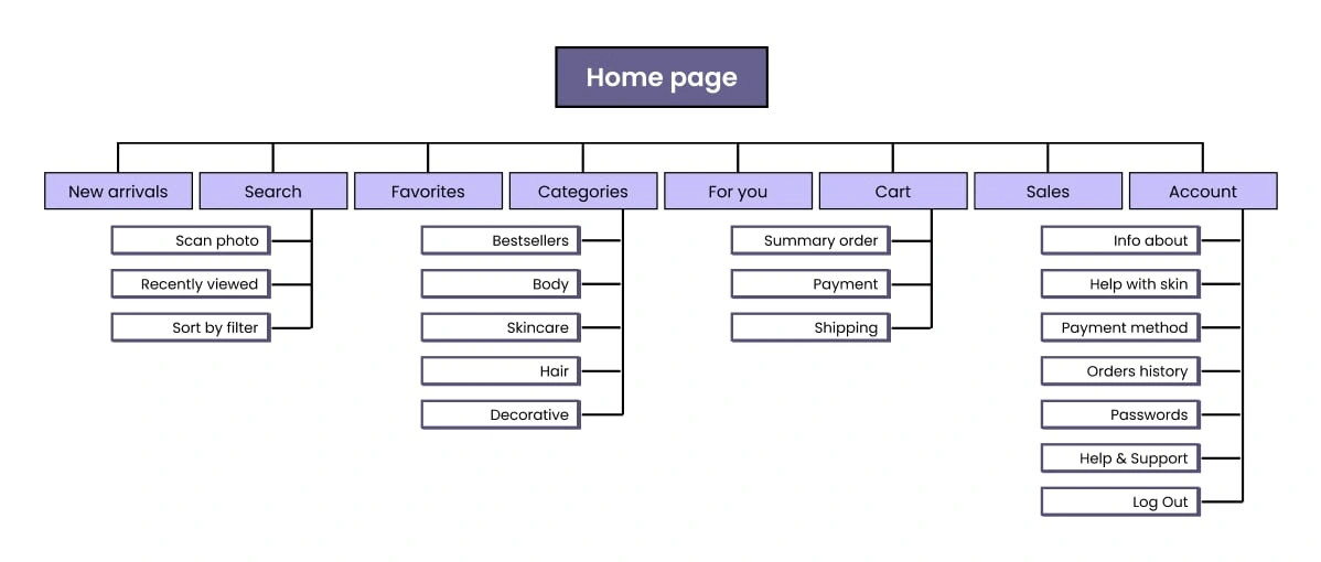
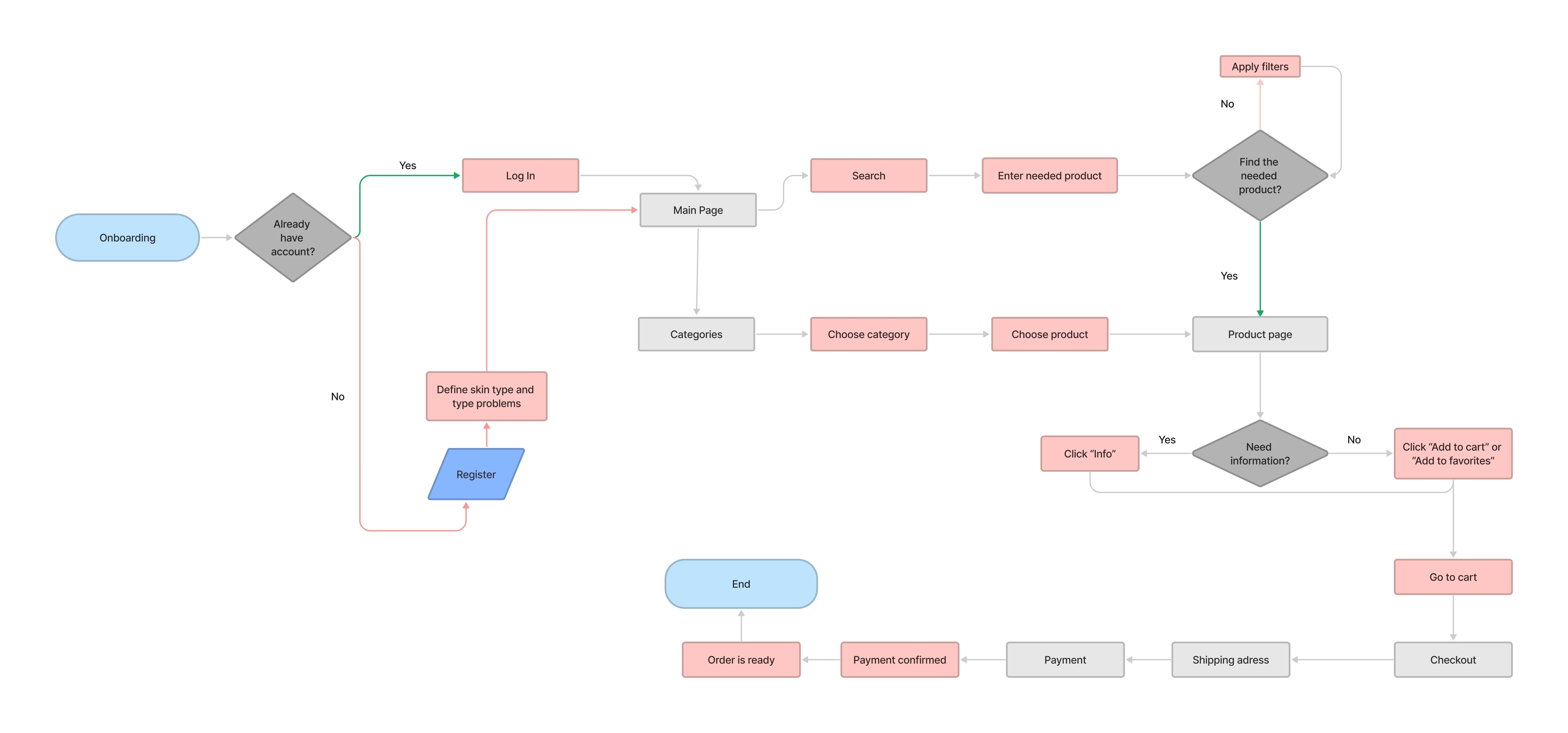
After analyzing the needs of makeup enthusiasts, I determined the key actions and features that were crucial and beneficial for a makeup app. Using this information, I created a sitemap that would provide a seamless experience for users. By keeping these factors in mind, I aimed to develop a user-friendly and effective makeup app that would meet the needs and preferences of makeup enthusiasts.
User Flow
Early ideation : wireframes
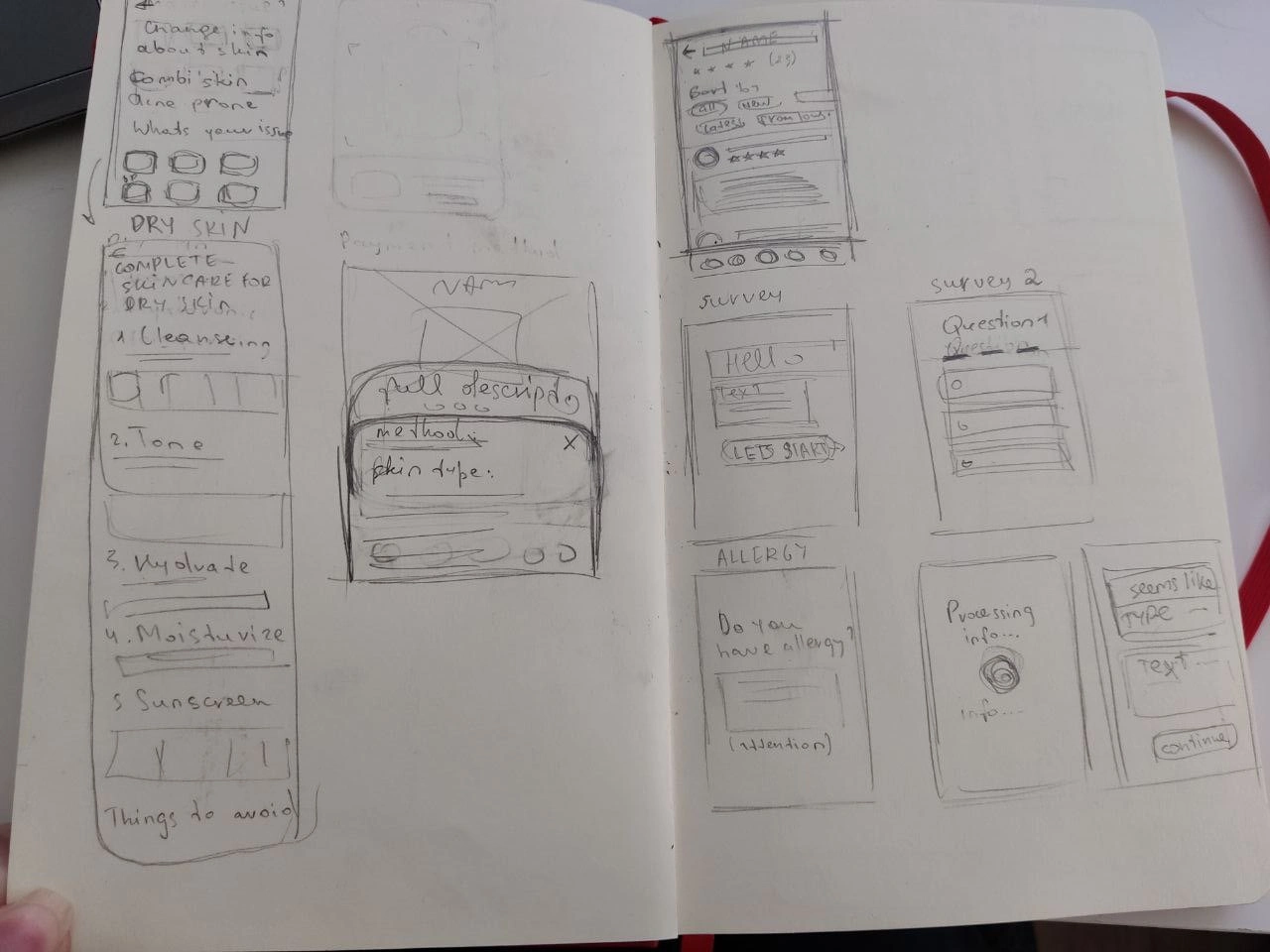
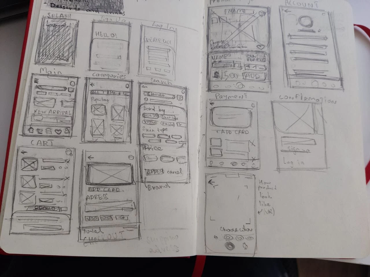
I made first rapid ideations for wireframes, using pencil and paper for quick sketches. This helps designers not get attached to any one design and pay more attention on the app in general.
Low-fidelity prototype
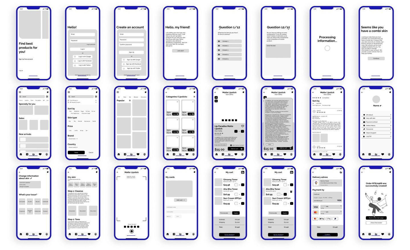
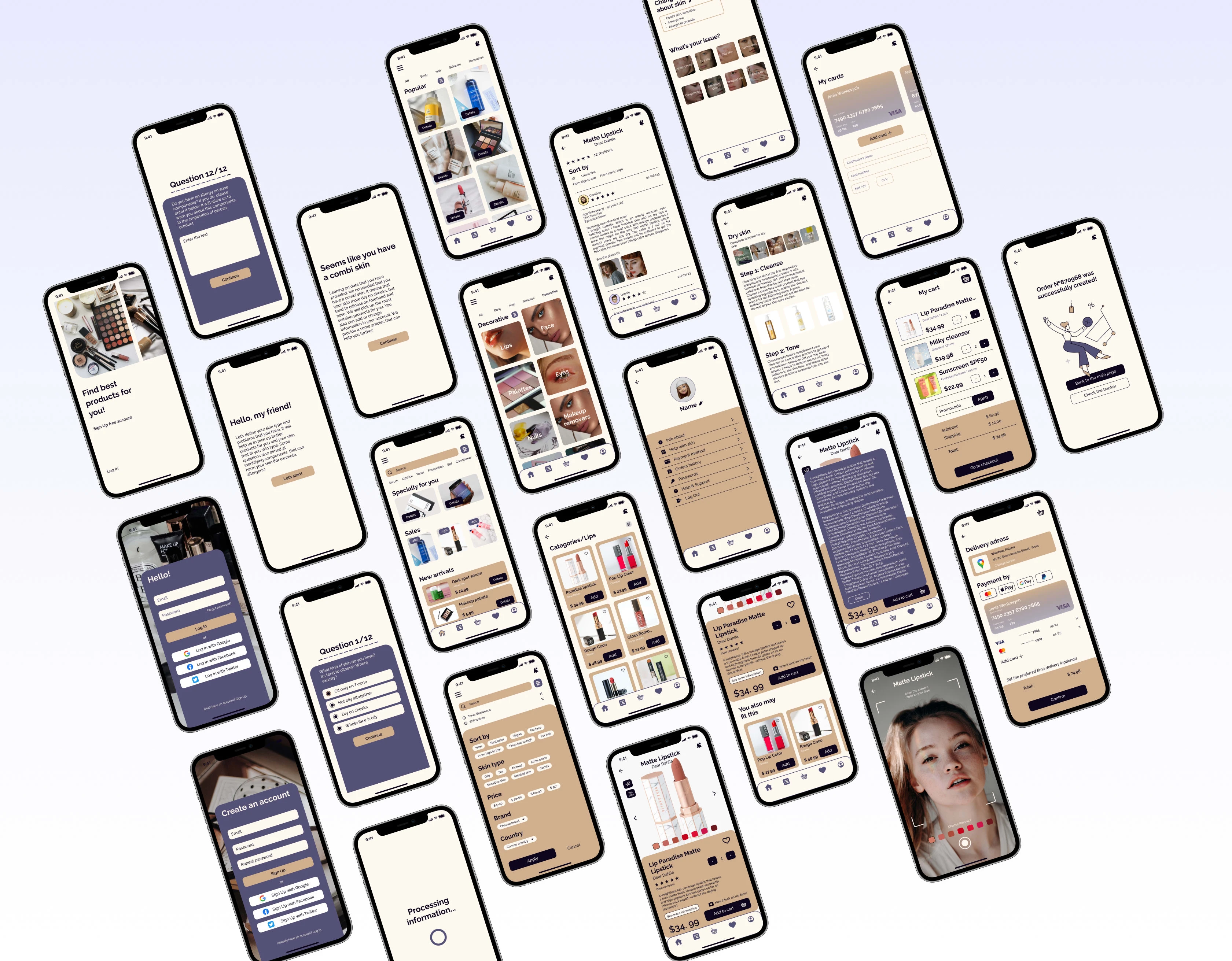
Hi-fidelity prototype
Testing
I did a user testing and got a good feedback. Participants appreciated design and colors. They pointed out that design looks cool, but now overloaded. However, they stumbles upon some pitfalls.
Participant A said there was too much information about composition. But this person doesn’t have any problems with skin so they are don’t check an ingredients. They said if it was an information about skincare, it would be hard for them to focus.
Another person said that a lot of information about composition is a good idea, especially when we talk about problematic or sensitive skin. For people, whose skin is acne-prone, it’s a perfect way to protect themselves from potential clogged pored ingredients.
Leaning on it, I can suppose that maybe it was a good idea to highlight clogged pored ingredients, especially when person’s type of skin is acne prone.
On the product page, 2 users didn’t realize that they could scroll down. This made it difficult to see the “you may like it” section (which wasn't visible). They was be able to managed with it ultimately, but I guess this problem can be solved by lifting image and description of product a little above to make a “You may like it” section visible.
Users appreciated hints about products in their account and help with routine for their skin, but they wished there was a more detailed information.
Final prototype
Move forward
There a lot of things that may be improved further. For example, some users say they want to check a more information about their skin type. We also can add a separation by time of day for uses since not all products may be used at the morning and in the evening.
Some users say they also would like to see a special function in app that can help them to make a skincare routine schedule for weeks.
Like this project
Posted Apr 6, 2023
Glamify is a mobile application that provides users with a range of tools and resources to help them experiment with makeup and take care of their skin
