Bus App
Case Study
UI/UX Design
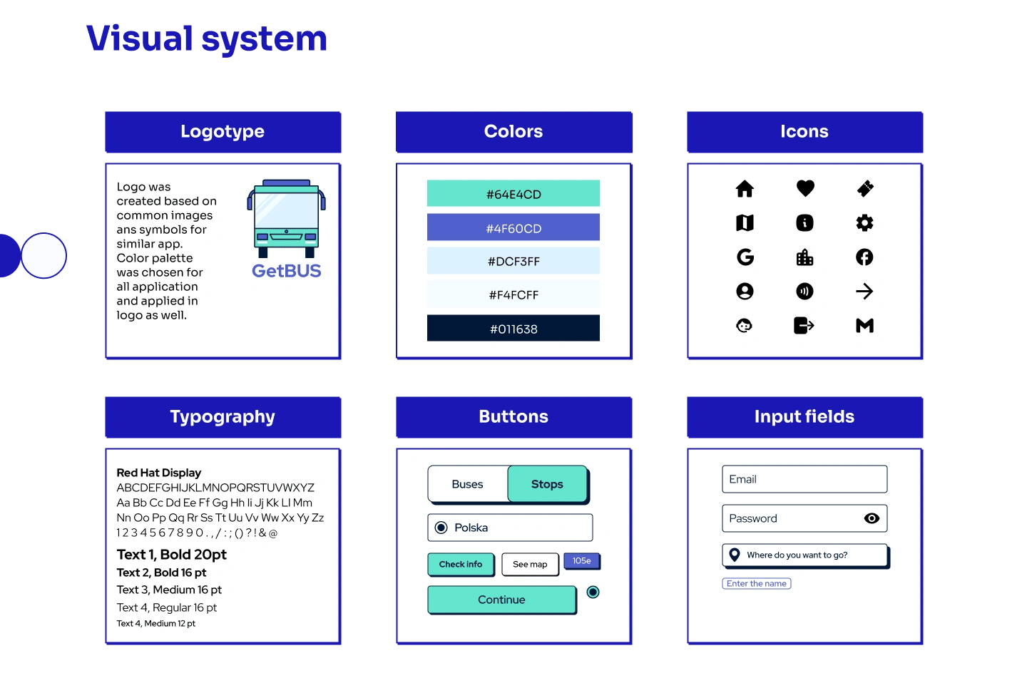
Visual design
Problem solving
GetBUS is a bus app that helps commuters track live bus schedules and receive alerts for delays or cancellations. The app also provides personalized trip planning options, including the fastest and most convenient routes based on users' location and destination.
Overview
My role
UX Designer, Researcher, Visual Designer
GETBus is a user-friendly mobile application designed to help commuters navigate their way around town by providing real-time bus schedules, routes, and maps. With the bus app, users can easily plan their journeys, track bus arrivals, and receive notifications about delays or route changes. The app also includes features such as fare information, bus stop locations, and user reviews to help users make informed decisions about their travel. Whether you're a daily commuter or a new visitor to the area, the bus app is an essential tool for hassle-free transportation.
Problem statement
Public transportation is crucial for people who use it every day when they get somewhere. However, with all the traffic jams we experience daily, the schedules of buses and other public vehicle can be disfficult to track. The mobile application that can track and provide real-time information on bus schedules can be valuable for people to manage their time and plan their routine without disappoiting events like buses delays.
Goals
Create an app that provide users by information about buses routes and also can give them information about real-time buses schedule and gaps between buses. It also implies the presence of warning notifications that let people know when bus delays or has been canceled. App should provide comfortable experience with all people who use it and meet requirements of all users. People could be able to check all suitable buses routes and see accurate and relevant schedule.
Impact
I tested final prototype on 10 participants. 8 of 10 users use transport app almost every day and they noticed a good design. 2 participants said that they think it looks and works better than their current applications, the interface is clean and modern. One of them said that information about traps for disabled people is am incredibly good idea and said it would be good to have the same signs for all types of transport. 7 of 10 participants said they would recommend app to their friends. All users highly appreciated idea of real-time tracking with an opportunity to keep pace with bus's route on the map instead of estimated time of arriving.
9 of 10 participants said they think app has a good potential to be valuable for commuters.
Early ideation: research and analysis
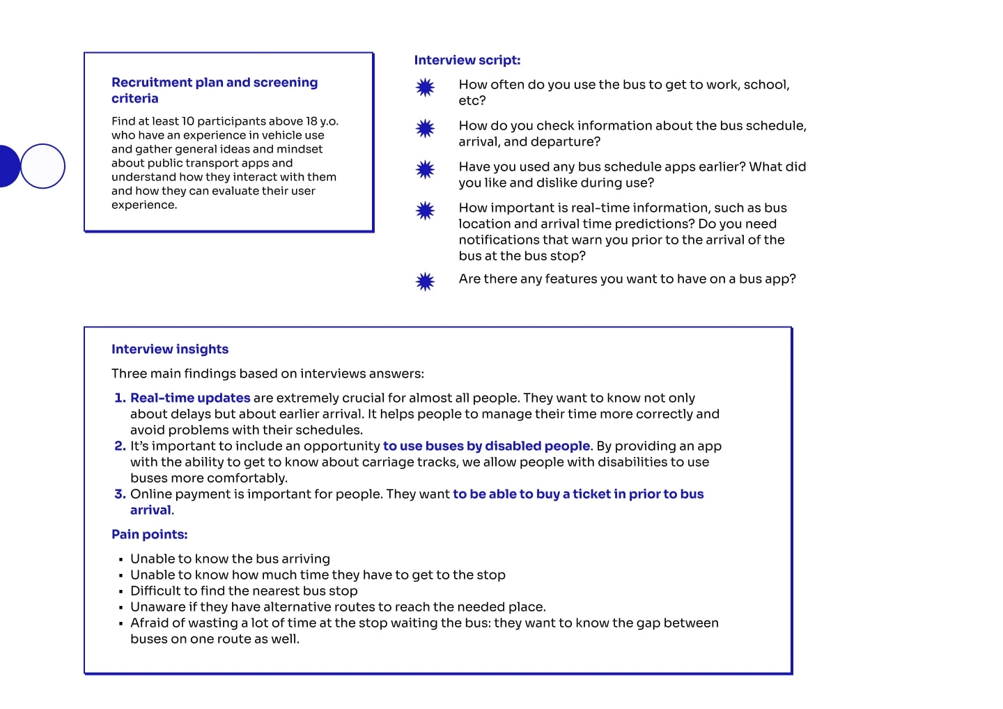
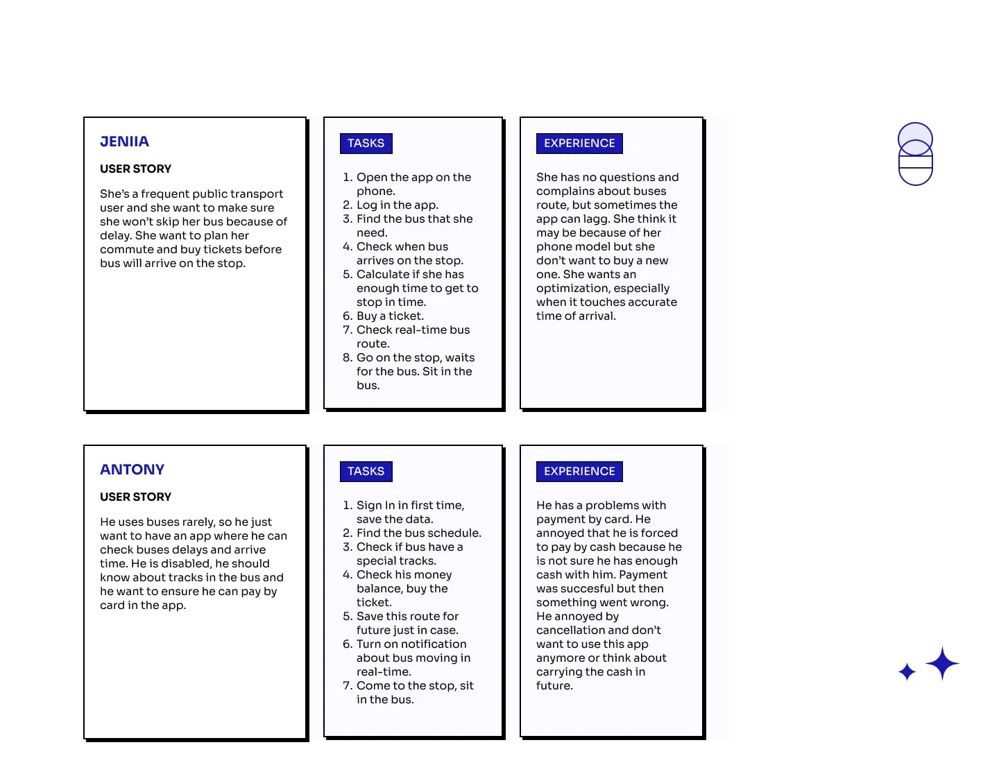
For better understanding of users during their using of app the interview was conducted. It helped to find out pain points, their frequent problems, frustrations and wishes about already exited applications.
Research
User stories
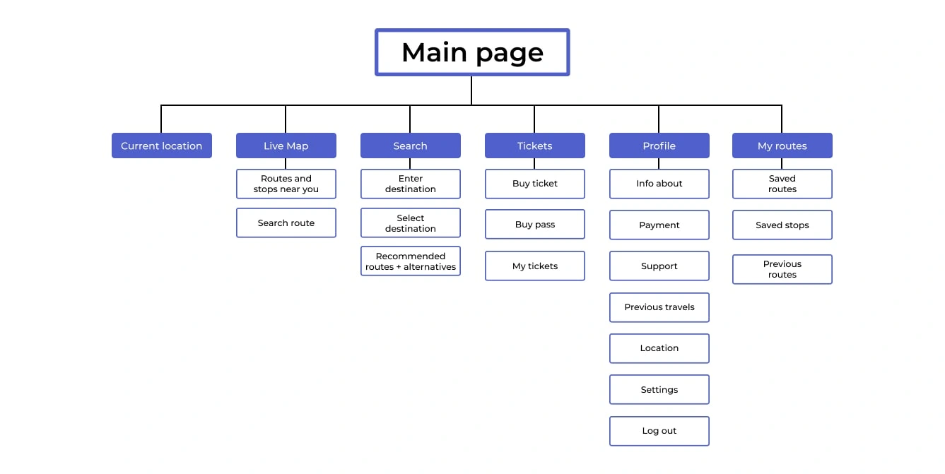
Information Architecture
User Flow
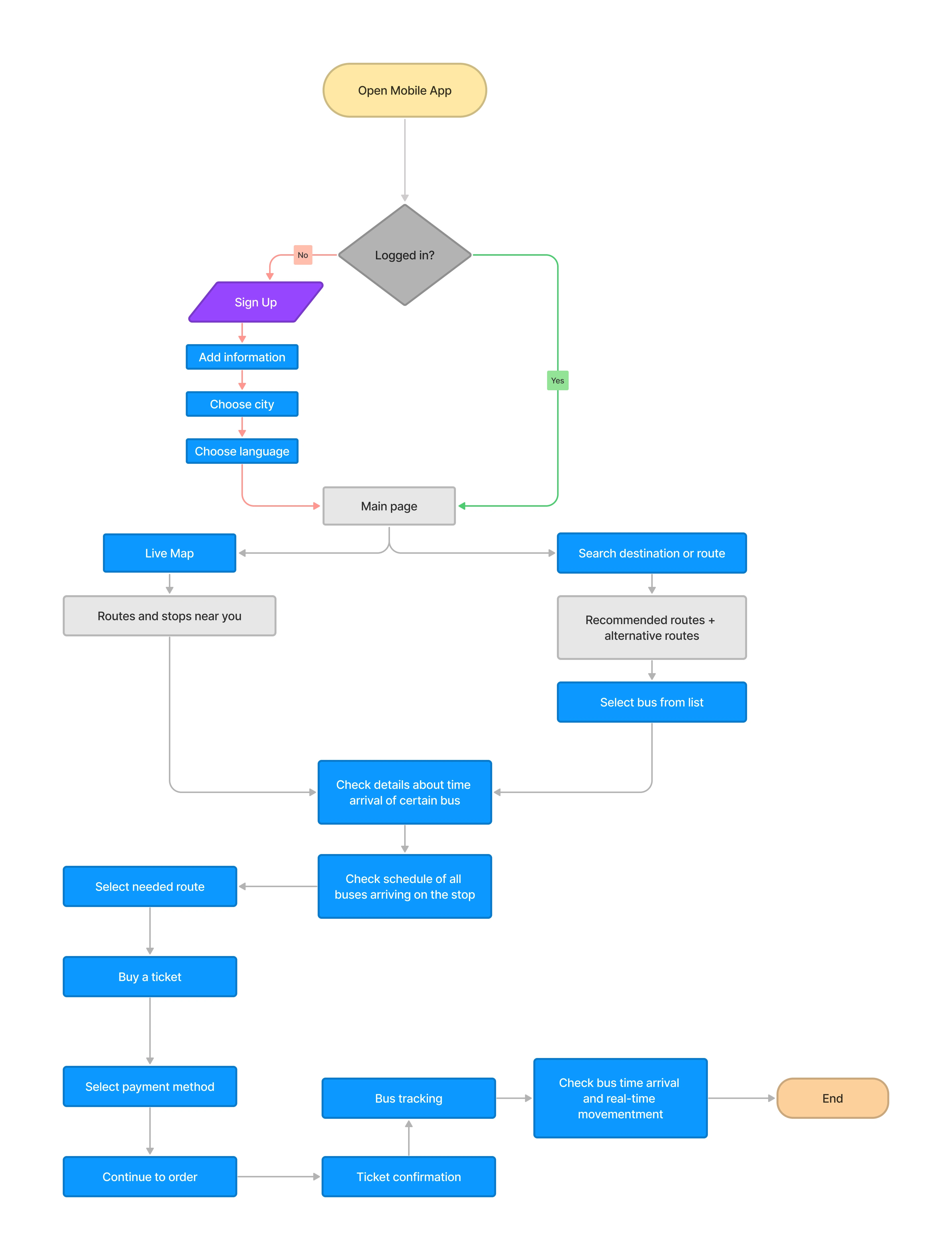
Taking into account gathered information, I created user flow that provides a seamless experience for bus riders, from searching for and selecting their desired bus route to purchasing and using a ticket or pass. By providing real-time updates about the bus's location and estimated arrival time, users can stay informed about the status of their ride and make any necessary adjustments to their plans.
Early ideation : wireframes
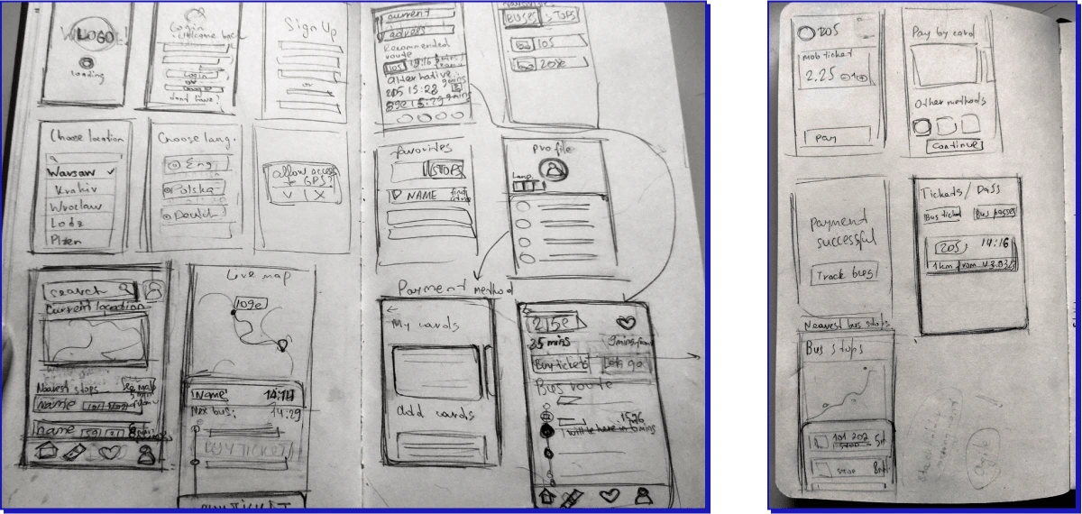
I made first rapid ideations for wireframes, using pencil and paper for quick sketches. This helps designers not get attached to any one design and pay more attention on the app in general.
From paper to digital
Low-fi wireframes were created leaning on paper sketches and given all gathered data. Main goal to provide the user-friendly interface and seamless flow. After creating of all low-fi wireframes they were tested by 4 people, who pointed out on some uncomfortable details. These words were taking into account due creating the final design.
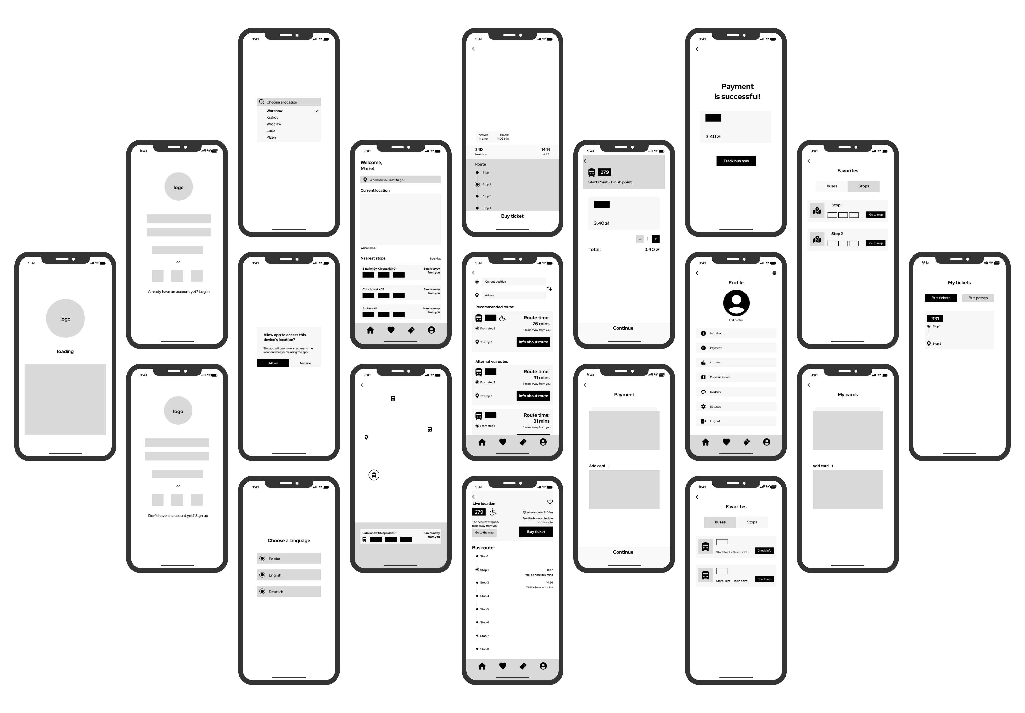
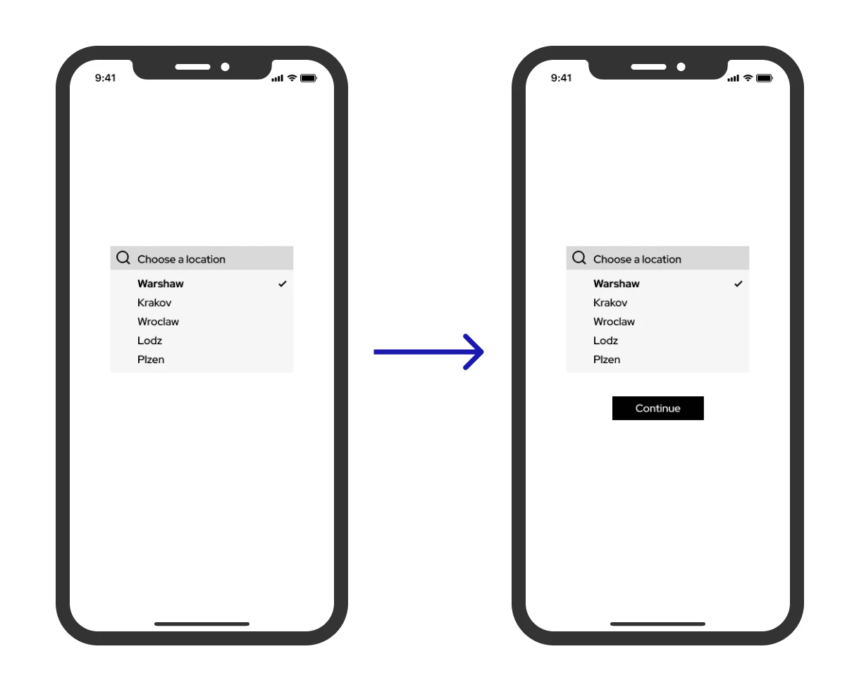
Due the testing 3 of 4 participants said on the page with nearest stop would be better to see all nearest routes without need to click on the certain icon on the map. All 4 participants also said they want to be able to change city or language if they chose wrong option and they don’t want to go to the account page after authentication. So in the final design was added the “continue” button instead of automatic switching on the next screen.
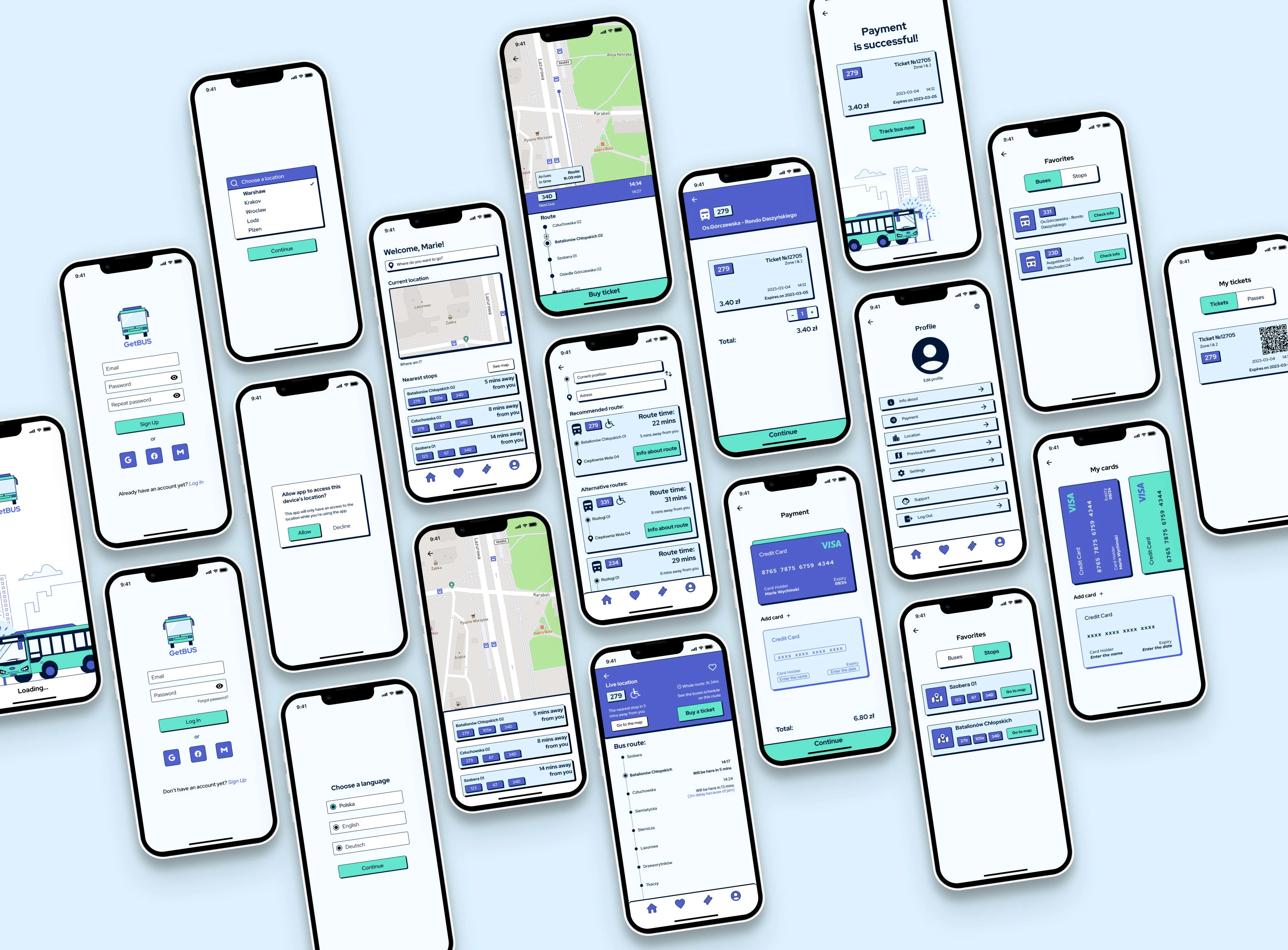
Hi-fidelity prototype
Testing
I did a user testing with 10 participants, 3 of them were involves in the testing on the low-fi stage. They said that design with buttons and map were more comfortable and useful for them.
Final prototype
Future steps
In the app, there may be a lot of things that need to be updated further. For example, maybe we can develop the GPS and add other types of public transport. For me, there would be a very crucial thing to create a more inclusive application that takes into account the needs of all groups of people, as I did with disabled people. The app can be improved given the opinion and experience of autistic people (some people who I know have a lot of difficulty with using public transport apps and they tend to lose the track of time and get lost in the area.
Moreover, we can test applications and create a new iteration for a better understanding of what kind of features people lack.
Like this project
Posted Apr 6, 2023
GetBUS is a bus app that helps commuters track live bus schedules and receive alerts for delays or cancellations.
