Brand Design for Karlan Group
Victor Elera

BRAND DESIGN FOR CONSULTING FIRM
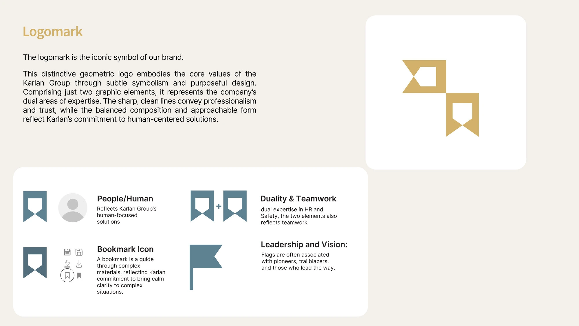
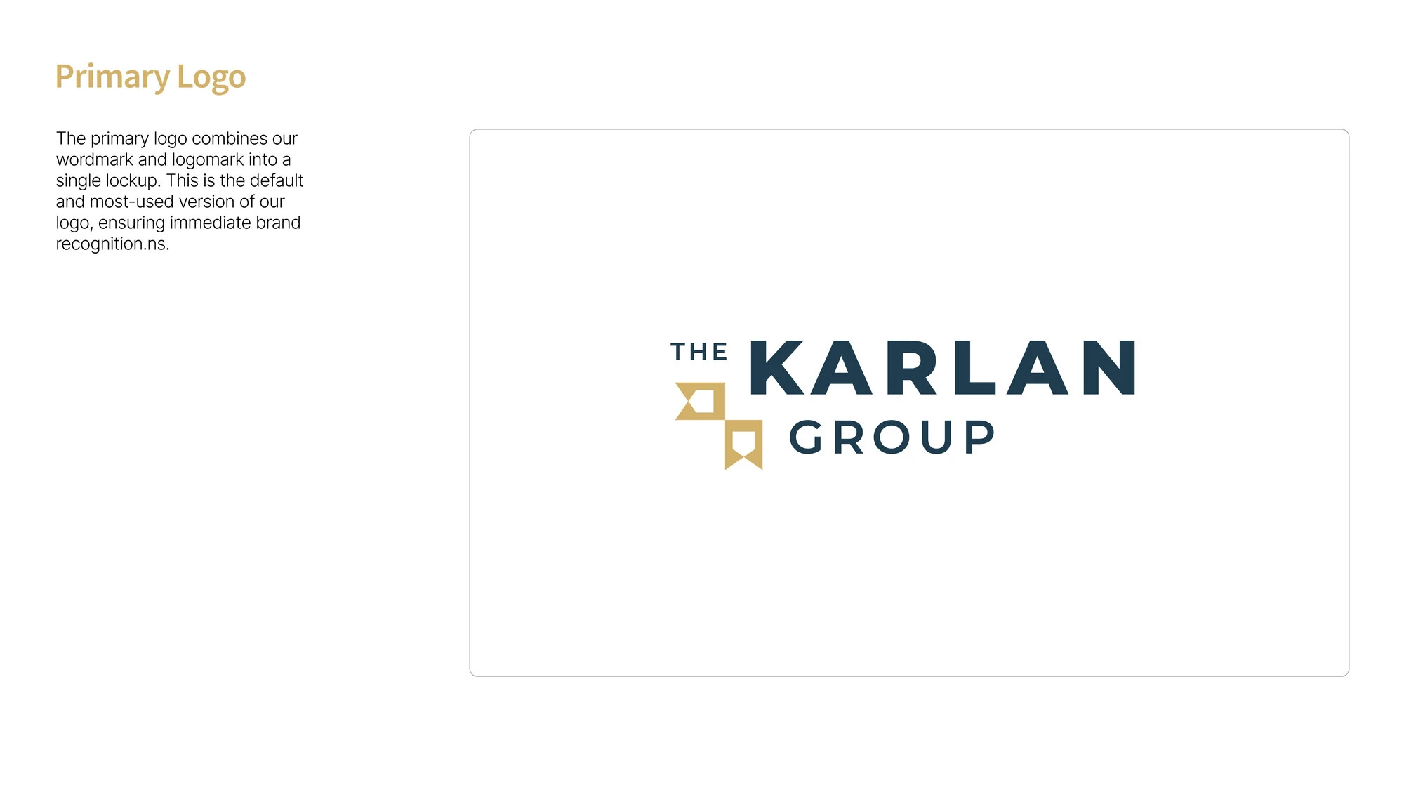
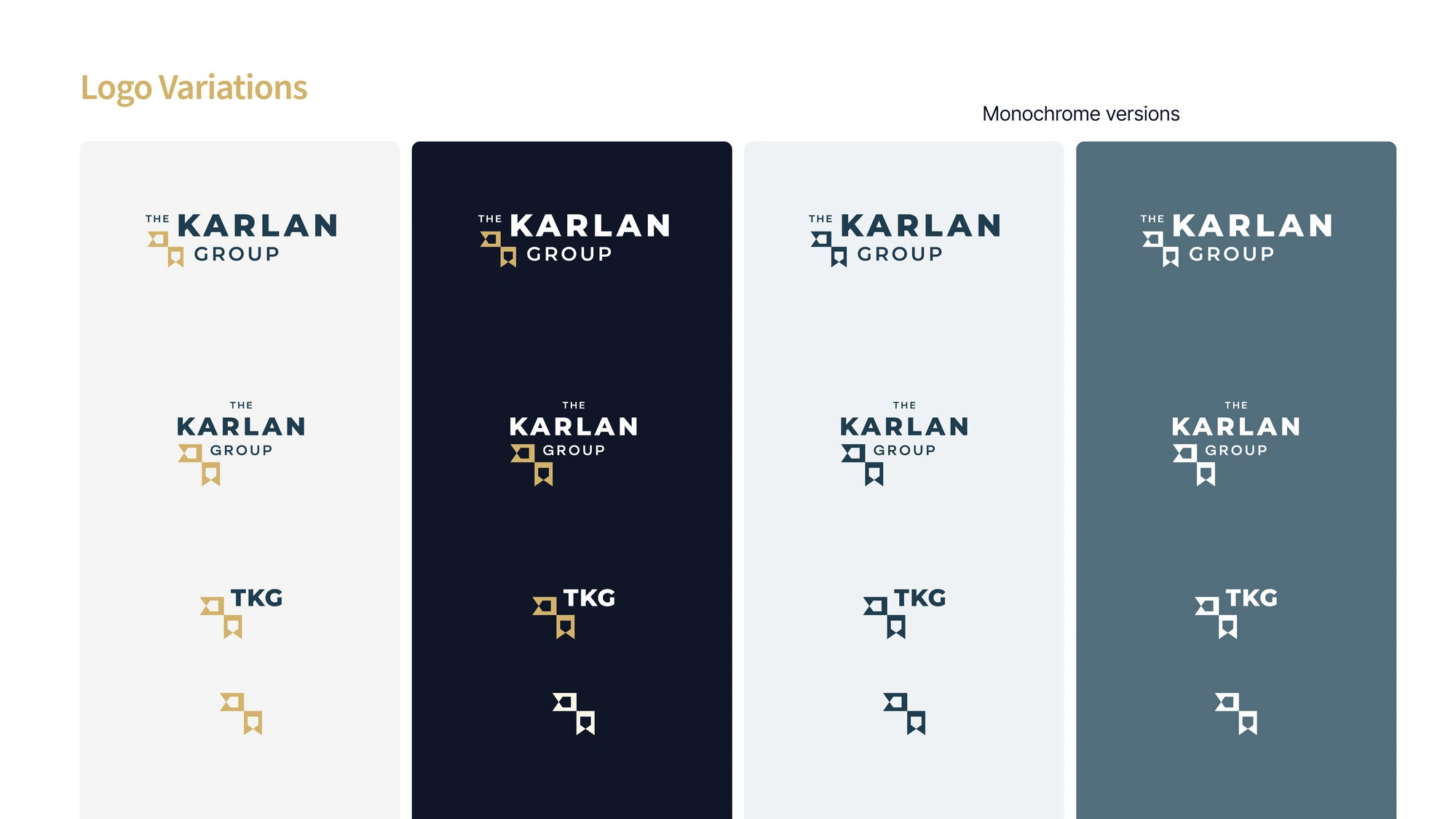
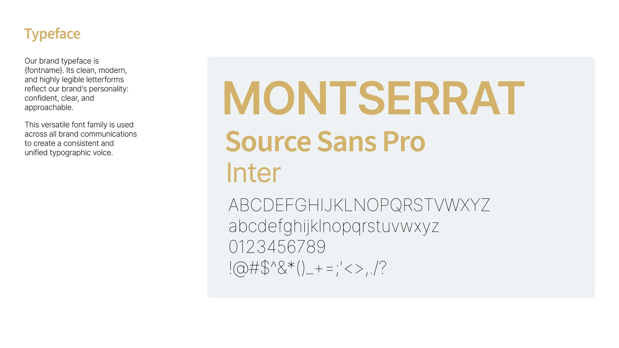
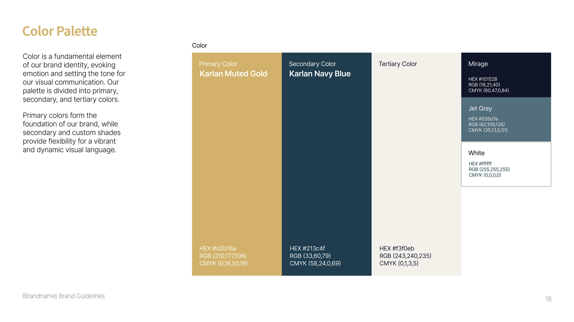
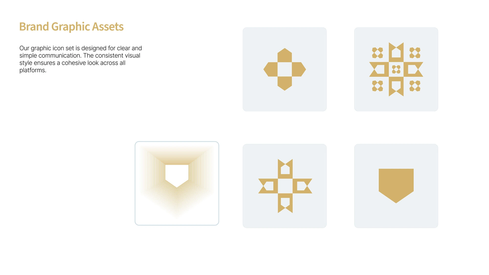
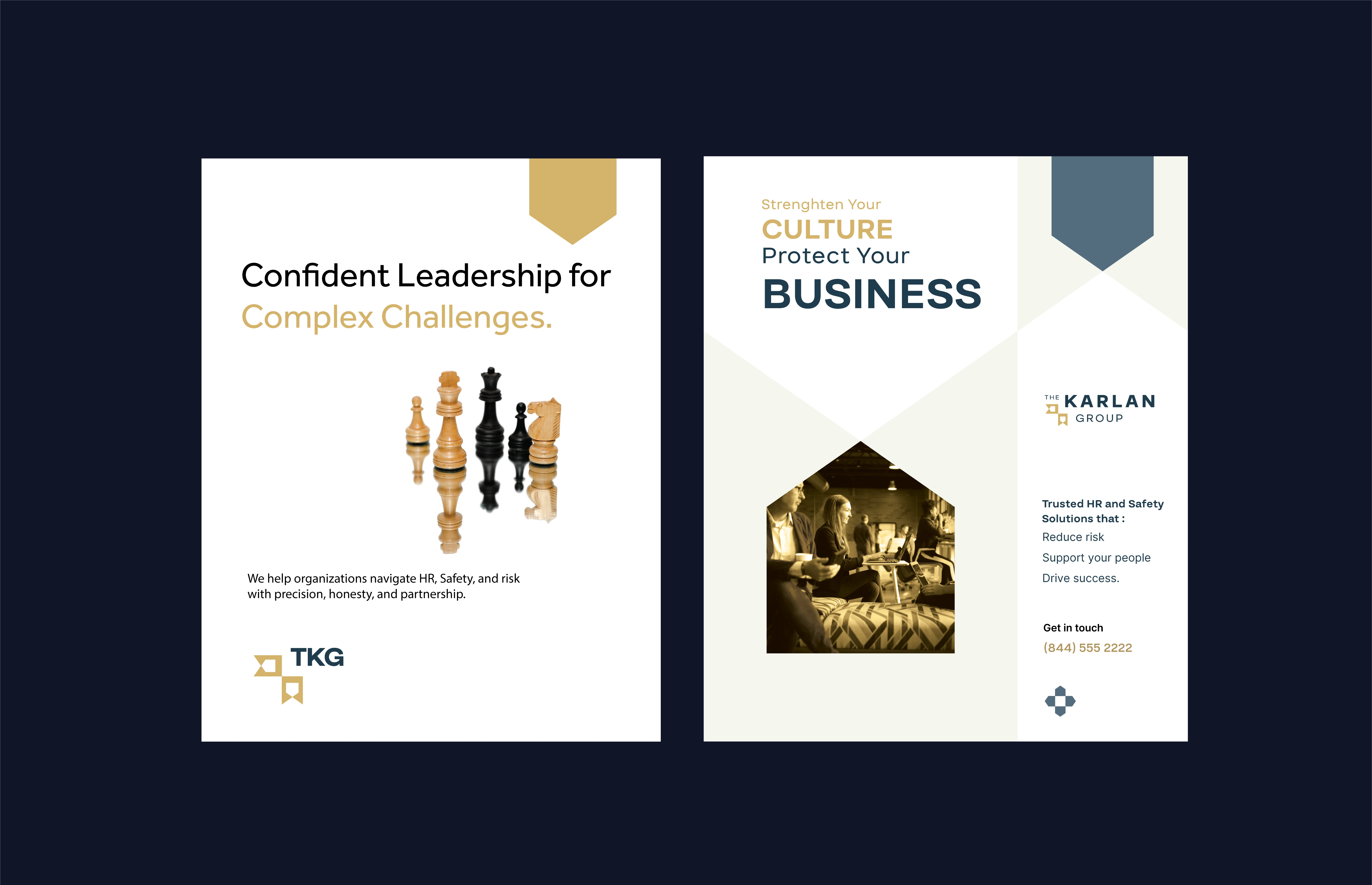
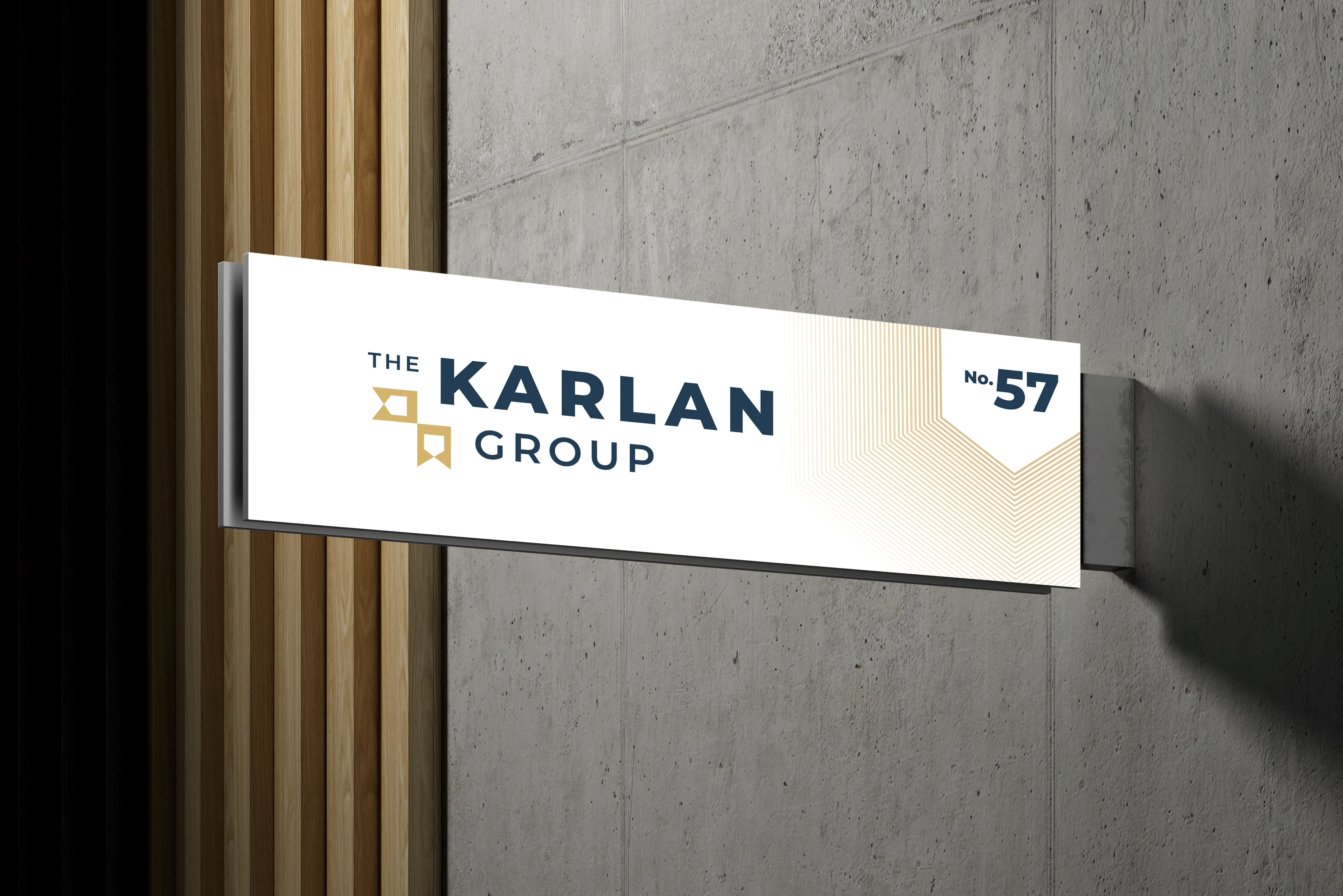
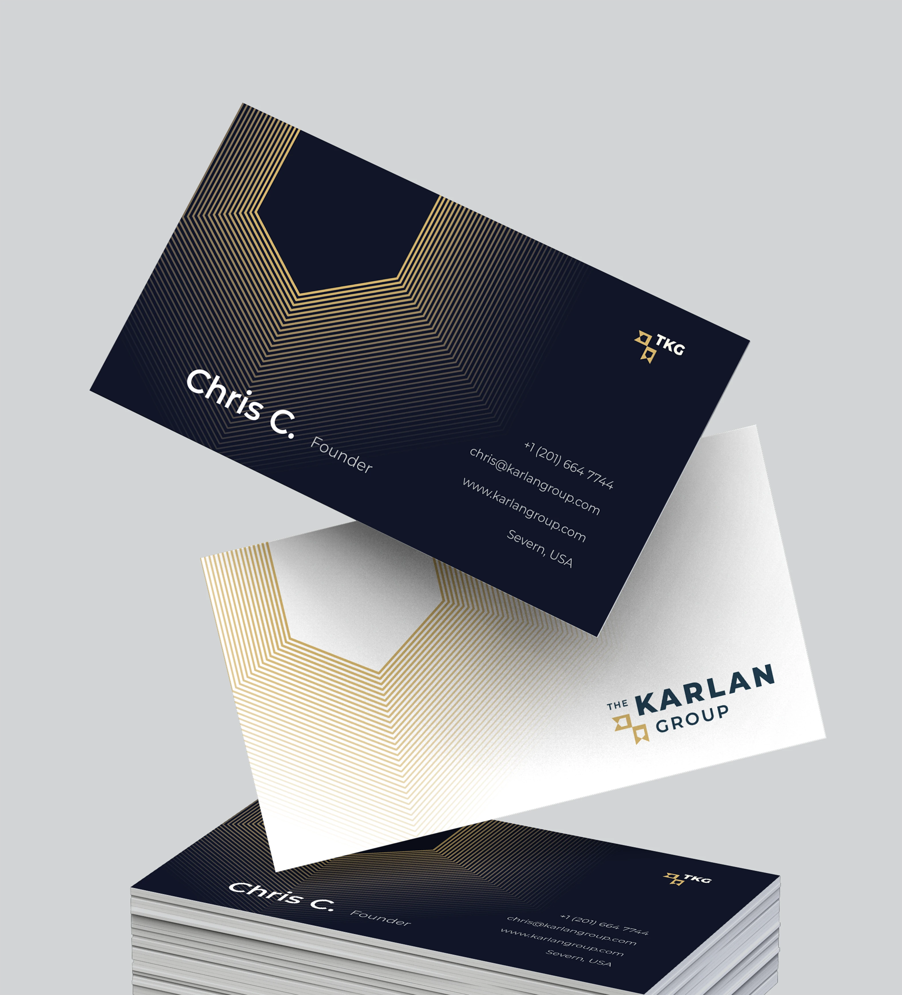
Karlan Group, a safety and HR consulting firm, struggled with brand inconsistency after redesigning its logo three times in one year. The issue was not preference, but misalignment. The logo failed to reflect the firm’s veteran-led leadership, dual expertise, and lacked scalability as a brand system. I led a full redesign, retaining the existing colors while rethinking structure and meaning. The final logo uses layered symbolism, negative space, and motion to communicate guidance, leadership, and a people-first philosophy, creating a cohesive, scalable brand identity.
Like this project
Posted Dec 25, 2025
Karlan Group faced brand inconsistency after 3 redesigns. I led a redesign that aligned veteran leadership and dual expertise into a cohesive brand system.