WorldNet Brand Identity
Edwin Mauricio Olivera
St. Louis WorldNet Solutions — Visual Identity Case Study
Digital Art Director (acting Associate Creative Director)
Stealth Creative — St. Louis, MO
Role & Context
As Digital Art Director at Stealth Creative, I was tasked with modernizing the visual identity for St. Louis WorldNet Solutions, a regional technology and network-infrastructure provider serving enterprise clients in the Midwest.
Although my role was officially Digital Art Director, I operated at associate creative director capacity—guiding concept development, visual strategy, brand positioning, and cross-channel execution. The client needed a modern, tech-credible brand identity that communicated reliability, speed, and enterprise-grade trust.
This included updating their visual presence across digital, print, and B2B sales collateral, while aligning the brand with the expectations of corporate clients and infrastructure partners.
The Challenge
Before the redesign, WorldNet Solutions had:
An outdated visual identity lacking cohesion
A logo and color system that didn’t reflect modern tech standards
Inconsistent use of photography, icons, and layouts across touchpoints
No scalable design system for sales teams or marketing
The rebrand needed to communicate:
Network reliability
Security
Scalability
Regional leadership
Enterprise professionalism
…and do so in a way that would stand alongside national competitors.
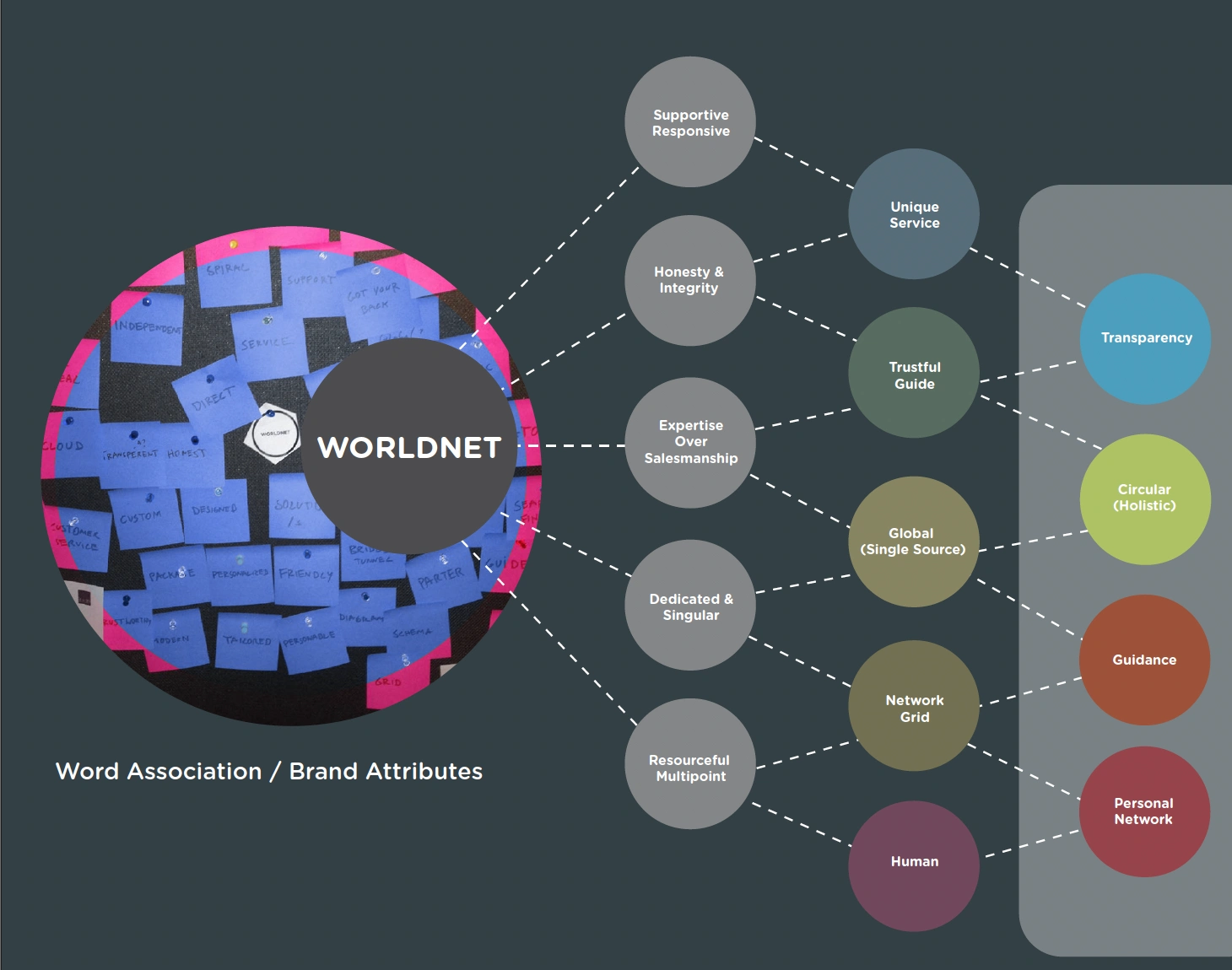
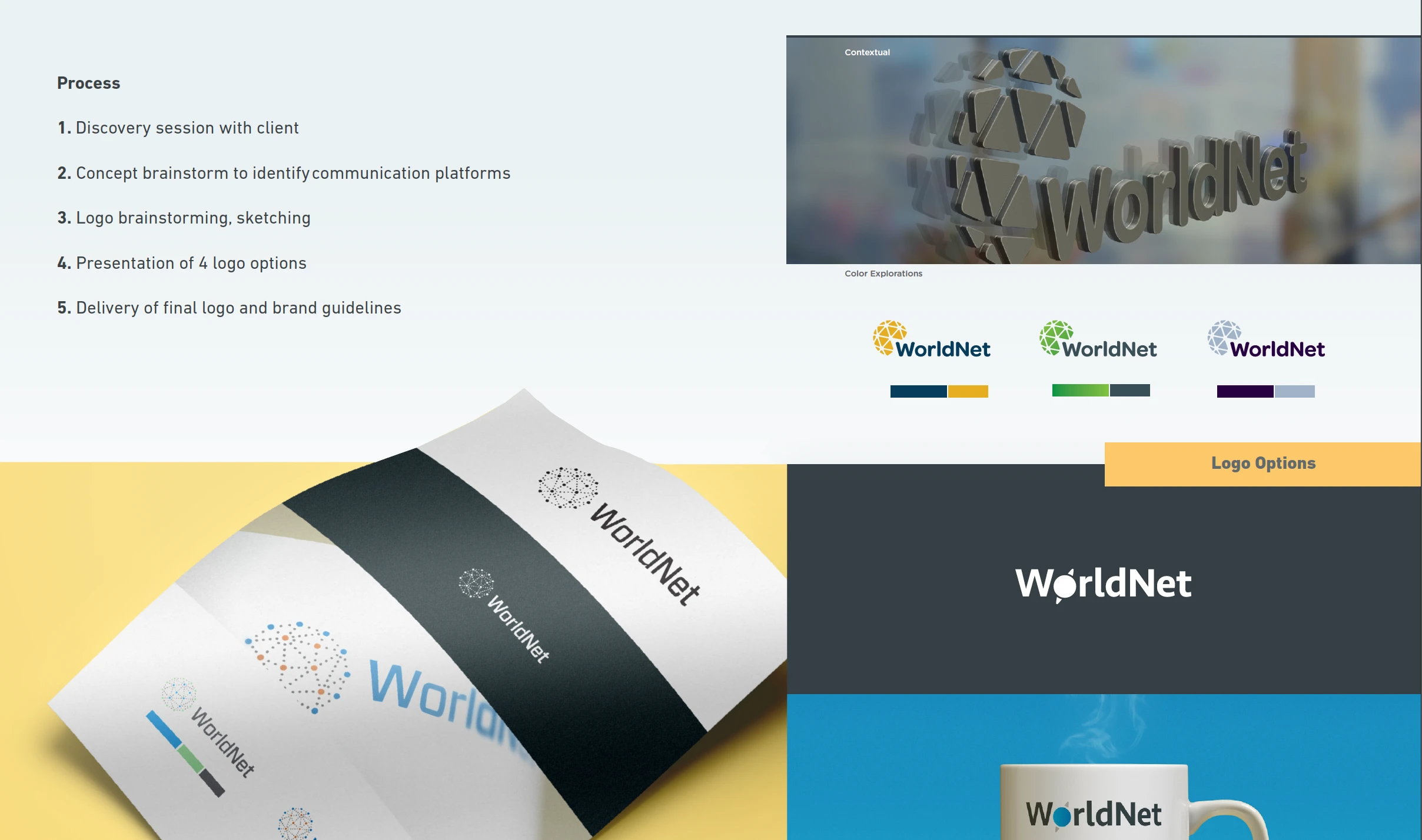
Brand Strategy & Concepting (ACD-level)
Developed the core visual direction, drawing on themes of connectivity, data flow, infrastructure, and Midwest reliability.
Defined the brand voice and tone: confident, technical, approachable.
Worked with account strategy to position the company as a trusted regional backbone provider.
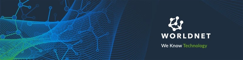
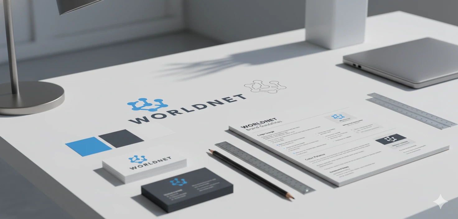
Logo & Visual Identity System
Modernized the logo using cleaner geometry and signal-wave metaphors.
Designed a new color system emphasizing deep blues, electric accents, and neutral greys, aligning with enterprise technology aesthetics.
Created a custom icon set representing network pathways, fiber connectivity, redundancy systems, and managed services.
Defined typography rules, spacing, motion cues, and usage guidelines.
Like this project
Posted Dec 16, 2023
This project was at it's core the conception and design of their visual identity for WorldNet solutions in the midwest.
Likes
0
Views
22
Clients
WorldNet