PG&E Business Energy Checkup
Edwin Mauricio Olivera
Business Energy Checkup | PG&E
Digital Art Director (Creative Placement → Momentum Worldwide St. Louis) Creative Director: Mason Magyar
Context & Challenge — Build a Simple, Believable B2B Energy Brand
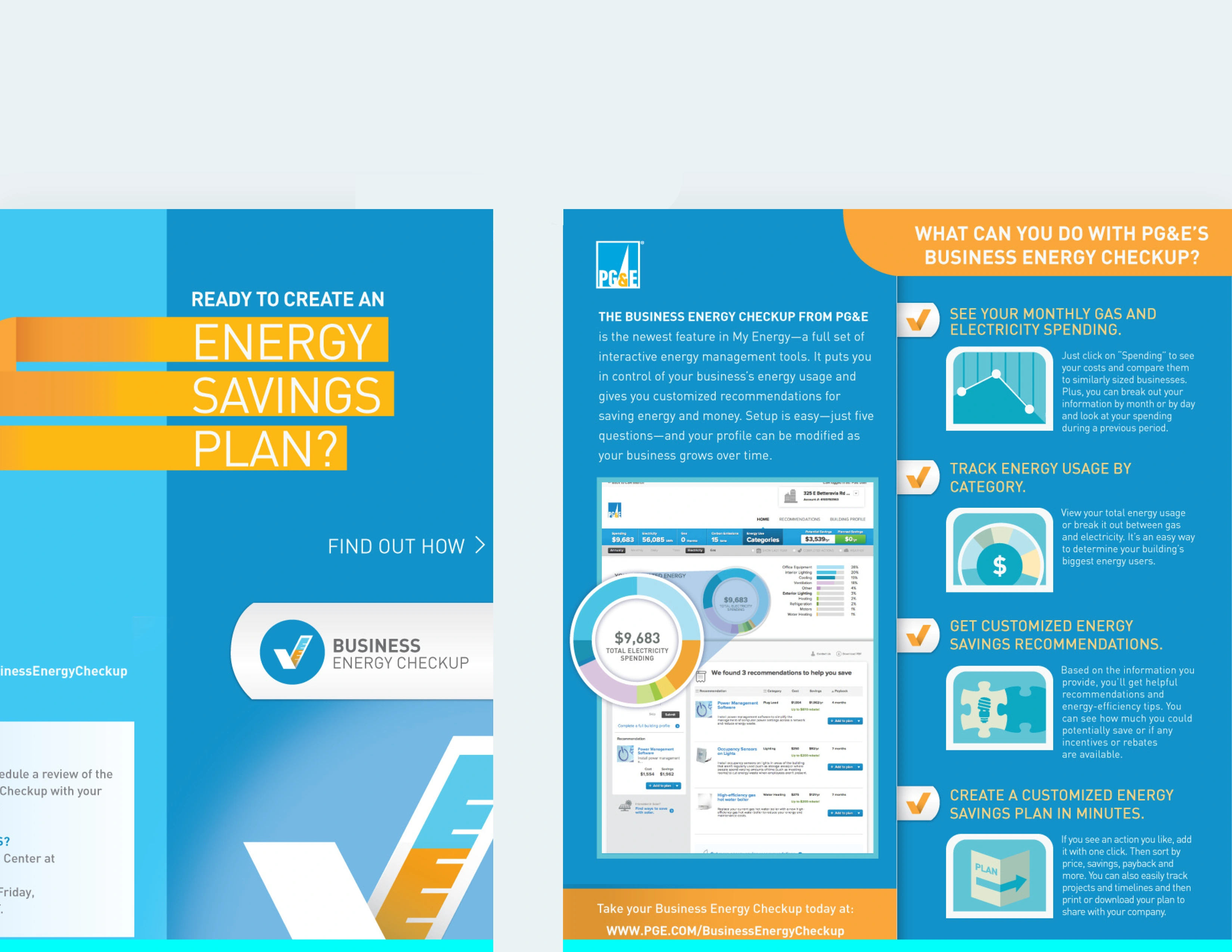
PG&E needed a dedicated Business Energy Checkup identity—something distinct from corporate branding, yet clearly part of the PG&E ecosystem. The audience was small business owners in the San Francisco metro area, who are time-poor and skeptical of “energy program jargon.”
Momentum tasked you with creating a digital-first, instantly readable visual system that communicated:
speed (the audit takes minutes), clarity (simple actions, not technical forms), and trust (small business owners must believe PG&E recommendations).
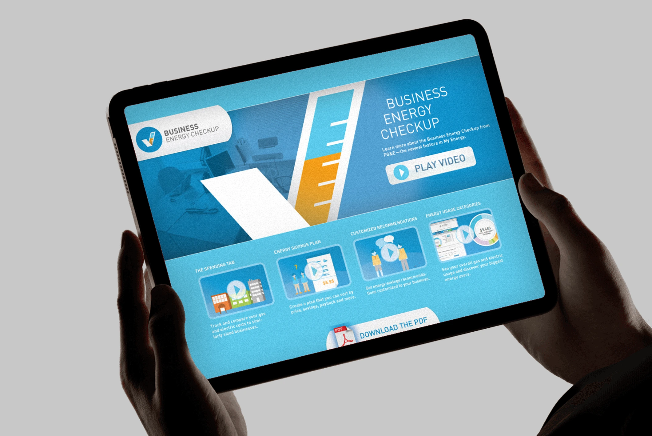
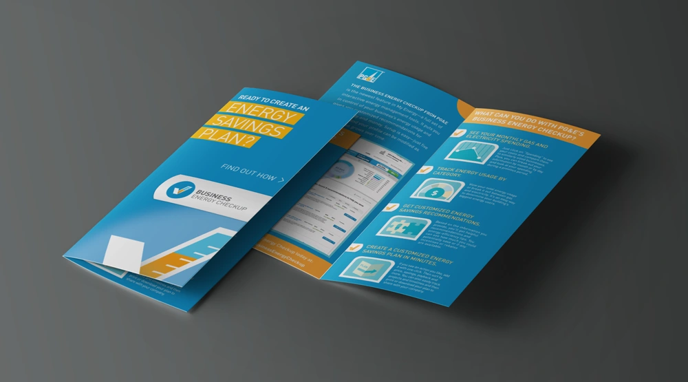
The brand needed to work across landing pages, emails, PDFs, and field collateral—while also supporting an interactive diagnostic flow.
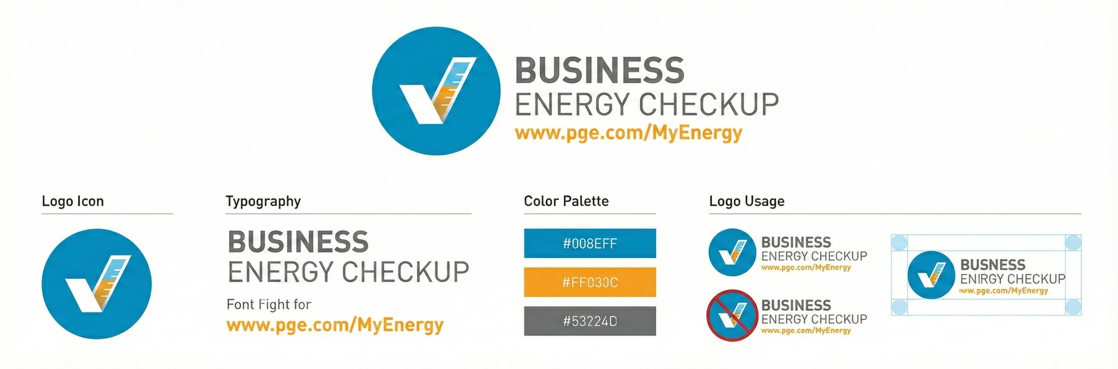
Design Concept — The Checkmark as Core Brand & Core Function
The defining creative idea was to use the checkmark as both a branding element and a functional UI mechanic across the checkup experience.
Brand-Level Meaning
A checkmark is universal: done, verified, understood, simple.
It communicates PG&E’s promise: “We help you identify quick, achievable actions.”
UI-Level Function
You elevated the checkmark from logo decoration into a dynamic interface device used throughout the experience:
Step progression: each step of the audit filled the checkmark outline, creating a sense of forward motion.
Diagnostic scoring: recommendations appeared with color-coded checkmarks (Immediate, Medium, Long-term).
Micro-interactions: subtle checkmark animations reinforced completion, reducing user uncertainty.
PDF report system: the checkmark created a consistent visual hierarchy across insight categories.
Brand System Built Around It
A modular identity was built where the checkmark became the anchor for:
icon sets,
section headers,
callouts in print collateral,
email modules,
and the responsive card system of the landing experience.
The result: a visual system that looked unified across digital and physical touchpoints—even when assets were deployed by different PG&E teams.
Email and landing assets benefited from the visual consistency—a unified brand made the B2B program feel modern, simple, and credible.
The creative system simplified production: assets for future segments could be built quickly by reusing the checkmark grid, icon framework, and visual templates.
Like this project
Posted Dec 11, 2023
Brand identity that functioned both as a brand element and interactive UI device, creating a fast, believable, and unified experience.
Likes
1
Views
22
Clients
PG&E