Burnish Candle Co. | Brand Identity + Packaging Design
Burnish Candle Co.
Selecting a candle to bring home with you comes down to so much more than just scent. Burnish Candle Comapny set out to craft candles that not only light up life’s everyday moments, but double as decor pieces for your space.
With artisan candles being an increasingly saturated market, our goals was to develop a brand that would stand out on both shelves and social platforms.

Lighting the fire
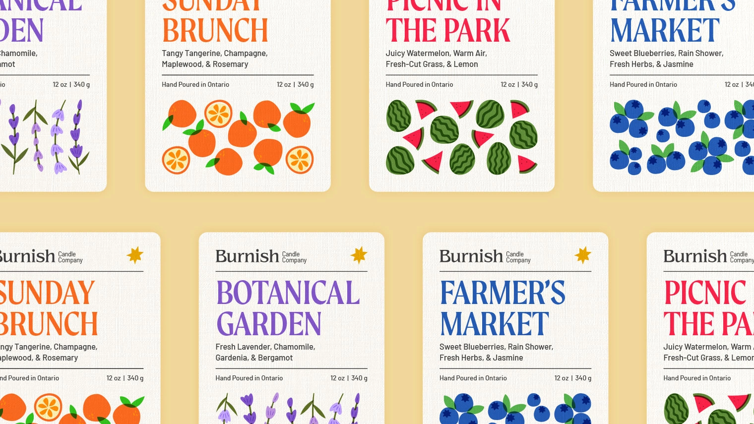
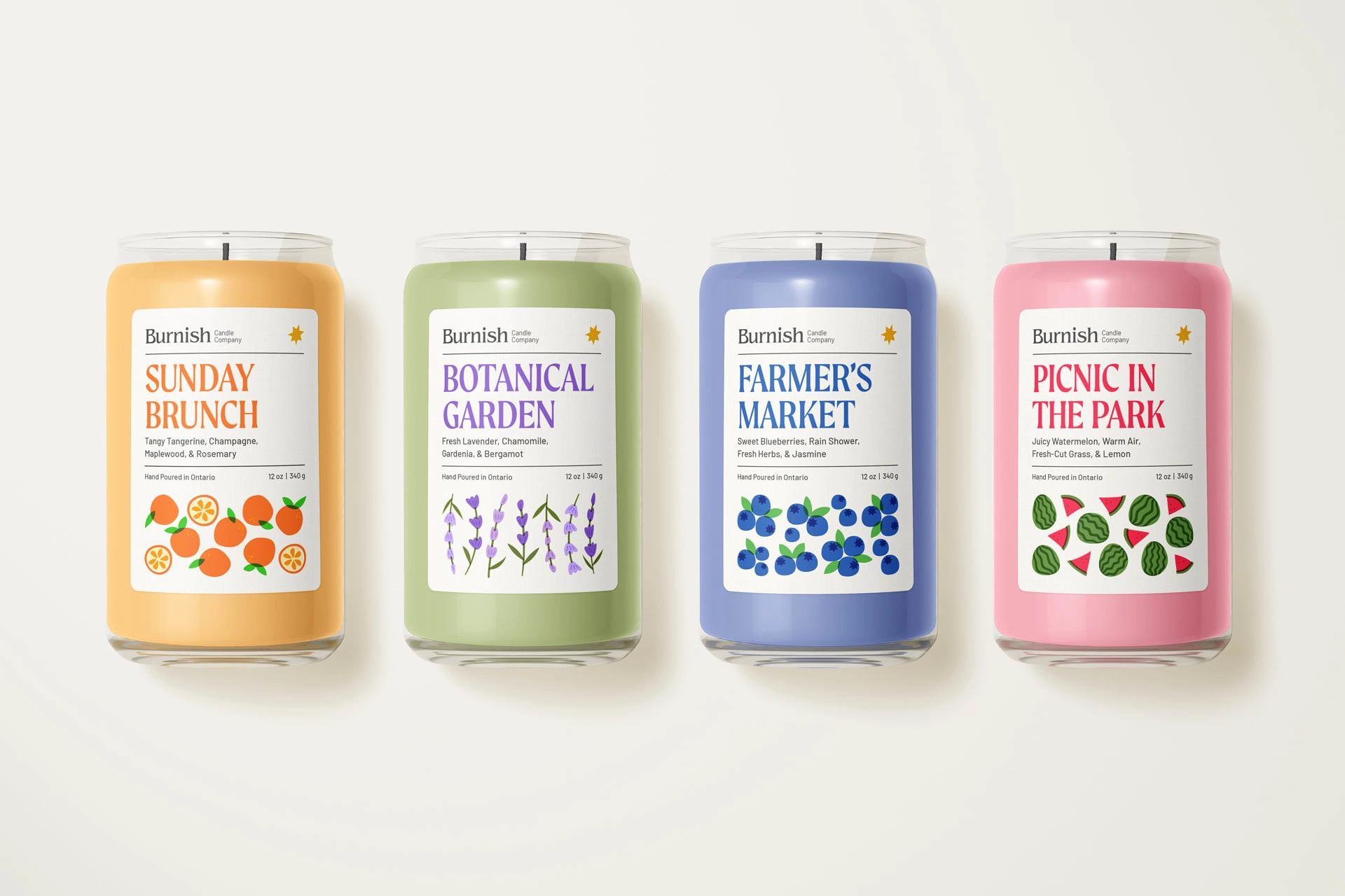
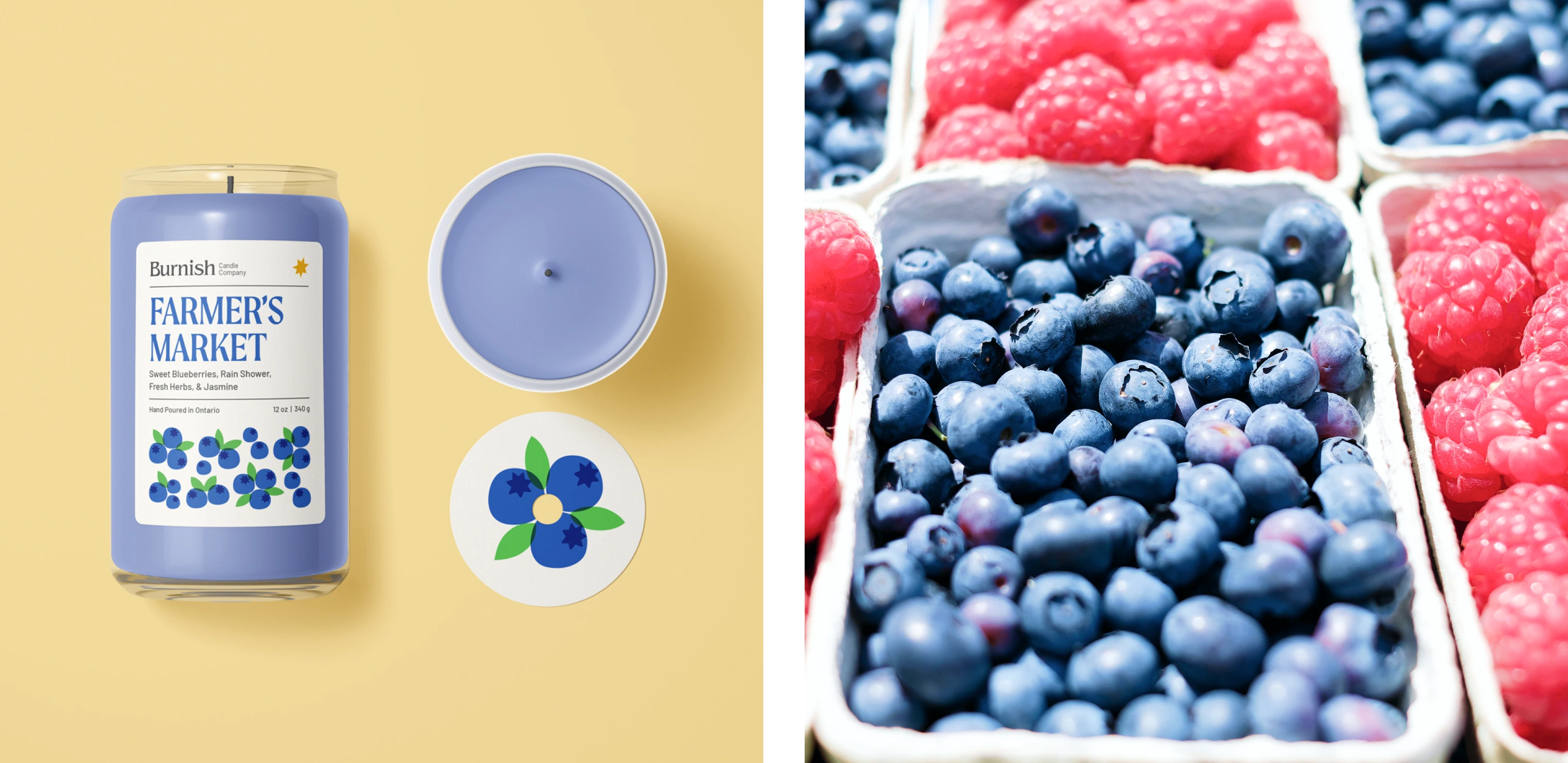
By striking a balance between illustrative shapes and refined typography within their logo, we provided Burnish with qualities that could be applied throughout their brand. The launch of their first collection utilizes organic illustrations and a vibrant colour palette to build off of this foundation, while leaving room to grow with future releases.


Making social shine
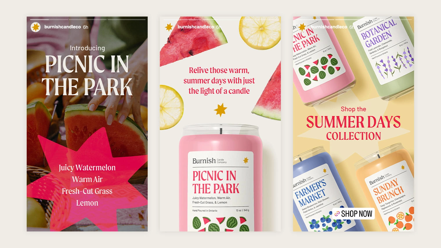
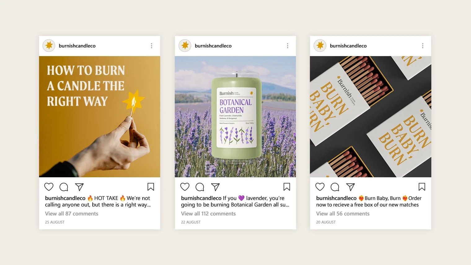
We wanted Burnish to have an online presence and voice that burned just as bright as their candles. From promotional stories that encourage engagement, to in-feed posts that let their personality glow, Burnish warmly invites users into their social circle.
Like this project
Posted Mar 8, 2024
Burnish set out to craft candles that not only light up life’s everyday moments, but double as decor pieces for your space.


