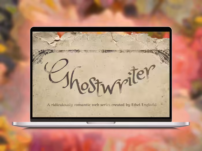
Electronic Press Kit for SAG Web-Series
The junk drawer of a modern marriage.
Created a unique and immersive EPK for a comedic web series for the film festival circuit. Delivered 12 PDFs that ranged in lengths and content to fit the needs of different film festivals. Some versions had less production stills while others had more comprehensive copy (longer synopsis, etc.). And here's the breakdown of everything I did:
Prep
Director and Creator Thomas Ross created a sardonic comedy in need of a stellar EPK. Since this was his first project it was especially important to have a pitch that was confident in its branding. After watching a preliminary edit of the web series I worked closely with Mr. Ross to fine-tune the copy of the document before stepping into the design. I usually don't create and/or edit the copy of a pitch as I believe that's best left up to whomever is at the helm of the project, but this is a service I do provide whenever applicable. And with my own experience in pitching and grant writing it's something I truly do enjoy. Once the copy-only form of the EPK is finished, we moved on to design.
Copy
Design, for me, is the most thrilling part. However, the copy-only document is by far the most utilized source a filmmaker can have, as everything regarding the project is organized neatly within this document.
In Mr. Ross' case, he was applying to as many film festivals as possible, and when every festival is asking for a synopsis, logline, specs, talent info., etc. it's handy to have those answers ready in a single document.
The copy-only document is created in the same font and order as the final EPK and approved by the client before moving on to design.
Style
The web series follows newly wed couple Jonathan and Deborah as they encounter unusual, and sometimes unannounced, company each episode. Mr. Ross and I landed on the tagline: "The junk drawer of a modern marriage," which led us to the eclectic, loud and mismatched style of the EPK.
Design
After nailing down the voice of the pitch in the copy-only document, and understanding the style of the series, I pitched a 1-3 page design of the EPK with no copy. After which Mr. Ross gave me the green light to apply the design to the whole document.
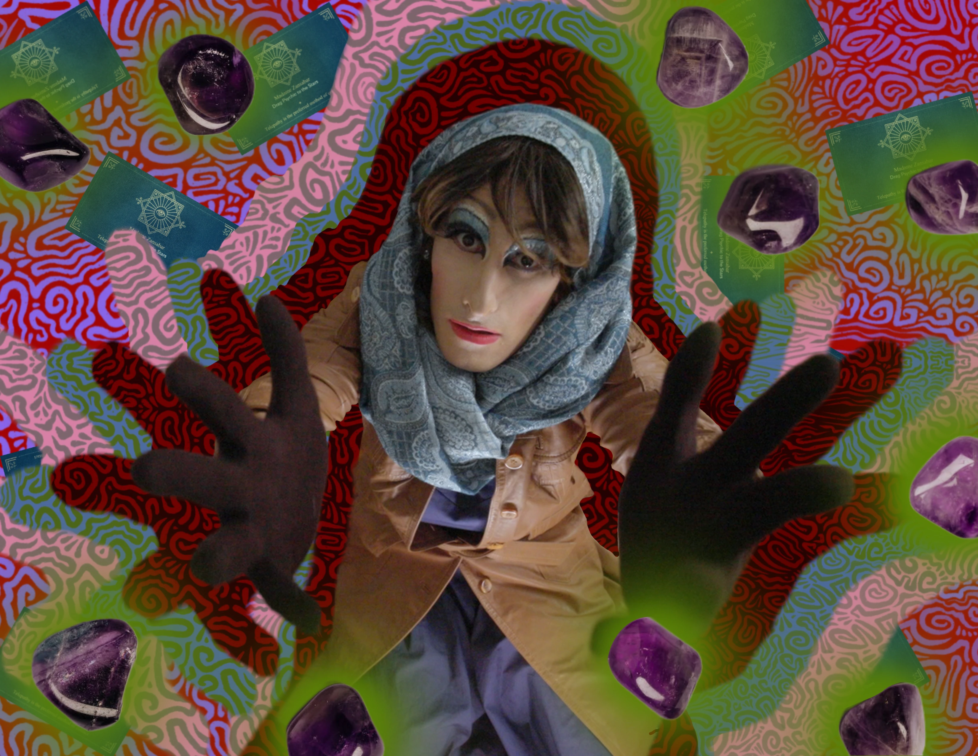
Madam Z graphic page. A great way to break up the words in between copy heavy pages.
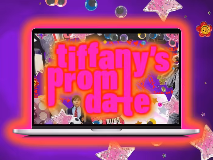
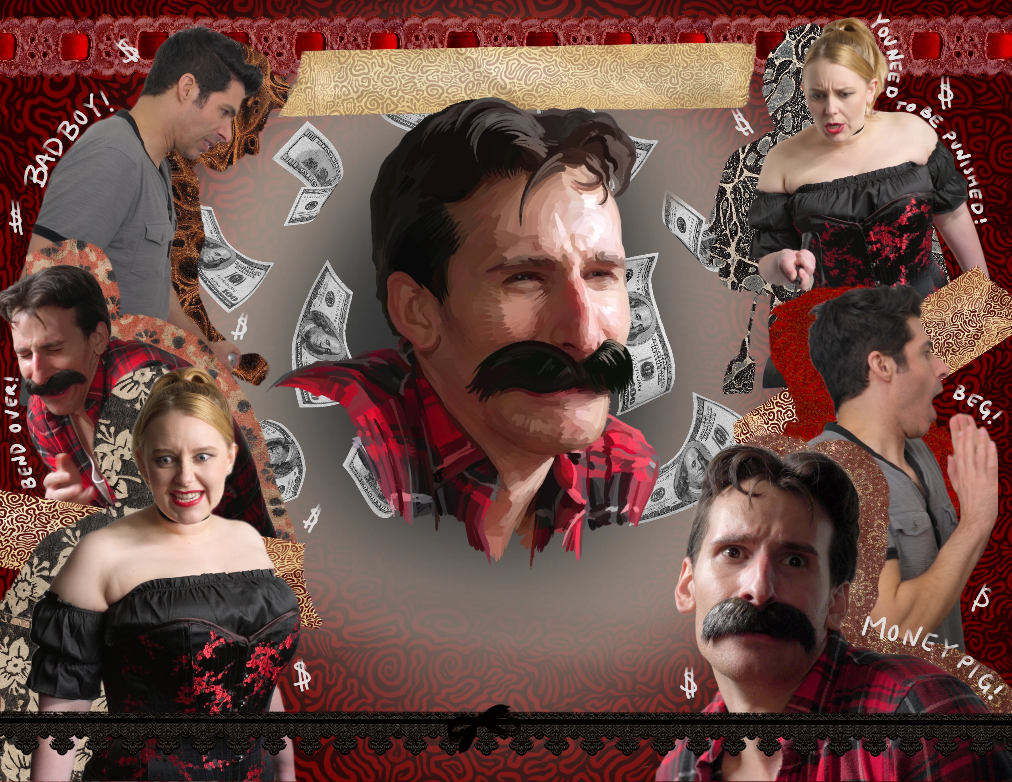
Luckily for me the title page came easily as I simply reused most of the assets of the existing poster which was created by an Illustrator Mr. Ross hired. I also reimagined the background, this beautiful squiggly pattern, in every page to showcase the different tones of each episode. And the beautiful busts of each character became the focal point in the episode title pages.
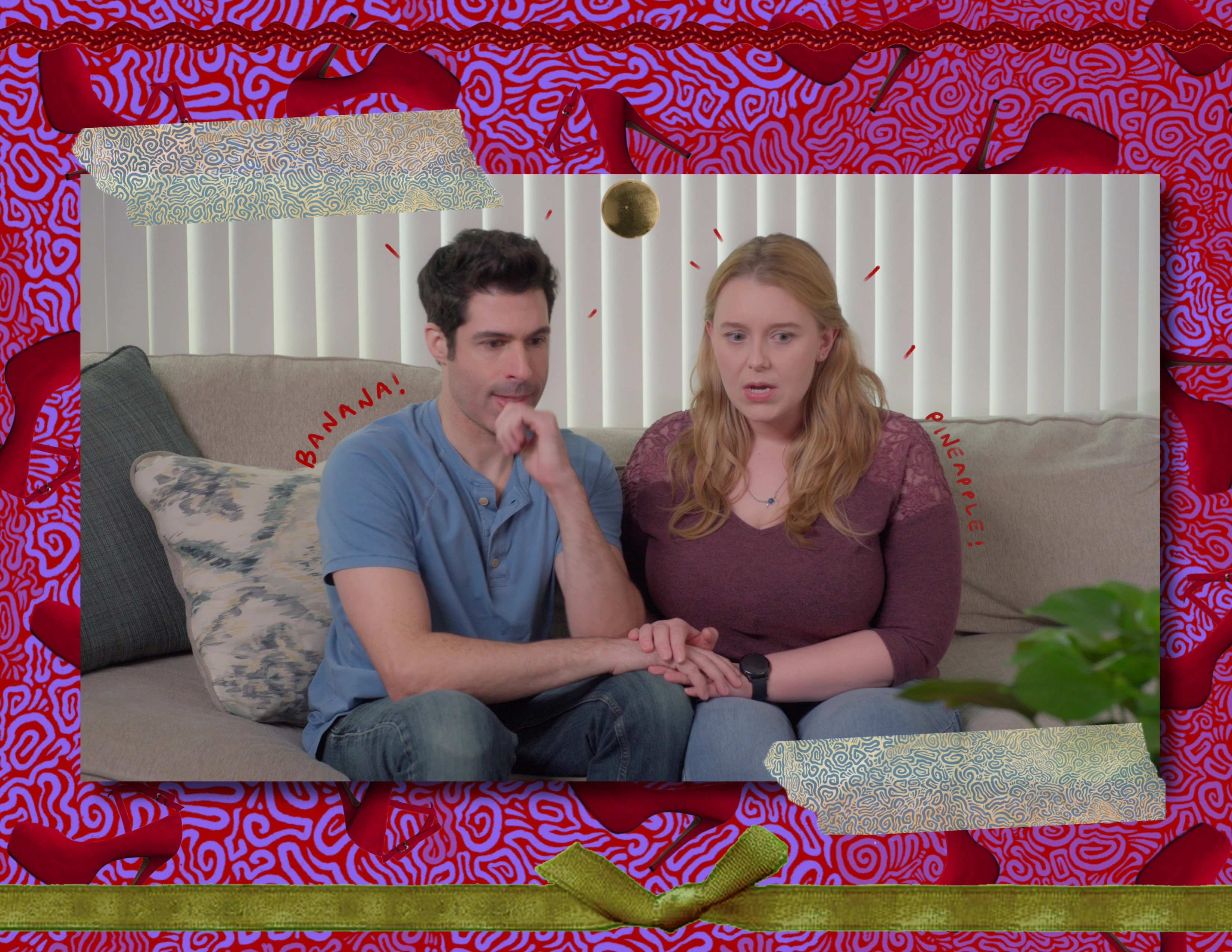
Production stills, instead of taking over the whole page, were immersed in the design of the EPK.
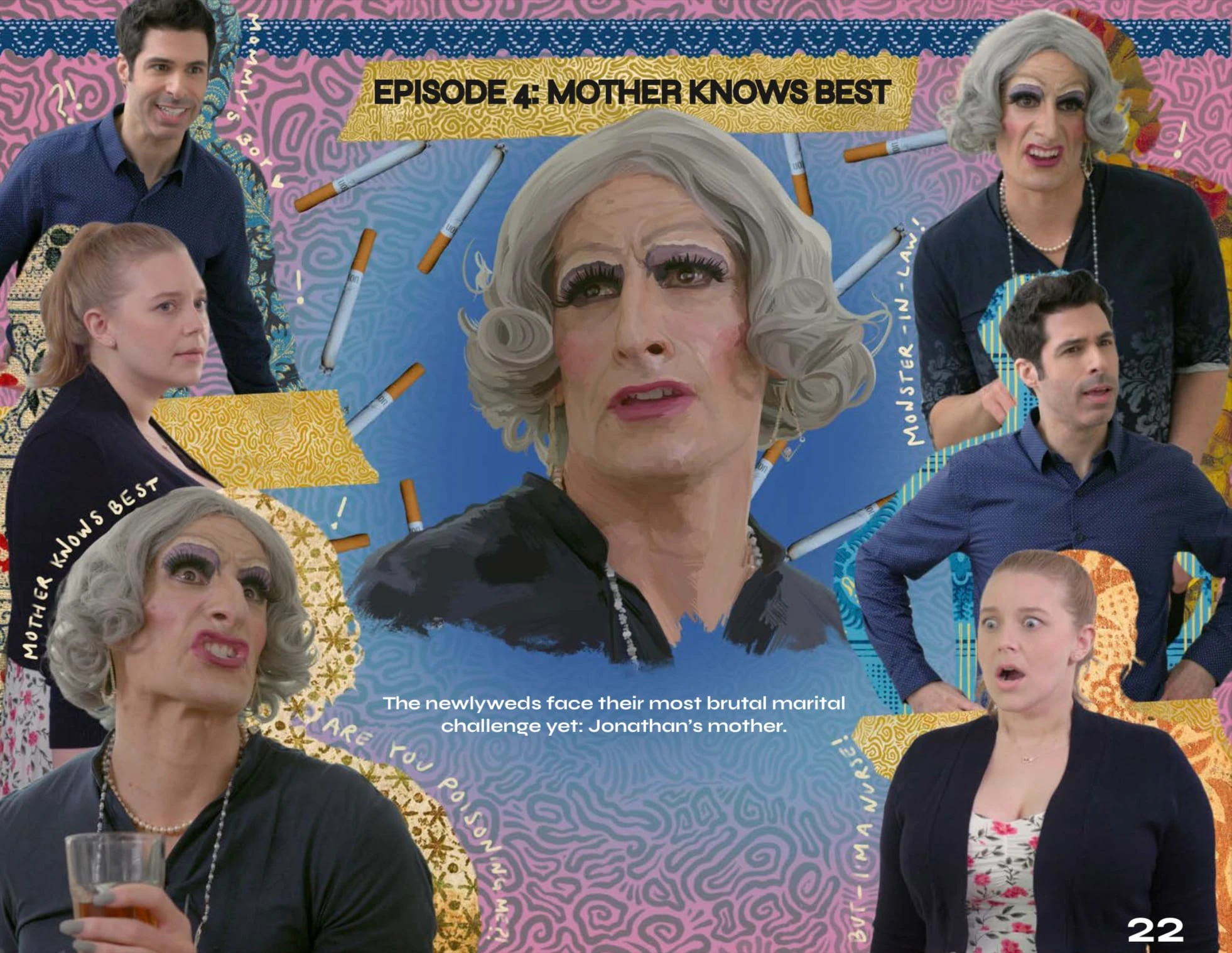
The assets floating behind the center bust of each character were sometimes sourced and sometimes hand drawn/made.
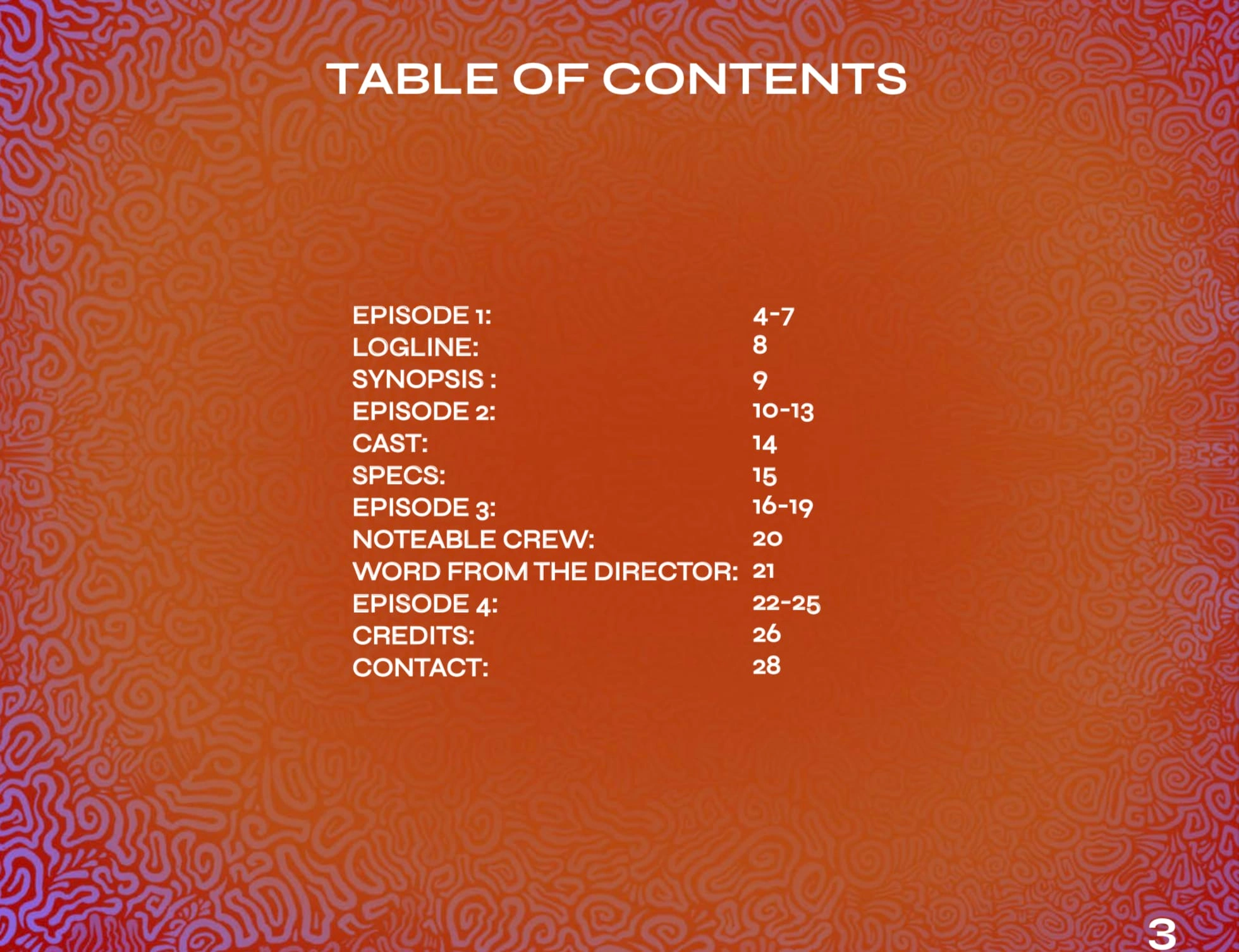
The copy-only document was formatted in the same font as the final EPK.
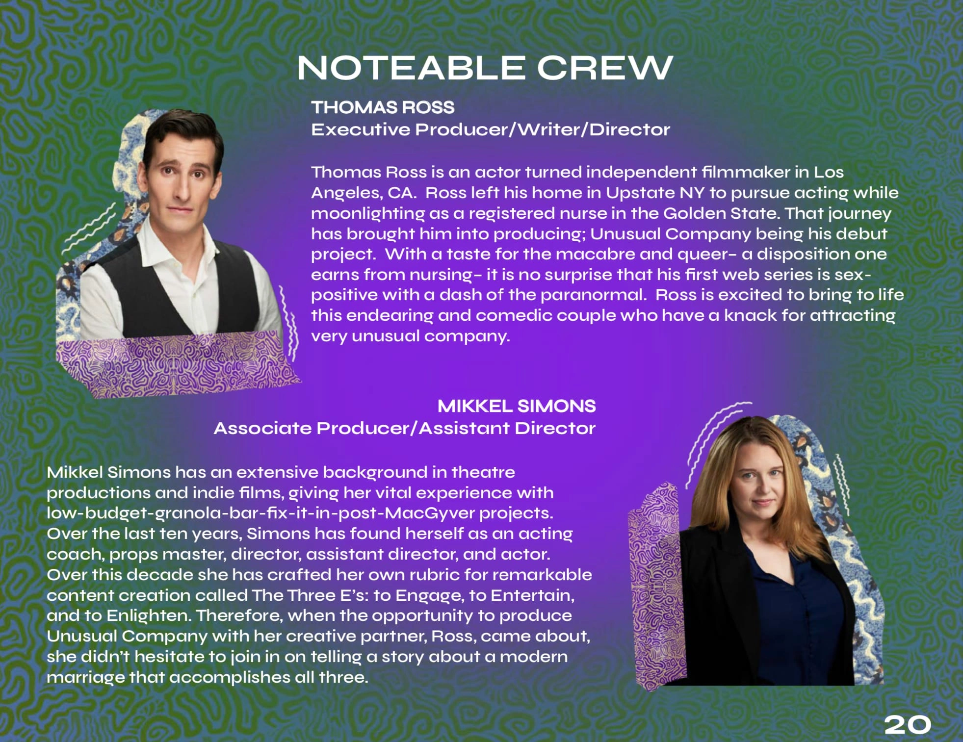
Crew and Cast pages also benefitted from creative design.
Deliverables
EPK
Usually I provide several deliverables: 1x Full Resolution, 1x Low Resolution, and perhaps a few cutdowns.
Mr. Ross' deliverables were quite extensive because each festival had different requirements. To accommodate the EPK required several different cutdowns and resolutions. All this to say, I can provide many deliverables to maximize the document's reach!
Social Media Assets
Mr. Ross was interested in social media assets matching the branding of the EPK to be used for promotion of the series. I created story templates/thumbnails to be primarily used on IG.
For the social media savvy, I offer more deliverables to extend your project's branding reach: story highlight thumbnails, title cards, digital stickers, etc..
Like this project
Posted Apr 8, 2023
Created a unique and immersive EPK for a comedic web series currently in the film festival circuit. Delivered 12 PDFs that ranged in lengths and content.
Likes
0
Views
26
