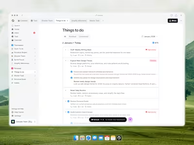
Anlytics Dashboard

Cansaas Agency

Like this project
Posted Jan 16, 2026
Analytics dashboard exploration designed to present key metrics, trends, and insights clearly through structured layout and visual hierarchy.
Likes
1
Views
4


Overview
This exploration presents an analytics dashboard designed to help teams monitor performance, understand user behavior, and make data-driven decisions with confidence. The focus is on clarity, trend visibility, and actionable insights within a single, cohesive workspace.
The Challenge
Analytics platforms often overwhelm users with dense charts, scattered metrics, and unclear priorities. Important signals can get lost in noise, slowing decision-making and reducing trust in the data. The challenge was to surface key insights clearly without sacrificing depth.
Visibility of System Status
The system should always keep users informed about what is going on through clear and immediate feedback.
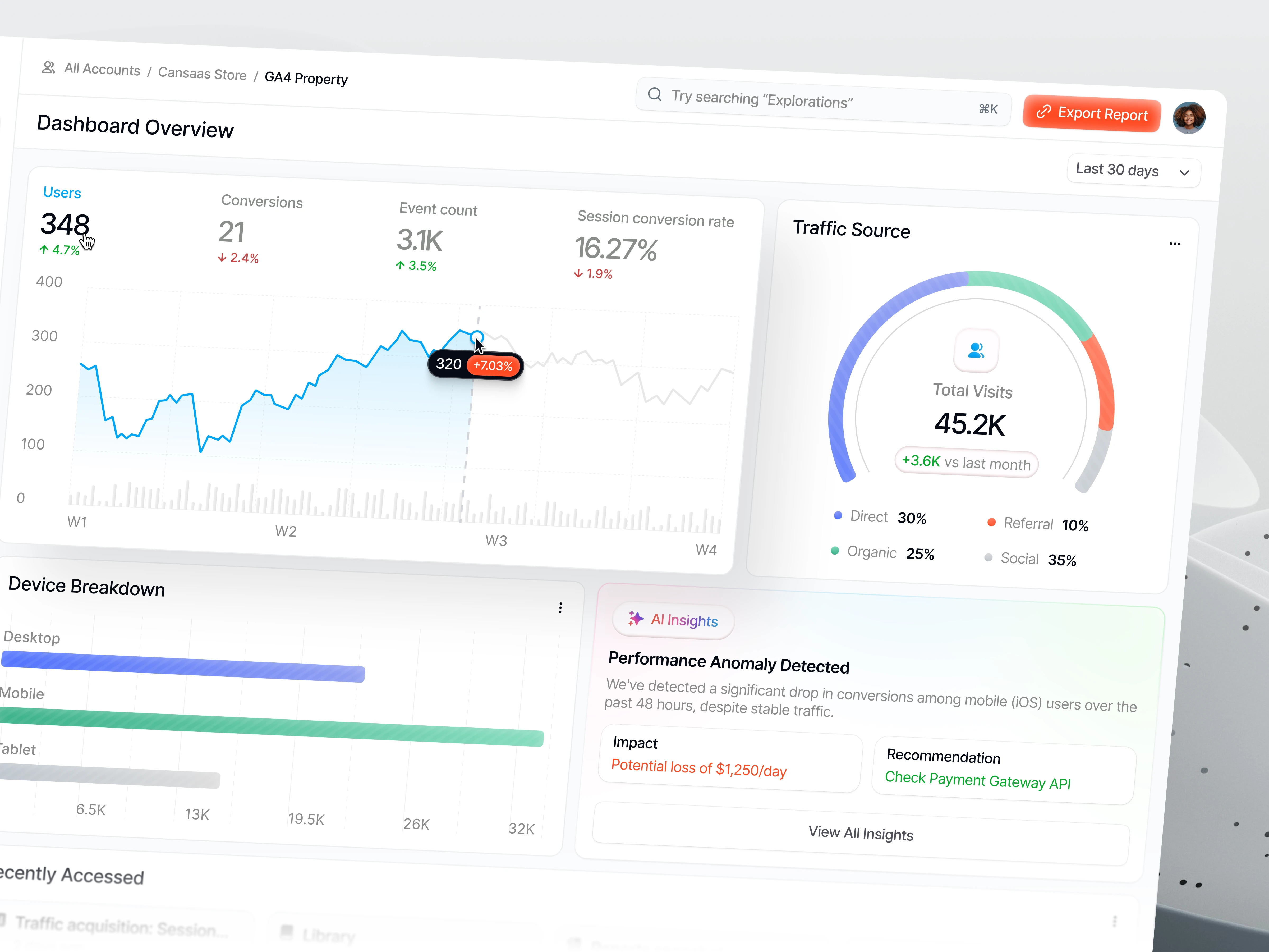
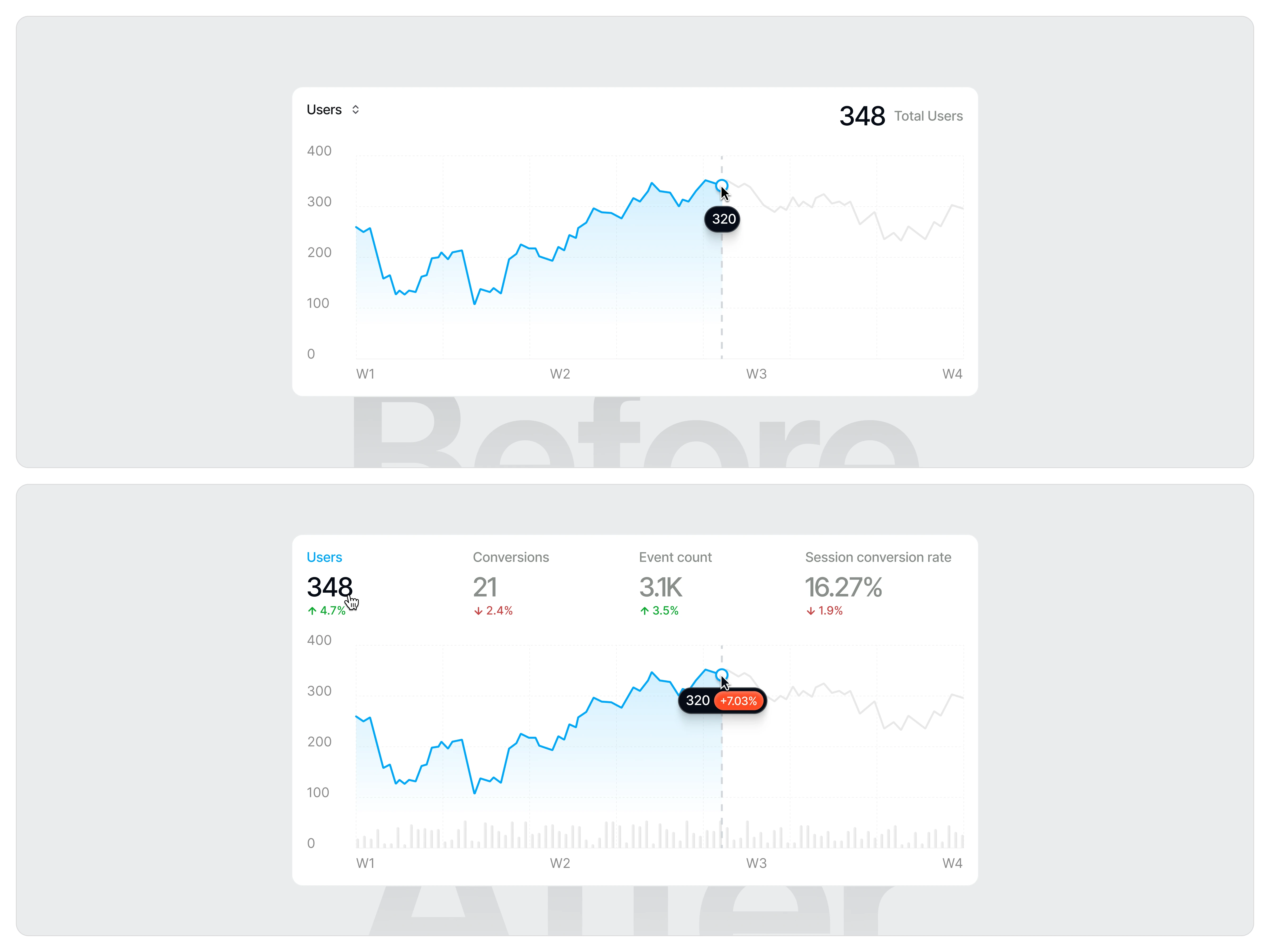
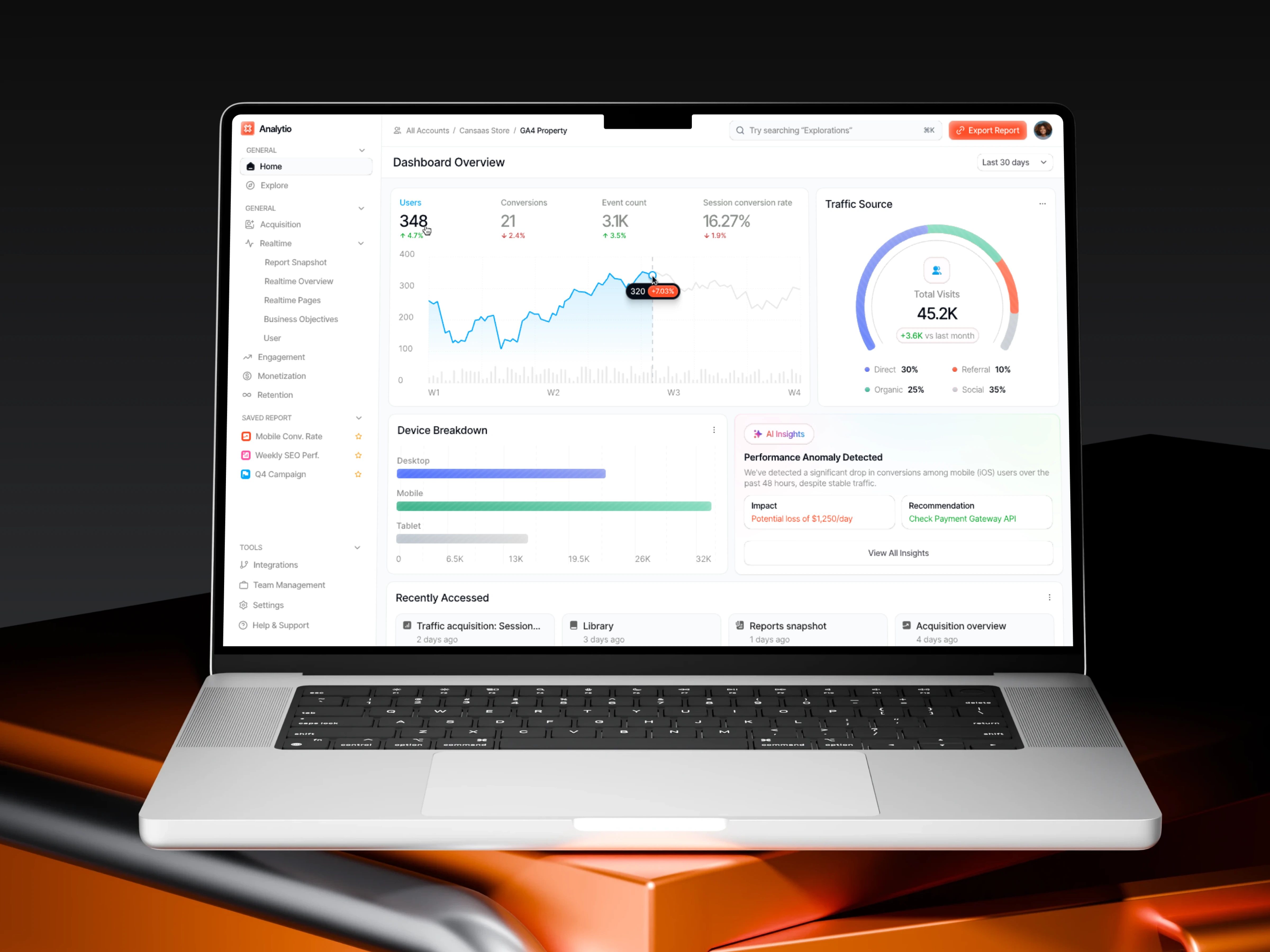
In the initial version, the chart displayed only a single metric (Users) with a static total number and a basic tooltip showing the raw value at a specific point in time. While users could see trends over weeks, the interface did not clearly communicate whether the change at a specific point was positive or negative, nor how it compared to previous periods. As a result, users had to manually interpret the trend line to understand performance changes.
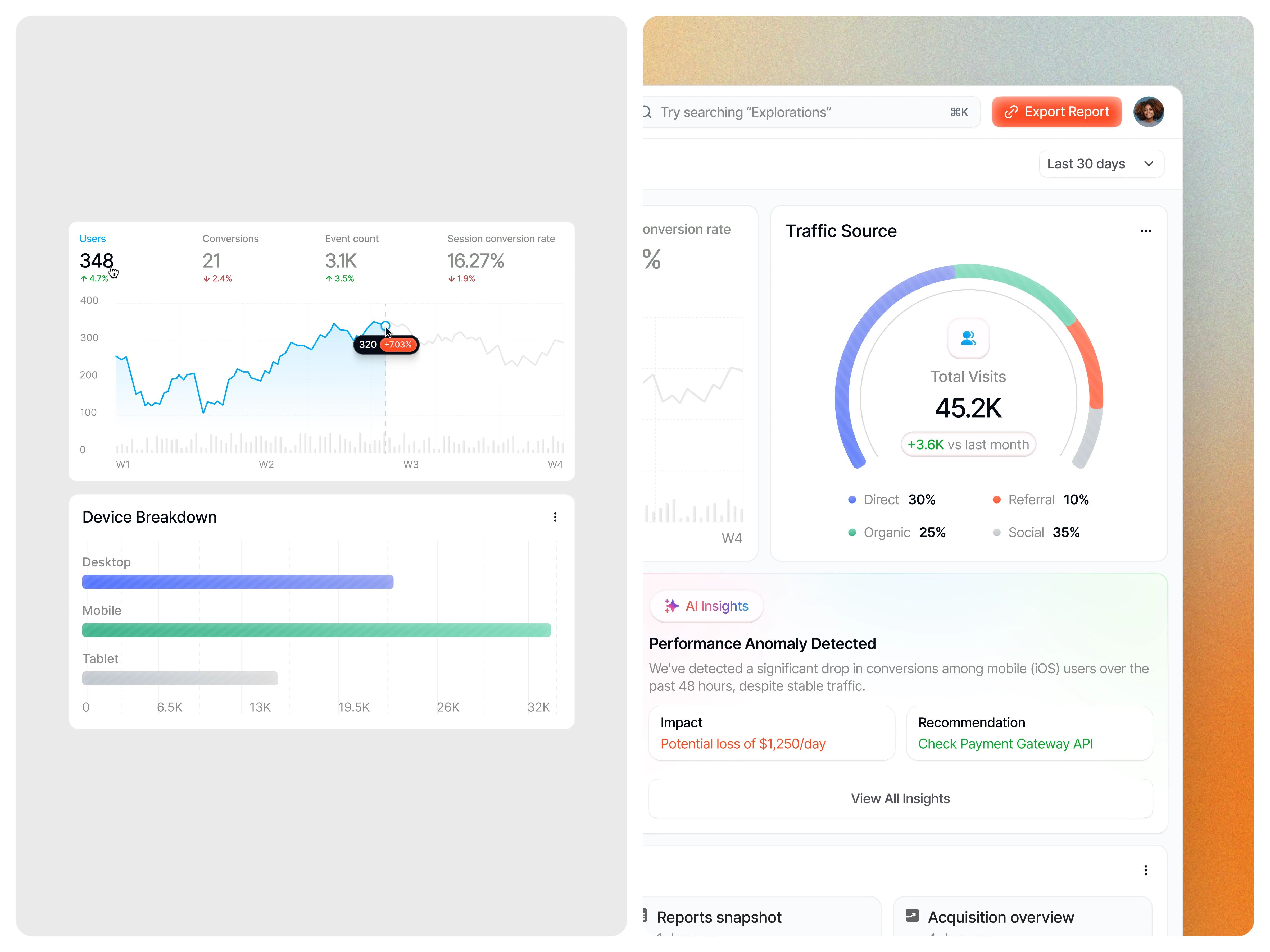
In the improved version, the interface provides richer and more explicit feedback. Key metrics such as Users, Conversations, Event Count, and Session Conversion Rate are surfaced at the top with clear percentage indicators and color cues, instantly signaling performance changes. The chart tooltip is enhanced to include both the exact value and the percentage change, making growth or decline immediately visible. This real-time feedback helps users quickly assess system performance, understand momentum, and make data-driven decisions without additional analysis. (src: Jakob Nielsen – 10 Usability Heuristics for User Interface Design)
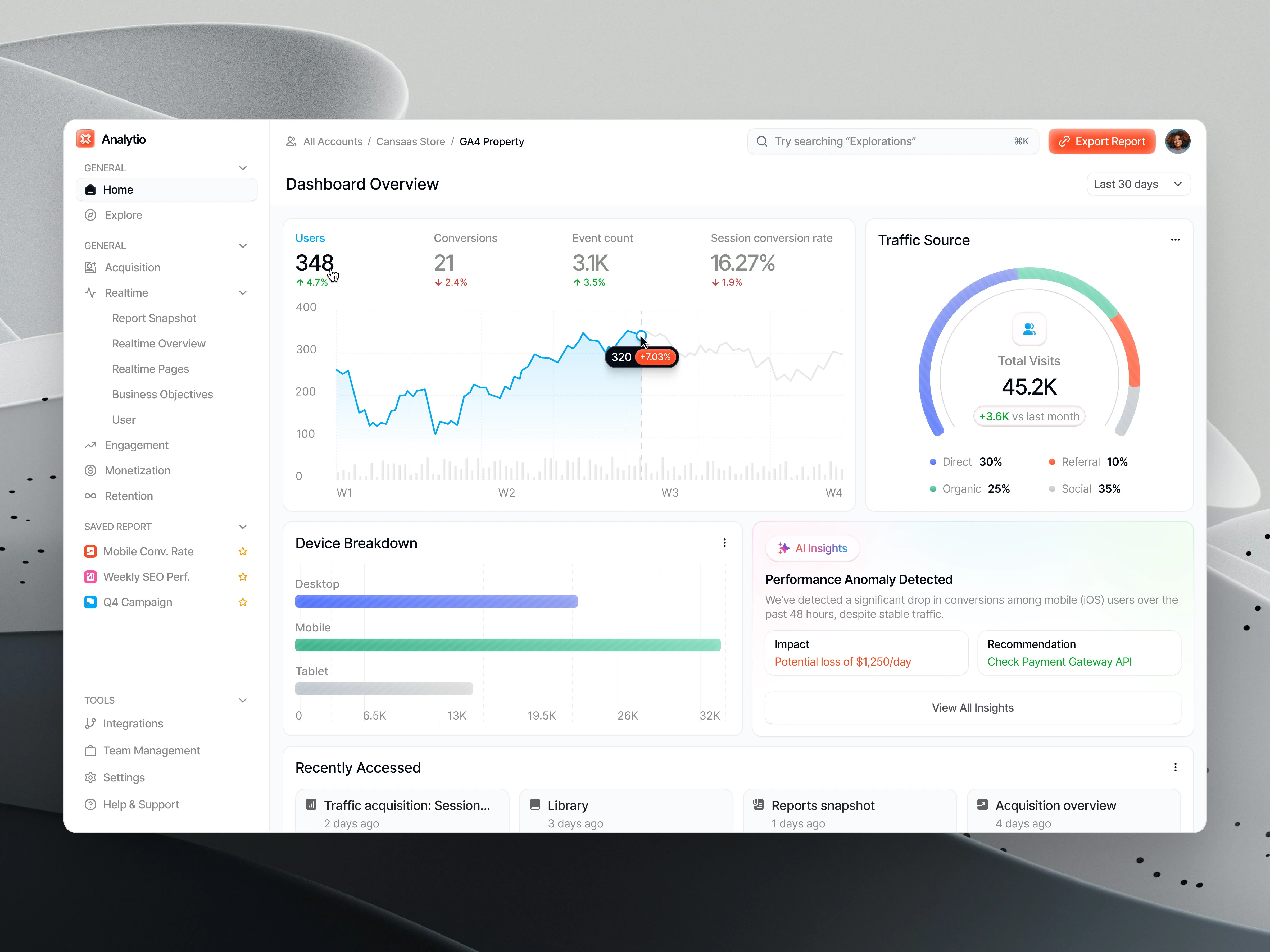
Design Approach
We structured the dashboard around core performance metrics, visual trend tracking, and contextual insights. Clean chart styles, consistent spacing, and clear data hierarchy guide users through information progressively, from high-level overview to deeper analysis.
The Solution and Impact
By simplifying data presentation and emphasizing insight-driven design, the analytics dashboard enables faster understanding and more confident decision-making. Users can spot trends earlier, respond to issues quickly, and align actions with real performance data.