Insentro Website Design Case Study
Ekta Bhoraniya
Problem Statement
Insentro needed a modern, intuitive data analytics platform website that could effectively communicate complex product offerings while appealing to various business sizes. The challenge was to create a visually striking design that simplified technical concepts and clearly presented pricing tiers without overwhelming potential customers.
Process
Research & Discovery
I began by analyzing competing data analytics platforms to identify market gaps and user pain points. The research revealed that many platforms either overwhelmed users with technical jargon or failed to clearly communicate their value proposition.
Information Architecture
Working from the ground up, I structured the content to guide users through a natural journey:
Product benefits highlighted upfront
Clear pricing structure with feature comparison
Actionable entry points strategically placed throughout
Visual Design
I created a distinctive visual identity using:
A rich purple gradient palette conveying sophistication and innovation
Geometric shapes and subtle particle effects suggesting data visualization
Clean card-based layouts to compartmentalize information
Design Insights
Simplicity Through Color Psychology
The purple-dominant color scheme creates a consistent brand identity while establishing a sense of trust and innovation. The gradient variations help users intuitively distinguish between different sections.
User-Centric Navigation
The streamlined navigation structure prioritizes the most critical user paths: exploring features, checking pricing, and signing up. This reduces cognitive load while ensuring important conversion points remain accessible.
Visual Hierarchy Through Cards
The card-based design pattern establishes clear information hierarchy, making complex feature sets and pricing tiers easily scannable and comparable.
Conversion-Optimized CTAs
Strategic placement of "Get Started," "Start Free Trial," and "Sign In" buttons creates a frictionless path to conversion while accommodating users at different stages of the decision process.
Final Designs
Few of the final design features:
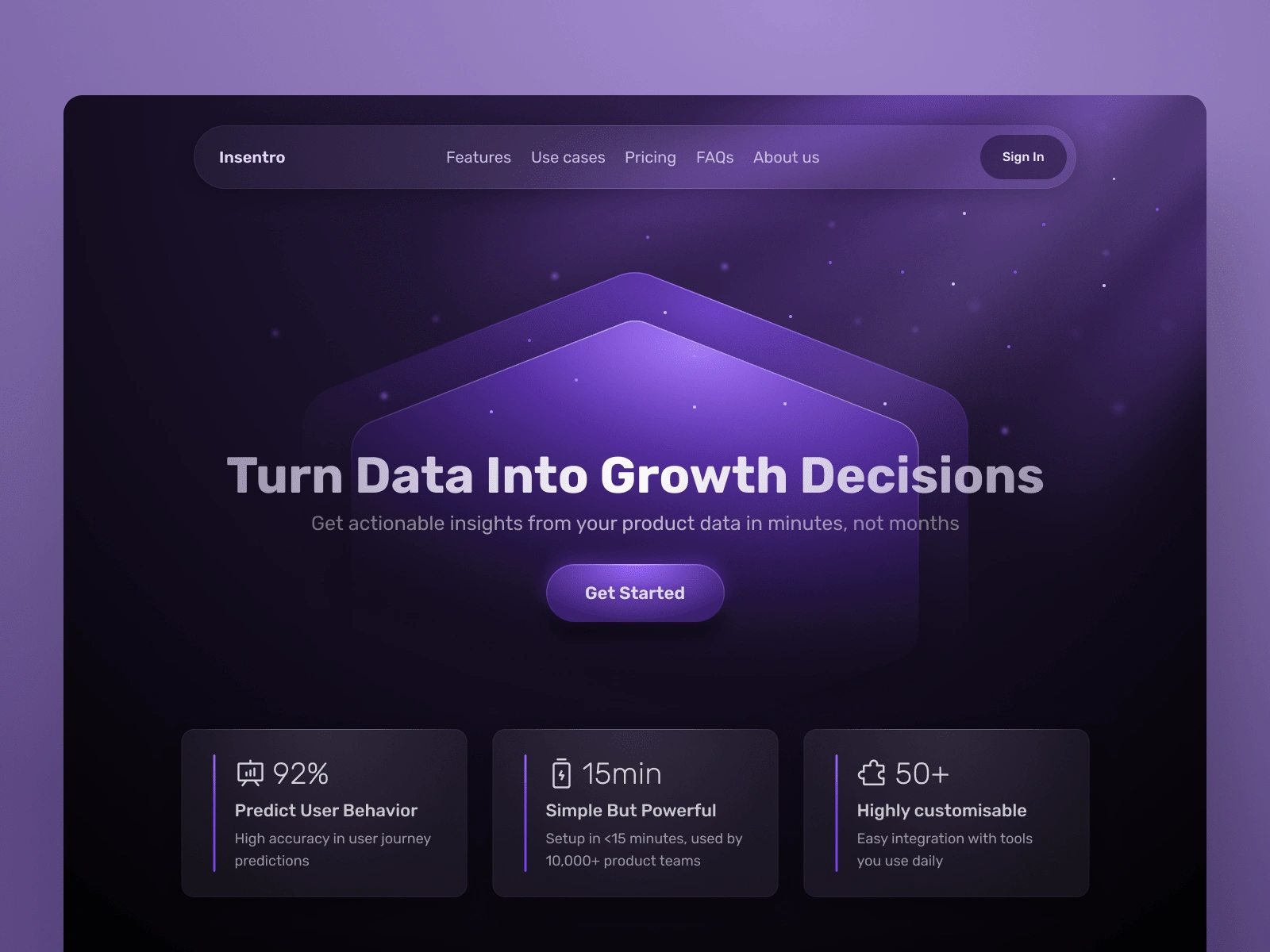
Homepage Hero Section
A compelling headline "Turn Data Into Growth Decisions" immediately communicates the core value proposition, supported by a concise subheading that emphasizes speed and actionability.
Strategic placement of impressive statistics to build credibility.

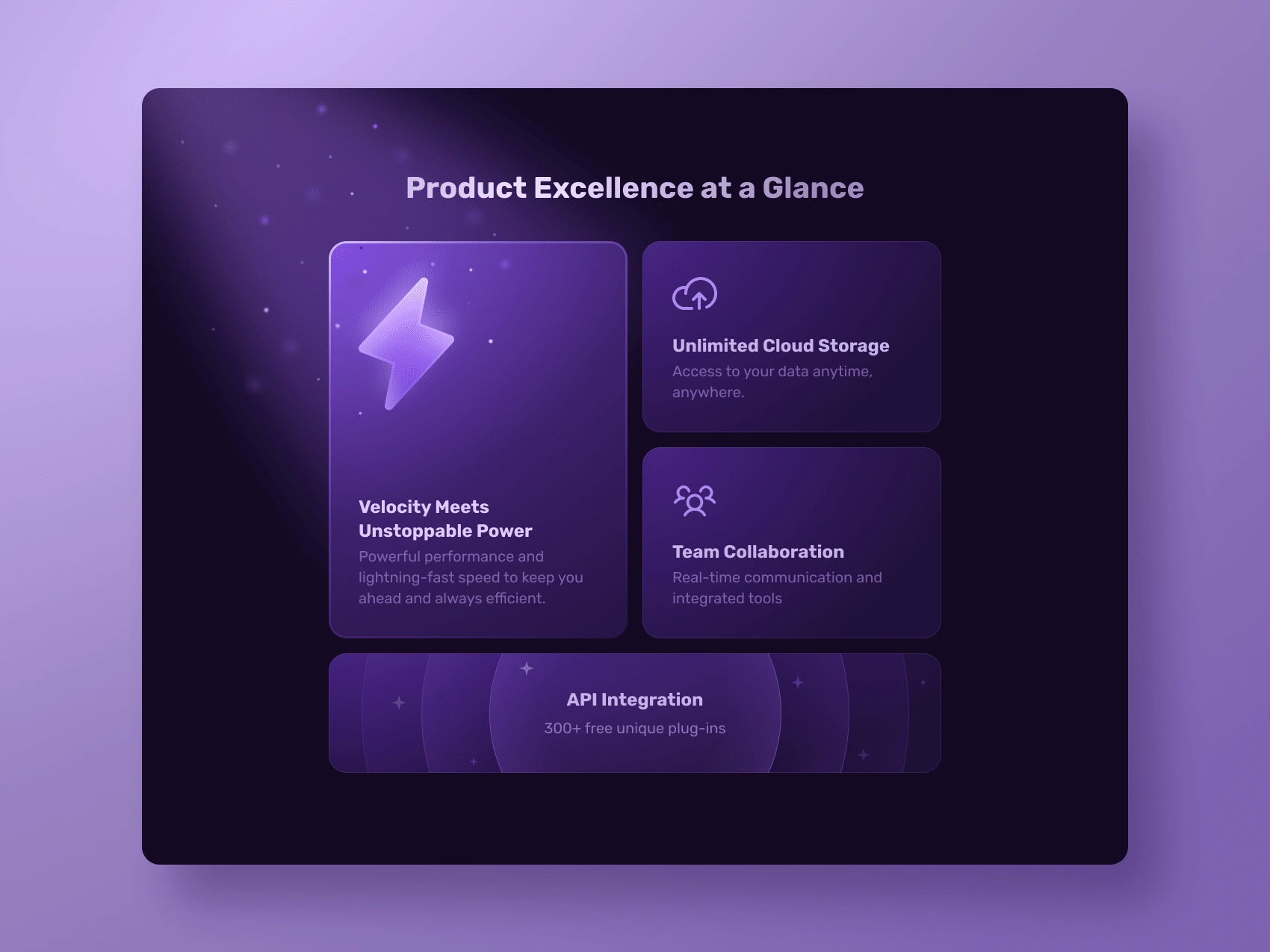
Feature Showcase
Key product benefits are presented in visually distinct cards highlighting:
Performance ("Velocity Meets Unstoppable Power")
Storage capabilities ("Unlimited Cloud Storage")
Collaboration features
API integration options
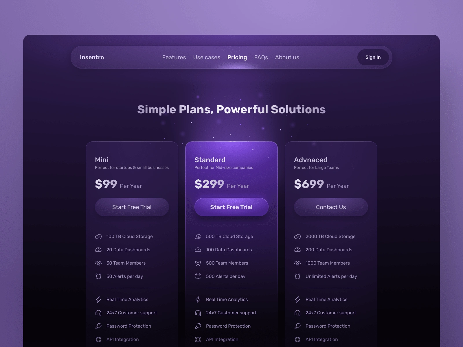
Transparent Pricing Structure
Three clearly defined pricing tiers (Mini, Standard, Advanced) with:
Prominent annual pricing
Visual indicators of included features
Appropriate CTAs for each tier (free trials for entry-level, contact for enterprise)
This design successfully transforms a complex data analytics platform into an approachable, visually appealing website that clearly communicates value to potential customers across different business segments.
Like this project
Posted Mar 3, 2025
Designed a modern, intuitive data analytics platform website that effectively communicate complex product offerings while appealing to various business sizes.
Likes
2
Views
17