Chemy lane
Overview
Brief
The company had a first version of the app that was built on-the-go like a functionnal Proof of Concept by developers. It got them to figure out their API, global database structure and consolidate their understanding of the market.
Problem
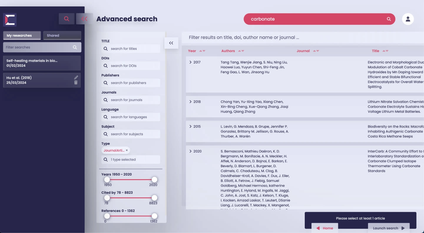
This initial version fell short on ergonomics and data architecture, slowly leading to waste of development time by piling up elements over an unstable base.
Surveys to their users came back with multiple not-so-good remarks regarding their UX compared to other solutions. Time had come for Chemy Lane to consider investing into a redesign.
Constraint
The new version had to be done before launching the app publicly to the market, which means 2,5 months UX/UI redesign + development included. Challenge accepted!
To support design efforts, a commando team of 3 senior developpers was assembled, who started coding prototypes back-to-back as soon as they would get validated on Figma.
It’s not ideal because the margin of error on designs gets very small and it ads pressure, but it’s the real business world!
How the interface looked like:
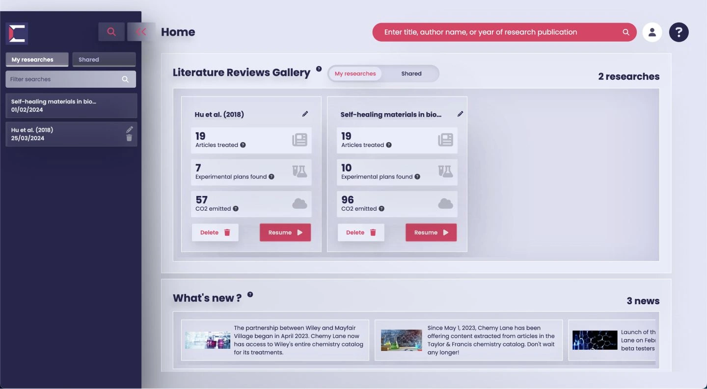
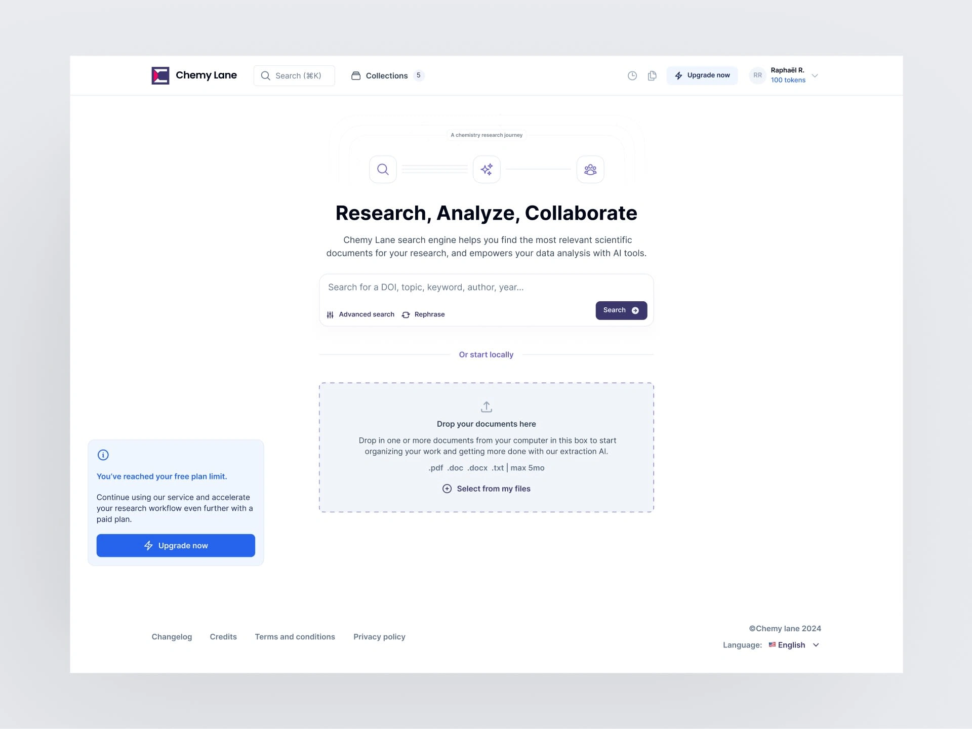
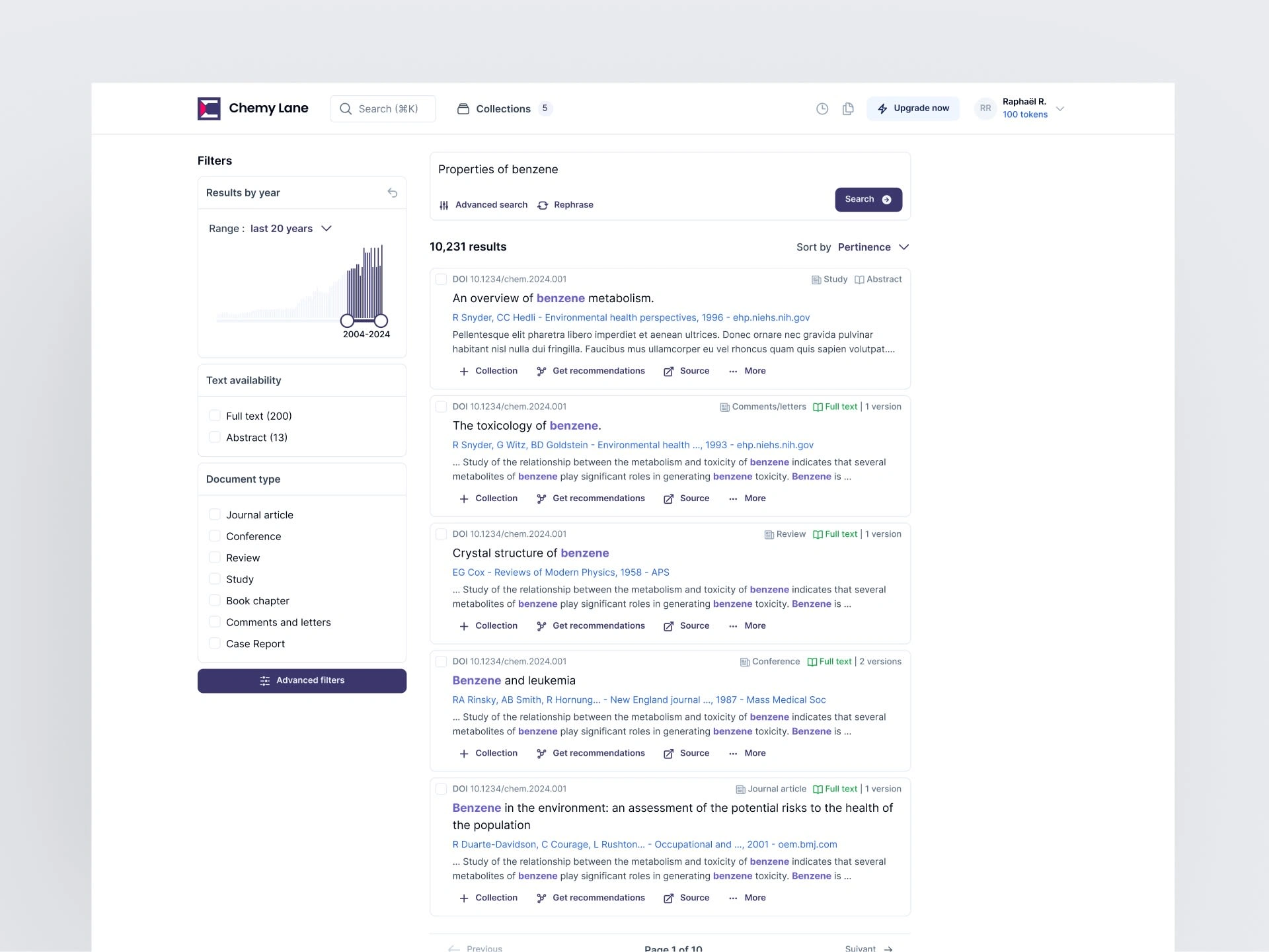
How it looks like now:
Approach / Methodology
So how do you transform a clustered interface into a clean and efficient version of itself?
Like in other redesigns, the answer basically lies in designing a UX methodology that strips down and maps the service to its core values, allowing to build up and iterate from a clear shared vision.
Here is how I approached this interface redesign :
Specification: I defined the current issues (including user feedbacks), constraints, business objectives, personas and global benchmark into a clear documentation.
Product understanding: I asked for video tours, tried the product myself multiple times and pinpoint its weaknesses and strenghts compared to common patterns and other existing solutions I could get my hands on.
User journey map: I deconstructed the service into user stories on a board that is organized by chronology of navigation and hierarchy of action relative to the product job-to-be-done by their users.
User journey map reorganization: Once I had a clear view of the service, I was able to start seeing functional UX patterns. In this particular case, I was able to clearly group users stories into 2 main blocks: a search engine, and an AI review engine which are the 2 main value propositions of the service, makes sense.
With this, I had enough to start producing wireframes.
Like intended, it allowed to iterate fast, lay out the data architecture and navigation without having styling temper productive discussion. The latter is also the main reason why Whimsical has been my favorite wireframing tool, it’s basic and enforces good practice, especially when you are short in time.
I only consider moving to the next UI phase until a solid common experience ground is secured.
Once a full architecture was settled and agreed upon, time for UI!
Making a moodboard: this makes sure all stakeholders on the project are aligned into the same vision. I make everyone vote on a Figjam board, drop hearts, stars etc…
Choosing a UI library that accelerates front-end development: Because of the team experience in React, Vue and JS in general, we chose Shadcn and tailwind, a winning combo.
Preparing Figma with all design foundations compatible with UI library to allow for powerful code-export. This means creating or importing many variables: spacing classes, breakpoints, color tokens semantics, font sizes, rounded corners, grids, widths, components etc… This is the most difficult part in styling which requires a profound understanding of clean CSS architecture, of most popular UI libraries semantics and how to create on top of them.
Gogo-gadgeto UI design: Time to make designs accessible, interactive and appealing. We were also able to easily hand-off to developers after review thanks to the “ready for dev” status integrated in Figma.
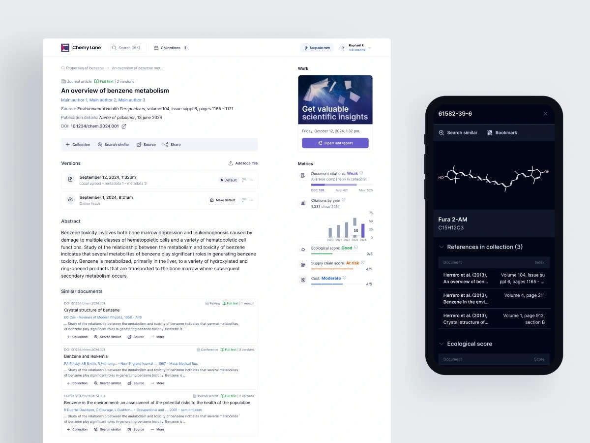
Final result shots:
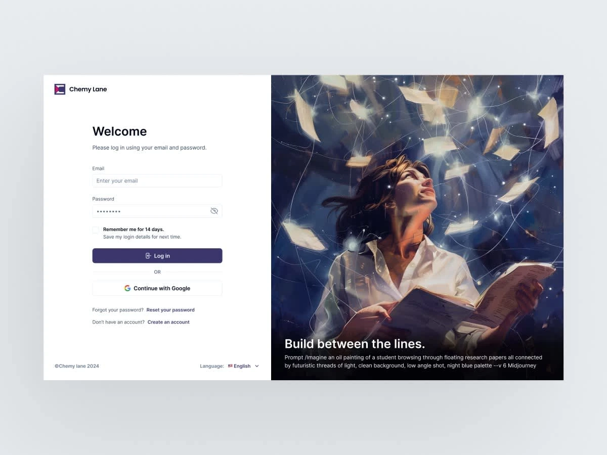
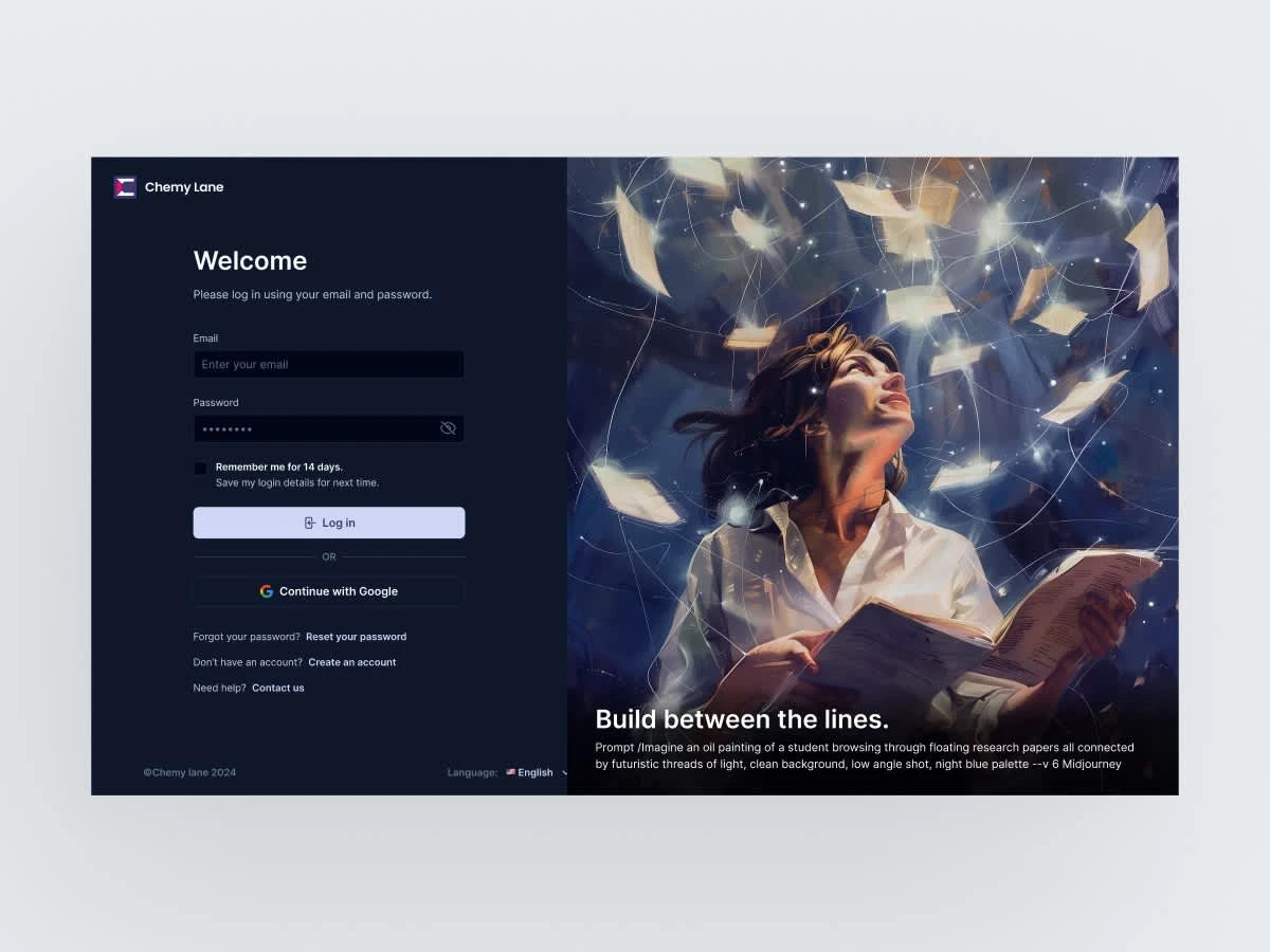
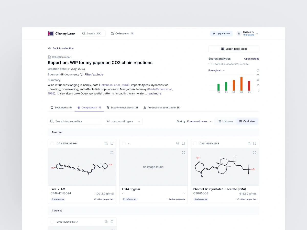
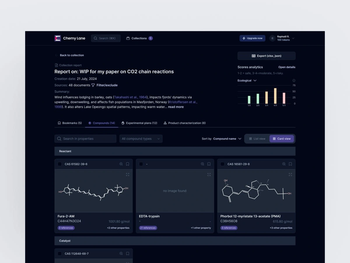
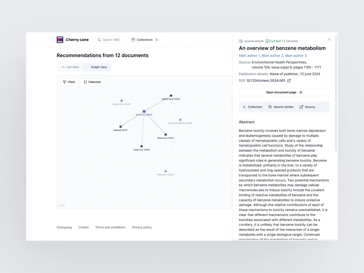

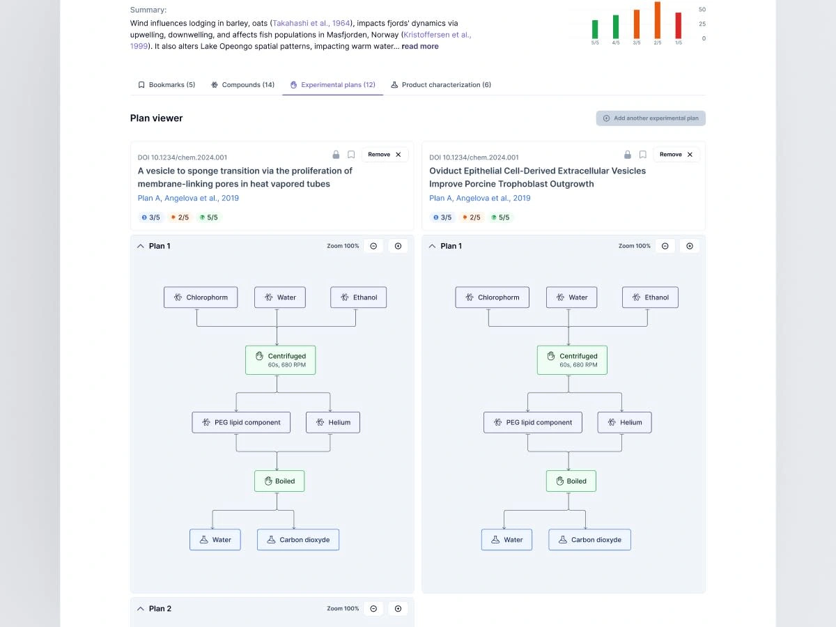
All screens are fully responsive, which means about 22x5= 110 frames minimum, without counting popins, drawers or modals 🥵
Developers were able to code the whole interface in time for commercialization, previous users were delighted by the new interface and all product demos went butter-smooth, setting the company on the tracks to success!
Thanks to Robin (CTO) for countless hours of brainstorming, Ibrahim, Jules and Fernand for recommending my profile for this challenging job.
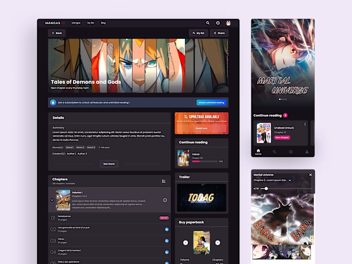
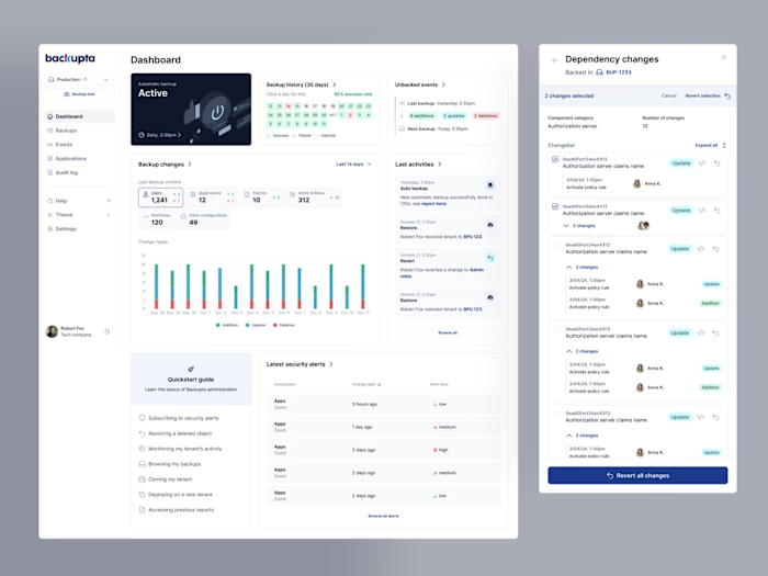
If you liked this work, consider other similar works like Backupta, Wisetax or Enerdigit.
Thanks for reading this far!
Like this project
Posted Sep 24, 2024
Full UX/UI application redesign before commercial launch. Scientific literature review service, search engine and data extraction AI.

