Office for Students
The OfS (office for students) is the independent regulator of universities in the UK, they run Discover Uni a website to provide impartial data about student perceptions and graduate outcomes across all courses and institutions in the UK. Their mission is to provide students with all necessary information they need to make an impartial and informed decisioon about what to study at university.In 2022 I started working with them to help with as a research and design partner to improve the user experience and refresh its visual style, in addition to this the internal discover uni team had already identified a number of user journeys that needed attention.
Research
Discover Uni serves multiple audiences, helping students through one of the most complex decisions they will make in their lives whilst also providing information to the teachers, advisors, parents and carers who support them.
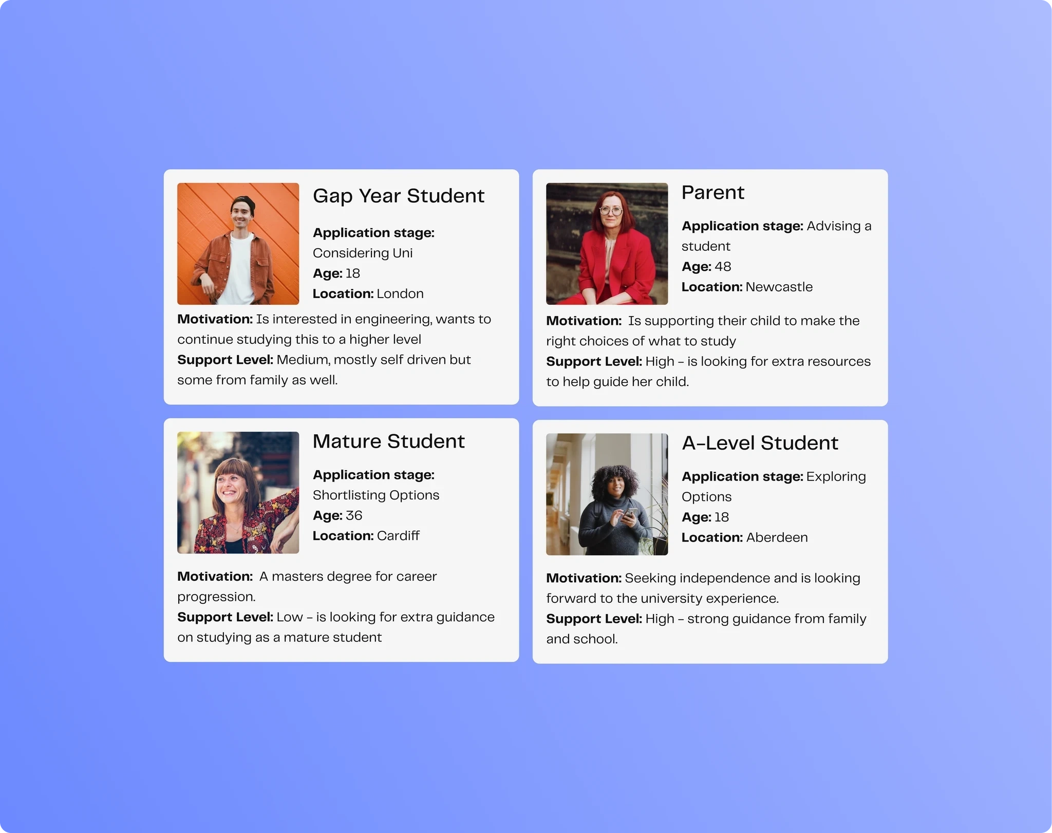
We began our engagement by diving deeply into these different user types, building an understanding of their needs and behaviours regarding the site. We combined qualitative data gathered from interviewing prospective students with a review of previous research studies and existing site analytics. Alongside demographic differences, we found that the student’s position in their application has a big say in how they behave on the site.
From initially considering higher education, through researching and shortlisting options, down to finally making decisions; each context requires a unique support system, and different information to be provided. In addition we discovered that there’s a broad spectrum of how proactive potential students are. This strongly influences how much additional guidance is required to effectively convey the information the students need. Our initial research let us map out the moments where we could have an impact, and prioritise areas where the site could better help students.
Visual refresh
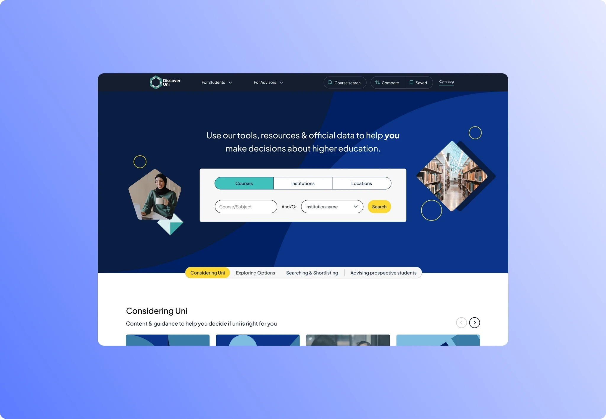
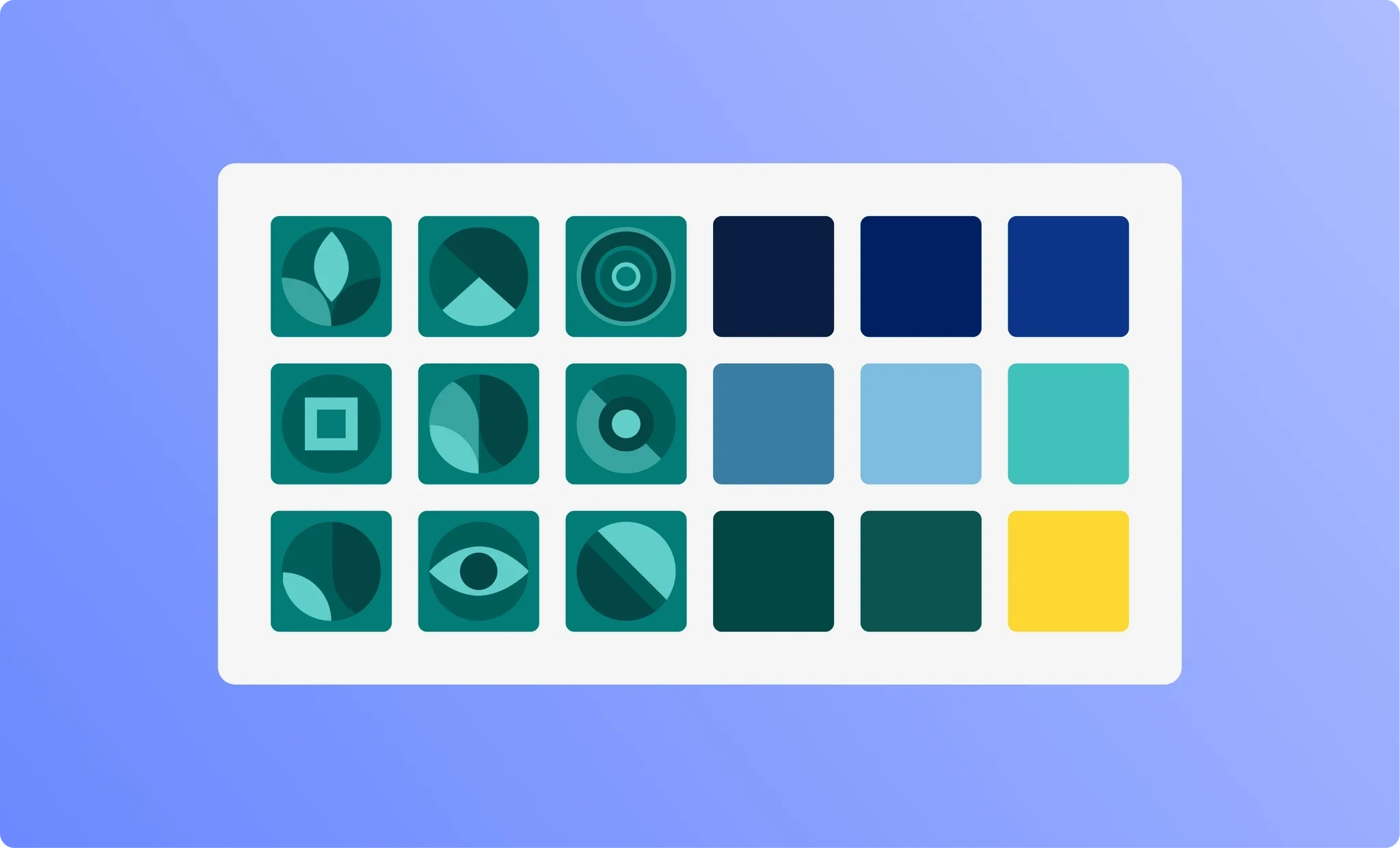
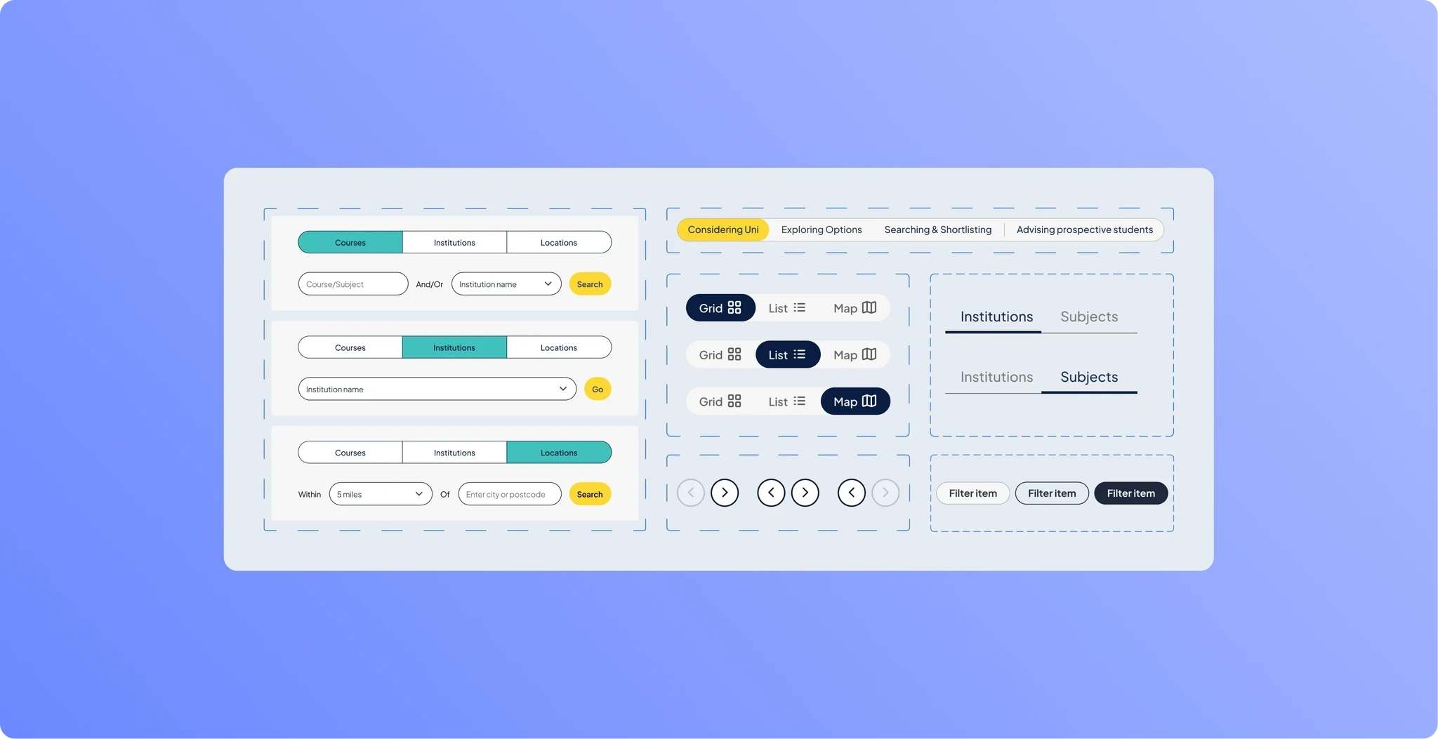
My brief included refreshing the visual style of the site to create a modern, inviting design that unified the interface with a consistent visual language. To achieve this, I began by building a component library of reusable UI patterns and establishing a clear typographic scale to ensure consistency across all new design work.To make the site more engaging, I developed a new, vibrant colour palette that was fully accessible according to WGAC guidelines. I used this palette to create bespoke graphics that draw attention to key areas of the site.The original Discover Uni site was text and data heavy, which could be intimidating for some users. To address this, I incorporated more imagery to create a welcoming look and feel that would appeal to the diverse range of users that use the website.
Targeted redesign and user testing features for students
I consistently heard from students at an early stage in their journey that the ‘course search’ box could be daunting, as they were often still exploring whether they wanted to go into higher education, and if so, what their options were. Students didn’t need a search box, they needed possibilities they recognised.
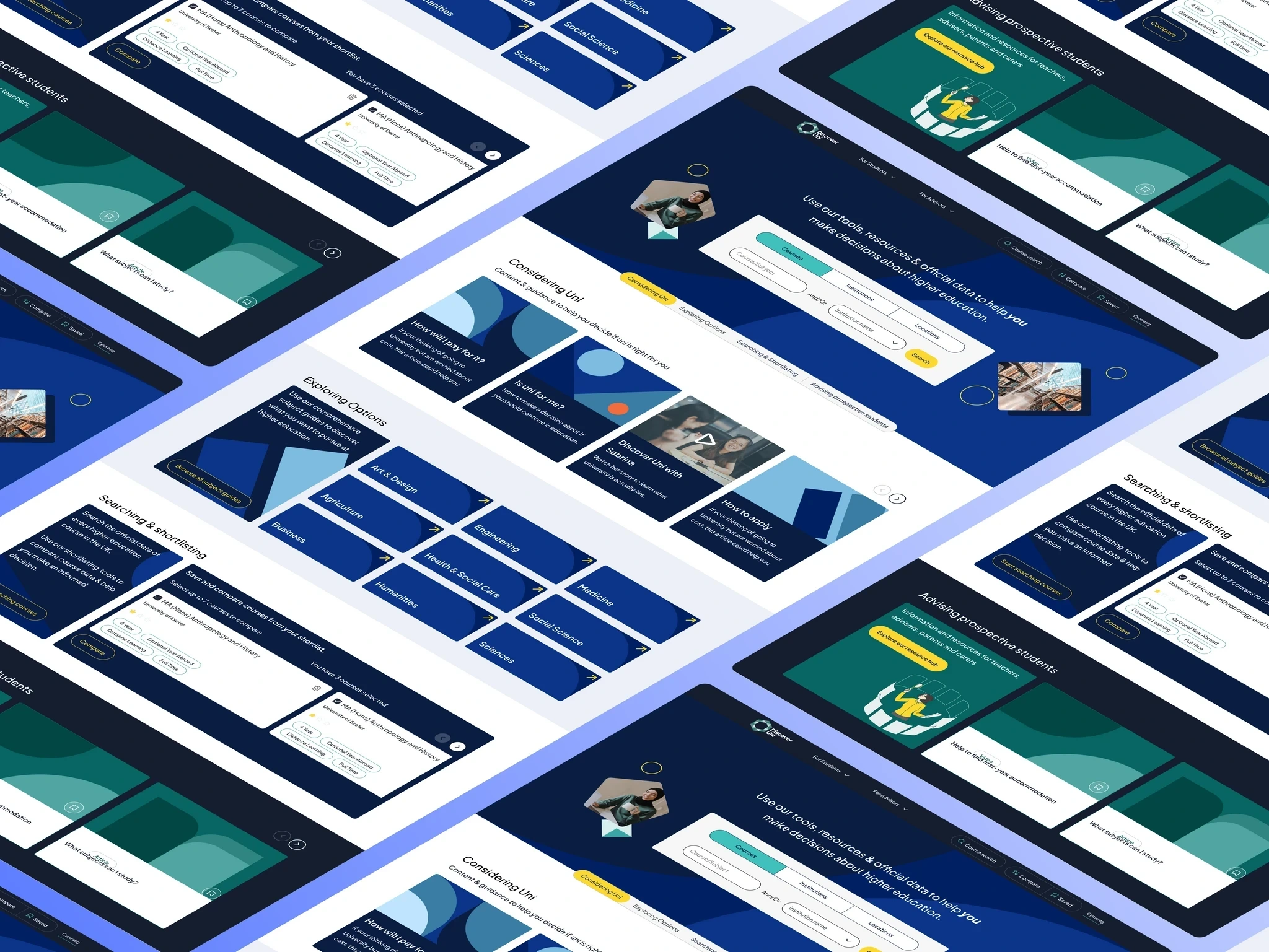
Working with the Discover Uni team I prototyped a ‘subject guide’ feature, which let users browse through categories of courses, find out more about them and understand what careers they could lead onto. Working in close collaboration with the content experts at the OfS I created multiple low fidelity prototypes and an exercise for our research participants to help prioritise the information they wanted to see.
Through our lean user testing approach I was quickly able to incorporate an appealing design language, and an effective scheme for prioritising information, efficiently leading to high fidelity website variants based on these findings.
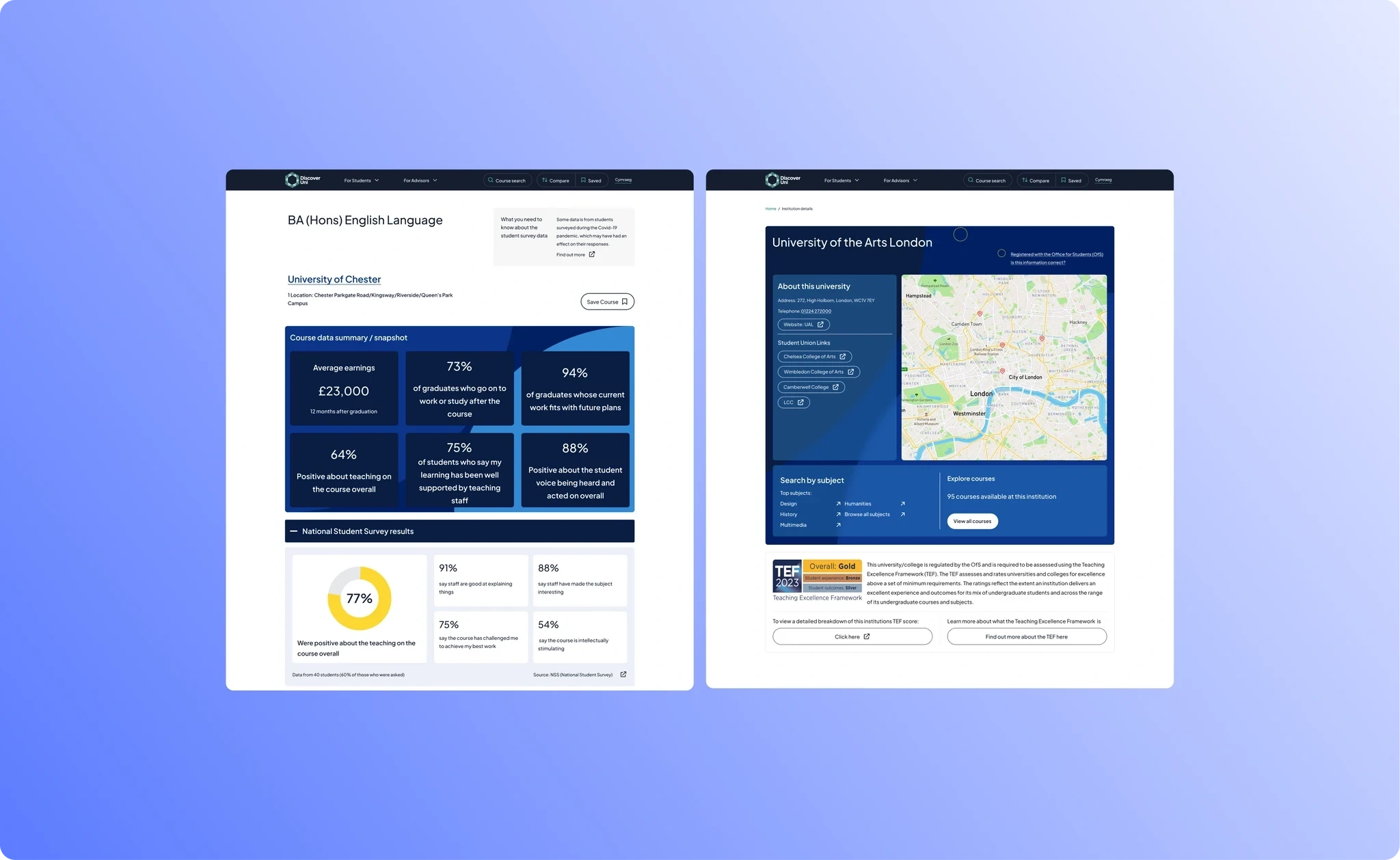
Making home, navigation and search work for a diverse audience
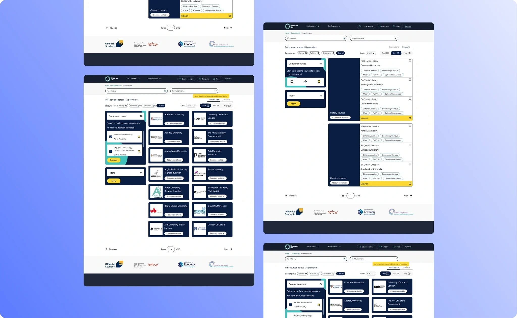
In addition to the subject guides feature, I identified that the homepage and navigation weren’t serving the diverse user group as well as they could, nor expressing the full value of Discover Uni at first viewing. As the primary journey for most users, the search bar and subsequent results worked well for some users, but not those in the early stages of decision making. As a site built by a changing team over a number of years it had also suffered from incremental tinkering, without a holistic review or update.The user contexts provided the perfect lens to understand the competing priorities for the homepage, nav and search journey. By combining data gathered from collaborative workshops with user research, I developed a relative priority order for different use cases, resulting in a reweighting of the importance of various items on the page.At the same time, I rethought search, adding multiple search ‘modes’ to the existing course search. In future, users will be able to search by location, course, subject and institution, better serving their diverse information needs.
Working on this project has been a really fulfilling experience as it has the potential to impact a such wide range of prospective students. The opportunity to conduct numerous user interviews and usability tests has really helped me understant how to design a website that caters to the needs of multiple audiences and displays complex data in an impatial and accessible way. I've just finished the final round of testing and I'm looking forward to seeing the impact the finished site has once the developers have shipped the code. Key skills learned: Usablity testing, user interviewing, interactive component design.
Like this project
Posted Nov 17, 2023
Working with an educational organisation to better reach their core audience.
Likes
0
Views
7


