University of Exeter
A new app for students
Designing and building a new app to improve students university experience
The University of Exeter ranks as one of the UK's top universities for academic outcomes, however their student satisfaction scores are often low. To address this, Exeter is in the middle of a digital transformation aimed at improving the university experience of their 30,000 students.As part of this, an in depth user research project was conducted over 6 weeks to give the university a better understanding of the student’s problems, and the problems identified were the starting point for this project.Having already trusted Loomery with the user research and digital transformation strategy, Exeter decided to continue working with Loomery. This led to the creation of our product development squad: four developers and a designer - myself.
Research and testing assumptions
In the first week of the project, I went to the Exeter campus where I looked through the findings of over 25 in depth student interviews and eight stakeholder interviews. I decided to expand on this by conducting in-person user research to test the assumptions uncovered in the original findings.
This allowed me to confidently identify key difficulties in the student experience at Exeter. From these emerged 20 clear ‘pain points’. Due to the scope and timeframe of the project, I worked to prioritise those we could solve using the app, and that would also have the highest impact on student satisfaction.
I narrowed it down to four key areas: study spaces, timetables, communications, and information. I started to turn these problems into opportunities to improve the students’ digital experience.
Discovery, ideation, wireframes & testing
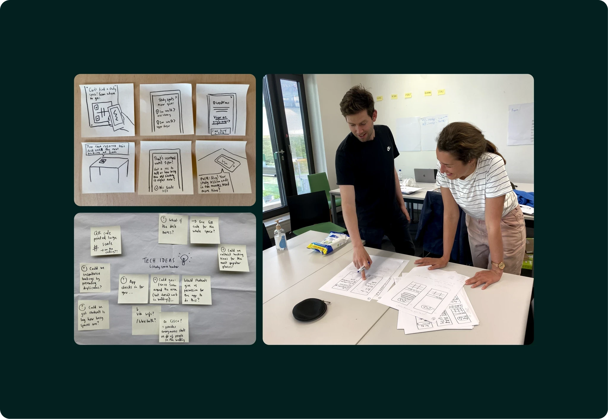
After identifying these four key areas, I set about testing initial ideas and assumptions with students through on-site guerrilla user research. We made paper prototypes and quickly sketched some wireframes to get ideas out and see which solutions resonated with students best.
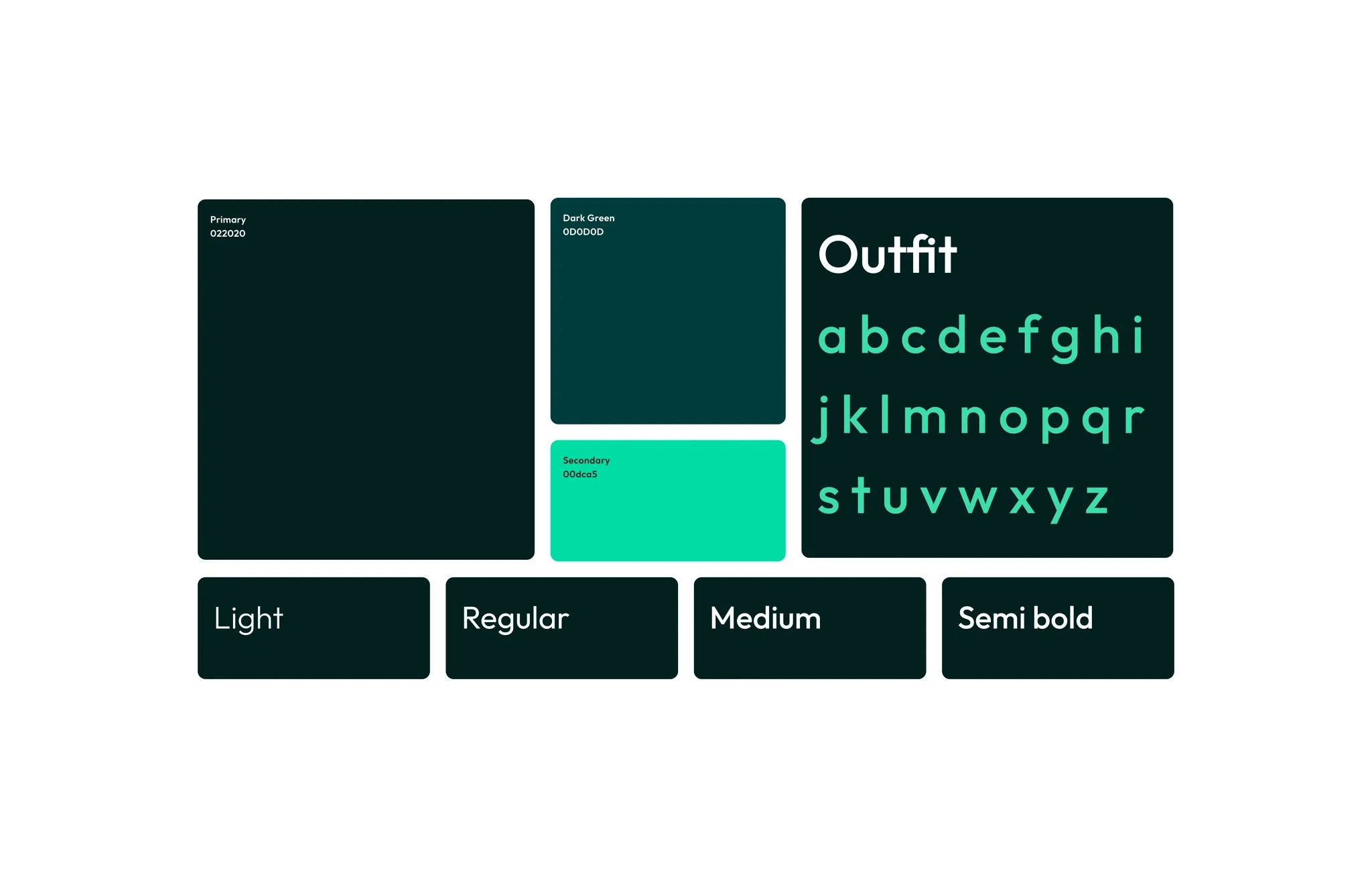
Branding
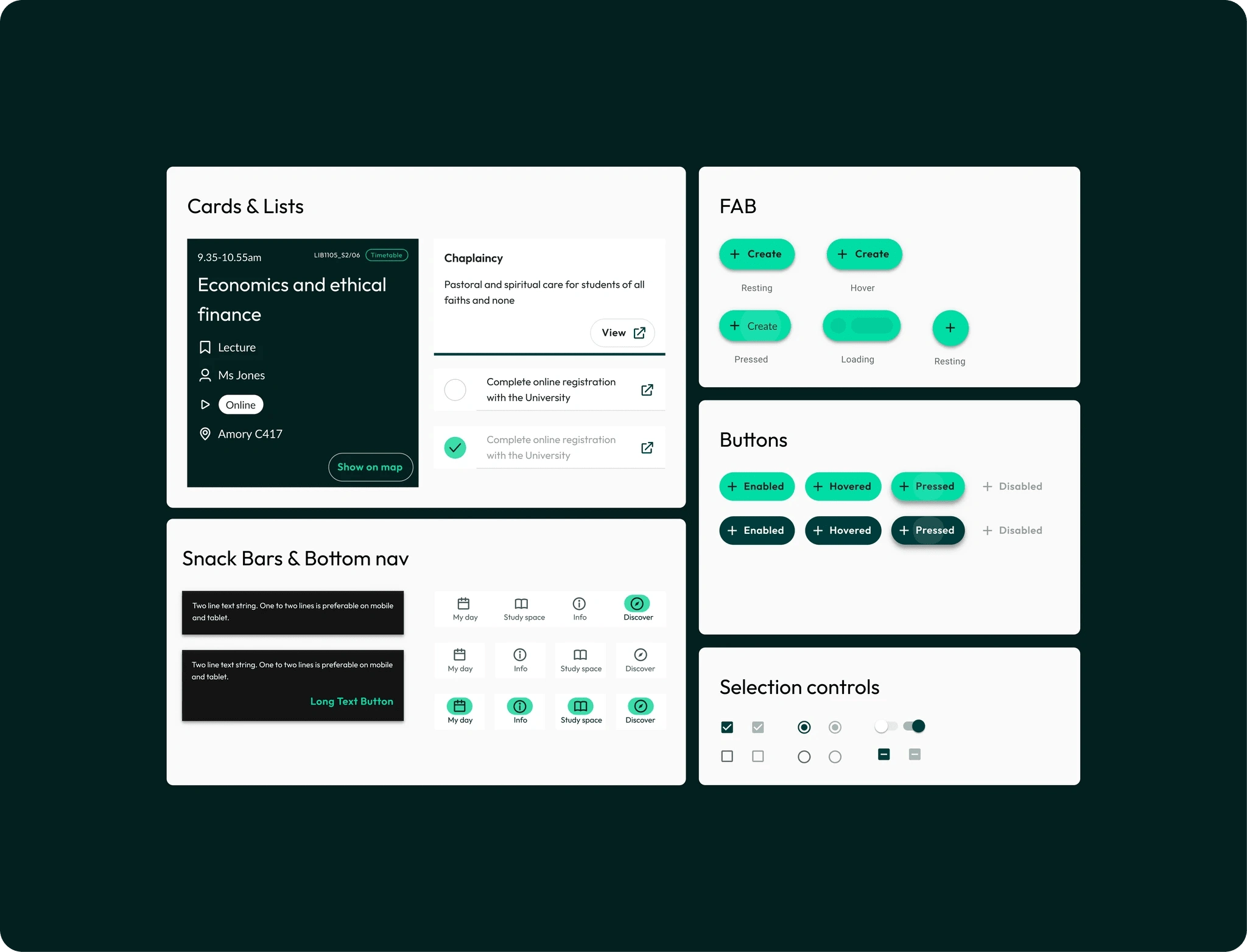
I also built a library of re-usable components that would be the foundation for any digital product the university would build in the future.
Features on the app
Because of the siloed nature of the university’s digital estate, students had to log into three separate systems (all with Two Factor Authentication) to check what lectures, seminars, deadlines or university events they had coming up. This was impractical as it was best done when at home or in a study space, as it was only possible to complete on desktop.
Through the user research I conducted in the first week of the project, I discovered that students had created their own solutions to this problem. These included manually writing their timetables on paper and trying to memorise all of the things they had to complete throughout a week (and inevitably missing out on some). We knew we could do much better than this.
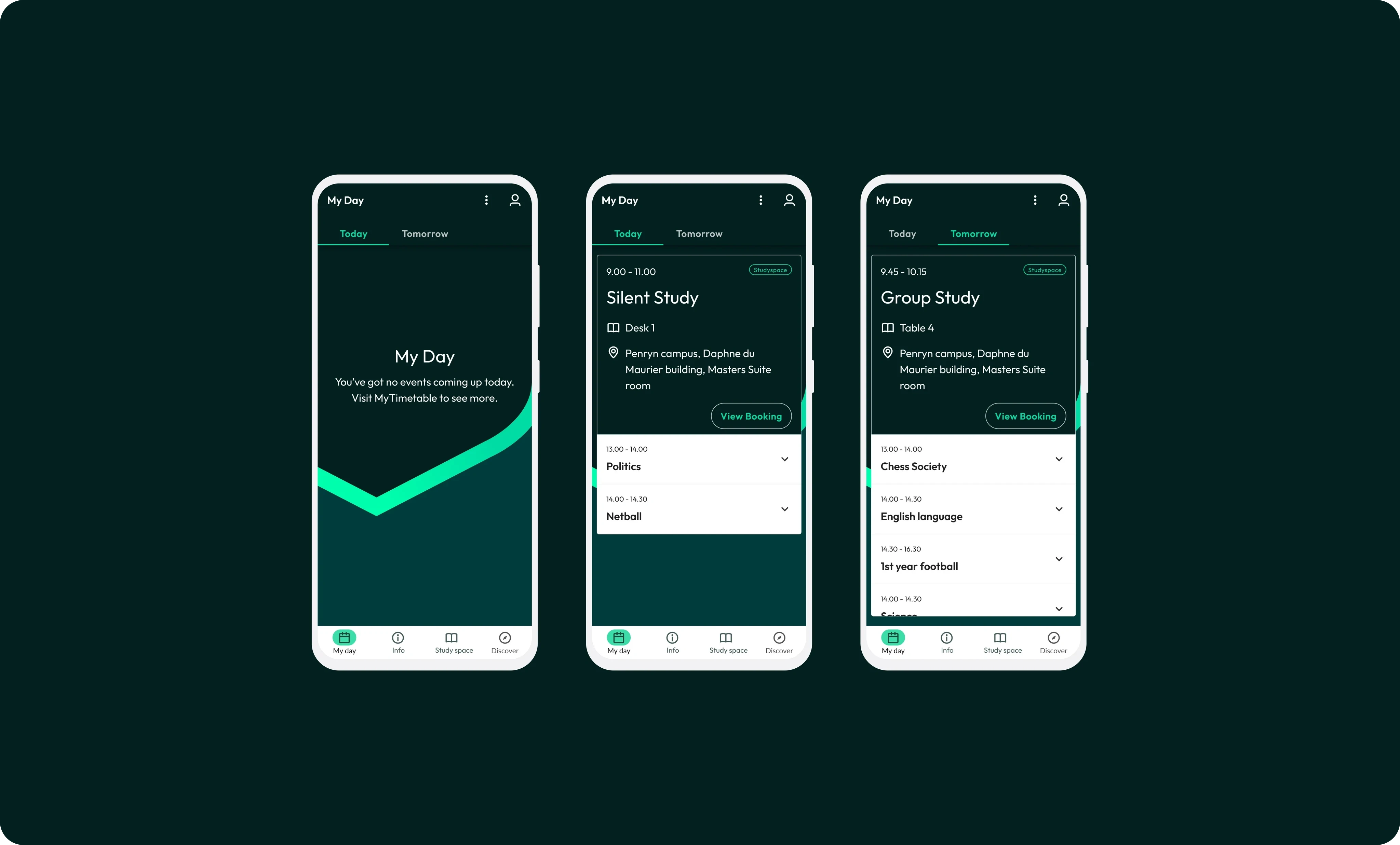
Then, after testing possible designs with a small group of students we created a solution in the app. The feature is called 'MyDay'. The core idea behind ‘MyDay’ is that students are able to quickly check the app while they are on the go, enabling them to see what activities they have coming up in the next 48 hours.
We gave students one location to quickly check what they have coming up in their day and help them plan their time effectively. We started off with a view for just today & tomorrow with the view to expand these to full week and month views once internal IT teams became more comfortable with sharing data with us.
Info Hub
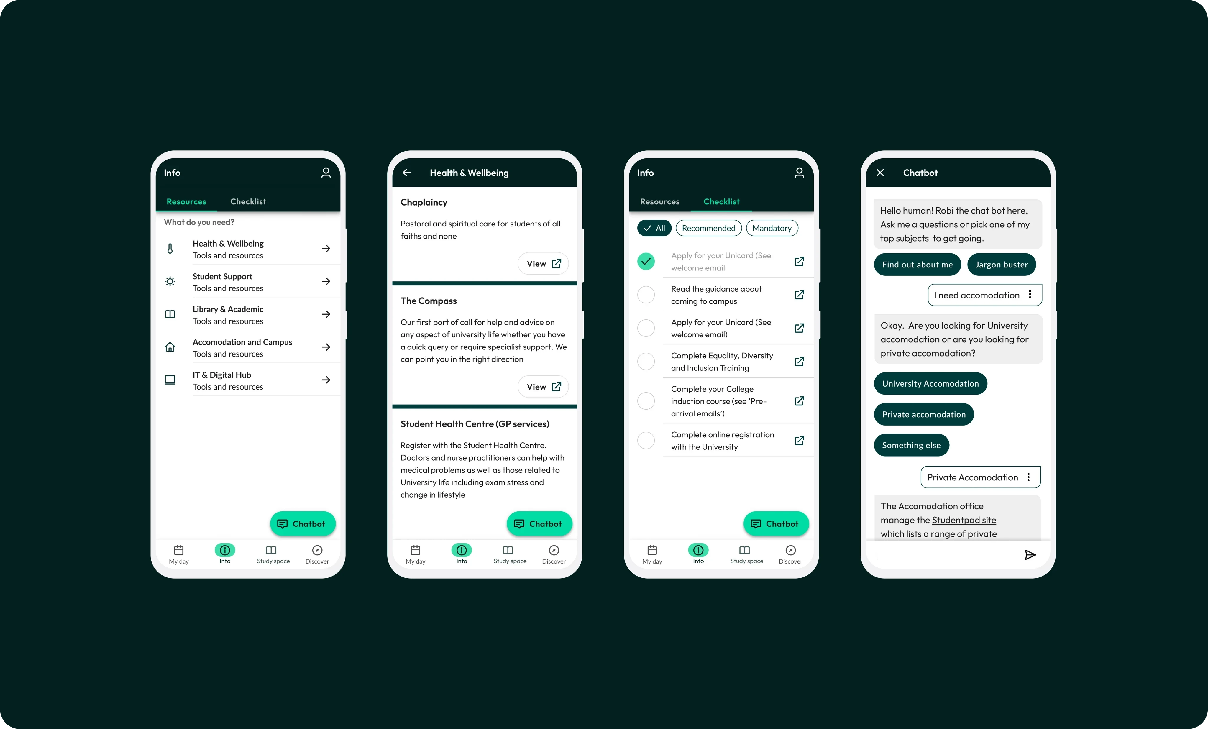
The university had hundreds of existing help pages spread across multiple domains. These weren’t maintained and contained out of date information. This meant that students who needed help were confronted by difficult to navigate digital systems that contained contradictory information. During user research, it was clear that this directly contributed to the low student satisfaction score and high drop out rates across the university.To help alleviate this issue, we looked at how we could improve the information architecture of the existing help pages. We built an information hub on the app by bringing them together into clearly defined themes and areas, such as Health & Wellbeing, or Accommodation and Campus. This enabled students to be supported and empowered them to solve their issues themselves.
We also found that there were several compulsory tasks requested by the University that students needed to complete throughout their studies. For many students this was overwhelming and resulted in long queues at helpdesk across campus. For the most common problems students faced completing these tasks, we created a simple, easy to access checklist that they could return to. This helped them complete compulsory tasks at each stage of their studies, from Freshers week through to graduation. For example, it guided them through applying for their Unicard, completing compulsory training and induction, and completing online registration for the University.
Finally, using Amazon's LEX technology we created a chatbot that would return answers based on any information in Exeter's digital domains. This was an alternative solution to the information hub, for those students who preferred a more interactive interface on the app.
Study spaces
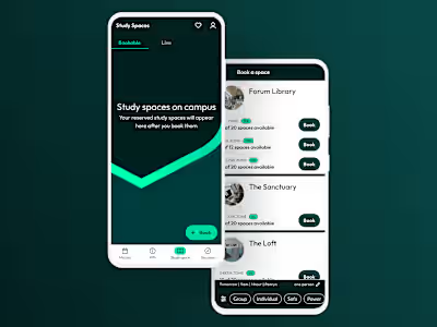
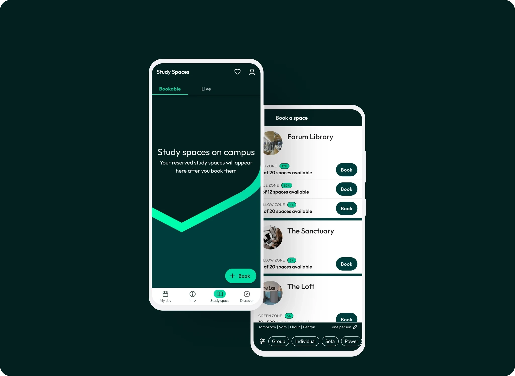
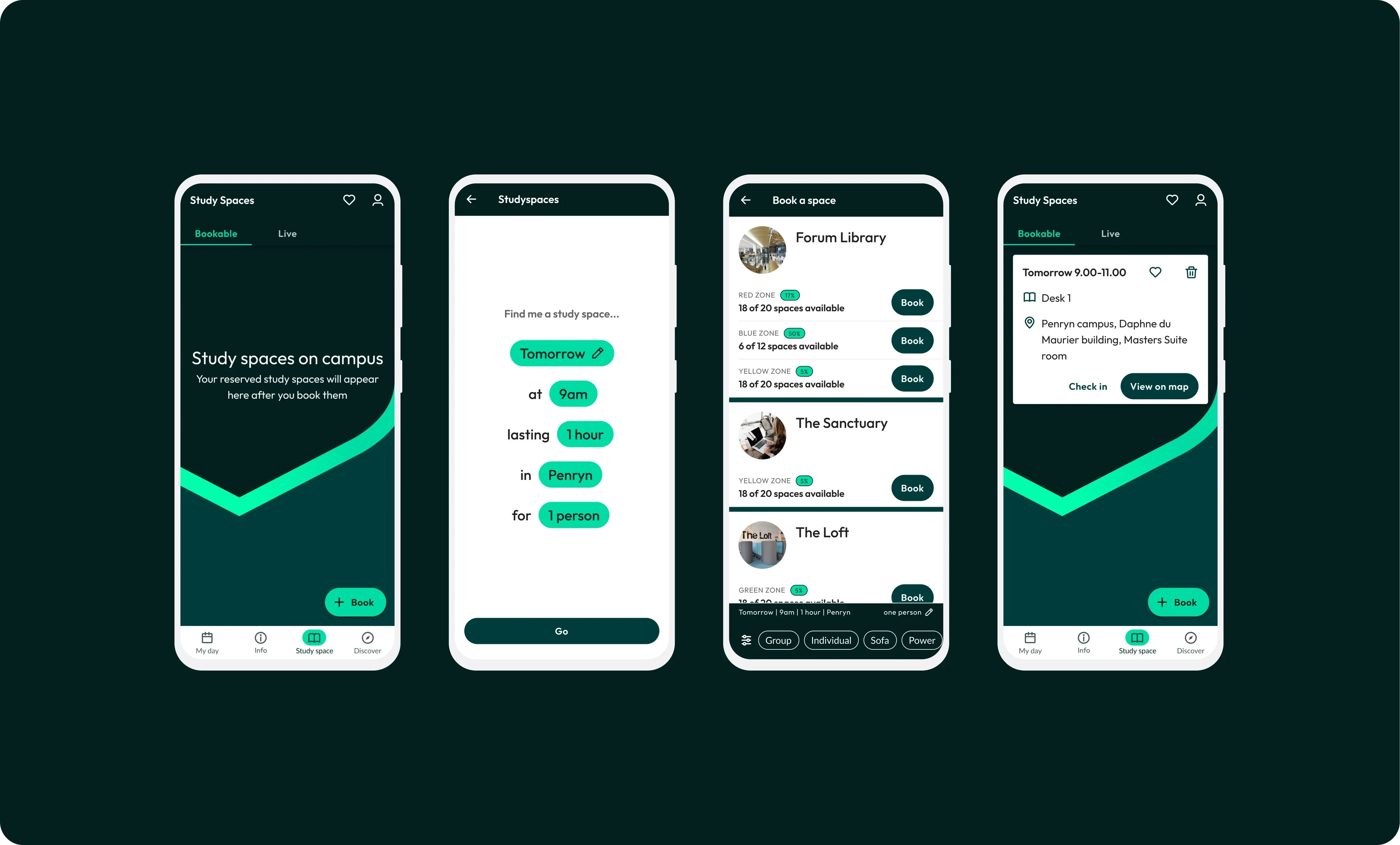
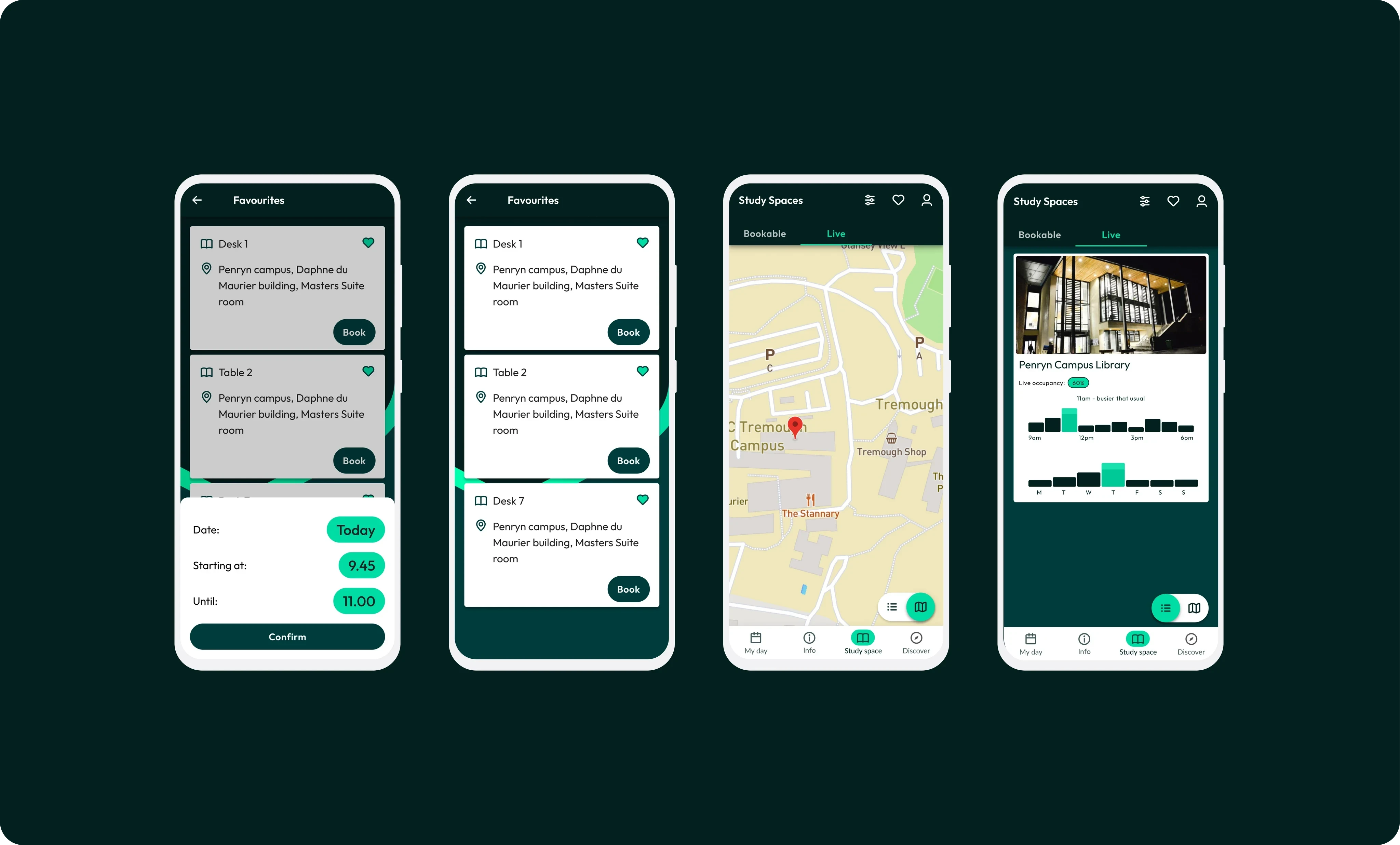
Three core key needs became apparent: 1. When booking a study space students wanted to quickly and easily see what was available, and then be able to filter for any more specific requirements.2. When travelling to campus, they wanted to be able to check how busy each study area would be. They could then determine which area of campus or the library they might travel to.3. To be able to 'favourite' particular study spaces so that they would be quick and easy to book onto again.
In response to these needs, ee mapped out the study spaces and hard coded the facilities for each space into the app. We created a booking system that allowed students to see what spaces were available, how busy the spaces currently were in the ‘Live’ tab, and allowed them to book a study space directly in the app. We also created a ‘Favourite’ feature to allow students to save and quickly rebook their favourite spaces.
Discover
Throughout the research we found that students were often overwhelmed by the university’s communication methods. At this time, the University would send out multiple emails everyday to each student. There was only very rudimentary filtering on which students received what type of information. Through research, we found that 90% of emails a student was receiving were irrelevant to them. On top of this, some of the most important and critical emails were getting lost in the sea of meaningless communications.
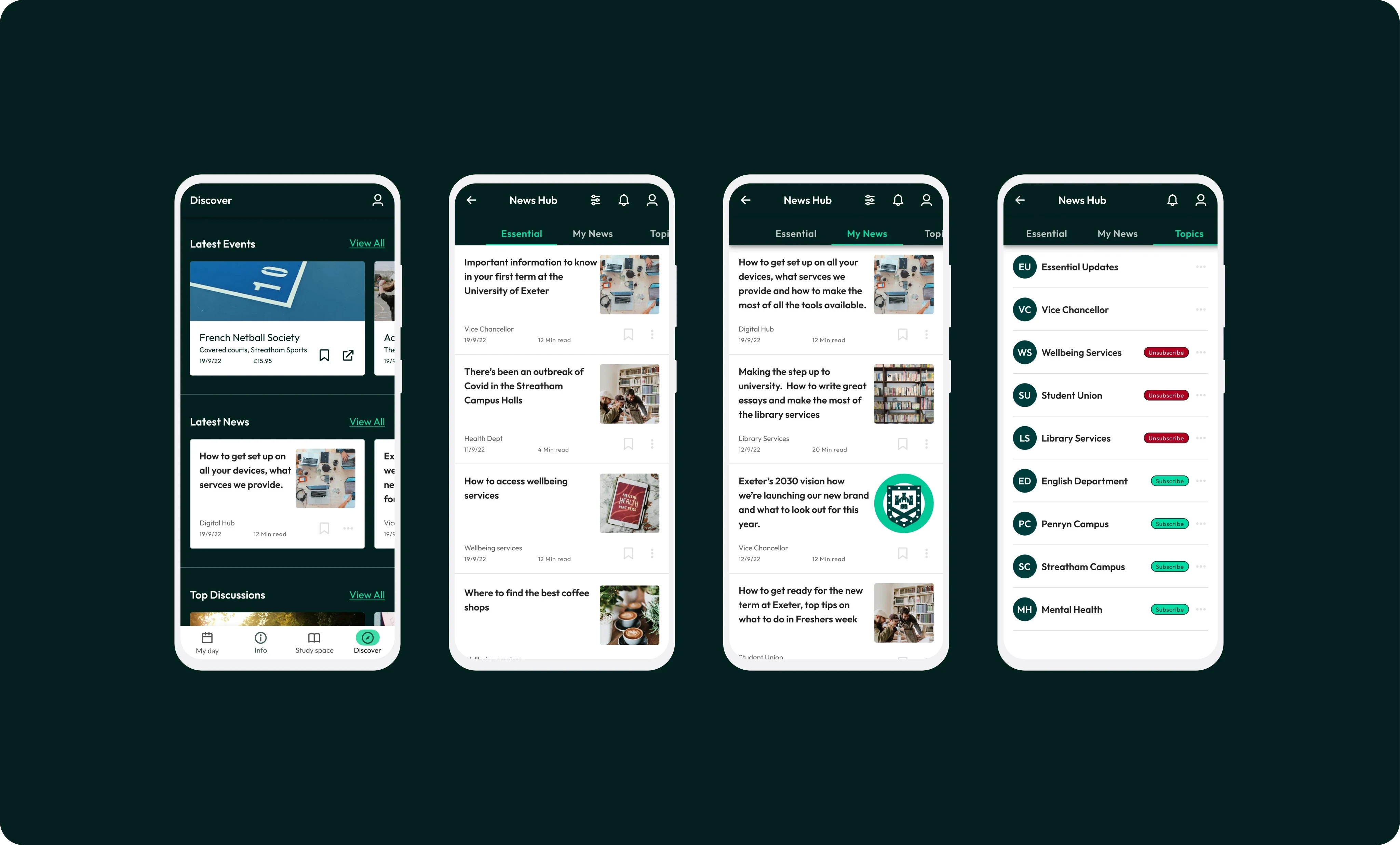
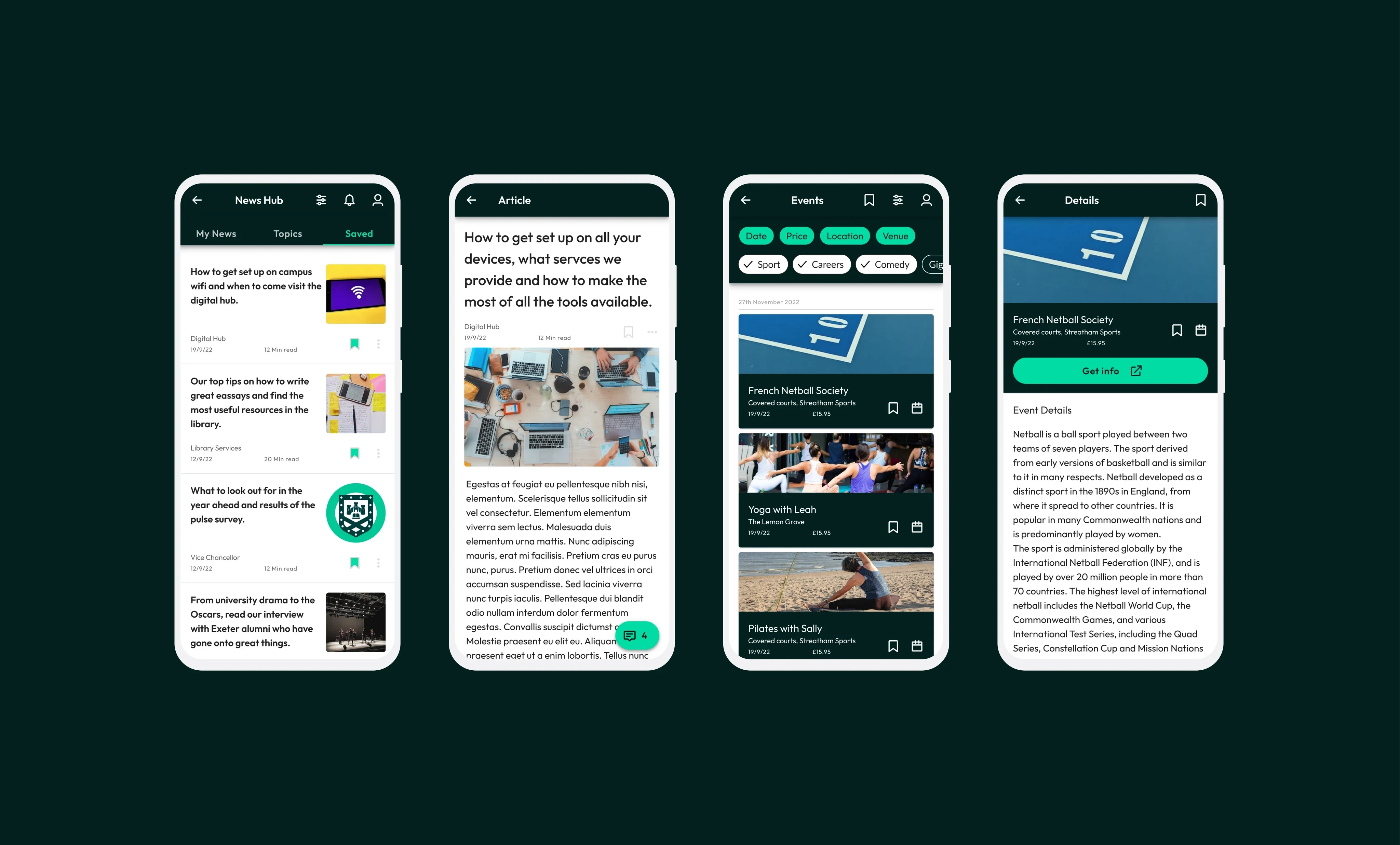
To help alleviate this, we built a news and communications hub on the app. This allows students to follow the channels that are most relevant to them, allowing them to keep up to date with the latest department and society news. We added a feature that gave them the ability to save the most useful articles and updates for later, or to unfollow channels that were no longer useful to them. A separate channel was created for critical university wide communications to ensure these weren't missed.
In addition to the struggles students had keeping on top of university communications, I also found that they were also finding it difficult to find out about all the different events going on across campus. With a student population of over 30,000 the university has an extensive calendar of talks, gigs, comedy shows, societies, sports activities and theatre productions each term. These are all run through a variety of different organisations ranging from the student union, the library, the drama department and directly by the university. Each organisation had separate events listing pages and ticket booking systems. To make it easier for students to find out what was happening across the university, we created an API that would pull in the data from these different systems and display them all in one place, as well as allow students to browse and filter the results.
In my time working with Exeter, we rolled out the University of Exeter app to a beta group of 2,000 students. I trained up two of their graduates to continue working on this product and others in the university’s product roadmap. I also supported during the recruitment process for a permanent designer role in their team. The client hired a new team of permanent developers to continue their digital transformation. I really enjoyed working closely with so many students to understand their complex digital issues. I’m really proud that the app we created has helped so many of them have a much better time at university. I also really enjoyed working so closely with a team of developers and learning about full stack development and agile working methodologies. Key skills learned: Typographic scales, micro ui interactions, rive animation, stakeholder management, flutter development, material design system, agile methodology.
Like this project
Posted Nov 17, 2023
Working as part of an agile team to create a new app for the 30,000 students of the university of Exeter. I worked across UX, UI and branding.
Likes
0
Views
5


