Inverto Tech
Inverto Tech
Brand, Website & Dashboard for innovative climate tech start-up
Inverto tech is an innovative climate tech start up that uses drones to plant, monitor and restore coastal wetlands.
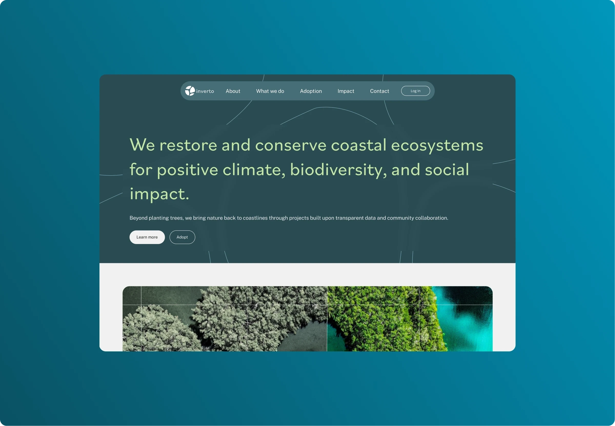
Inverto uses innovative drone technology to rapidly restore coastal mangrove ecoe-systems, they approached us to help them create a compelling brand system in addition to designing their external website and supporters dashboard.
Restoring coastal ecosystems
Inverto are strong believers in the power of technology to help mitigate the worst effects of the climate crisis. They have a unique approach to restoring coastal ecosystems which are one of nature's nest ways of sequestering carbon. They partner with local coastal communities to restore mangrove forests and coastal ecosystems with the use of drones which allows them to plant and monitor mangroves at scale.
Once a suitable mangrove restoration site has been found they map the entire area into 3x3m2 parcels which individuals or businesses can then subscribe to the restoration costs.
A key goal for the landing page is to explain their proposition and drive subscriptions to parcels in their restoration projects.Once a user has subscribed to a parcel/project, they then get access to their own personal dashboard which will give them a detailed and transparent breakdown their support is having across key metrics of carbon sequestered, biodiversity increased and communities supported.
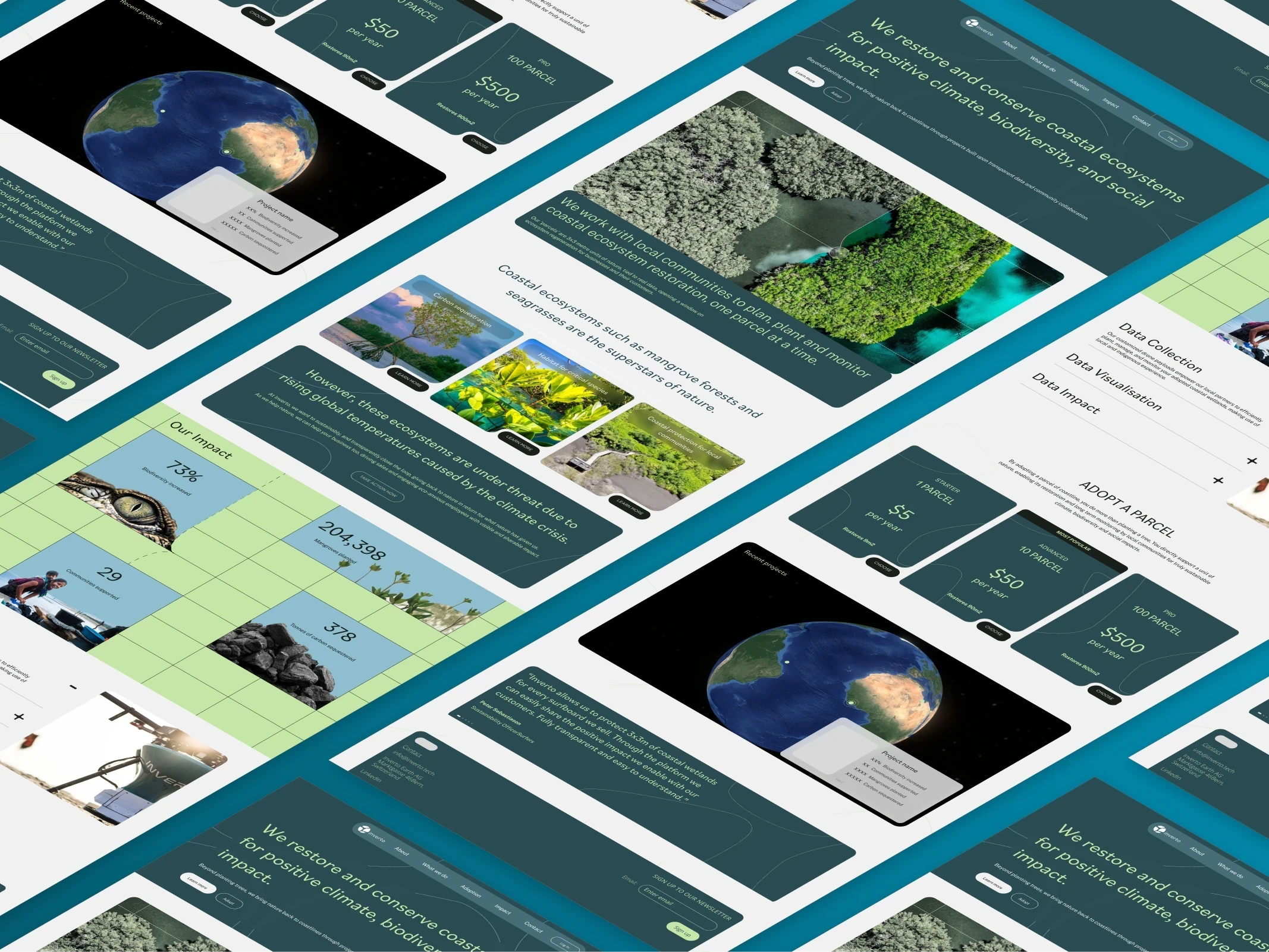
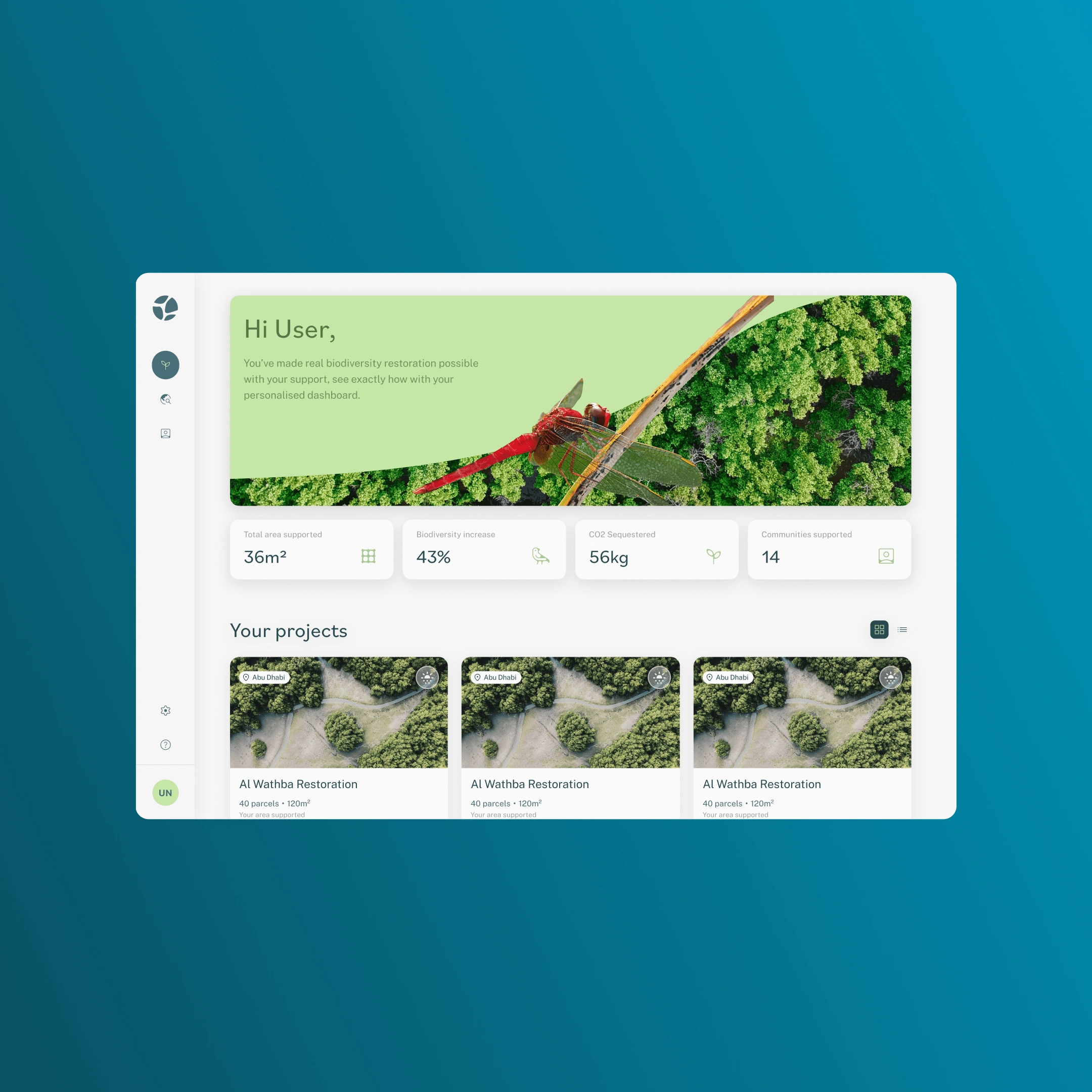
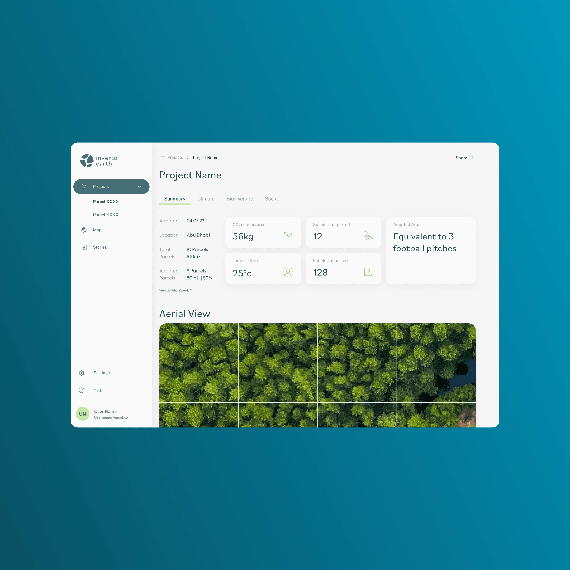
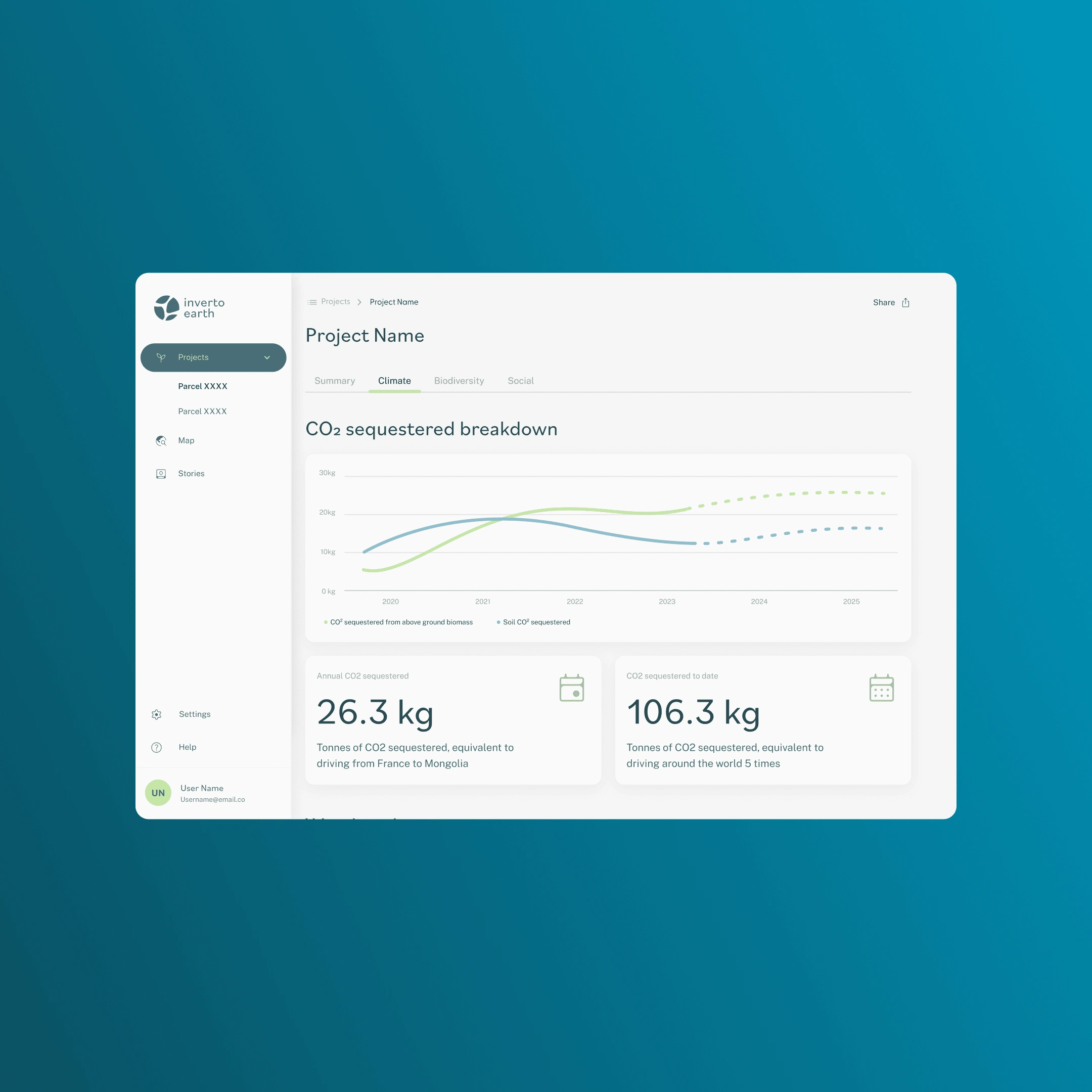
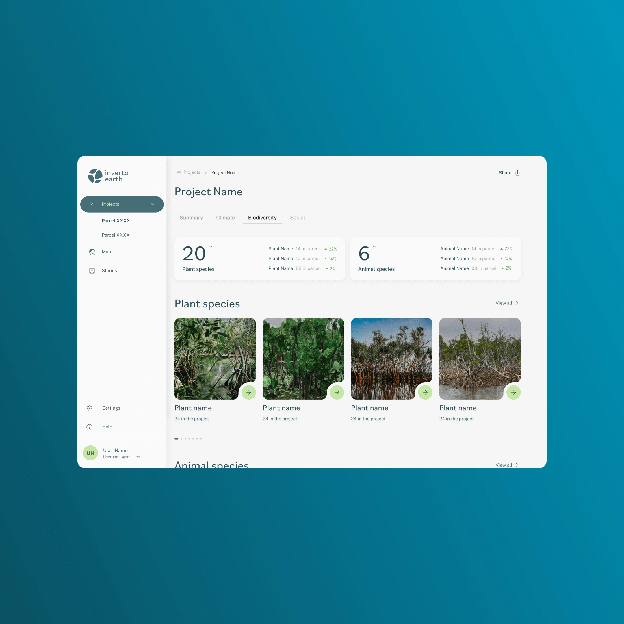
Dashboard - Card Sorting, User Journey and wireframes.
For the dashboard it was important to define exactly what data would be displayed here and the hierarchy of how best to do this. Through a series of workshops we defined the user flow and wireframed the key screens of the dashboard that would allow users to view data from exact parcels they have subscribed to within a project, what the environmental impact of theses parcels have been for carbon sequestration, biodiversity and the social benefit.Through a series of graphs, charts and interactive maps the user will be able to see down to a granular level the impact of their subscription and be able to share this data through an impact certificate.
Like this project
Posted Feb 16, 2024
Inverto tech is an innovative climate tech start up that uses drones to plant, monitor and restore coastal ecosytems. I did UX and UI work to bring this to life
Likes
0
Views
14


