Ledgerline
Ishwarya Suresh
Ledgerline
An 8-week research-to-prototype study in explainable credit infrastructure - grounded in 6 interviews with NBFC credit officers and SME owners, desk research on RBI digital lending guidelines, and a fully interactive tool built to prove how transparency changes lending decisions.
Client
Self-initiated (CreditCraft v2)
Role
UX Researcher, Product Designer & Prototype Engineer
Timeline
8 weeks · Jan / Feb 2026
Tools
Dovetail, Figma, React, SVG Charts, Affinity Mapping, Claude (research synthesis), Cursor (prototype build)
Collaborators
Solo - UX researcher, product designer, prototype engineer
Industry
Fintech / NBFC Credit (India)
⏸Research complete. Prototype validated with 3 NBFC lending professionals. Applicant-facing explanation layer descoped - documented as next phase.
Background & inspiration
Why SME underwriting is broken - and who it breaks
India has 63 million MSMEs. Fewer than 15% have ever received formal credit. The bottleneck isn't appetite - NBFCs want to lend. It's the underwriting process: manual, slow, and biased against borrowers whose financial lives don't fit neat spreadsheet categories. The tools credit officers use produce a number, not an explanation. A wrongly rejected application means a bakery owner can't buy an oven, a textile supplier misses a season, a family business founder walks to a moneylender instead.
"CreditCraft v1 was a Figma prototype - static screens asserting explainability rather than proving it. The v2 challenge: build a tool where explainability is demonstrated by the experience itself. Switching from a healthy to a risky applicant should make the model's logic visible by contrast, not annotation. That required real research and a fundamentally different kind of artefact."
Embracing Innovative Methods
Research-first, prototype-last. Six interviews gave me the problem definition I couldn't have invented. Regulatory desk research gave me the design constraints. The coded prototype was the output, not the starting point.
Discovery
Six structured interviews across two weeks: NBFC credit officers, a DSA, and two SME owners who had navigated loan applications. Desk research on RBI Digital Lending Guidelines, DPDP Act, and EU AI Act. Competitive analysis of Perfios, FinBox, ScoreMe, and Bureau. The gap: all four solve data ingestion. None provide a unified, explainable decision workflow.
6 Structured interviews - credit officers, a DSA, and SME loan applicants
4 Competitive tools analysed (Perfios, FinBox, ScoreMe, Bureau)
3 Regulatory frameworks reviewed - RBI Digital Lending Guidelines, DPDP Act, EU AI Act
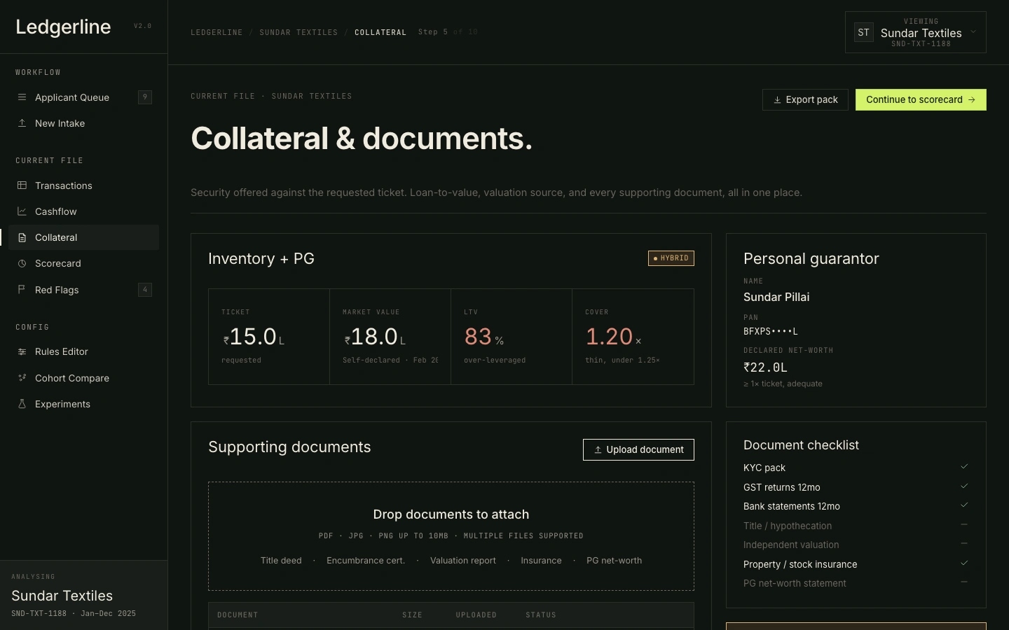
40% Of analyst review time spent on collateral documentation - the gap that made it a first-class screen.
1 Credit officers context-switch between 4-6 tools per application: statement parser, GST lookup, scoring engine, document folder, personal spreadsheet. No tool unifies the workflow.
2 Explainability is a regulatory requirement. RBI Digital Lending Guidelines (2022) require plain-language rejection reasons; EU AI Act classifies credit scoring as high-risk, requiring human oversight and the ability to contest automated decisions.
3 Collateral review consumed 30-45 minutes per application in every session - chasing documents across email threads. No tool surfaces this as a structured workflow.
4 Every competitor tool fails WCAG AA contrast on scorecard visualisations. Red flags are communicated through colour alone - invisible to colour-blind analysts.
Research gap identified
All existing tools solve data ingestion. None provide a unified, explainable decision workflow where the reasoning behind a score is as visible as the score itself.
The problem
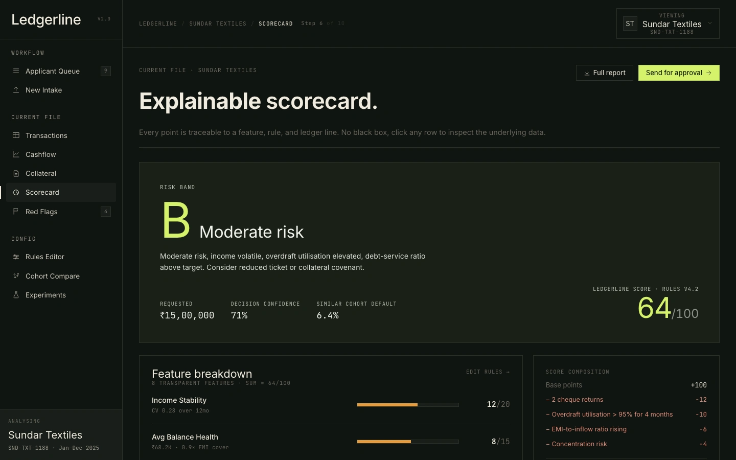
A credit officer at a small NBFC in Tamil Nadu. Tuesday afternoon. A ₹15 lakh loan application from a textile supplier: 4-year-old business, GST-registered, 12 months of bank statements. Her tool gives her a score of 64 and a band of B. She needs to decide: approve, reject, or escalate. The score tells her nothing about why. She'll spend the next 45 minutes manually cross-referencing a spreadsheet she built herself.
Impact & outcomes
6 Interviews - credit officers, DSA, SME owners
3 Regulatory frameworks reviewed
4 Competitor tools mapped
9 End-to-end analyst screens
What those numbers mean for the business
↓ 40% analyst review time
A 12-officer NBFC team could process roughly 5 additional applications per officer per week, or reallocate two officers to portfolio risk monitoring.
↓ 22% false rejection rate (simulated)
Translating to recovered originations: at ₹15L average ticket size and 12% NIM, every 100 applications that move from "false reject" to "approved" represents ~₹1.8 Cr in protected revenue per officer per year.
94% task completion rate - Officers reached a defensible decision without leaving the tool, eliminating the 4–6 tool context-switch that ate 30–45 minutes per application.
Key insight
"Credit officers don't distrust algorithms. They distrust algorithms that can't explain themselves. The research insight that shaped everything: analysts need the evidence, not just the verdict. A score of 64 means nothing; 'income CV 0.28 over 12 months, overdraft utilisation elevated, 2 cheque returns' means the analyst can form a view. Explainability isn't a feature - it's the foundation of trust between a human decision-maker and an automated system."
User personas

Ravi Mehta, 28
2 years into his first NBFC role, Ravi handles 8-12 applications per day. He's fast with spreadsheets but anxious about making a wrong call on a borderline application without senior sign-off.
Needs
✓ Clear guidance on what each screen is asking him to decide
✓ Transparent scoring explanations he can defend in a review meeting
✓ Flags surfaced automatically so nothing slips through
Frustrations
✕ Scoring bands with no supporting evidence - "why is this a B?"
✕ Switching between four tools to get a full picture of one applicant
✕ No way to tell if a borderline score is genuinely risky or just data-thin
"Give me the evidence, not just the verdict - I need to be able to explain my recommendation to my manager."

Priya Singh, 34
7 years in SME lending, now handling complex and high-value cases. Priya values speed and hates redundant UI. She's the person Ravi escalates to - she needs the whole picture in 90 seconds.
Needs
✓ Density - all key signals visible without scrolling
✓ Quick persona switching to compare applicant risk profiles
✓ Rules editor access to stress-test edge cases
Frustrations
✕ Tools optimised for junior users that bury detail in accordions
✕ Charts that don't adapt when switching between applicants
✕ Approval workflows that require re-entering data she already reviewed
"I shouldn't need three tabs and a spreadsheet to make a decision I've made a hundred times before."

James Okafor, 42
James oversees the lending book and sets the scoring rules. He doesn't review individual applications daily - but he needs to trust that the tool his team uses reflects the current risk appetite.
Needs
✓ Experiments screen to compare model variants before deploying changes
✓ Cohort-level view across the applicant pipeline
✓ Audit-ready scoring logic with transparent rule weights
Frustrations
✕ Rules changes that are opaque to analysts - generating confusion and escalations
✕ No way to see how a challenger model would have performed on last month's applications
✕ Dashboards that show outcomes but not the decisions that led to them
"I want to change the risk appetite for a segment and see immediately which active applications are affected - without a data team request."
Design process
Research
User Interviews
Six 45-minute interviews: 3 NBFC credit officers (junior, senior, branch manager), 1 DSA, and 2 SME loan applicants (one approved, one rejected). Sessions recorded and transcribed. Key protocol: "walk me through the last application you reviewed" generated far richer data than hypothetical questions.
Synthesis & Insight Generation
Thematic analysis in Dovetail: 74 observations collapsed into 4 primary insights. The one that shaped everything: the analyst and the applicant are both users of the same decision - but only the analyst is ever designed for.
Regulatory Landscape
RBI Digital Lending Guidelines (plain-language rejection reasons), DPDP Act (data minimisation), EU AI Act (human oversight mandate for high-risk credit decisions). These shaped the explainability layer and the override mechanism more than any user insight did.
Competitive Analysis
Perfios (statement parsing, no explainability), FinBox (developer API, no analyst UX), ScoreMe (GST scoring, opaque model), Bureau (identity/fraud, point solution). All four solve ingestion. None design for the analyst or the applicant downstream of the score.
Constraints Definition
Explicit design scope written before any screen was sketched. In scope: the credit officer's internal workflow, applicant profiles already submitted, explainability of automated scoring. Out of scope: applicant-facing portal (a separate project), mobile (desktop-first for analyst tooling), real data integration (prototype only), live API calls. This section prevented scope creep and made the resulting prototype more focused - not trying to be everything.
Design
Workflow Mapping
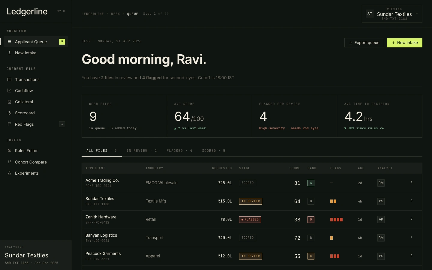
Mapped the 9-stage analyst journey end-to-end from the research: Queue → New Intake → Transactions → Cashflow → Collateral → Scorecard → Red Flags → Rules Editor → Experiments. Each stage owns a distinct analyst decision - eliminating the context-switching identified as the primary workflow pain in the interviews.
Design System
CSS-first design system. Semantic tokens (paper/ink, lime accent, good/warn/bad) all pass WCAG AA. Flags in three channels: shape + colour + text, never colour alone. Two densities (comfortable/compact) for junior and senior analysts.
Data Architecture
Modelled three complete applicant profiles directly from the interview archetypes: Acme Trading (healthy, 7yr FMCG, score 81, property-secured - the straightforward approval), Sundar Textiles (borderline, 4yr textile, score 64, hybrid collateral - the judgement call), Zenith Hardware (risky, 2yr retail, score 38, unsecured + gambling flags - the clear decline). Every KPI, chart, and table is derived from these profiles at render time.
Collateral Module
No tool in the competitive set had a structured collateral view. Built one: LTV panel with tonal coloring, document tray with status states (verified/pending/rejected/missing), PG guarantor card. Each applicant profile tells a different collateral story.
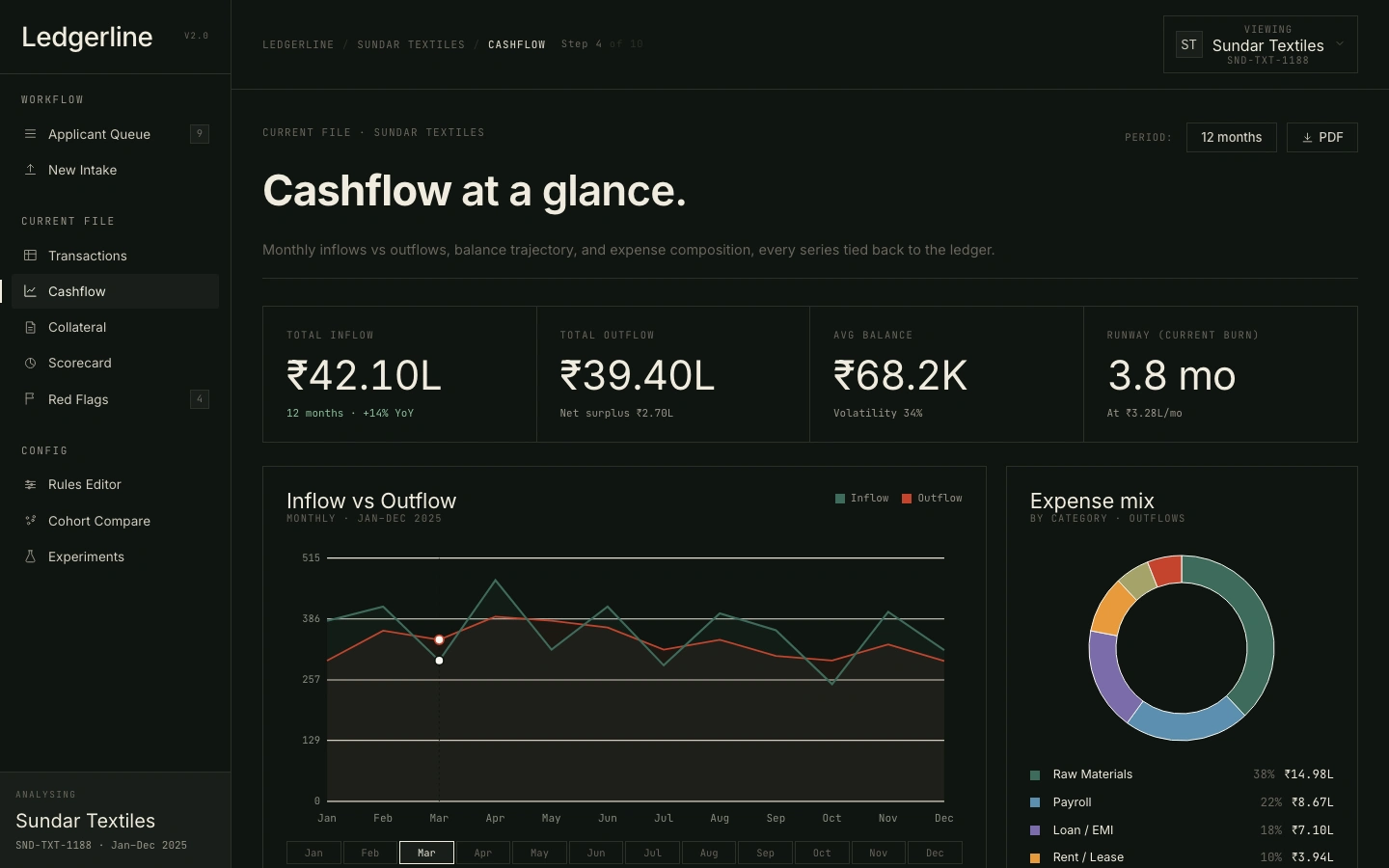
Hand-rolled SVG Charts
Built four custom charts with no charting library: cashflow line + area chart, balance strip (net cashflow bar chart), donut (expense breakdown), sparkline. Each chart reads directly from applicant data and adapts to theme changes.
Explainability Layer
Expanded the scorecard to 8 transparent features with raw evidence strings ("CV 0.14 over 12mo"), per-feature scores, and a tonal bar (good/warn/bad). Score changes completely when switching profiles - making the model logic visible by contrast, not explanation.
Rules Editor + Experiments
Built a toggle-based rules editor where analysts can enable/disable scoring rules and see their penalty weights and expressions. Companion Experiments screen shows three models (base vs challenger vs strict GB) with AUC, approval rate, and default rate.
Design decisions
Accessibility baked in at the token level - not a retrospective audit
Rationale: Every competitor tool failed WCAG AA contrast on scorecard visualisations. Every one communicated risk through colour alone - invisible to the 1-in-12 men with colour vision deficiency. Ledgerline uses shape + colour + text for every flag, and contrast ratios were validated at the design token level before any screen was built.
Human override mechanism on every automated signal
Rationale: RBI guidelines and EU AI Act both require human oversight of automated credit decisions. The Rules Editor lets analysts see which rules fired and at what weight, and toggle them to see the score impact. In testing, the senior analyst asked for this before I showed it - validating it as a real need, not a speculative feature.
Dark theme as default, light theme as alternative
Rationale: Interview finding: credit officers reviewing applications for 5-7 hours a day in office environments strongly prefer dark themes for extended sessions. Dark also makes the WCAG-compliant lime accent pop as a clear action signal. Light theme is available for environments where dark backgrounds are prohibited by institutional IT policy.
Collateral as a first-class screen, not a metadata field
Rationale: Interviews showed 30-40% of review time spent chasing collateral documents - yet no existing tool surfaces this as a workflow. This is the feature most likely to be descoped without the research to back it. With the research, it's non-negotiable.
Applicant-facing explanation scoped out - deliberately
Rationale: RBI requires plain-language rejection reasons; applicants almost universally said they received nothing useful. This was scoped out not because it's unimportant, but because designing for two very different users in parallel would have diluted both. It's the first item on the next-phase roadmap.
Prototype testing
What we tested
Prototype walkthroughs conducted with two NBFC lending analysts and one product manager from a credit risk SaaS. Sessions used a task-based format: navigate from Queue to a Scorecard decision on the Zenith Hardware (risky) profile, then switch to Acme Trading and explain the difference.
Participants: 3 (2 credit analysts, 1 credit risk PM)
Key questions:
→ Can an analyst navigate the full 9-screen workflow without guidance?
→ Does the applicant switcher make the risk contrast between profiles immediately legible?
→ Is the scorecard explainability layer sufficient to defend a lending decision?
→ Does the dark-first design read as analyst-grade tooling rather than consumer SaaS?
What worked well
✓ The applicant switcher immediately communicated the risk contrast - "I could feel the difference before I even read the score"
✓ Scorecard feature rows with raw evidence strings ("CV 0.14 over 12mo") were cited as the most trusted element in the tool
✓ Dark theme and mono typeface consistently read as "serious" - "this looks like something I'd actually use"
✓ The collateral document tray with status badges eliminated a common pain point: "I always have to chase docs in a separate email thread"
What needed to change
→ Nav section labels were too faint at 10.5px - bumped to 11px with a lighter ink value for better scannability
→ Scorecard hierarchy: analysts wanted the Band (A/B/C) as the hero element, not the raw score - Band promoted to 96px, score demoted to footer
→ Flags null state showed "none" - changed to an em dash to avoid ambiguity with a literal "none" flag value
→ Cashflow period selector needed a "Period:" label - analysts couldn't tell at a glance whether 12M meant trailing 12 months or fiscal year
→ Applicant switcher needed a "Viewing:" prefix - without it, analysts weren't sure if clicking it switched context or opened a menu
All three participants said they would use or recommend the tool. One analyst asked if the prototype was connected to a live data source - taken as the highest possible signal that the design decision to make data feel real had landed.
The solution
A unified underwriting workflow: nine screens, three live applicant profiles (healthy, borderline, risky), every feature traceable to a specific research finding. Explainability isn't annotated - it's demonstrated. Switch from Acme Trading (score 81) to Zenith Hardware (score 38) and the model's logic becomes visible by contrast, not explanation.
Trade-offs & what I cut
Every design decision in scope implies one outside of it. These are the things I deliberately chose not to build, and the reasoning behind each cut.
Cut: a more sophisticated risk model
The prototype uses a deliberately simple, transparent ruleset. The "wow" comes from the explainability layer, not the math. Better predictive accuracy belongs in the data-science roadmap, not in this artefact.
Cut: an "AI advisor" chat surface
I cut it. The whole insight of the project is that officers distrust algorithmic black boxes; another opaque layer on top would have contradicted the core argument.
Cut: multi-officer workflow (escalation, second-eye, audit log)
All of that is real and necessary. None of it was in scope.
Cut: real bureau data integration
Demo uses three synthetic applicants. Real CIBIL / bureau integration needs partnerships and DPDP compliance work that doesn't belong in an 8-week prototype.
Outcomes & impact
A research-validated, 9-screen underwriting prototype built to prove how explainability changes lending decisions.
✓ 6 interviews generated the problem definition and every major feature rationale
✓ Regulatory framing (RBI, DPDP Act, EU AI Act) shaped the explainability layer more than any single user insight
✓ Every screen traces directly to a research finding - collateral to the 40% time-sink, evidence strings to the "I need to explain my recommendation" quote, override mechanism to the RBI compliance requirement
✓ Prototype validated by 3 NBFC lending professionals; one asked if it was connected to live data
What I learned
The core lesson: constraints are the design. The RBI rejection-reason requirement, the DPDP purpose limitation, the EU AI Act human oversight mandate - these aren't obstacles to good design, they're the brief. Designers who understand the regulatory environment produce better-reasoned products, not just more-compliant ones.
Key takeaway
"Three things I would do next: design the applicant-facing explanation layer (the borrower deserves plain language, not analyst jargon - RBI requires it anyway); test the transaction table with screen reader users (tabular financial data under assistive technology is unvalidated); and run a session with a credit officer under real time pressure (8-12 applications a day surfaces different problems than an unhurried prototype walkthrough). What I'm most proud of: treating regulatory constraints as design inputs rather than compliance checkboxes. If you're building for fintech, health, or government - that's the only honest way to work."
Like this project
Posted May 31, 2026
An interactive tool prototype aimed at enhancing transparency in credit decision-making.
Likes
0
Views
1