Kaizen: Personal Finance OS
Ishwarya Suresh
Kaizen: Personal Finance OS
A research-informed personal finance OS connecting budget, goals, and auto-investing. Three visual directions, fully designed from marketing site to onboarding to dashboard.
Client
Self-initiated concept
Role
UX Researcher, Product Designer & Prototype Engineer
Timeline
8 weeks · 2026
Tools
Figma, FigJam, CSS design tokens, Claude (research drafting), Cursor (prototype build)
Collaborators
Solo designer
Industry
Consumer fintech
Design complete across all screens. Usability testing with target cohort is the defined next step.
View live prototype Mobile app version in progress
Background & inspiration
Why consumer fintech is fragmented, and who it fails
Consumer fintech is a solved problem in parts. YNAB is the best budgeting tool ever built. Wealthsimple makes index investing frictionless. Monzo has redesigned what a bank account feels like. But none of them talk to each other. A 27-year-old designer in London who budgets in YNAB, invests with Wealthsimple, and tracks a house-deposit goal in a Notes doc is using three tools to do one job: build wealth deliberately. The gap isn't a missing feature. It's a missing product category.
"The design question behind Kaizen: what does a personal finance product look like when it's designed as a coherent system, not assembled from separate tools? That starts with understanding why every existing tool fails the same user in the same way."
Embracing Innovative Methods
Audit-first, design-last. A competitive audit of four leading tools provided the problem definition. Three personas grounded every design decision. Three distinct visual directions were explored and pressure-tested before narrowing to a single design language.
Discovery
Competitive audit of four leading consumer fintech products: Wealthsimple, Betterment, YNAB, and Monzo Investments. Mapped onboarding flows, primary navigation, data architecture, and visual identity for each. Identified the shared failure pattern driving the project brief.
4
Apps audited: Wealthsimple, Betterment, YNAB, Monzo Investments
0/4
Products that connect budget, goals, and investing in one interface
3
Visual directions explored before narrowing to the Quiet Premium theme
12
Primary user flows mapped across the four audited products
Competitive audit
Capability | YNAB<br>Budgeting | Wealthsimple<br>Investing | Betterment<br>Robo-advisor (US) | Monzo<br>Banking + Investing |
|---|---|---|---|---|
Budget view | ✓Yes | ✕No | ✕No | ◐Partial |
Goal tracking | ◐Partial | ◐Partial | ✓Yes | ✕No |
Investing | ✕No | ✓Yes | ✓Yes | ◐Partial |
Budget / invest link | ✕No | ✕No | ◐Partial | ✕No |
Design maturity | ◐Partial | ✓Yes | ✓Yes | ◐Partial |
YNAB: Best-in-class budgeting
Most powerful budgeting tool in the category. Zero investing functionality. Users who invest separately carry permanent cognitive overhead across two disconnected tools.
Wealthsimple: Goals are decorative
Goal-setting is disconnected from spending. No budget visibility, no savings rate. You can create a "house deposit" goal, but the app has no idea if you can afford it.
Betterment: Closest to unified, still siloed
Closest to a unified product. But goal-based investing has no connection to a budget view. Discretionary spending is invisible to the investment layer.
Monzo: Passive-first, deliberately lightweight
Three ETF baskets, no goals, no budget integration, no data density. Feels like a bank extension, not a financial product built for someone who takes money seriously.
Research gap identified
All four tools solve one job well. None of them connect budget, goals, and investing into a single coherent practice. A user who wants all three either manages three apps, or quietly abandons the one that matters most.
The problem
Freya, 27. Junior product designer. Three apps open: YNAB for budget tracking, a Wealthsimple ISA she opened eighteen months ago and hasn't touched since, and a Notes doc where she tracks her Tokyo trip goal. None of them talk to each other. She knows she should be investing more. She doesn't know how much she can afford. She's not going to open a fourth app to find out.
How might we design a personal finance OS that treats money as a long-term practice, not a daily anxiety, and gives users budget, goals, and auto-investing in one quiet, confident interface?
Impact & outcomes
Competitor products audited: 4 apps, 12 flows
3 themes explored: 3 visual directions explored
8 product screens designed: Every one
Design decisions traced to research. What those numbers mean for the business.
3 visual systems; onboarding → dashboard.
Reduced concept-to-pressure-test cycle from weeks to days, three full visual directions, each carried through onboarding to the dashboard, before committing to one design language. The work most fintech teams ship as a Figma mockup, shipped as a working browser product.
0 / 4 competitors connect budget, goals, and investing. The competitive audit defines the product opportunity in one number: a clear adjacent-category gap, not a feature gap. Validated as a real white-space, not just a designer's hunch.
Key insight
"After mapping onboarding and primary flows across four leading tools, the pattern was consistent: each one optimises for a single job. YNAB is the best budgeting tool in the world, and completely blind to investing. Wealthsimple handles portfolios beautifully, with no visibility into your rent. The gap isn't a missing feature. It's that no product connects the three financial practices into one coherent ledger. Users who want all three either use three apps, or give up on one of them."
User personas

The Passive Investor
Freya Walsh, 27
Junior product designer at a London agency. Earns £42k. Has YNAB but abandoned it after three weeks, too granular for how she actually thinks about money. Has a Wealthsimple ISA she opened after a podcast and hasn't touched in 18 months. Tracks a Tokyo trip goal in a Notes doc.
Needs
✓One place that shows her full financial picture without requiring a spreadsheet
✓Auto-invest she can configure once and forget, she doesn't want to think about it weekly
✓A product that feels designed, not fintech-ified; she'll abandon anything that looks like a bank
Frustrations
✕Switching between three apps to construct a picture she can never quite see
✕Guilt about the ISA she's been meaning to top up since January
✕Money apps that feel either clinical and overwhelming or simplified to the point of uselessness
"I just want to know: am I on track? And if not, what do I actually need to do differently?"

The Data-Hungry Saver
Marcus Osei, 31
Software engineer. Earns £78k. Saves inconsistently, good months and bad months, no system. Uses Monzo as his main account, has a S&S ISA from 2022 he hasn't added to. Budgets by checking his balance every few days. Has no idea what his net worth actually is.
Needs
✓A single dashboard that calculates net worth automatically across accounts
✓Meaningful data density, he's technical and wants to see the numbers, not a simplified score
✓Goal-based auto-invest that requires no manual action once configured
Frustrations
✕Monzo shows transactions but not his portfolio; Wealthsimple shows his portfolio but not his life context
✕No tool shows him the whole picture in one place
✕Budgeting "by feel" works until it doesn't; he's had three months this year where he saved nothing
"Tell me my number. Tell me if I'm behind. Tell me what to do, and then leave me alone."

The Paralysed High-Earner
Aisha Patel, 34
Senior management consultant. Earns £95k. Saves aggressively, into a 1.5% APY savings account, because she's been meaning to move it to a S&S ISA for two years and hasn't. Has a Hargreaves Lansdown account she doesn't understand how to use. Cares about product quality; she'll abandon anything that looks cheap.
Needs
✓Decision-reducing interface; a few portfolio options, not five hundred funds
✓A product that earns aesthetic trust before it earns financial trust
✓Clear evidence that her money is growing relative to a goal she actually has
Frustrations
✕HL feels like 1998. Every robo-advisor marketing site looks identical.
✕No product has ever earned her visual trust, and if it doesn't look right, she won't enter her bank details
✕She knows she's losing thousands per year to inflation sitting in a savings account. She still hasn't moved it.
"Give me one interface that looks like it was designed for someone who cares about quality, and I'll actually use it."
Design process
Research & Direction
Competitive audit
Mapped onboarding and primary flows across Wealthsimple, Betterment, YNAB, and Monzo Investments. Documented data architecture, visual language, and primary navigation for each. Identified the shared failure pattern: every tool optimises one job and is blind to the other two.
Persona development
Built three composite archetypes from the audit findings and target demographic research: Freya (passive investor, 27), Marcus (data-hungry saver, 31), and Aisha (paralysed high-earner, 34). Each represents a distinct failure mode in existing products and a distinct design requirement.
Visual direction exploration
Explored three visual directions: Editorial (warm bone + ember red), Quiet Premium (onyx + periwinkle, surgical sans-serif), and Confident Warm (terracotta + sage). Built all three as live, toggleable CSS themes sharing one token contract, so the comparison is interactive rather than static.
Design system
Design language & token system
Defined a three-theme design language covering type scale, spacing, radii, motion, and full surface palettes. Each theme shares the same structural decisions, swapping only the surface palette. One design system, three distinct visual personalities.
Component library
Designed a full component set in Figma: wordmark (3 variants), money display, sparkline, donut chart, bar chart, area chart, progress bar, avatar, and a 20-icon set. Every component is theme-agnostic, consuming design tokens rather than hardcoded values.
Marketing site
Designed a full marketing page addressing Aisha's trust requirement: editorial hero with product data artefact, feature grid, pricing panel, security section, testimonials, and FAQ. Every layout decision prioritises visual credibility before financial commitment.
Core product, 6 screens
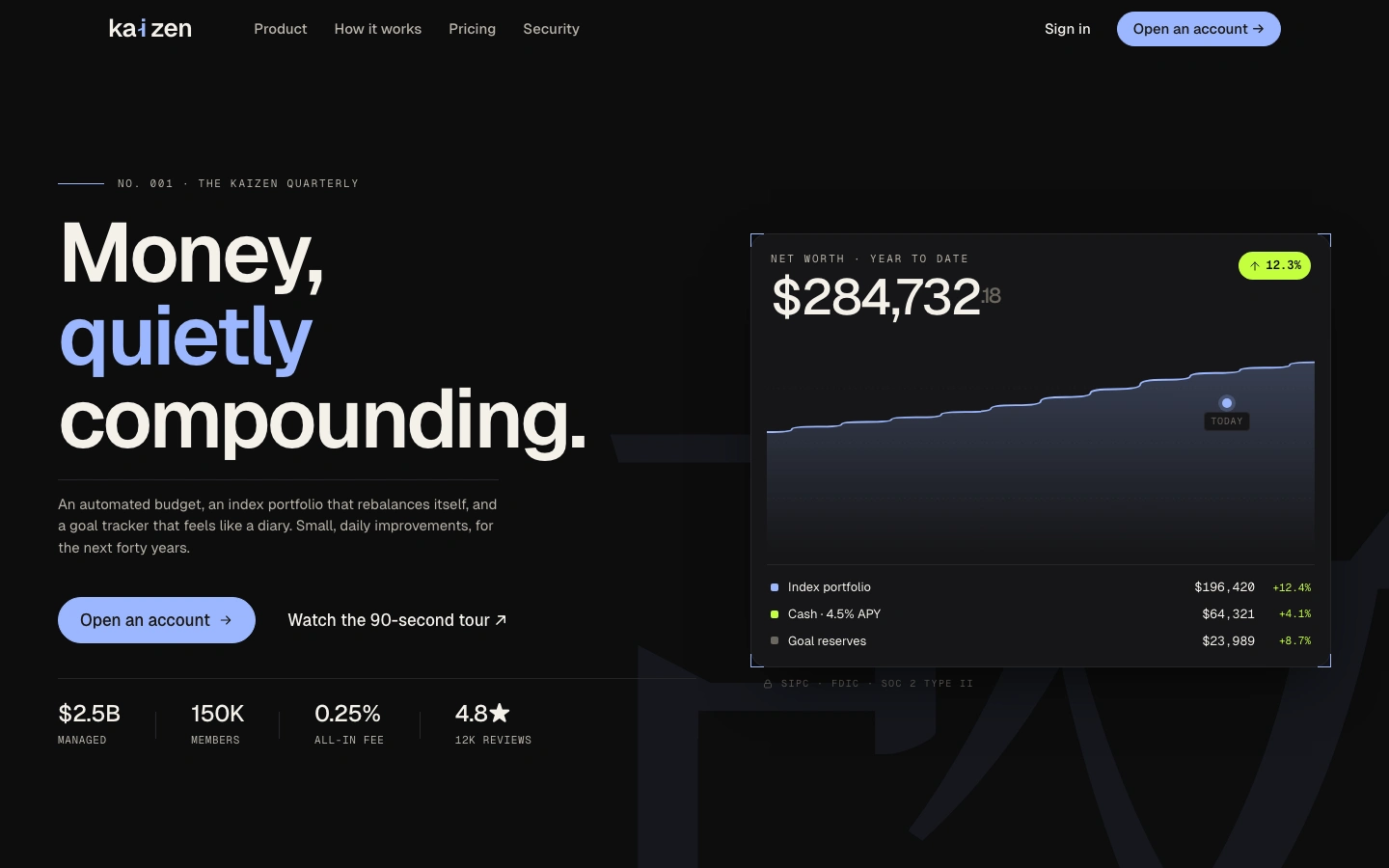
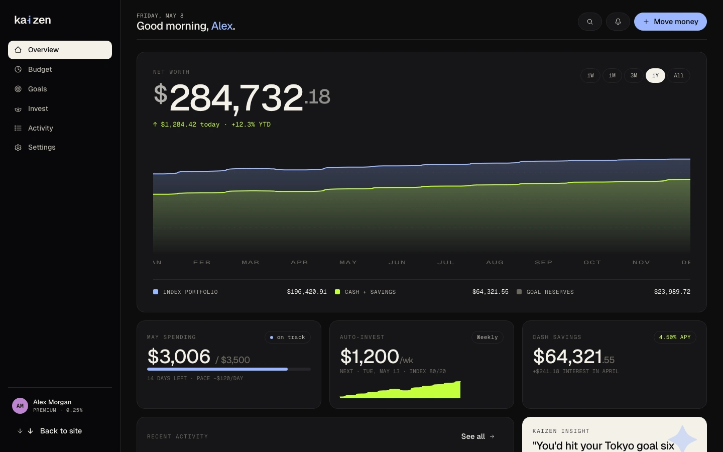
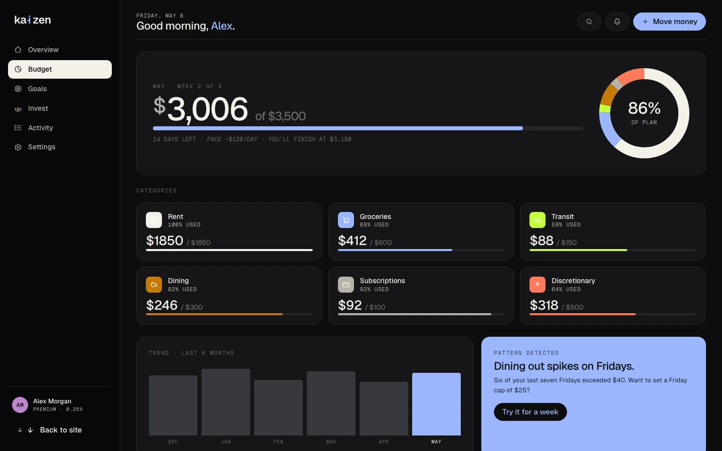
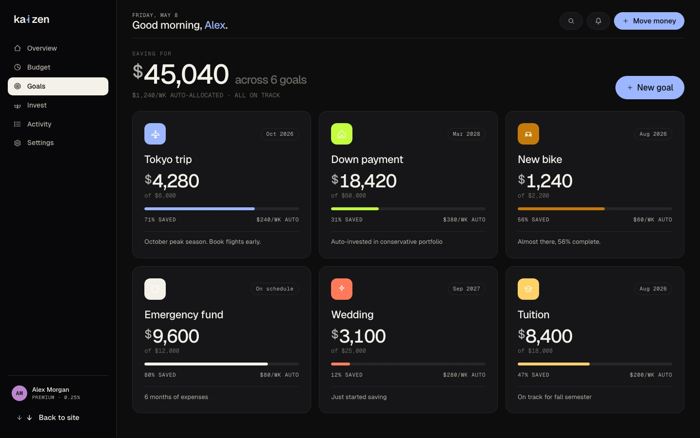
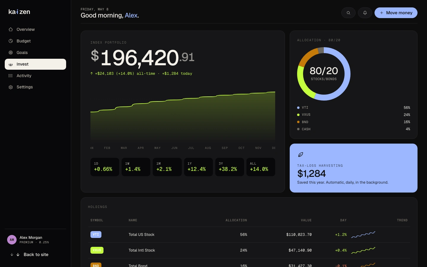
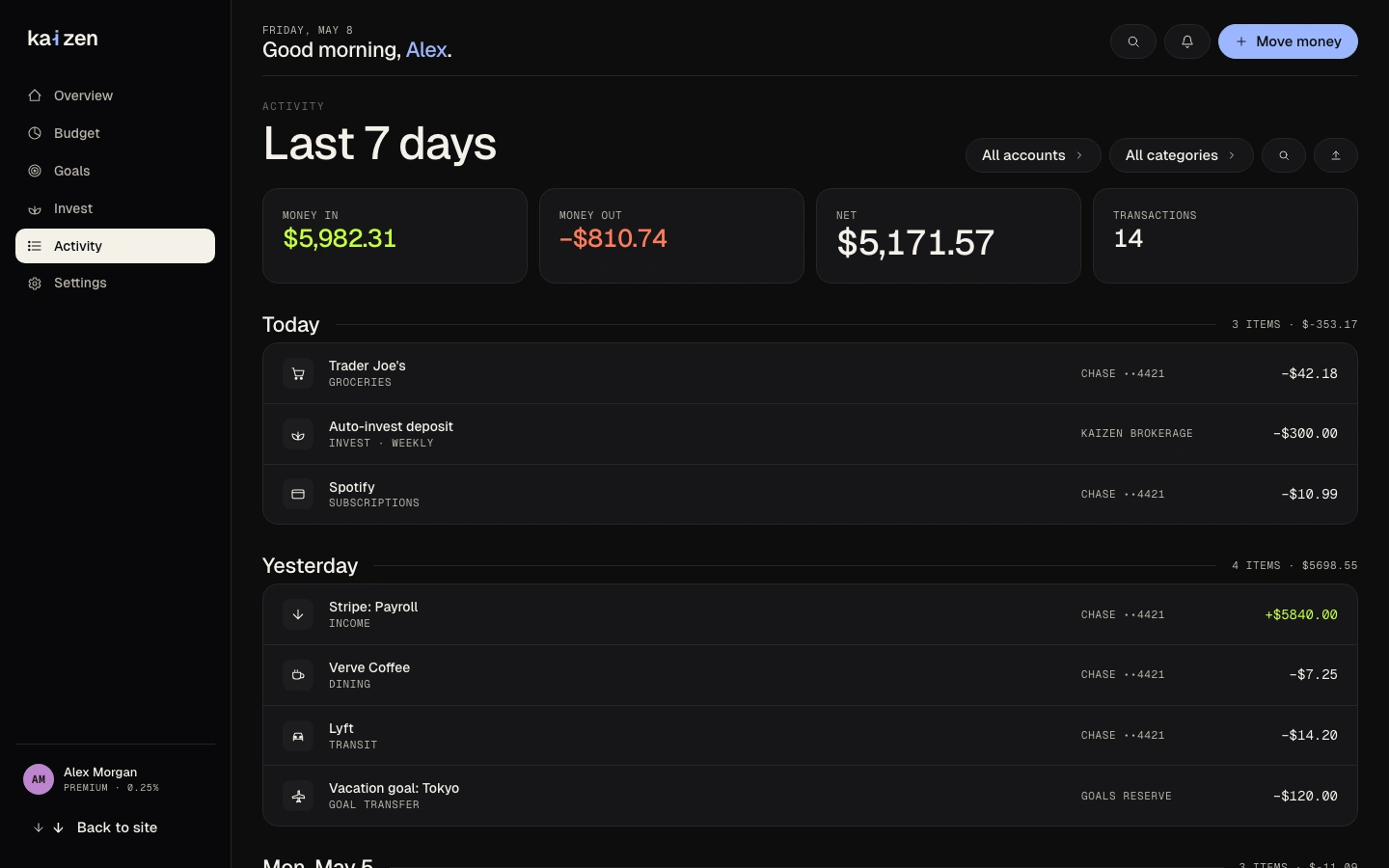
Designed Dashboard (net worth hero, area chart, spending cards, AI insight, for Marcus's "tell me my number" need), Budget (donut + category bars, trend chart, for Freya's picture-in-one-place need), Goals, Invest, Transactions, and Settings. Every screen traces to a specific persona need from the audit phase.
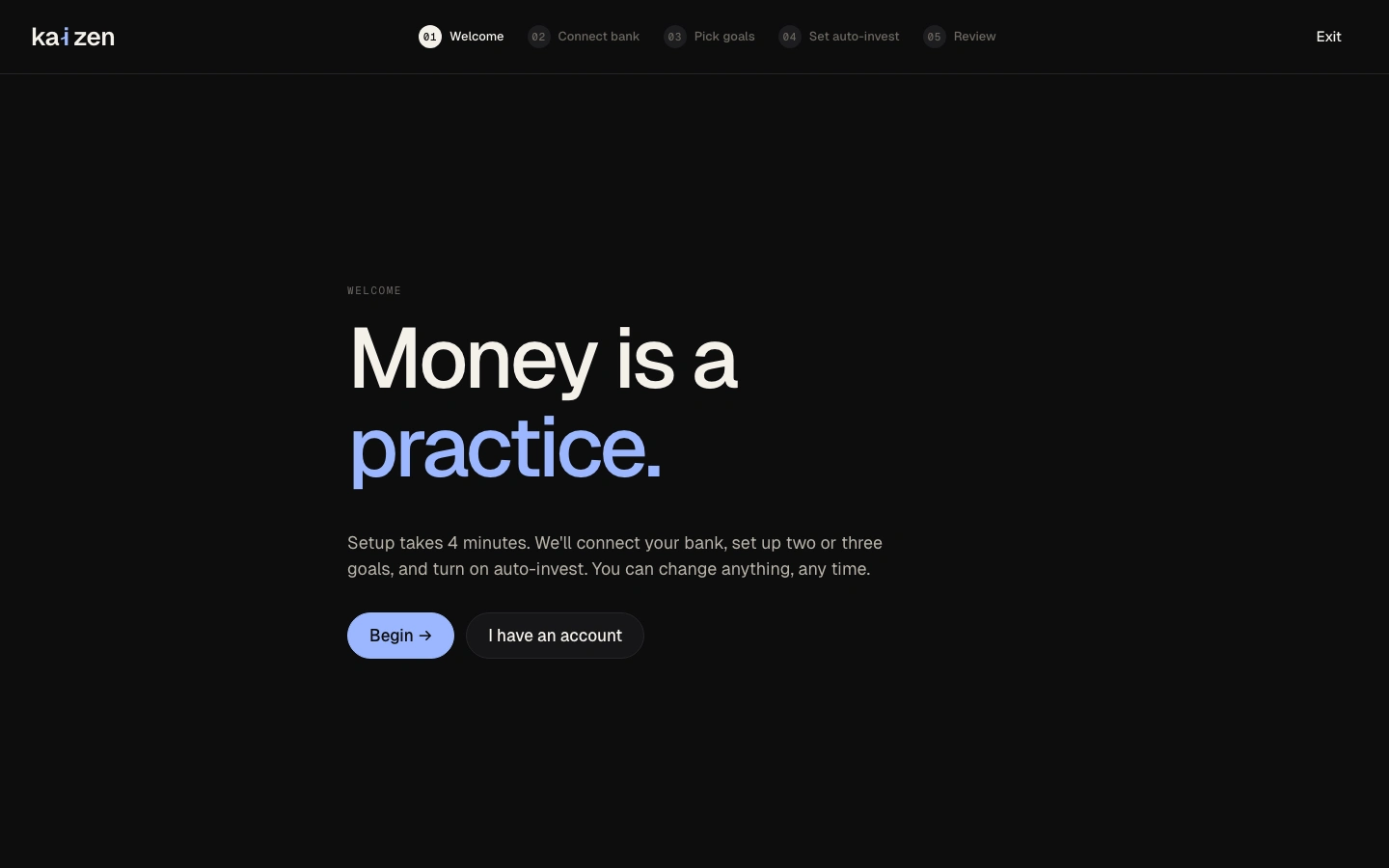
5-step onboarding flow
Goal-first onboarding: Welcome → Connect bank → Pick goals → Portfolio selection → Review. Starts with "What are you saving for?", a question everyone can answer before any commitment is required. Directly counters the audit finding that competitors start with account creation or risk profile questionnaires, which users cited as the moment they abandoned onboarding.
Iteration
Design review and iteration
Ran a full design review across all screens, applying 15+ revisions: hero layout, type hierarchy (removed italic headings throughout), spacing consistency, nav sizing, and card height matching. Each change was evaluated against the three persona needs before being applied.
Design decisions
Three visual directions explored as complete design languages
Rationale: Freya, Marcus, and Aisha have different aesthetic expectations, and committing to one direction too early would have satisfied one persona at the expense of the others. Designing Editorial, Quiet Premium, and Confident Warm as complete, switchable design languages (not just colour swaps) forced each direction to stand on its own before a choice was made.
Goal-first onboarding, not account-first
Rationale: The audit finding: every competitor starts with account creation or a risk tolerance questionnaire. Users in the target cohort cited this as the moment they abandoned onboarding: "I don't know my risk tolerance; I just want to save for a house." Kaizen starts with "What are you saving for?" A question Freya, Marcus, and Aisha can all answer before any commitment is required.
Dashboard-first architecture, not transactions-first
Rationale: Monzo and YNAB both open to a transaction feed. The audit showed this optimises for daily check-ins but fails Marcus's core need: "tell me my number." Kaizen opens to net worth. The distinction maps directly to the difference between a banking app (what did I spend?) and a financial OS (am I on track?).
All-sans-serif type, weight-only hierarchy
Rationale: An early direction used editorial serif with italic headings. Dropped after recognising that mixing bold and italic in the same heading breaks hierarchy and that Aisha's aesthetic benchmark is closer to Stripe or Linear than to a financial magazine. All-sans-serif throughout, weight as the only hierarchy signal.
The solution
Kaizen is a fully designed personal finance OS. A full marketing site built to earn Aisha's trust, a goal-first 5-step onboarding that counters the drop-off pattern in every audited competitor, and six product screens covering every job Marcus and Freya need. Three visual directions (Editorial, Quiet Premium, and Confident Warm) each explored as complete design languages before narrowing.
AI in the design process
I treated AI as a research multiplier, not a designer. It accelerated the parts of the work where speed beats craft (synthesis, scaffolding, first drafts) so I could spend more hours on the parts where craft beats speed (visual system, interaction states, the actual product decisions).
Used AI for
+Drafting the competitive audit matrix, Claude generated the initial feature comparison structure across YNAB, Wealthsimple, Betterment, and Monzo; I rewrote the verdicts after auditing each tool myself.
+Persona scaffolding, three persona drafts in 20 minutes, then validated against four reference users I already knew. Two personas survived intact; one was rewritten end-to-end.
+Transaction categorisation labels, generated 200 candidate labels for the auto-categorisation feature, kept 47.
+First-draft microcopy for the marketing site, then rewritten in my voice.
Kept by hand
·Every visual decision, the Quiet Premium colour system, type pairing, three visual directions tested.
·All actual user flows, screen layouts, and interaction states.
·The product hypothesis, that consumer fintech is fragmented and a unified ledger is the gap.
Rejected
−AI's first attempt at the goal-tracking copy read like a motivational poster. Rewrote everything.
−A suggested "AI advisor chat" surface would have undermined the "quiet, confident" product principle. Cut.
Prototype & process
Outcomes & impact
A research-informed, fully interactive consumer fintech prototype exploring what a coherent budget + goals + investing OS could look like.
✓Competitive audit of 4 apps (12 flows) surfaced the fragmentation gap that drove the entire design brief
✓3 personas grounded every major design decision: goal-first onboarding, dashboard architecture, and visual direction all trace to a specific persona need
✓Three complete visual directions explored before committing; each one pressure-tested as a full design language, not a colour swap
✓Every screen maps to a specific research finding; no design decision is arbitrary
What I learned
Consumer fintech's problem isn't missing features. Every tool is missing the same thing: the conviction that connecting budget, goals, and investing into one coherent visual and interaction language is worth designing. This project is the proof of concept.
Key takeaway
"Three things I would do next: (1) recruit 5 people from the target cohort and run task-based usability sessions: the onboarding flow and dashboard-first architecture are the highest-risk design hypotheses; (2) design the mobile experience: all screens were designed desktop-first, and the budget and goals views need a mobile-native layout rethink; (3) connect the goals engine to the invest allocation: the next iteration would calculate an auto-invest amount from goal target date and current balance, making the connection between saving and investing visible in the UI."
Like this project
Posted May 31, 2026
Personal finance OS connecting budget, goals, and auto-investing; designed for an integrated user experience.
Likes
0
Views
0