Milan Book Publishing | Logo & Brand Board Design
I designed the logo and brand board for Milan Book Publishing when the company was in its early development.
The owner, Stefani, had an existing temporary logo, but wanted a fresher, more modern style that incorporated books in some way. She also had already chosen a design for her business cards on her own and wanted a logo that would match her business cards, which contained a border design of books on shelves. I agreed with Stefani that the business card border worked well but the logo needed to be replaced, as the old logo didn't have the same friendly and approachable style as the business card border.
I first sent Stefani my logo design questionnaire (see blank sample of it below) to collect all the information I needed from her upfront and see how specific her answers to the questions would be. Stefani was clear that she wanted books to be incorporated to the logo somehow and that she wanted to keep a similar color palette to those she chose for her old logo and current business cards. However, most other details about the design were quite open-ended.
Within 3 days of receiving Stefani's completed logo questionnaire, I created 4 logo concepts for Stefani and sent them to her along with detailed notes (see below) explaining both my general thoughts on her project and more specific insights about the concepts I developed. The color palettes from her old logo and existing business card were slightly different, so I chose a color palette for the new logo that drew from both.
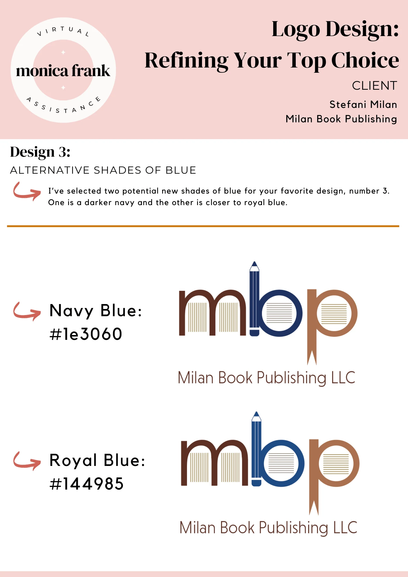
Stefani really liked the third logo concept I designed, which contained lines inside the letters "MBP" to reference book pages, a pencil as part of the letter B, and a ribbon-style bookmark as part of the letter P. The only change she requested was to make the teal color more of a blue instead, so I sent her two possible alternatives (see below). Stefani chose the option that was more of a royal blue as opposed to navy blue.

The two alternative shades of blue I sent Stefani to adjust her favorite logo concept.
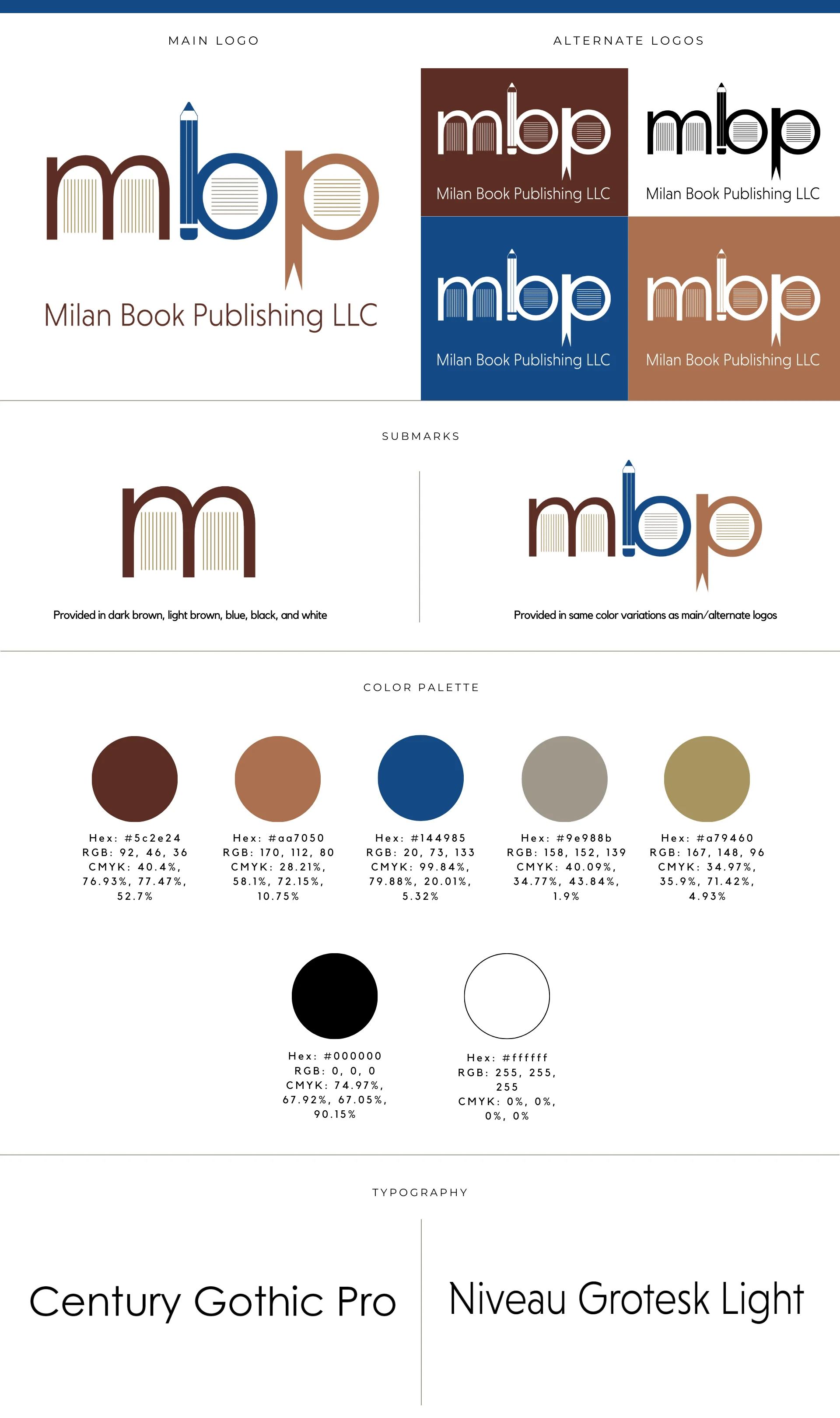
From there, I created two submarks for her that could be used whenever she needed a reduced version of her logo: 1) just the letter M, and also 2) just the "MBP" initials without her full company name. I sent across her logo files in all necessary color combinations in both RGB and CMYK color modes, and in all necessary file types: .png, .jpg, .ai, .tiff, .svg, .pdf, and .eps. I also created her brand board as a reference of the designs created and colors/typography chosen (see below). Overall, this project took about one week to complete.

Milan Book Publishing's final brand board.
Here's what Stefani had to say about the project:
I enjoyed working with Monica on my logo design. She is prompt, professional, and thorough, three qualities I truly appreciate. She took time to understand my vision and then provided lots of different options for me to choose from. She communicates clearly and concisely while listening to her client’s needs and delivering exactly what they ask for! Her designs are creative and well done. I will definitely be working with Monica again on future projects!"
If you're looking for a logo and brand board like what I designed for Milan Book Publishing, I'd love to help! You can check out my Contra services to book your brand board creation as well as your logo 🎨
Like this project
Posted Feb 20, 2024
Logo and brand board I designed for a book publishing company 📖 📚
Likes
0
Views
16


