Grazioso Duo | Logo & Brand Board Design
I designed the logo and brand board for Grazioso Duo, a pair of classical wedding ceremony musicians. While they weren't completely sure regarding the particulars of their desired brand voice, they wanted something light, airy, and feminine that was in line with common branding choices seen throughout the wedding industry. They showed me the website of a particular wedding photographer whose work they admired as inspiration. They also wanted ideas for images to use on their future website that would tie in with their chosen color palette.
Because Grazioso Duo wasn't sure what specific color scheme or typography they preferred, we decided to work on their brand board before doing their logo. Because serif fonts generally have a classic, formal look, I felt a serif font called Lovelace Text would work well in its standard case-sensitive typeface for headings, and in lowercase italics for subheadings. Then for the body text, because mixing serif and sans serif fonts often works very well, I chose a clean sans serif font called Nunito Light.
Regarding color palettes, I created 4 different pastel options--all of which felt appropriately "bridal"--for Grazioso Duo to choose from: mauve pink, blue, coral pink, and green. For images, I selected photos of flowers--for me, the highlight of any wedding's decorations!--and sheet music to suit Grazioso Duo's profession. I also selected various delicate line illustrations of flowers which would suit their website design well alongside the photos in the future.
I sent all 4 brand boards (see below) to Grazioso Duo for their review, and they selected the mauve pink option with no edits requested.
From there, we moved on to the logo. Grazioso Duo said they wanted to reference both plants/flowers and music in some way. I felt a round seal-like logo would suit the soft feel of the brand board. So, the first design I sent them was the serif initials "GD" embellished with leaves inside a ring of musical notes, and their full name was written in a cleaner sans serif typography (see below).
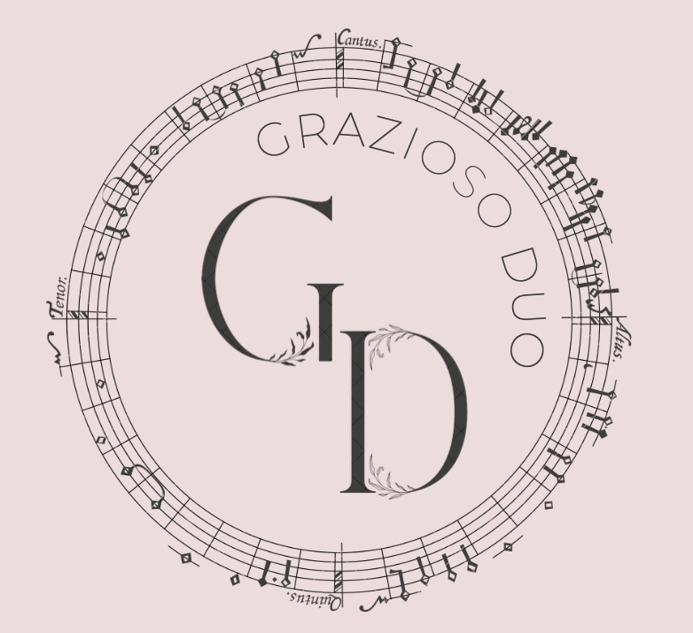
The first logo concept I sent Grazioso Duo.
Grazioso Duo felt the musical notes in this design were a bit too small and wanted the musical element to be more prominent. They also said they wanted a simpler logo with fewer embellishments. So, I instead chose a stylized treble clef as the central element for the design, surrounded by a floral wreath. I also added the words "Wedding Musicians" to the logo in the serif font chosen for the brand board to further clarify what Grazioso Duo does.
I sent Grazioso Duo two options (see below): one with some of the text inside the wreath and the rest of the text being part of the arc of the wreath, and another containing all the text within the wreath. Grazioso Duo chose the second option (with all text inside the wreath) with no further edits requested.
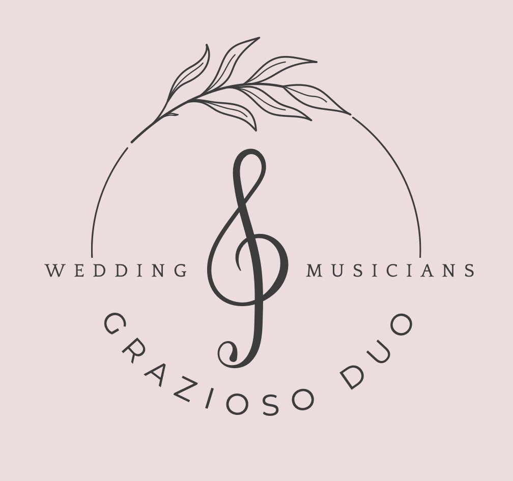
The first revision option I sent Grazioso Duo.
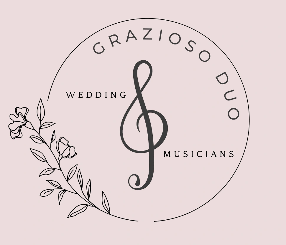
The second revision option I sent Grazioso Duo. This was the design they ultimately chose.
I added the logo to the brand board to complete the project (see below), and sent Grazioso Duo their logo files in all necessary color combinations in both RGB and CMYK color modes, and in all necessary file types: .png, .jpg, .ai, .tiff, .svg, .pdf, and .eps. Overall, this project took about two weeks to complete.
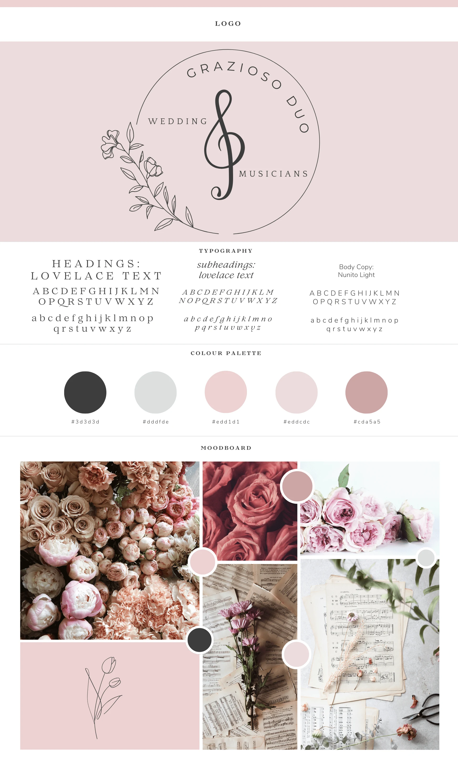
Grazioso Duo's final logo and brand board.
If you're looking for a logo and brand board like what I designed for Grazioso Duo, I'd love to help! You can check out my Contra services to book your brand board creation as well as your logo 🎨
Like this project
Posted Feb 20, 2024
Logo and brand board I designed for Grazioso Duo, a pair of classical wedding ceremony musicians 💍 🎶
Likes
0
Views
10
