eProgesa
Summary
Since the application is having 10 basic features and more than 30 sub features, we had a separate it into core features and not so important ones, put all the informations into the sprints and start working on it.
The recruit and planning features together with the donor was the ones which we started our work together.
Services
- User research
- Competitor research
- Workshop facilitation
- Wireframing
- Design system and UI
- Prototyping & testing
- Developer collaboration
People
- 2 product managers, 1 business analyst
- 1 designer
- 12 engineers
Outcome
Working to a tight deadline I made a completely new experiences together with user flow, information architecture, branding, designing and prototyping. This application was designed back in 2015 and still useful for the people around the world.
Research & discovery
Started with users research and went deep based on the previous experience using the desktop application and defining major things:
- Who are the app users
- What is the users day at workWe put all research informations together and start building a user persona based on the research results:
- Name: James Doch
- Age: 35 – 55
- High technology proficiency: 3
- Day in life: Using the eProgesa application mostly every day
- Pain points – doctors are using sometimes smaller screens sizes, a lots informations in the menu navigation, scenario when they’re using the app in the places with a lot lights inside.We took all the informations on the one place and starting ideation process and sharing the ideas all around the team. Ideation process had one story which was – help James to use better our application.
We got many ideas, group them together and started working on low fidelity mockups.
- How they are using the application
We put all research informations together and start building a user persona based on the research results:
- Name: James Doch
- Age: 35 – 55
- High technology proficiency: 3
- Day in life: Using the eProgesa application mostly every day
- Pain points – doctors are using sometimes smaller screens sizes, a lots informations in the menu navigation, scenario when they’re using the app in the places with a lot lights inside.
After the building persona, we took all the informations on the one place and starting ideation process and sharing the ideas all around the team.
Ideation process had one story which was – help James to use better our application.
We got many ideas, group them together and started working on low fidelity mockups.
Solutions and iterations
We did resolve the problem with the navigation doing the properly information architecture and creating two different navigations. Main navigation is having the crucial actions for all features and it’s most used what ever application part is active.
After the internal and external design testing, we got a feedback that our users are using the actions for increasing letters, but it’s not enough for them to focus on the main feature.
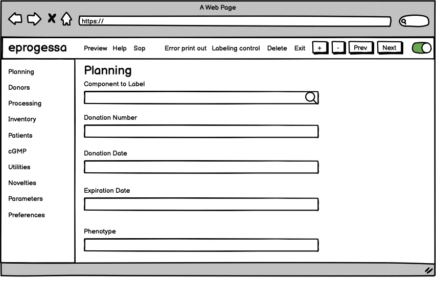
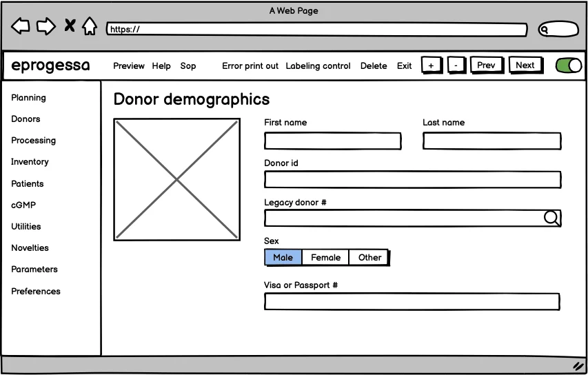
Getting back on ideation process and we got on idea to add one more action to minimise the complete left navigation and to give all user focus on the feature no matter about the screen size, lights around, etc.
We tested all experience for planning and donor features and got a positive feedbacks.
UI, hi fidelity mockups and prototyping
UI and braning part started. Defined the application, colors, fonts, icons, etc and grouped all together for creating initial version of design system.
I coded initial versions for the basic features and helped the people from front end development to make the better experience based on the designed solutions.
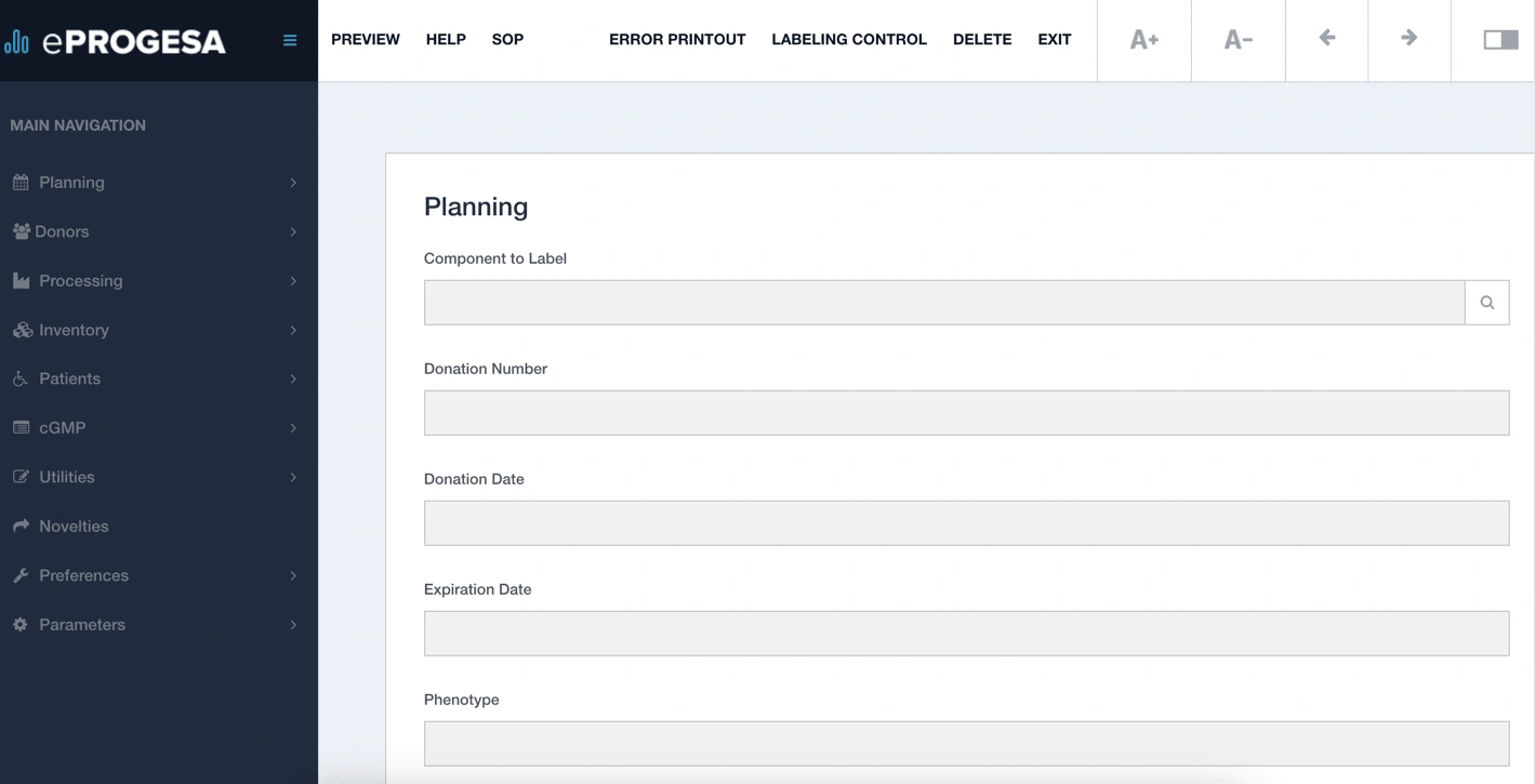
Planning feature
Planning feature shows the informations about the main planning and recruting which is site scheduling and planning grid for from selected users.
Also it contains multicriteria selection and telerecruitment as the subpart of the Planning feature.
Donor feature
This feature shows the main information about the donor. Actually the user can see who is the blood donor, his basic informations, picture, etc.
More detailed and not so important informations about the donor are in the tabs which is place of birth, language, correspodent name etc.

Outcome
It was a nice challenge to redesign this huge application and to transform it into fully functional web based application.
Research & personas
I found out how users were interacting with old desktop application, day in life, pain points. I defined the main problems, ideate it with the team, designed and tested new designs.
Workshops & iterations
Sharing the ideas is always good way to group and get the best solutions. Also the big part was to do the information architecture because the application has a lot of features/subfeatures.
Prototype & coding
Defined the application braning, colors, fonts, light/dark modes, interactions and built new designs.
I also coded the few features (HTML, SASS, JS).
Like this project
Posted Nov 29, 2023
eProgesa was a nice working desktop application which customers had to installed it on every local environment which caused the expenses for configurations.
Likes
0
Views
34
