School Diary
Solving problem for the mobile application for the kids school diary based on the user feedback and analysis
Summary
Knowing and talking with other parents, I found out that the parents are stuck with some diary features sometimes when using the mobile application for checking their kids in school
Services
User research
Persona building
User flow
Wireframing
UI and branding
Prototyping & testing
People
1 product manager
1 designer
Outcome
Exploring and creating new mobile experience based on user research and the problems and pain points using the school diaries
Research & discovery
Discovery phase started with knowing and using the kids diary application to check all the informations for the kids.
I was analysing the application features and discovered paint points and was talking with other parents which is using this application. This informations which I got from the application users helped me to get a bigger preview about it and to realise how they’re using it and what’s actually the features which they are using.
The application users
This platform is using by different type of users. For the different type of users, I would need a different user stories, researching and learning from them.
I will separate user types like in this list:
Parents,
Teachers,
Students
In this case study, I will focus only on the parents scenario and probably in time will focus on other user types for this application which is Teachers and Students.
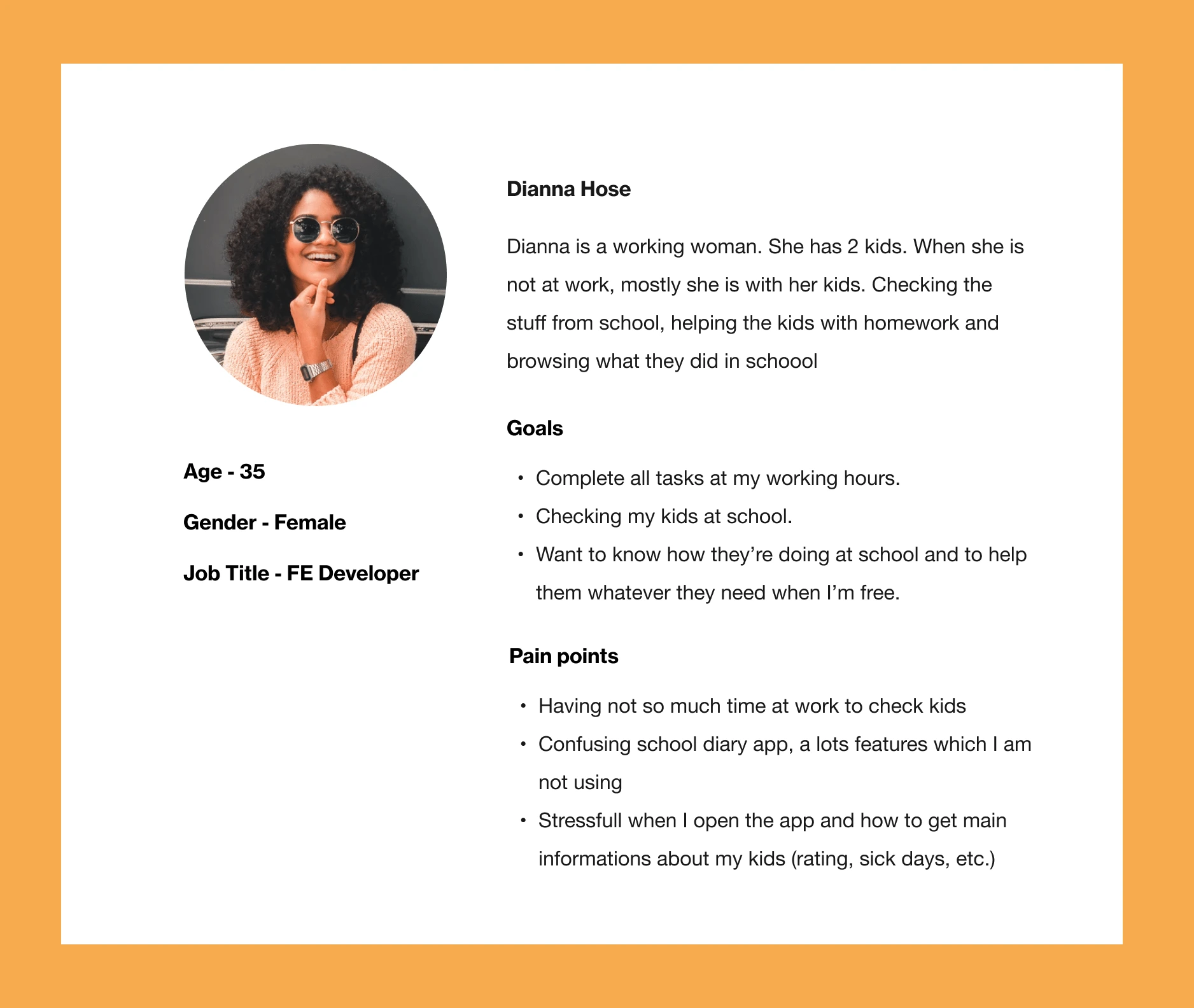
User persona
In this case study, I was researching and designing the scenario for the users – parents.
In some other interactions, I will probably start working on other users scenarios which will be – teachers or students to analyse their problems and to try to resolve them.
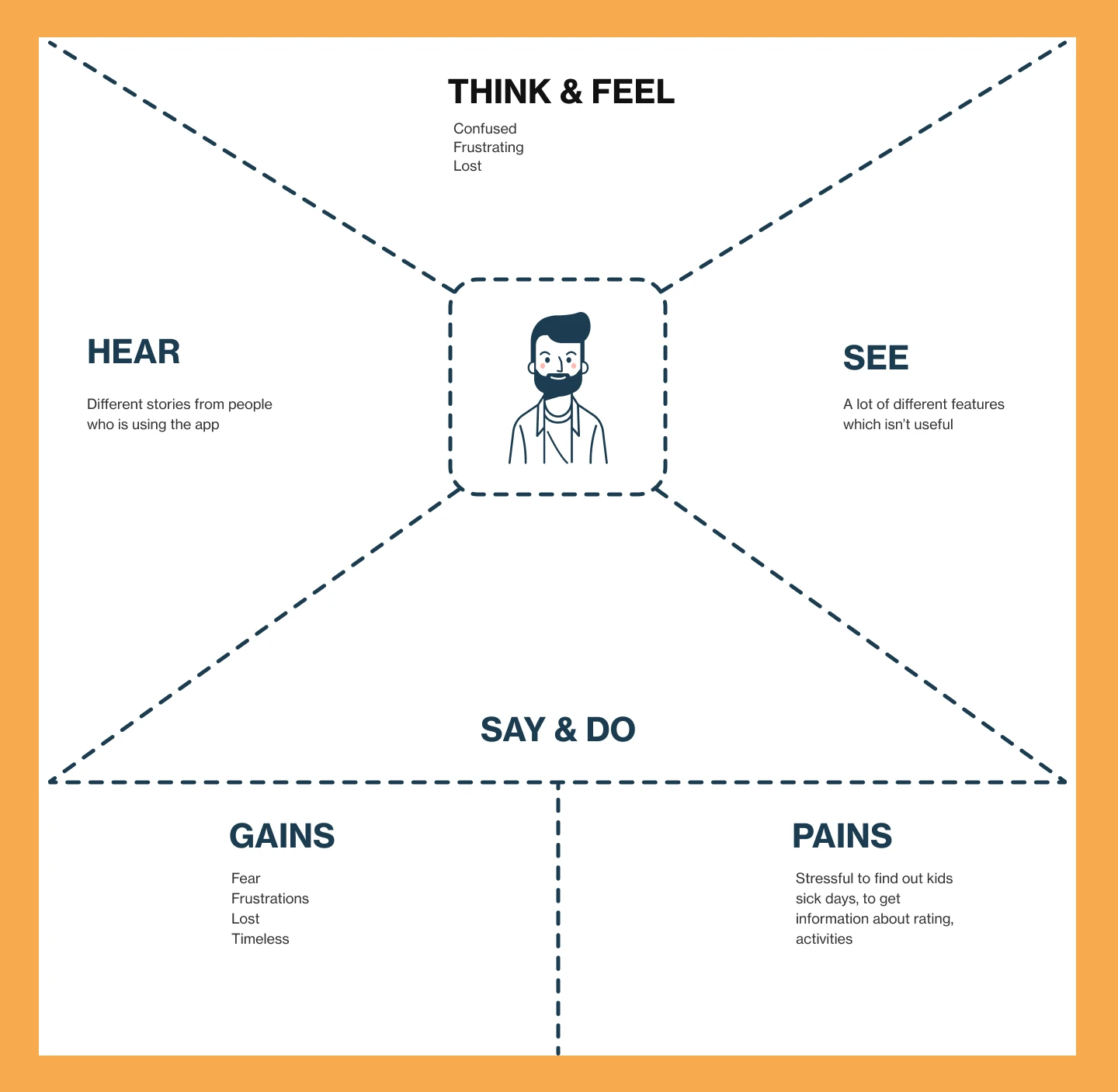
Empathy map
I was following the users emotions during the interview process when the user was signing in to the app, across the features which is visible on the screen after they logged in into the application.
It was obvious that the user is feeling stressful, disappointed and lost. Also I figured out that the user is wasting their own time to get necessary informations and to do the basic tasks on the app which is to get the main informations about their students, to send necessary docs for the sick leave for their kids, etc.
Ideation & iterations
Summarized all informations which i got from the research phase and everything was ready for the ideation step.
The next step after the research phase was ideation process and to share all ideas with the user story – help Dianna to get the informations about her kids fast.
Since I have only few people to do the ideation, we started the ideation session together with classical way with sharing every idea on each sticker.

Grouping all ideas on one place gave me the correct way and inputs from the other people in which direction should I design the features and what will be the best way to solve the problems for the users.
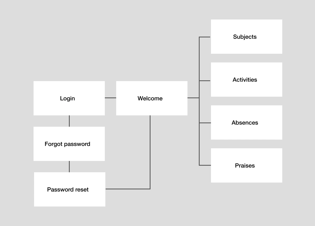
User flow
On the beginning I redesigned the application user flow and tried to make it better and easier for users.
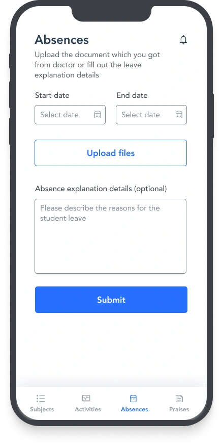
Focus was to make the flow which saves a users time to do some task – in this case study to see all students subjects and actions for this feature and to easily send the docs for sick days leave.
Low fidelity mockups
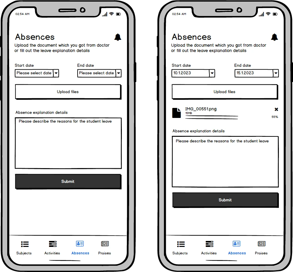
After I finished working on the user flow, I was focusing on low fidelity mockups, early stage of designing mockups and interactions.
Also set up the information architecture and created a down navigation with the actions for main application features.
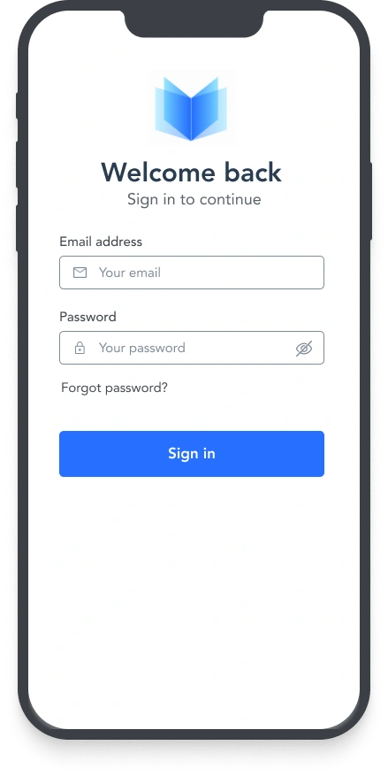
I was assuming that the application already has predefined username (email) for all parents and it wasn’t necessary to design sign in form. Actually, the login form has only Forgot password action which will take user on the email form and to reset own password and then get on the Subjects feature.
High fidelity mockups
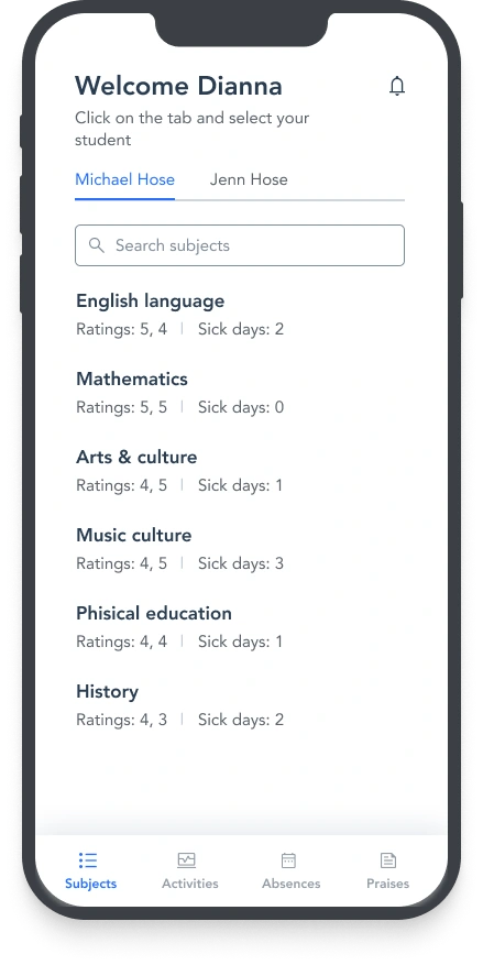
Had a not so much time for the branding defining and at least crafted logo, font families, few UI elements and a few colors. Of course I had to make sure that accessibility is on the right track and that all colors are working well together.
Probably will go more deeper with the interfaces and branding in some other iterations and updates for this feature.
Prototyping & User testing
Used the mockups which I built for the necessary features together with the UI components in Figma and created two different prototypes. The first prototype was for the rating system and second one for the sick days.
In the user testing phase, I did a two different features testing. The first one was how users were interacting with a new designed feature for the rating system and the second one was a new designed feature for absences (when the student wasn’t on the classes).
I was testing the features with 7 different parents and got really useful comments from them.
The first user testing was for the new rating system and had a user story like on the ideation stage – as a parent, I want to login, check and filter the student ratings
The second user testing was for the new absences feature and had a user story – as a parent, I want to login, filter sick days, upload the files from doctors and write a details about the leave.
The testing sessions were live and I was close to the people who were interacting with both features and prototypes. I was thankful that I had an opportunity to test it live and to see the people emotions and possible reactions on my designs.
Six different people helped me to test my experiences and really appreciate it.
In general, the testing results went very well. Since I was following the reactions from people, I saw that there was no pain points during the testing sessions. Few issues had a with the content which I saw on testing phase, but I made all necessary changes.
Designed with hope that the diary application will make some changes and become more easier to use for the parents.
Outcome
This case study helped me for better understanding the parents (as a users) and tried to solved the problems using the student’s diary application
User research
The research phase which included live intervewis helped me to better understand the users, how they are using the app and to define the pain points
Ideation
Shared the problem with the rest of the people and we put all ideas on the table. I grouped the same solutions on the places and started with the initial mockups
Like this project
Posted Nov 27, 2023
Solving problem for the mobile application for the kids school diary based on the user feedback and analysis
Likes
0
Views
11

