How I trailblazed a Shirataki noodle brand: Landing Page Design…
Embark on a visual journey as I unravel the intricacies of designing a landing page for Yumomi Shirataki Noodles.
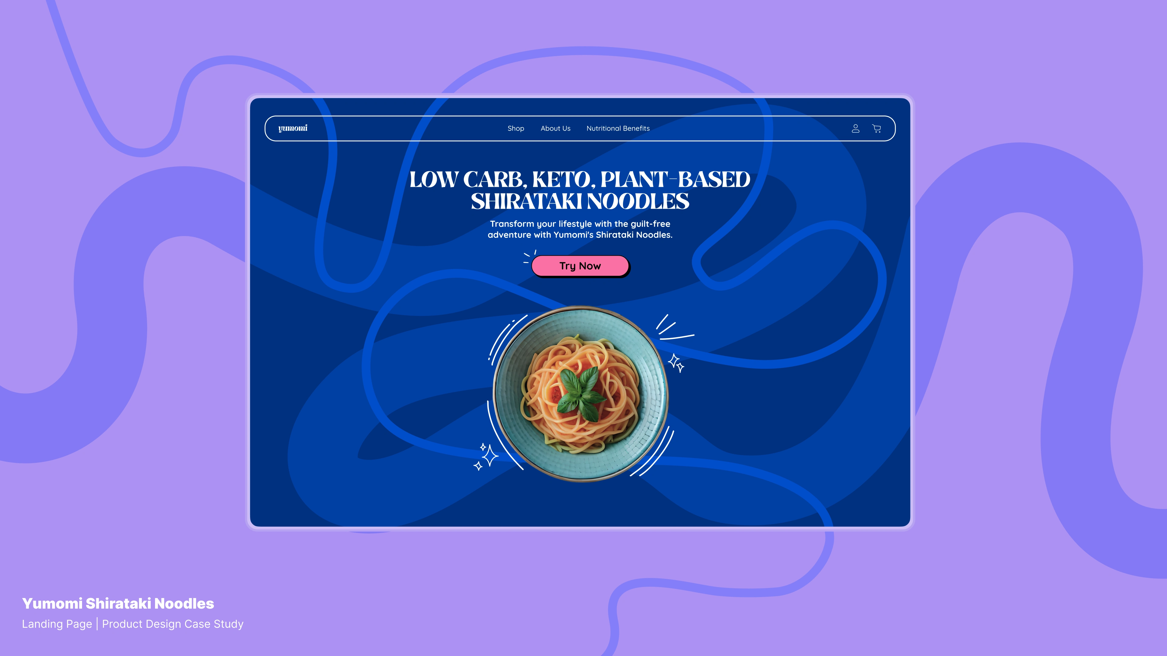
Finding Noodle Options
In the diverse world of Indian noodles, craving more than Maggie and WaiWai led me to explore Samyang Buldak and Shin Ramyun. However, in terms of health, these choices fall on the indulgent side. The quest for a healthier alternative brought me to Shirataki Noodles — low-calorie and gut-friendly, although the challenge remains that this wholesome option is yet to gain traction in India.
Love for Noodles Turns into Designing a Landing Page
While on the hunt for healthier noodle options, I stumbled upon my first product design assignment as part of the 10kdesigners cohort : Design a landing for a Shirataki Noodles Company!
PROBLEM STATEMENT : Design a website for a Shiratake Noodles Company to trailblaze brand awareness
DURATION : 14 days
BRAND NAME : Yumomi (ゆもみ) — A play on “yum” and “noodles” (もみ, momi)

Discovering and Defining
The user navigates Amazon’s Urban Platter for shirataki noodles but faces hurdles like prep gaps and low awareness, impacting sales. Yumomi targets health-conscious Indians, spotlighting shirataki noodles with zesty sauces and varied flavor kits.
Adopting a friendly, yet savvy tone, our website becomes the go-to for potential customers. It urges exploration of shirataki noodles, fostering engagement and brand clout. The content strategy, rich in diversity, guides users toward droolworthy choices in healthy eating. Yumomi isn’t just a brand; it’s a transformative force shaping how India perceives shirataki noodles.
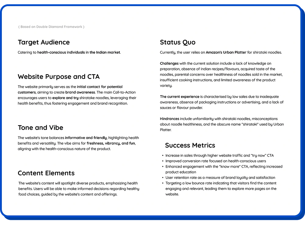
Detail on Target audience, Website purpose, the main CTA, the tone and vibe of the landing page, the Status Quo and their challenges and success metrics
Competitor Analysis
The competitor study emphasises the recipe for success: a carefully designed landing page focusing on social proof, brand awareness, and conversion optimisation.
Miracle Noodles and Huel opts for green, symbolising health, while other food brands embrace vibrant colors. Hence, my strategy weaves striking visuals with playful design.
Introducing Yumomi, a new brand, faces a challenge — no reviews or media buzz. The approach? Curate testimonials from fitness icons and chefs to resonate with Indian Gen Z and millennial audience.
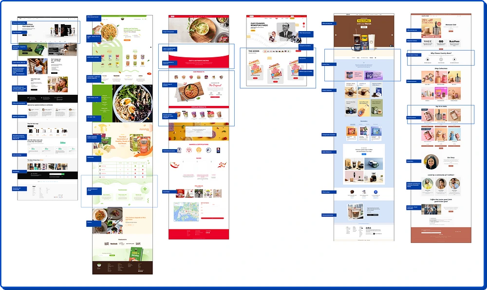
competitor analysis
Information Architecture
The Information Architecture guides users through a flavorful journey by leveraging the AIDA framework (Attention, Interest, Desire, Action). Each section gives you information about Yumomi’s shirataki noodles. The positioning of the Call-to-Action (CTA) and the arrangement of sections are strategically placed to facilitate a comprehensive understanding of the product before reaching a decision. Yumomi, being a recent entrant in the market, is committed to transparency and providing information, considering the limited awareness about shirataki noodles among many individuals.

Wireframes
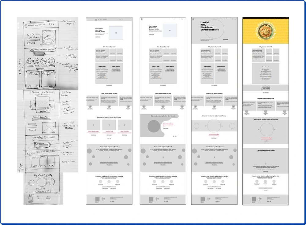
In the wireframing stage, I translated ideas into tangible structures through paper prototyping and development of high-fidelity wireframes. The focus was on achieving a seamless flow of content with design which was done through writing the copy alongside.
Visual Design
Moodboard: Developed a moodboard with lively colors, quirky lines, irregular shapes, pastel graphics, and a mix of doodles and real photos. The aim? Nudging the design towards a NeuBrutalist look, guided by the belief that “Healthy food shouldn’t be boring”.
Typeface Selection: Opted for Brasika Display for headers and branding to infuse that Neubrutalism fun factor. For other text, went with Quicksand — easy on the eyes, enhancing readability with its rounded style (complementing noodle strands).
Color Palette: Weaved together a color palette that’s more fun and vibrant than a summer festival. Each shade is handpicked to not just grab attention but keep it hostage. It’s the secret sauce for a brand identity that sticks.

Typography and color palette
Before diving into the design of each section,
You can also checkout the prototype of the Landing Page here or preview the landing page video below!
Hero Section
In this pivotal segment, we strategically apply the AIDA framework. The header boldly showcases the major health benefits, acting as the primary attention-grabber — capturing focus instantly.
The Call-to-Action (CTA) follows, serving as the secondary attention catalyst, guiding users toward the next step.
The vibrant background and imagery play a crucial role as the tertiary attention element, fostering interest and creating an immersive experience. It’s not merely a landing page; it’s a visual journey that sparks curiosity.
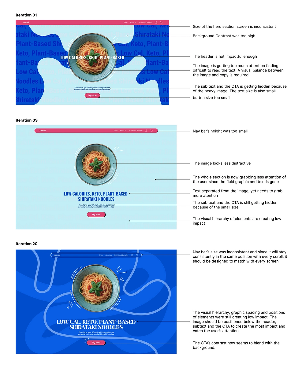
iterations of the hero section
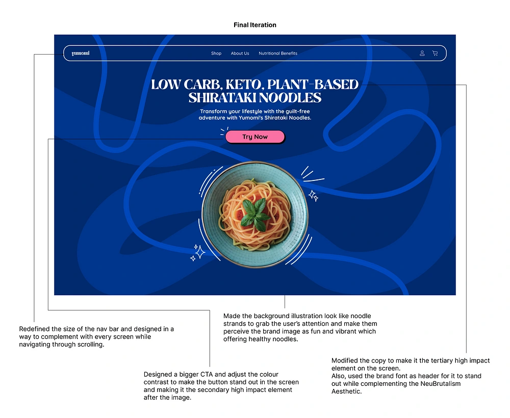
final iteration of the hero section
Health Benefits Section
Here, we underscore that health benefits take center stage. we draw Attention by highlighting the primary selling points of Shirataki Noodles — low-calorie and gut-friendly. The Desire is kindled by presenting these benefits as a solution to the health-conscious consumer.
Finally, the Call-to-Action becomes the bridge between desire and action, urging users to make a healthy choice.
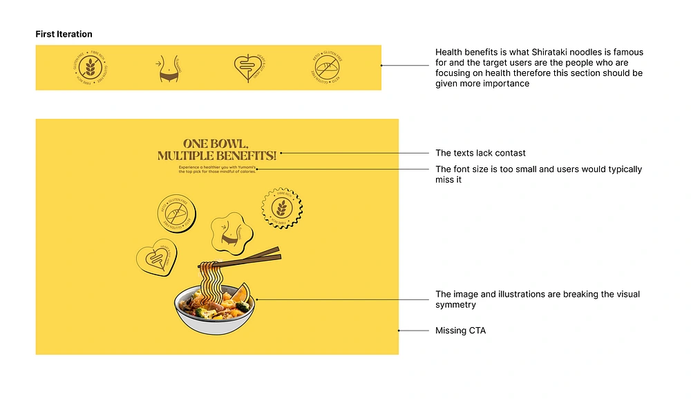
iteration of the health benefits section
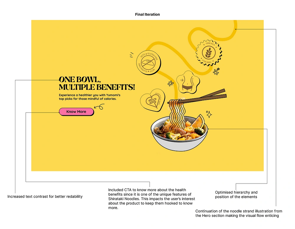
final iteration of health benefits section
About Us Section
Short brand story presented like a deck of cards? This is to create a quick emotional connection. The key qualities of the product are showcased, making it more personalised and desirable.
The attention is captured through the brand story, Interest is piqued by showcasing product qualities, and Desire is nurtured by making the brand relatable. It’s about turning a brand into a story worth investing in.
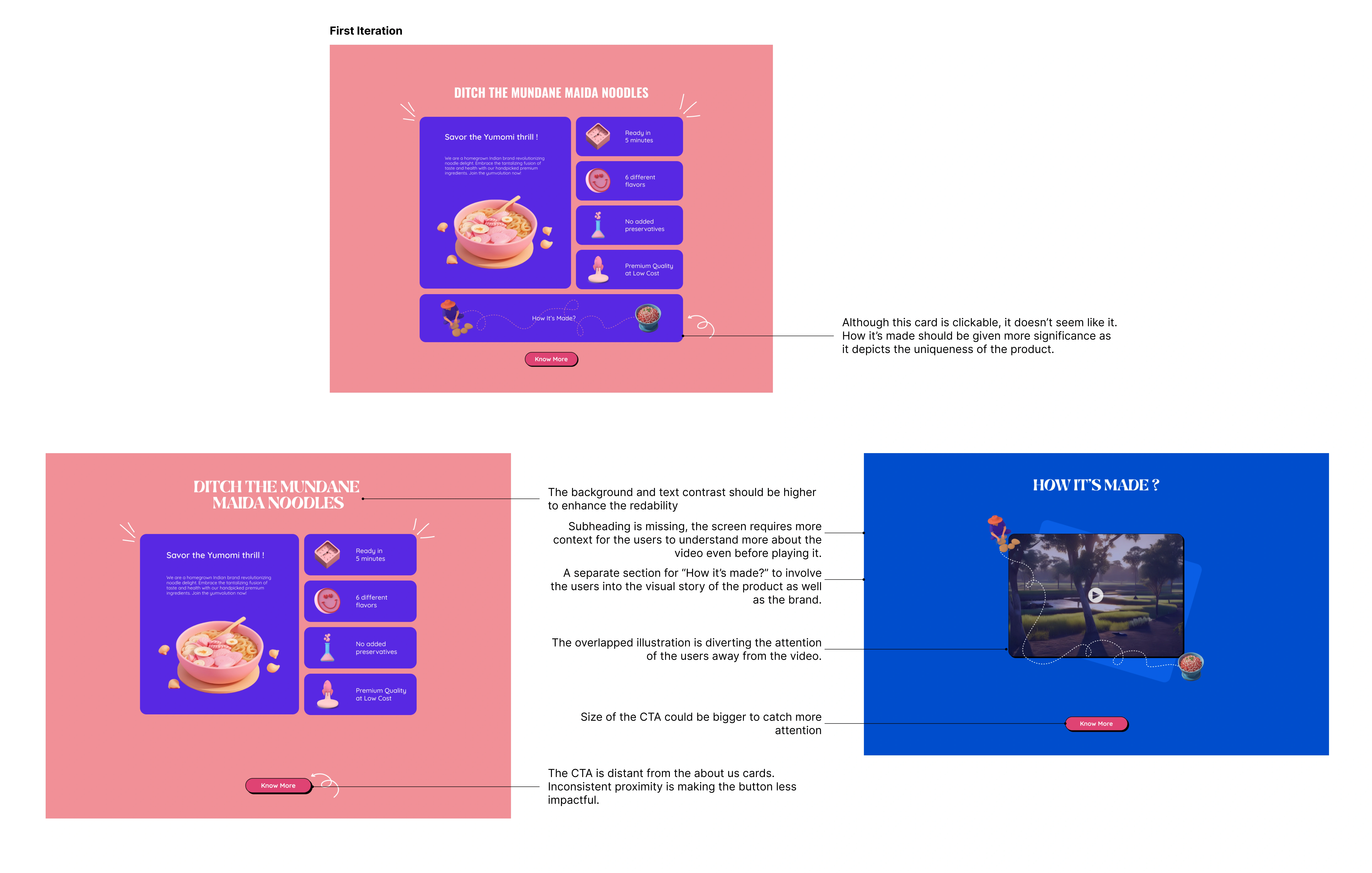
iterations showing about us section and “how it’s made” section
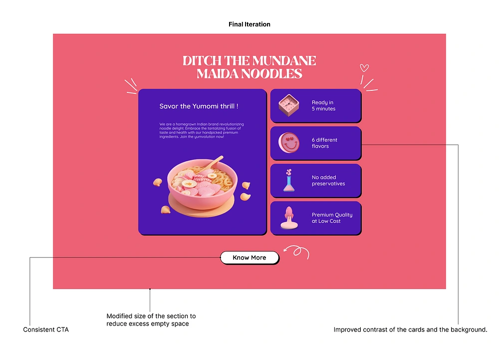
final iteration of how it’s made section
How It’s Made Section
This section showcases the innovative process through visuals and video. Interest is sustained by weaving the brand story into the production narrative. Desire is heightened by emphasising the uniqueness of Shirataki Noodles. The division from the About Us section ensures a more focused and engaging user experience, aligning with feedback from mentors.
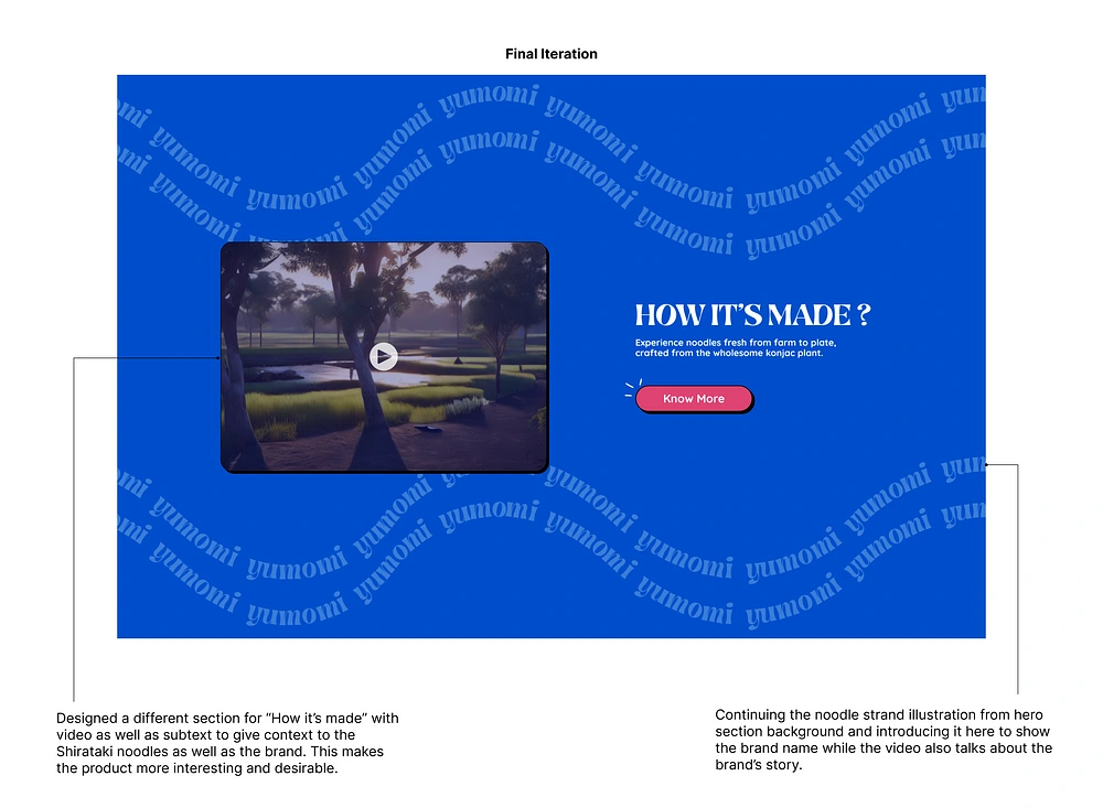
final iteration of how its made section
Product Section
Here, each noodle flavour is presented with enticing visuals. Interest is generated by detailing the ingredients transparently, and desire is intensified by showcasing custom-made flavours tailored for Indian taste buds. The CTA serves as the gateway to converting desire into action, making the purchase seamless and satisfying.
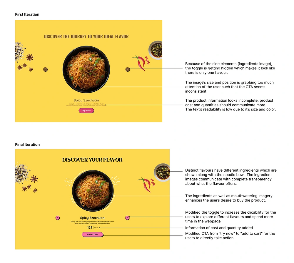
Iterations of product section
Testimonials Section
Testimonials from influential figures aren’t just words on a screen; they’re trust bombs. Social proof is paramount, and the testimonials section strategically places endorsements from influential figures who are popular among Gen Z and millennials. Testimonials draw attention, associating with familiar faces generates interest, and trusting the product through credible endorsements solidifies desire.
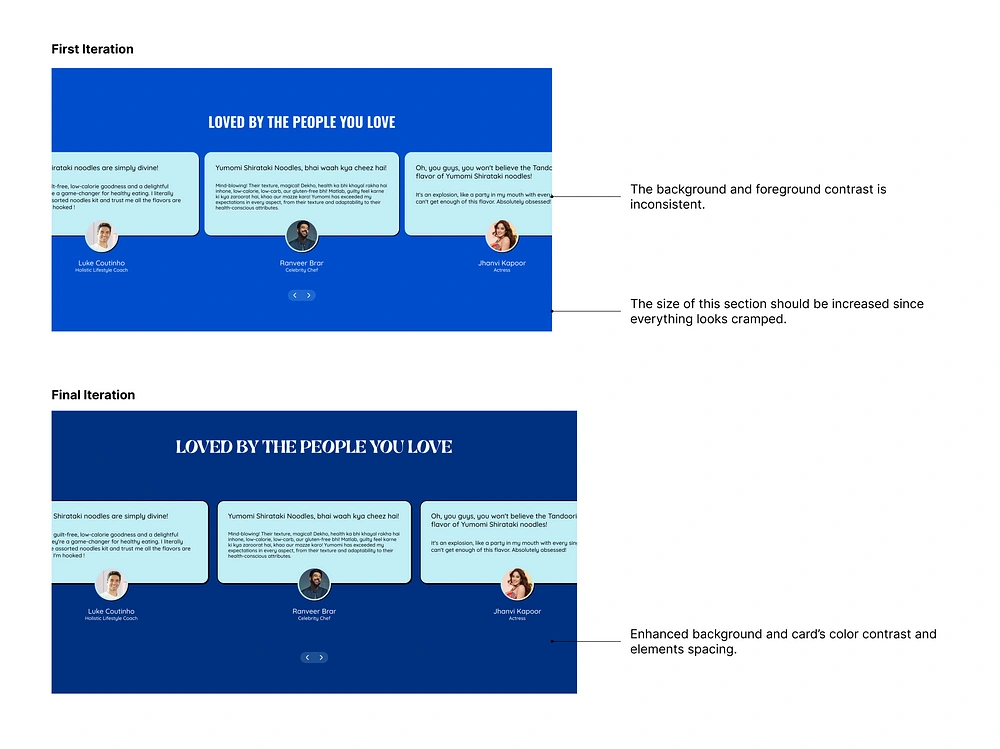
Iterations of testimonials section
Assorted Flavours Section
Recognizing the novelty of Shirataki Noodles in the market, the Assorted Flavours Section addresses the potential hesitation of first-time buyers. It grabs attention by offering a solution to the dilemma. Interest is sparked by the idea of trying all flavors, and desire is cultivated as users envision the joy of discovering their favorite. The CTA is the final nudge, turning hesitation into action.
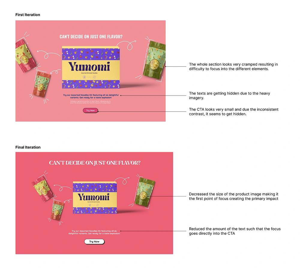
Iteration of the assorted flavours pack section
Subscription Section
This section talks about the benefits and convenience of subscribing, portraying it as a valuable opportunity for customers. The landing page cleverly concludes with a subscription offer, serving as the last chance to convert visitors into long-term customers.
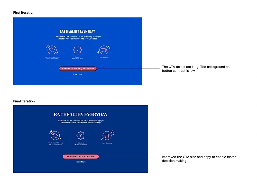
Iterations of subscription section
Key Learnings
Design isn’t just visuals — it’s the entire user journey. Launching a brand like Yumomi in an unfamiliar market demanded a trustworthy landing page. My task was to craft a landing page that not only looked good but also guided users through a visual journey, educating them about the product and building trust.
My approach to iteration involved a brain dump — get inspired, pour out ideas, and discard what doesn’t work. This helped generate a range of ideas quickly and efficiently.
Highlighting the Unique Selling Point (USP) is key. I strategically integrated it into the information architecture, deciding how elements appear on each screen. The goal is to not just grab attention but convert users with a simple scroll.
Slurp, slurp, finish!
As I conclude this case study on trailblazing the Shirataki Noodle brand through landing page design, it’s evident that the journey from “chokher khide” to Yumomi has been a transformative one.
See you around! 🍜
Like this project
Posted Feb 29, 2024
In the vibrant world of anime, where colors pop and animated food becomes an art form, I was hooked. Whether it’s Ponyo savoring noodles or the intense culinar…
Likes
0
Views
20

