Fintech SaaS Landing Page Design
Al Razi Siam
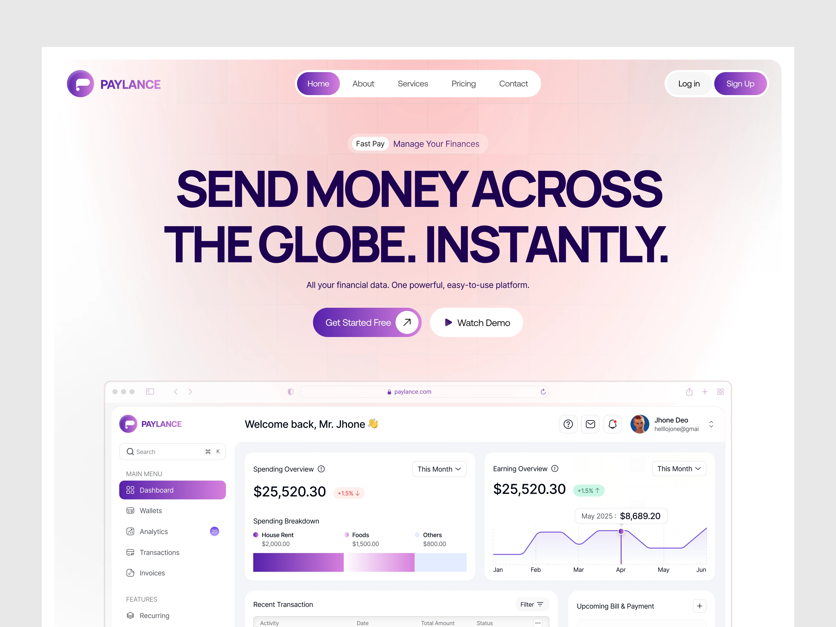
Fintech SaaS Landing Page
Most finance tools look intimidating or outdated. Users abandon before they even understand the product. The finance landing page had to build trust fast and make a complex SaaS feel approachable.
Solution: A clean, conversion-focused layout that guides visitors from curiosity to sign-up. Bold headlines, familiar UI previews, and social proof do the heavy lifting before a single feature is explained.
Design Direction
Purple gradient system that feels premium without being cold. Generous whitespace balances dense data sections. Typography hierarchy ensures the eye always knows where to go next. Every section earns its place in the funnel.
Key Highlights on UI
Real-time financial analytics dashboard
Multi-currency and global payment support
Secure card management UI
Tiered pricing built for teams of all sizes
24/7 customer support promise baked into the layout
Like this project
Posted Apr 6, 2026
Designed a conversion-focused fintech saas landing page for a financial analytics and payment gateway platform.
Likes
1
Views
9