Memora App -Landing Page Design and Framer Development
Al Razi Siam
Overview
Memora is an AI-powered personal health companion that organizes your entire medical history in one place.
My role was to design a conversion-focused landing page in Figma and build it in Framer with smooth interactions and a simple, intuitive flow.
The goal was simple: create a landing experience that makes healthcare feel less chaotic and more human.
Project Duration: 1 Week
Role: UX/UI Designer and Framer Developer
Tools: Figma & Framer
Live website: https://memoraapp.framer.website/
Identifying the problem
Healthcare products tend to feel clinical, cold, or overly technical.
The challenge was to solve three core problems:
Medical information is scattered across apps, emails, PDFs, and portals.
Users feel overwhelmed when trying to understand their own health.
Existing health apps fail to provide a warm, human experience.
Memora needed a landing page that would reflect its mission:
A single, intelligent home for all your health data.
1. Create Content first, powered by AI
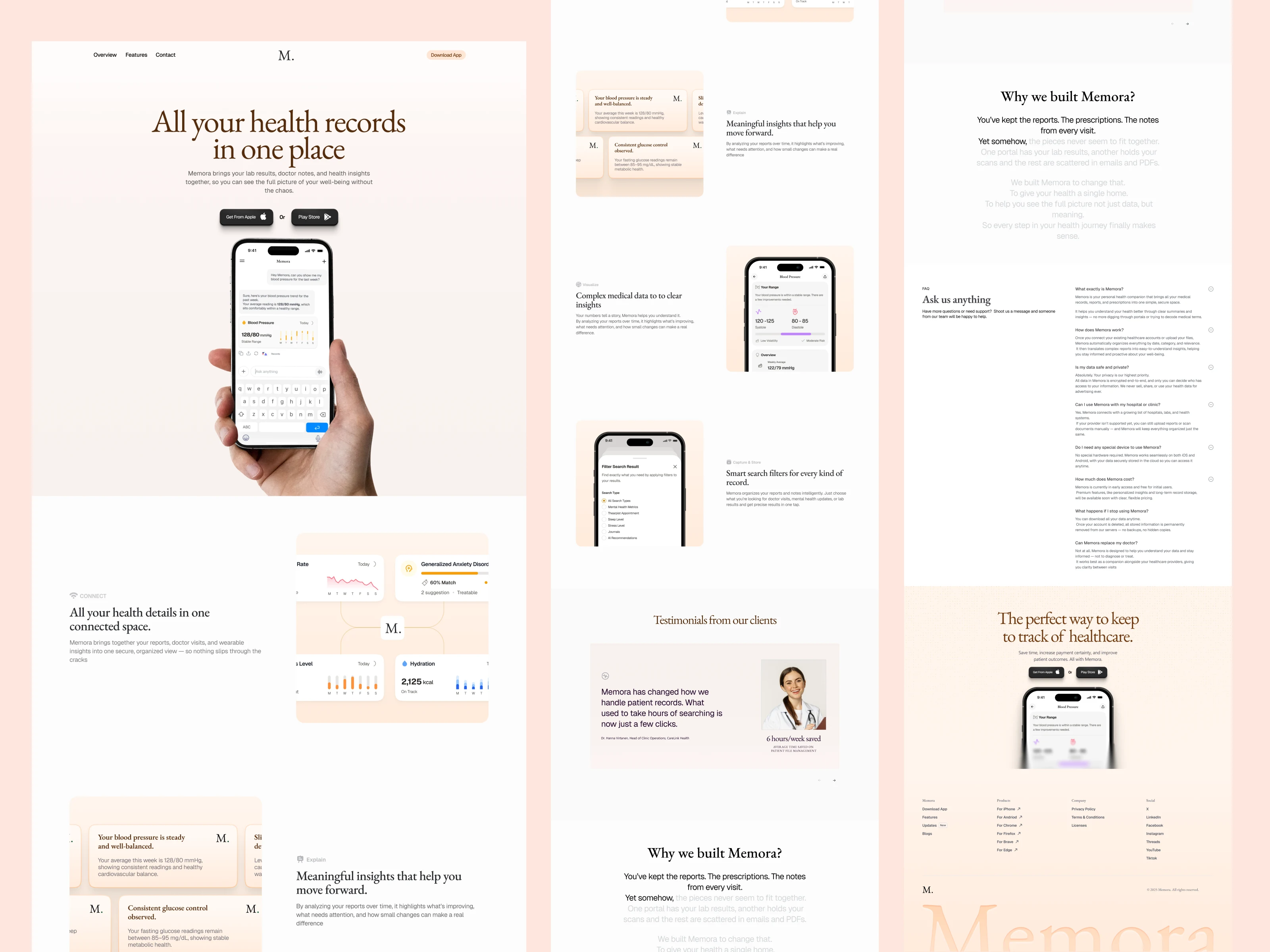
For the hero, I focused on outcomes instead of features. After exploring multiple options, the winning heading was: “All your health records in one place.”
Once the hero message was set, I structured the rest of the page content around it.
2. Wireframes
Before touching visuals, I built a full wireframe to map the layout and storytelling.
The wireframe helped me:
Set the content hierarchy
Define the user flow from problem to solution
Plan sections like hero, features, testimonials, story, FAQ, and CTA
Test layouts without any visual distractions
It gave a clear blueprint for what the final landing page needed to communicate.
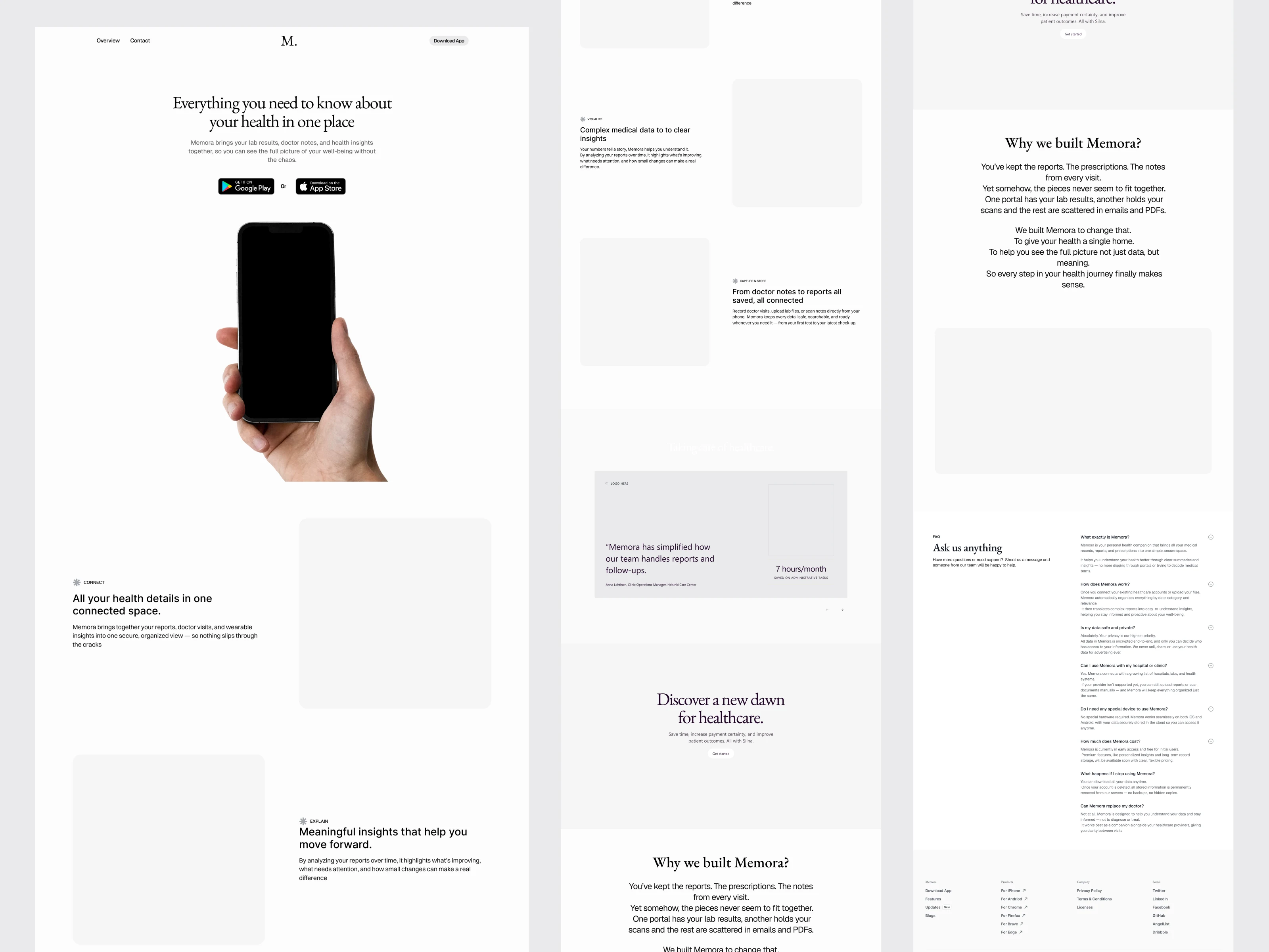
3. Design Direction
The design direction was set to a warm, human tone using:
Soft peach/neutral gradients
Real hands and device photography
Clean, minimal UI
Gentle, readable typography
This made Memora feel approachable and safe from the first glance.
4. High-Fidelity Design
With the wireframe locked, I translated everything into the final visuals:
Replaced placeholders with real app screens
Added warm gradients and subtle tones
Introduced floating UI cards and soft interactions
Applied the final typography and spacing
The shift from wireframe to high-fi brought clarity, emotion, and a polished brand feel.
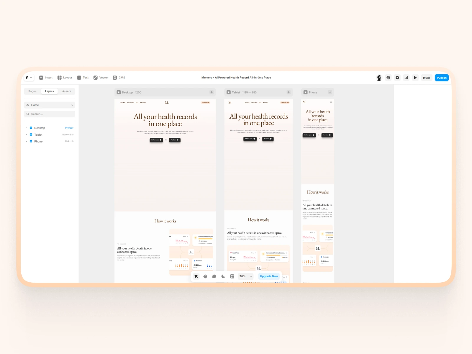
5. Development in Framer
Once the Figma design system was set, I built the full landing page in Framer.
Key details:
Component-based structure for easy updates
Soft scroll transitions and subtle micro-interactions
AI typing animation in the hero
Fully responsive across all breakpoints
Smooth fade-ins and card animations
Optimized images and fast load performance
Precise spacing using an 8-point grid
The final build feels smooth, modern, and aligned with the product’s warm, human tone.
Outcome
The final landing page delivers a clear, calm, and trustworthy experience that reflects what Memora stands for.
Make complex medical data feel simple and approachable
Build trust through warm visuals and human-centered design
Clearly explain how Memora organizes health records
Guide visitors smoothly from problem to solution with a structured content flow
Showcase the product’s AI intelligence through subtle, thoughtful interactions
Improve clarity, credibility, and conversion by aligning design and motion
In the end, the landing page turns a traditionally heavy healthcare topic into an experience that feels supportive, organized, and easy to understand.
Check-out the live website: https://memoraapp.framer.website/
Like this project
Posted Dec 10, 2025
Designed and developed a conversion-optimized landing page for Memora using Figma and Framer.
Likes
0
Views
20