Redesigning the Anima Patient App for seamless user experience
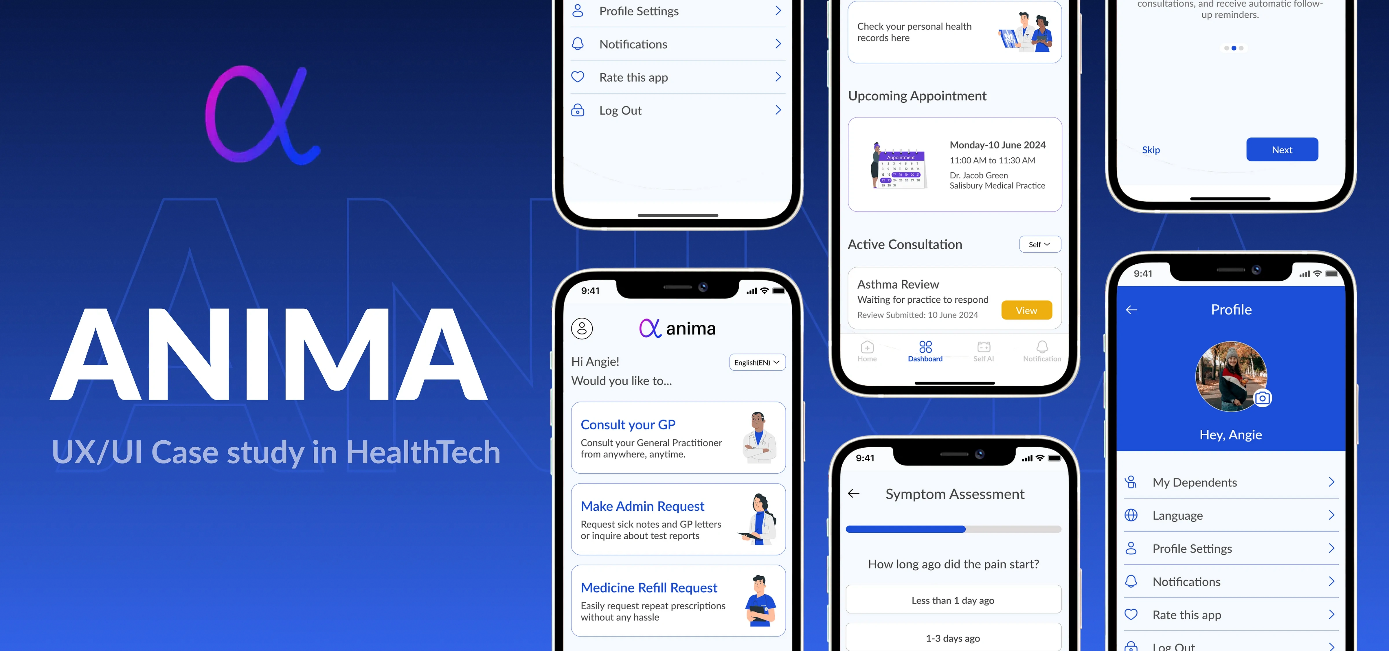
In this case study, we will take you through the process of redesigning Anima’s patient-side app
Project type: Independent Project
Time Duration: 2 weeks
UX Designers: Manvinder Jaret and Priyanka Pal
We decided to undertake this collaborative project to get the experience of working with a fellow designer with different ideas and design approaches.
Problem Statement
Navigating the Anima patient mobile app is a frustrating and time-consuming process. The app’s design is not optimized for mobile, resulting in a cluttered and difficult-to-use interface.
Patients often struggle to complete tasks like booking appointments leading to errors and wasted time. This subpar experience leaves users feeling disempowered and dissatisfied with their healthcare provider and the Anima app.
How might we streamline the user interface to make navigation more intuitive and efficient for patients using the Anima app on mobile devices?
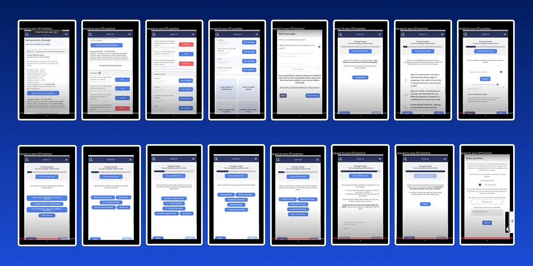
Anima App Screenshots 2024
What is ANIMA?
Anima is a digital health platform designed to streamline the workflow of healthcare providers and enhance patient care. It focuses on improving communication and efficiency in GP practices.
Anima Patients companion app is their demand side app that allows patients to book and manage their GP appointments.
How does it work?
Submitting Requests: Patients can submit new requests through the Anima platform, which typically takes 2–5 minutes to complete. They answer a series of contextual questions to provide details about their medical issue or administrative needs.
Practice Review: The patient’s request is then sent to their healthcare practice for review by a medical professional or administrative staff.
Response: Patients receive regular email and SMS updates on the status of their request as the practice processes it. The practice can then respond, provide the next steps, or book an appointment as needed.
However, while Anima’s healthcare platform has a strong supply-side experience for care teams(GP), its demand-side (patient) experience is lacking as a mobile app. Patients are finding the current experience confusing, leading to errors when booking appointments.
Research and exploration
We began the research process by gaining a comprehensive understanding of how healthcare services operate in England, particularly the interaction between the NHS and other healthcare services.
It was crucial to differentiate this system from the Indian healthcare system to ensure our designs were unbiased and culturally appropriate.
This foundational knowledge was essential for creating designs that accurately reflect the unique aspects of the English healthcare system and meet the specific needs of its users.
It was this research and understanding that helped us in designing the unique login flow of such healthcare apps in England.
Target Users
The next step towards getting to the right solution is to identify and understand our target users. Through our research, we’ve determined that the key user groups for the Anima patient companion app are:
Patients:
• The primary target users are patients who need to access healthcare services through their local practice or hospitals.
• This includes a wide range of demographics ranging from 16 years and above, who can use the web-based platform to submit requests, track their care, and communicate with their providers.
Dependents:
• Children or elderly parents are under the care of the primary user.
• This allows them to manage healthcare needs for their entire family through the platform.
Healthcare Practices:
• While not direct users of the patient app, healthcare practices, and providers are a key stakeholder group for Anima.
• The platform integrates with the practice’s electronic health record (EHR) system, allowing them to efficiently manage patient requests and streamline care coordination.
Understanding the Users
To better understand this broad user group it is important to analyze their pain points and expectations. Since we had very limited access to actual users of apps we relied heavily on comments on app stores and YouTube video explainers of these apps to understand the users.
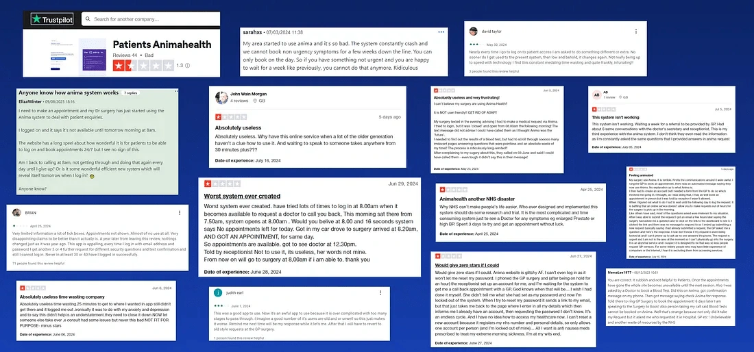
User Reviews
User Pain Points and expectation
Based on the reviews, we were able to narrow down the user's major pain points needs, and expectations.
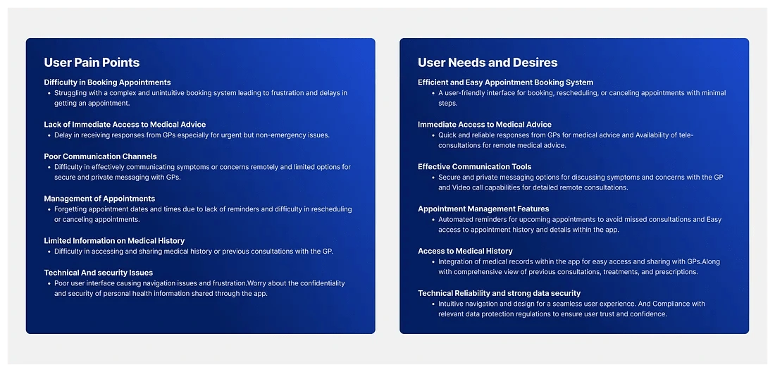
User Pain Points and expectation
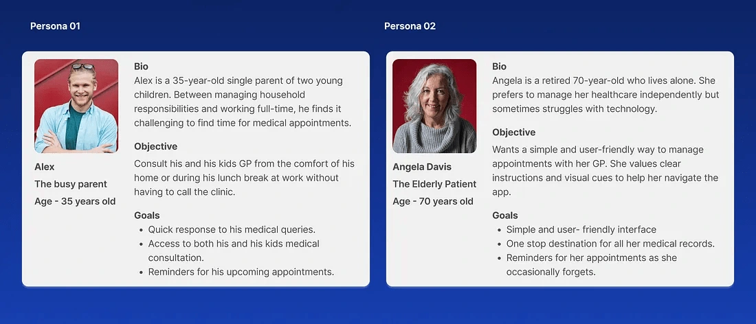
User Personas
Based on the research and user pain points and needs and expectations we were able to come up with two personas.
Competitive Analysis
We wanted to get familiar with the patterns and trends in the current healthcare patient management app market and to achieve this, We started research with a few points in mind-
Who are the competitors?
What are some common and unique offerings of the competitors?
What are the common design patterns that remain consistent among all competitors?
Identifying 5 major competitors and a deep dive into the competitive analysis helped answer these questions and we identified a few key features that we need to include.

Direct Competitors of Anima Health Patient App
Insights so far…
Based on the research and insights gathered, we’ve identified the following potential design solutions to address the key challenges and improve the user experience of the Anima.
Make the consultation form easily accessible and simplify the form layout and navigation to minimize user efforts and errors.
Keep users updated on the status of their appointments and any upcoming steps.
Implement an AI chatbot or virtual assistant to assist users in symptom assessment and with other medical questions.
Give users access to their and their dependent’s complete medical history, including past consultations, test results, and prescribed medications.
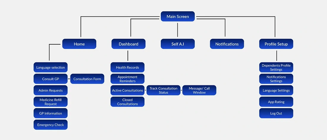
Information Architecture
This is where a lot of the thinking about the product is done. As a product designer, we need to make sure that the whole flow and information is laid out to the user in the best way possible for better usability.
Information Architecture
Wireframes
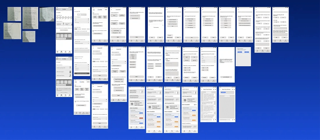
We started the process of wireframing with paper and pencil to be able to freely layout our ideas without having to worry about the time and effort utilized. Once we had a basic idea of the layout we moved on to lo-fidelity designs
Low Fidelity Design
The idea was to nail down the basic structure of the app here. These wireframes served as a blueprint for the app’s structure, guiding the design and development process. Here’s a snippet of some of the wireframes.
Wireframes
Visual Designs / Design System
Screen by Screen breakdown
Home Screen
Home Page
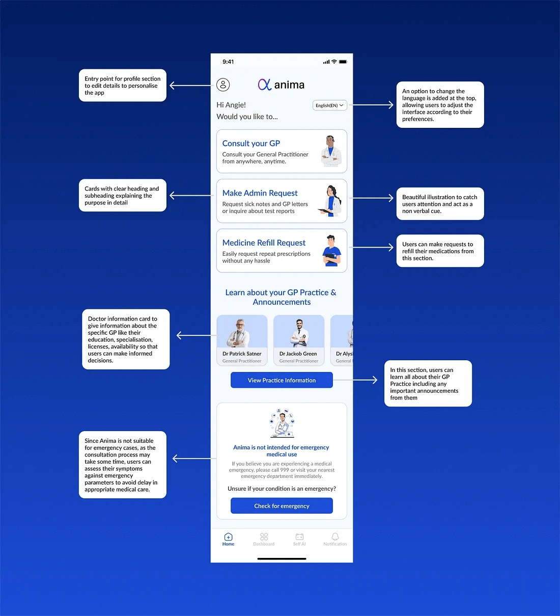
The home screen serves as the user’s first point of contact with the app. It’s crucial that this screen not only captures the user’s attention but also effectively communicates the app’s core features while guiding them towards the primary call-to-action (CTA).
To achieve this, we designed cards for the three main features and the primary CTA, arranging them by priority:
Consult GP Card: This is prominently placed as the MVP feature, allowing users to initiate consultations with their GP conveniently at any time and from anywhere.
Admin Request Card: Users can submit non-urgent admin requests to their GPs, such as requesting fitness or sick letters. This request is given a separate card due to its low-priority nature.
Medical Refill Card: Introduced for efficiency, this card allows users to manage their prescription refills and medication-related needs directly within the app. GPs can verify requests using prior consultation data and may request further details as needed before approving medications.
Practice Information Card: Provides users with essential details about their GP Practice, including working hours, services offered, individual GP information and availability, and important announcements. This helps users make informed decisions.
Emergency Check Card: Since Anima is not intended for emergency situations, this card provides users with tools to assess the urgency of their condition upfront and receive instructions on the appropriate actions to take. This feature ensures that users with urgent medical needs can still receive timely and reliable support.
Language Selection: This feature allows them to adjust the interface according to their preferences, ensuring accessibility and inclusivity for a diverse user base.
This layout ensures clarity, efficiency, and user engagement right from the moment they interact with the app’s home screen.
Consultation Screen Design
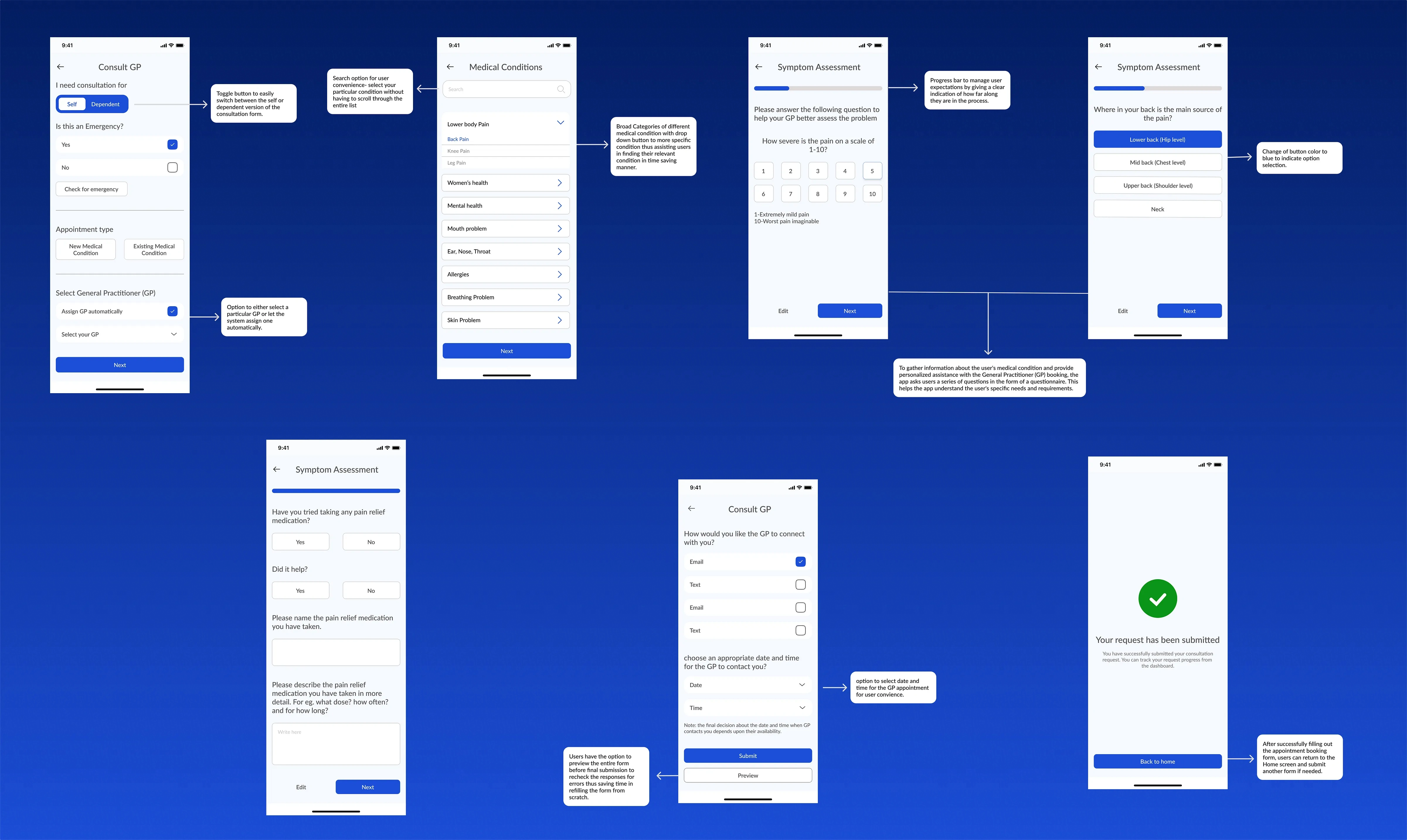
Consultation Flow Design
Designing the consultation screen was the most time-consuming and critical part of the app, as it was both content-heavy and crucial for user satisfaction. The form serves as a bridge between the user and the General Practitioner (GP), enabling the healthcare provider to better understand the user’s specific problem and offer personalized care.
Consultation For: Ensuring clarity by allowing users to specify the consultation recipient upfront.
Emergency Check: An early checkpoint is included to prevent users from risking delays in addressing potentially critical issues.
Appointment Type: Allowing users to start new or continue previous consultations to save time and avoid redundancy.
Condition to Discuss: Designing this segment was the most time-intensive. In the initial iteration, we offered users to freely describe their condition. However, after gathering feedback from real users, we discovered that many struggle to articulate and categorize their concerns. To address this problem, in the final version users can now either select from a comprehensive library of predefined categories or specify their condition through free-text input.
Consultation Form: A comprehensive questionnaire designed to gather detailed information about the user’s medical condition. This data gives the GP a clear and accurate understanding, ensuring more effective diagnosis and treatment recommendations. It is dynamic in nature, adjusting questions based on individual responses to collect relevant and specific information. To ensure accessibility and inclusivity, the form features clear language and offers language preferences to users.
Contact Options: Offering multiple contact methods and flexible scheduling for user convenience.
Dashboard
Dashboard
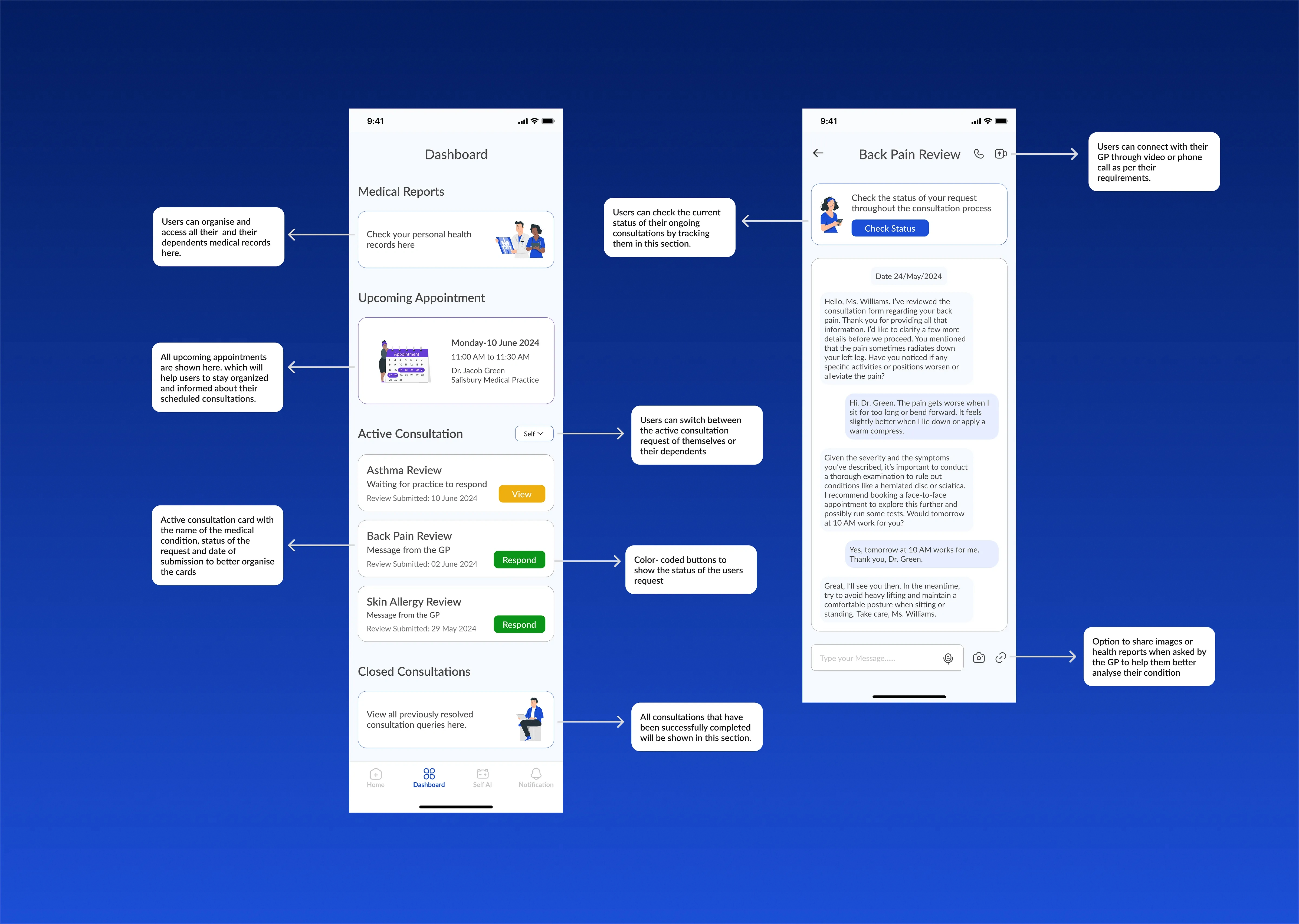
The Dashboard section of the Anima app offers users a comprehensive overview of their healthcare information and ongoing activities. This central hub empowers users to stay informed, organized, and in control of their healthcare by providing easy access to essential data and functionalities.
Medical Report: We introduced this new section in the app to centralize all medical records. This enables users to easily access and share their records with their GP directly within the app.
Upcoming Appointments: These are placed prominently to eliminate the need for users to navigate through active consultation windows. This reduces the likelihood of missing appointments and the inconvenience of rescheduling.
Active Consultation: To enhance clarity, we segmented active and closed consultations into separate sections. Each individual consultation request features a color-coded status button, instantly informing users of any required actions. Users can seamlessly track and interact with their ongoing requests through dedicated message screens.
Closed Consultations: The Dashboard also features a section for all consultations that have been successfully completed to support users in overall understanding of their medical history.
Self AI
Self AI
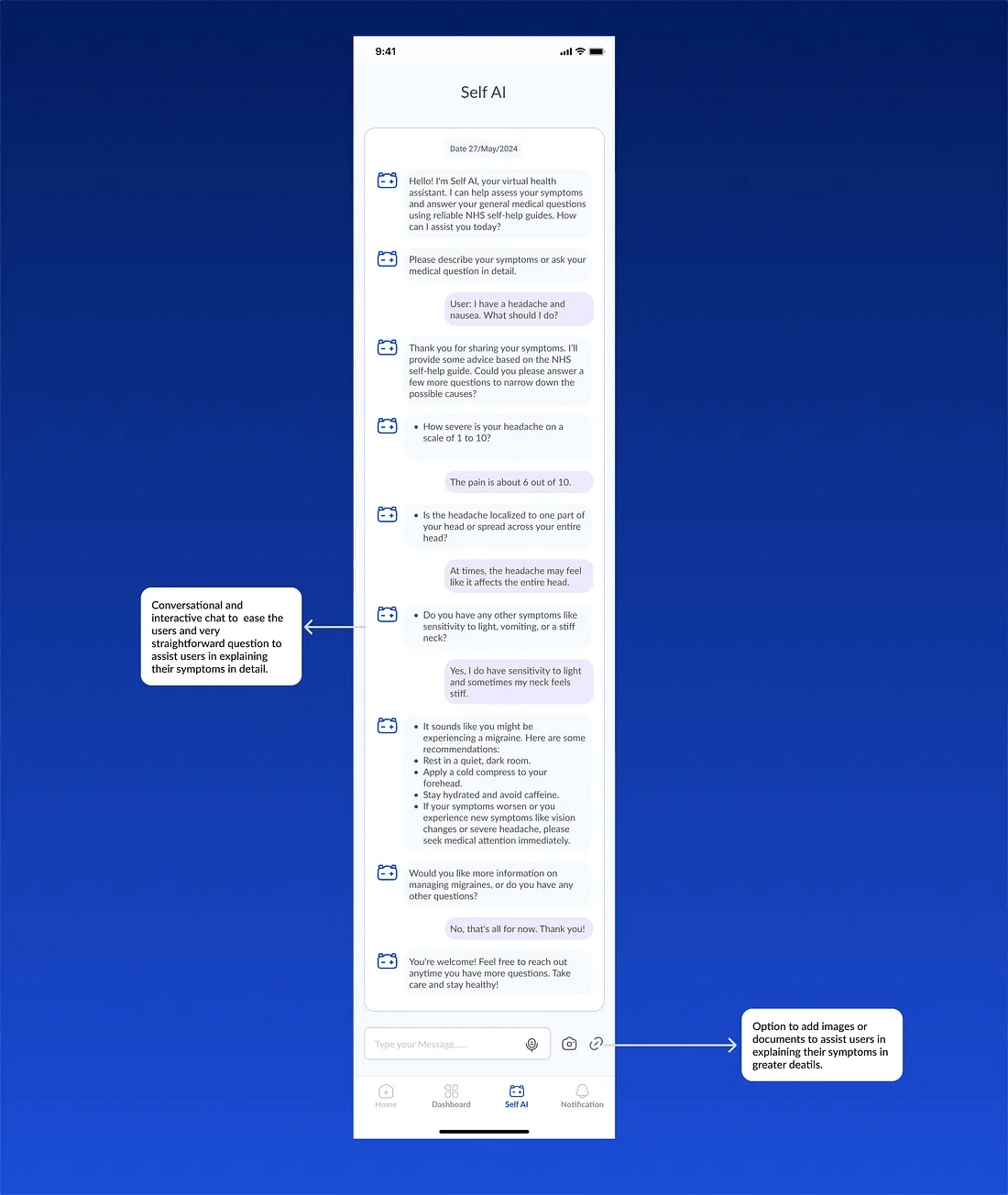
We are excited to introduce a new feature: Self AI.
Let me explain briefly what Self AI does and the reasoning behind its development.
Self-AI leverages AI technology and the NHS self-help guide to assist users through various aspects of their healthcare journey like analyzing symptoms, giving possible solutions, etc. The earlier version of the app required users to manually consult the NHS self-help guide to analyze their symptoms and discover potential solutions.
Acknowledging users’ desire for prompt responses and their aversion to extensive documentation, we opted to streamline the process using AI technology. Self-AI simplifies symptom analysis, alleviating the burden and enhancing user convenience.
Our design approach was simple. We strived for a user-friendly interface, taking cues from successful AI applications such as ChatGPT and Perplexity AI. Additionally, we aimed to foster a friendly and conversational interaction style.
Challenges/ Constraints faced
● Understanding the intricacies of healthcare in England particularly how NHS works was the first major challenge faced by us.
Solution: Reading multiple articles and extensively using AI to simplify and understand NHS workings particularly how healthcare services operate in tandem with NHS was the first step towards uncovering the intricacies of this project.
● Another major challenge was finding screenshots of the app including competitor apps since most of them were either not available in India or required an NHS ID to log in.
Solution: A YouTube video explainer of these apps, their websites, and an open Google search helped us find a way around this problem. So hours and hours were spent going through videos and websites and taking screenshots to collect the screen for competitive analysis.
● Another challenge that we had to navigate was the limited access to the actual users of the app to conduct user research, interviews, and usability testing from the target demographic in the UK.
Solution: Navigating this challenge was harder and we had to rely a lot on the data already available on the internet. We extensively went through user comments on app stores and YouTube comments on their videos to understand user grievances and utilized Linked In to find a few users to connect with to gather some data.
Thank you for taking the time to explore this case study. I hope you enjoyed it as much as I enjoyed putting it together!
Your feedback is invaluable! Feel free to share your thoughts and suggestions in the comments below or say hi to me on LinkedIn.
I’m actively seeking opportunities as a Product Designer. Do reach out to me on LinkedIn if you’d like to work with me or collaborate on some projects.
Thank you.
Like this project
Posted Oct 2, 2024
In this case study, we will take you through the process of redesigning Anima’s patient-side app


