Nothing’s Open

Howie Y
Nothing’s Open
A premium reservation platform for high-demand restaurants.
Nothing's Open was designed to make premium restaurant access feel transparent, intentional, and operationally simple — combining reservation discovery, transparent pricing, and premium hospitality into a single booking experience.
Role
Lead UI/UX Designer
Type
Consumer Facing · Web
Year
2023
Deliverables
Product Design · UI/UX · Product Strategy · Design System
01 Brief
A two-sided opportunity in premium dining
Two audiences, one platform: diners chasing impossible tables, and restaurants looking to capture the demand they create. Here's why the opportunity was real.
Demand for premium access
75% of diners would pay more for a better dining experience. The willingness was there; a transparent way to spend it was not.
Restaurants needed differentiation
Restaurateurs were looking for new ways to capture demand and stand apart in a crowded, competitive hospitality market.
A dual-market opportunity
One platform serving both diners and restaurants — a chance to design a system that scaled across two audiences inside the TRUFL product family.
02 Problem
Impossible tables, and no honest way to pay for one
Some restaurant reservations are harder to snag than ever before.
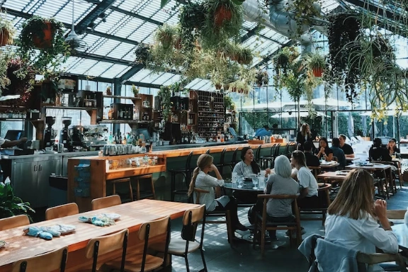
Snagging a table can sometimes be particularly challenging depending where you live or where you're visiting. If you don't have a reservation a week — or even a month — in advance, your likelihood of scoring a table at a popular restaurant in a densely populated city is pretty low.
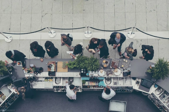
Restaurants are looking for new ways to set themselves apart from the pack.
The hospitality industry is equal parts competitive and innovative. With restaurants popping up left and right, restaurateurs have realized the importance of offering something extremely unique to meet this new demand.
03 What was broken
Five gaps a generic booking app couldn't close
High-demand reservations disappeared within minutes.
Top restaurants release reservations weeks ahead and they vanish in minutes. Diners who weren't watching the clock missed out, even when they were ready to pay.
Existing platforms didn't price for scarcity.
Traditional platforms like OpenTable and Resy treat every reservation the same way: first-come, first-served. Diners willing to pay more had no way to express that demand, and restaurants had no way to capture it.
Concierge services were opaque and expensive.
High-end concierge services existed for premium diners, but they operated as black boxes. Pricing was hidden until after the booking. Trust was built person-by-person, not at scale.
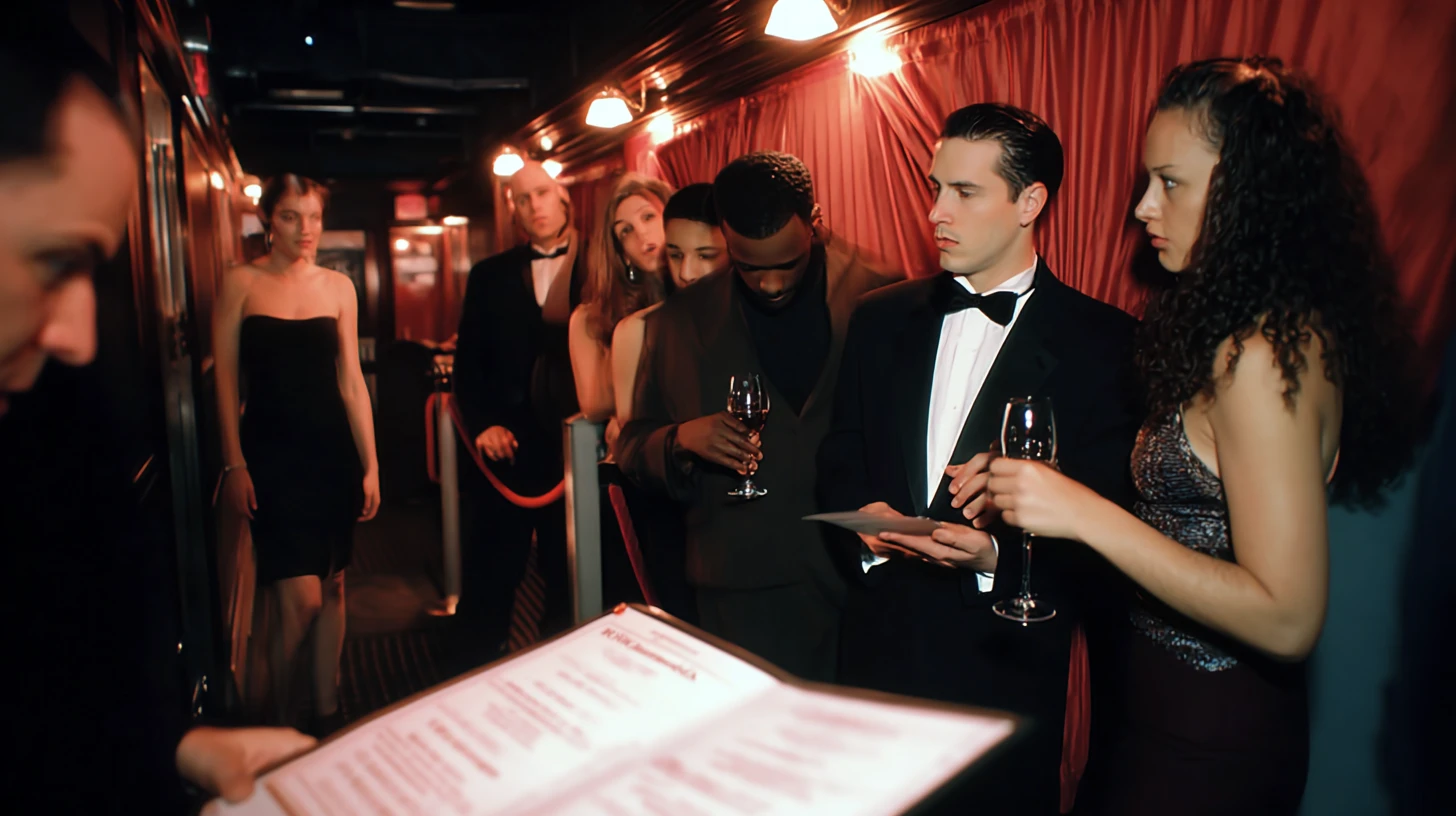
Restaurants couldn't capture the demand they generated.
When a $250 tasting menu is impossible to book at face value, the secondary market captures the upside. Restaurants generated the demand but watched the value flow to resellers and brokers.
Premium hospitality lacked a premium digital experience.
Even at the highest end of dining, the booking experience felt generic. The contrast between the in-restaurant moment and the digital flow that led to it was jarring, and the brand suffered for it.
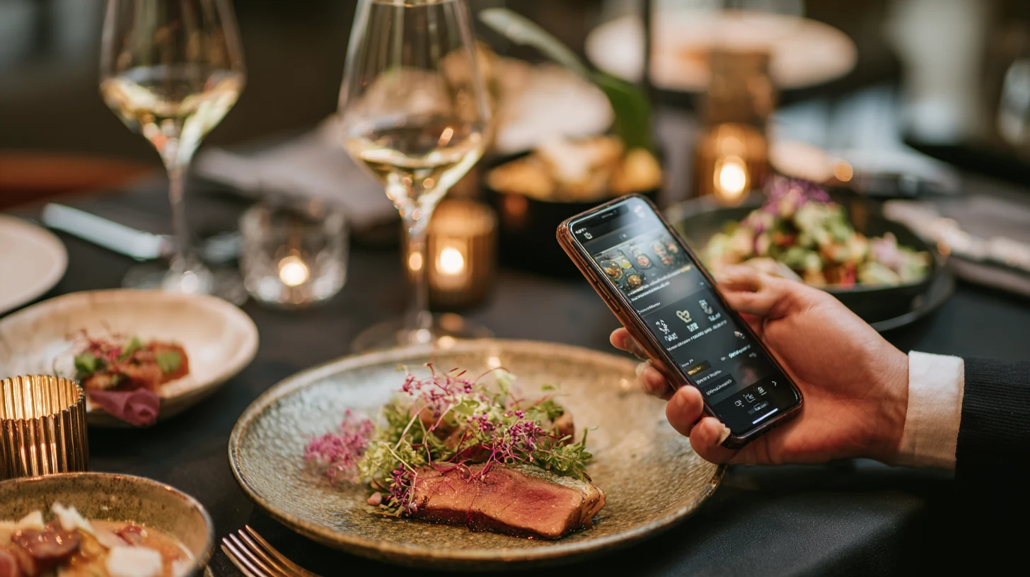
04 Insight
75% of diners would pay more for a better dining experience.
Pairing reservation scarcity with transparent pricing created an opportunity for a new kind of dining platform — one where access became part of the product experience itself.
05 Goal
Premium hospitality, productized for diners and restaurants both
User goals
Confidence from the first tap.
Discover sought-after restaurants quickly, book with transparency, and feel the premium tone immediately.
Business goals
Capture premium demand.
Open a new sellable surface for restaurants and build a dual-market platform under TRUFL.
Design goals
Premium, with less friction.
Reinforce hospitality through visual design, reduce friction at every step, and scale a dual-market design system.
06 Solution · Flow 01 · Brand entry
Establishing premium tone from the first interaction
A minimal, brand-led entry with the rotating NOTHING'S OPEN mark and a single clear CTA. The grayscale palette and editorial typography establish the premium tone before any content loads.
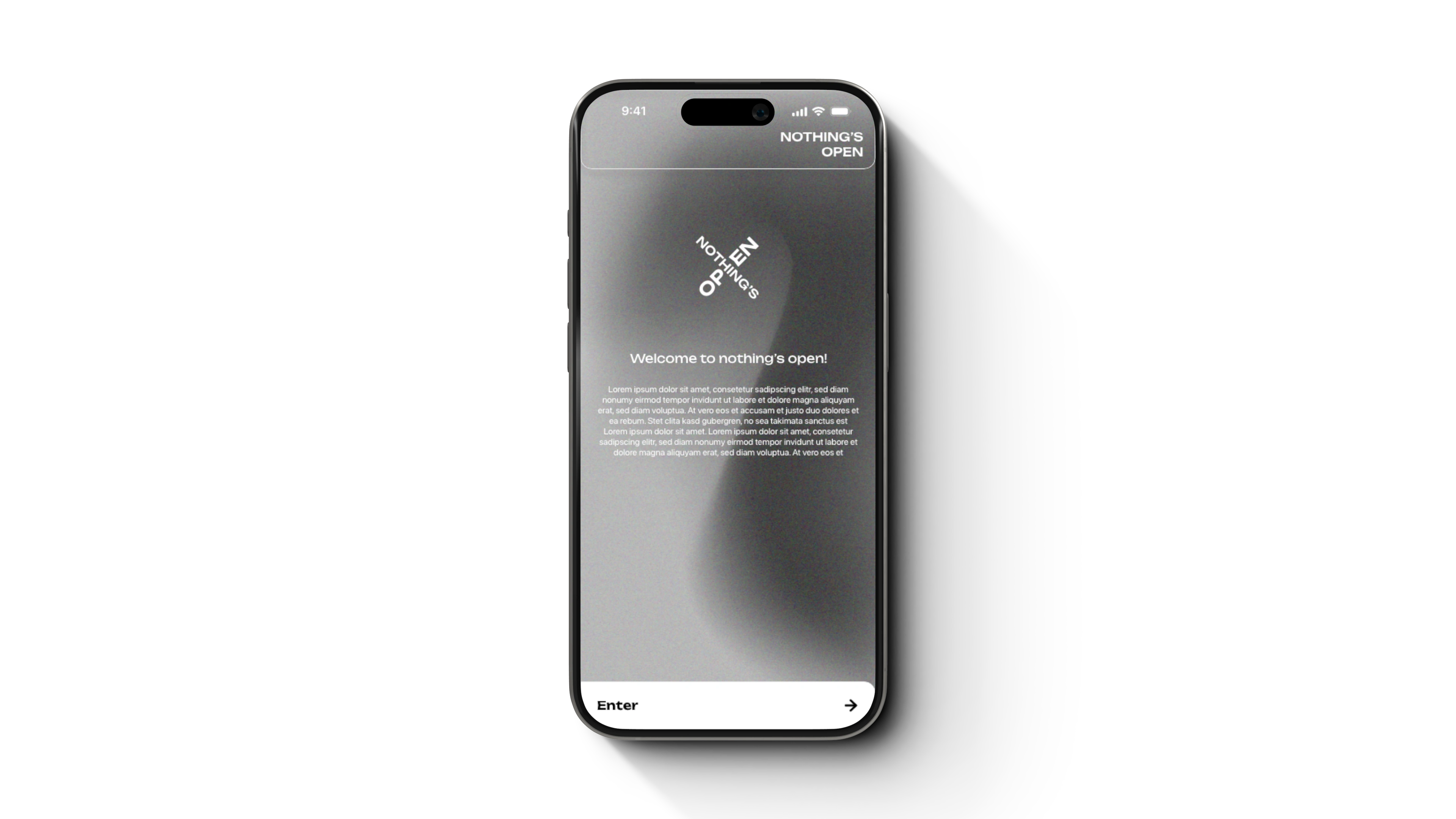
Single clear CTA
One action, no distractions. The entry experience focused on clarity and restraint, letting the brand and restaurant content carry the experience.
Premium editorial visual language
Grayscale palette, restrained typography, and generous spacing signal premium hospitality immediately.
07 Solution · Flow 02 · Invite-only onboarding
Sign-up designed around existing social behavior
A short, gated form (name, phone, social handles) reinforces the invite-only positioning. Social handle integration with TikTok, Instagram, Twitter, and Facebook makes onboarding feel native to how this audience already lives online.
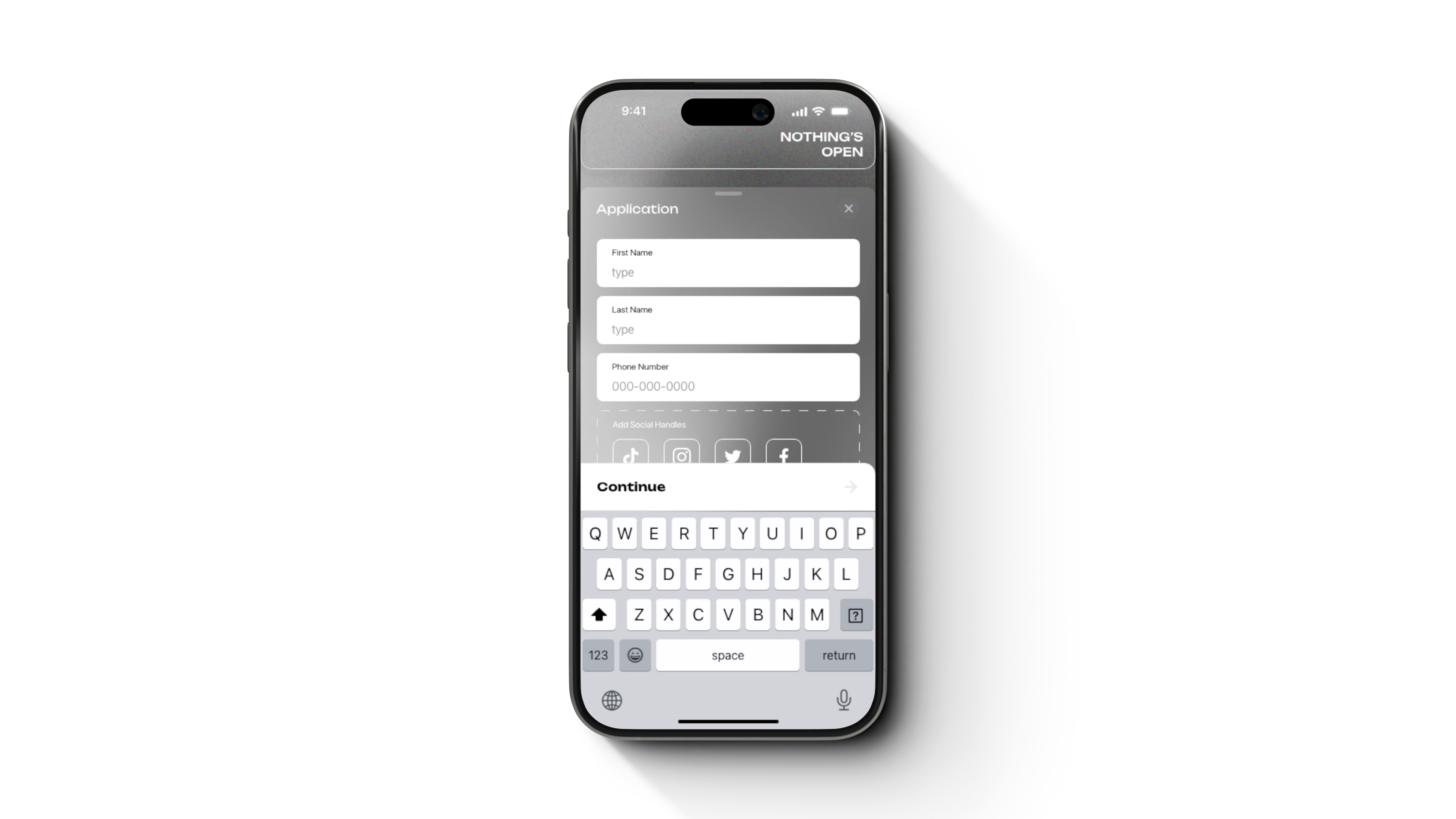
Gated form, short by design
Only the essentials: name, phone, social handles. Keeps friction low while signaling invite-only positioning.
Social handles as identity
TikTok, Instagram, Twitter, Facebook — the platforms this audience already uses to express identity. Onboarding feels familiar, not corporate.
08 Solution · Flow 03 · Curated discovery
Discover — a curated guide, not a directory
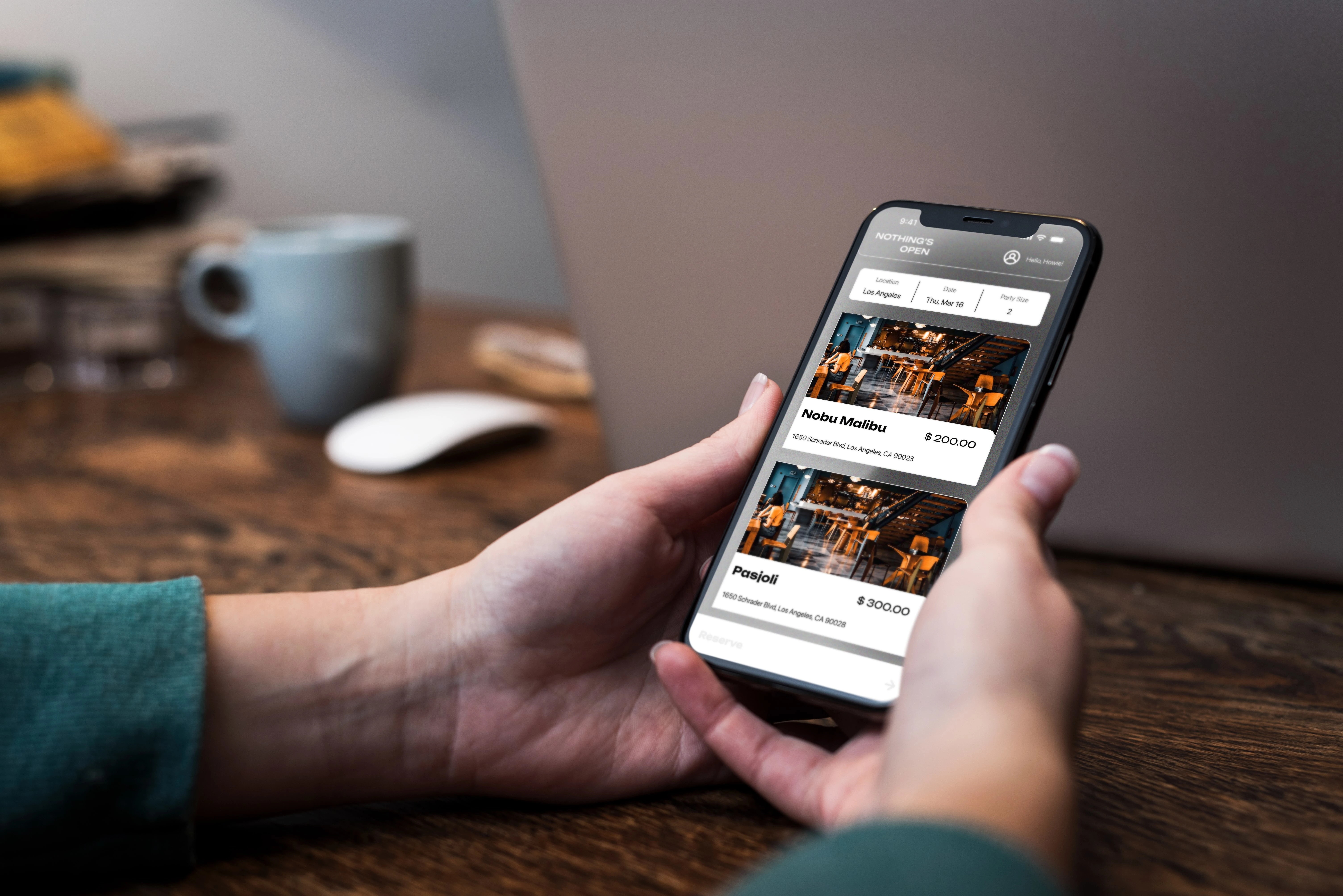
A personalized home view with city, date, and party size at the top. Restaurants appear as large, image-forward cards — making browsing feel more like a curated guide than a directory.
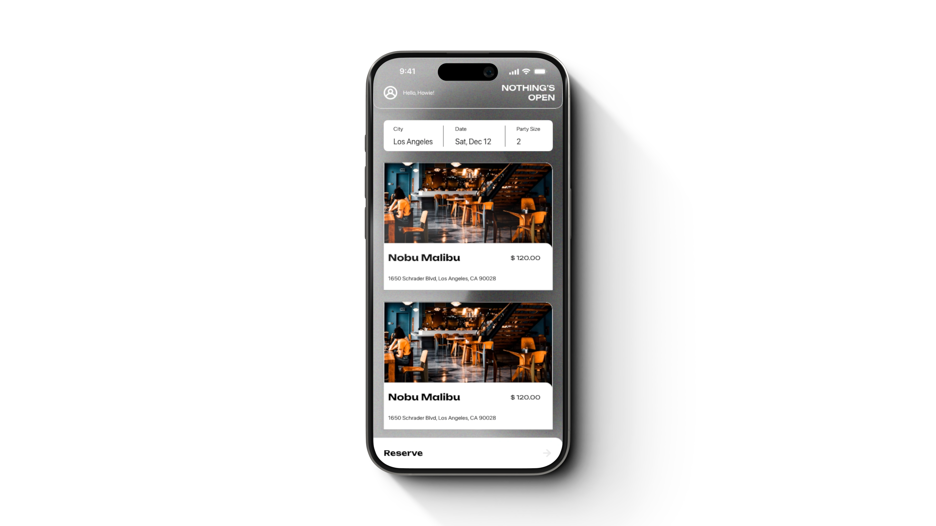
Image-forward, curated cards
Restaurants get full-bleed photography, not thumbnail rows. Discovery became part of the premium experience, not just a utility layer.
Personalization woven in
City, date, and party size sit at the top — preferences travel with the user instead of being buried in settings.
09 Solution · Flow 04 · Transparent pricing
Time slot selection — transparent pricing at the moment of choice
Reservation times shown in a clear grid, each with food/bev credit and ticket amount transparently broken out. Selected slots invert to black for immediate visual feedback.
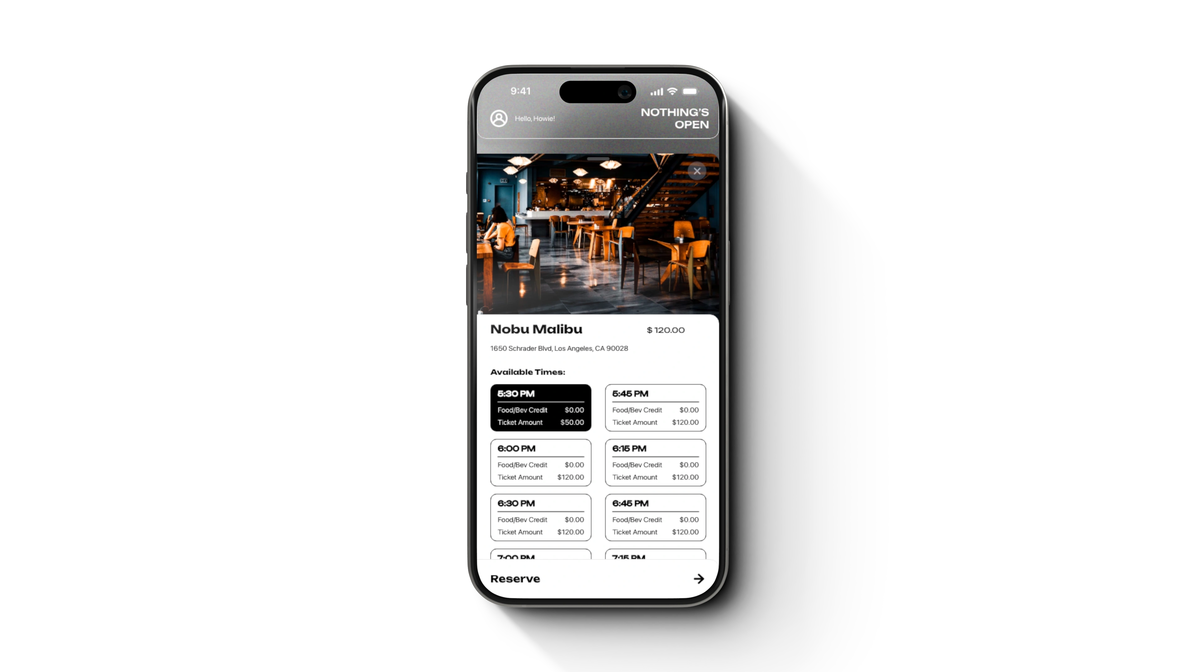
Food/bev credit + ticket amount, side by side
Both numbers shown per slot. Diners see exactly what they're paying for before they tap.
Restaurants set the rules
Restaurants configure their own food/bev minimums and ticket amounts per slot — pricing reflects how they actually run their business.
Dynamic pricing shapes demand
Pricing flexes by time and demand: lower during off-peak hours, higher during peak windows. Diners see the trade-off transparently.
10 Solution · Flow 05 · Confirmation
Reservation confirmation — a receipt, not a confirmation modal
A receipt-style confirmation with restaurant photo, QR code for entry, full itemized total, and a 30-second auto-redirect. Designed to feel tangible — like a ticket worth showing up for.
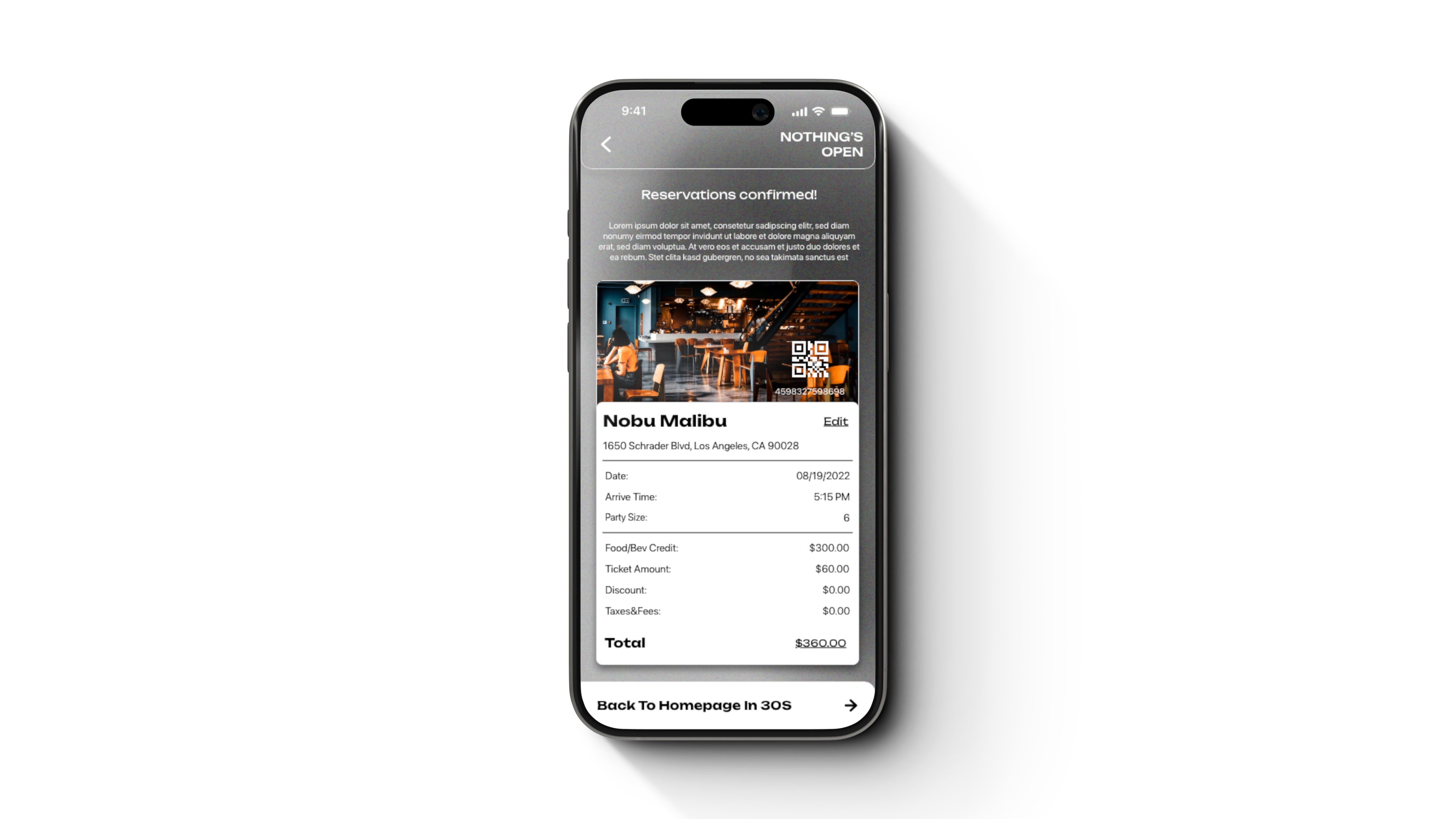
Receipt-style, not a modal flash
Itemized total, scannable, screenshottable. The confirmation reinforced the sense of value and exclusivity behind the reservation.
QR code for entry
One scan at the restaurant door. The diner shows up holding the reservation, not searching their email.
11 Design decisions
5 decisions that shaped the platform
Premium editorial visual language
Heavy whites, generous spacing, and restrained typography put restaurant photography front and center.
Persistent bottom CTA
The anchored bottom action (Continue, Reserve, Back to Homepage) reduces decision fatigue throughout the flow.
Transparent pricing as a lever
Surfacing food/bev credit and ticket amount up front builds trust around a pricing model that's often opaque in this space.
Personalization in the flow
Location, party size, and social profile are woven into the flow rather than buried in settings.
Built for both sides
Designed to support diner and restaurant-partner experiences across the broader Trufl product ecosystem.
12 Outcomes
Premium hospitality, productized
Diner side
Tap → Reserve.
A booking flow that felt like an experience: brand-led entry, transparent pricing, receipt-style confirmation. Closer to buying a ticket to a show than checking out of an e-commerce site.
Restaurant side
Dynamic pricing as an actual operational tool.
Restaurants gained a real lever for shaping demand — setting Food/Bev minimums and adjusting Ticket Amounts to pull customers into quieter hours and capture value during peaks.
Brand
Premium tone, set in seconds.
The editorial visual language earned the price point users were being asked to pay.
13 What it taught me
Premium pricing means premium scrutiny
When users pay an access fee, every detail has to earn it. "Good enough" stops being good enough.
Transparency is a marketplace lever
Not just a UX feature: showing Food/Bev Credit and Ticket Amount upfront built trust with diners, and gave restaurants a real tool for shaping demand.
Shipping isn't the end of the work
Watching how users actually moved through the booking flow shaped instincts for the next thing. Post-launch observation taught more than any pre-launch usability test.
14 The bigger opportunity
Access as a category, not just a feature
The longer view
Scarcity creates opportunities for more transparent access models — restaurants were just the first vertical we explored.
Hotel suites, private clubs, sold-out shows, members-only sports — anywhere scarcity creates a secondary market, a transparent first-party platform can replace it.
Like this project
Posted Jun 9, 2026
A premium reservation platform designed for high-demand restaurants, enhancing user experience and transparency.
Likes
0
Views
5
Tags