Brand Identity and Landing Page Design for Women Who Build
Keerthi G
Women Who Build
Project Overview
A complete brand identity and landing page design for Women Who Build, a new movement and community focused on female founders, creators, and artists. The goal was to create a brand that felt empowering, premium, and distinct, positioning it not as "another collective," but as a dedicated "house of builders" for women who execute.
Visual Identity: Building the Brand
Based on the strategy, I designed a visual system that balances elegance with modern energy.
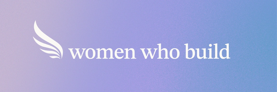
Logo Design
The logo system features a primary wordmark paired with a stylized wing icon, symbolizing ambition and connection.
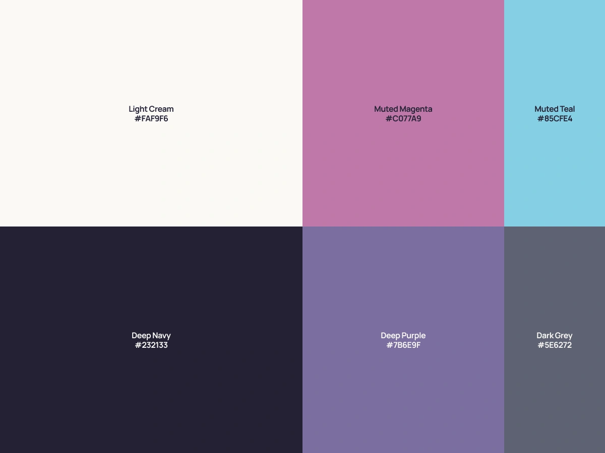
Color Palette & Gradients
The color palette was chosen to evoke both trust and creativity.

Typography
A dual-font system was implemented to create a clear and refined hierarchy:
Primary Font (Headlines):
Stix Two Text, a classic serif, was chosen for its authoritative and refined feel.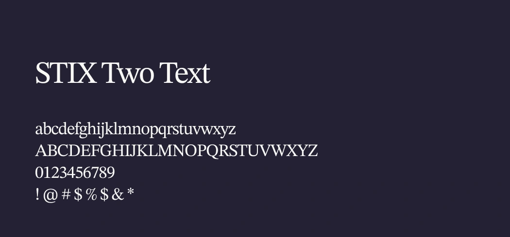
Secondary Font (Body):
Manrope, a clean and modern sans-serif, is used for all body text and UI elements to ensure clarity.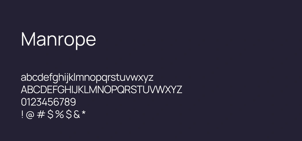
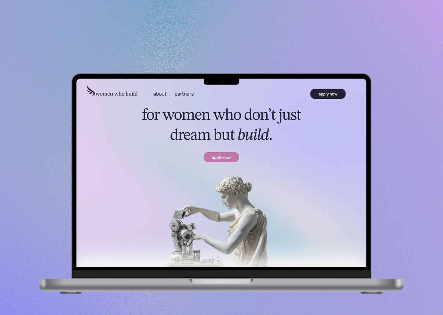
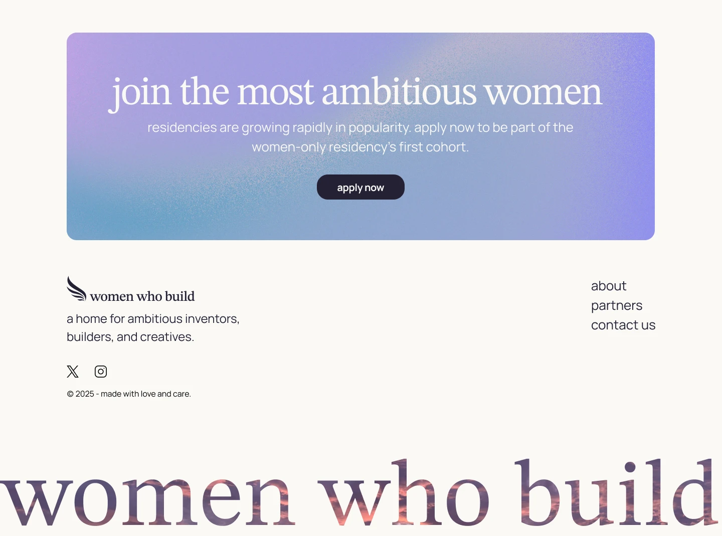
Landing Page Design: The Strategy in Action
The brand strategy was directly translated into a high-impact, conversion-focused landing page. The design guides the user through the "what, why, and how" of the Women Who Build movement.


Like this project
Posted Nov 6, 2025
Designed brand identity and landing page for Women Who Build.
Likes
0
Views
51
Timeline
Nov 1, 2025 - Nov 6, 2025