Ligo Re-Engagement Email Campaign Design
Zazzy
A mobile-optimized re-engagement email that turns feature education into community action.
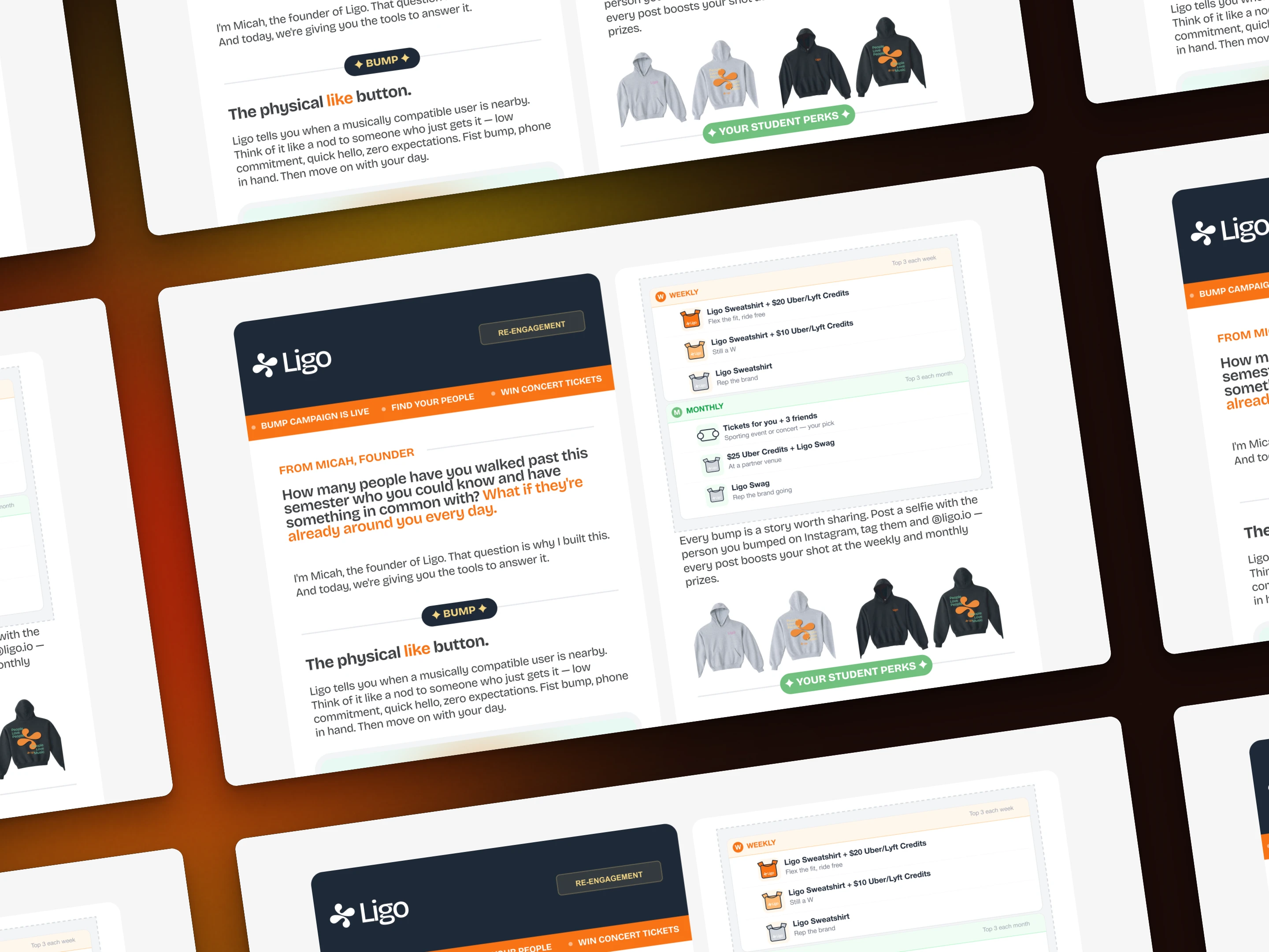
The goal of this project was to design a re-engagement email campaign for Ligo, a music-based social discovery app targeting college students. The client needed a single email that could accomplish multiple objectives: introduce the founder's vision, explain the new "Bump" feature, promote a giveaway campaign, showcase student perks, and drive app re-engagement — all without overwhelming the reader.
I approached the design with a "mobile-first, clarity-first" mindset, structuring the email as a scannable narrative that guides students from curiosity to action. The challenge was balancing rich content with clean presentation, ensuring each section felt purposeful rather than promotional. The result is a 1,500px vertical composition that maintains visual consistency while adapting complex information into digestible, visually distinct blocks.
The email uses Ligo's vibrant brand palette (orange #F97316, green #71C07F, yellow #F5D783, and pink #EA8CE1) strategically — never overwhelming, always intentional. Each color serves a functional role: orange for primary CTAs, green and pink for secondary accents, and yellow for highlights. The flat illustration system with thin black outlines and rounded geometric characters creates a youthful, approachable aesthetic that resonates with college culture without veering into dating-app territory.
Approach
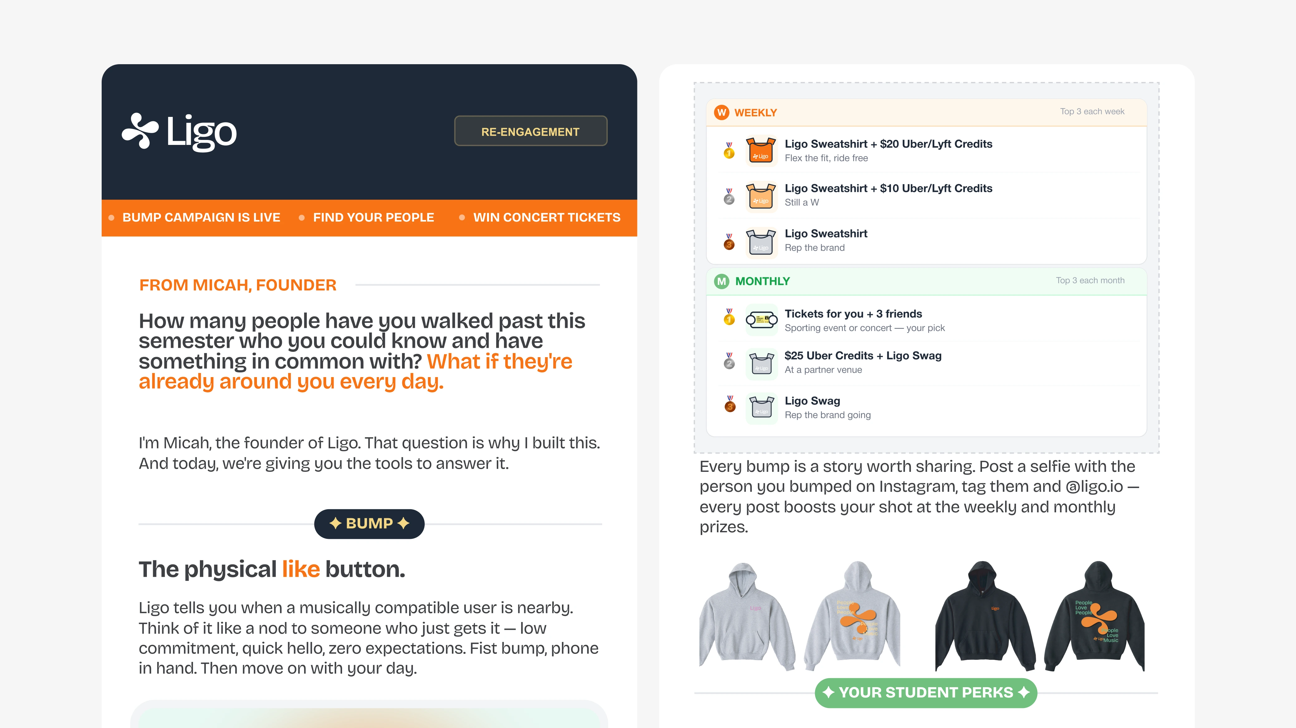
My approach began with information architecture. What does a student need to know first, and what can wait? The hierarchy became clear: founder credibility → feature education → incentive (giveaway) → ongoing value (perks) → action. This narrative flow ensures readers understand the "why" before the "what," building trust before asking for engagement.
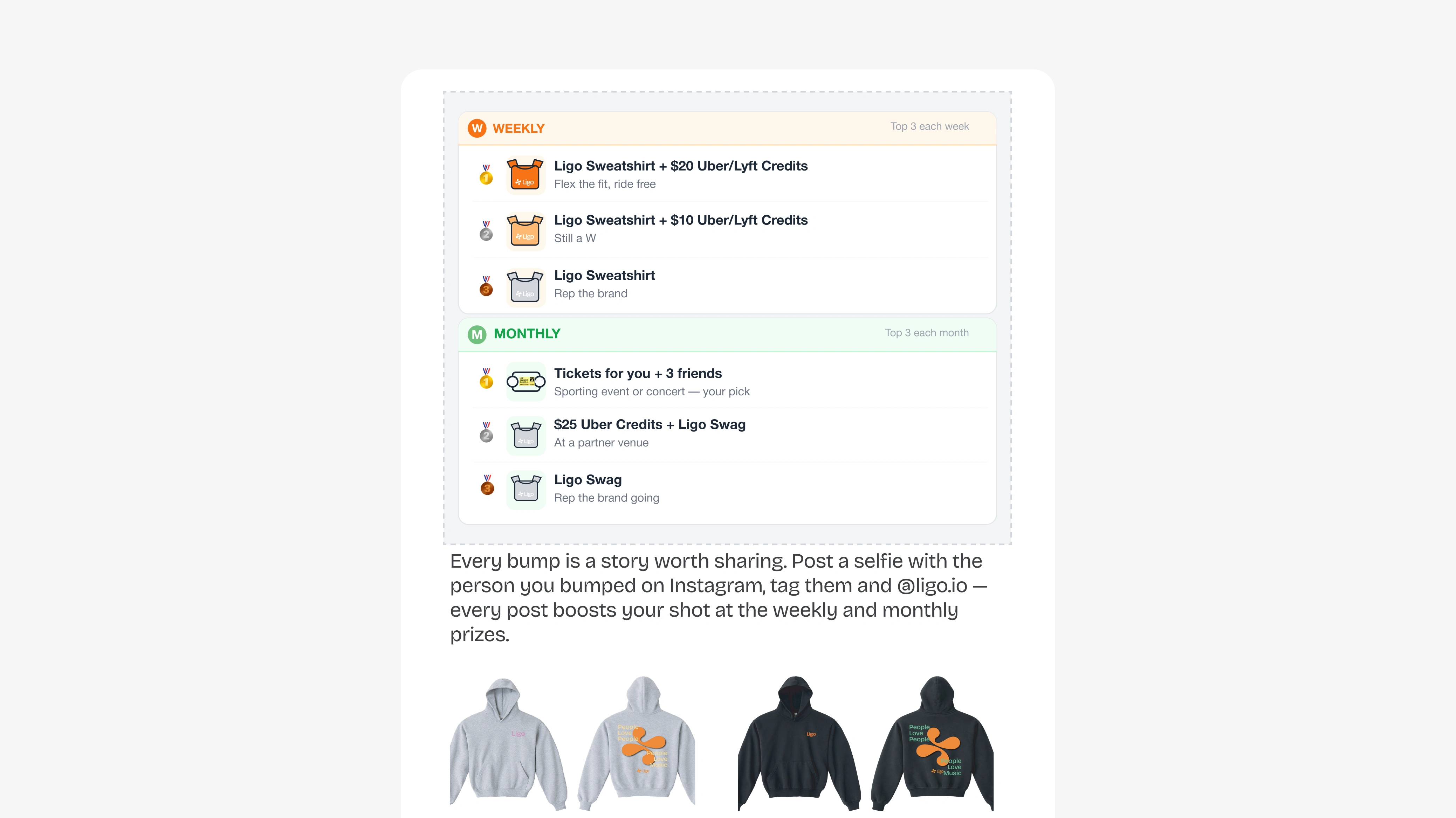
I designed the email in distinct visual zones, each with its own rhythm and purpose. Section dividers with centered text ("— BUMP —" and "— YOUR STUDENT PERKS —") create natural breathing room and signal transitions between topics. Placeholder containers with dashed borders mark areas for dynamic content (GIF animations, prize grids, venue cards), making the template scalable for future campaigns.
The illustration style required careful consideration. I developed a consistent visual language using minimal facial features (dot eyes only), rounded geometric shapes, and flat color fills. This approach keeps the design friendly and inclusive while maintaining professional polish. The "Bump" mechanic illustration shows two abstract students bumping phones with music wave connections — communicating the feature instantly without requiring explanation.
Typography plays a critical role in scannability. I used a clean sans-serif system (Inter or similar) with clear hierarchy: 16px body text at 1.5-1.6 line-height for readability, 14px uppercase section dividers with 2px letter-spacing for structure, and 12px labels for secondary information. All text meets the 16px minimum for mobile accessibility, and the CTA button exceeds the 48px touch target standard.
Process
Content Strategy & Hierarchy
I worked closely with the client to distill their message into essential components. The founder's personal intro sets a warm, authentic tone — "How many people have you walked past this semester..." immediately creates relatability. The Bump feature explanation avoids technical jargon, using analogies ("Think of it like a nod to someone who just gets it") that resonate with student culture.
Visual System Development
I built a reusable component library in Figma, including:
Venue card templates (50x50px icons + text + arrow CTAs)
Prize pool grid cards (160px wide, white background, 8px radius)
Section divider patterns
Button variants (primary orange, hover states)
Icon system with consistent 2px stroke weight
This system ensures brand consistency not just within this email, but across future campaigns. The client can easily swap venue partners, update prize offerings, or modify copy without breaking the design.
Mobile Optimization
Every design decision considered the mobile experience first. The 600px max-width ensures compatibility across email clients. Single-column layout eliminates horizontal scrolling. Generous 24px section margins and 16px internal padding create breathing room on small screens. The CTA button ("Open Ligo →") is centered, 280px wide, and 56px tall — impossible to miss and easy to tap.
Brand Alignment
I conducted a brand audit to ensure the email felt authentically "Ligo" — community-focused, music-driven, and student-centric. The tagline "The best songs don't start loud. They build." in the footer reinforces the brand philosophy while connecting to the music discovery mission. The founder signature ("— Micah, Founder of Ligo") adds personal accountability and approachability.
Outcome
The email design delivers a complete re-engagement experience that balances education, incentive, and action. Students can quickly understand the Bump feature's value proposition, see tangible rewards for participation (concert tickets, Uber credits, gift cards), and discover immediate practical benefits (Georgetown venue discounts).
The modular structure makes this email template highly reusable. The client can:
Update the GIF animation placeholder with actual motion design
Rotate prize pool offerings seasonally
Add or remove venue partners as partnerships evolve
A/B test different CTA copy or button colors
Repurpose sections for in-app messaging or social media
Most importantly, the design achieves its core objective: making students feel like Ligo is a tool built for them, not just another app. The founder's personal voice, the community-focused giveaway mechanics, and the real-world student perks all work together to build trust and encourage re-engagement.
Like this project
Posted Mar 13, 2026
A mobile-first re-engagement email for Ligo's Bump feature. Clean design, strategic hierarchy, and brand-consistent illustrations drive student engagement.