Redesigning the hero page for improved conversion

Augustina Ambrose

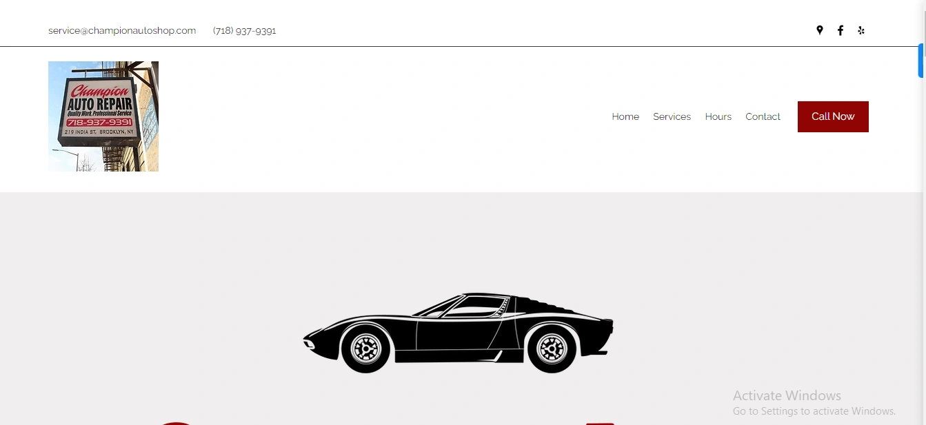
Before
Here’s what I did when I redesigned the website for Champion Auto Repair:
1) Visual Layout
- Old Design: The previous version had a basic, outdated layout with minimal content, which didn’t engage visitors.
- New Design: I opted for a clean, modern layout with a background image of mechanics at work. This instantly connects with users and makes the business feel more trustworthy. The dark overlay keeps the focus on the text, making it easier to read without distracting from the visuals.
2)Branding & Logo
- Old Design: The branding wasn’t integrated well into the old design. It just had a static image of the company’s sign, and the site didn’t really reflect the brand’s identity.
- New Design: I made sure the brand name, “Champion Auto Repair,” was bold and professional. I also used red, which matches the CTA buttons, creating a sense of brand consistency throughout the site and improving recognition.
3)Headlines & Subheadings
- Old Design: There wasn’t a clear headline, so it wasn’t obvious what the business offered.
- New Design: I crafted a strong headline, “Reliable Auto Repair Services to Keep You Moving.” It clearly communicates what the business does and connects emotionally with users by addressing their main concern—keeping their cars on the road. The subheading provides more detail and reassures customers about the quality of service they can expect.
4)Calls-to-Action (CTAs)
- Old Design: The old site had a generic “Call Now” button, which didn’t really give users many options.
- New Design: I added two clear CTAs: “Get a Free Quote” and “Book an Appointment.” These buttons are in bright red, so they stand out and are easy to find. Giving users more options increases the chances of them taking action, which can lead to higher conversions.
5)Navigation Menu
- Old Design: The previous menu was functional but lacked style and appeal.
- New Design: I streamlined the navigation by adding essential pages like “About Us,” “Services,” and “Testimonials.” The new design has a modern feel, with rounded edges and a white background that stands out against the dark hero image. It’s easy to use and makes for a more refined experience.
6)Typography & Readability
-Old Design: The fonts were bland and didn’t create a clear hierarchy for the content. -New Design: I chose bold, easy-to-read fonts that give the site a professional, trustworthy feel. The layout guides the eye naturally from the headline to the subheading, making the content more engaging and helping users stay on the page longer.
Impact on Users:
1) Improved User Experience: The new design feels fresh, reliable, and user-friendly. The background image of mechanics working reassures visitors about the business’s expertise and professionalism.
2) Better Navigation: The updated navigation makes it easier for users to find what they need, whether that’s learning more about the company or booking an appointment.
Impact on Business & Conversions:
1) Increased Credibility: The use of real-life visuals, clear typography, and strong CTAs helps build trust with potential customers. This should lead to more inquiries and appointments.
2) Enhanced Lead Generation: With two CTAs—one for getting a free quote and another for booking an appointment—I'm giving users options based on their needs, which should increase the likelihood of converting visitors into customers.
3) Improved Engagement: By making the site more visually appealing and easy to navigate, I expect more visitors to engage with the content and take action.
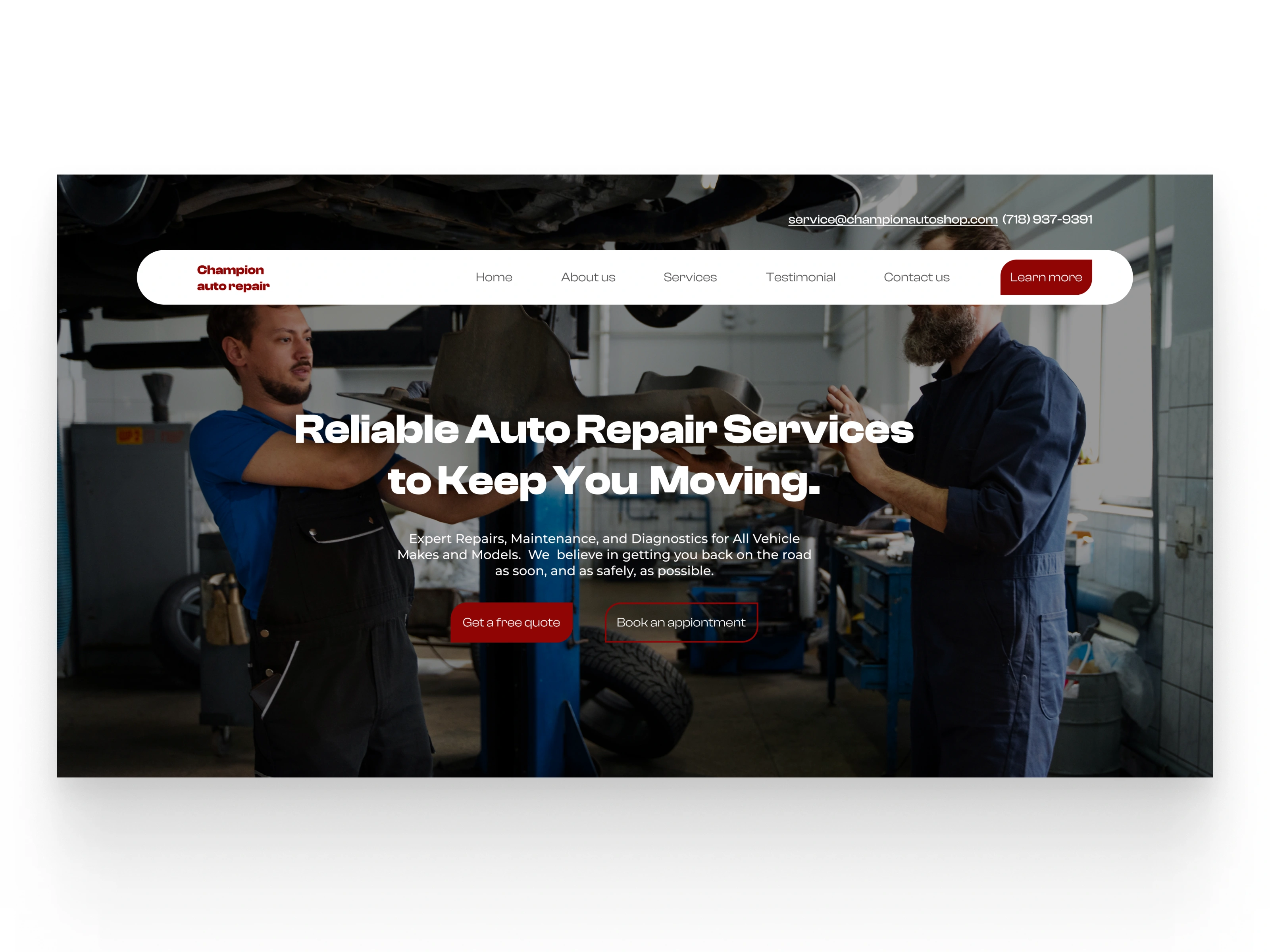
After
Like this project
Posted Dec 21, 2024
Designed an engaging, modern, and user-friendly experience that speaks directly to potential customers and converts.
Likes
0
Views
1


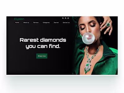
Designing a high converting landing page for a jewelry brand
Revamping the hero page to showcase brands quality offering
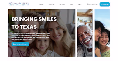
Redesigning the hero page section of a dental practice website
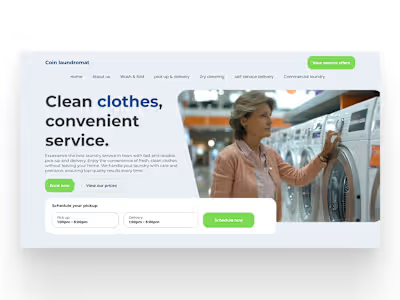
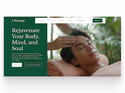
Revamping the hero page section of a laundromat business