Revamping the hero page section of a laundromat business

Augustina Ambrose
Before
Design overview
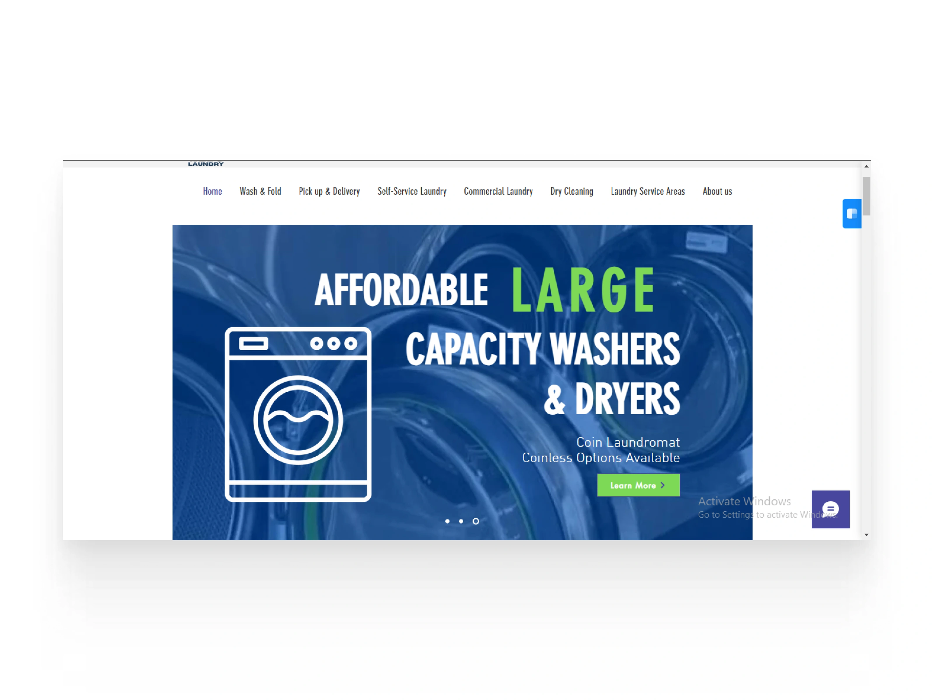
🧷 Old Design (Before)
Visual Design
🧷 Cluttered Visuals: The old design is dominated by a bold blue background and large graphic imagery, making the hero section feel busy. The washing machine graphic distracts from the main message.
🧷 Unclear Branding: The imagery in the background is generic and does not convey a unique brand identity. It also doesn’t provide a clear connection to the service being offered.
🧷 Font Usage: The fonts used are large and overly bold in multiple areas, giving off a heavy, almost overwhelming feel.
Content Structure:
🧷 No Clear Focus: There are too many elements competing for attention — large washing machine graphic, “Affordable Large Capacity Washers & Dryers,” and a coinless feature all jumbled together.
🧷 Weak Call to Action (CTA): The "Learn More" button is small and hard to notice, buried under the heavy text. It doesn't clearly invite the user to take action immediately.
User Experience (UX):
🧷 Overwhelming Text: The excessive bold text and large fonts reduce readability and make the design seem crowded.
🧷 Lack of Personalization: The design doesn’t communicate the convenience of the service to the user or show a personalized experience.
🧷 Navigation: The navigation bar is present but blends into the background due to the colors, making it hard to notice.
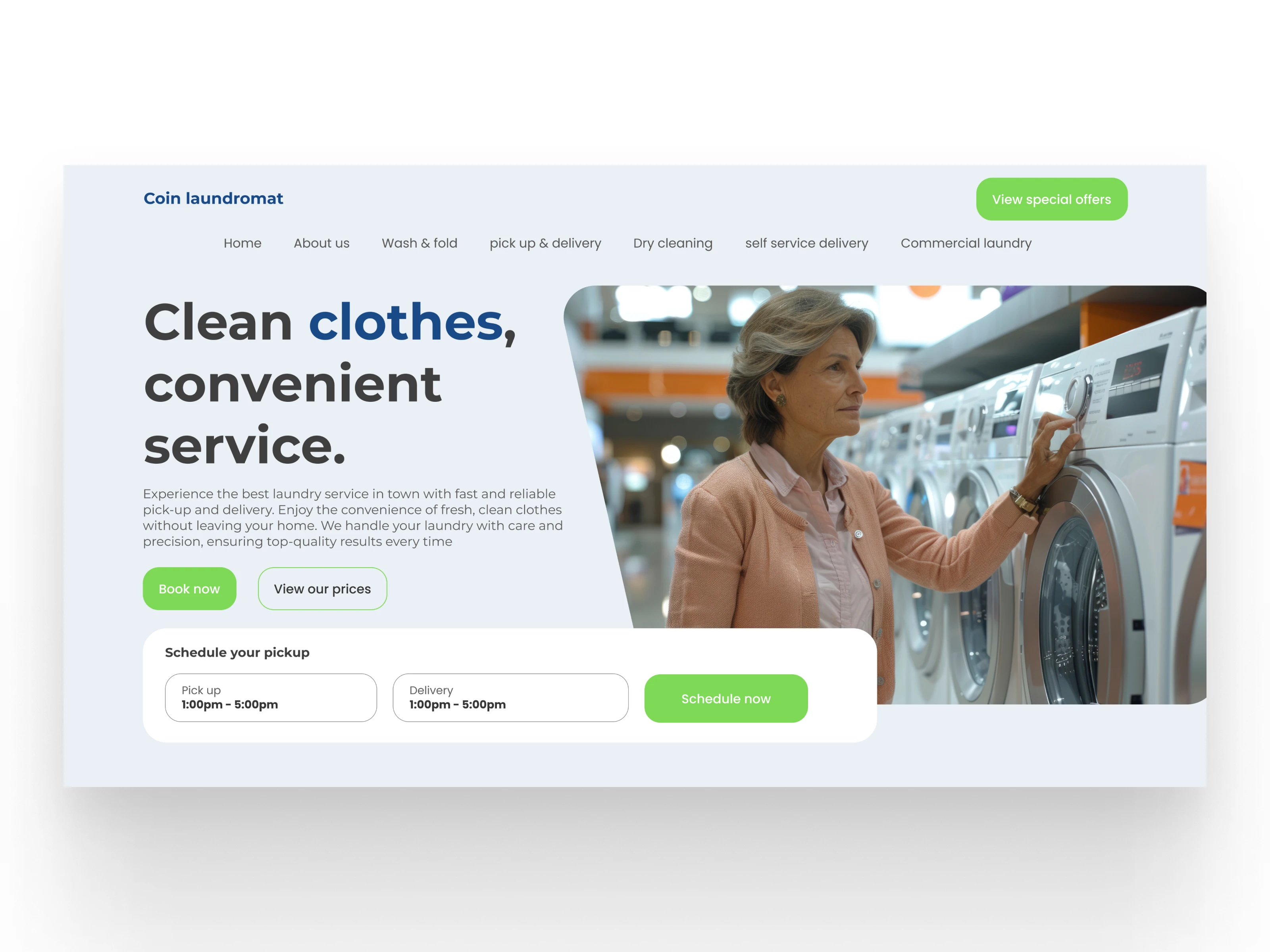
🧷 New Design (After)
Visual Design:
🧷 Modern, Clean Look: The new design uses light, soft colors with more white space, immediately giving a clean and modern look. The image of a person doing laundry adds a personal touch.
🧷 Clear Visual Hierarchy: The heading “Clean clothes, convenient service” takes the focus, with the subheading providing details without overpowering the message. The balanced fonts and more restrained use of bold text improves readability.
🧷 Improved Branding: The updated visuals, including the imagery of laundry machines and a user, align more closely with the brand. It feels more professional and inviting. Content Structure:
🧷 Focused Content: The content is straightforward and communicates the value of the service concisely. Users can easily understand the service with the headline and supporting text.
🧷 Stronger Call to Action (CTA): The prominent buttons — “Book Now” and “View our Prices” — are well-placed, inviting immediate action. They stand out due to their green color, providing a visual contrast against the light background.
User Experience (UX):
🧷 User-Centered: The new design speaks directly to the user’s needs, emphasizing the convenience of laundry pick-up and delivery services. The service is framed in a way that’s approachable and easy to understand.
🧷 Improved Navigation: The navigation bar is now easier to spot due to its darkened text and simpler layout, allowing users to explore different services effortlessly.
🧷 Scheduling Feature: The scheduling section near the CTA is a great addition, making it convenient for users to see pick-up and delivery times right away, improving the user flow.
🧷 Key Improvements:
Visual Appeal: The new design feels lighter, more professional, and user-friendly, which builds trust with potential customers.
Personalization: Featuring a person in the hero image makes the service more relatable and humanizes the brand. Stronger CTAs: Clear, action-driven buttons encourage users to take immediate steps. User-Friendly: The cleaner layout improves usability, making it easier for visitors to navigate and engage with the content.
🧷 Final Thoughts: The redesigned website presents a significant improvement in terms of visual appeal, content structure, and overall user experience. The new design is modern, clean, and easy to navigate, which will likely result in increased user engagement and conversions for the laundromat service.
After
Like this project
Posted Dec 21, 2024
Redesigned the hero page section of a laundromat into a functional design that leads to conversation.
Likes
0
Views
0

Revamping The Hero Page section for Improved User Interaction
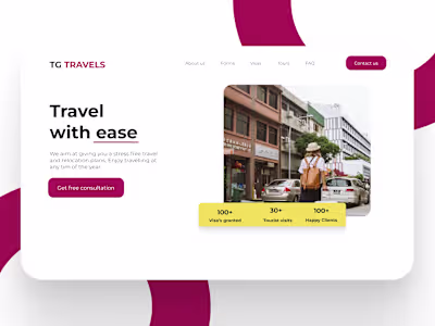
Landing page design for a travel agency
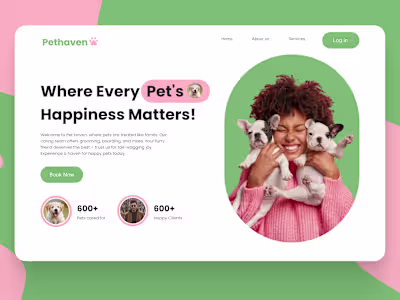
Designing a captivating Pet care Website
Improving Conversion Through Functional landing page Design