Revamping the hero page to showcase brands quality offering

Augustina Ambrose

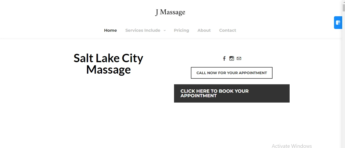
Before
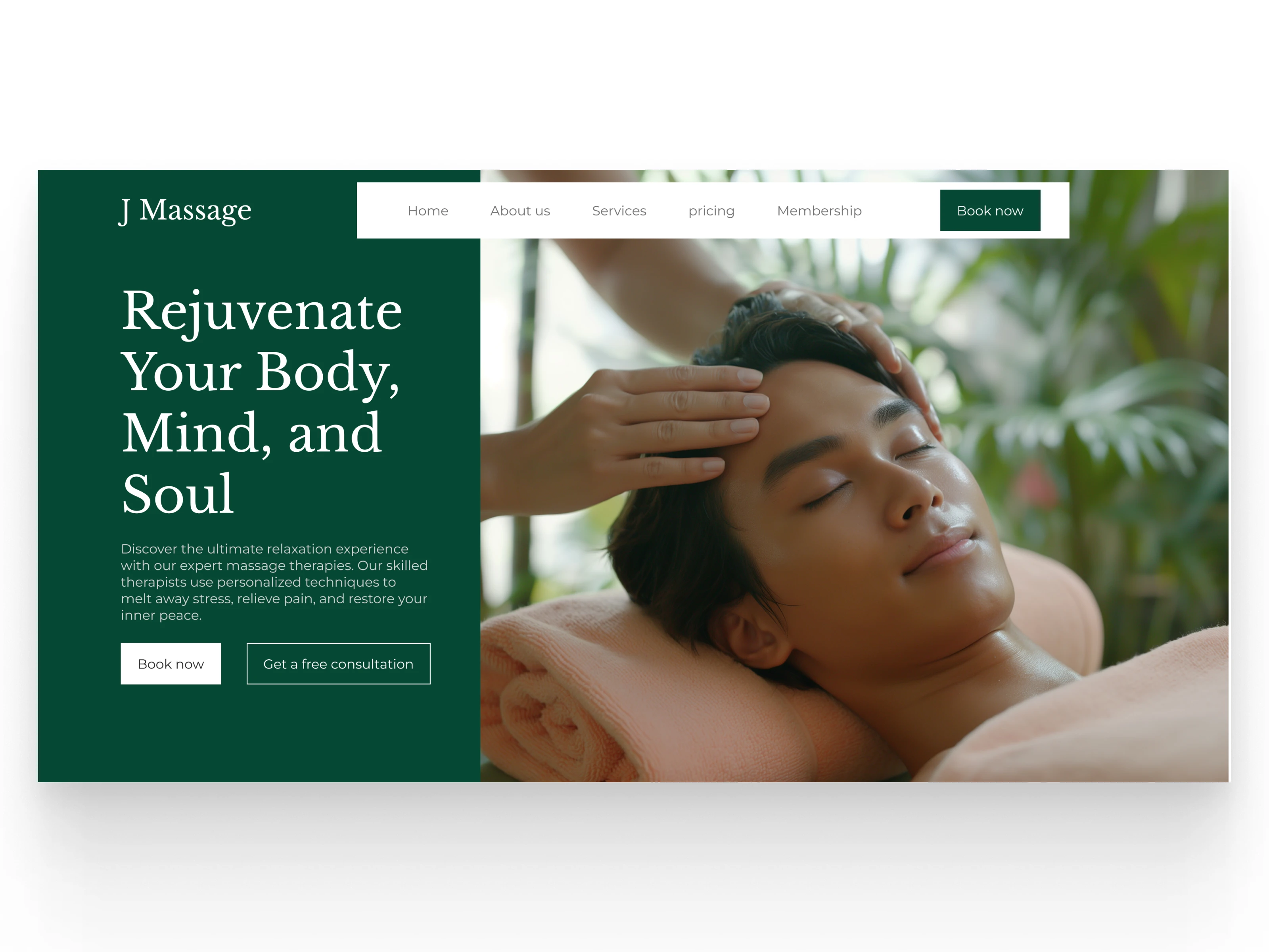
Design comparison
📌 Visual Design
Old Design: The old design is simple and minimalistic but lacks visual appeal. It uses a plain white background with a heavy emphasis on text rather than images, making the website feel flat. The two CTA buttons ("Call Now" and "Book Your Appointment") don't stand out enough and lack differentiation, as they are both quite basic in style and color.
New Design: The new design dramatically improves the visual aesthetics by using a deep green background that immediately feels more soothing and luxurious, matching the brand's purpose. The background image of a person receiving a massage also enhances the emotional appeal of the service, making the user feel relaxed just by looking at it. The use of white for text on the dark background improves readability, while the high-quality image brings a human connection to the website.
📌 Content Structure
Old Design: The old design relies heavily on brief text such as "Salt Lake City Massage" without any supporting details about the services or the unique value of the brand. There is no description to inform users about what makes the service stand out or why they should choose J Massage.
New Design: The new design includes a clear headline, "Rejuvenate Your Body, Mind, and Soul," followed by a brief, impactful description about the massage services offered. The content is structured to communicate the benefits, emphasizing relaxation, stress relief, and pain management. This gives users a better understanding of what they can expect and encourages engagement.
📌 User Experience (UX)
Old Design: The user experience in the old design is basic but functional. The main CTA is to book an appointment, but it lacks emphasis on user motivation. The navigation bar is straightforward, but the site doesn't engage the user with any special offers or reasons to stay longer on the page.
New Design: The new design significantly improves UX by providing clear CTAs ("Book Now" and "Get a Free Consultation"), which are well-placed and visually distinct. The addition of a free consultation option adds an extra incentive for users to engage. The overall flow of information is more intuitive, and the design is more engaging, inviting users to explore more of the website.
📌 Key Improvements
Visuals: The new design uses high-quality images, an appealing color scheme, and a well-balanced layout that aligns with the massage therapy theme.
Content: The updated content is more informative and persuasive, offering a clearer value proposition.
User Engagement: The new design incorporates user-friendly CTAs that guide visitors toward taking action while offering more value through consultation offers.
📌 Final Thoughts The new design offers a more professional, visually appealing, and engaging experience for users. It better communicates the brand’s services and encourages user interaction, ultimately leading to higher conversions. Overall, the new design is a significant improvement over the old one in terms of both visual aesthetics and user experience.
After
Like this project
Posted Dec 21, 2024
Improved the hero page section of the website to increase the number of visitors, conversions while presenting the brand as trusted.
Likes
0
Views
0


Redesigning the hero page section of a dental practice website
Revamping the hero page section of a laundromat business
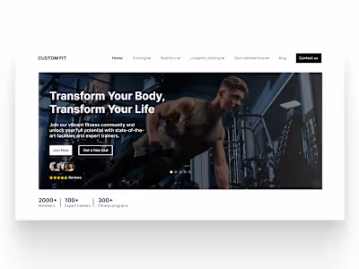
Revamping The Hero Page section for Improved User Interaction
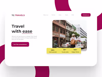
Landing page design for a travel agency