Wellmiss | Provide women in trauma with care via telehealth
Wellmiss

/Overview
Introducing a revolutionary telehealth app designed for women with trauma, offering a holistic healing experience. Users can seamlessly book online appointments with compassionate doctors, combining traditional and alternative therapies for comprehensive care. This virtual sanctuary prioritizes well-being, providing a transformative journey toward healing without leaving the comfort of one's space.
Holistic and integrative health and wellness care platform that demystifies trauma and provides women with wellbeing and preventive care via telehealth appointments, community, and care support sessions.
/My Role
As a Product designer for wellmiss, I led the design process from start to finsh. I began with extensive research to understand the needs of the women seeking trauma care and preventive wellness services. Based on the research data and fundamental requirements needed to properly structure the platform to be intuitive in solving the said problem, a design specification document was drafted which highlight the important flow and personas involved with the system. I was involved in creating the low-fidelity wireframes to outline app structure and user flow then developed high fidelity wireframes that incorporated visual elements and branding.
My design process was been done on figma & adobe XD and after wireframing, i engages in prototyping to simulate user interactions, adding animations, page transition and micro-animation for an engaging user experience.
Role
Product Design, UX Research
Duration
April 4th - June 12th
Tools
Adobe XD, Google Docs, Figjam
Find Peace. Recover
/User Flow
I crafted the user flow diagram for the Wellmiss app with a focus on simplicity and intuitive navigation, ensuring that it would be easy for users to interact with the app. I began by mapping out the primary user journeys, such as onboarding, accessing therapy sessions, and utilizing wellness resources. By incorporating feedback from potential users and stakeholders, I identified key pain points and streamlined the flow to minimize clicks and eliminate unnecessary steps. Each interaction point was designed to be clear and straightforward, with a consistent visual language to guide users seamlessly through the app. This approach ensured that users could easily find and use the features most relevant to their needs, enhancing their overall experience with the Wellmiss app.
/Competitive Analysis
As a UX designer, I analyzed BetterHelp, Calm, and Headspace as competitors for the Wellmiss app by conducting a comprehensive competitive analysis focusing on their business models, client acquisition strategies, and feature lists. BetterHelp's subscription-based model with direct access to licensed therapists emphasized personalized mental health support but lacked a freemium tier. Calm and Headspace both offered diverse meditation and mindfulness resources, with Calm excelling in sleep aids and soothing music, and Headspace integrating physical wellness with mindfulness exercises. All three apps leveraged robust digital marketing, content marketing, and social media strategies, with significant partnerships and referral programs enhancing user acquisition. To position Wellmiss at an advantage, I planned to integrate the personalized therapy approach of BetterHelp, the calming content of Calm, and the holistic wellness approach of Headspace, while offering a compelling freemium tier to attract a broad user base. Additionally, I aimed to focus on creating strategic partnerships with healthcare providers and corporate wellness programs, alongside innovative referral incentives to boost user growth and retention.
/Color Palette
The color palette was carefully crafted to reflect the theme, purpose and mission of the app. The idea was to be user friendly and work with the target audience psych to better position them for recovery.
The hex code color #F280AB, a soft pink, is ideal for Wellmiss as it evokes feelings of calmness and compassion, creating a comforting environment for women
The soft pink hue of #F280AB evokes calmness and compassion, making it perfect for a wellness app like Wellmiss aimed at helping women above 40 recover from trauma.
The calming green hue of #2DA58A evokes tranquility and balance, making it ideal for a wellness app like Wellmiss aimed at helping women above 40 recover from trauma.
Below is a card list of the color choices that was decided after color psychology sessions
#F280AB
#F280AB
#2DA58A
#63BD96
#FAFAFA
Have an Idea?Drop an email
SOCIAL CONNECT
Like this project
Posted Aug 9, 2024
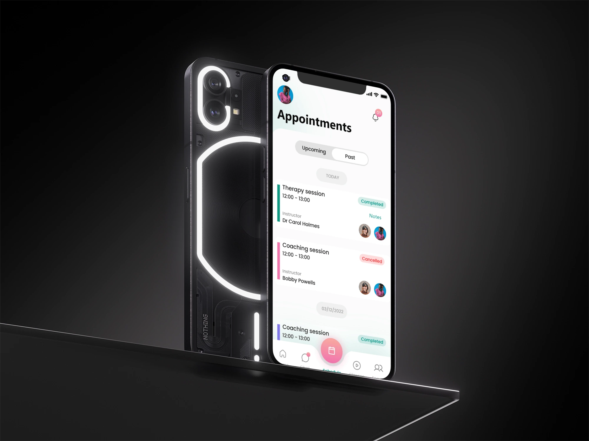
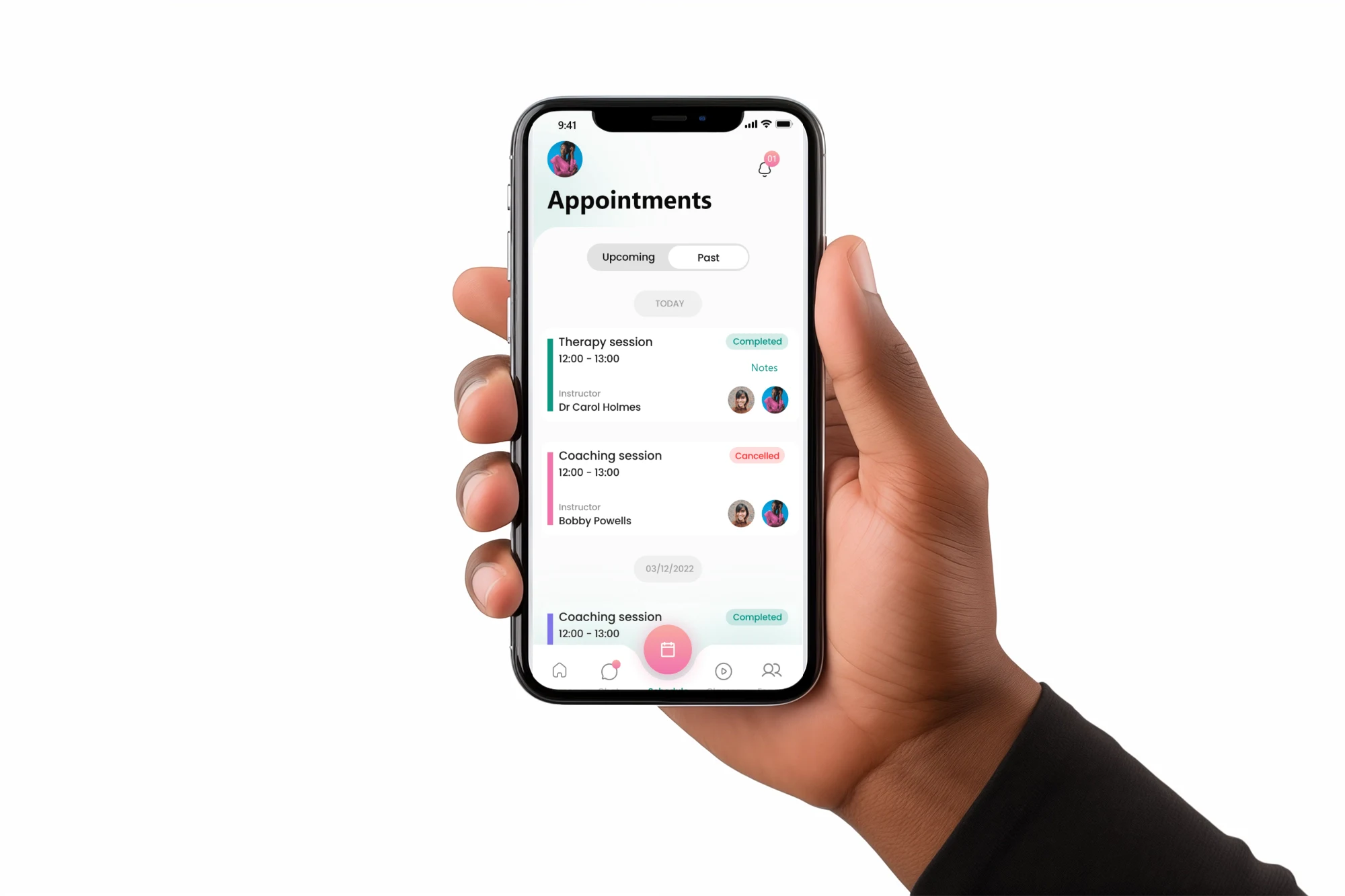
I designed both low fidelity and high fidelity mockup for wellmiss as well as creating interactive prototype of which could be used for user testing.
Likes
0
Views
7

