D3-MAVEN | Rebranding a creative digital agency
Creative digital & branding agency
Try Prototype
/Overview
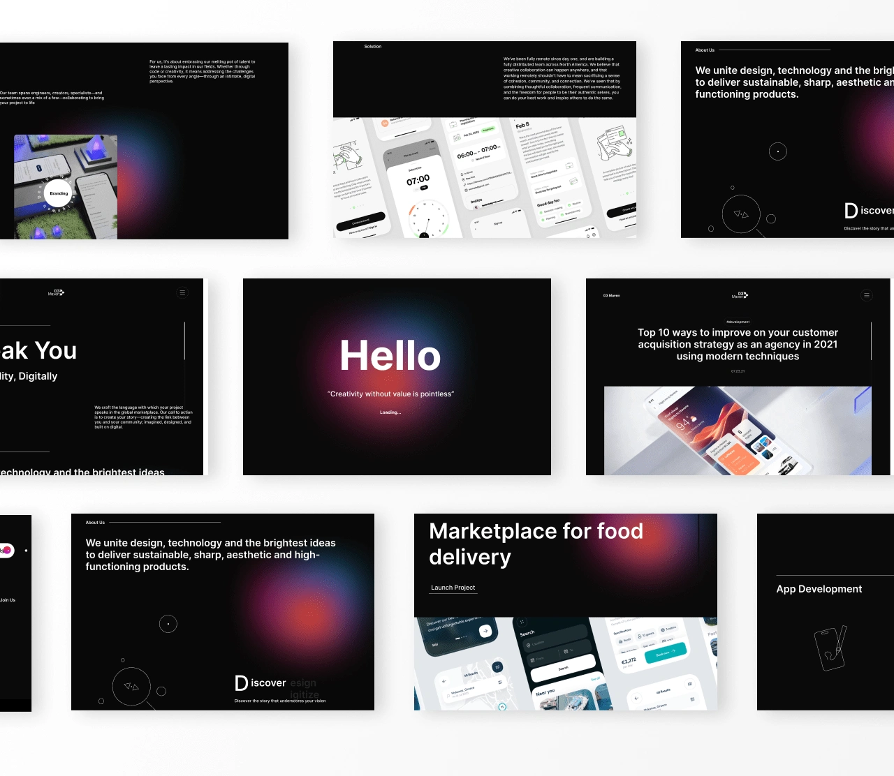
D3 Maven is a creative and marketing agency based in Sri Lanka. They follow a people-first approach in their designs and marketing process, focusing on championing ideas and insights into digital product as well as businesses.
This project was aimed at refreshing their current site and rebranding the entire platform to properly highlght their ethics and believes. In every step on the design process, where highlighted across the design to better represent their vision.
/My Role
My Design role for D3 involve understanding current design system that was implemented and drafting a document highlight point of weakness, improvements and point of strength. This data collected was then used to craft a more funtional and feasible solution for the agency using mordern design solutions that fits the business vision, ideas and personality
Role
Product Designer, Project Manager
Duration
April 4th - June 12th
Tools
Figma, Adobe photoshop, Google Docs, Clickup, Google Drive
Rediscovering Identity
/Sitemap
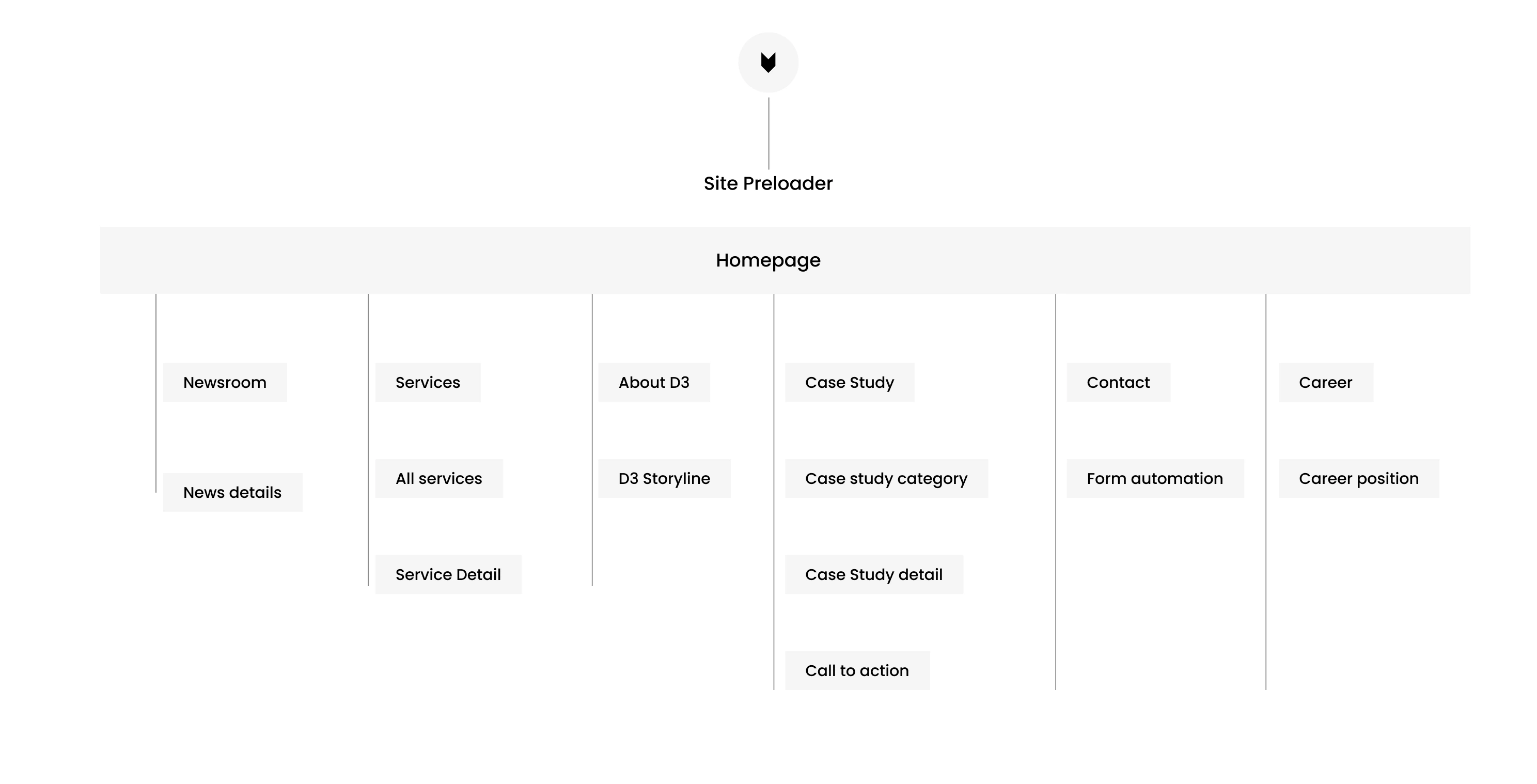
I embarked on the crucial task of crafting the sitemap for D3 Maven agency's website redesign. This strategic foundation will guide both users and search engines through the online brand experience, ensuring clarity and discoverability.
The sitemap also served as a blueprint for search engine optimization (SEO). By incorporating relevant keywords strategically, it can optimize the website's visibility in search results, attracting qualified leads and potential clients.
/Style guide
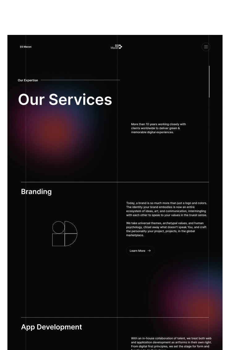
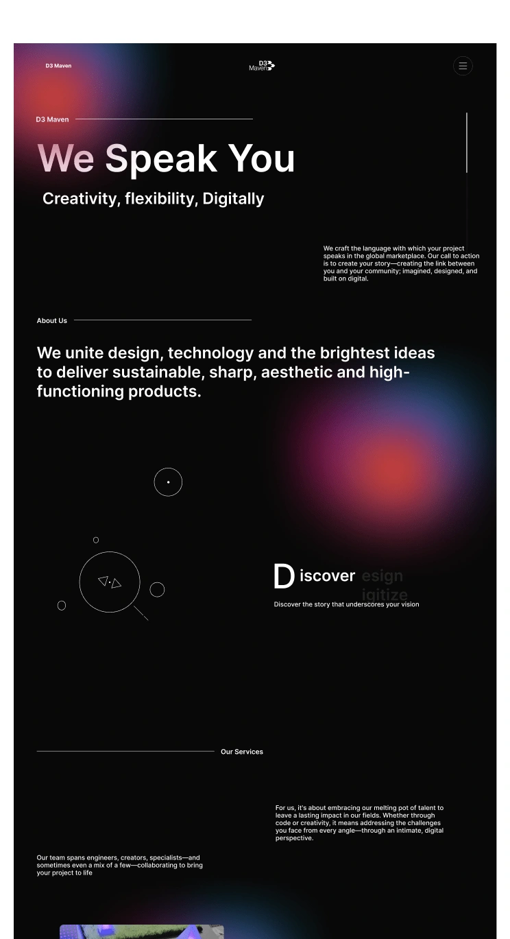
Dark Theme: Enhances readability and focus on content., Creates a more modern and sophisticated aesthetic., Reduces eye strain, especially for prolonged viewing., Provides a unique and memorable brand experience.
Subtle Gradient Effect: Adds visual interest and depth without being overwhelming., Reinforces the agency's brand colors and personality. Creates a sense of movement and dynamism.
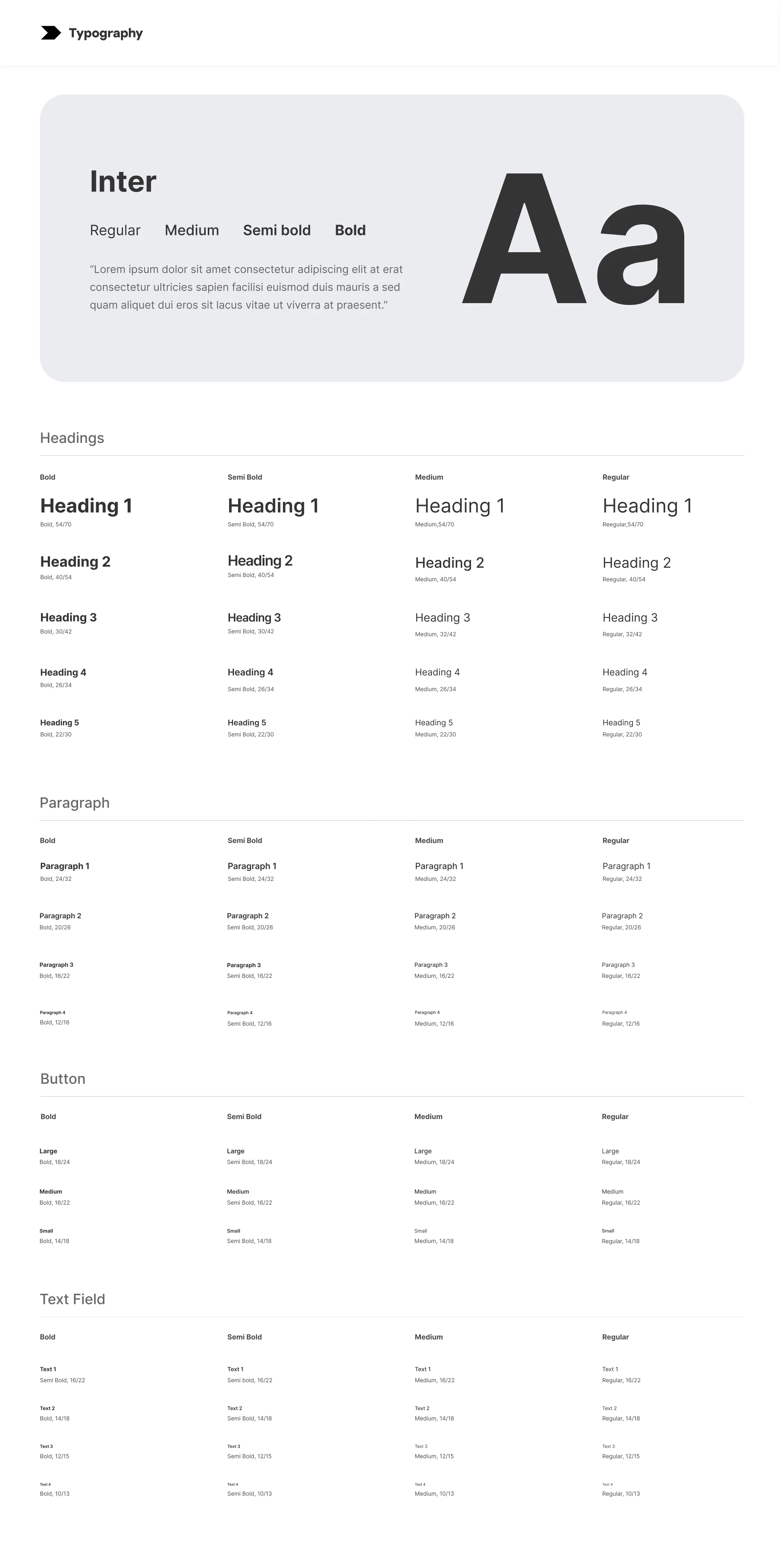
Better Typography: As your friendly neighborhood designer, I handpicked the Inter font for your rebrand, and here's why it's the perfect match for your agency's fresh, modern look:
Accessibility Advocate: Not everyone experiences the web the same way, and Inter takes that seriously. Its clean lines and open letterforms are optimized for diverse reading needs, making sure your website welcomes everyone with open arms (and clear typography).
#090909
#0ED2DE
#FF4C00
#1400FF
#DE0E72
#464646
#FAFAFA
/Outcome
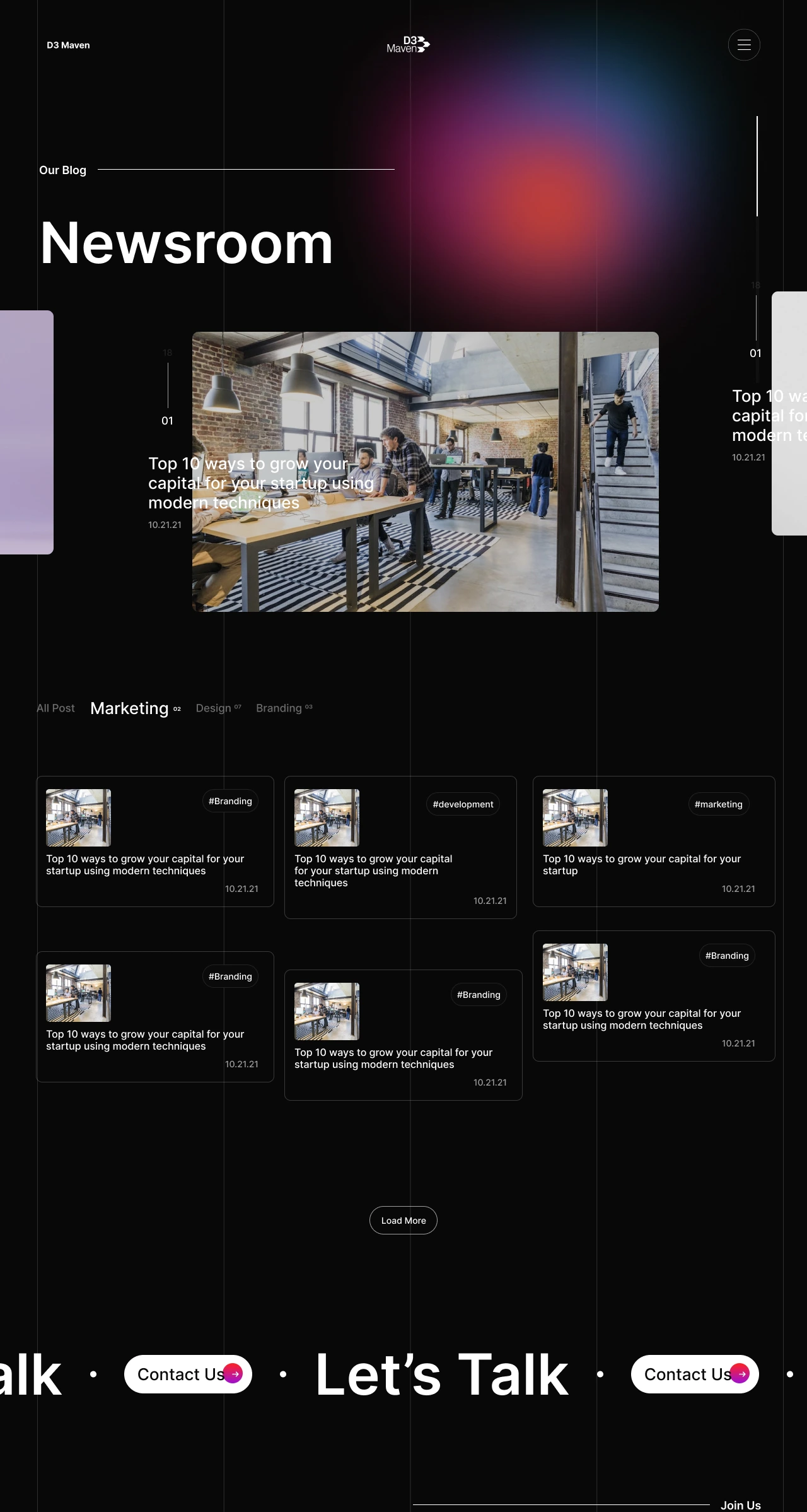
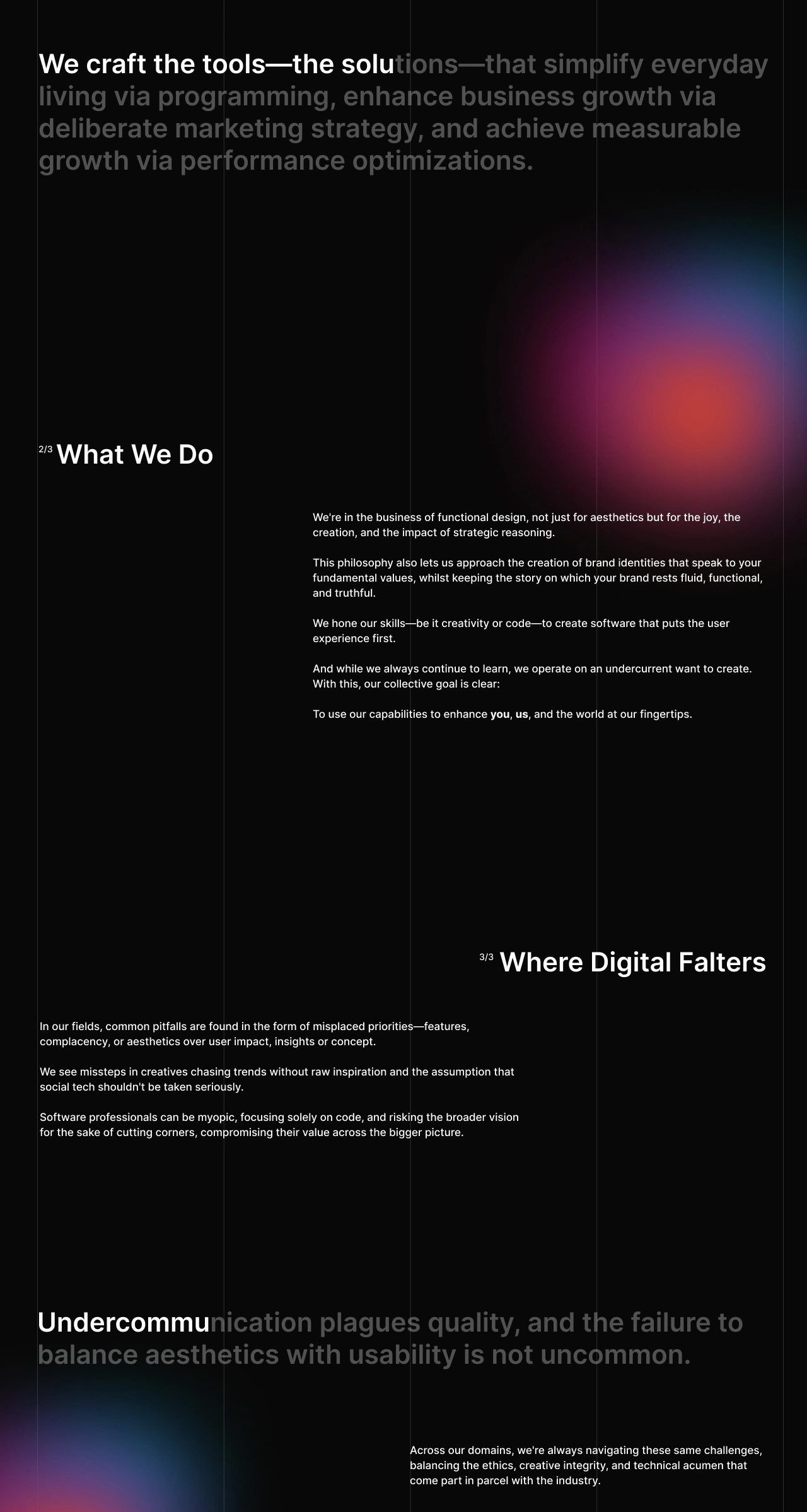
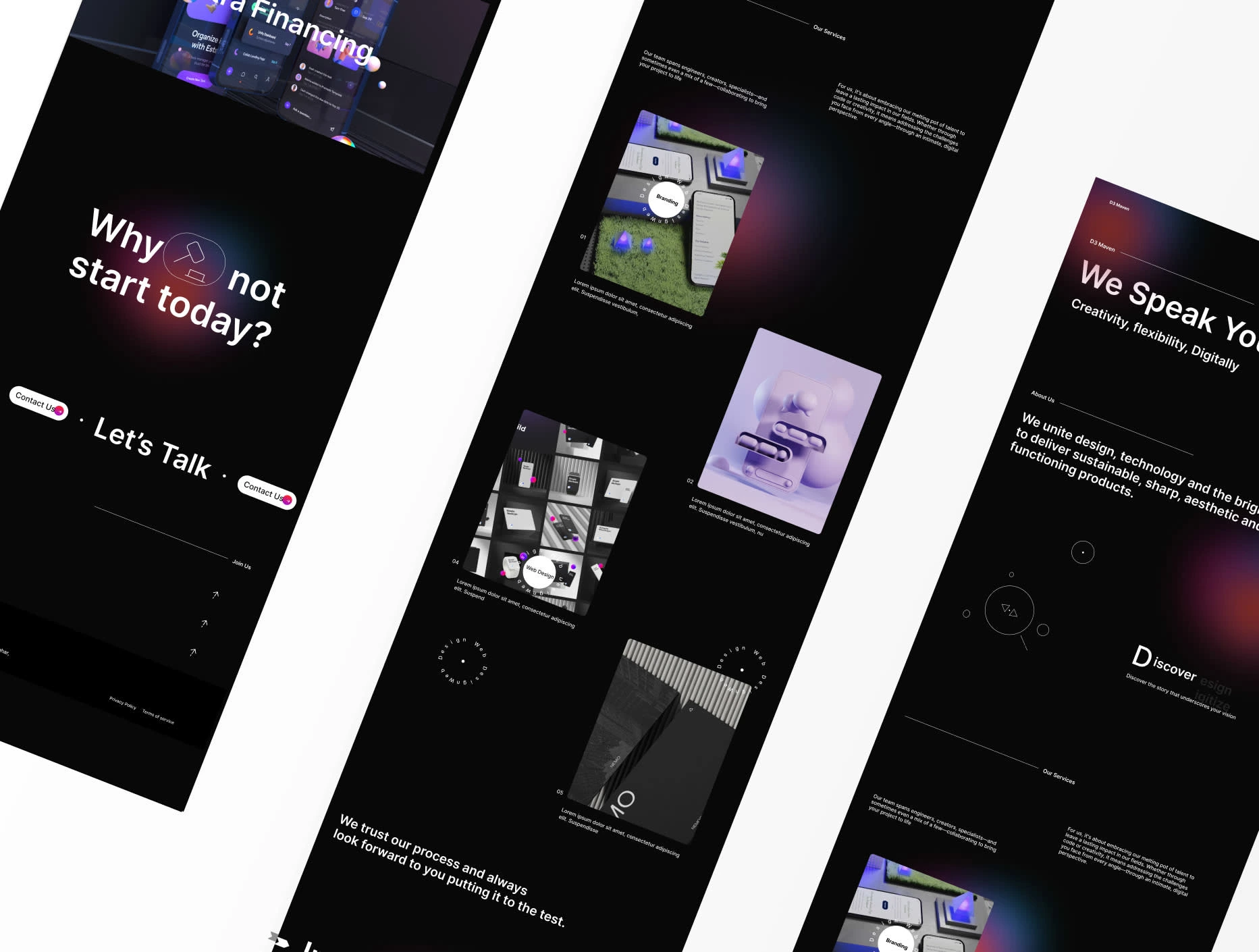
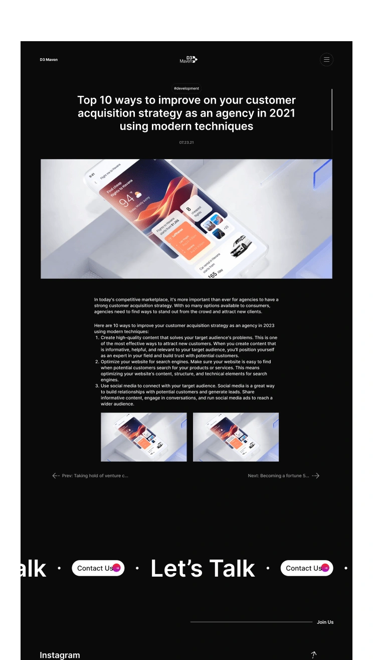
The high fidelity wireframe for D3 is the culmination of a meticulous design process, resulting in a user interface that is both elegant and sophisticated. The wireframe adheres closely to the site's style guide, which emphasizes a clean, minimalist aesthetic with soft colors and rounded corners. This design approach creates a sense of approachability and encourages users to explore the agency's various services with ease.
Have an Idea?Drop an email
SOCIAL CONNECT
Copyright © 2024 All rights reserved
Made on webflow with love by Me 😉
Like this project
Posted Aug 9, 2024
Rebranding a digital agency to capture their vision, services and philosophy

