The Bouldering Guidebook Branding and App Design
Dhaval Bhimani
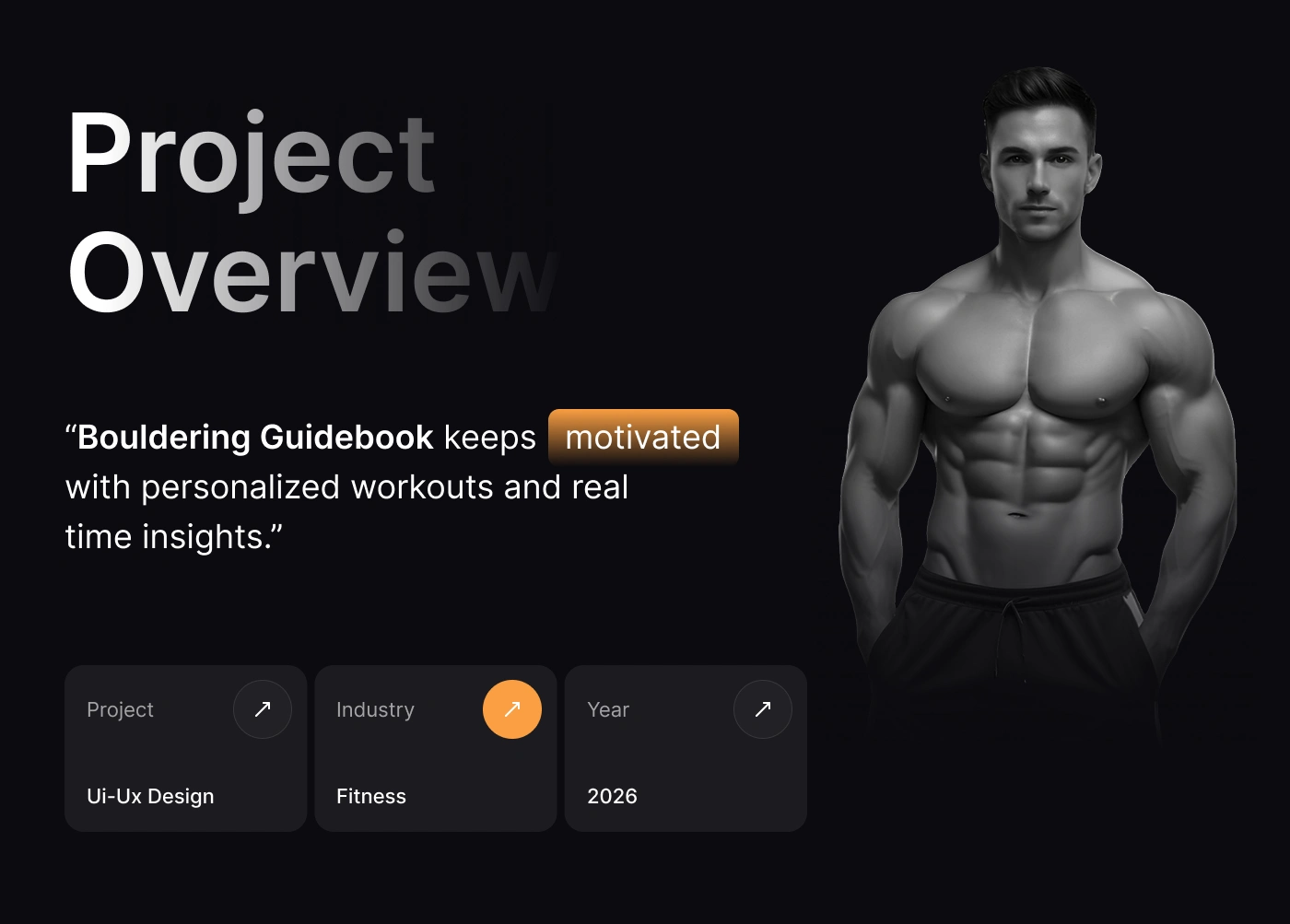
The Bouldering Guidebook
The Bouldering Guidebook is a performance-focused training platform built for climbers who want structure, progression, and measurable results. Designed for intermediate to advanced boulderers, the product delivers personalized training programs within 24 hours, removing guesswork and helping users train with purpose.
We partnered with The Bouldering Guidebook to design the complete product experience, focusing on the mobile app and its core training system. The goal was to take detailed training plans, workouts, and recovery routines and present them in a way that feels easy and not overwhelming, so users can stay consistent and focus on improving.
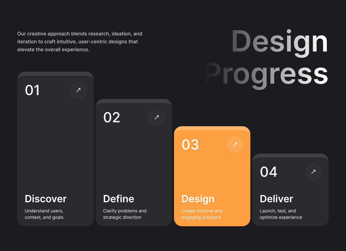
Design Process
Discover
We started by understanding how climbers currently train, what works, what feels confusing, and where they struggle to stay consistent. This helped us identify key gaps like a lack of structure and too much guesswork.
Define
From there, we narrowed down the core problem: climbers need a clear, structured system that’s easy to follow without overthinking. We defined key goals around simplicity, clarity, and consistency, making sure every feature supports progress without adding friction.
Design
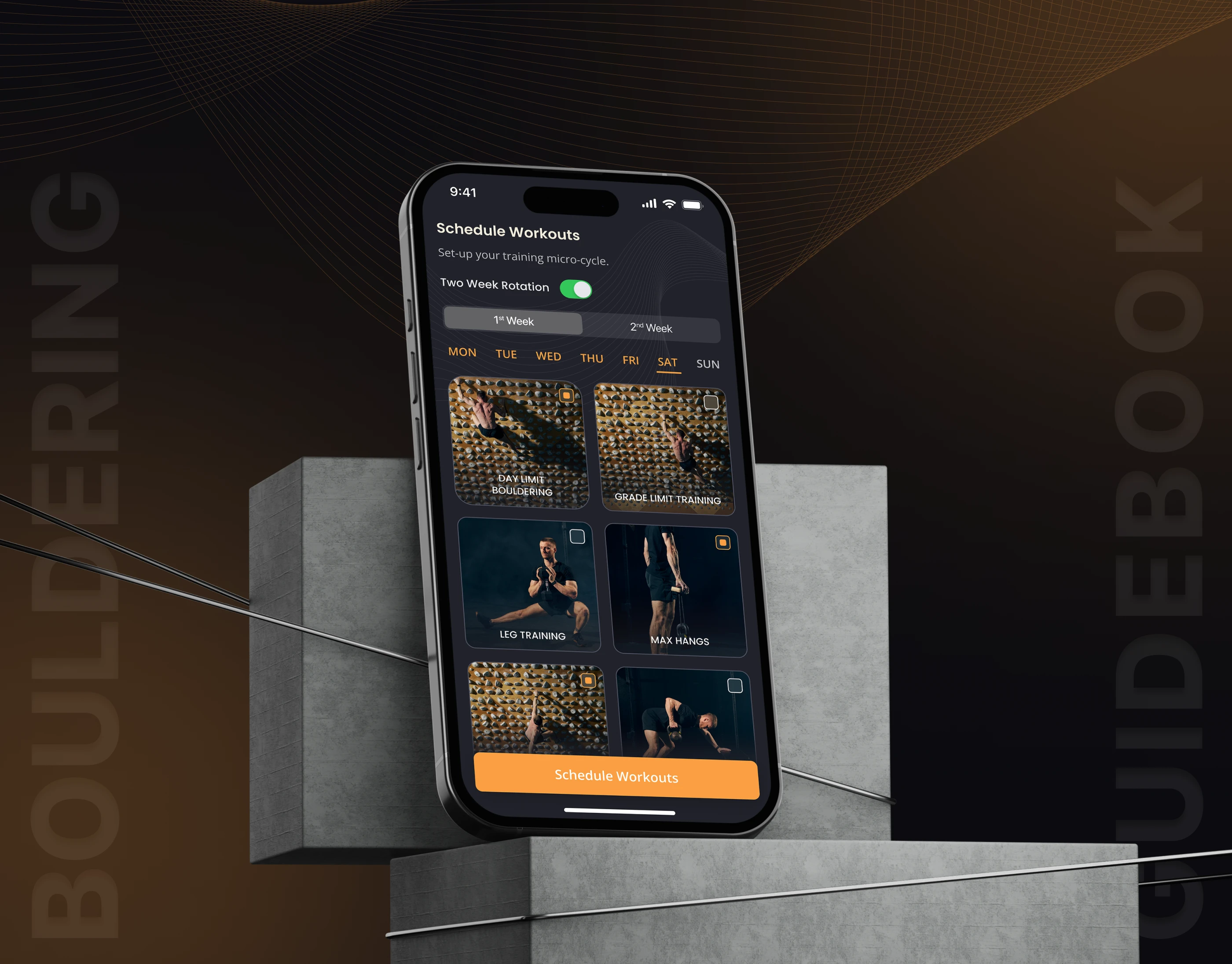
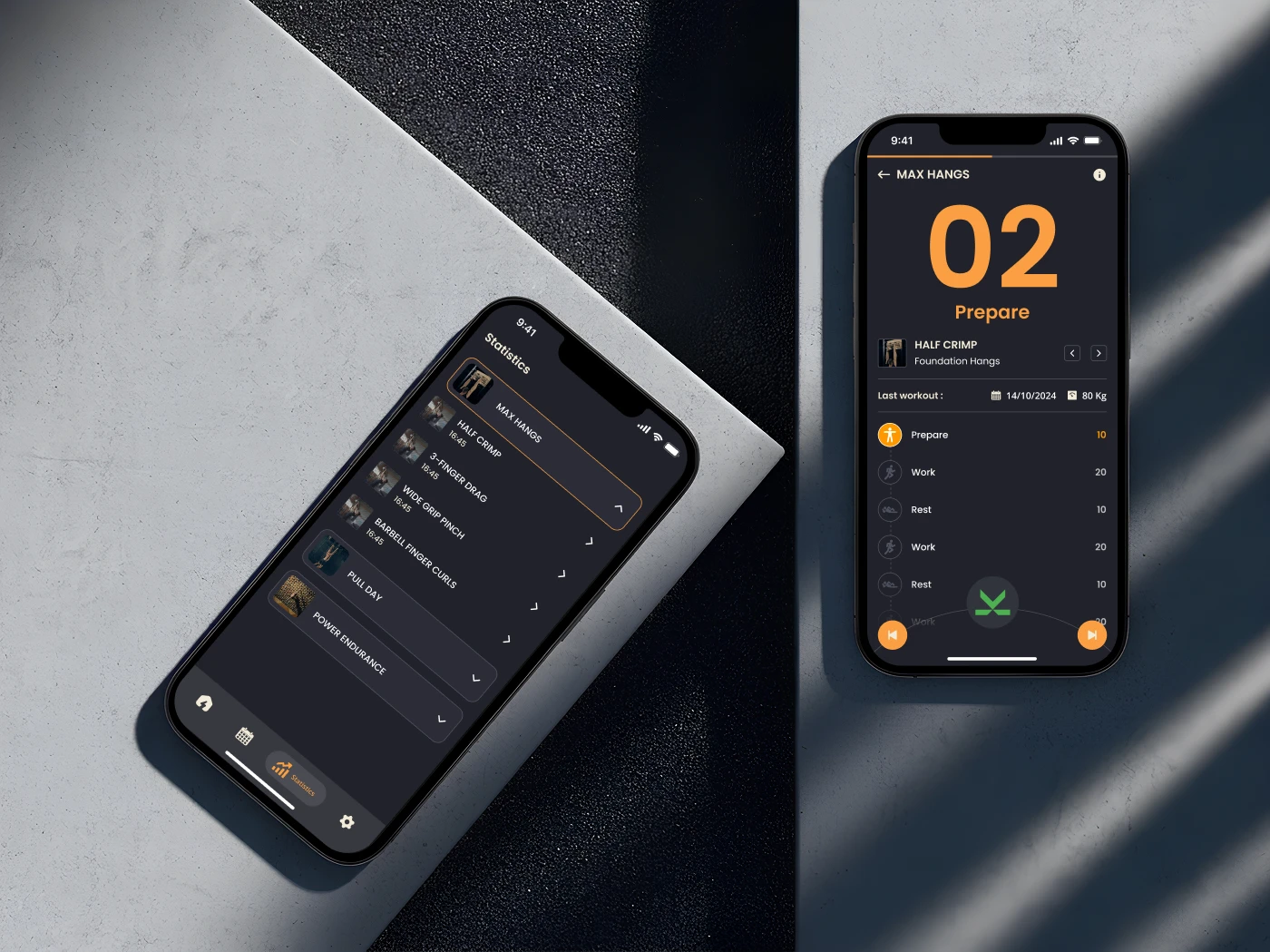
We explored different ways to present training plans, workouts, and progress tracking cleanly and intuitively. The focus was on reducing complexity, breaking down detailed programs into simple, actionable steps. Visually, we kept the interface minimal, with strong contrast and clear typography to guide users through the experience.
Deliver
Finally, we refined the experience into a complete system ready for real use. Every screen, interaction, and component was designed to work together seamlessly, making it easy for users to follow their plan, track progress, and stay consistent over time.
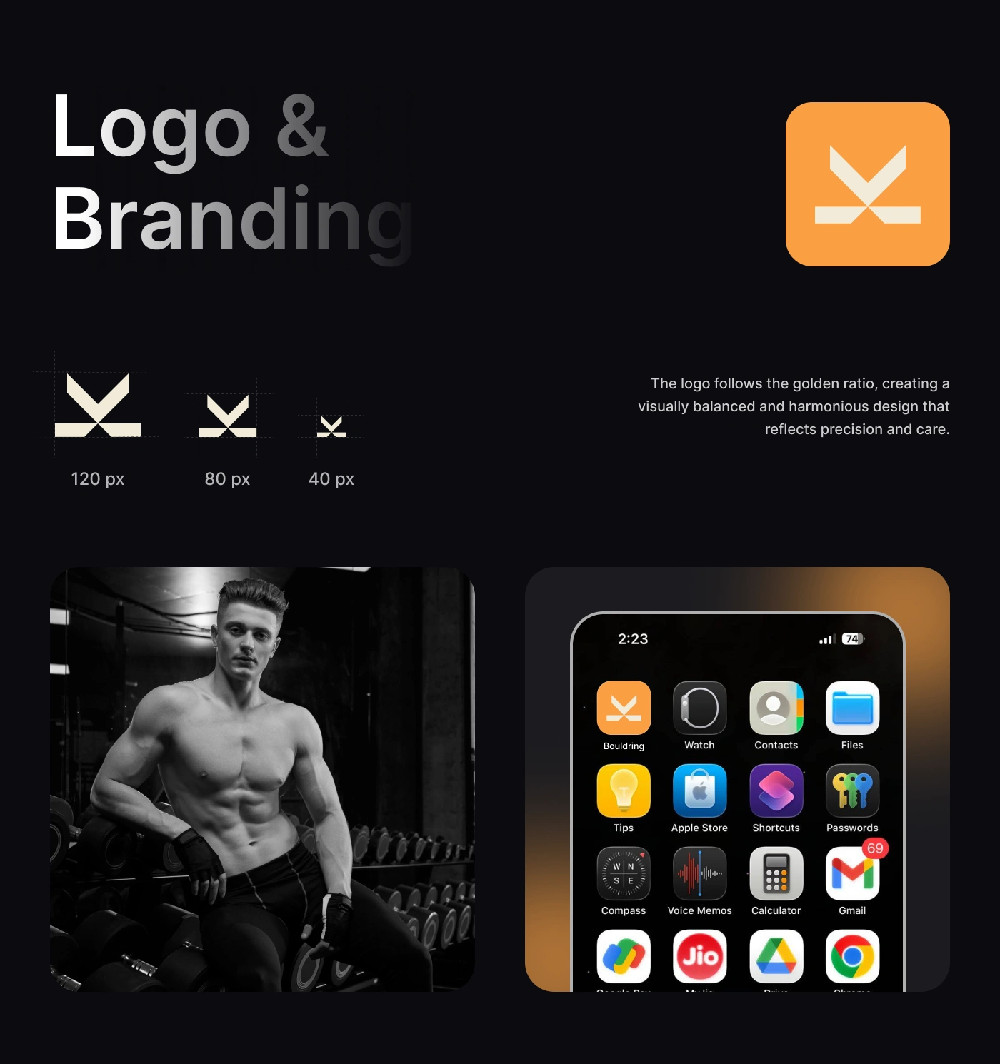
Logo & Branding
The visual identity for The Bouldering Guidebook is built to feel strong, focused, and precise, just like the sport itself. Instead of following typical fitness visuals, we kept things minimal and sharp, using a bold mark that reflects control, balance, and movement.
The logo is designed with clean geometry and balanced proportions, giving it a sense of structure and intention. It scales clearly across different sizes from app icons to larger surfaces while staying recognizable and consistent.
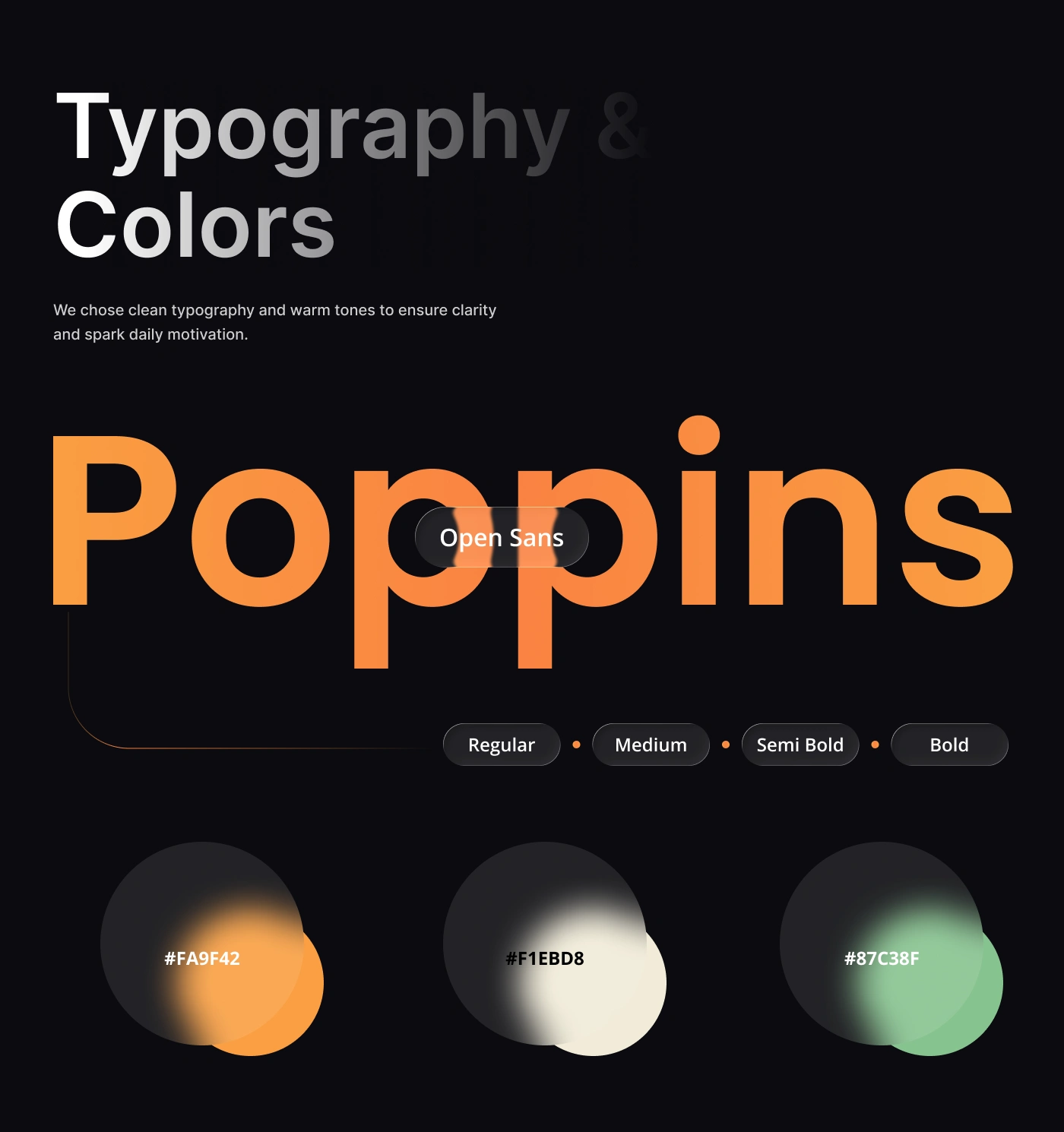
We paired this with a dark base and warm accent colors to create contrast and energy without being distracting. The typography is clean and modern, making everything easy to read while still feeling performance-driven.
Overall, the brand is simple, confident, and built around clarity, supporting the idea of focused training and steady progress without unnecessary noise.
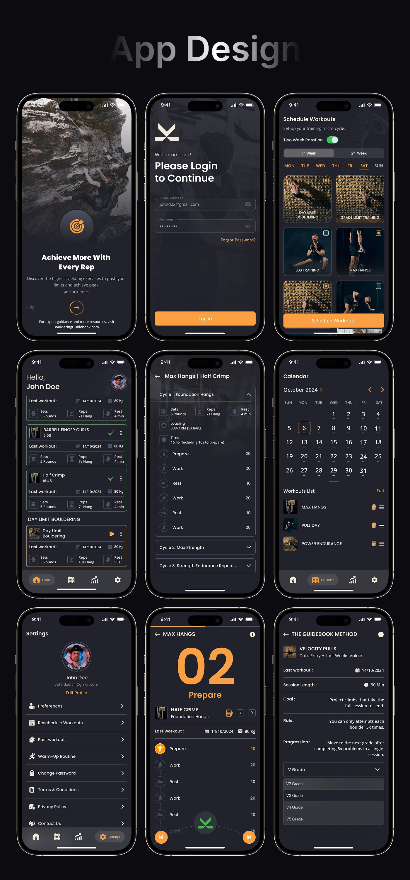
App Design
Like this project
Posted May 6, 2026
Designed The Bouldering Guidebook's Logo, Brand identity and mobile app for climbers focused on structure, progression, and results.