Kvit — business banking for Ukrainian freelancers

Igor Voitenko


Kvit — business banking for Ukrainian freelancers
Role
UI/UX & Product Designer
Platform
Mobile
Domain
FinTech · Business banking
Team
Solo concept
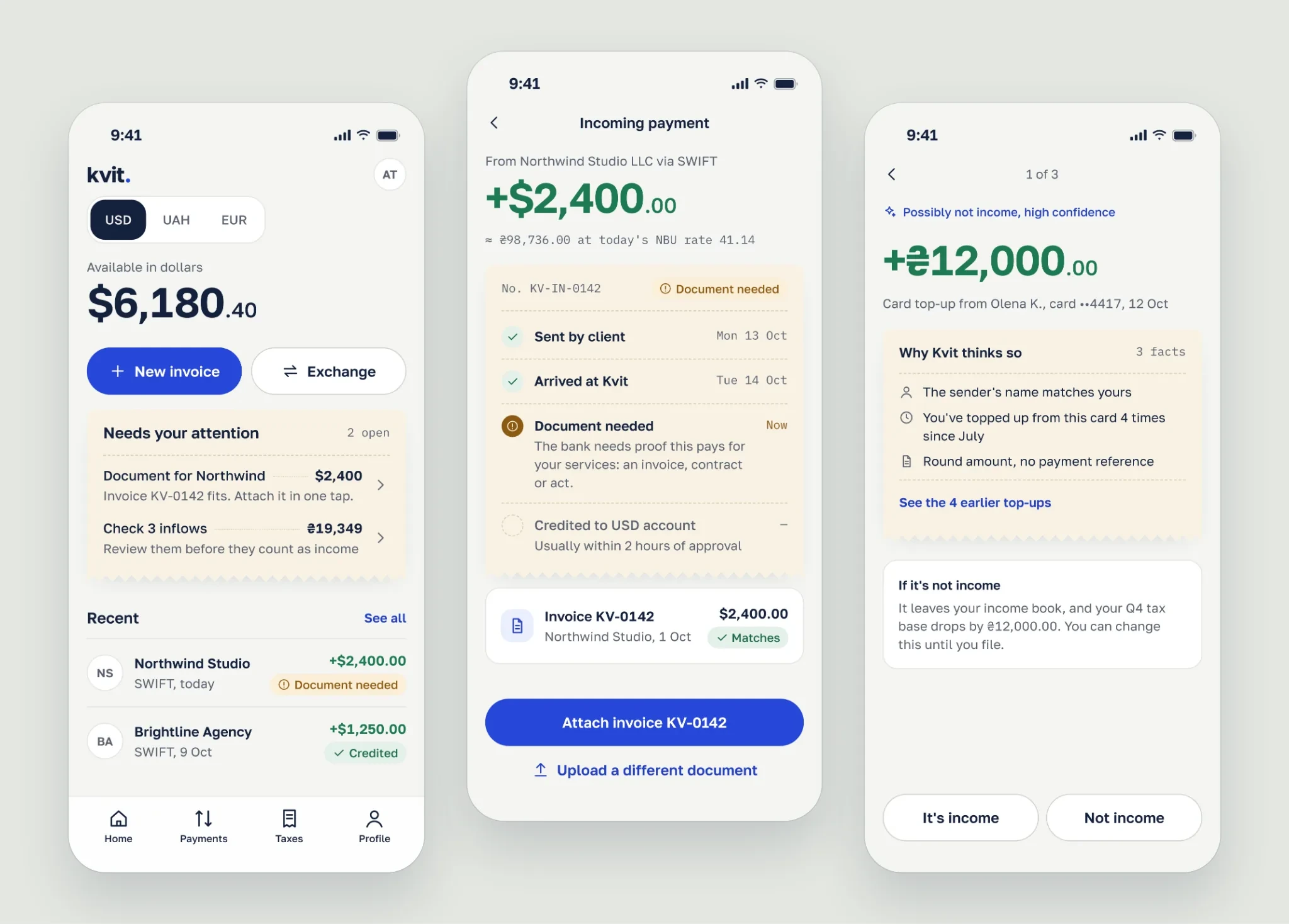
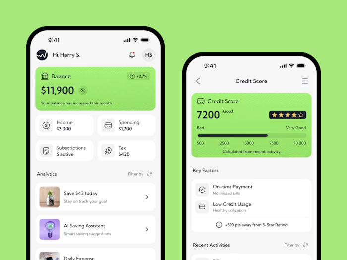
Home, payment tracker and AI income check
Problem
Verification, money in transit and income records: at the moments that matter, people can’t see what the bank wants from them.
What I did
One path from sign-up to the first payment received: verification that names the error and the fix, a tracker for foreign payments with the document request inside, and AI flags on income that show their reasons.
Result
Activation reached its 28% target, up from 23%. Verified accounts went from 41% to 57%, and foreign payment tickets fell by a third.
Kvit is a mobile bank for Ukrainian sole proprietors who get paid by clients abroad. In beta, 59% of sign-ups never reached a verified account, and only 23% received a first payment within 30 days. I redesigned the path from sign-up to the first dollar, and activation reached its 28% target.
Concept. Product, users and data are fictional.
My role
This is a solo concept, written the way the project would run inside a team. I’m the only product designer, working with a product lead, four engineers, a compliance officer and an accountant as an advisor. The timeline is ten weeks of work and six weeks of measurement.
I ran the research, framed the problem and hypotheses, designed the flows and screens, built a design system with light and dark themes, and planned the tests.
The problem
Many Ukrainian developers, designers and marketers work as sole proprietors. They pay 5% tax on income, and their clients pay them in dollars or euros.
Kvit is five months into its beta: 32,000 sign-ups and about 11,000 monthly active users, mostly freelancers who sell services abroad. The quarter has one goal, activation: a first incoming payment within 30 days of sign-up. It stands at 23%, and the target is 28%.
Three moments get in the way:
Verification. Every photo goes to manual review, with a median of 26 hours. A failure comes back by email as “Verification failed”, with no reason.
Money in transit. 31% of foreign payments are held until the bank sees a supporting document. The request comes by email and doesn’t say which document fits.
Income records. Income has to be recorded in hryvnias at the National Bank rate on the day it arrives. Own-card top-ups and refunds end up in the income book and get taxed by mistake.
The common thread: at the moments that matter, people can’t see what the bank wants from them.
The constraints
For some holds, the bank can’t tell the customer the exact reason. Every hold message has to be agreed with compliance.
The app can’t give tax advice. It can suggest, but the user decides anything that touches tax.
Diia, the state ID app, is an outside service. If it’s down, the photo path has to work on its own.
The bank can’t see a SWIFT payment before it arrives, so the tracker can’t show earlier steps.
Ten weeks and two mobile engineers: anything that needs new back-office work has to earn its place.
All text meets WCAG AA contrast in both light and dark themes.
The process
I started by cutting the scope. My first list had onboarding, verification, two-factor login, invoices, foreign payments, tax reminders and AI tips on spending. That was too much for one quarter. I picked one path: from sign-up to the first payment received.
Research
The funnel showed where we lose sign-ups; interviews explained why.
Funnel. In the August cohort of 6,400 sign-ups, 38% failed verification on the first try, and only 37% of them retried.
300 support tickets. 48% were about foreign payments on hold or unclear document requests.
9 interviews. Six freelancers paid in USD or EUR, two local-only owners for contrast, and an accountant who keeps the books for about 40 of them.
Compliance joined two synthesis sessions, so we knew early what we could and couldn’t show users. Four findings changed the direction:
A rejection without a reason feels like an accusation. 6 of 8 had failed a bank’s verification at some point. Nobody minded sharing data; what hurt was not knowing what went wrong.
I took the photo in my kitchen at night, glare all over the ID card. If it had said ‘glare’, I’d have moved to the window. Instead I got an email two days later. Marta, illustrator
Money in transit is the most stressful moment. All six foreign-currency earners described a payment they couldn’t track and a document request they didn’t understand.
They asked for a ‘supporting document’ by email. Which one? Contract, invoice, act? I sent all three, including a 40-page contract, just to be safe. Andrii, backend developer
Tax isn’t hard; knowing what counts as income is. The 5% rate is simple. Converting at the National Bank rate on the right day, and keeping own-card top-ups and refunds out of the books, is not.
Cash flow beats discipline, and people split. Three of six wanted the app to set tax aside for them; three said their income is too uneven to lock any of it.
Hypotheses
Four hypotheses, each tied to one number we could move in a quarter:
H1. Naming each verification failure with a fix, and putting Diia first, gets more people verified. Sign-up to verified: 41% now, target 52%.
H2. Asking for documents inside a payment tracker, with a Kvit invoice attachable in one tap, clears holds faster. Held payments cleared within 24 hours: 38% now, target 60%.
H3. Most foreign-currency earners will turn on an automatic tax pocket. Target: 40% of them.
H4. AI flags with checkable reasons will be accepted and cut corrections before filing. Target: 60% of flags accepted.
H3 was the riskiest bet: interviews split on it, and it touches available cash. The product lead and I agreed to test it cheaply, as a staged rollout, instead of arguing.
The roadmap also had AI tips on spending. I dropped them. For this tax group, expenses don’t change the tax. I moved the AI to incoming payments, where a mistake costs money. And instead of a generic money transfer, I designed the one these users make most: selling dollars.
For references, I studied the App Store screens of Mercury, Wise, Qonto, Revolut Business, Copilot and Payoneer. I took principles, not screens: tasks on the home screen, time and fees next to the amount, a review queue for AI suggestions. Payoneer showed me what to avoid: a payment status written as small grey text.
Options and the system
For each key moment, I sketched three options as grey wireframes. I picked one and wrote down what it costs.
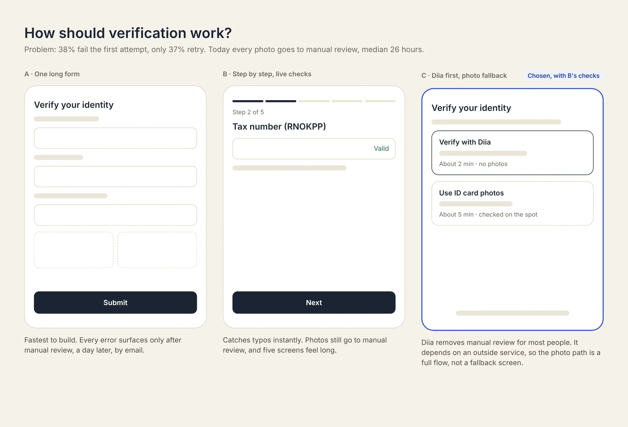
Three ways to verify. I picked Diia first, with live checks and a full photo path.
Next came a small design system: two layers of color tokens, a type scale and eight components, with every text pair checked for contrast. A design critique of the final screens was honest: clean, but they could belong to any fintech app. I did a second visual pass on three key screens, compared it with the first version, and rolled it out to the whole set.
What I designed
Verification that names the error and the fix
A tracker for foreign payments, with the document request inside
Selling dollars, with a daily limit, a rate hold and confirmation
AI flags on income that show their reasons
A design system with light and dark themes
A loyalty layer with quests and a tax streak
Verification you can fix
Diia comes first. It shares a verified ID, so most people skip manual review. The cost is an outside dependency, so the photo path is a full flow, not a fallback screen. Engineering pushed back on custom photo checks, so we used the vendor’s three: glare, blur and cropped edges.
When a photo fails, the photo itself marks the field that couldn’t be read, and the text says how to fix it. The screen also confirms what was read correctly, so a retry doesn’t feel like starting over. A short panel explains who sees your data and for how long.
Two-factor setup fits into the wait: while the bank checks documents, people link the phone and set Face ID and a PIN.
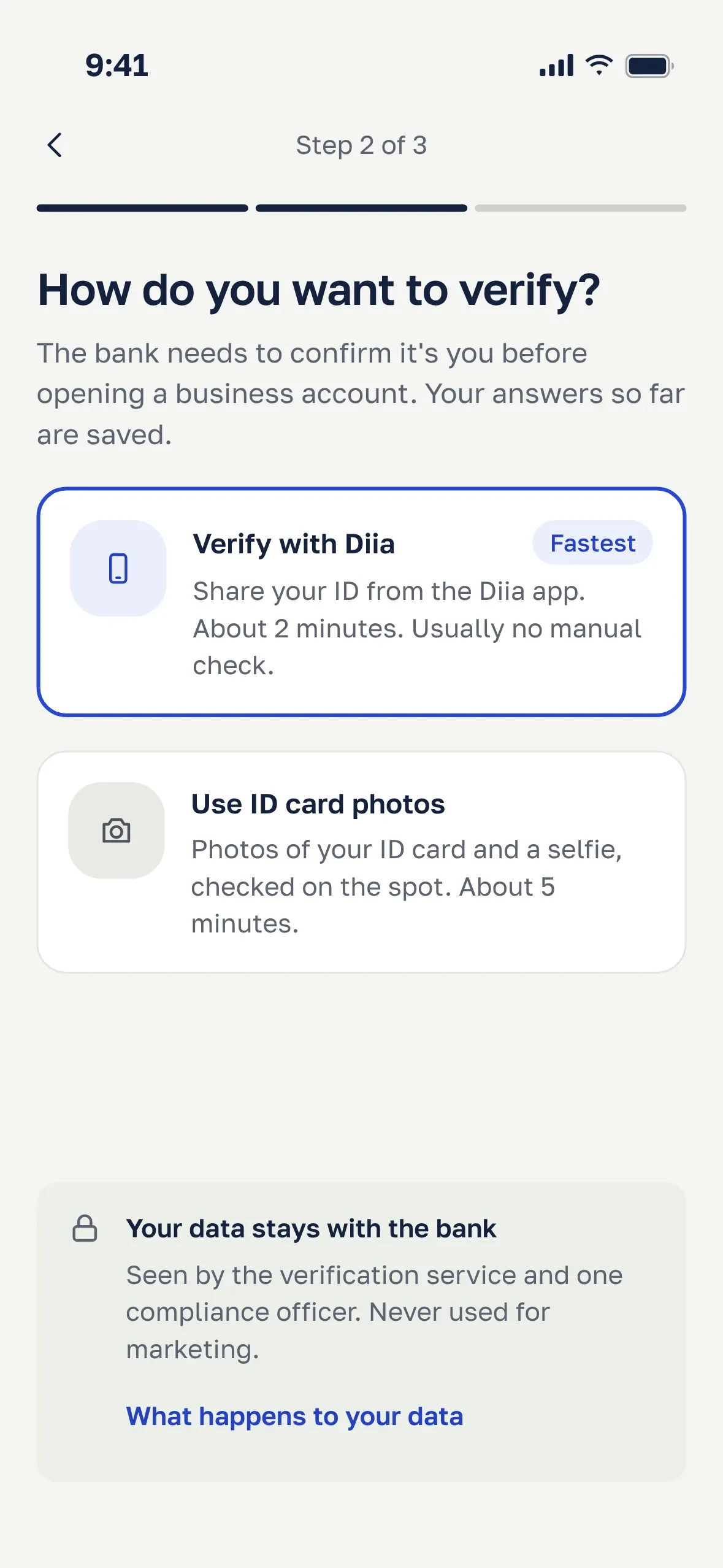
Choose how to verify
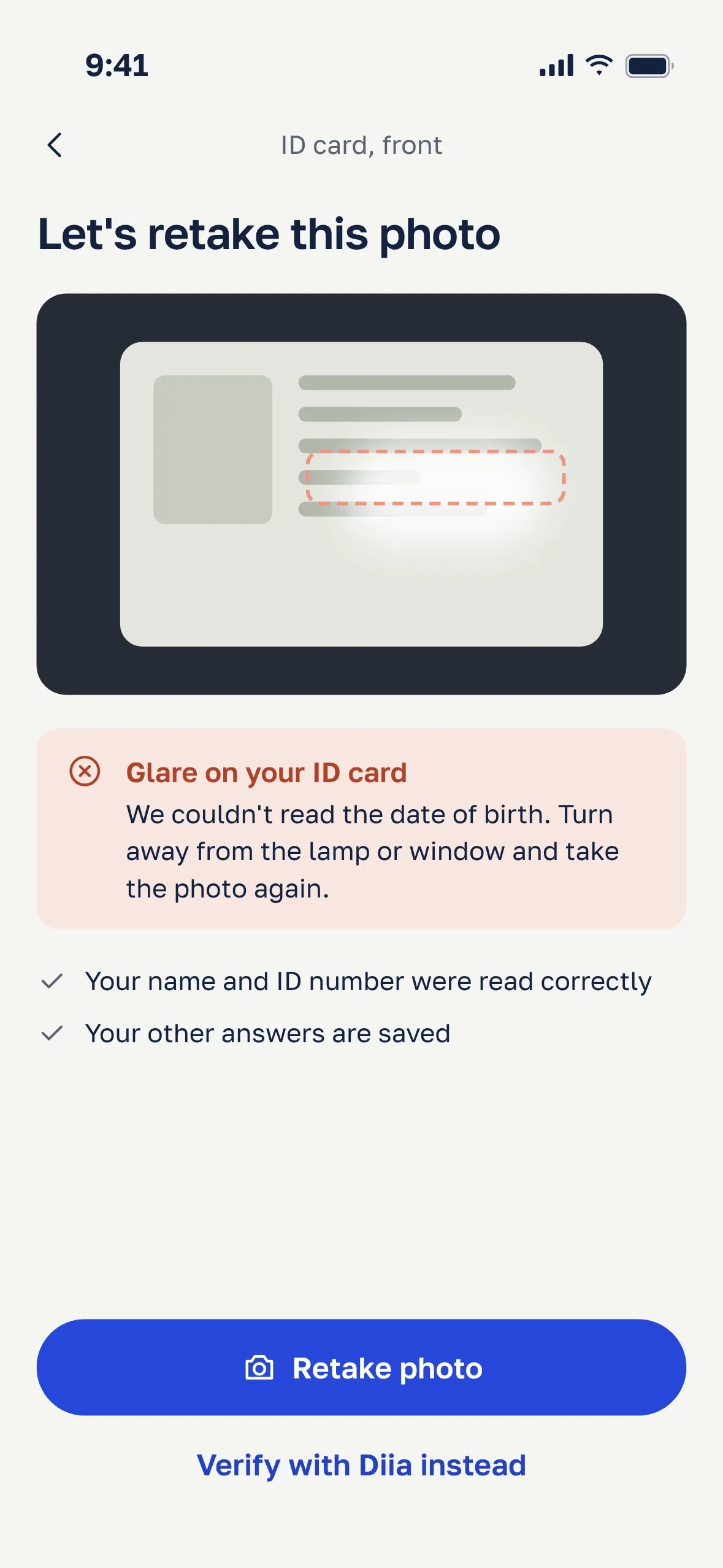
The error names the cause and the fix
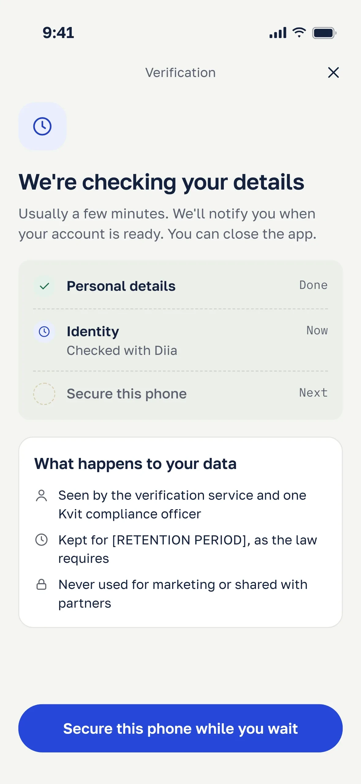
Checking, and what happens to your data
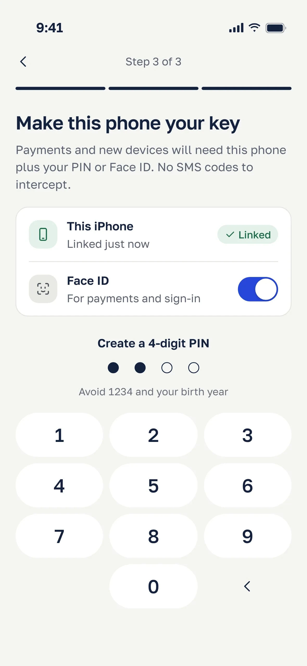
Two-factor setup while you wait
Money in transit
The home screen has a “Needs your attention” block. Bank requests live there, not in email.
The tracker shows a payment like a parcel: what happened, what’s happening now and what comes next. The key idea: an invoice made in Kvit is already the document the bank wants. The app matches it by client, amount and currency and offers it in one tap.
If a document is rejected, the screen gives the reason, a deadline and a fix. With compliance, I rewrote 14 hold reasons in plain language. For the three they can’t disclose, the screen says what happens next and when. To fit ten weeks, the tracker has four statuses, not a full SWIFT trace. When the money arrives, the app converts it at the National Bank rate and adds it to the income book.
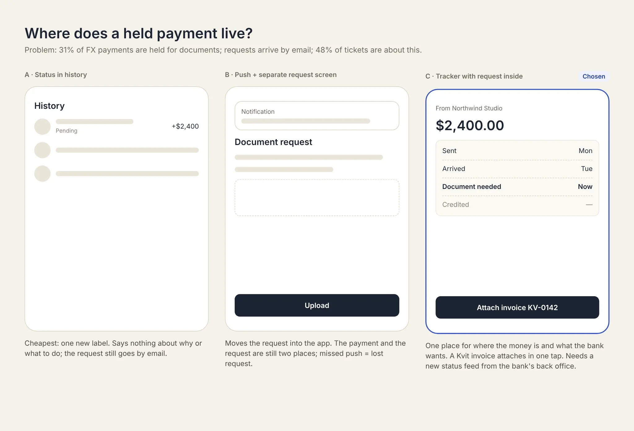
Three ways to show a held payment. I picked the tracker.
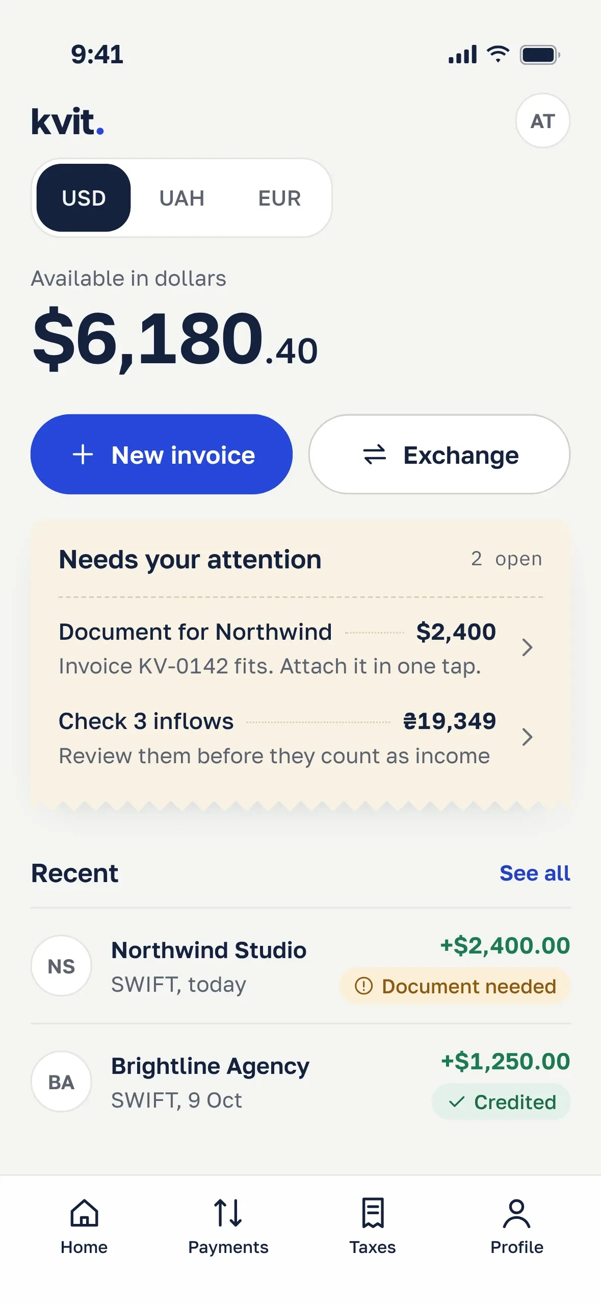
Home: what’s waiting for you
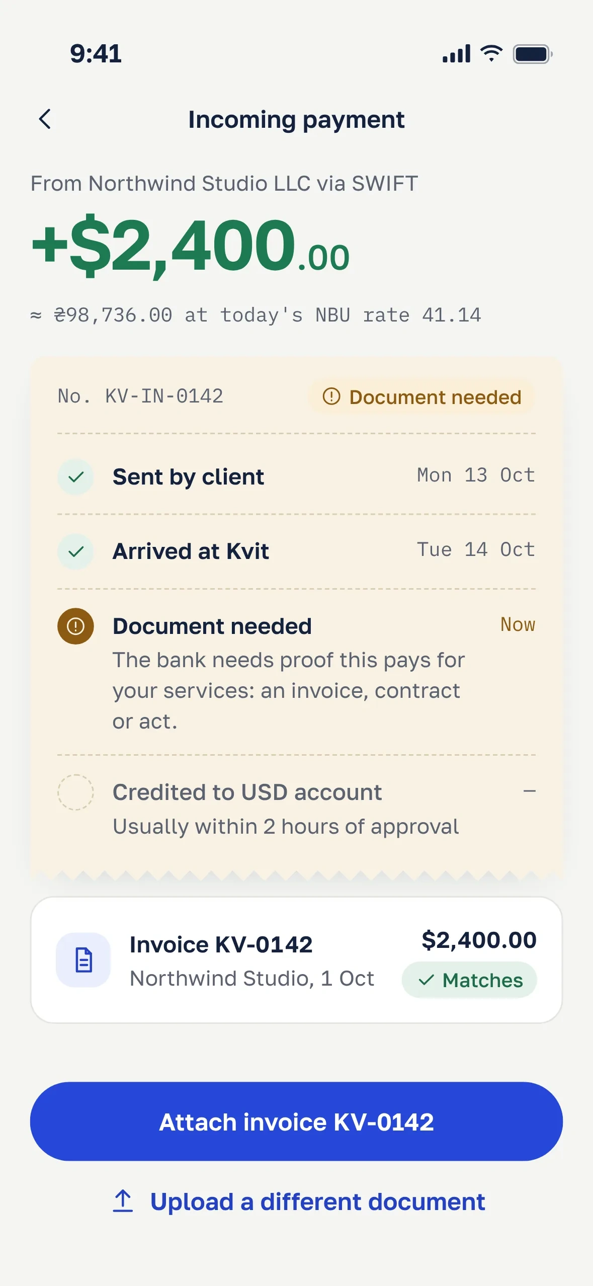
The payment, step by step
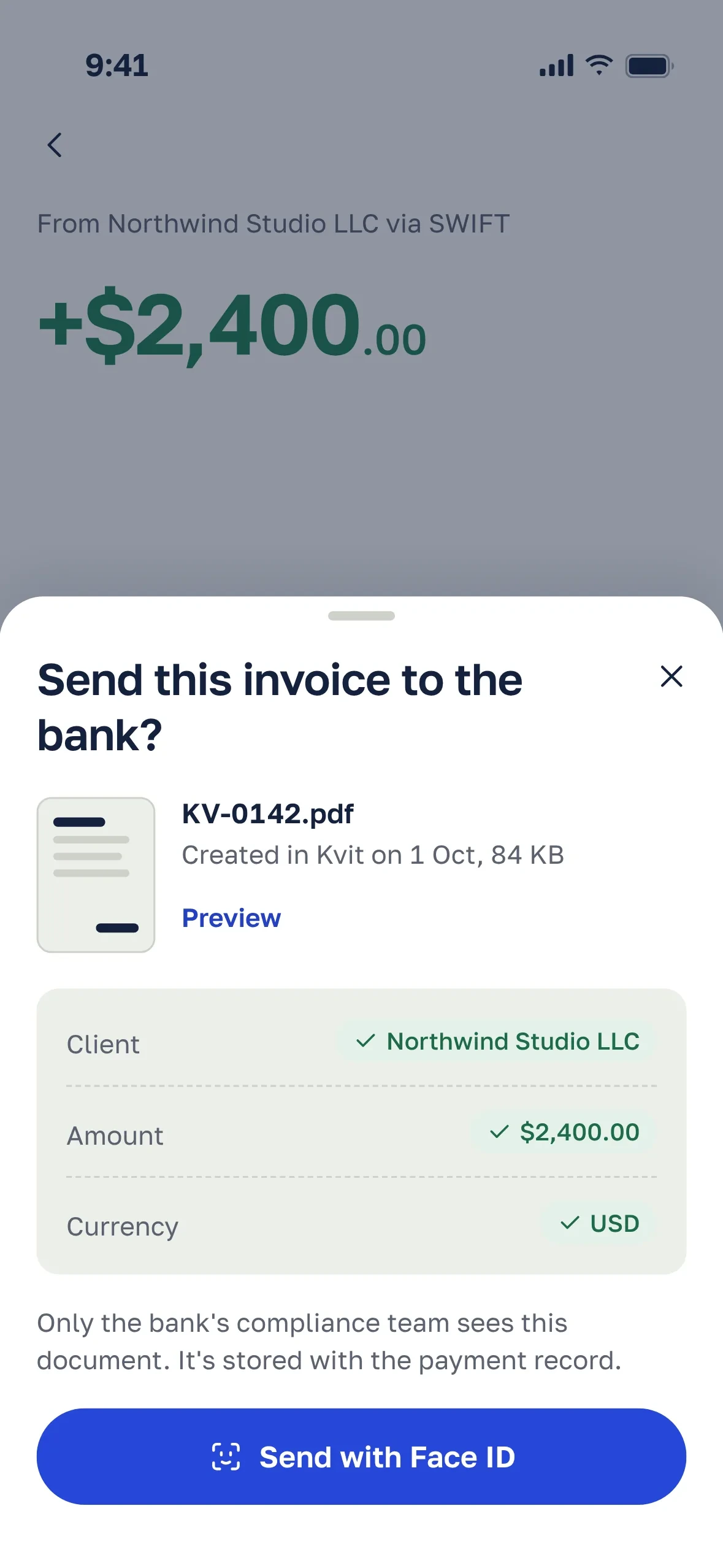
Send the matching invoice in one tap
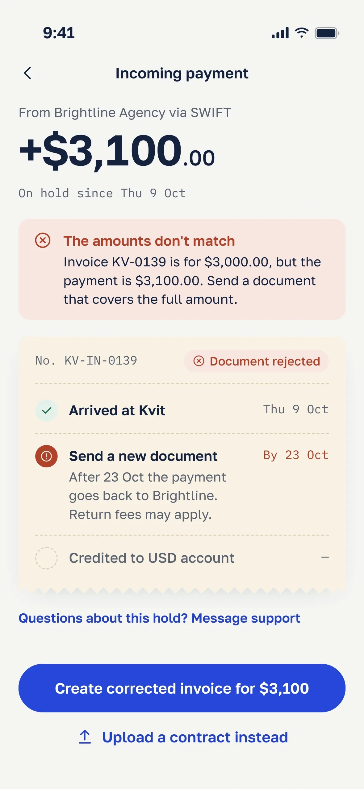
A rejection with a reason and a fix
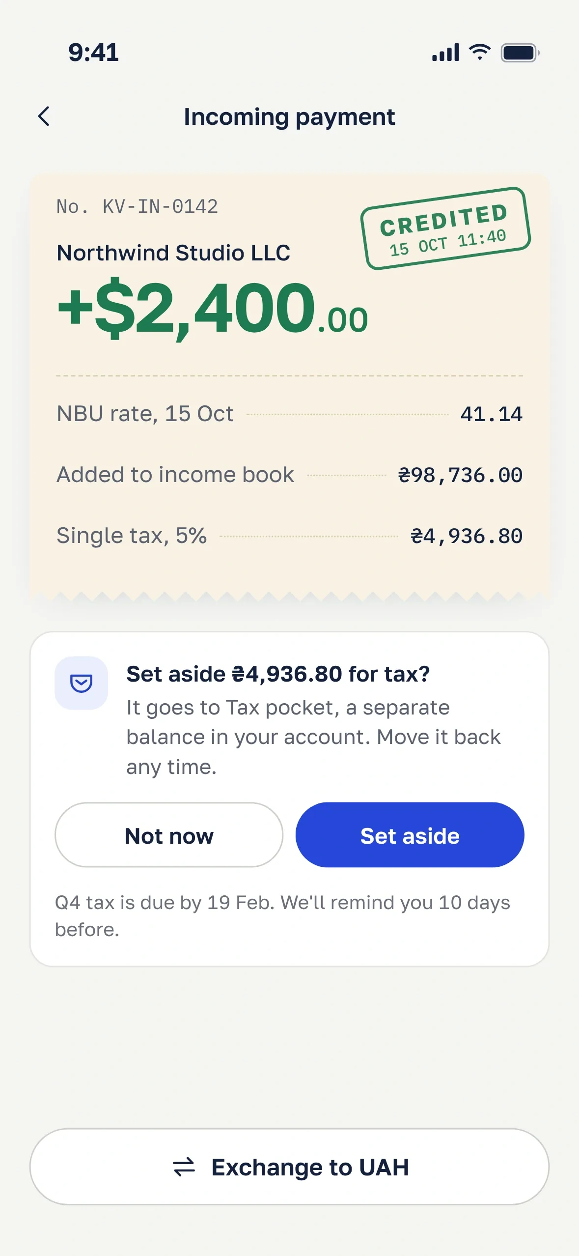
Credited means recorded
Tax started as H3: an automatic pocket that moves 5% of every payment. In the staged rollout it reached 19% of foreign-currency earners against a 40% target, and 23% of those who turned it on switched it off within two weeks. I called six of them. The reason was the one from the interviews, now with behavior behind it:
It took 5% exactly when I was short for rent. I’d rather pay the tax myself, I just need to know how much. beta user
We kept the goal and gave control back. Each credited payment now offers the exact amount, one button and a reminder ten days before the deadline. In the first month, 41% of foreign-currency earners set money aside at least once, twice the reach of the automatic pocket.
Selling dollars is usually the next step, so that’s where the transfer states live: a daily limit with a way around it, a rate that holds for a minute, confirmation and success.
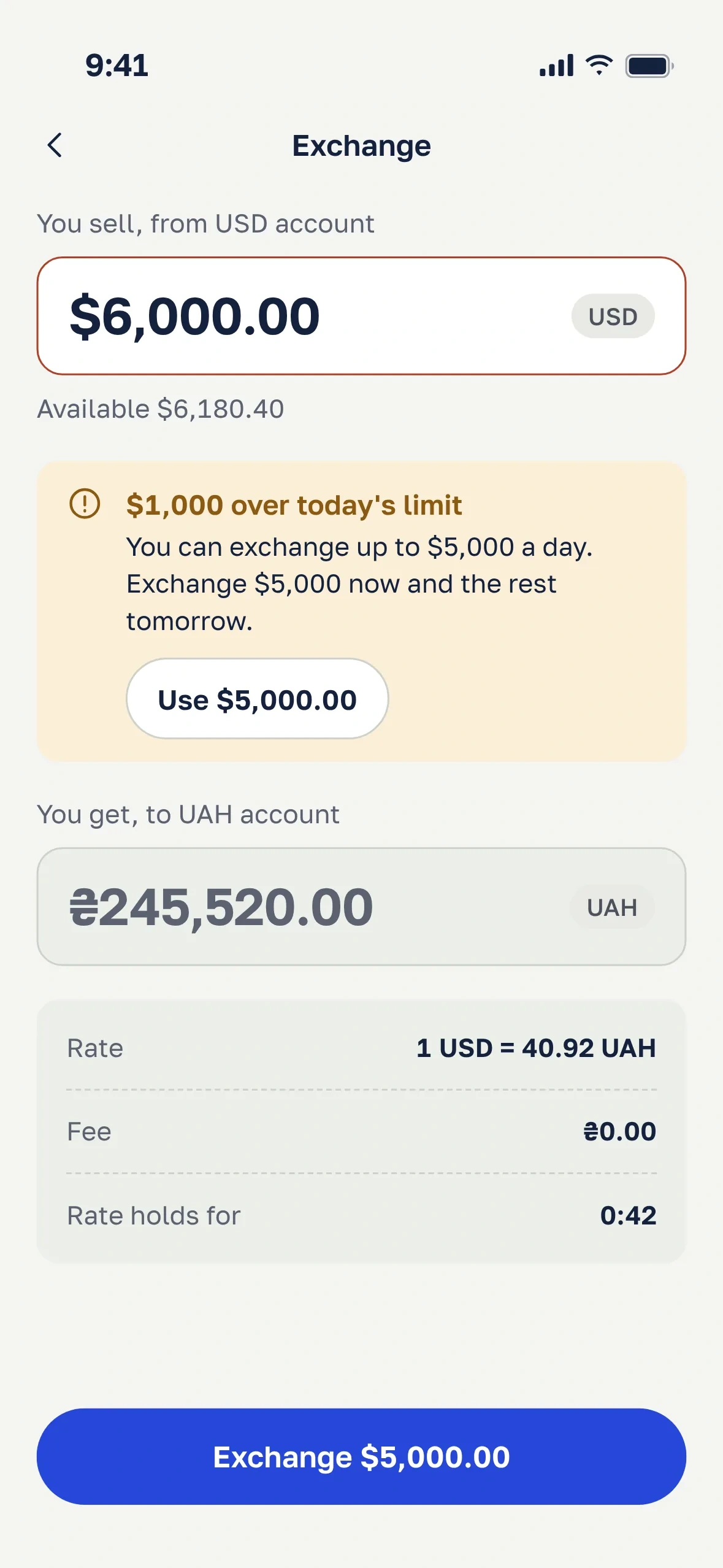
Over the daily limit
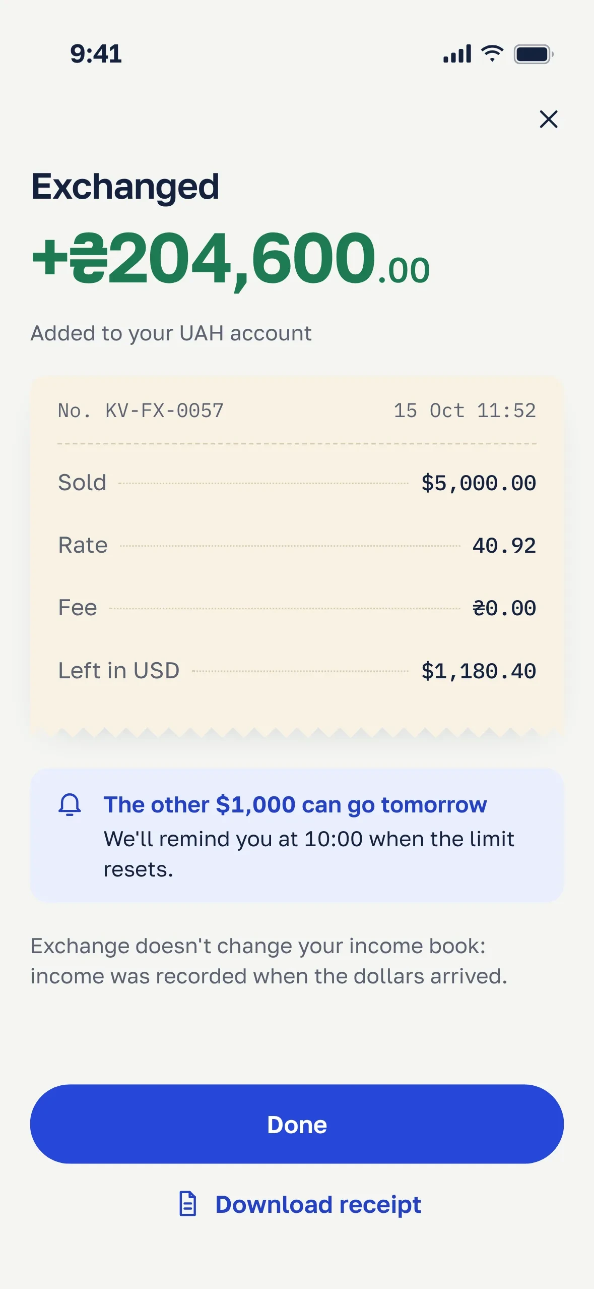
Exchange done
AI flags that show their reasons
The AI never changes the books on its own. It flags incoming payments that may not be income, such as top-ups from your own card or refunds.
In the prototype test, the plain suggestion failed: 4 of 6 people asked “why does it think so?” and tapped Yes to make it go away. So each flag shows two or three facts the user can check, and a confidence word instead of a percentage. The wording stays away from tax advice: “may not be income”, never “not taxable”. The two answers also have the same visual weight: a filled “Not income” button would be a tax hint in disguise.
Flags wait in one queue instead of interrupting each payment. After an answer, the user can tell Kvit to treat that card the same way from now on. Any answer can be undone until the tax return is filed.
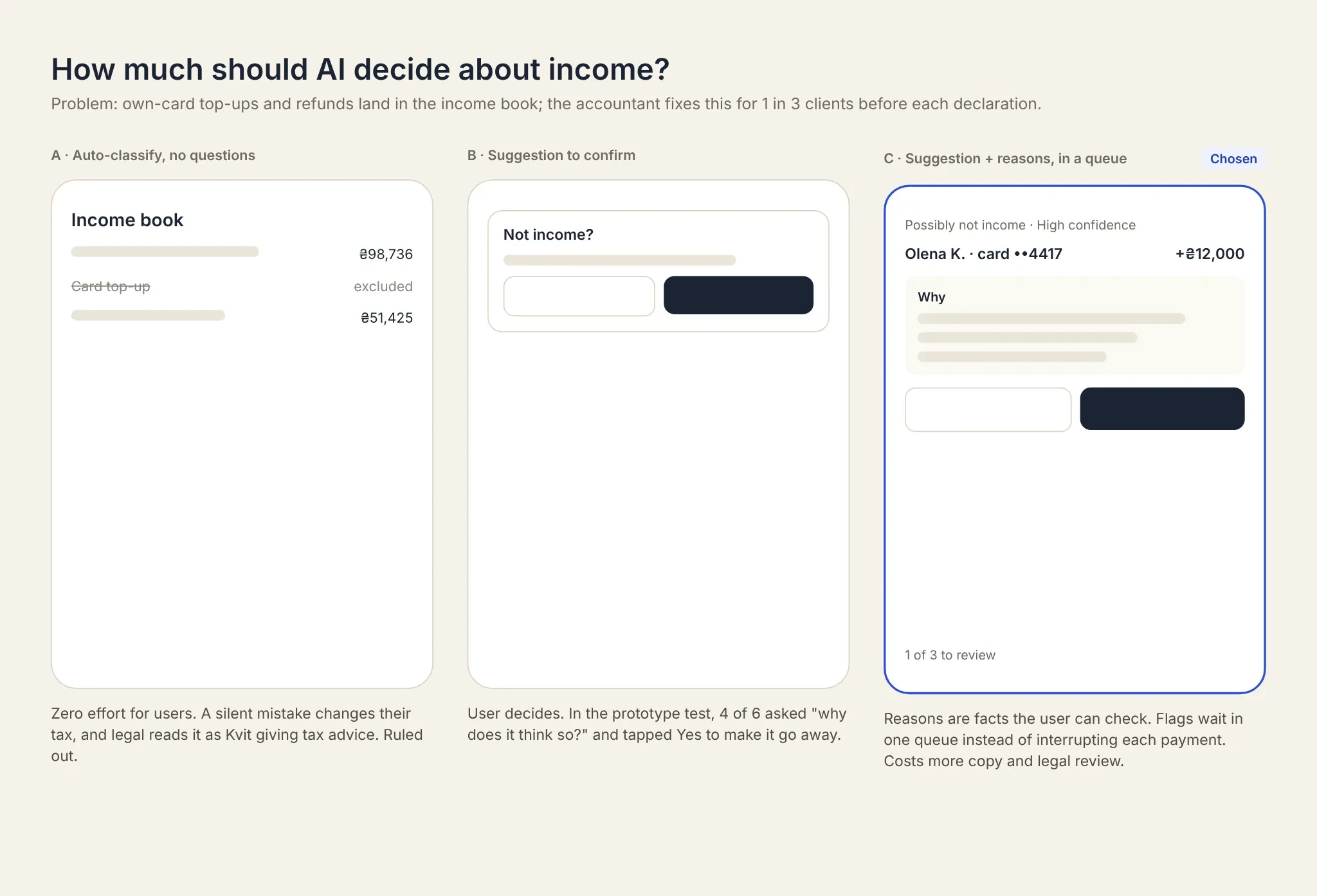
Three levels of AI control. I picked suggestions with reasons.
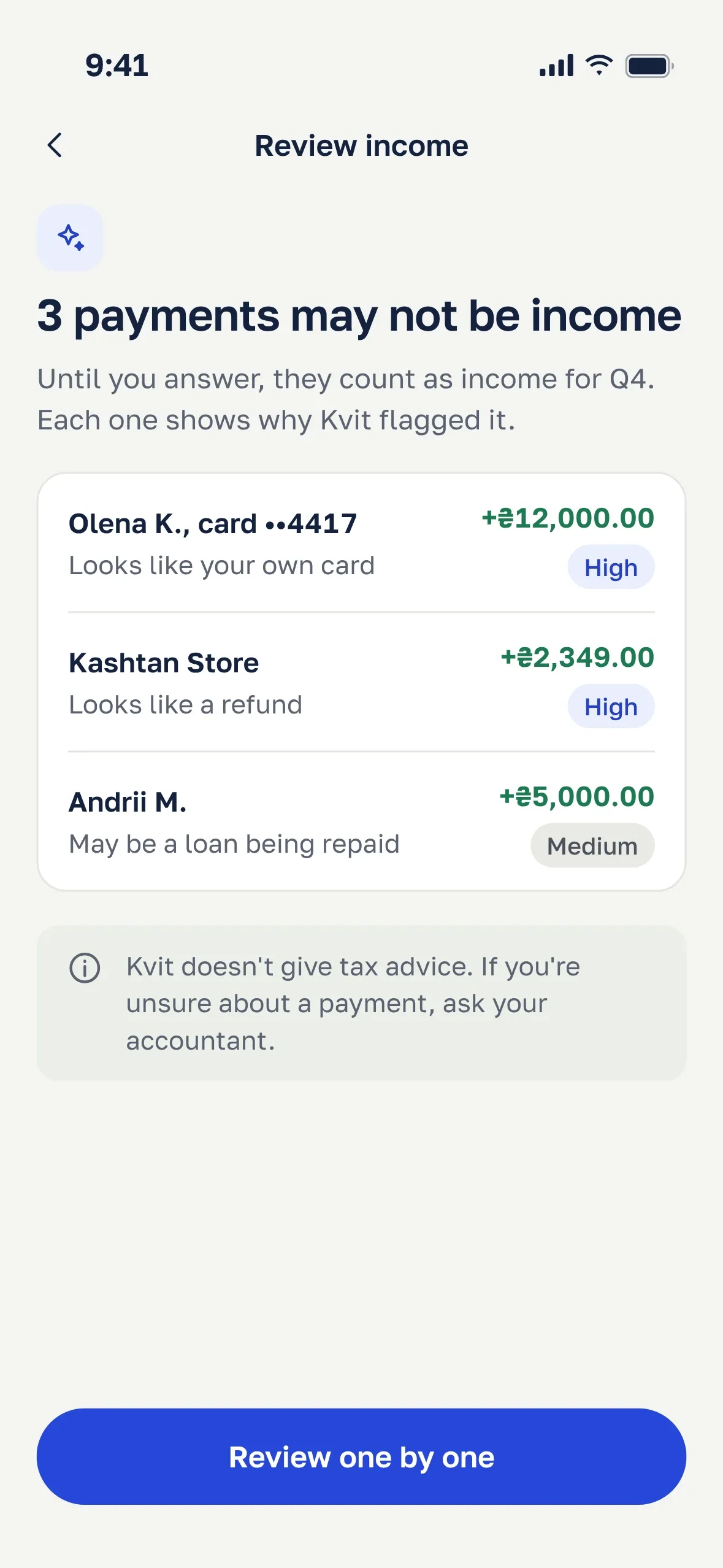
One queue, reviewed in one sitting
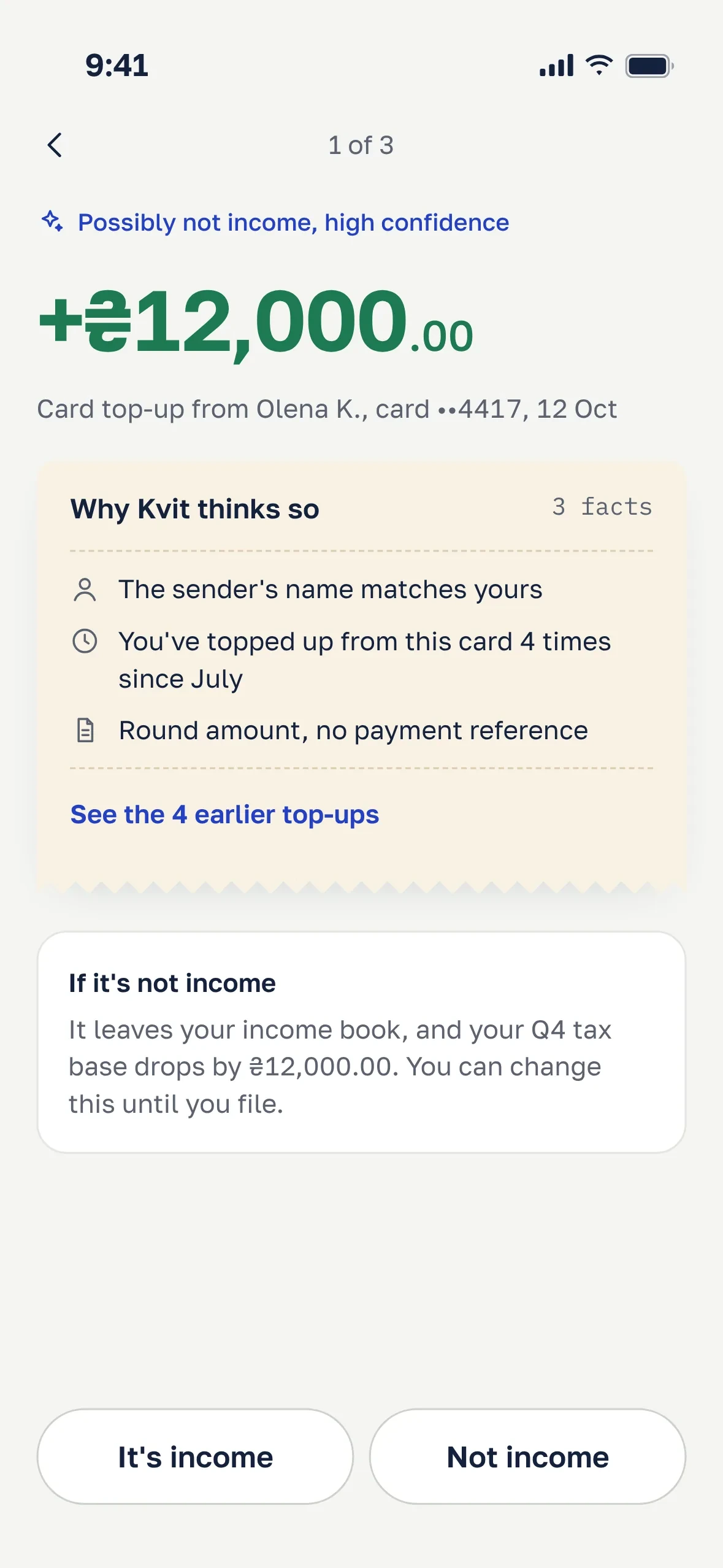
The reasons are facts you can check
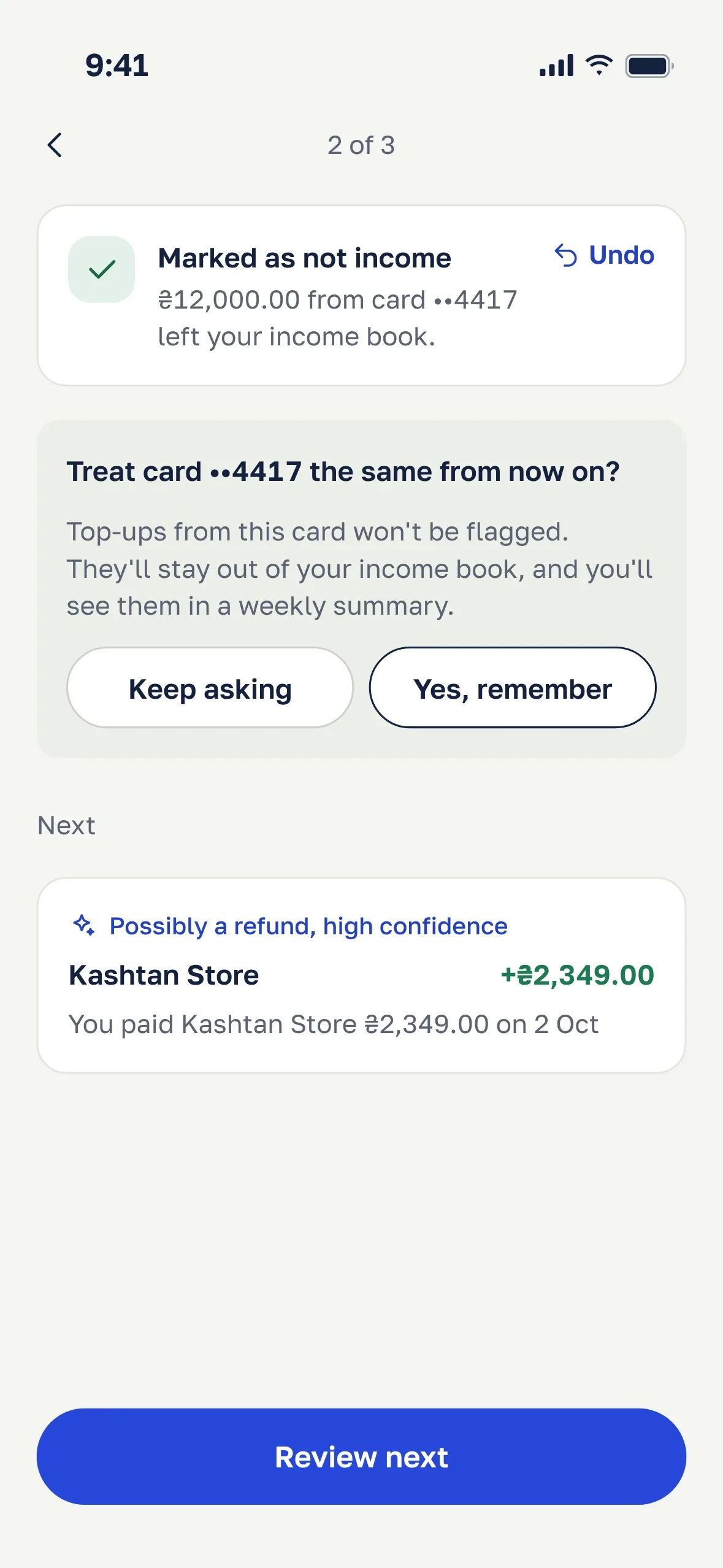
Undo, and opt-in learning
Design system and themes
The name Kvit is short for kvytantsiia, the Ukrainian word for a receipt, so the receipt became the one memorable element. Payment records, statuses and confirmations are printed on warm paper with a torn edge, dotted leaders between a label and its amount, and a document number. On a credited payment, a green stamp shows the date and time. Everything else stays quiet: a cool grey background, navy ink and one cobalt accent.
The type is Golos Text, a typeface designed with Cyrillic in mind. Amounts use it too, large and with tabular figures, so they read as numbers rather than code. A monospaced font is kept only for what a real receipt would print in it: document numbers, rates and dates.
Colour always means one thing: cobalt for actions, green only for money coming in, amber when you need to act, red when something failed. Components use semantic tokens only, so the dark theme is a second set of values, not a second set of screens.
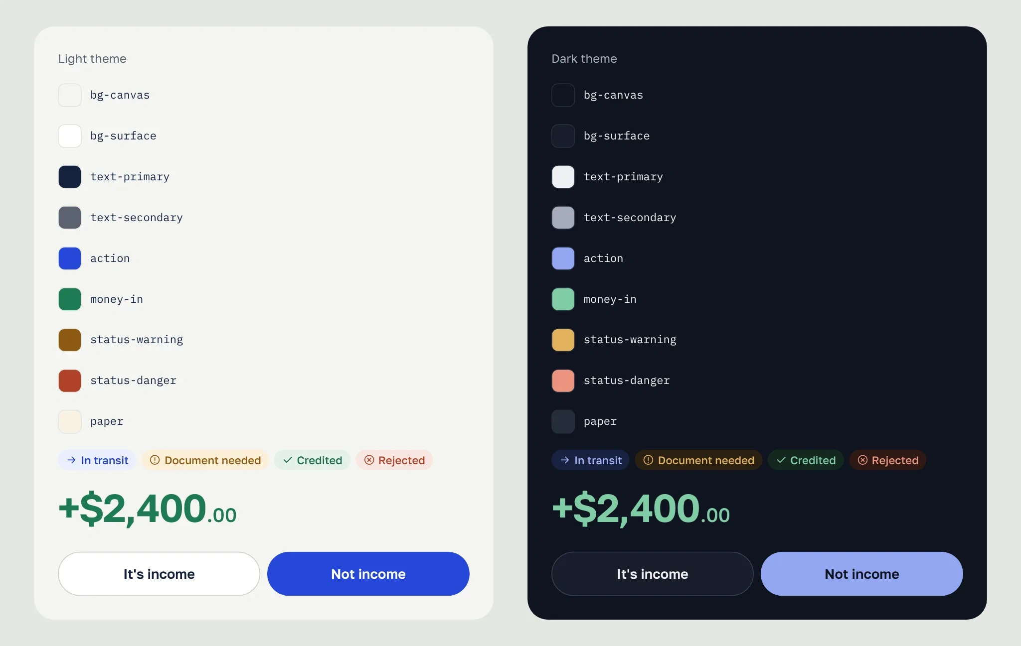
Semantic tokens in two themes
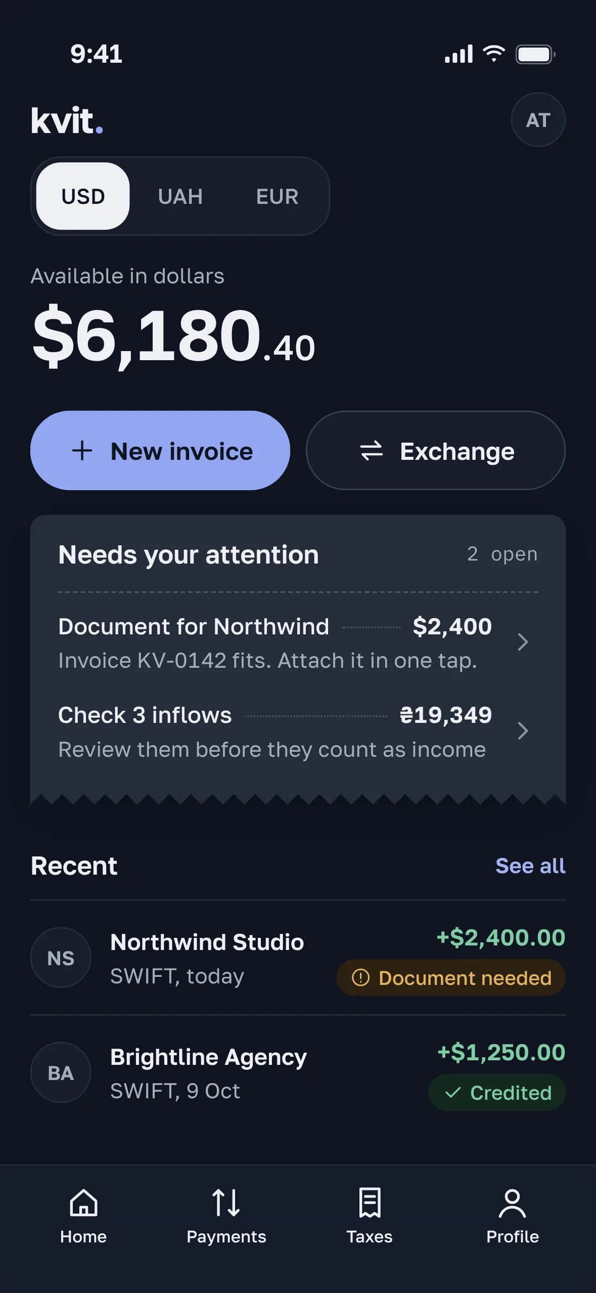
Home screen in the dark theme
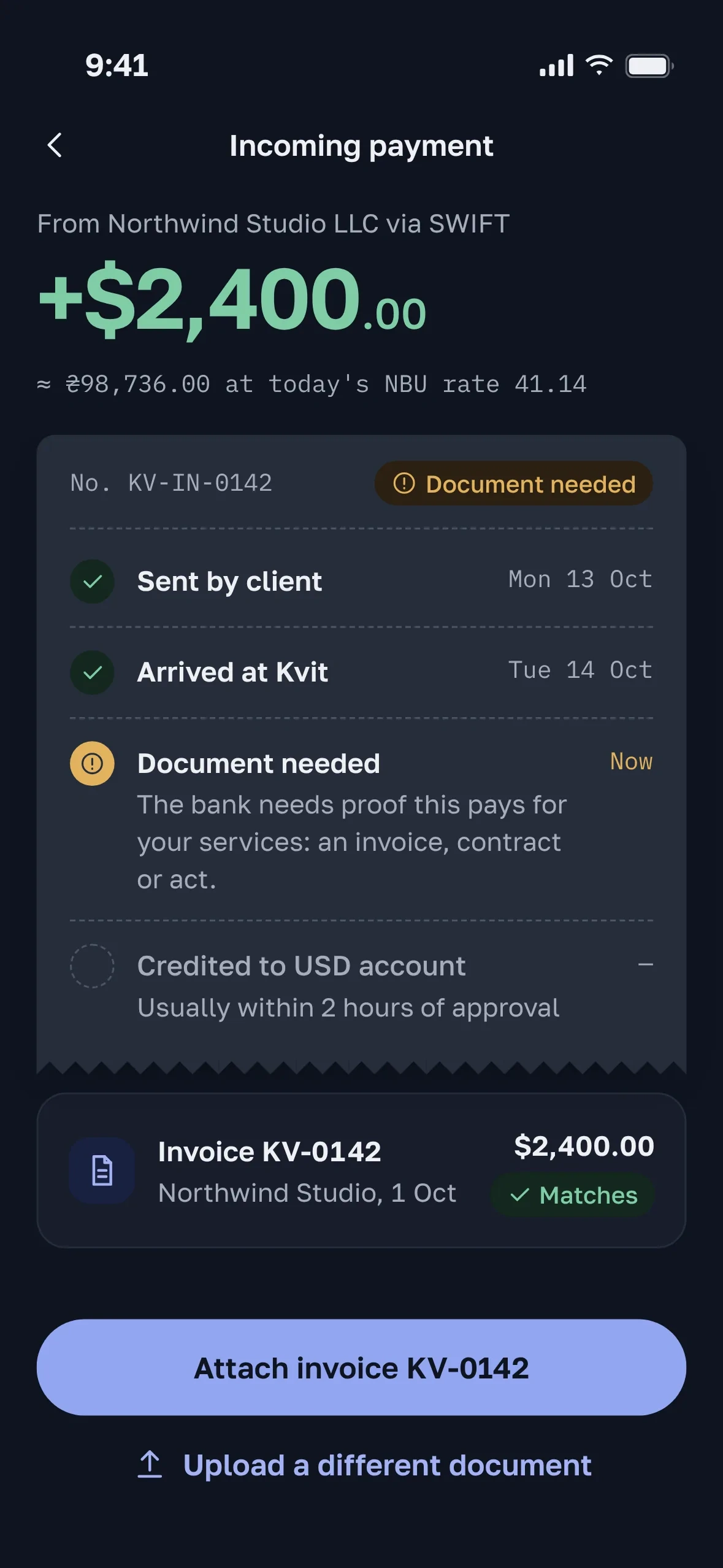
Payment tracker, dark theme
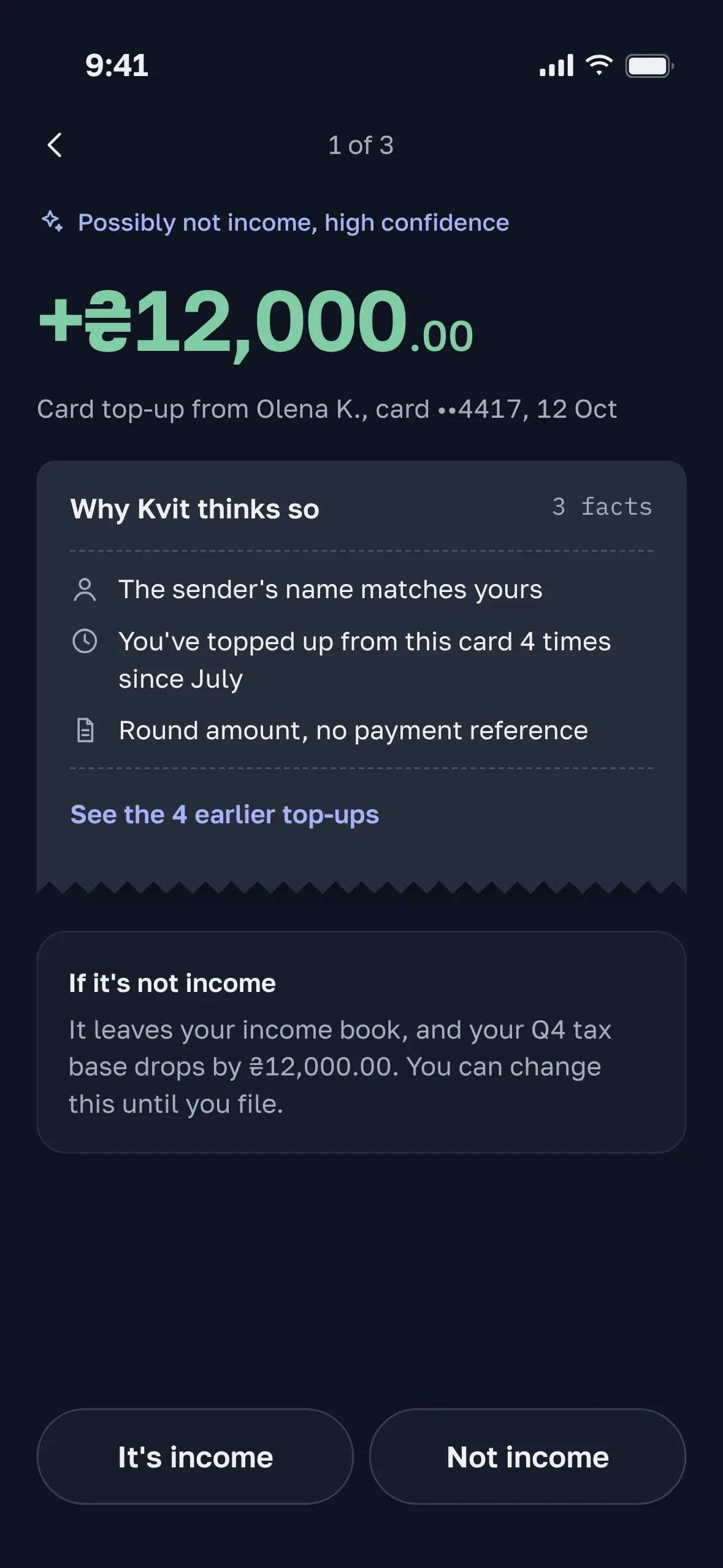
AI flag, dark theme
Loyalty layer
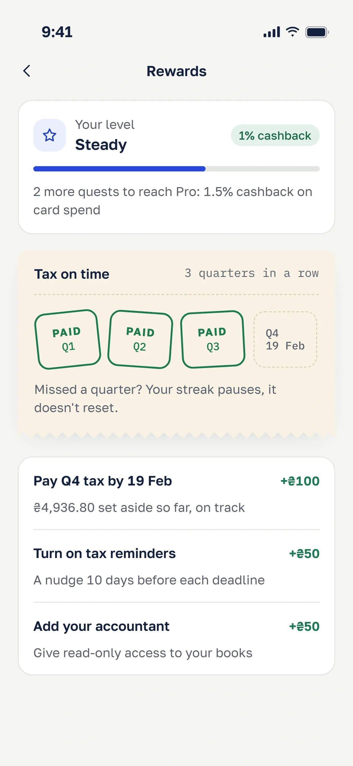
Quests give small cashback rewards. A streak counts quarters with tax paid on time, shown as a stamp card on receipt paper: each quarter paid on time gets a PAID stamp. Three levels raise card cashback.
Three months after the activation work, day-60 retention had barely moved, and the product lead proposed gamification. I designed it and set up an experiment so we’d learn either way: eight weeks, 20% of active users against a holdout of the same size. The guardrail was average invoice size, in case quests changed how people bill.
The result was mixed:
31% took part. Participants sent 22% more invoices than the holdout, partly because active people join quests.
Day-60 retention went up 1.1 points, which is not significant.
The guardrail fired: people who completed “Send 5 invoices” cut their average invoice by 17%, splitting bills to finish the quest.
3 of 8 people over 35 called the rewards “not serious for money”.
The volume quest is gone. The remaining quests reward habits that protect the user: paying tax on time, turning on reminders and giving an accountant access. A missed quarter pauses the streak instead of resetting it. A re-run with the same holdout is planned.
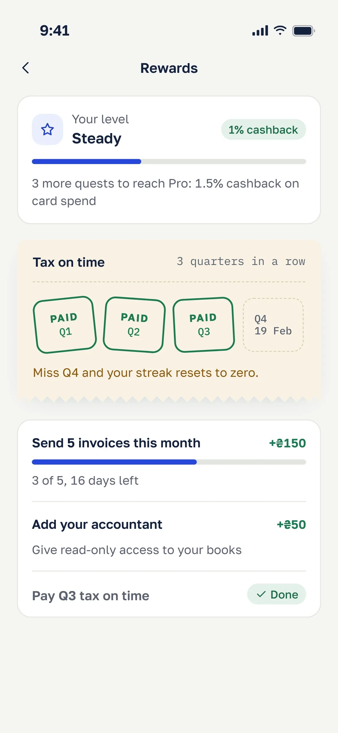
First version, with a volume quest
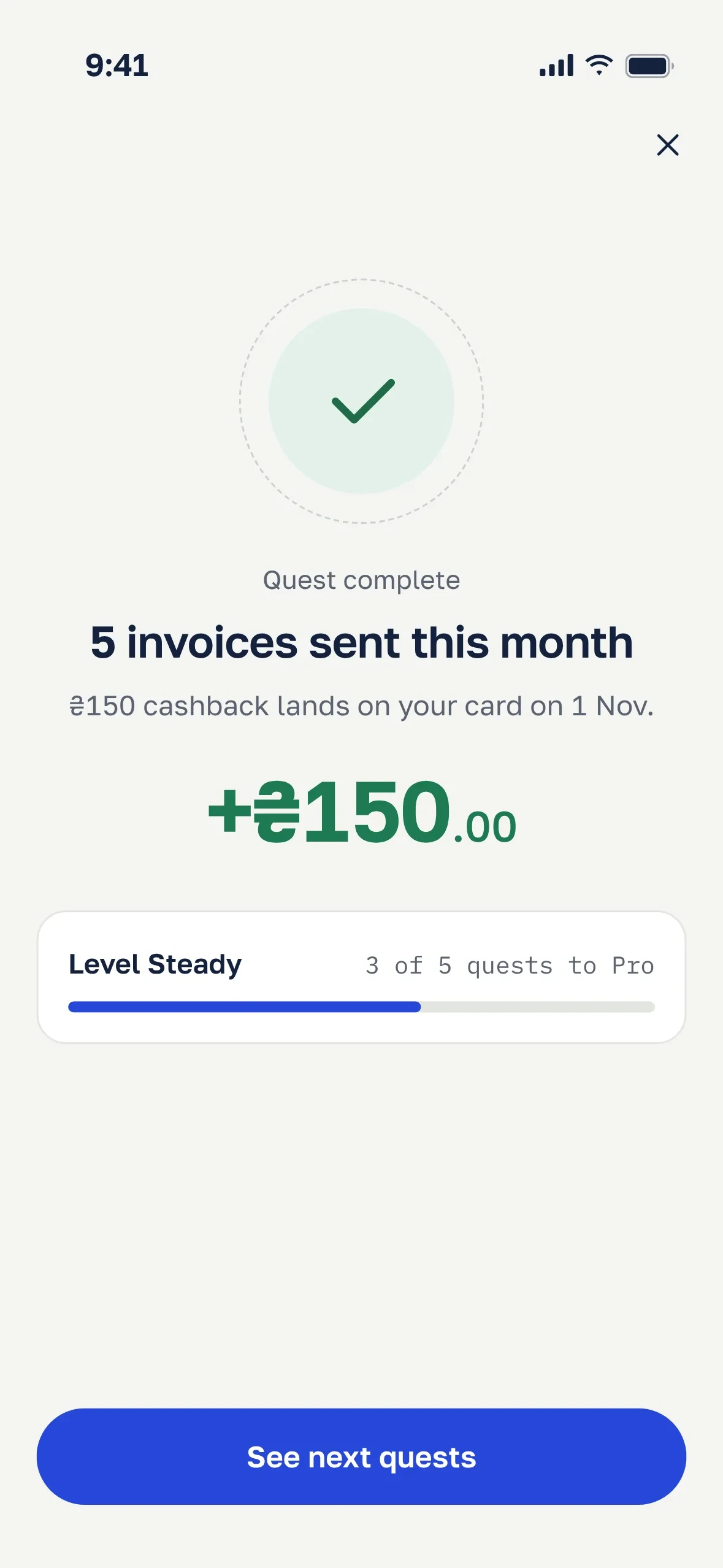
The reward moment
Revised version: habits, not volume
Result
Each decision got the cheapest test that could prove it wrong.
Moderated prototype test, 6 people, week 5. All 6 understood what the bank wanted, and 5 attached the invoice without help. One checked email out of habit, so the hold notification now opens the tracker. Two missed the error under the ID photo, so the photo itself now marks the unreadable field.
Unmoderated comparison of old and new verification, 20 people, week 7. Task success went from 55% to 90%, and the median time from 6:40 to 3:10.
A/B test of the new onboarding, 50/50 for 3 weeks, about 9,400 sign-ups. 56% reached a verified account in the new flow versus 43% in control. The other changes went out as a staged rollout and were measured before and after: there wasn’t enough traffic to A/B test everything.
Six weeks after the full rollout, activation reached the quarter’s target of 28%, up from 23%.
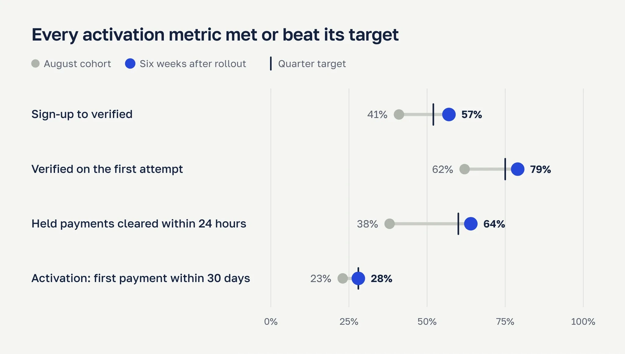
Four metrics before and after, against the quarter targets
Support. Foreign payment tickets fell from 46 to 30 per 1,000 active users, about 175 fewer tickets a month.
Speed. The median time to a verified account dropped from 26 hours to 2.5 hours. On the Diia path, it’s under 10 minutes.
Books. 74% of AI flags were accepted against a 60% target. Manual corrections to the income book fell from 2.1 to 1.3 per user per quarter.
Business. At about 6,400 sign-ups a month, five points of activation means roughly 320 more accounts receiving money every month, which is where the bank earns.
One number went the other way: the share of verified users who got paid within 30 days fell from 56% to 49%. We now verify people who used to drop out, and many of them aren’t ready to invoice yet. That’s the next problem: helping newly verified users send their first invoice.
What I learned
The strongest idea connected two features that already existed: the invoice and the bank’s document request.
When a feature touches someone’s cash, the user should make the move. The product should make it easy.
Name the riskiest bet up front. It turned the tax pocket’s failure into a planned result, not a debate.
A reward mechanic has side effects. A guardrail metric belongs in the plan from the start.
Like this project
Posted Oct 22, 2026
A concept banking app that helps Ukrainian sole proprietors get verified and paid in dollars without guessing what the bank wants.