Airline Brand Identity Design
JeRy Design
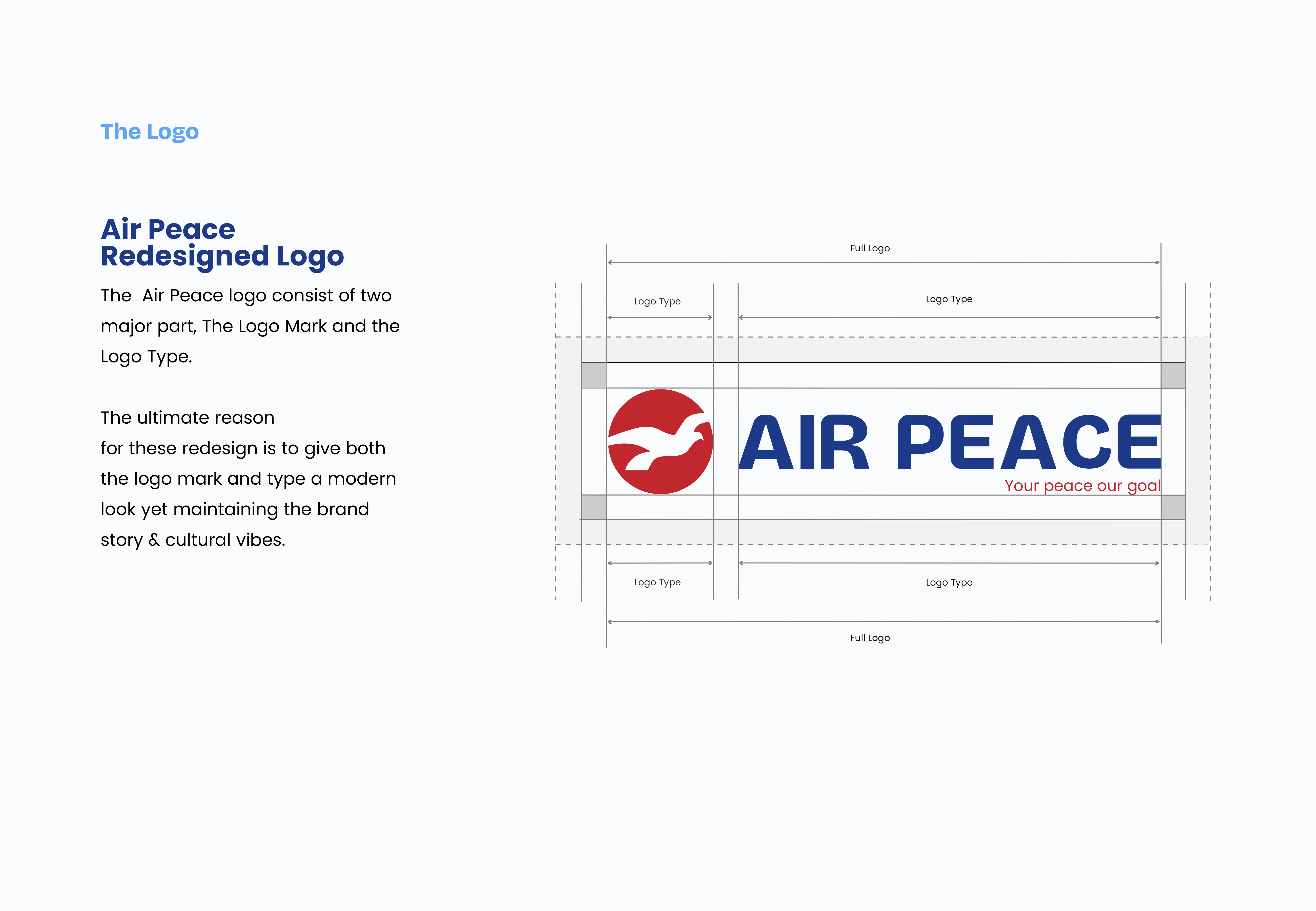
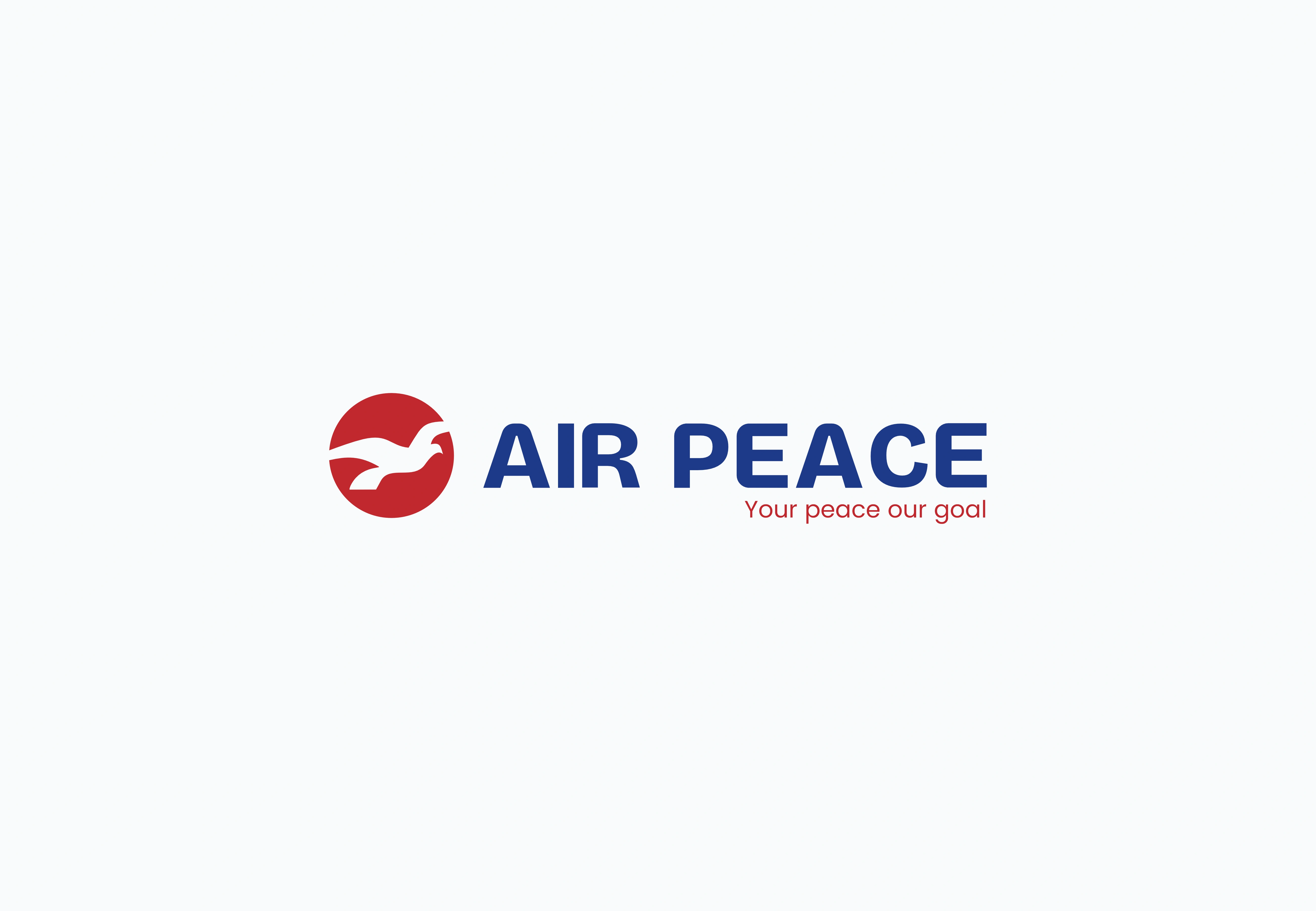
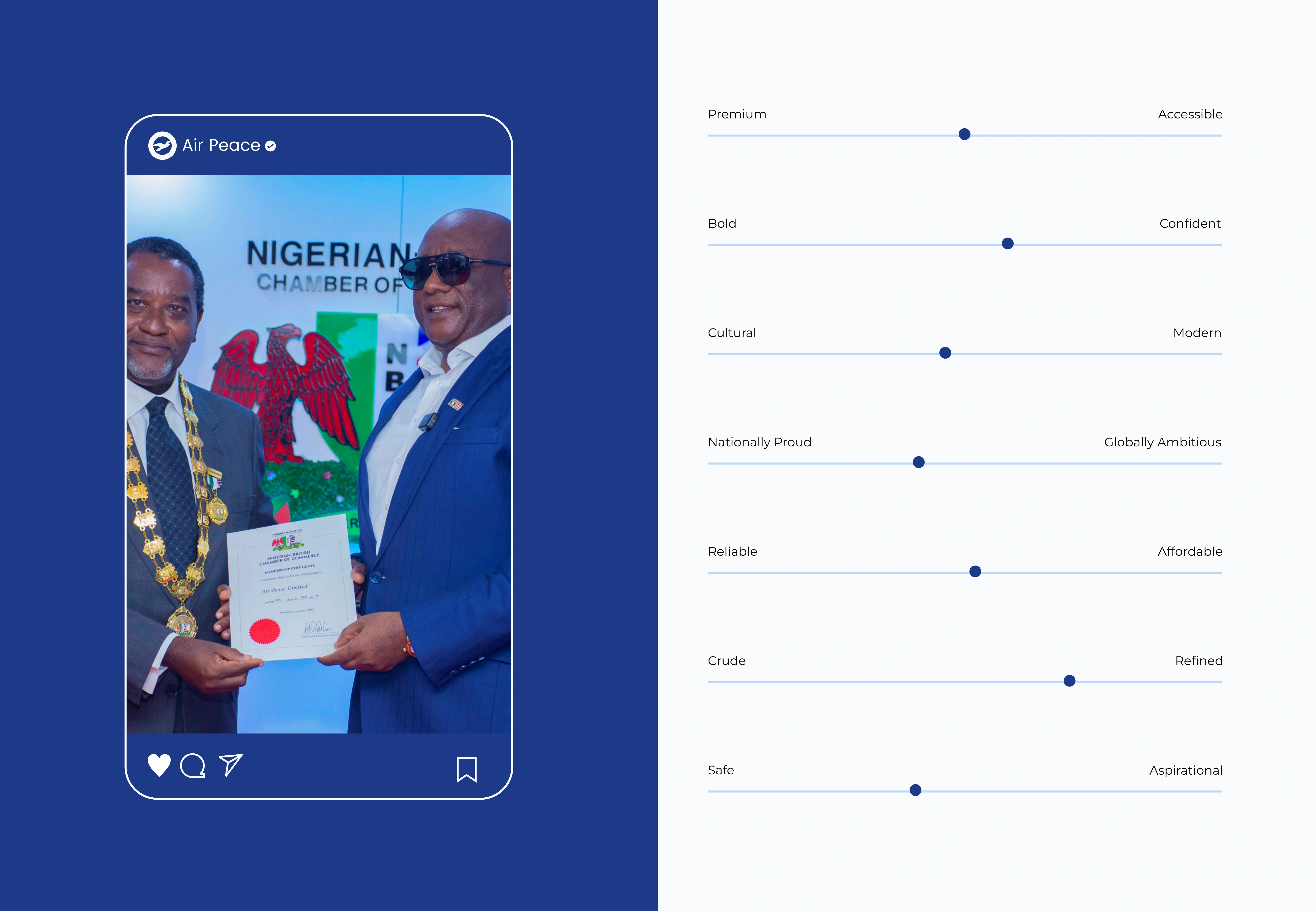
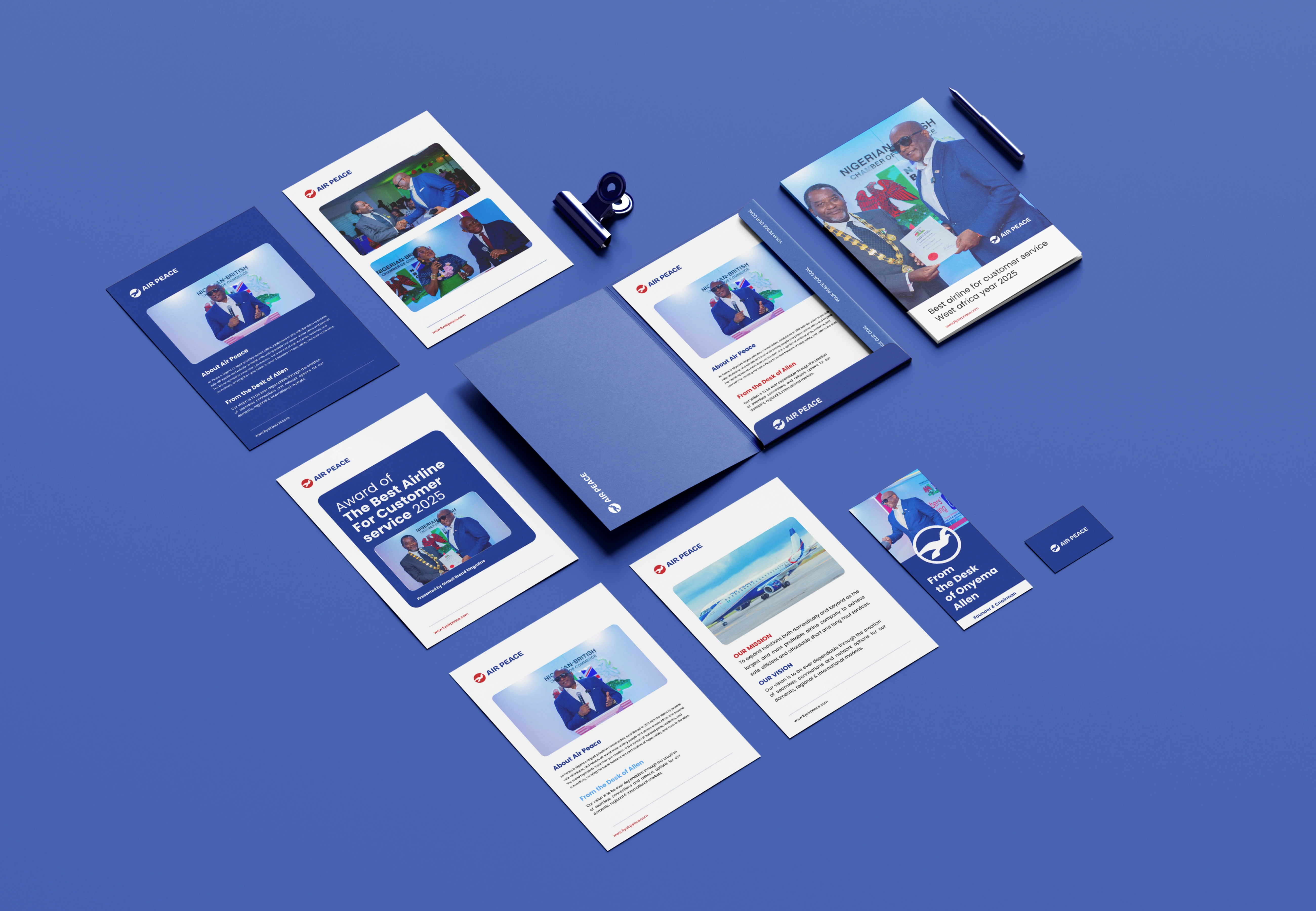
About Air Peace
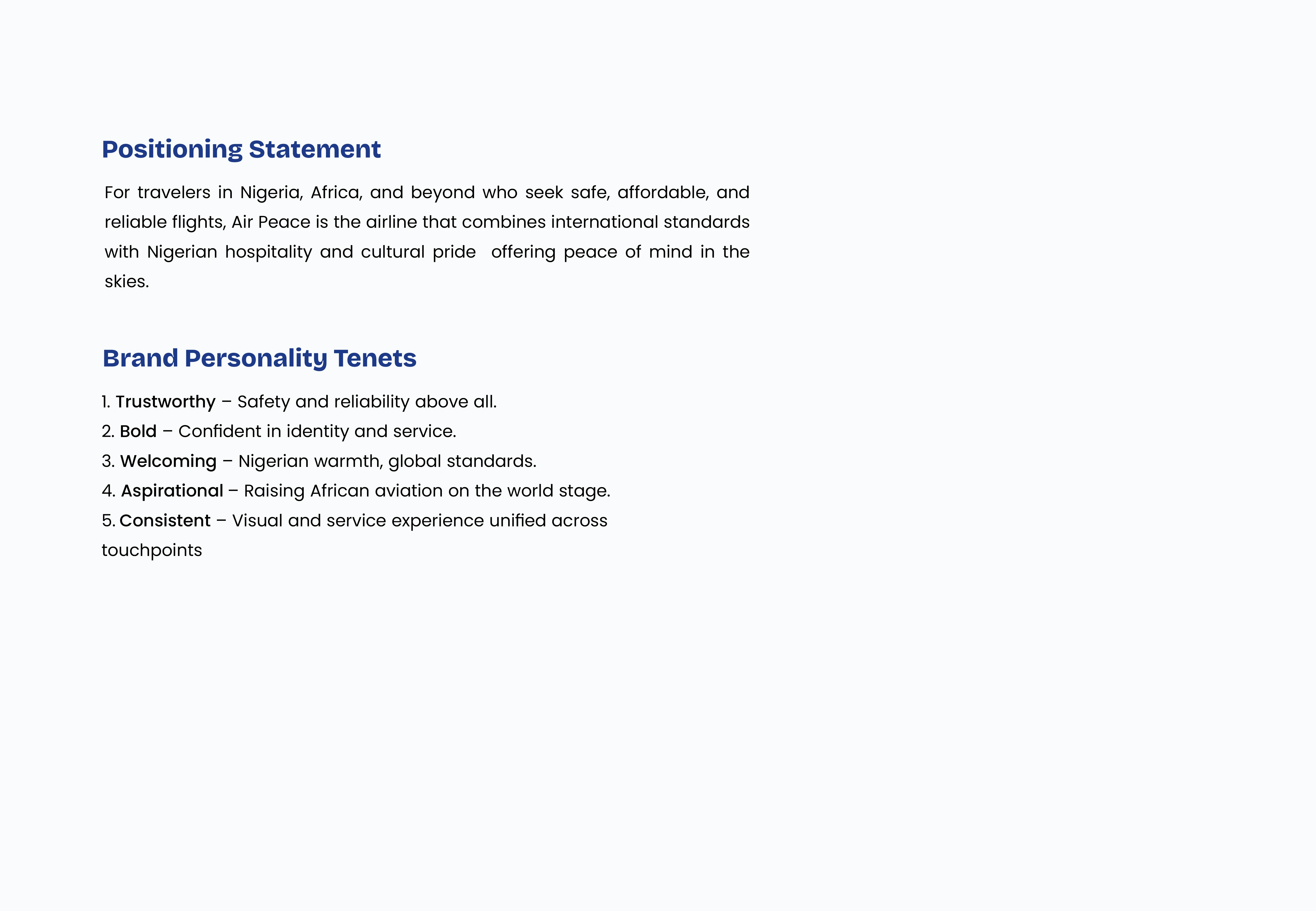
Air Peace is Nigeria's largest privately-owned airline, established in 2013 with the vision to provide safe, affordable, and reliable air travel while uniting people and places across Africa and beyond. The brand represents more than just aviation, it is a symbol of national pride, resilience, and connectivity, carrying the name Peace to remind travelers of hope, safety, and calm in the skies.
Brand Mission
To expand locations both domestically and beyond as the largest and most profitable airline company to achieve safe, efficient and affordable short and long haul services.
Brand Vision
To be ever dependable through the creation of seamless connections and network options for our domestic, regional and international markets.
Problem/Brand Pain Points
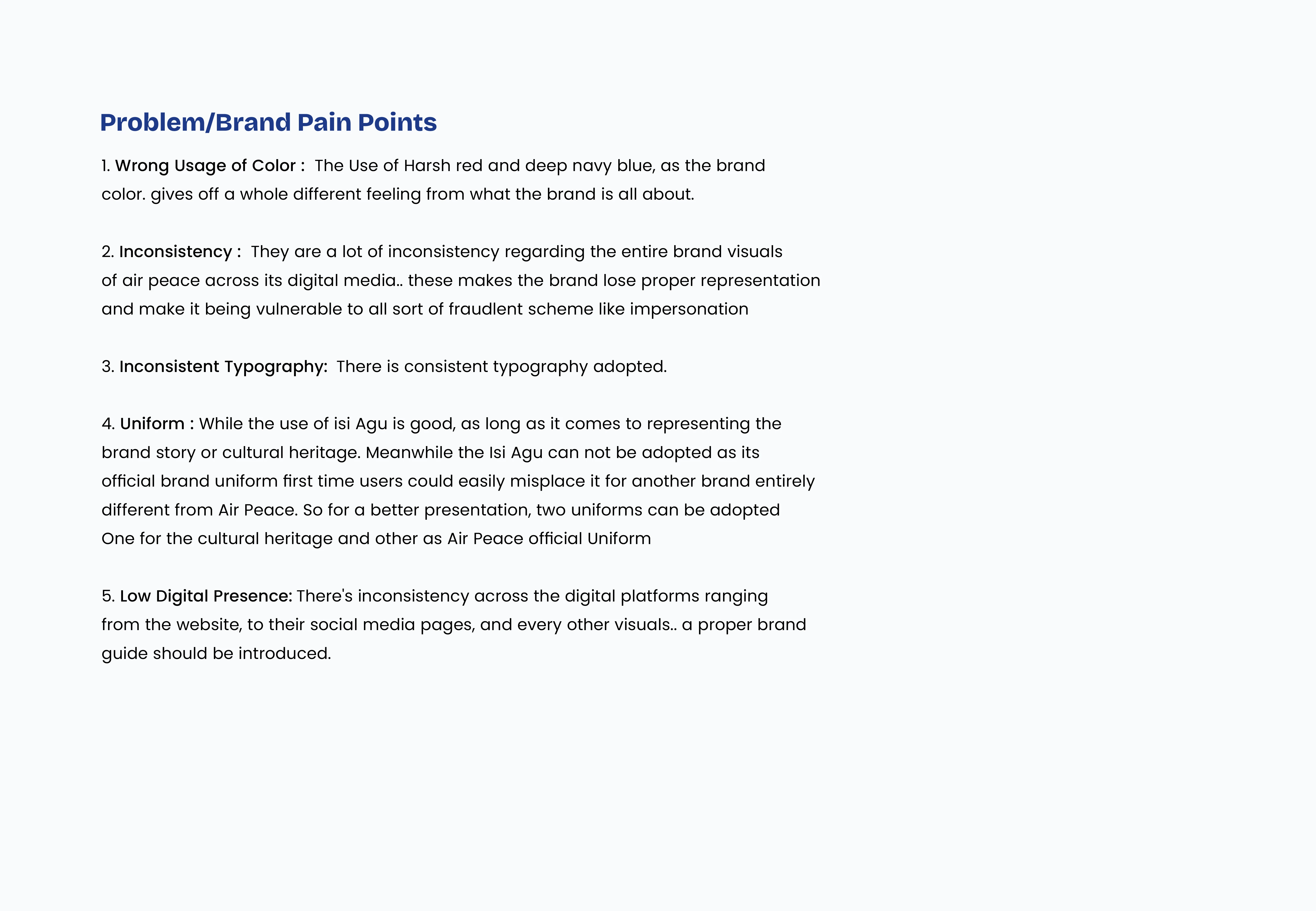
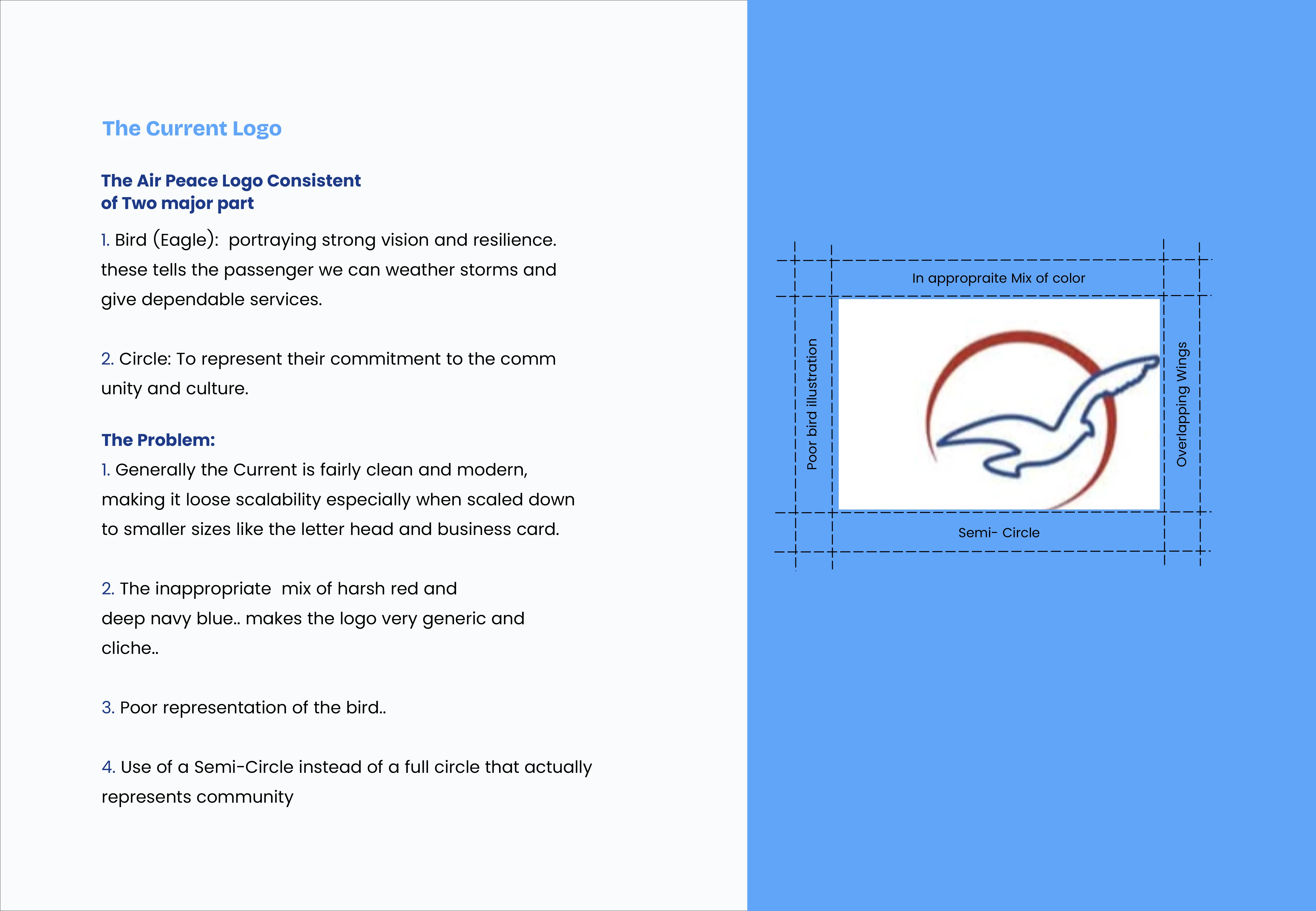
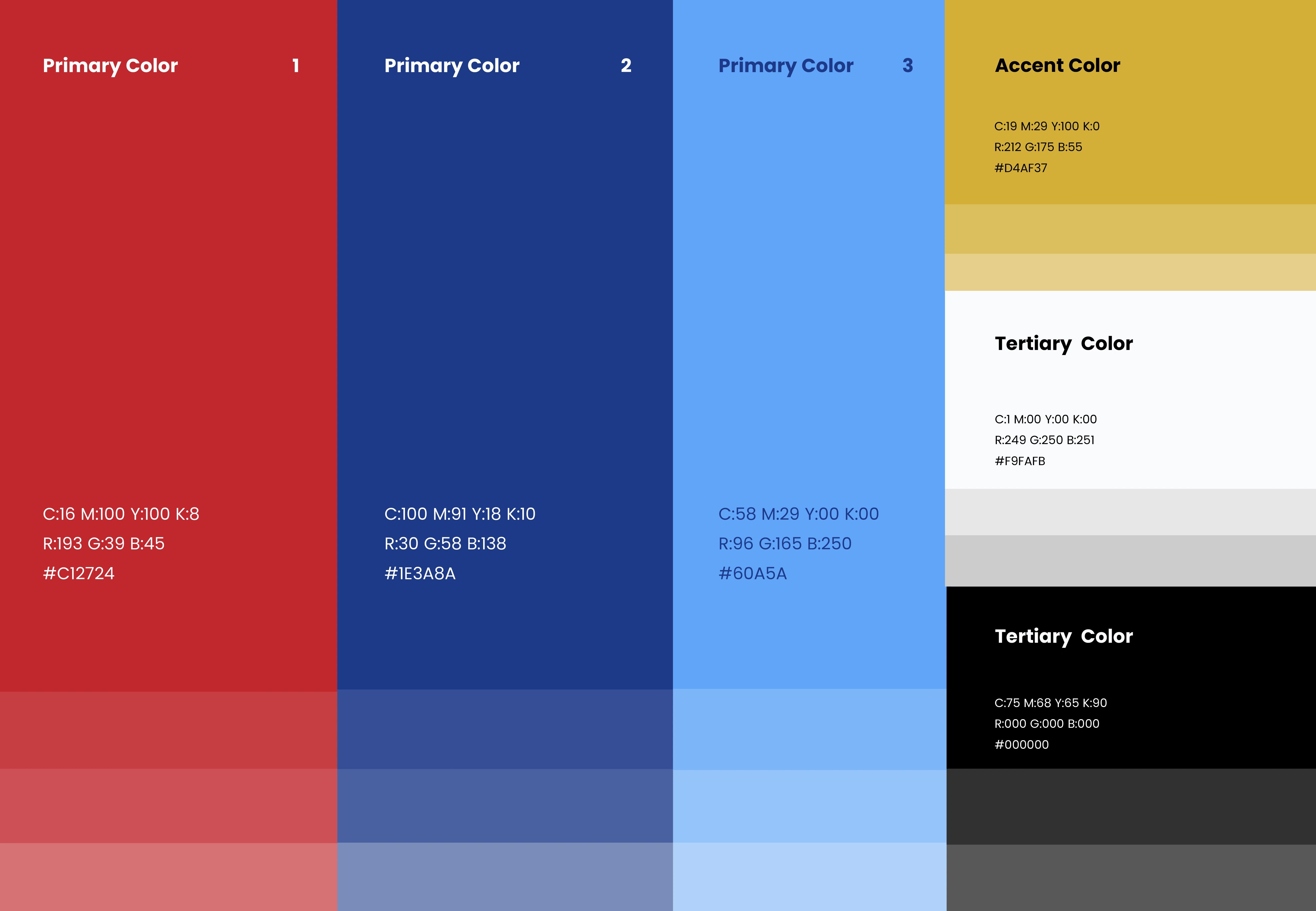
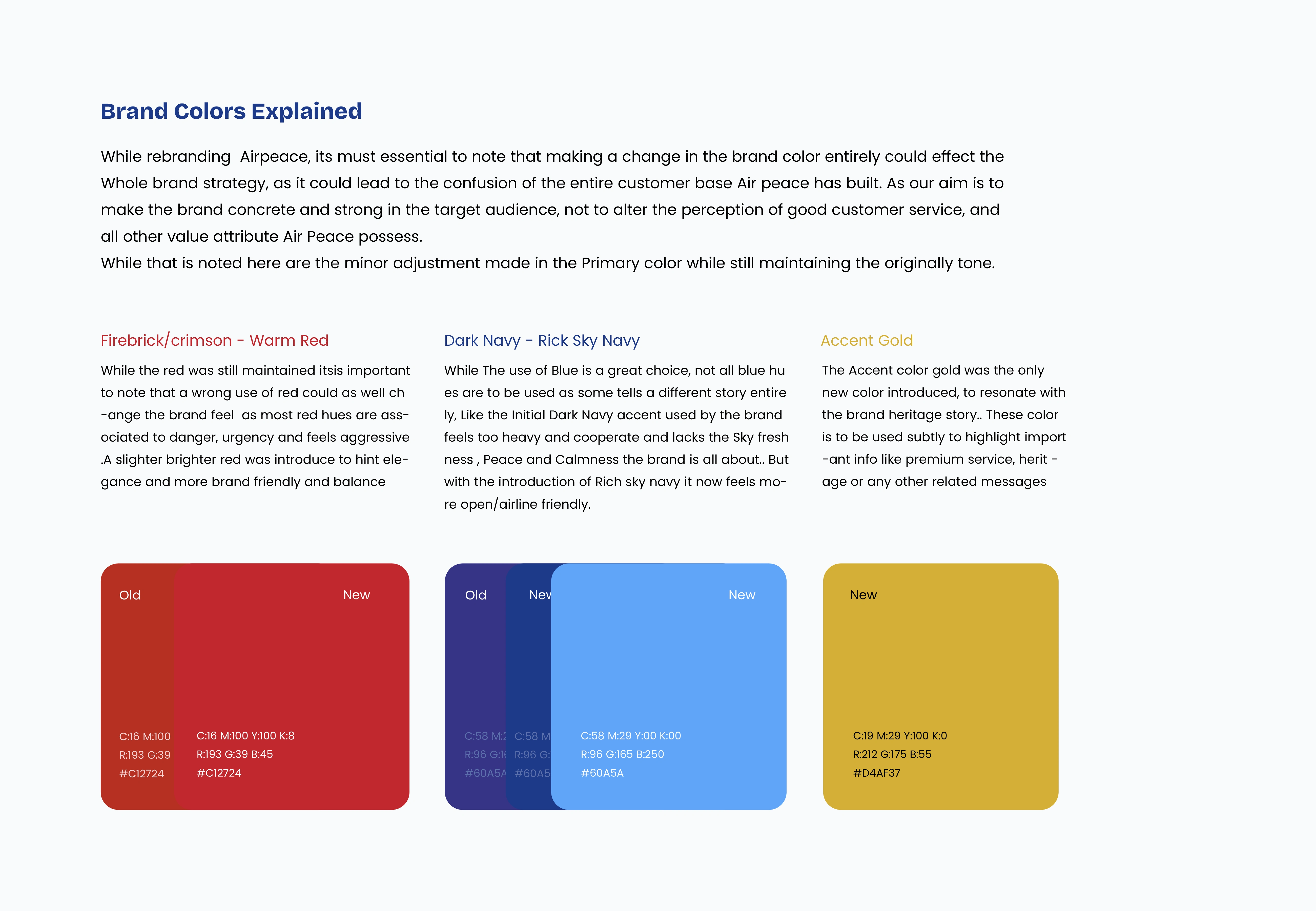
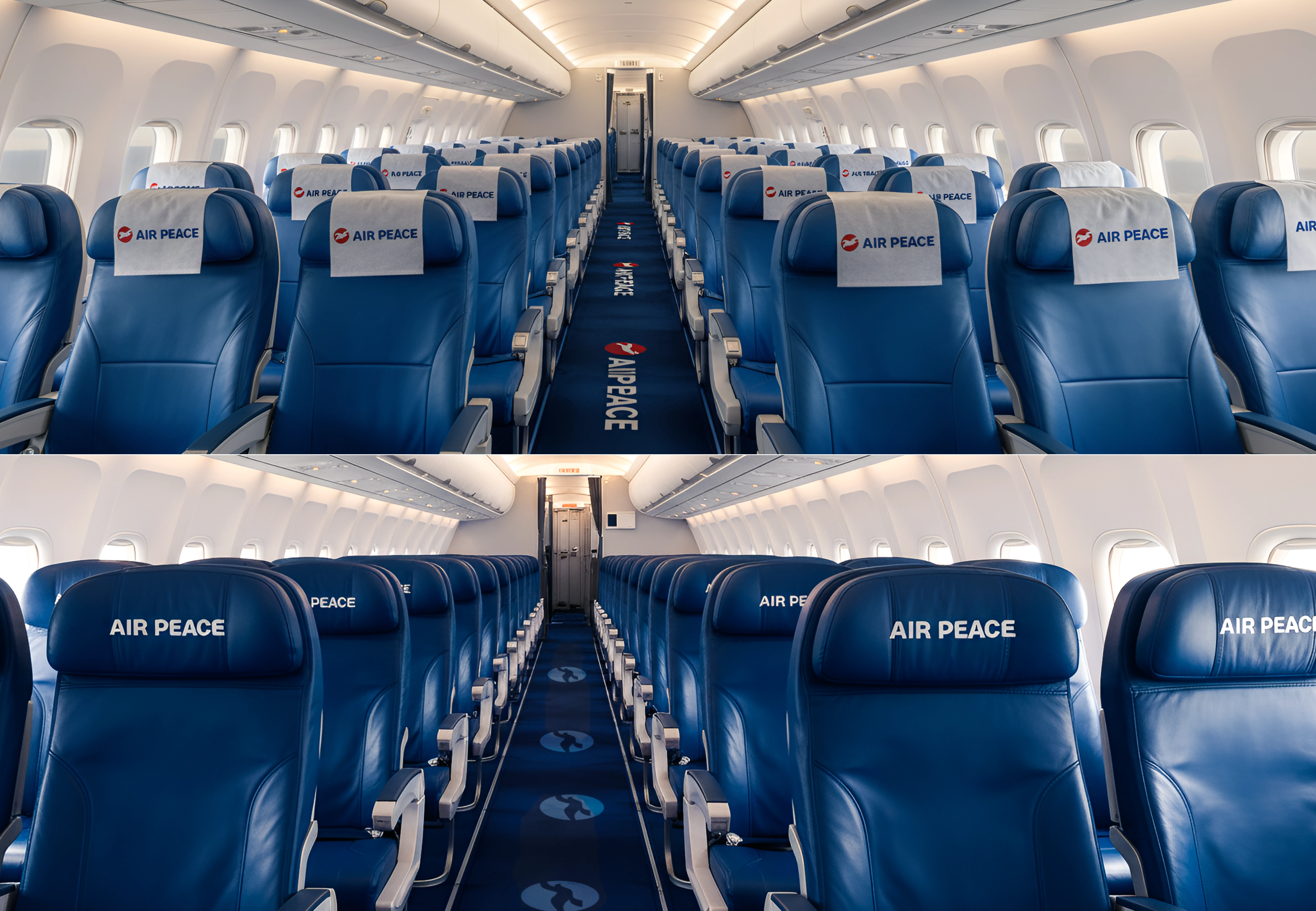
1. Wrong Usage of Color:
The Use of Harsh red and deep navy blue, as the brand color. gives off a whole different feeling from what the brand is all about.
2. Inconsistency:
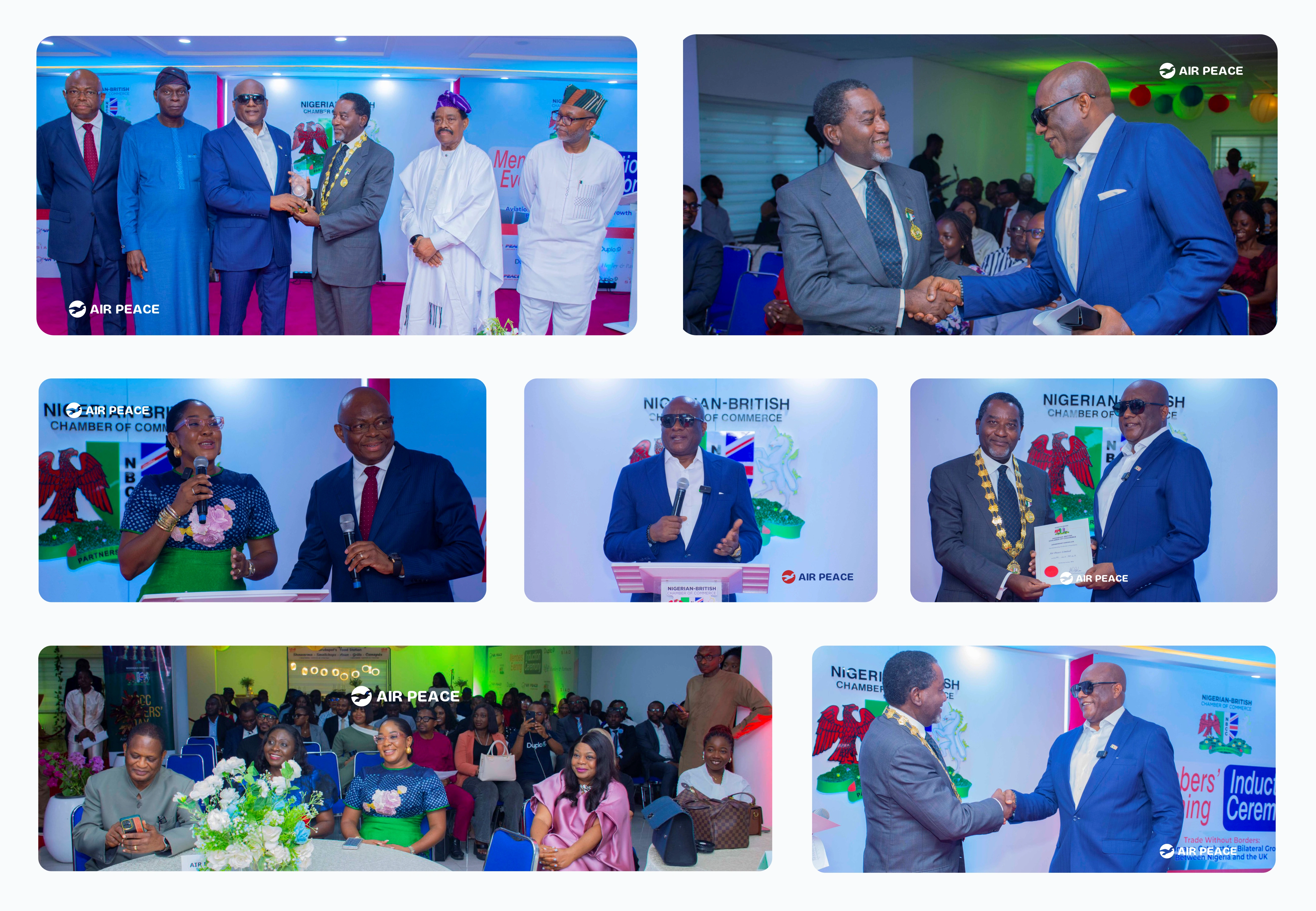
They are a lot of inconsistency regarding the entire brand visuals of air peace across its digital media.. these makes the brand lose proper representation and make it being vulnerable to all sort of fraudulent scheme like impersonation
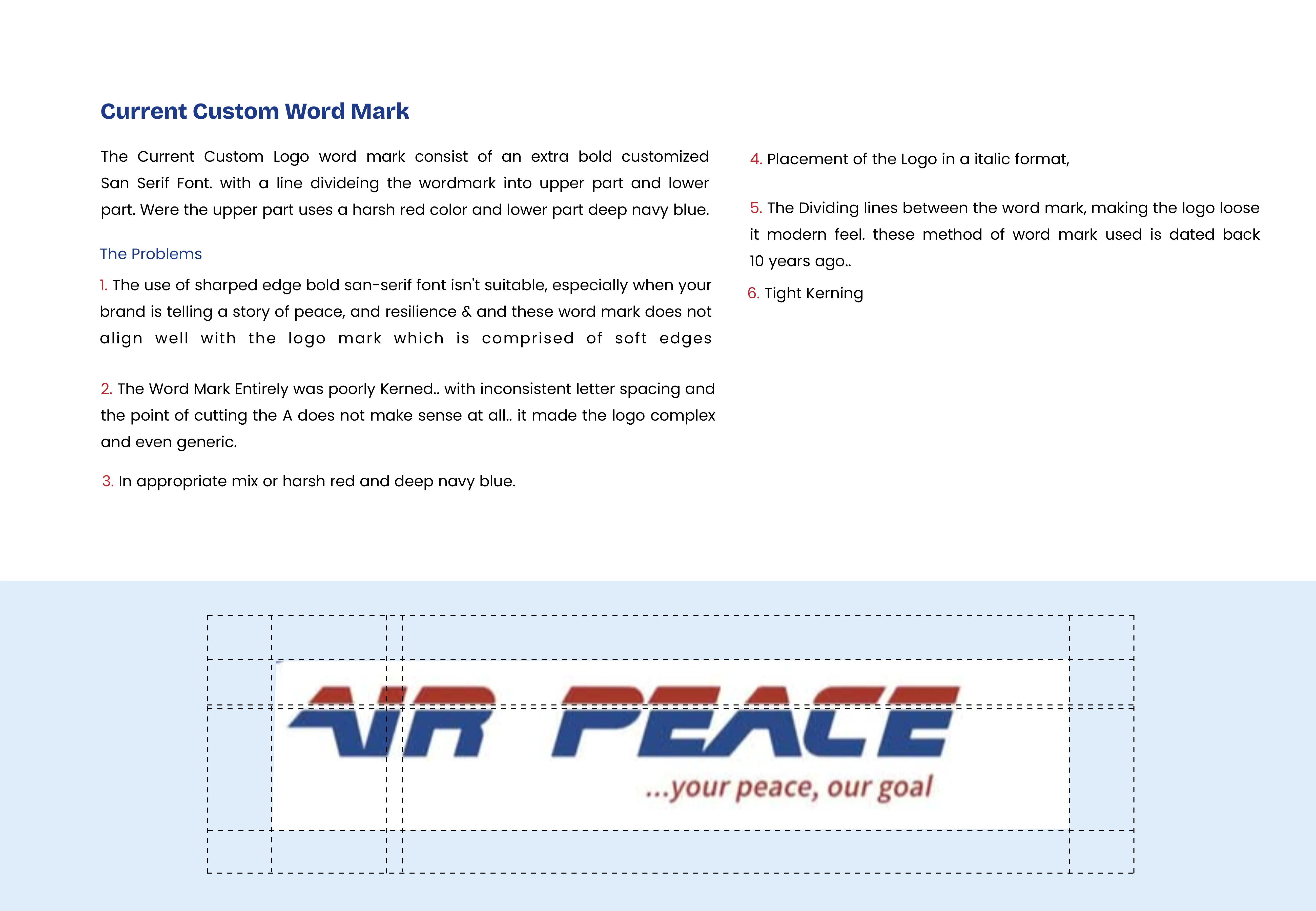
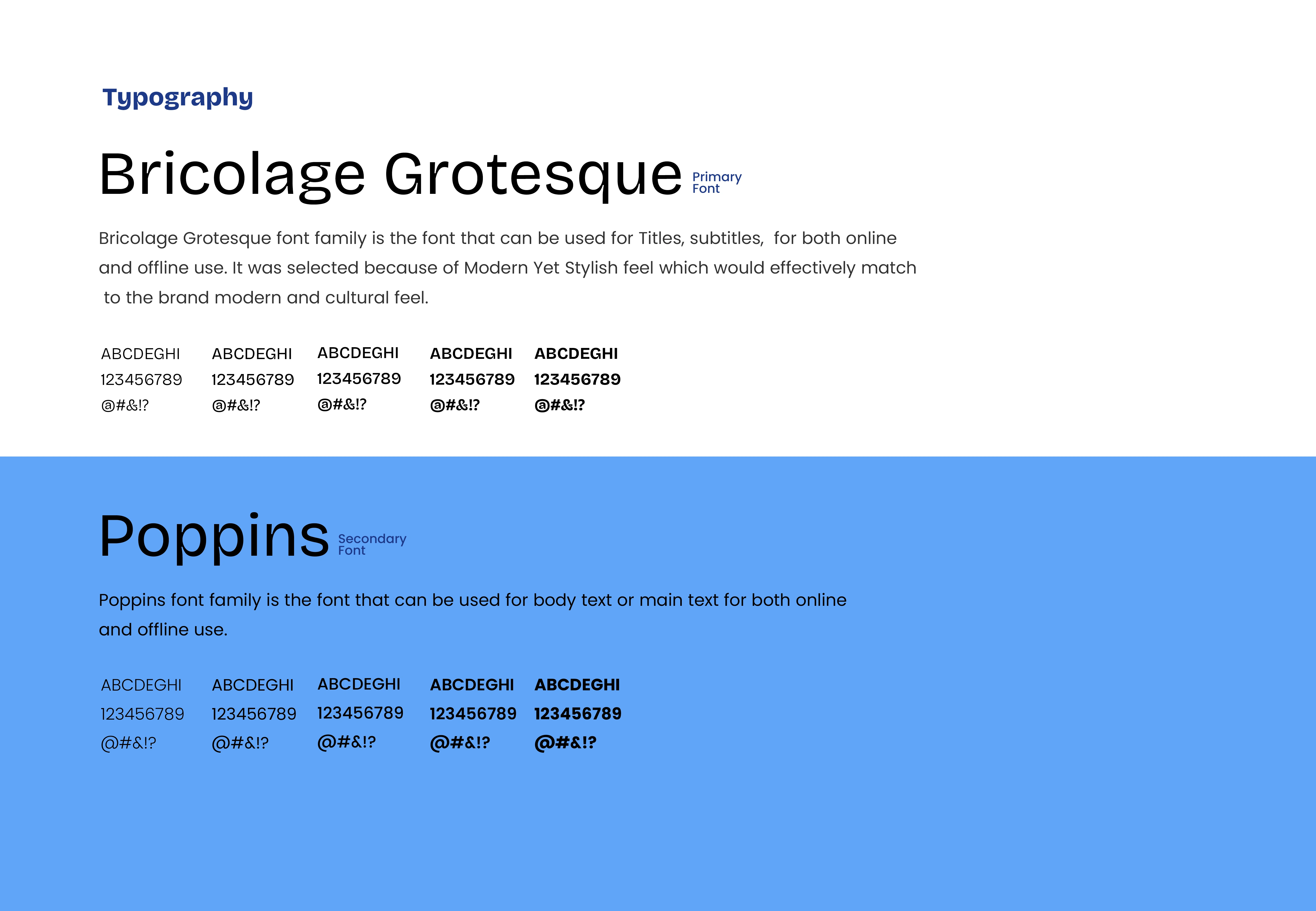
3. Inconsistent Typography: There is consistent typography adopted.
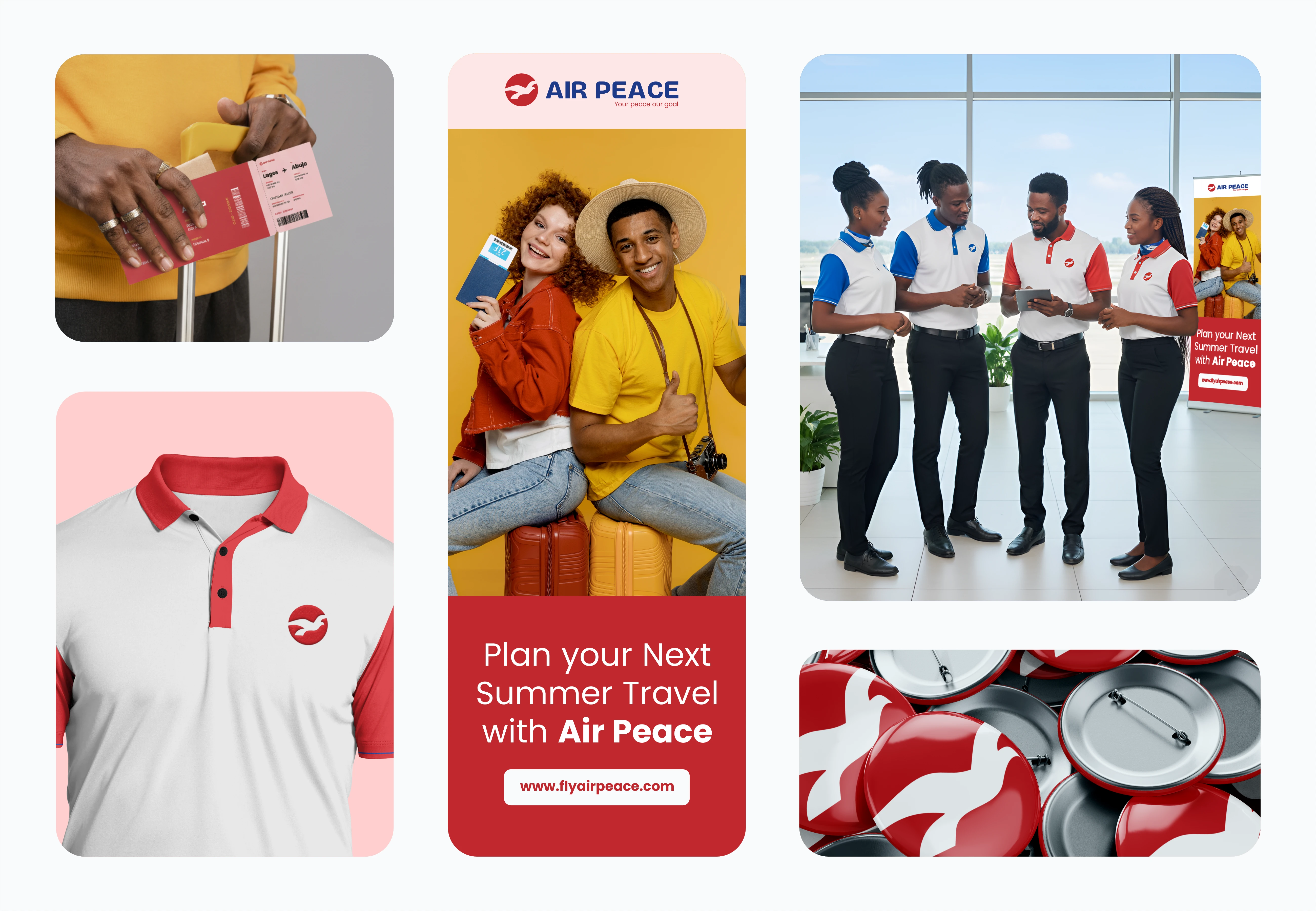
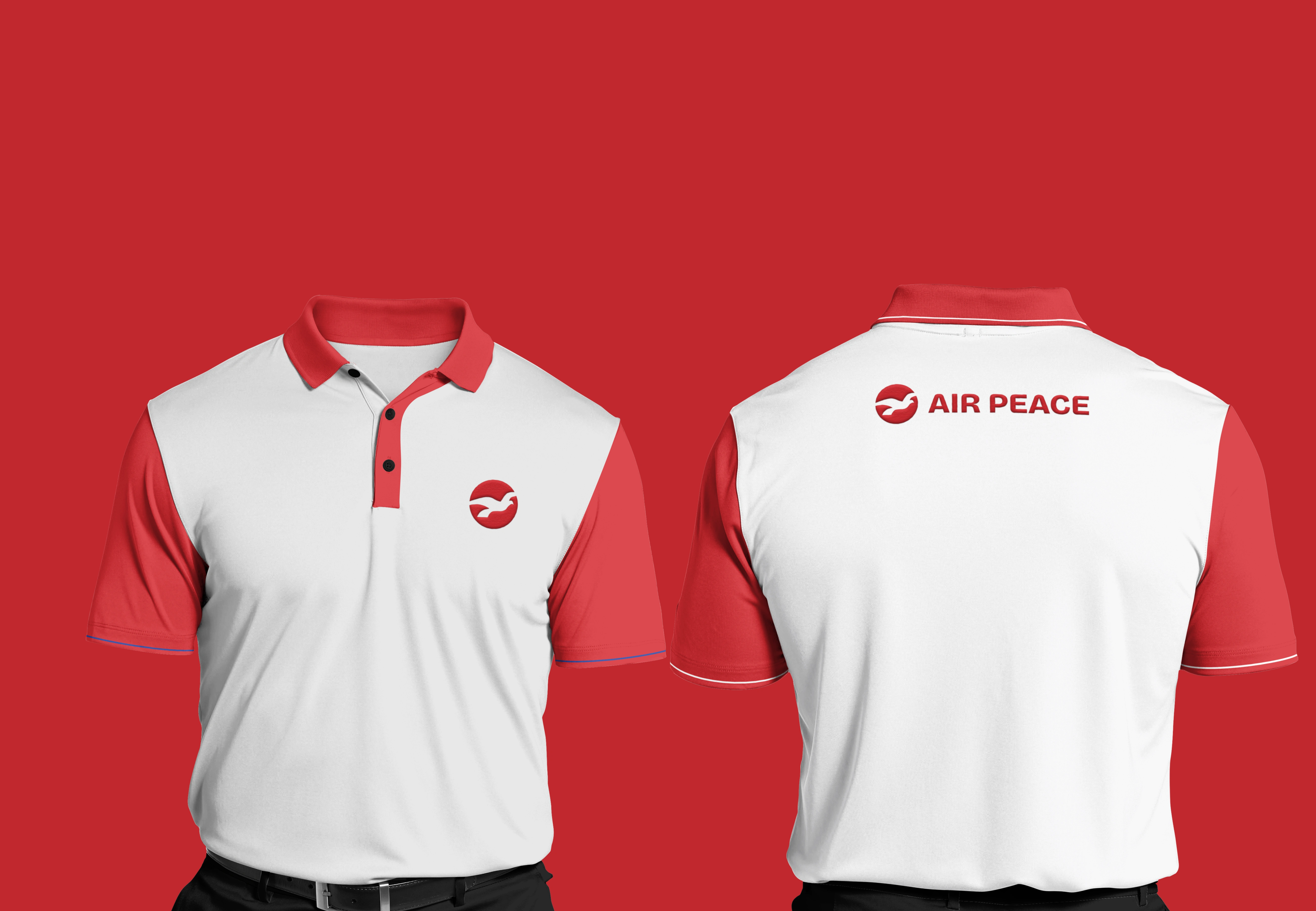
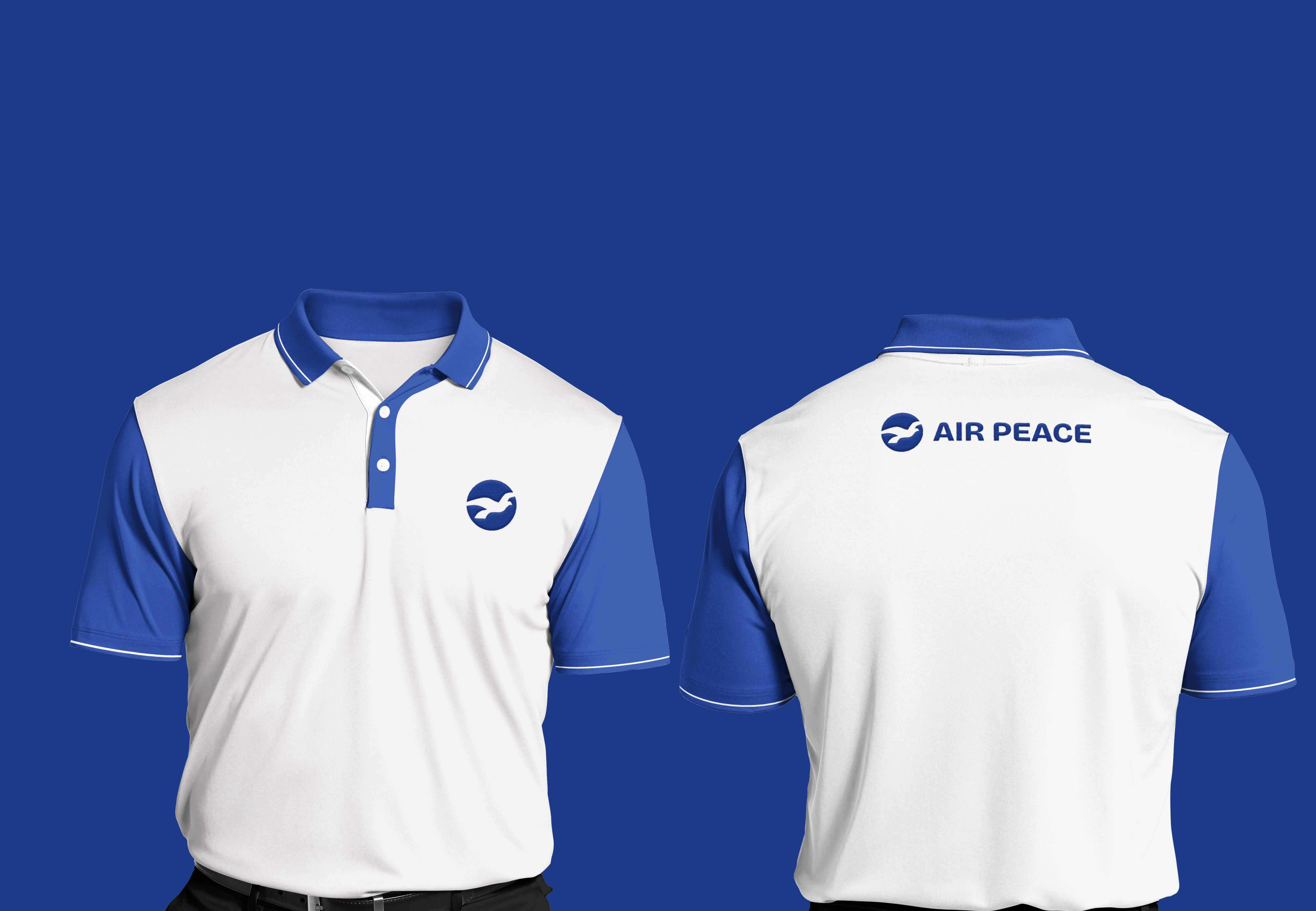
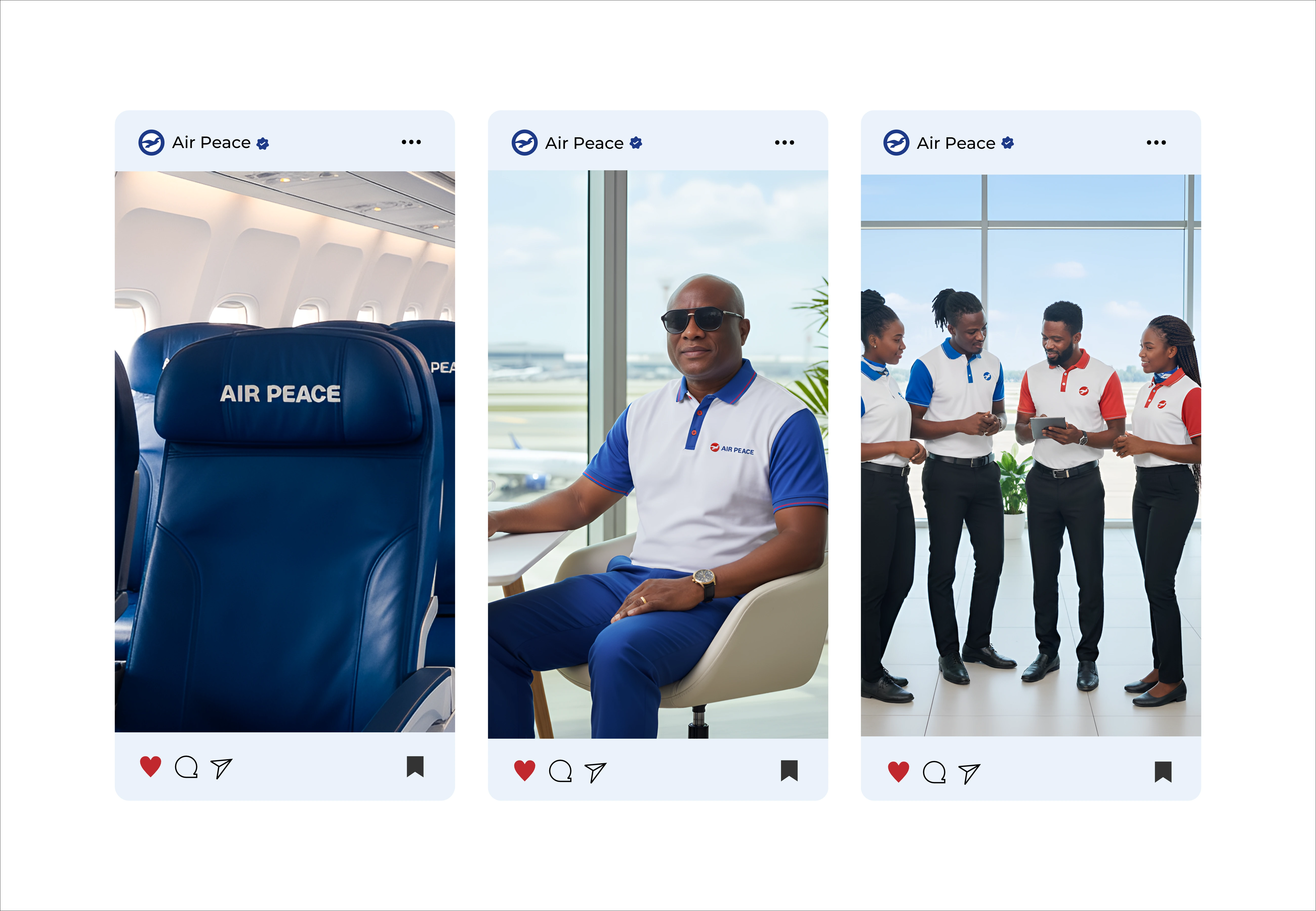
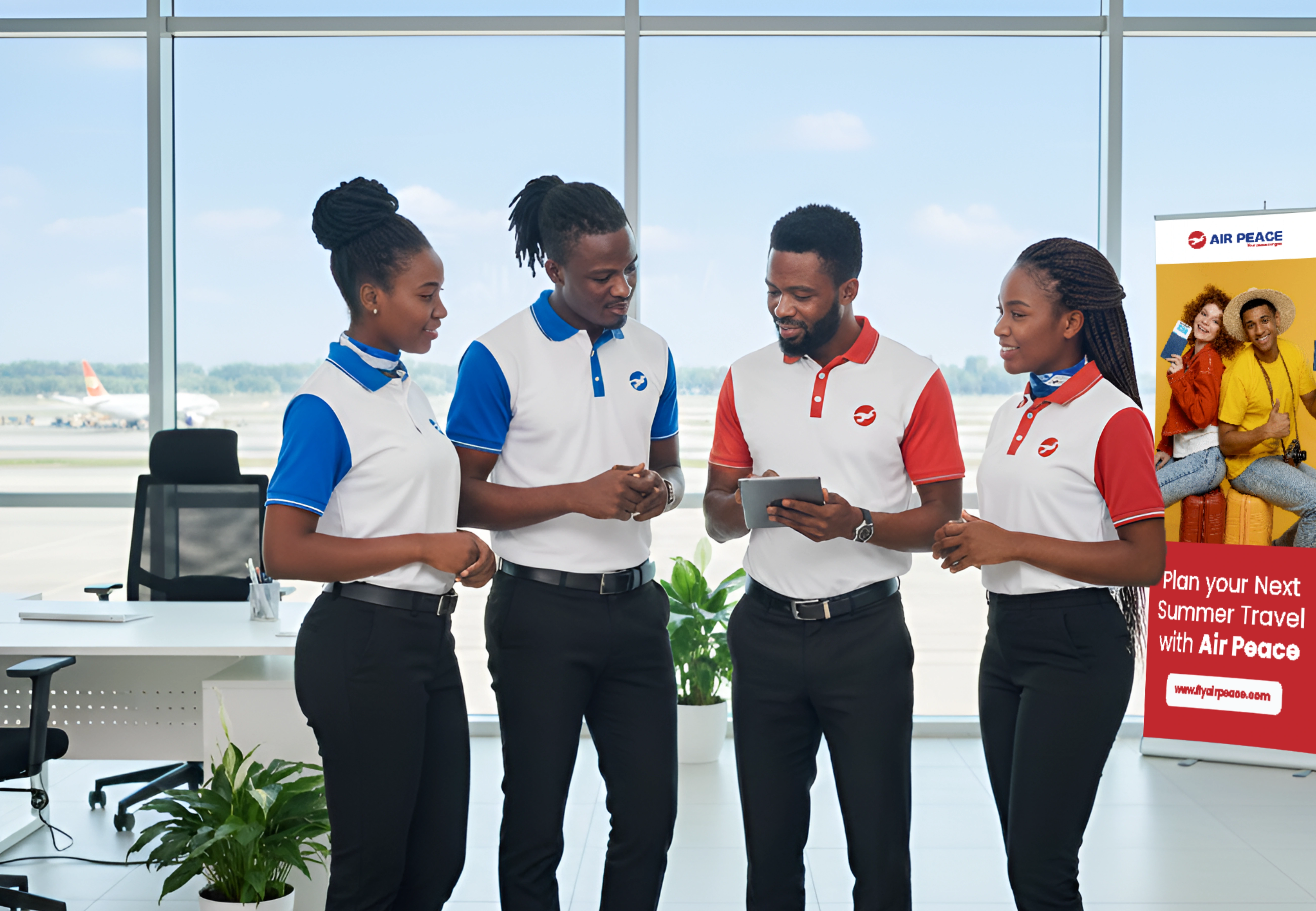
4. Uniform:
While the use of isi Agu is good, as long as it comes to representing the brand story or cultural heritage. Meanwhile the Isi Agu can not be adopted as its official brand uniform first time users could easily misplace it for another brand entirely different from Air Peace. So for a better presentation, two uniforms can be adopted One for the cultural heritage and other as Air Peace official Uniform
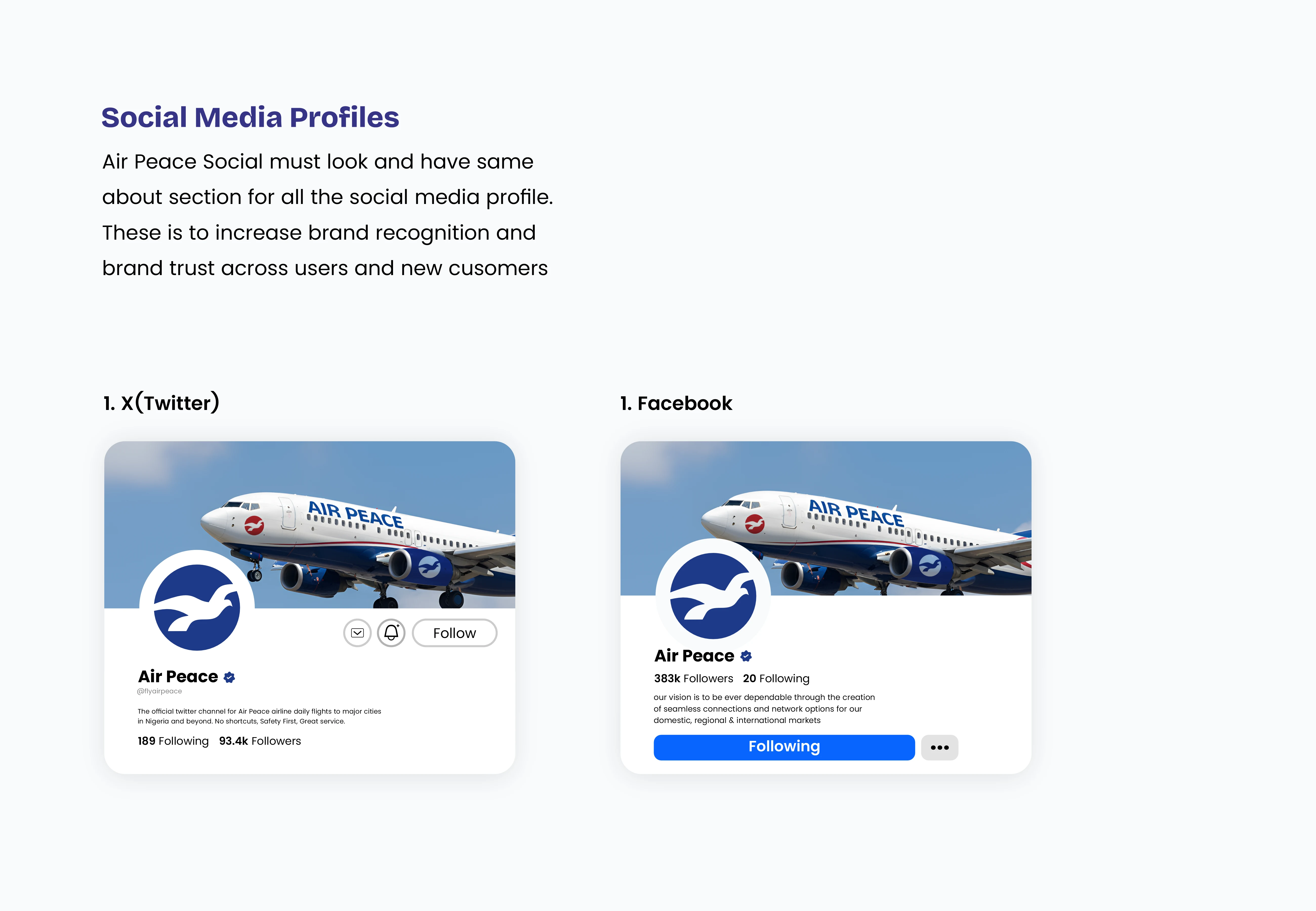
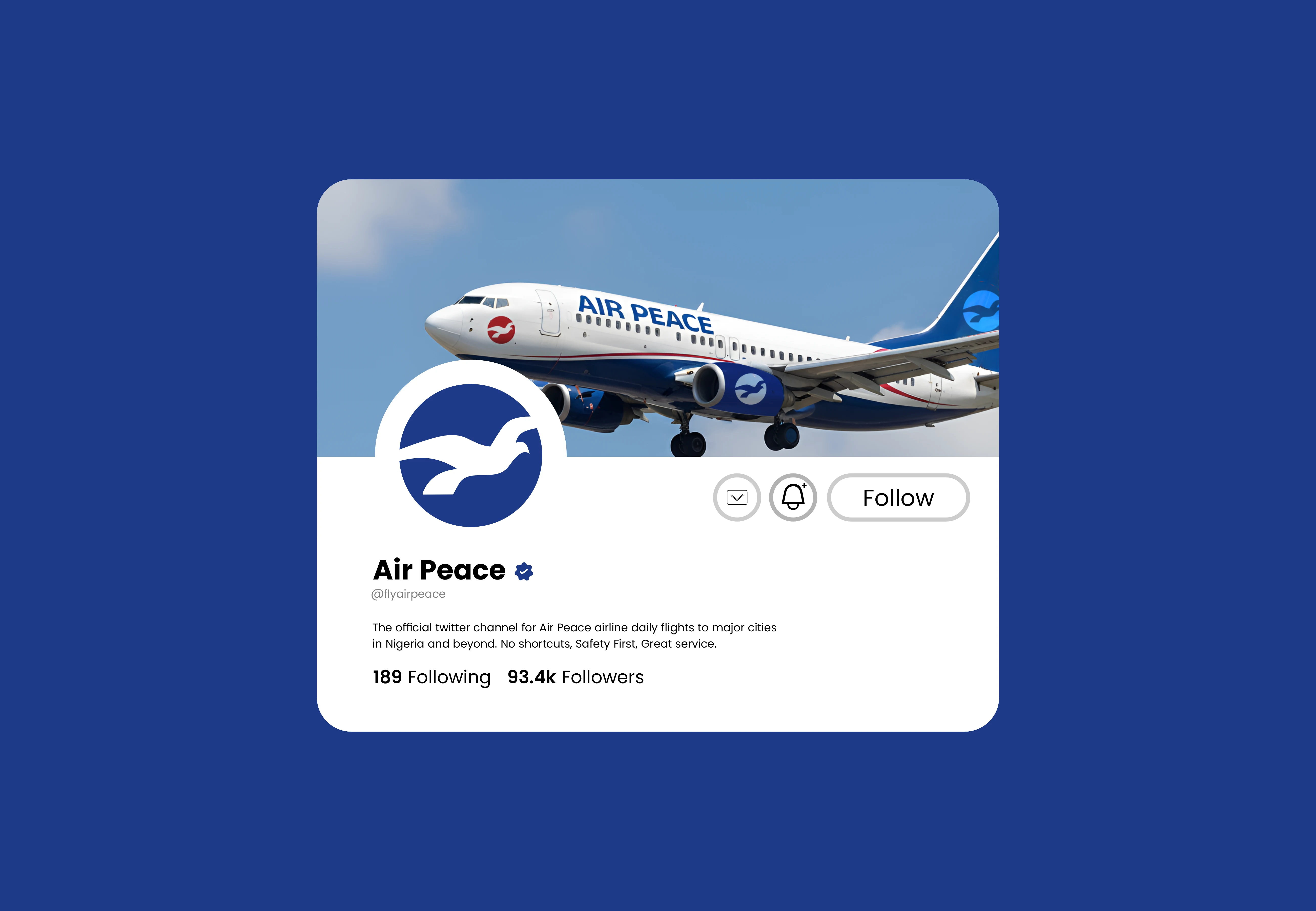
5. Low Digital Presence:
There's inconsistency across the digital platforms ranging from the website, to their social media pages, and every other visuals.. a proper brand guide should be introduced.
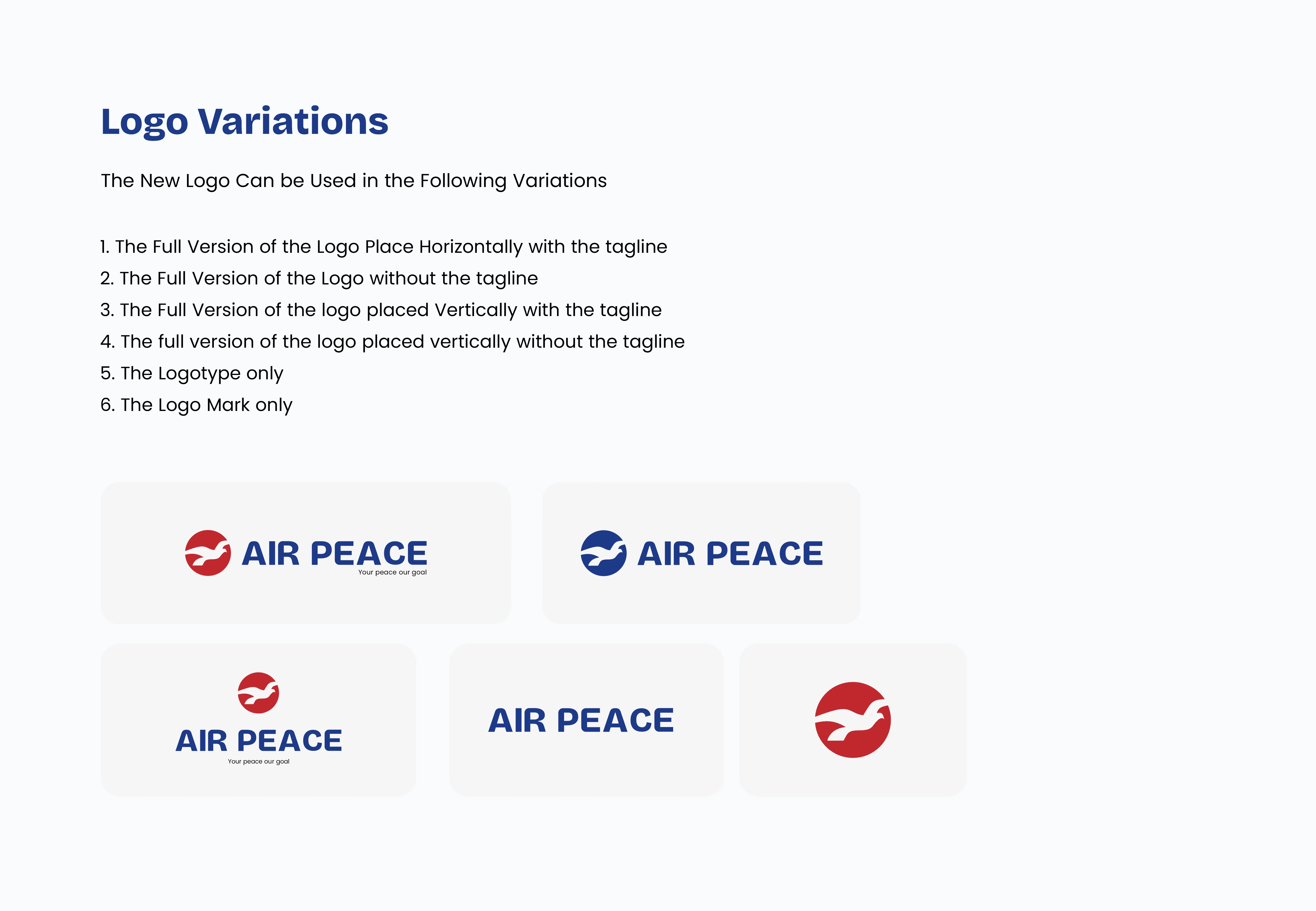
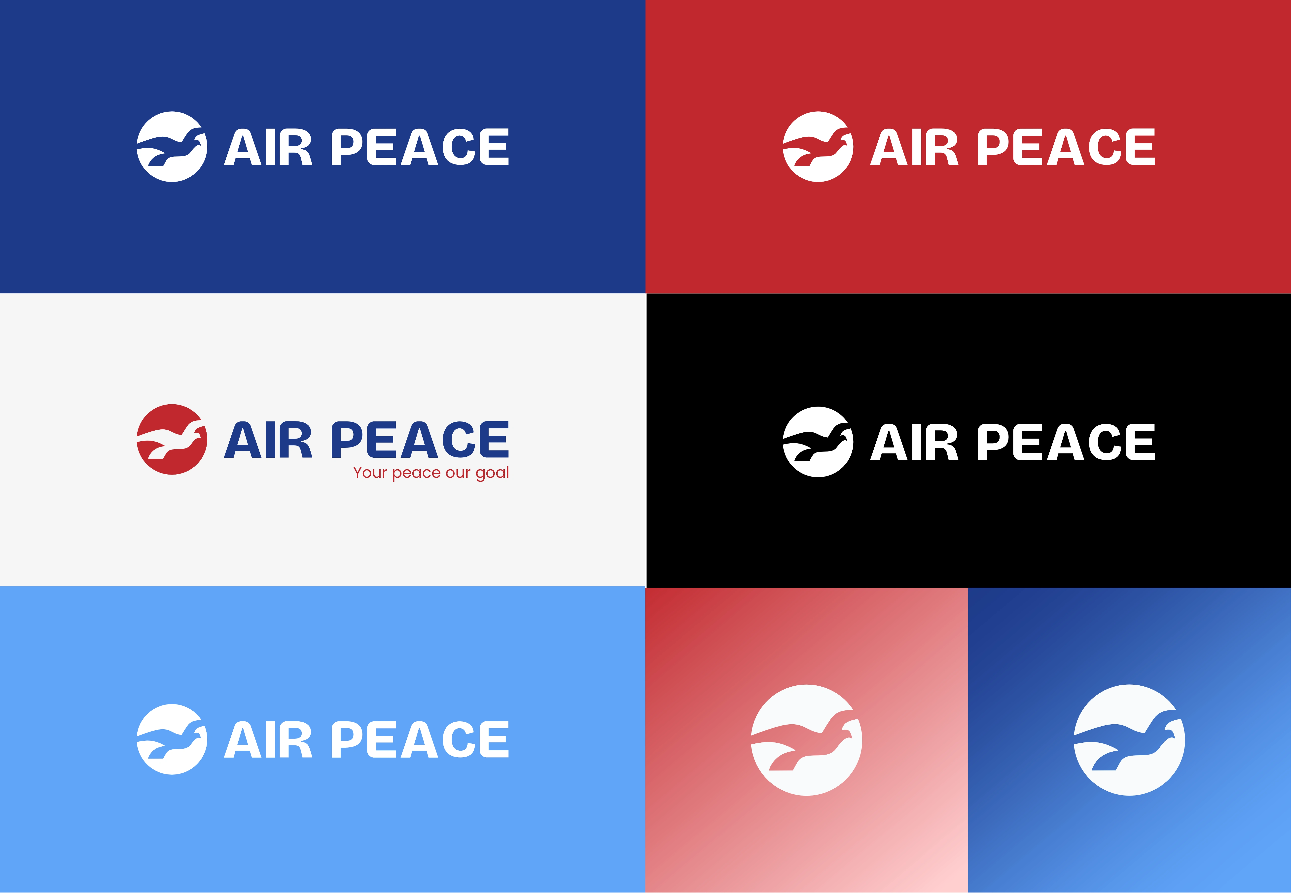
Solution
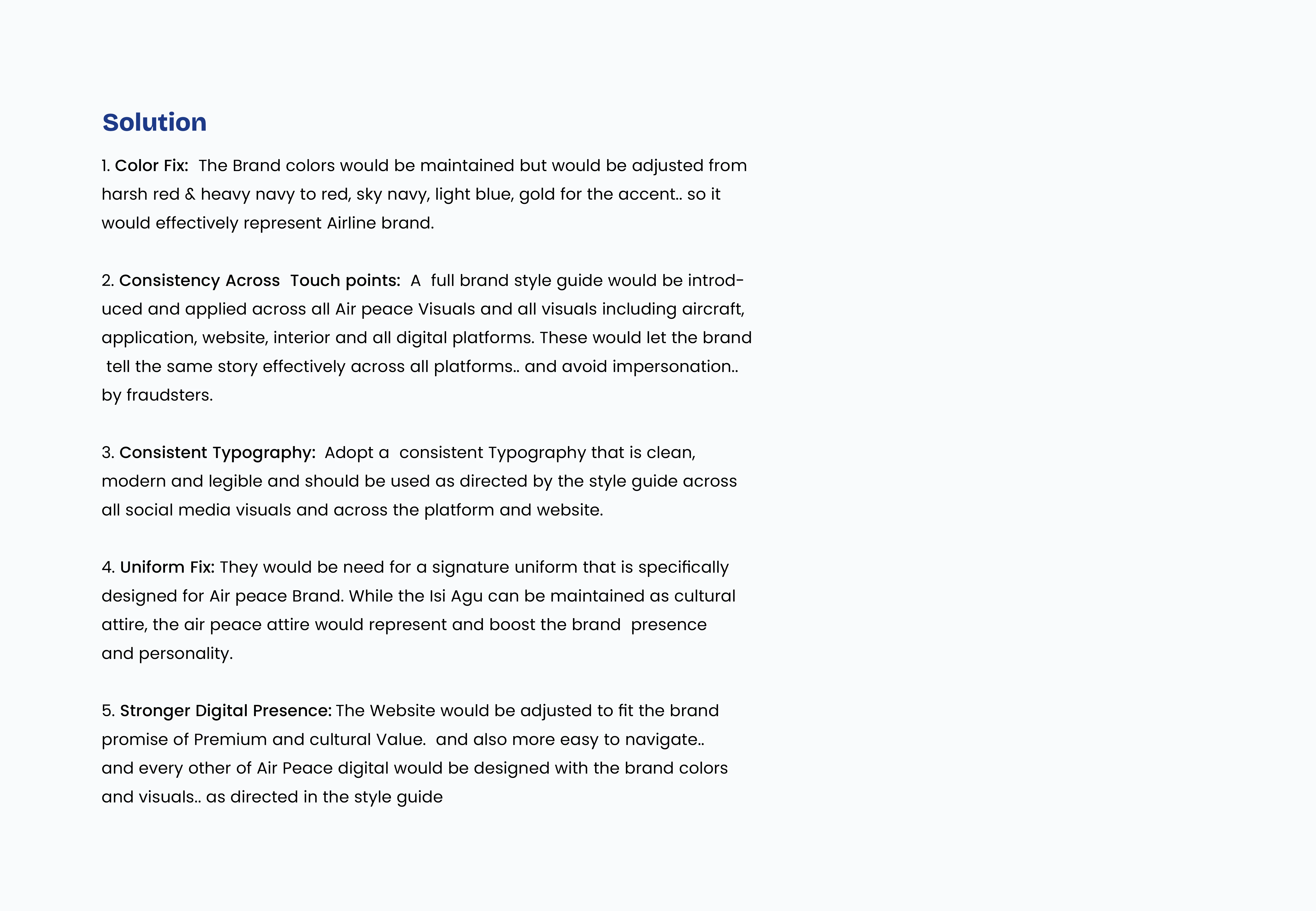
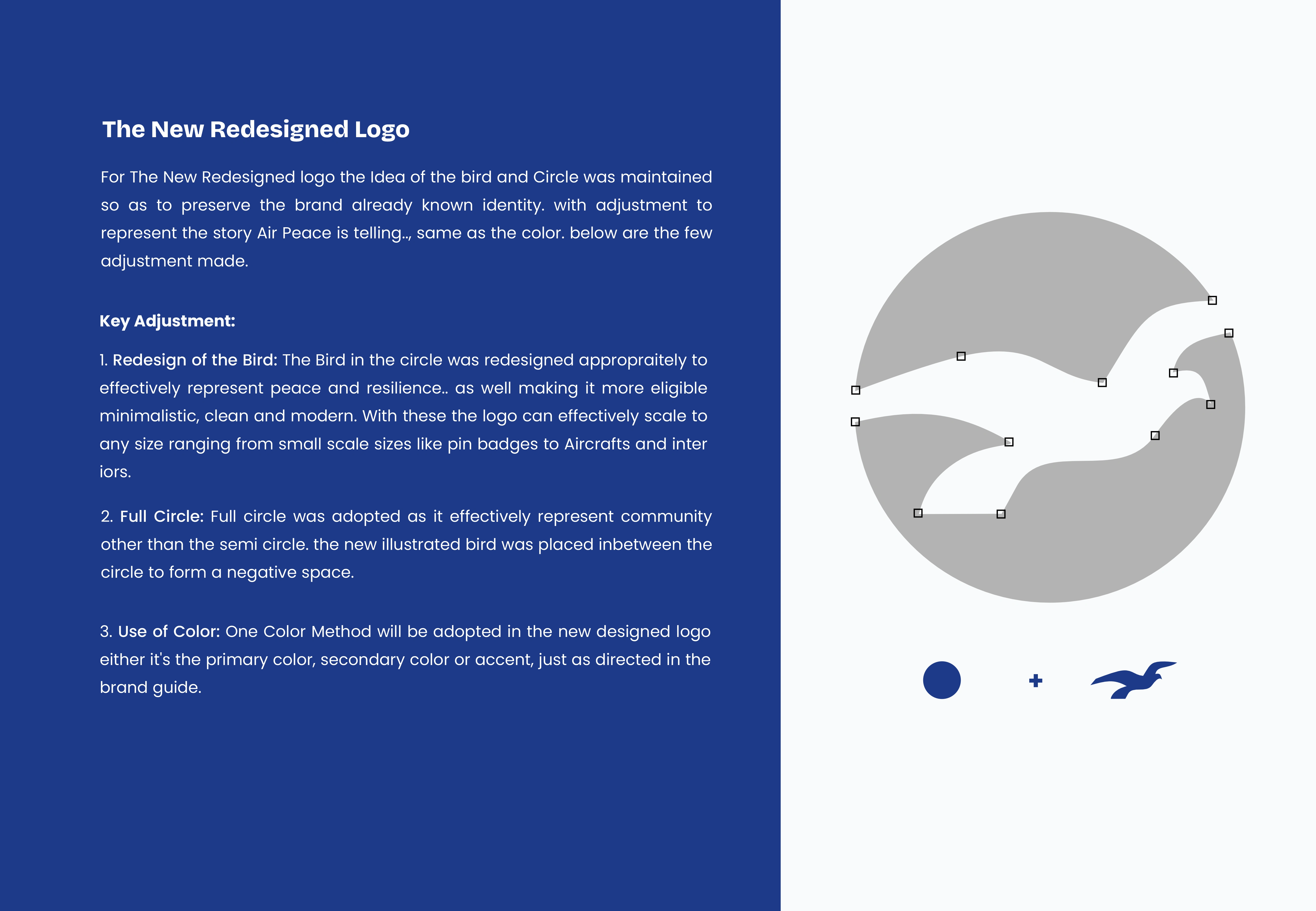
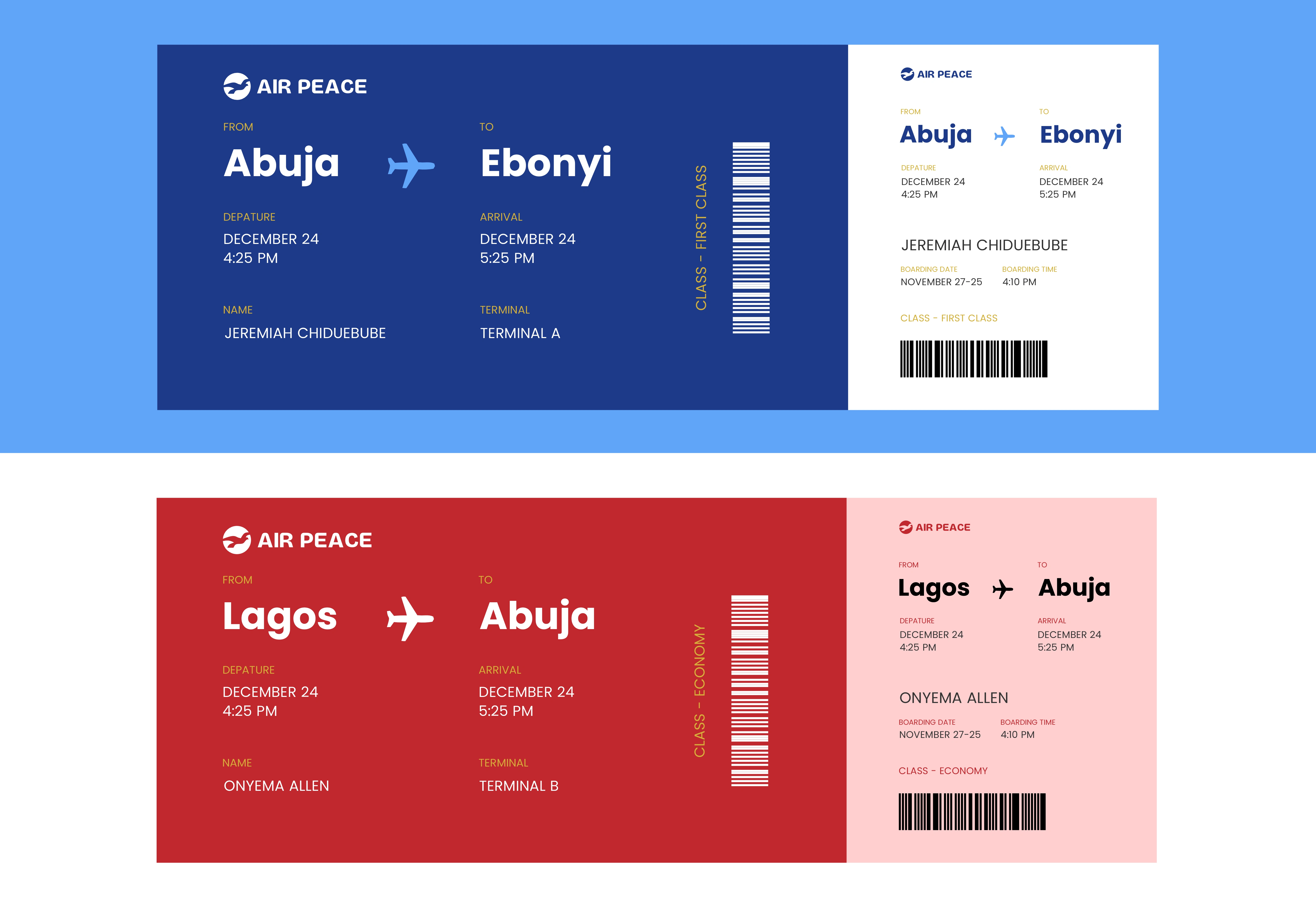
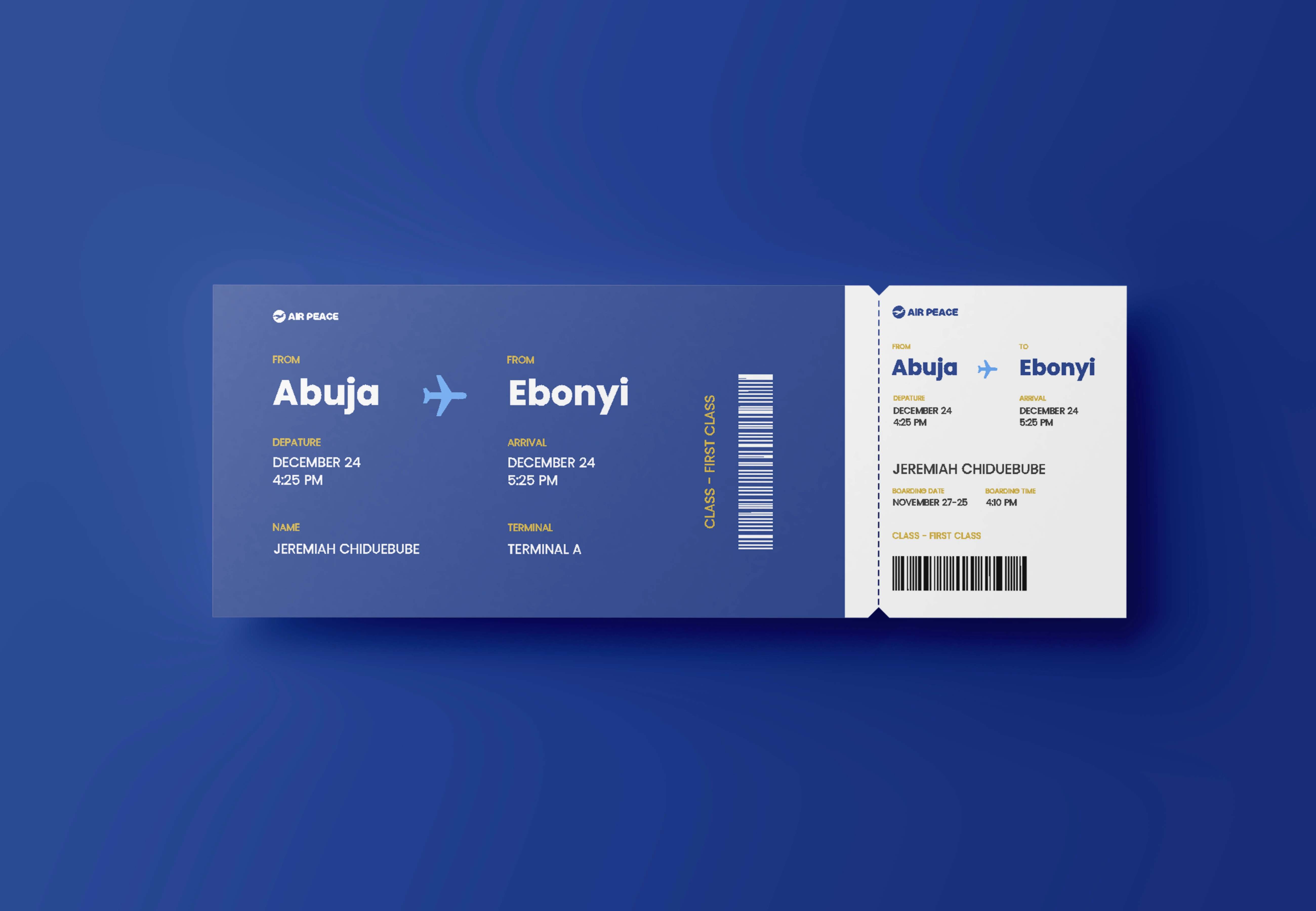
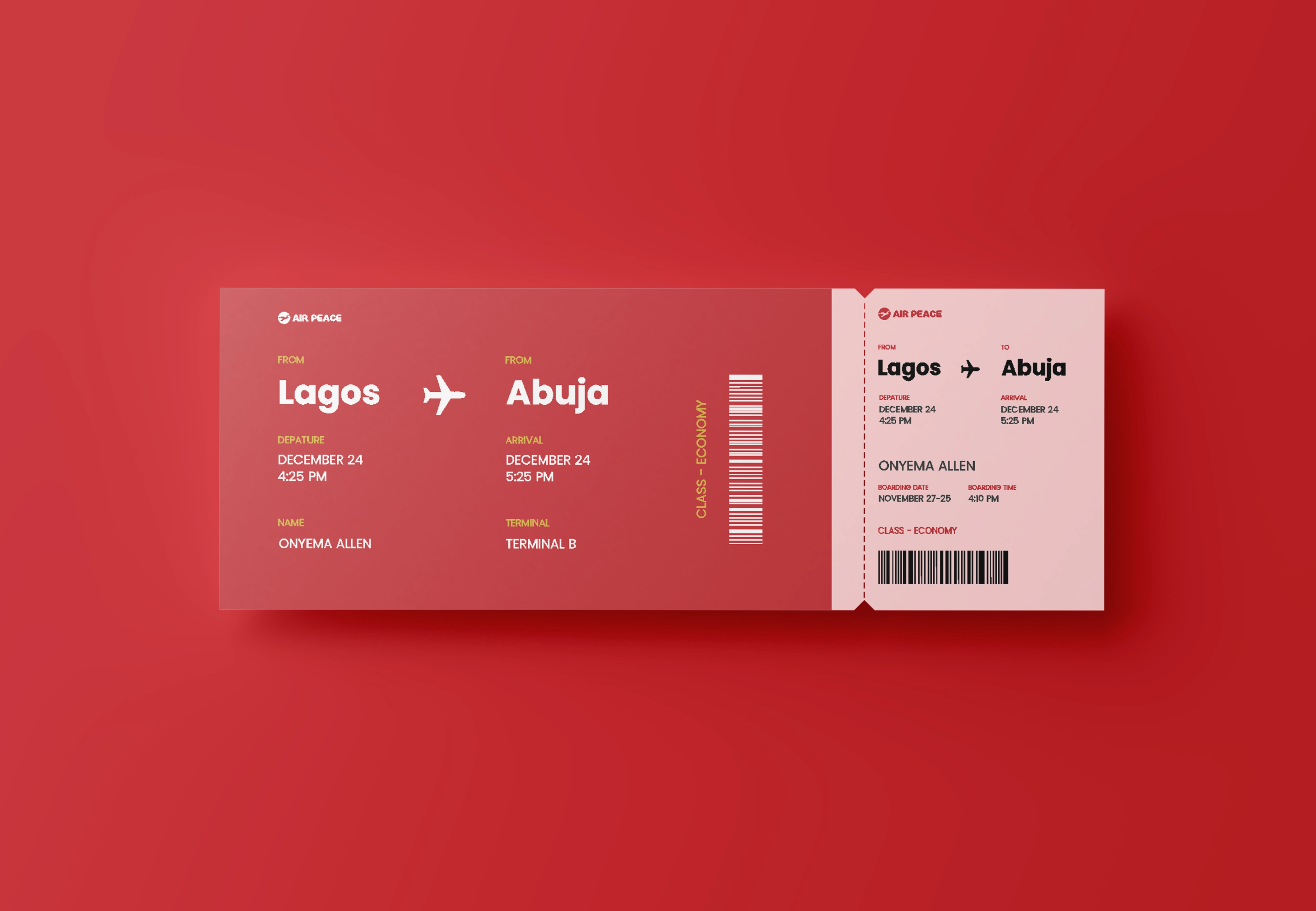
1. Color Fix:
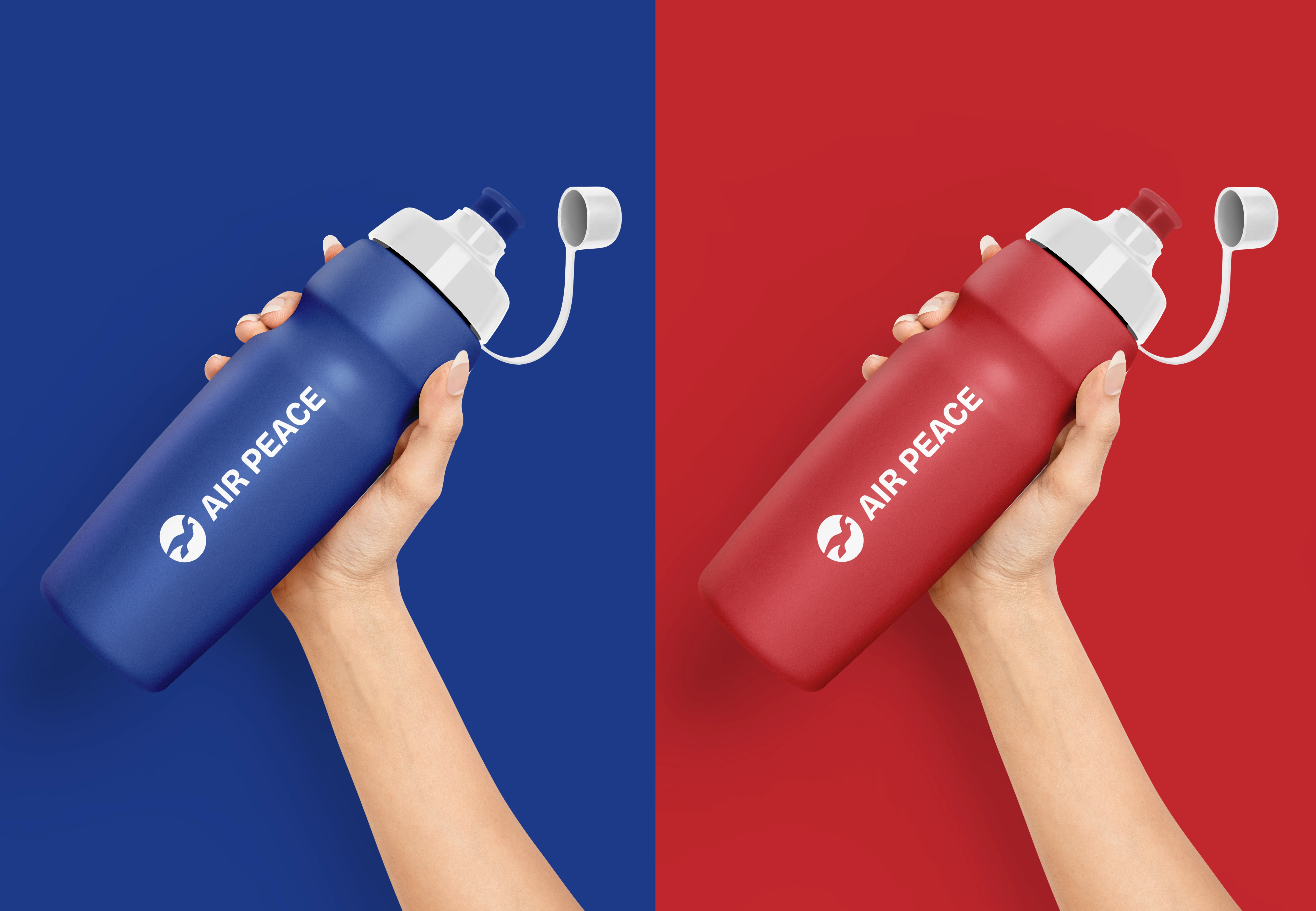
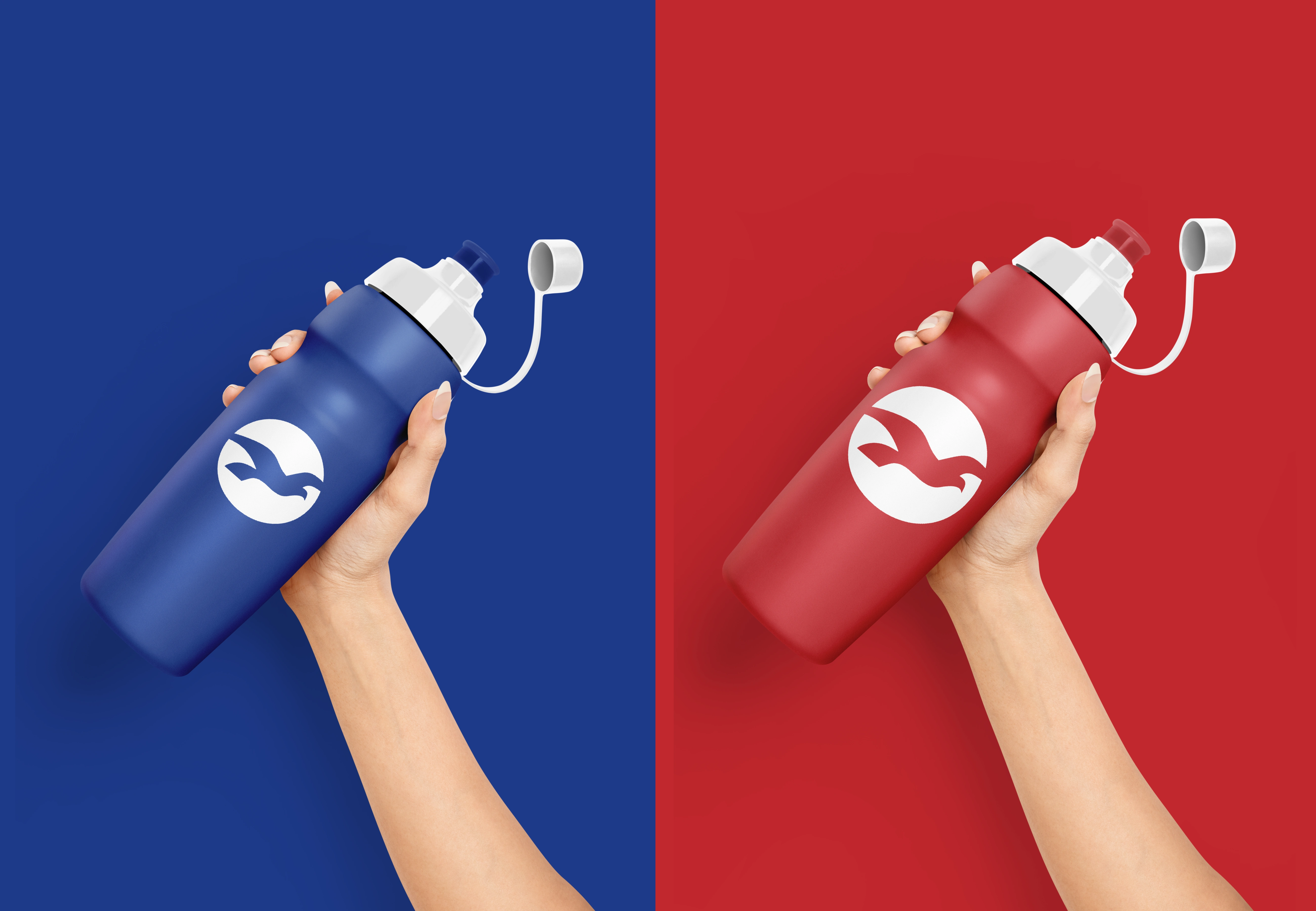
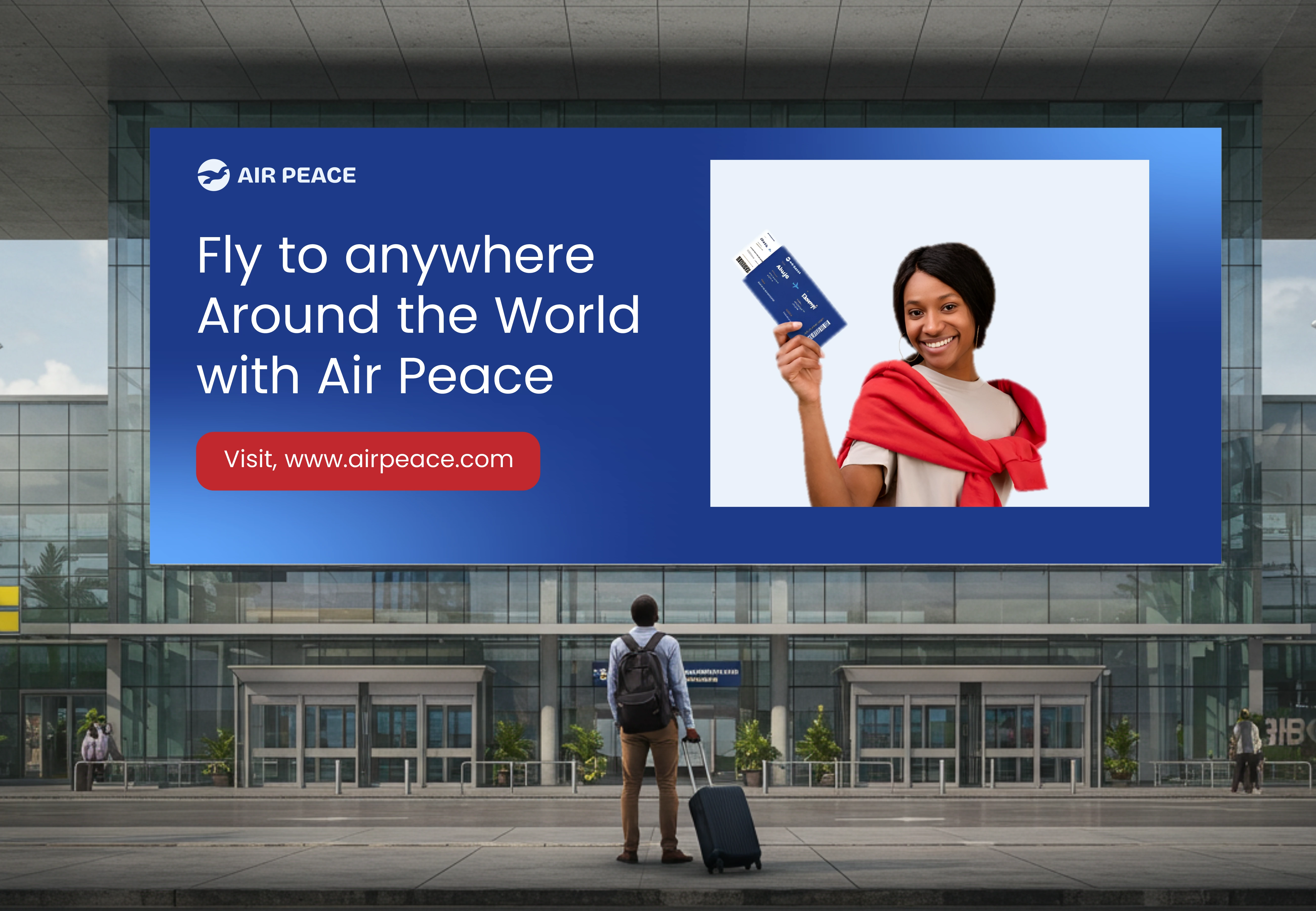
The Brand colors would be maintained but would be adjusted from harsh red & heavy navy to red, sky navy, light blue, gold for the accent.. so it would effectively represent Airline brand.
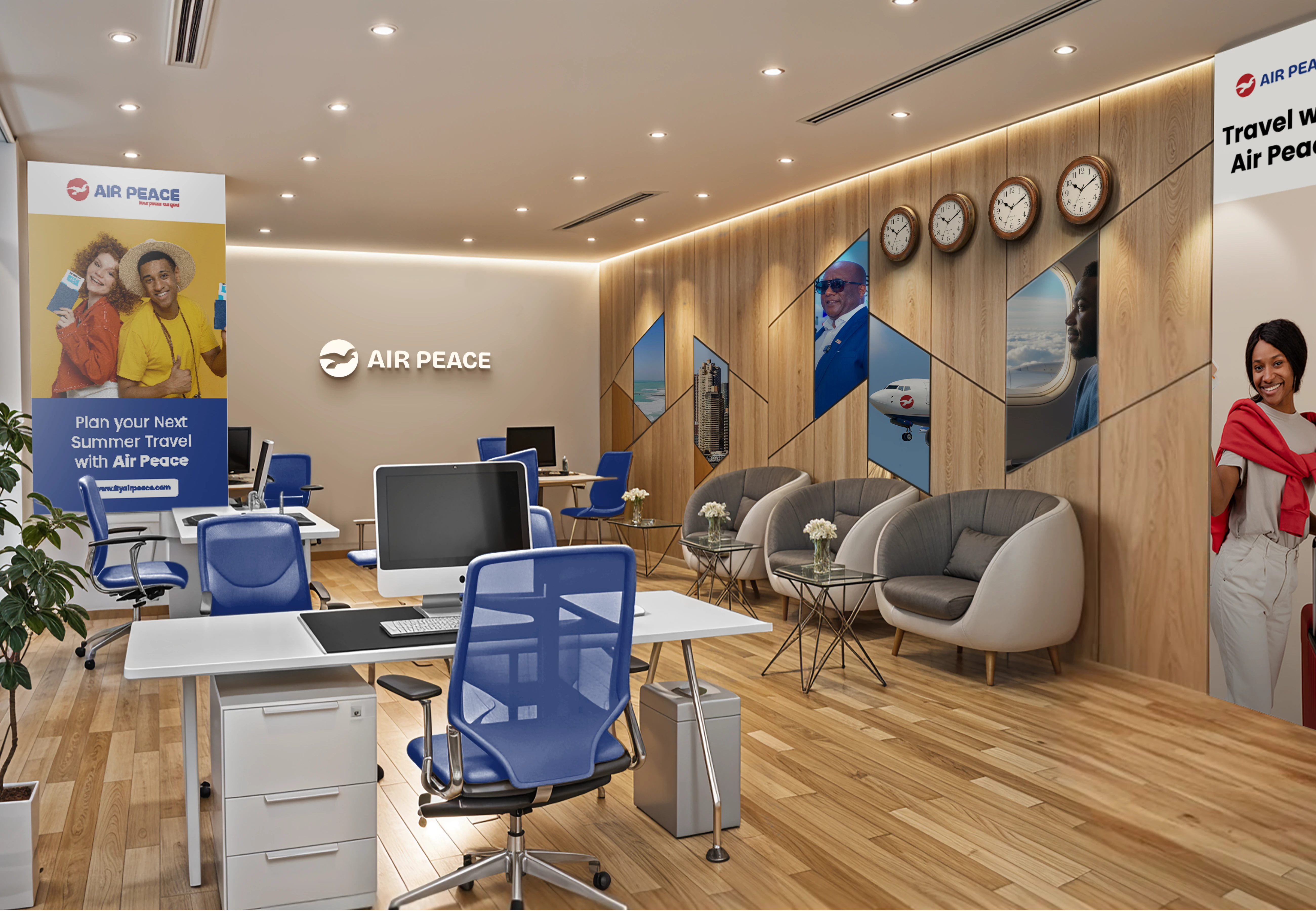
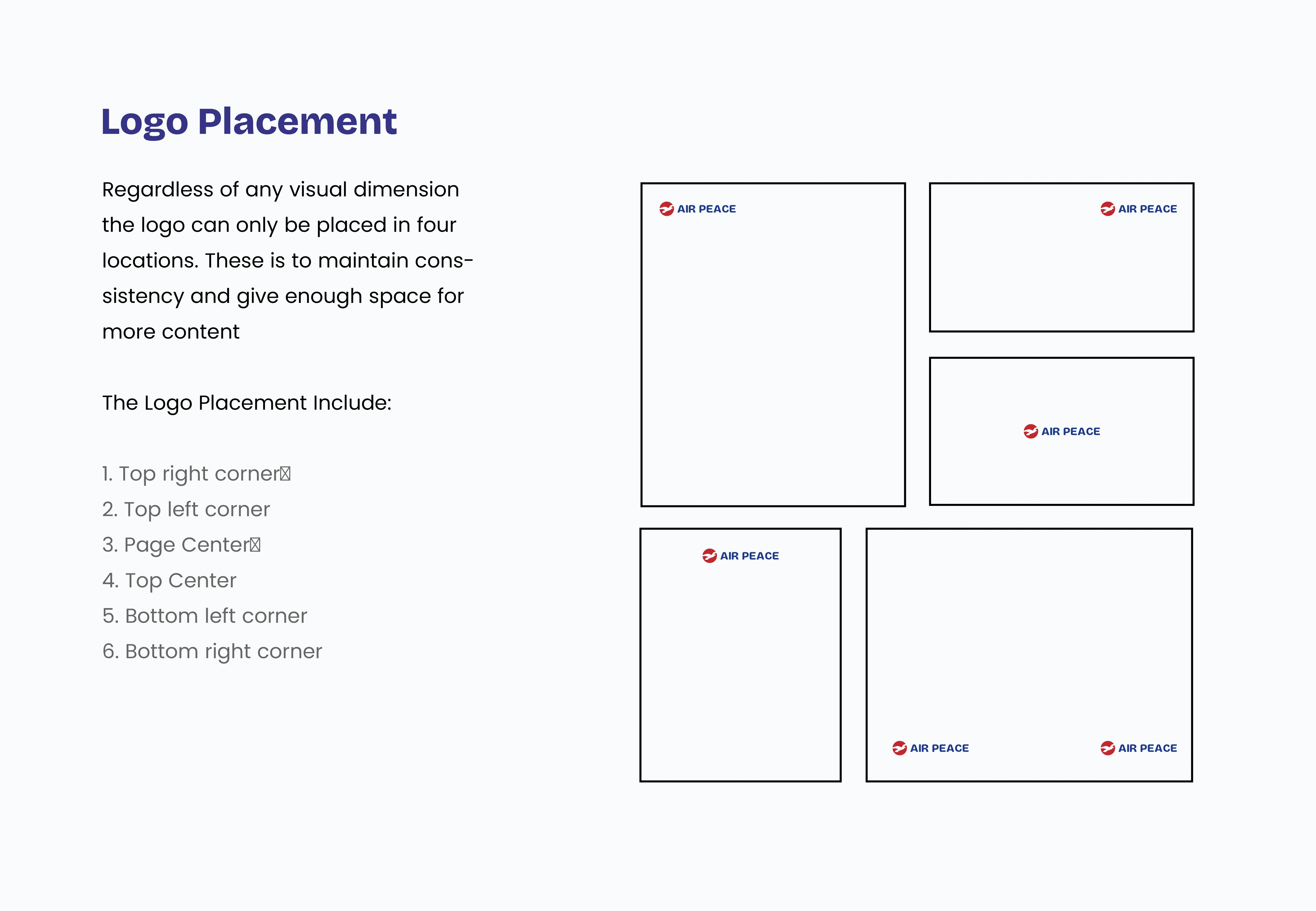
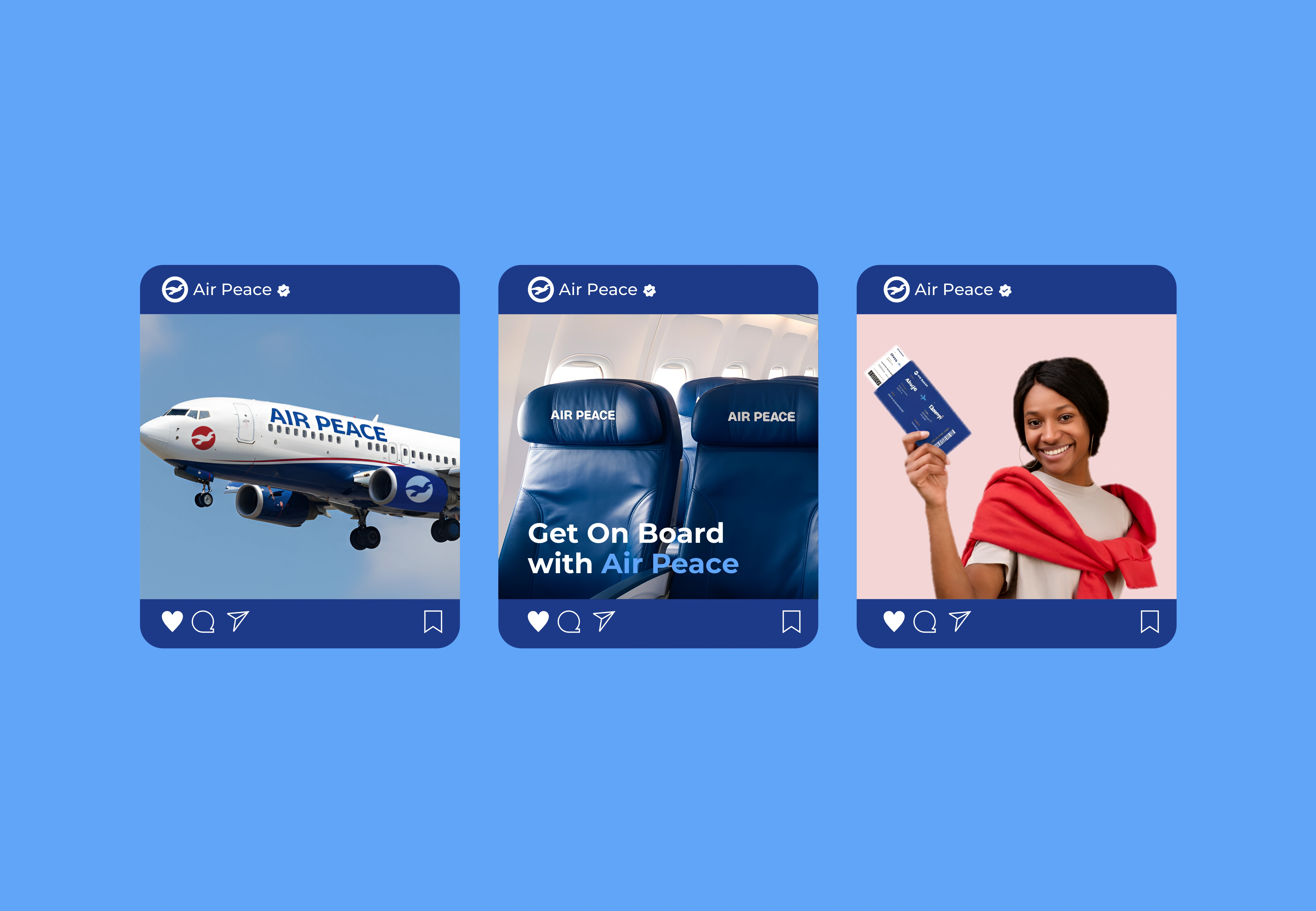
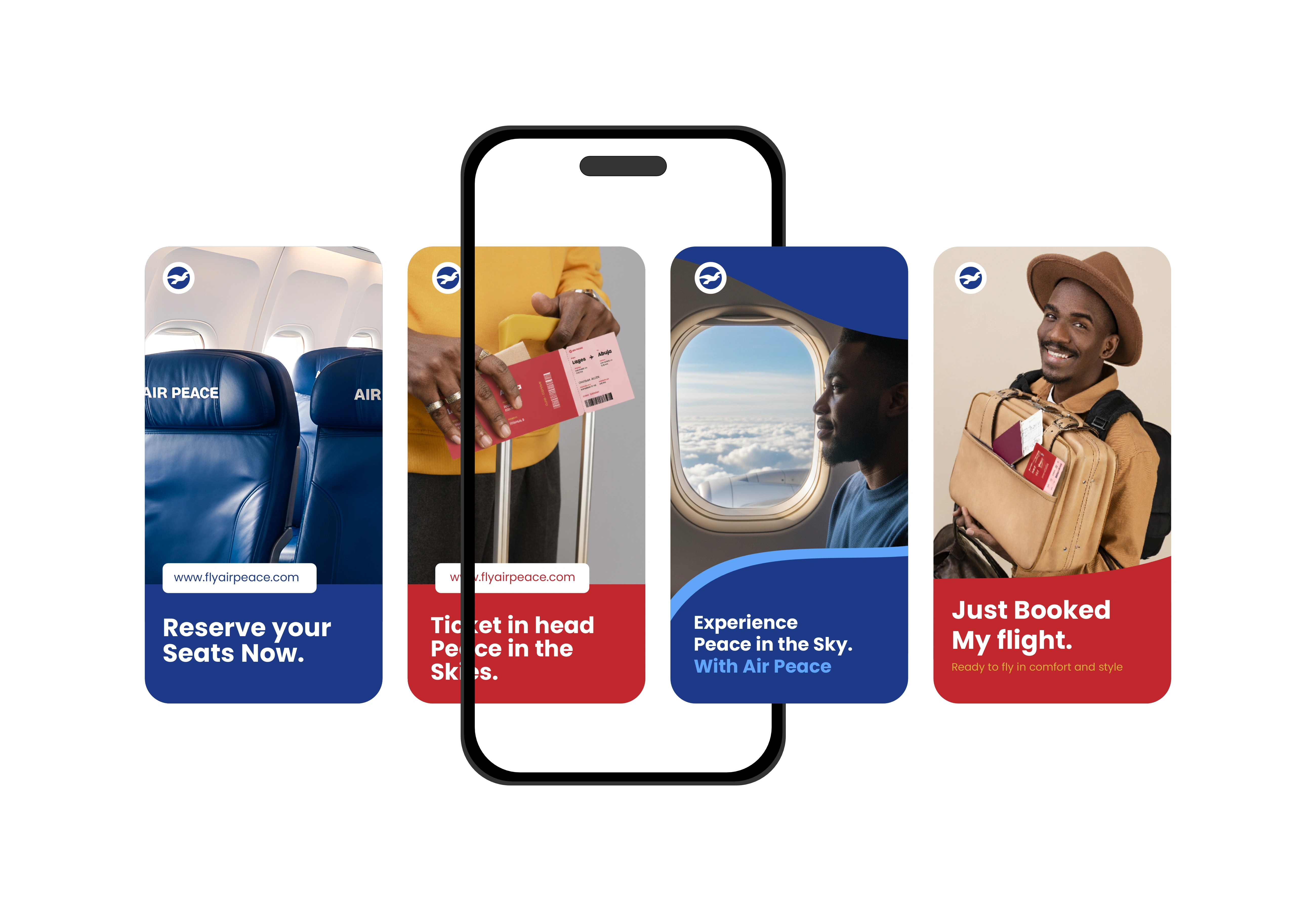
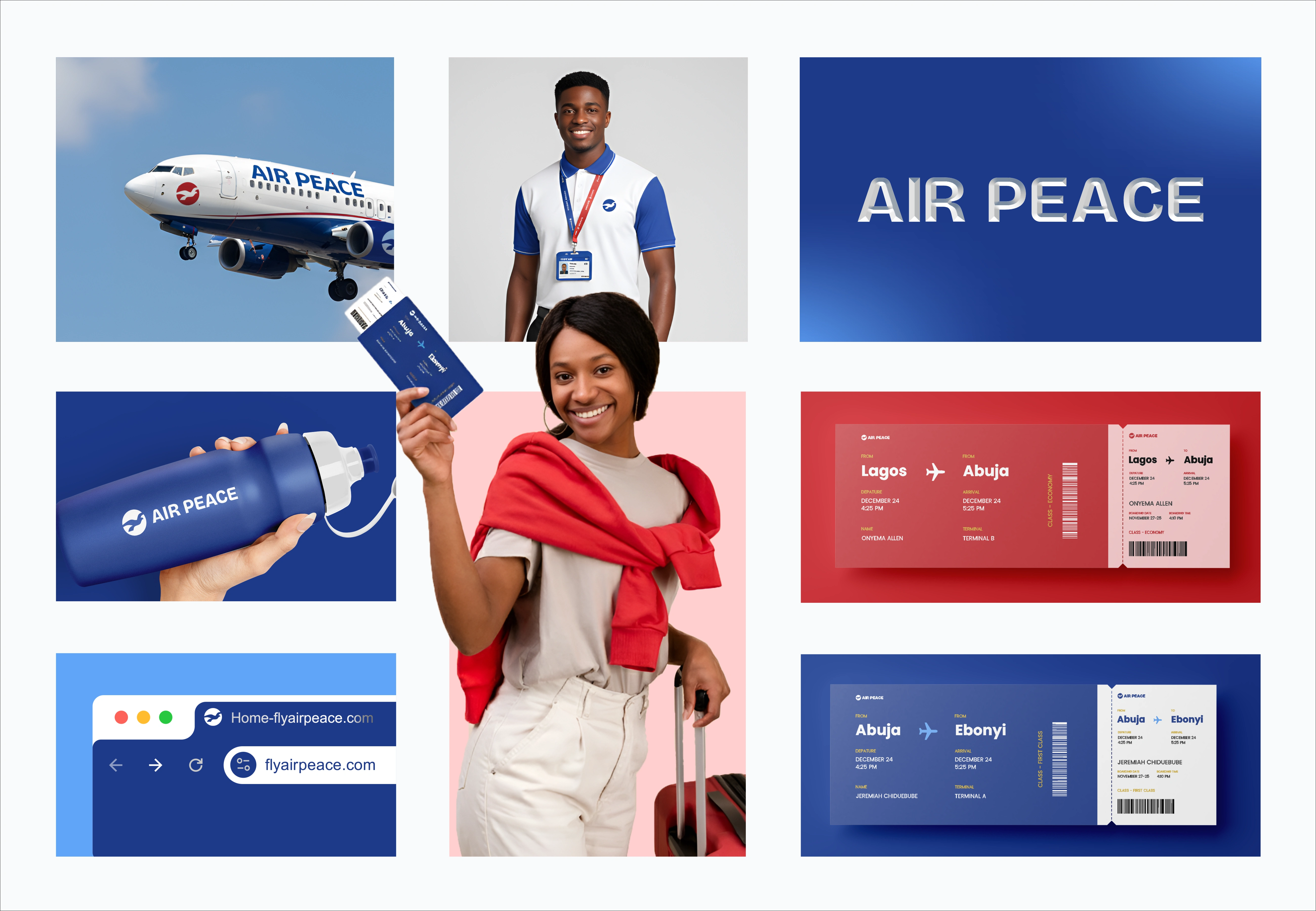
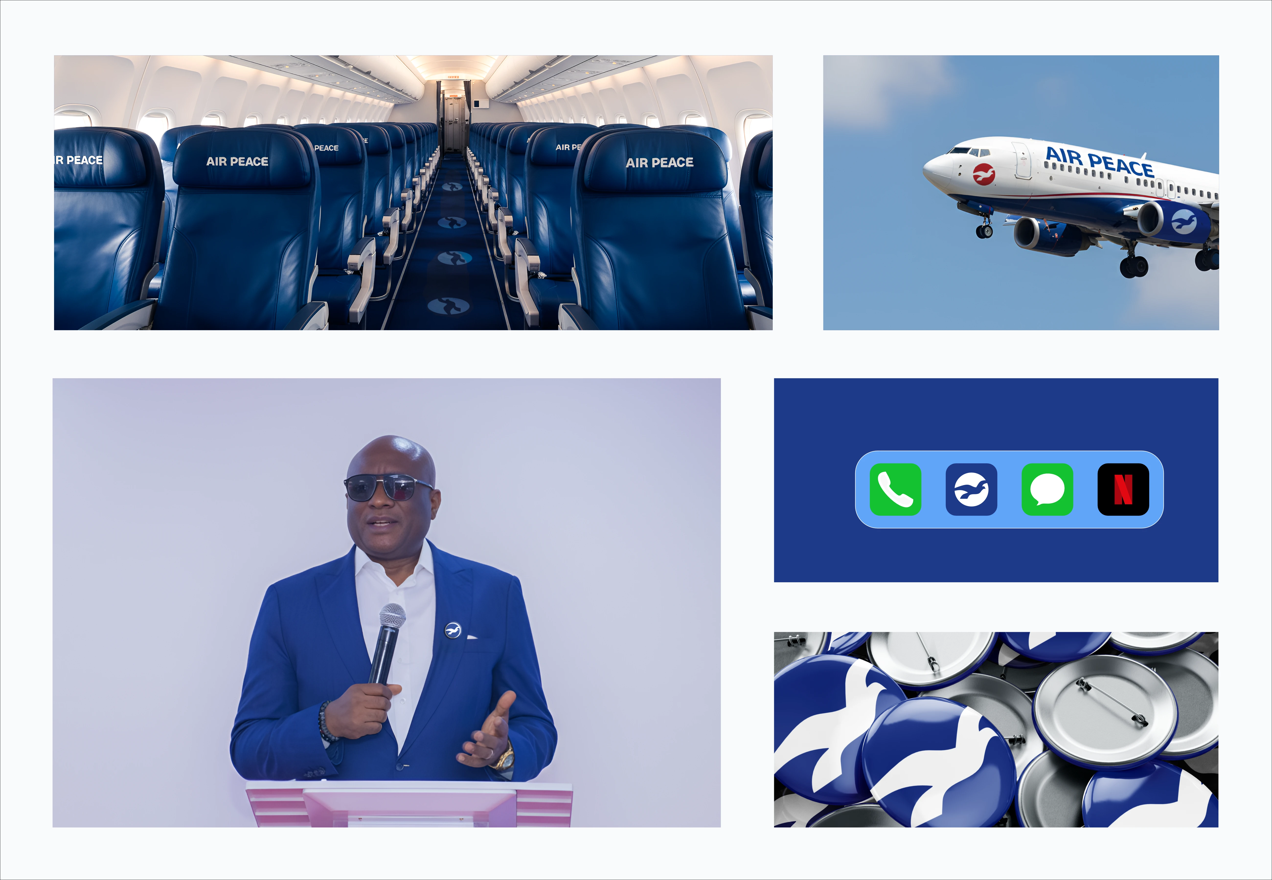
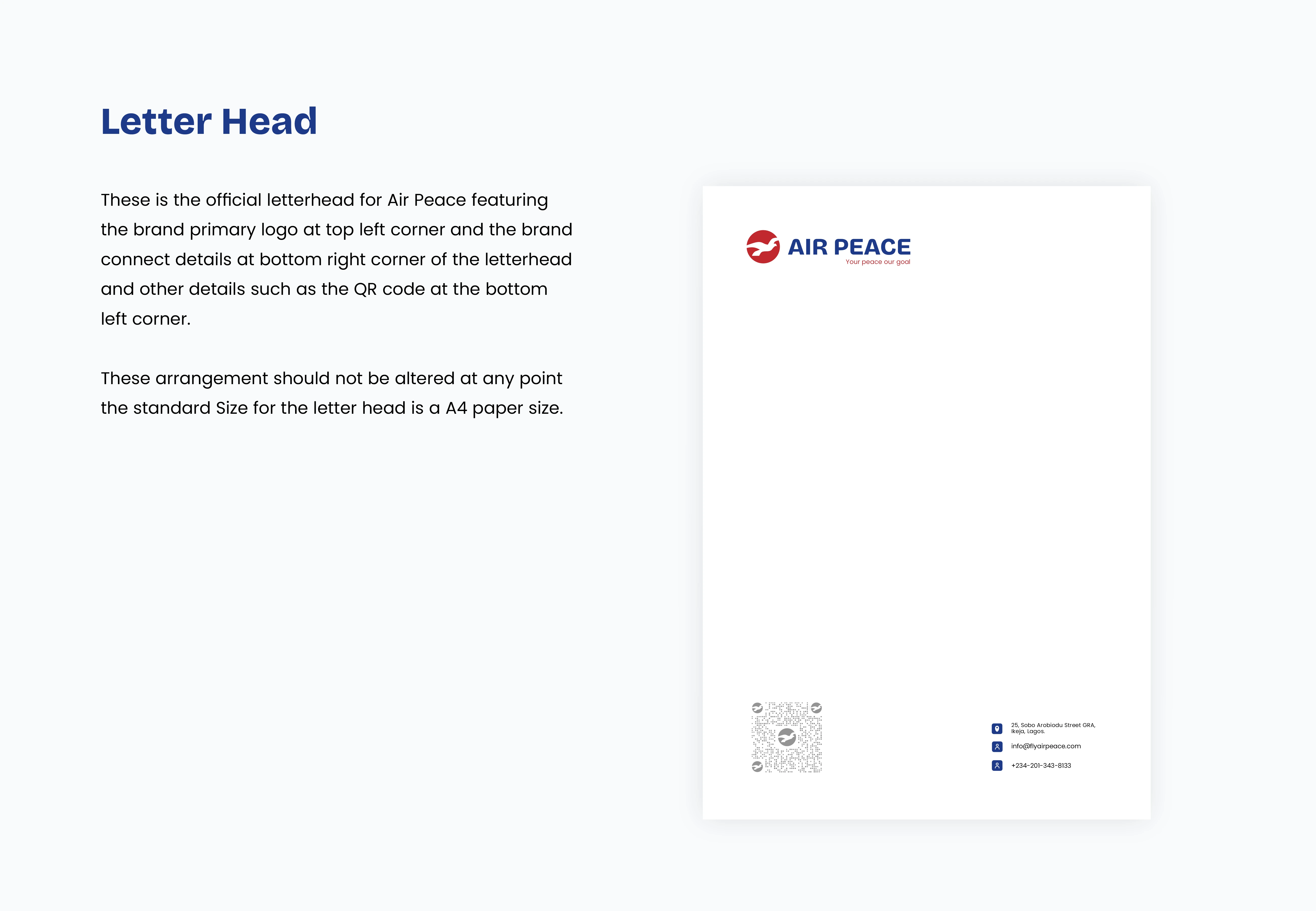
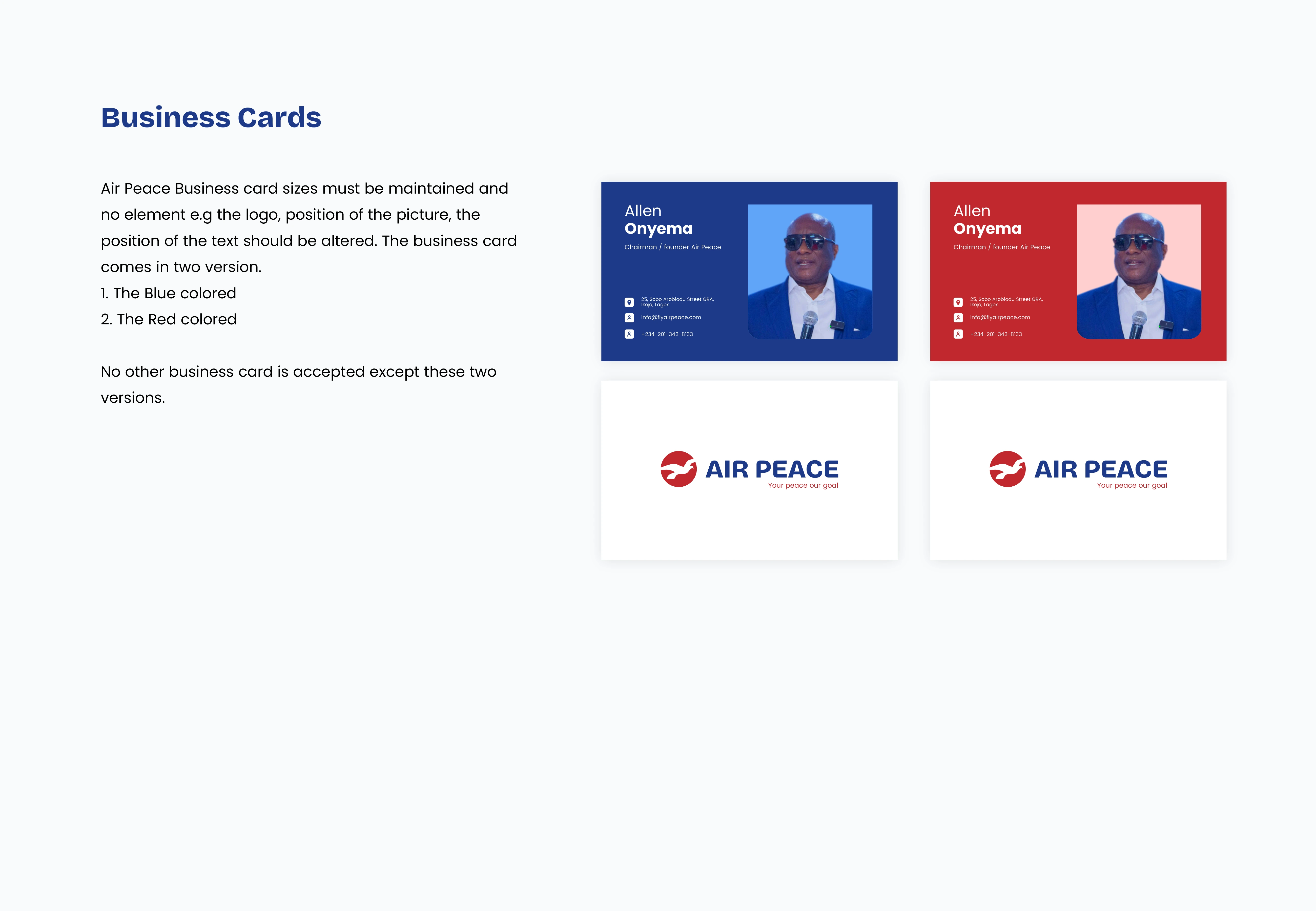
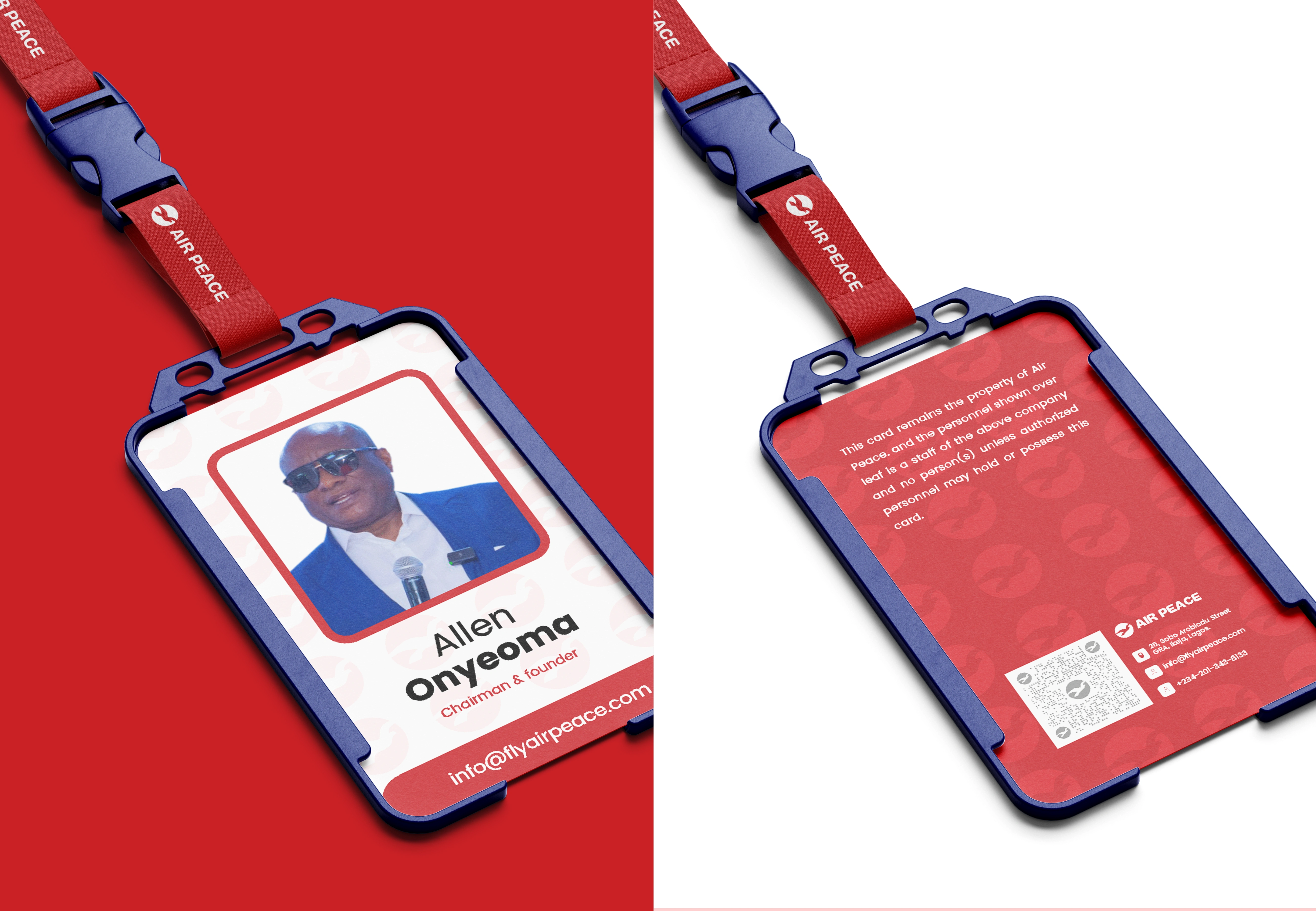
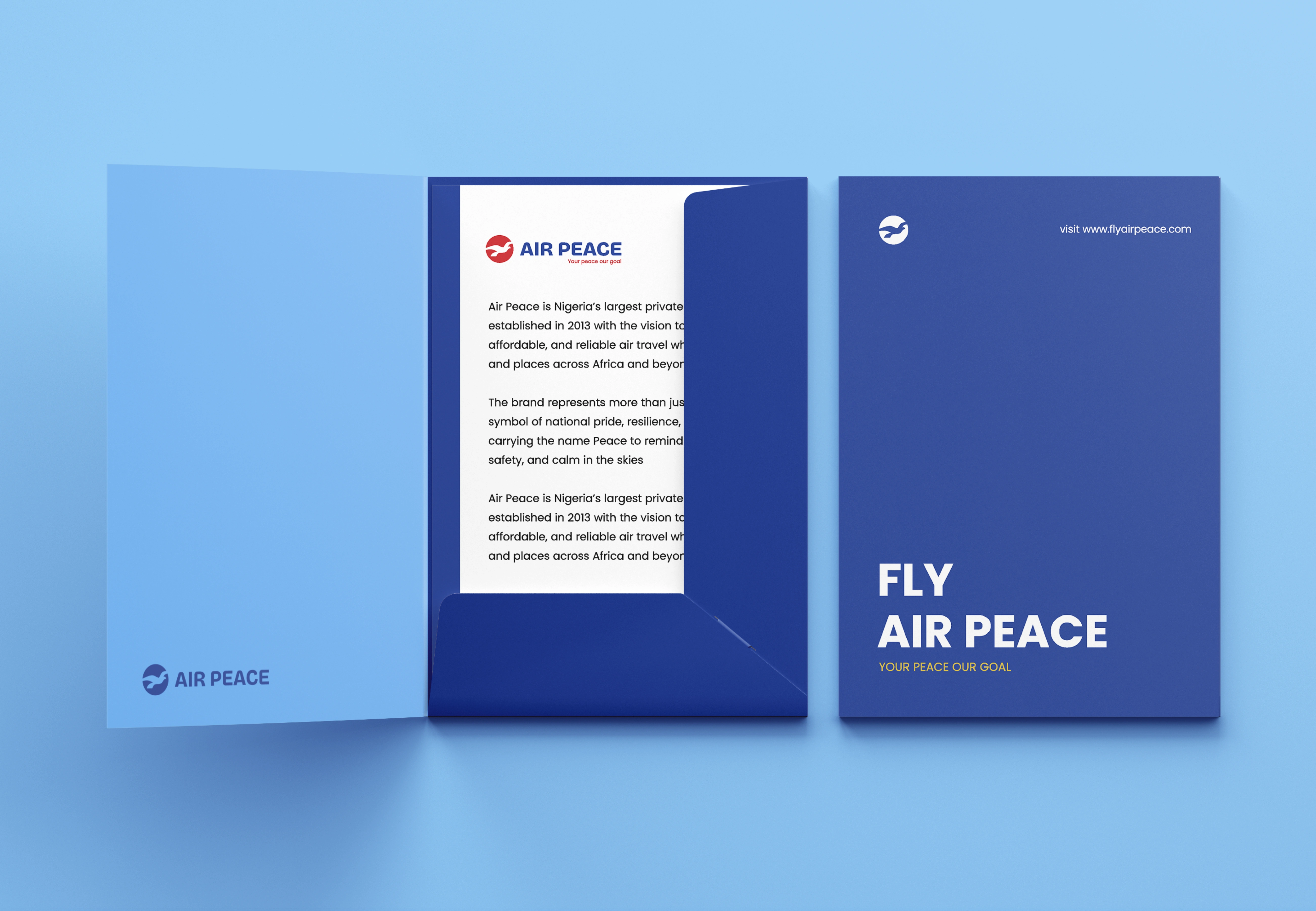
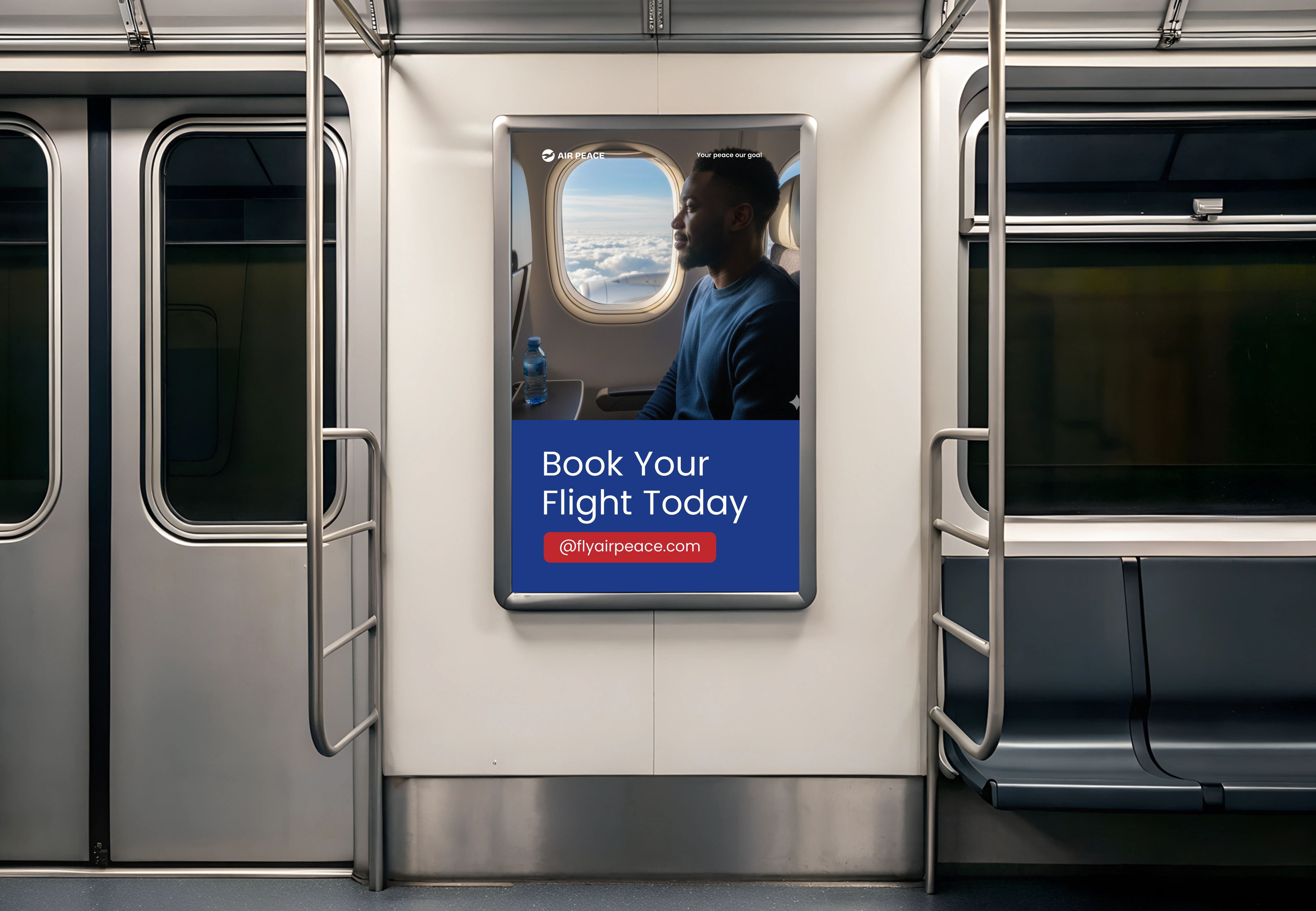
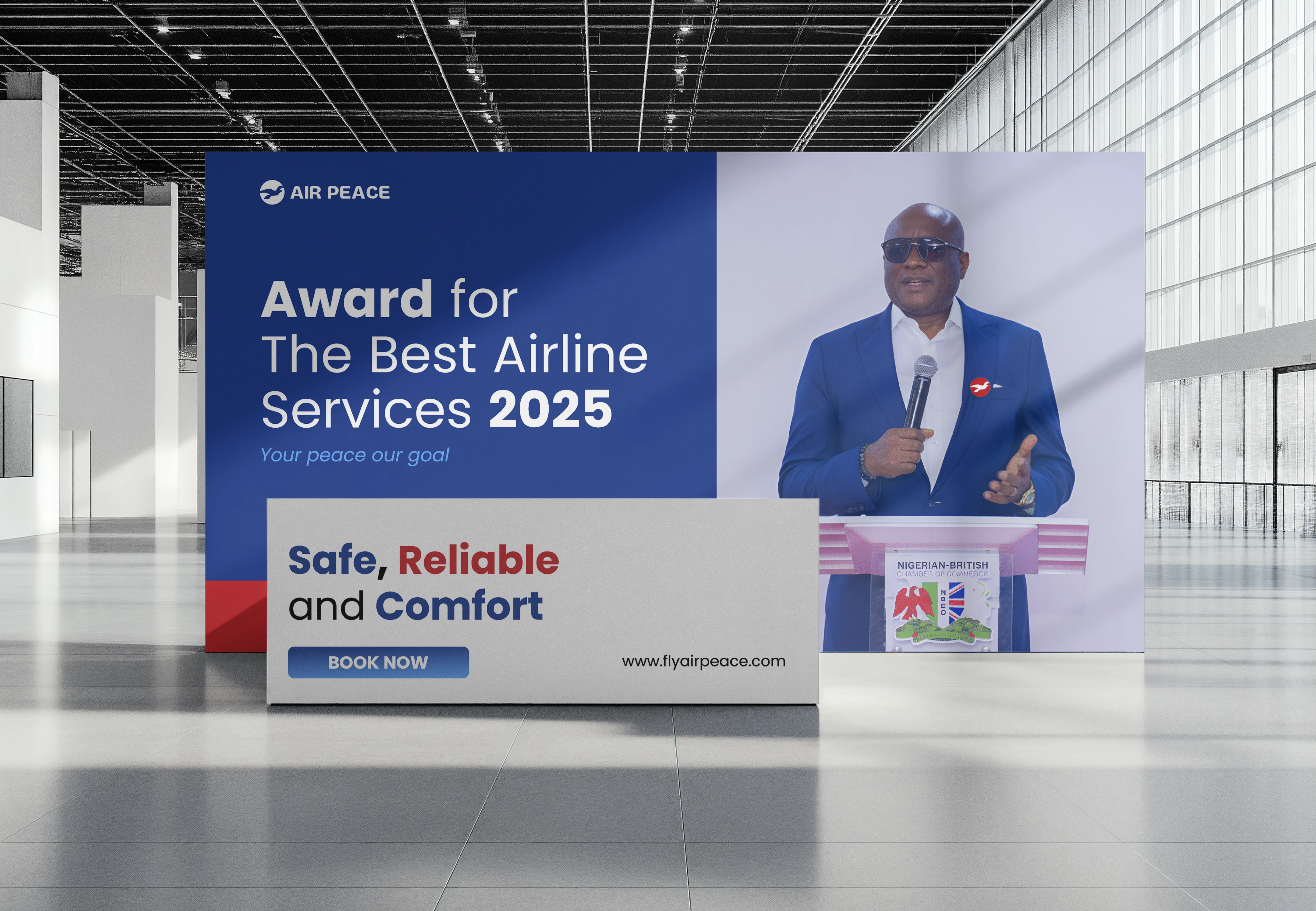
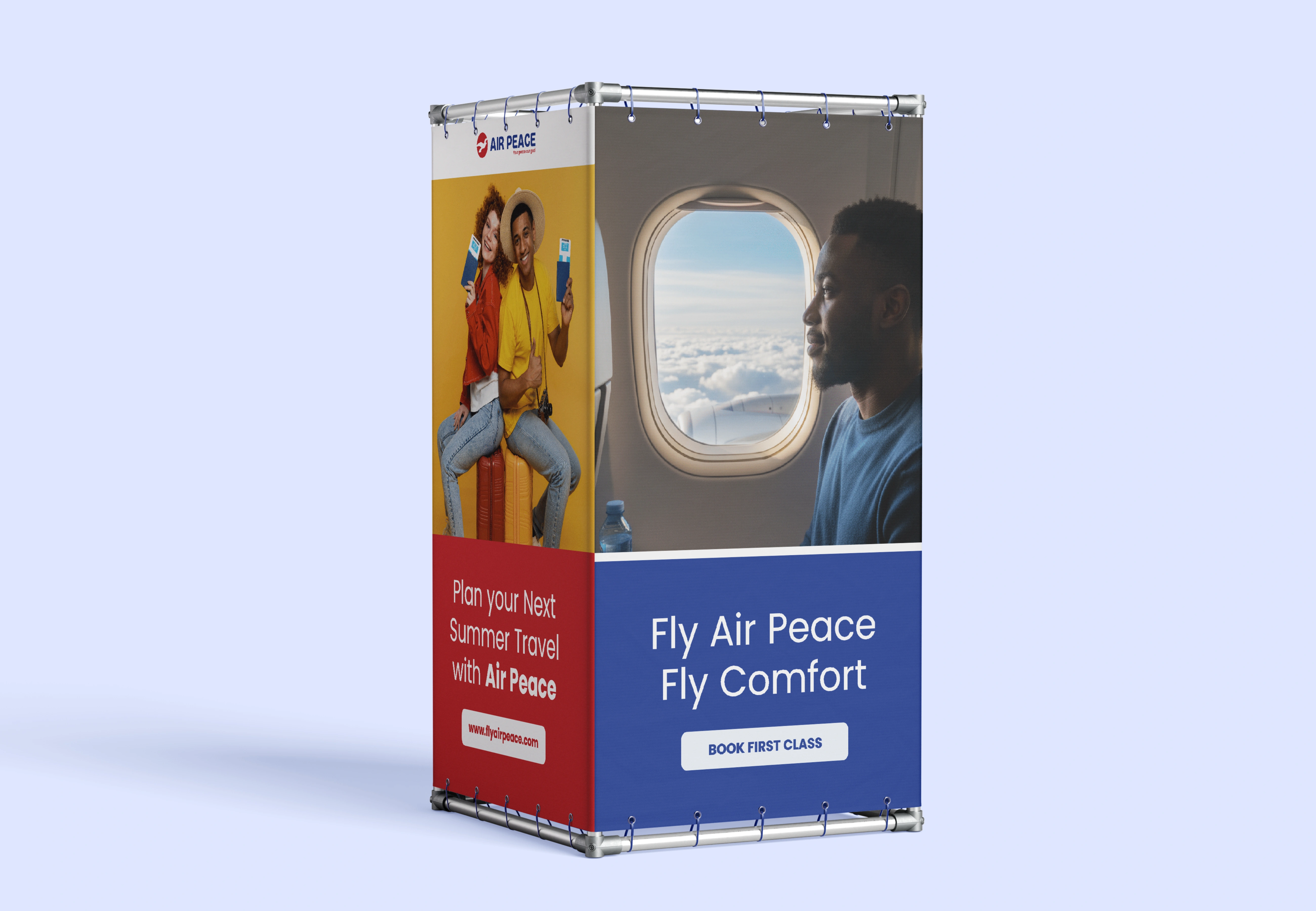
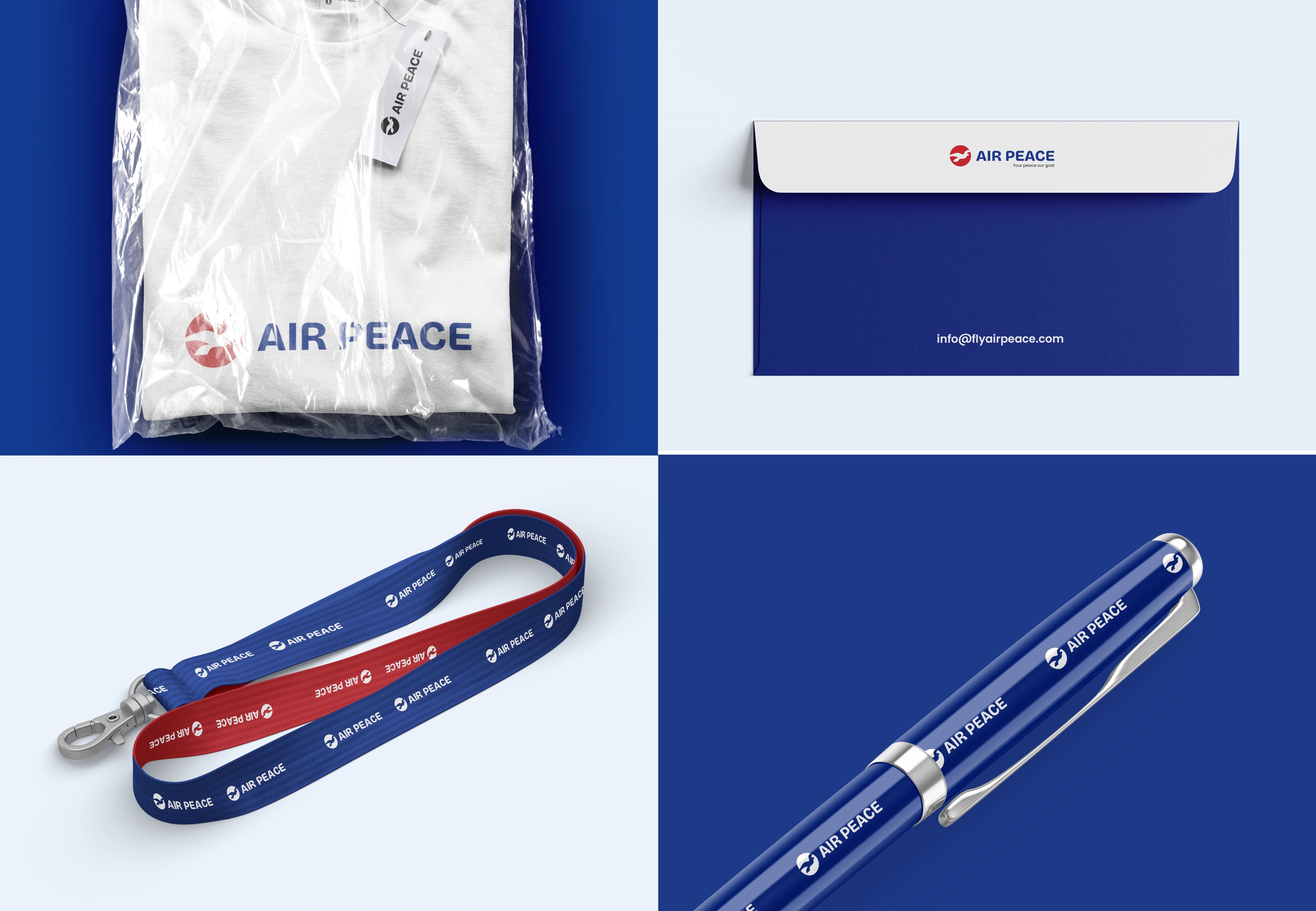
2. Consistency Across Touch points:
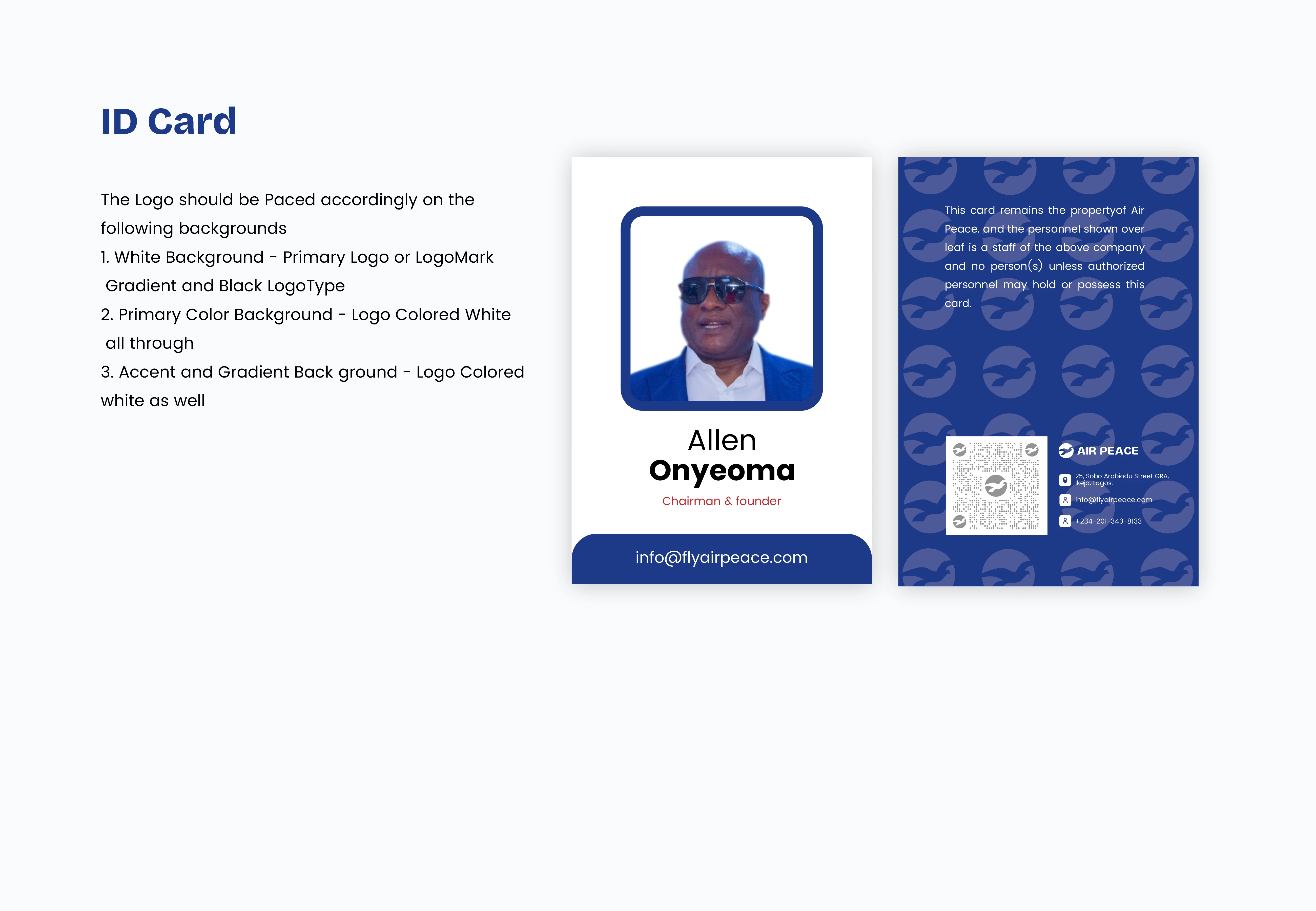
A full brand style guide would be introduced and applied across all Air peace Visuals and all visuals including aircraft, application, website, interior and all digital platforms. These would let the brand tell the same story effectively across all platforms.. and avoid impersonation.. by fraudsters.
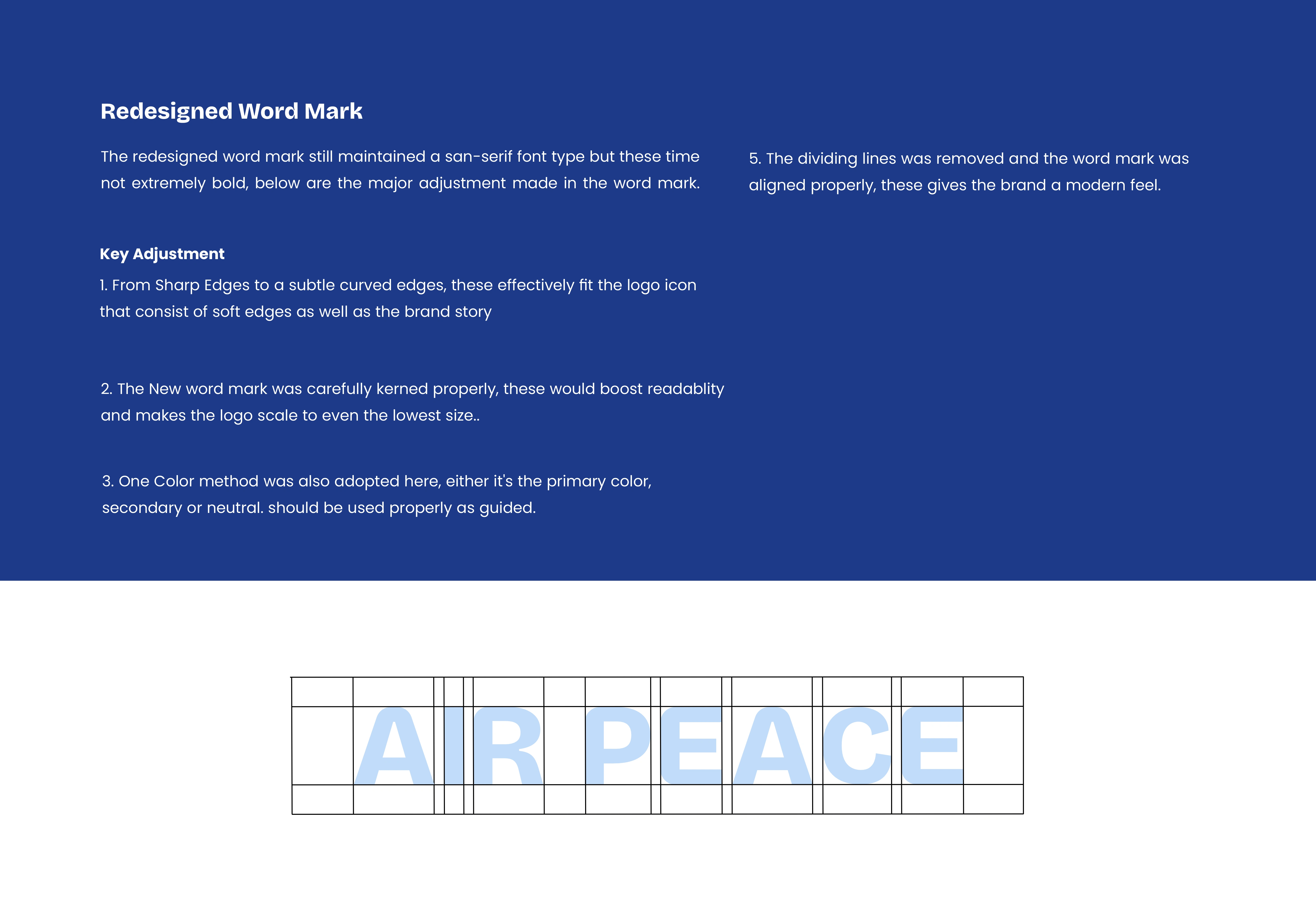
3. Consistent Typography:
Adopt a consistent Typography that is clean, modern and legible and should be used as directed by the style guide across all social media visuals and across the platform and website.
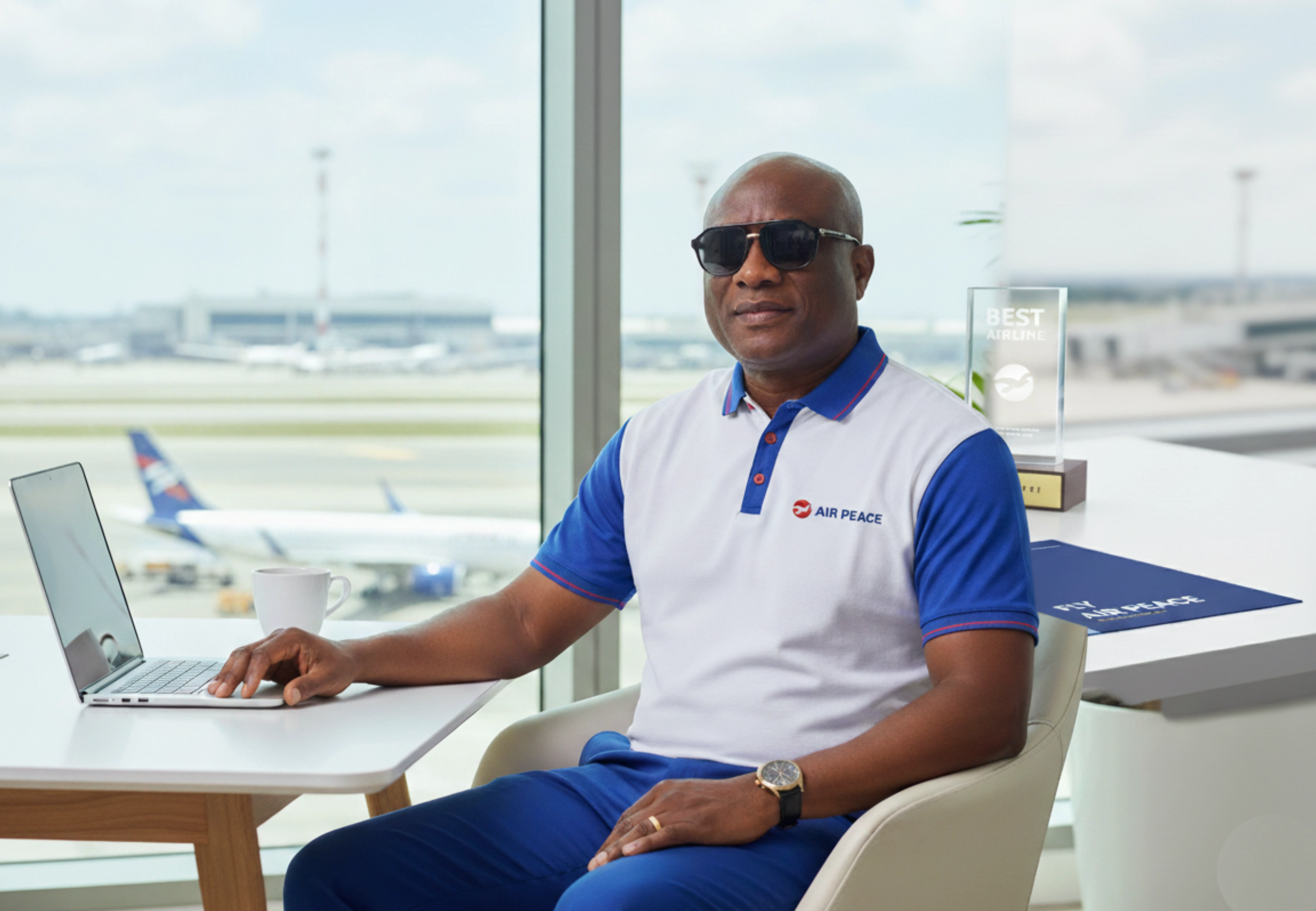
4. Uniform Fix:
They would be need for a signature uniform that is specifically designed for Air peace Brand. While the Isi Agu can be maintained as cultural attire, the air peace attire would represent and boost the brand presence and personality.
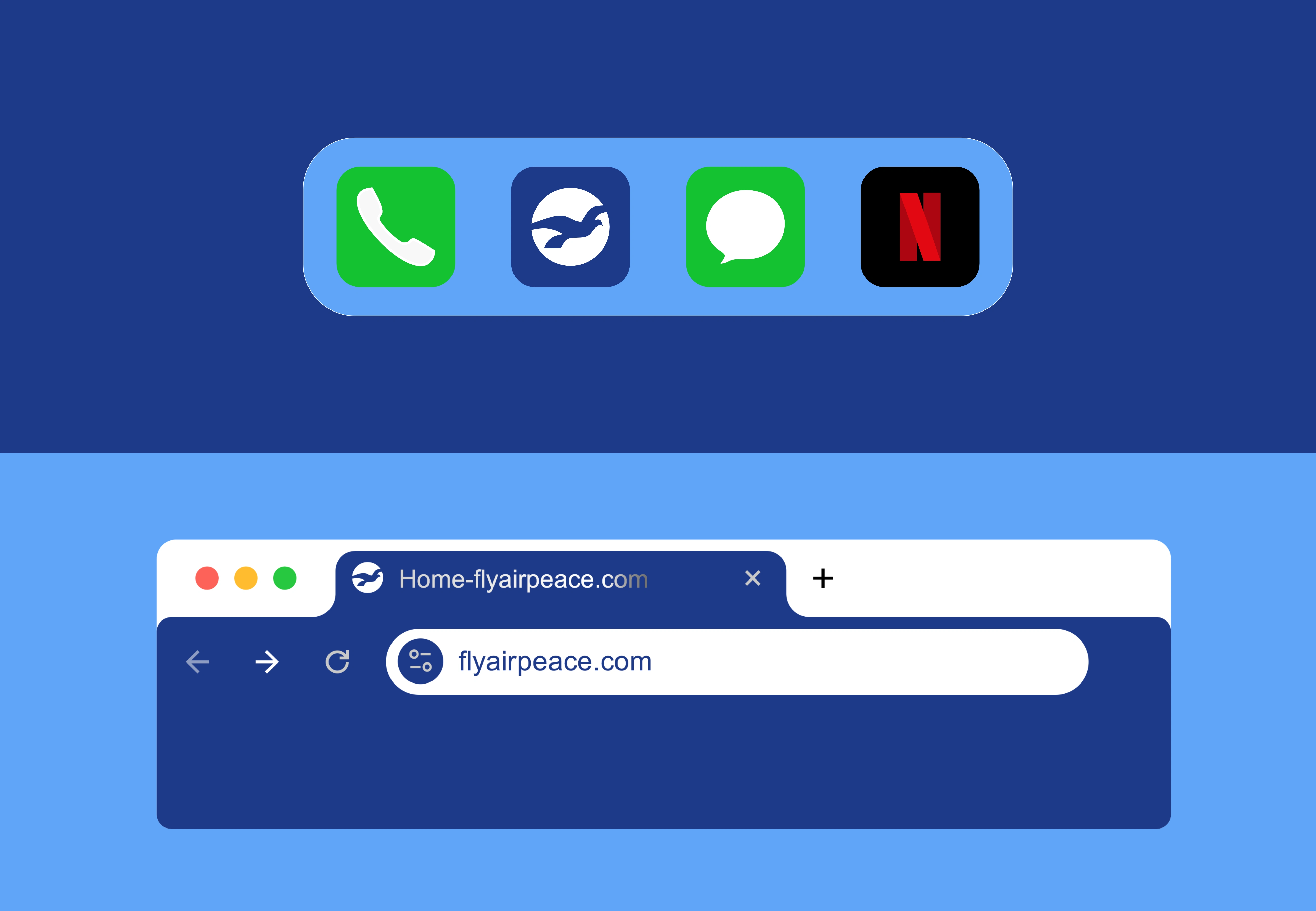
5. Stronger Digital Presence:
The Website would be adjusted to fit the brand promise of Premium and cultural Value. and also more easy to navigate... and every other of Air Peace digital would be designed with the brand colors and visuals.. as directed in the style guide
Like this project