Modern Sunscreen Packaging Design

Apex Design


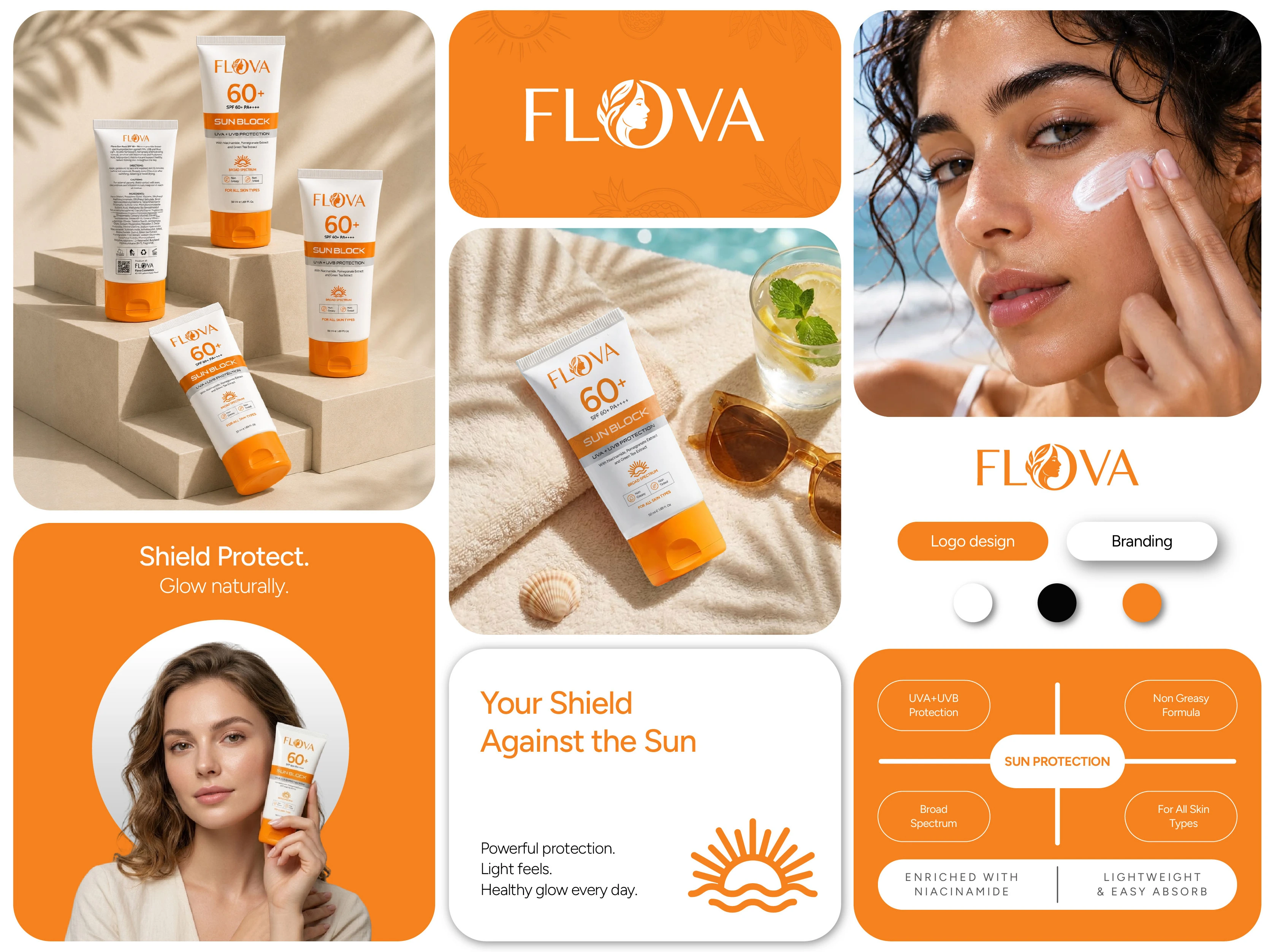

FLOVA Sun Block is a fresh and modern skincare packaging concept designed to bring everyday sun protection together with a clean, confident, and visually distinctive identity.
The visual direction combines a soft white base, vibrant orange accents, bold typography, and a structured information hierarchy to create a packaging system that feels fresh, energetic, and easy to recognize. Every element, from the 60+ SPF communication and UVA + UVB protection messaging to the ingredient highlights and product claims, was carefully arranged to maintain clarity while creating strong shelf appeal.
The packaging was further brought to life through realistic 3D product mockups and creative visual compositions, exploring different angles, environments, and summer-inspired scenes. The goal was to create a complete visual experience that makes FLOVA feel modern, premium, approachable, and ready for the beauty and skincare market.
About Apex Designs
We craft distinctive branding, packaging, and visual identities that help products stand out and leave a lasting impression. By combining creativity, strategy, and attention to detail, we create designs that are both visually compelling and commercially effective.
✨ Turning ideas into impactful brand experiences.
❤️ Press “L” if you enjoyed the project
📩 Have a project in mind? Let's create something remarkable together.
Like this project