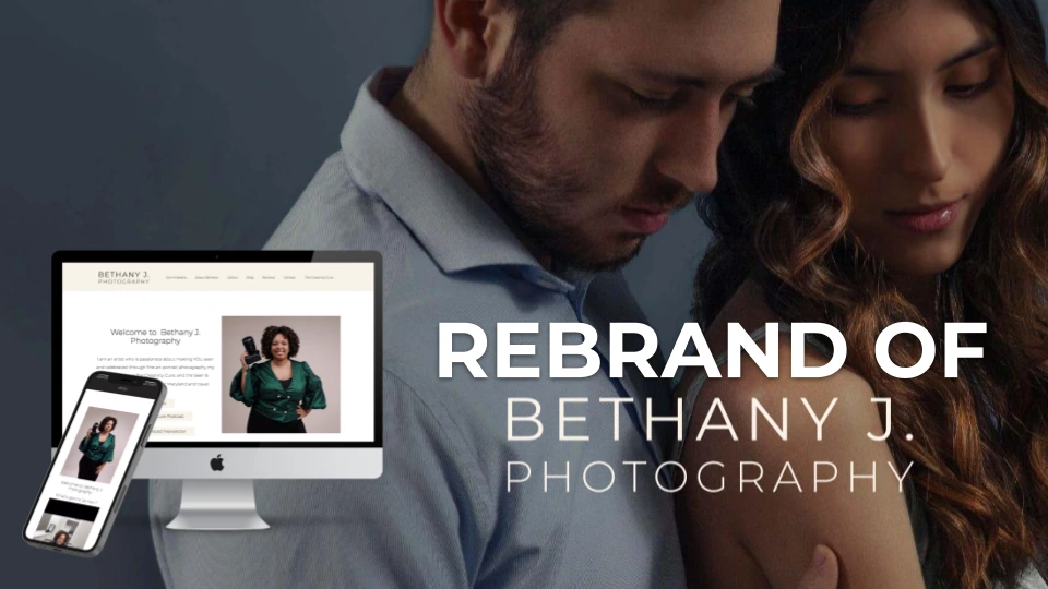
Rebrand and Web Development
Bethany Steele
An audit revealed users rarely engage with the website resulting in low bookings and a misguided marketing approach.
The brand needs to identify the target user and what their goals are on the website to create a user-guided approach to branding, the website, and marketing.
Identify the goals of users and obstacles in the UI to these goals on the pages.
Increase return visits to the website.
Use research to improve the user experience across the brand including the website.
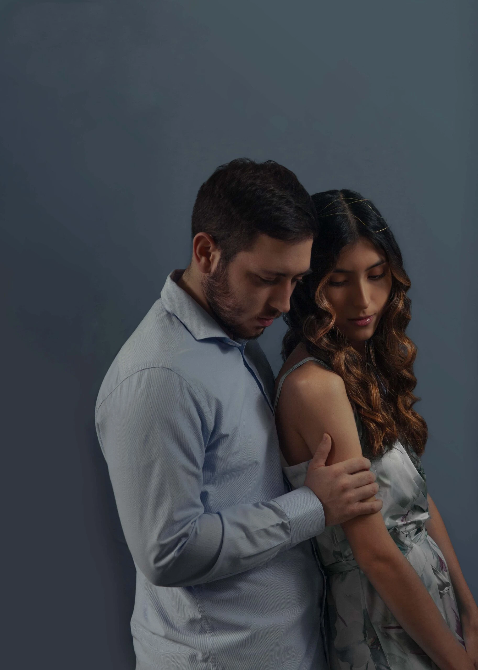
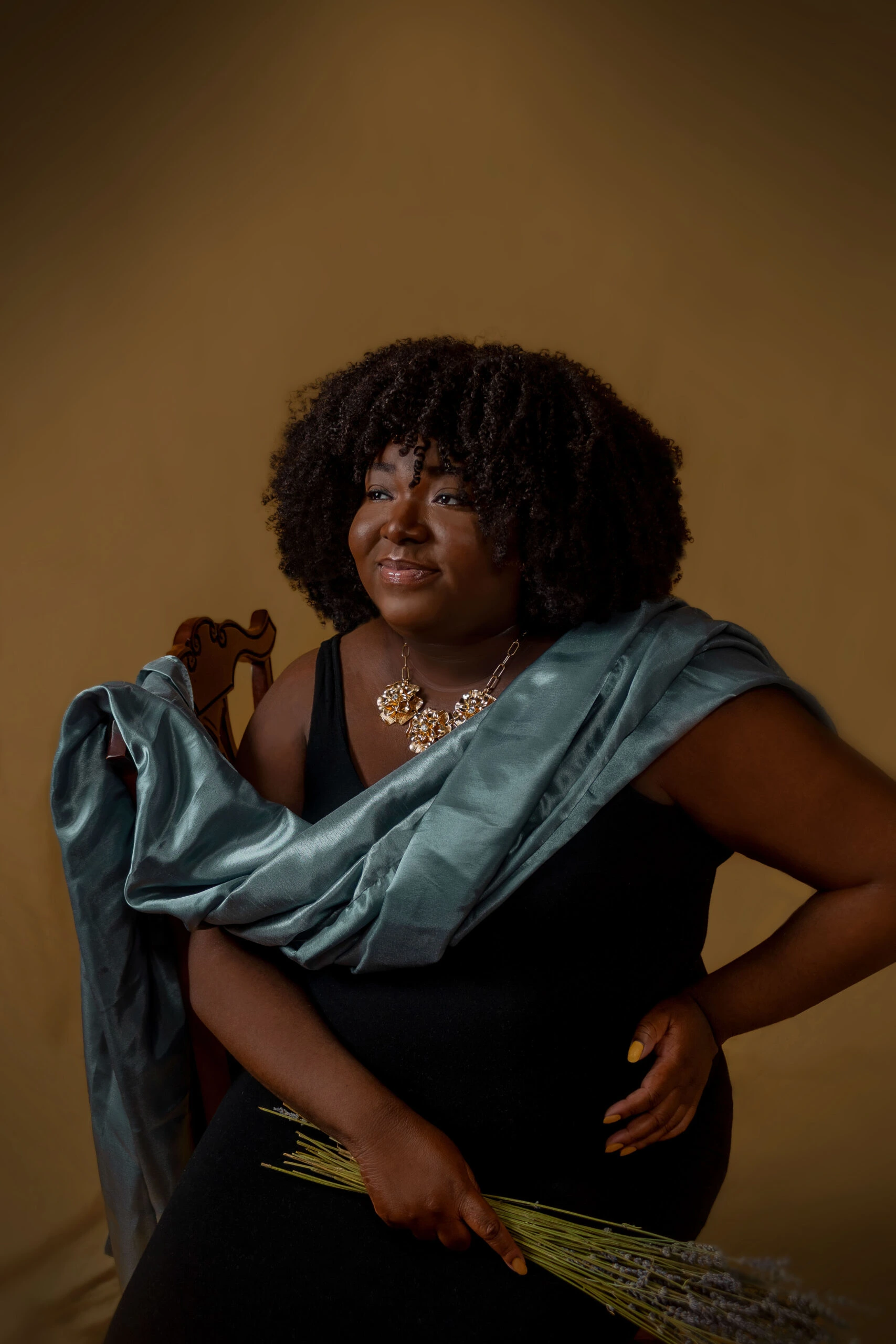
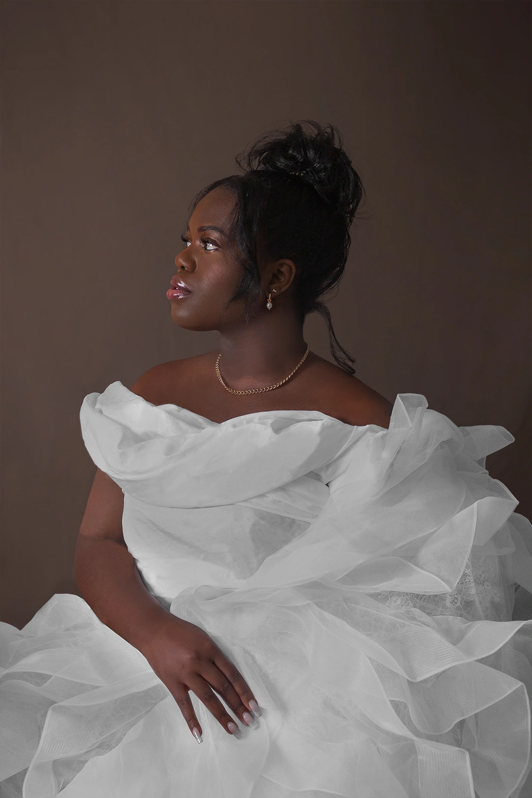
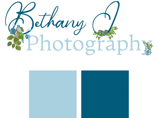
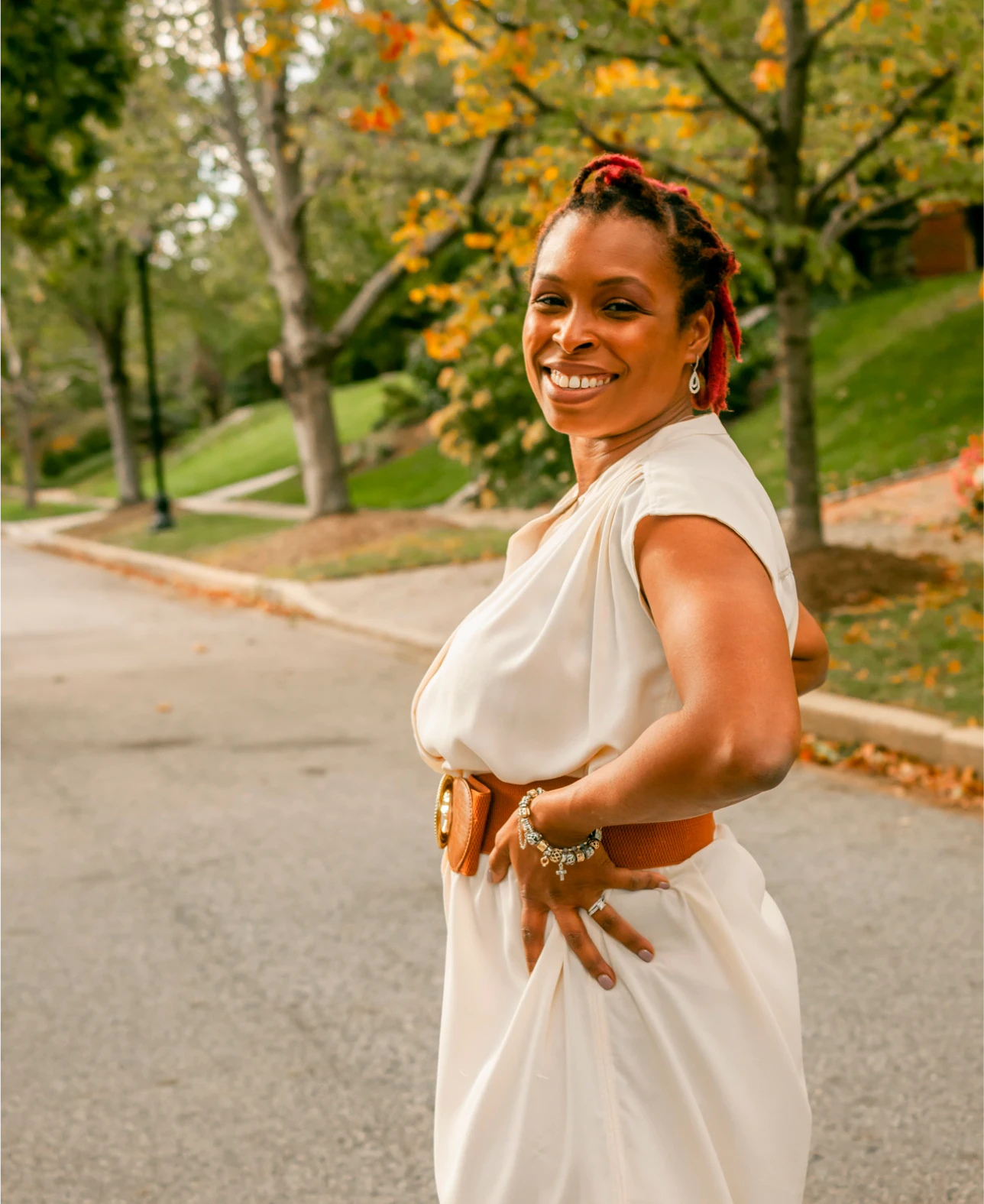
New brand colors emphasize simplicity and luxury like high-end brands. It emphasizes the artist which is key for a fine art portrait brand.
Updated Core Values and Strategy
These are the initial solutions that were implemented as a first prototype.
Shifted to artist focus from service focus by emphasizing how unique skills create unique value.
Focused on 3 values that communicate the brand.
Specialized and narrowed down the offer.
Shifted language to communicate value.
Create additional value through newsletters and podcasts.
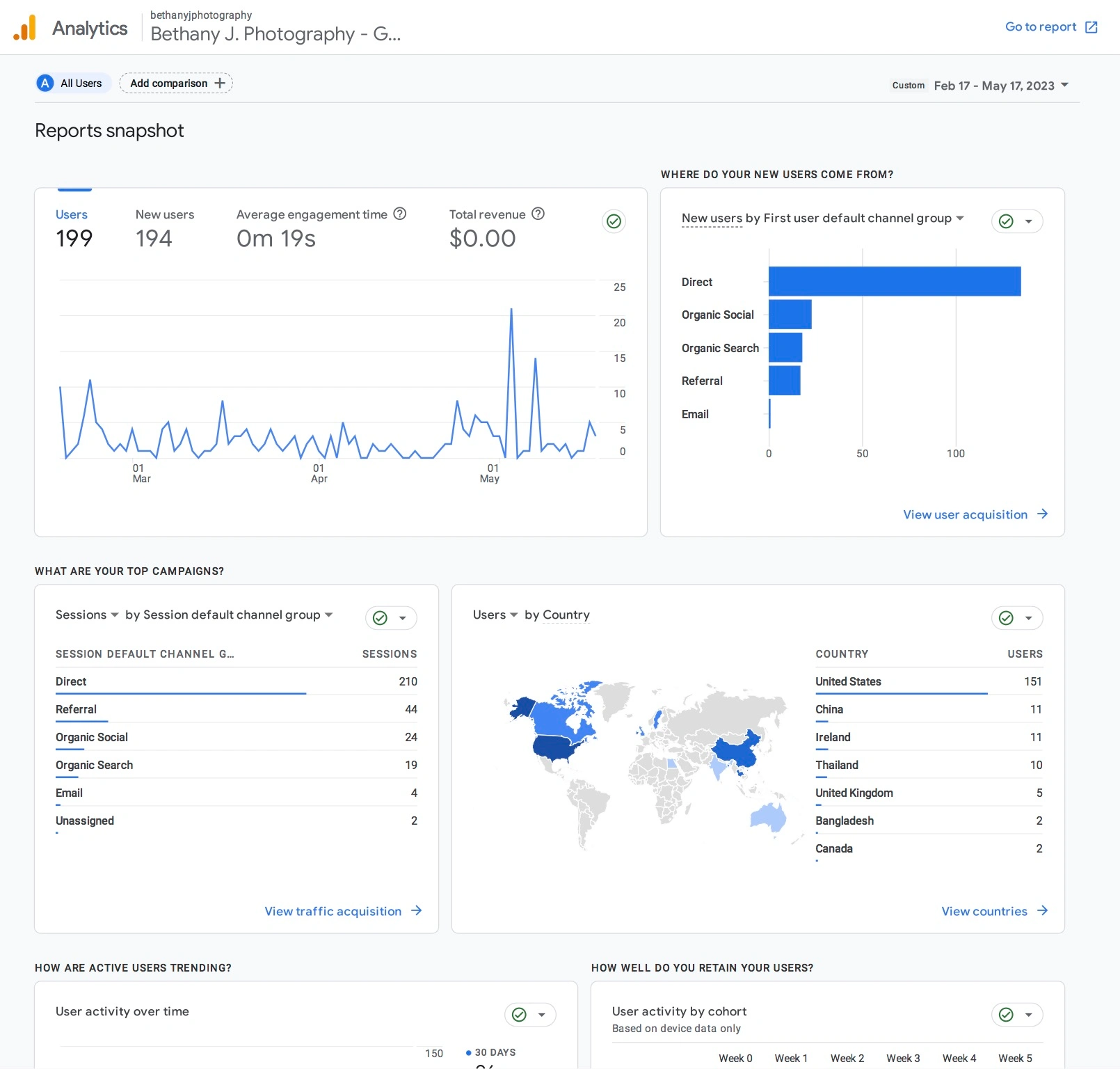
Shows direct email marketing and social media are the biggest drivers of users to the website. With a strong interest in the home, contact, and blog page.
Increase in Instagram following since launching on February 17th
Currently in a 6 month testing period
Watching inquiries, email subscriptions, and social media metrics to see a 50% increase in activity
Collecting qualitative data
First I conducted a SWOT analysis of the current brand values and image through UI to identify what was currently communicated across the photography and experience based on data from social media, email, and website analytics.
Colorful and playful
Clients come back
Strong relationship investment in my life
The reputation of consistent high-quality work
Working with families
Prompt responses
No limit problem solving
Flexibility
Relatable
10 years of photography
Flooded market- MD has a ton of family/ portrait photographers
Indoor studio costs
Limited time
Having to handle marketing, booking CRM, and products by myself
The ceiling of spending within $200-$300
Money for advertising
Lower cost competitors
Peers are currently having kids, getting married, and doing big first
My peers will most likely recommend me to other people I went to highschool with
Untapped email list
as long as social media is a thing people will want portraits
Specialization would maximize my time and quality
Referrals are still a strong
High competition
Recession (less luxury money)
Customers from small social circle
Lower priced photographers
Competition
Bigger clients
studios/ physical locations
Stylists
The Original Brand
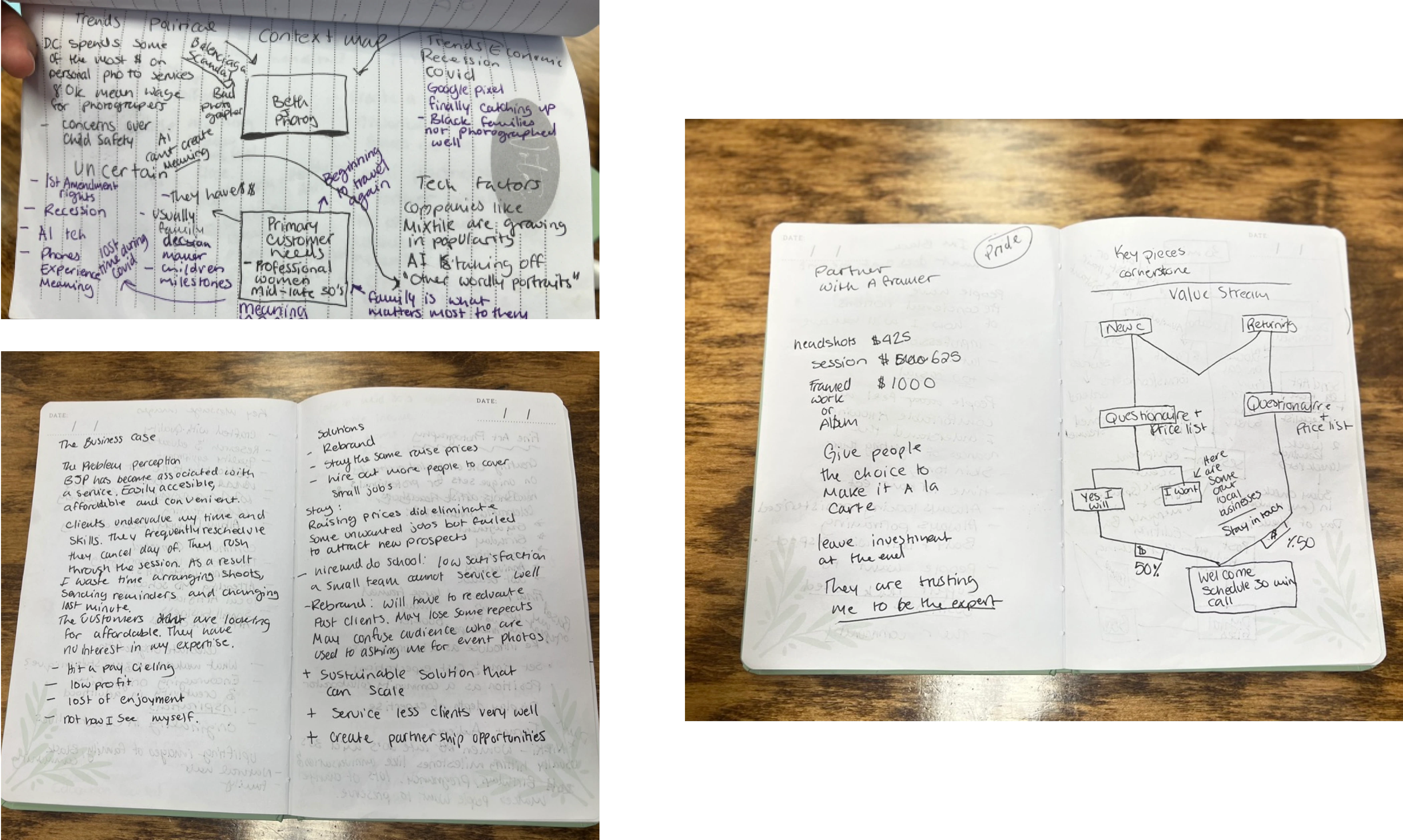
The original brand was broad. Users experienced frequent delays with communication, file delivery, and schedule as I attempted to address many different types of work. The website was rarely used. Users preferred to contact me directly. The business reputation was friendly and low costs. This didn’t fit the reality of the cost of operation on my end and profit was affected.
Users experienced frequent delays with communication, file delivery, and scheduling.
The website was rarely used. Users preferred to contact me directly.
The business reputation was friendly and low costs. This didn’t fit the reality of the cost of operation on my end and profit was affected.
The user had expectations for quick service and provision of a wide variety of services.
The users were not familiar with the website and wanted a streamlined way to book a session.
The user wants flexibility with final product delivery.
The user wants thought put into the final product timeline in relation to the session completion.
interviewed a current user who was in the target demographic I wanted to increase in the business.
The user had expectations for quick service and provision of a wide variety of services.
The users were not familiar with the website and wanted a streamlined way to book a session.
The user wants flexibility with final product delivery.
The user wants thought put into the final product timeline in relation to the session completion.
Nikki
is a business owner and family woman who loves her community. She appreciates customized art and a tailored photography experience. She is not technically savvy and prefers a call over an online sign-up form.
Goals:
To fill her home with art
To support the black community
To have custom art made of her and her family
Frustrations:
Confusion on how to sign up for a session and limited options for delivery.
Relies on mobile phone for communication
Age: 38
Education: Masters
Hometown: White Marsh MD
Family: Married with 1 child
Occupation: Experienced Nurse
Nikki
is a business owner and family woman who loves her community. She appreciates customized art and a tailored photography experience. She is not technically savvy and prefers a call over an online sign up form.
Goals:
Frustrations:
Confusion on how to sign up for a session and limited options for delivery.
Relies on mobile phone for communication
Age: 38
Education: Masters
Hometown: White Marsh MD
Family: Married with 1 child
Occupation: Experienced Nurse
I used context maps, defined the value stream, and created a business case to thoroughly understand the problems and the solutions.
Interactive Prototype Design
Organic, Vibrant, Casual Location
Spontaneous poses with a lot of experimentation
Quick planning by confirming location and clothing
Family portraits, events, weddings, and more. (Spreads my focus thin)
30-1 hour session
Candid photos
Luxury, Vibrant, Custom,
Curated, Historic Mansion or Studio
Collaborative poses with professional guidance
Celebrate accomplishments or milestones with a one-of-a-kind portrait. (I focus more on you!)
Unlimited session time depending on your needs
Composed photos
Figma
Adobe Photoshop
Adobe Premiere Pro
Final Cut Pro
Adobe Lightroom
Adobe InDesign
Google Suite

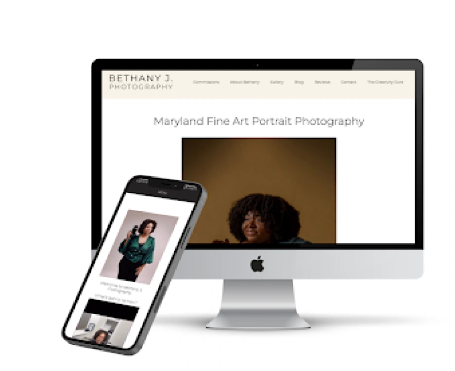
The Home Screen immediately identifies the purpose of the website through high-contrast text and a large image.
A single-column layout is used to reduce cognitive load as users interacting with the website are most likely using a mobile web app.
The mobile version features a Hamburger menu to reduce page density while the desktop page features a sticky header that is always accessible.
The responsive design accounts for the haptics of scrolling with a finger on a mobile versus scrolling with a mouse on a desktop.
Consolidated sections and removed repeat information.
This new logo is simple and classic and serious. I sought to emphasize my professionalism to every person who visits my website. This logo communicates luxury and trustworthiness values important to users seeking to hire a photographer.
Currently examining week by week what users are responding to with plans to review the methods after 3 months.
Users like the artist-centered brand approach and are excited about a new approach.
May need to find new ways to fine-tune where the target demographic is with branding.
Updated Core Values and Strategy
These are the initial solutions that were implemented as a first prototype.
Shifted to artist focus by emphasizing how unique skills create unique value
Focused on 3 values that communicate brand
Specialized and narrowed down offer
Shifted language to communicate value
Create additional value through newsletters and podcasts
These are the initial solutions that were implemented as a first prototype.
Shifted to artist focus by emphasizing how unique skills create unique value.
Focused on 3 values that communicate brand.
Specialized and narrowed down offer.
Shifted language to communicate value.
Create additional value through newsletters and podcasts.
The Home Screen immediately identifies the purpose of the website through high-contrast text and a large image.
A single-column layout is used to reduce cognitive load as users interacting with the website are most likely using a mobile web app.
The mobile version features a Hamburger menu to reduce page density while the desktop page features a sticky header that is always accessible.
The responsive design accounts for the haptics of scrolling with a finger on a mobile versus scrolling with a mouse on a desktop.
Consolidated sections and removed repeat information.
Users can see recent videos, links to podcast host websites, and a detailed description of what the podcast is about.
This page serves to offer value immediately to the user regardless of if they decide to book with the company or not. It allows the user to have a reason to continually visit and further engage with content.
The design is slightly different than the other pages because podcast listeners will engage initially with this page and it serves as a second entry point into the art practice.
These are the initial solutions that were implemented as a first prototype.
Shifted to artist focus by emphasizing how unique skills create unique value.
Focused on 3 values that communicate brand.
Specialized and narrowed down offer.
Shifted language to communicate value.
Create additional value through newsletters and podcasts.
Users can learn more about my personality and preferences and understand the values of the business as they scroll the page.
Photography is a personal service and can be uncomfortable. Here users are getting a feel for who I am as an artist creating familiarity for the user while delivering important information.
The reviews page allows users to verify my qualifications via others’ experiences.
Users can also visit links to published works and a link to the google my business page to build trust in my reputation via third-party sites.
I use columns to continue the experience of skimmable content that is easy to navigate by reducing page density and eye strain with the simple color palette.
Users can see recent videos, links to podcast host websites, and a detailed description of what the podcast is about.
This page serves to offer value immediately to the user regardless of if they decide to book with the company or not. It allows the user to have a reason to continually visit and further engage with content.
The design is slightly different than the other pages because podcast listeners will engage initially with this page and it serves as a second entry point into the art practice.
New brand colors emphasize simplicity and luxury like high-end brands. It emphasizes the artist which is key for a fine art portrait brand.
These are the initial solutions that were implemented as a first prototype.
Shifted to artist focus from service focus by emphasizing how unique skills create unique value.
Focused on 3 values that communicate the brand.
Specialized and narrowed down the offer.
Shifted language to communicate value.
Create additional value through newsletters and podcasts.
Shows direct email marketing and social media are the biggest drivers of users to the website. With a strong interest in the home, contact, and blog page.
Increase in Instagram following since launching on February 17th
Currently in a 6-month testing period.
Watching inquiries, email subscriptions, and social media metrics to see a 50% increase in activity
Have had several users comment on how they enjoy the website and content.
My next updates will include fine-tuning the user interface in terms of animation, text legibility and looking at user behaviour based on analytics. Will review the results in August.
Users like the artist-centered brand approach and are excited about a new approach.
What I learned: Users spend the most time on the home page and blog page. This indicates they visit the web page to explore more of the brand and are interested in the storytelling that takes place through the blog.
My next updates will include fine-tuning the user interface in terms of animation, and text legibility, and looking at user behavior based on analytics. Will review the results in August.
What I learned: Users spend the most time on the home page and blog page. This indicates they visit the web page to explore more of the brand and are interested in the storytelling that takes place through the blog.
Like this project
Posted Nov 3, 2023
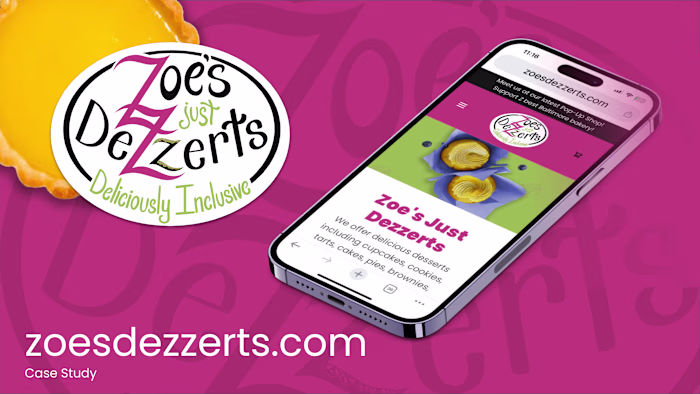
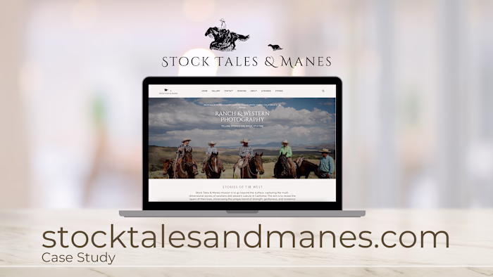
This case study shows the rebranding of web design for a photography business.
Likes
0
Views
21