Bakery Website Development
Bethany Steele
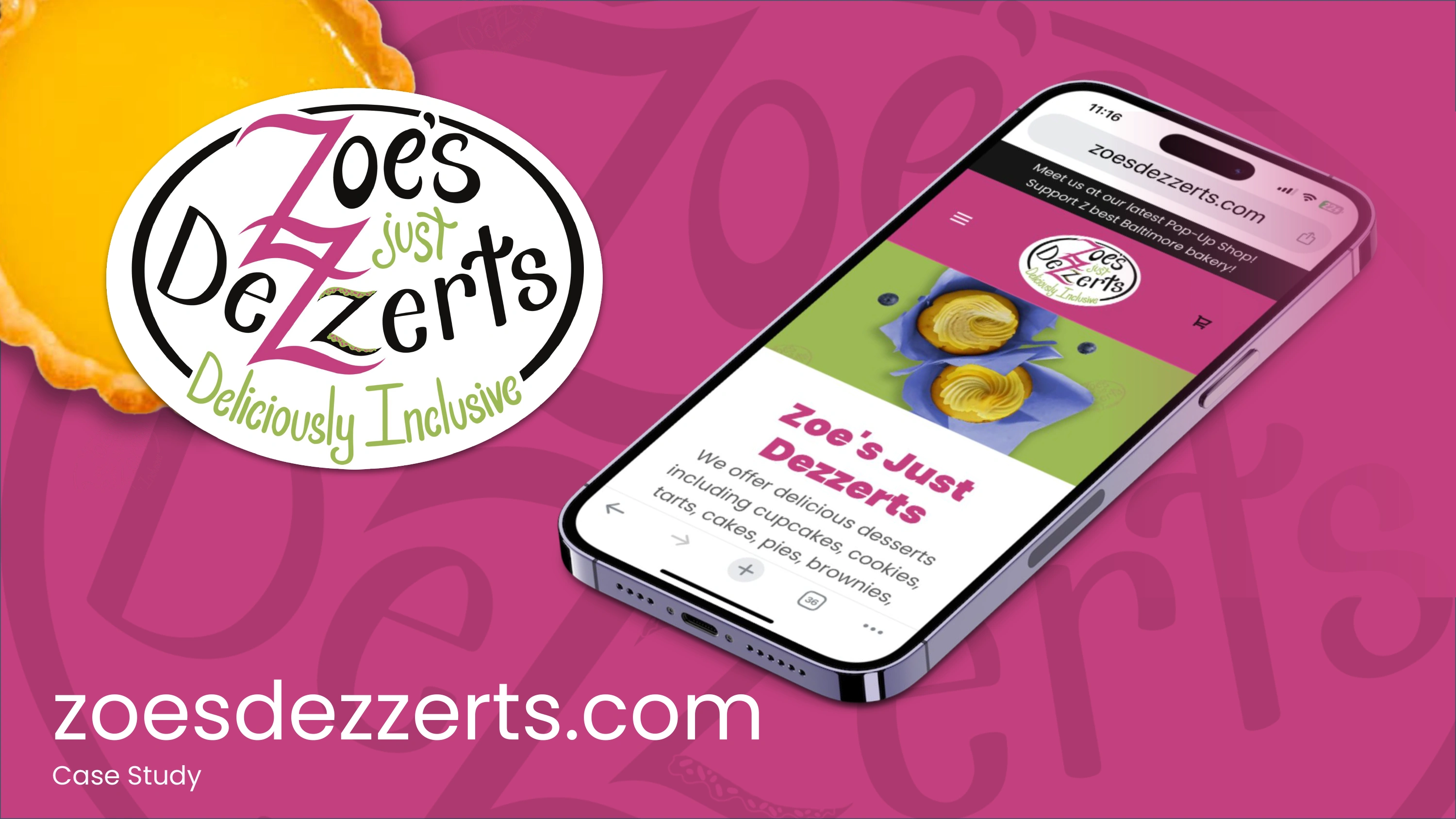
Zoe’s Just Desserts Case Study
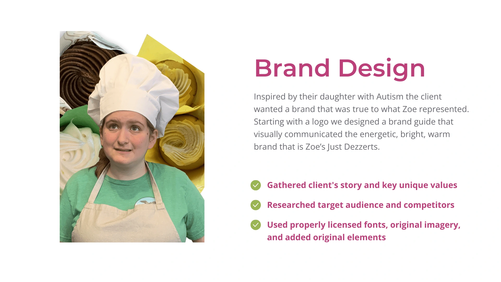
Jenn and Adrian are opening a bakery to create a place for their daughter Zoe who has autism to have community and purpose with other adults who have autism. They reached out to me to create a website that was easy to update, communicated the branding, and included the ability to add an online shop.
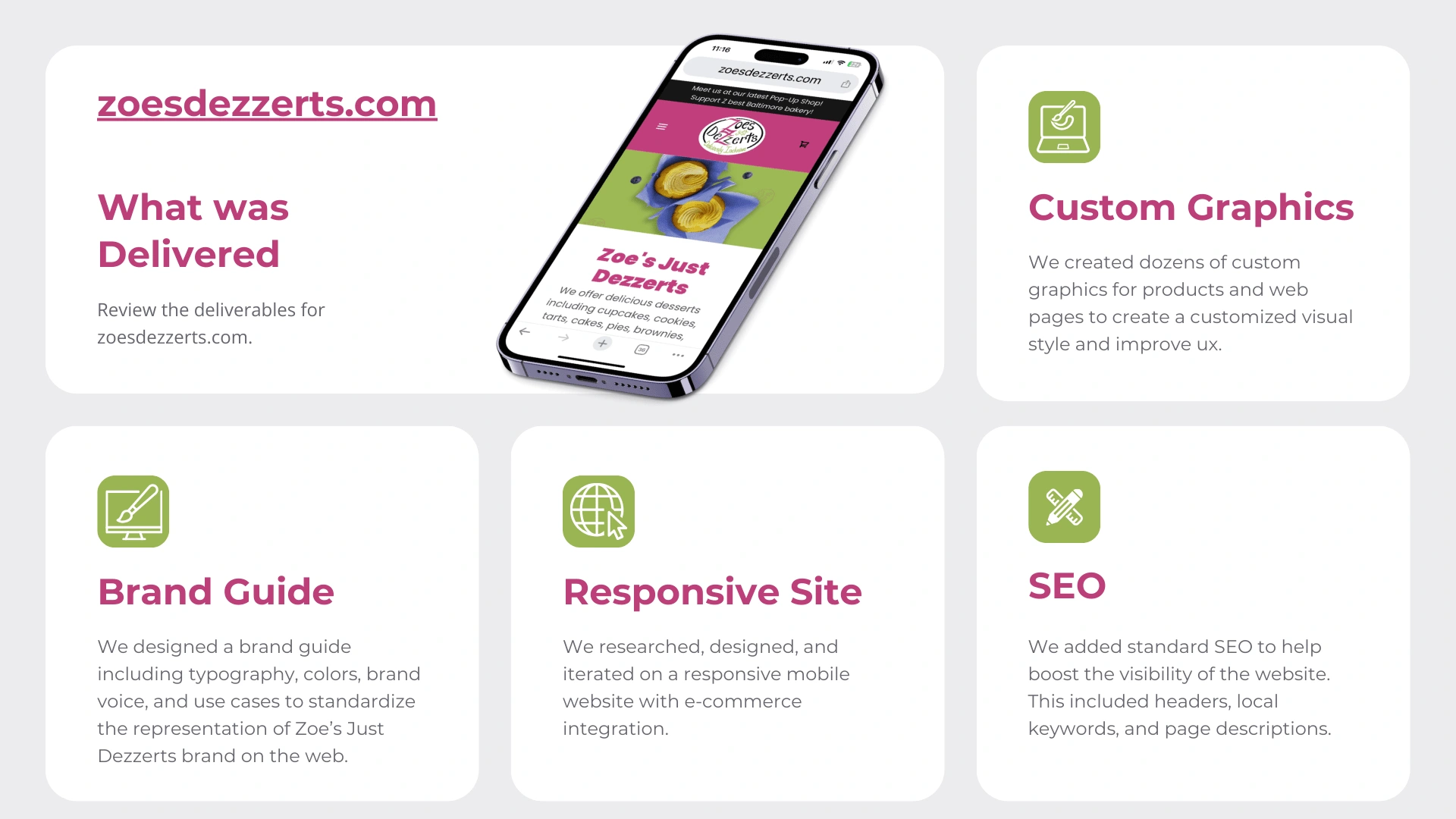
zoesdezzerts.com was the final website and is still occasionally updated as the needs of the bakery change.
See featured articles with the website here:
Initial Challenges
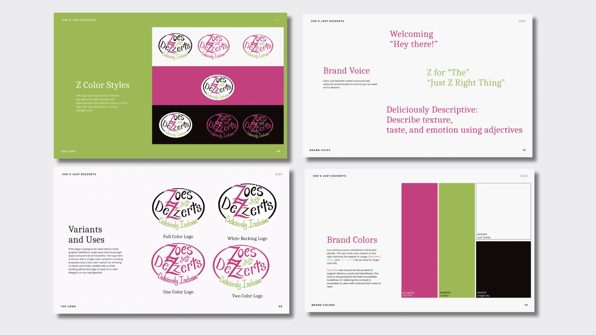
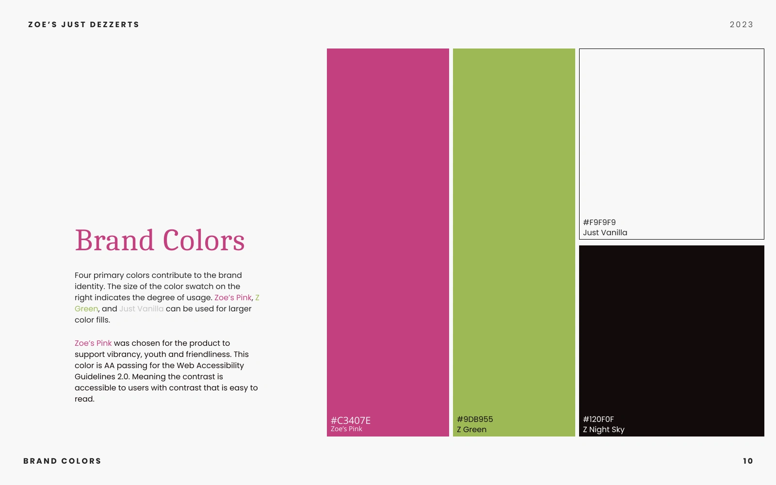
The bakery was in transition from pop-up shops to a renovated building. The website needed to account for communicating the story of the bakery to the users so they could grow familiar with the processes of placing orders and where to find updates. Zoe’s Just Dezzerts did have a logo but there was not an established brand guide that could be used for the user interface colors and fonts.
The Goal
Speaking with the owners of the bakery and understanding their needs indicated to me that they needed a website that was informational and flexible. The website needed to be up quickly and could be iterated on as time went on. Its primary goal was marketing and giving people an online place to get to know the brand as they released new information.
Live Website
Takeaways
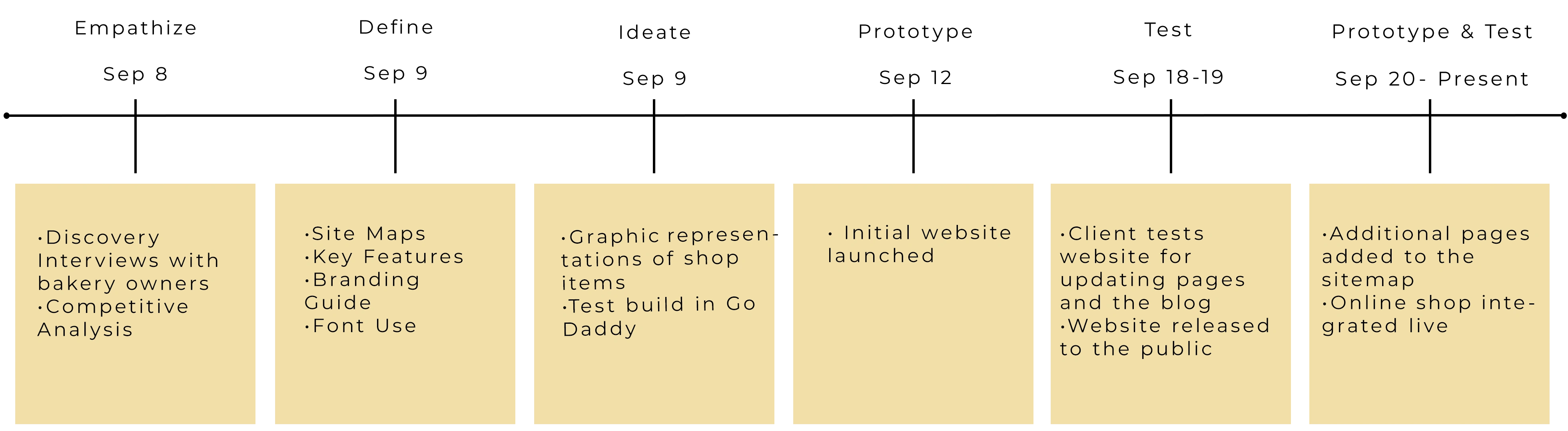
It took some time to establish the sitemap but the website owners wanted to prioritize a functional prototype over multiple initial iterations.
The initial font did not translate to the website because the font was not legible at smaller scales.
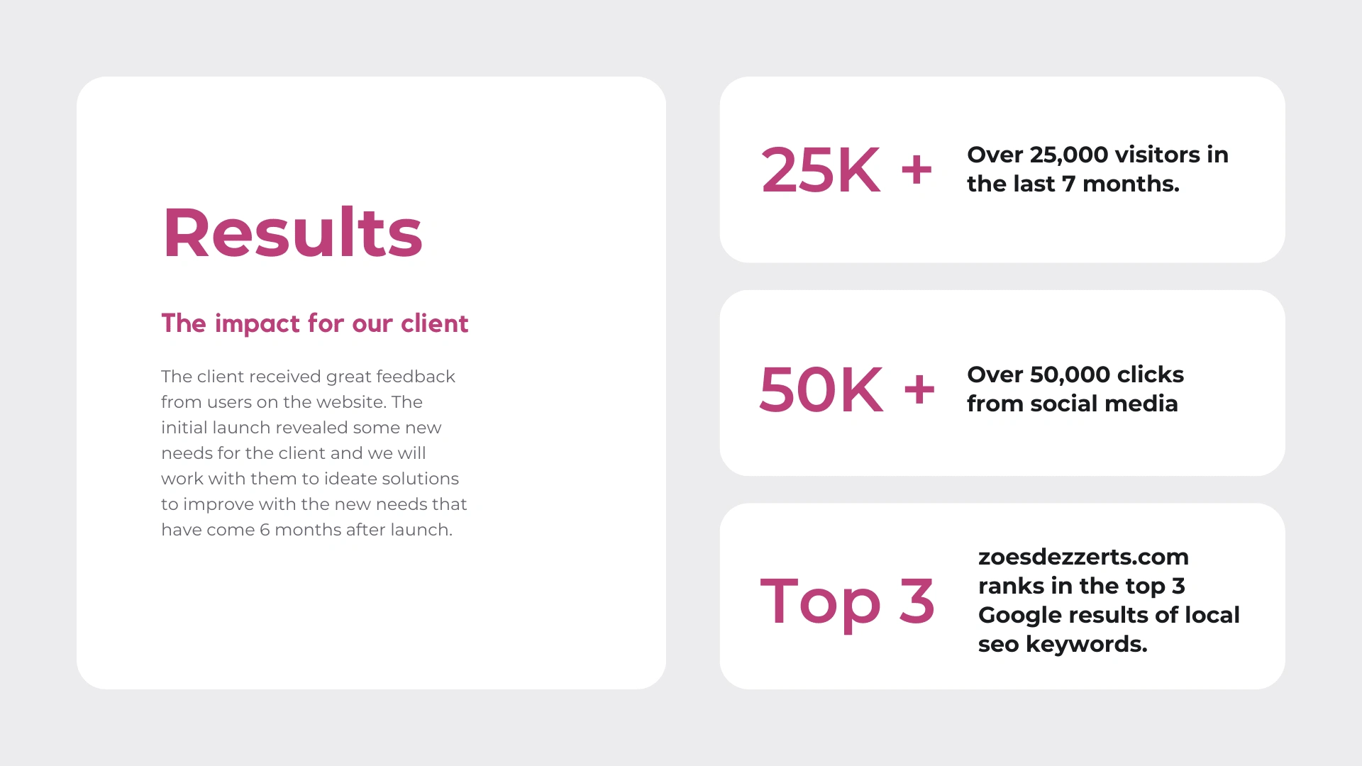
“I had so many people tell me they loved the website!”
Research
I sat with the owners of the bakery to fully understand their needs for the website. They would be the primary operators and would need to update and edit on a daily basis easily
They shared favorite websites and features on other bakery websites that were priorities to them
We identified that the website needed branding and also established the tone the website should take
They communicated future plans for an online shop and the need to have the functionality to grow with the bakery included
Live Website
Takeaways
It took some time to establish the sitemap but the website owners wanted to prioritize a functional prototype over multiple initial iterations.
The initial font did not translate to the website because the font was not legible at smaller scales.
“I had so many people tell me they loved the website!”
Research
I sat with the owners of the bakery to fully understand their needs for the website. They would be the primary operators and would need to update and edit on a daily basis easily
They shared favorite websites and features on other bakery websites that were priorities to them
We identified that the website needed branding and also established the tone the website should take
They communicated future plans for an online shop and the need to have the functionality to grow with the bakery included
Updates Post Published Website
These are the areas of improvement identified after the initial launch of the website.
Round 1
The initial font chosen as the header font was not versatile enough for the website when used as it was originally laid out in the brand guide. I shifted to the font Poppins due to its playful nature and readability at different font sizes.
Round 2
In collaboration with the owners of the bakery, I developed the online shop feature and we discussed the best way to set up shipping and delivery costs.
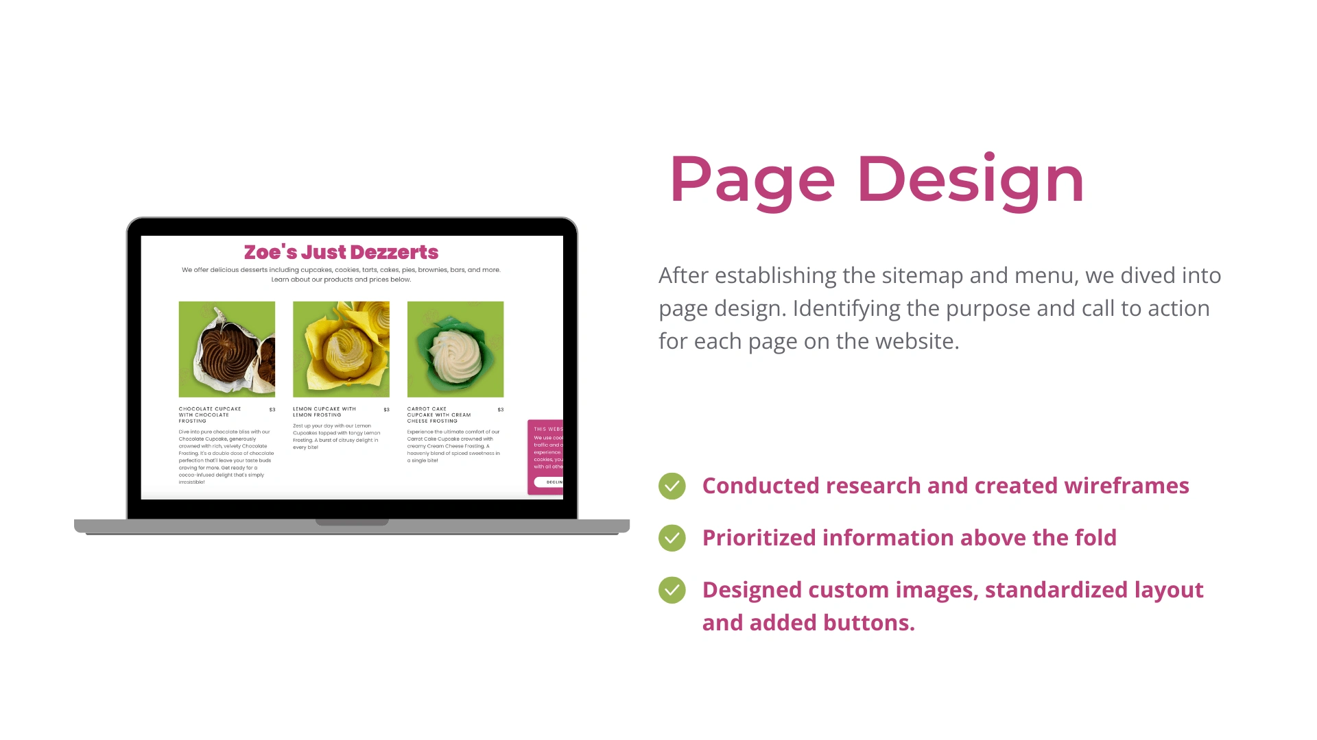
Page Design
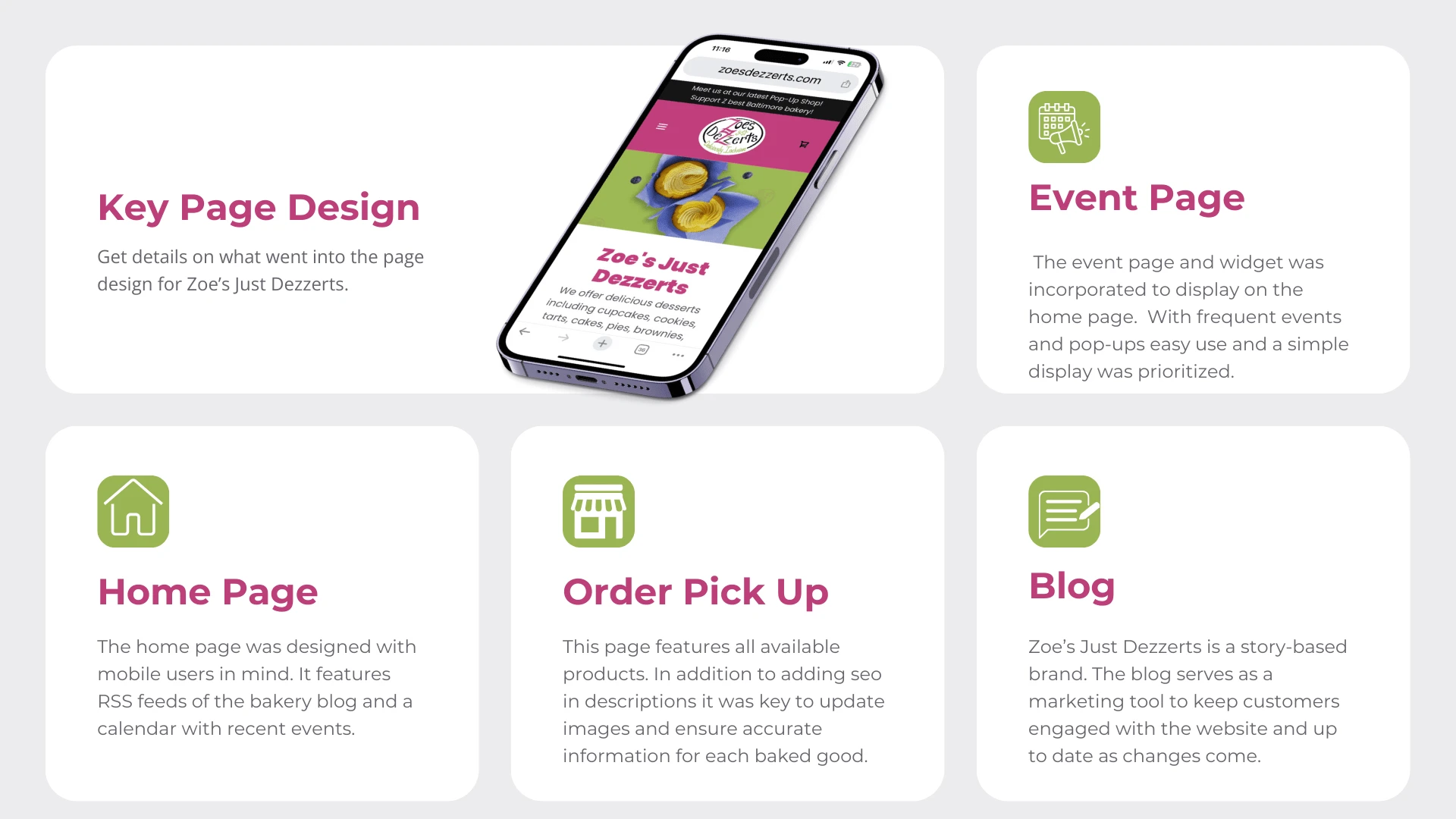
Home
The home page was designed with mobile users in mind. It features RSS feeds of the bakery blog and a calendar with recent events.
Dessert Detail Page
Since Zoe’s is currently in a pop-up shop it is important for users to know what is available and what the cost will be. This page features a menu with images and copy describing in detail each item.
Online Swag Shop
Users can shop on this page using the e-commerce shop set up for delivery of shirts and hats. Shipping is connected through a third-party vendor selected by the client.
The Pop Up Shops
The pop-up shop page is a simple hamburger-style feed with information on events in the order in which they will occur. The client needed this section to be flexible.
Contact Page
The contact page is designed for users to find a direct email and address for the upcoming bakery opening. It focuses on important information with a simple layout.
The Blog
To keep continuity and familiarity in the user flow the blog page uses a similar setup to the event page which is a hamburger-style menu with links to blog posts.
The Brand Guide
In the planning for this website, I identified the need for UI guidelines that could be integrated in print and online. Using the already-created logo and the feedback from the conversation with the owners I was able to create some initial guidelines for the website.
Moving Forward
This website is currently in the test phase as I continue to work with the bakery to identify areas of improvement or additional functionality based on changes in the business.
Like this project
Posted Nov 3, 2023
I developed a website and branding for a small bakery in Baltimore, MD.