Richter Park — Redesigning a Public Golf Destination
Matias Lucero
1 collaborator
Richter Park is a municipal golf course in Danbury, Connecticut — and it's been one of the region's best-kept secrets for decades.
The course is genuinely excellent. The brand never told that story.
When the Product Outgrows the Brand
The existing identity had aged past its usefulness. A dated logotype, inconsistent visual language across signage and digital, and no clear positioning — it read like a city park, not a destination course.
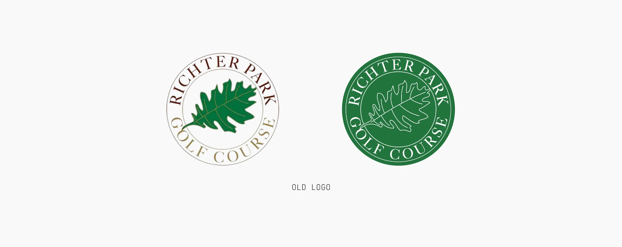
Before Redesign
More importantly, the brand wasn't speaking to anyone in particular. Not to the serious golfer who compares layouts and travels for a good round. Not to the Danbury family bringing their kid out for the first time. Not to city leadership evaluating long-term investment.
When a brand tries to speak to everyone without a clear point of view, it ends up resonating with no one.
The opportunity was clear: Richter Park had the product. It needed the identity to match.
Repositioning Richter Park
We started by defining what Richter Park actually stands for — not just visually, but strategically.
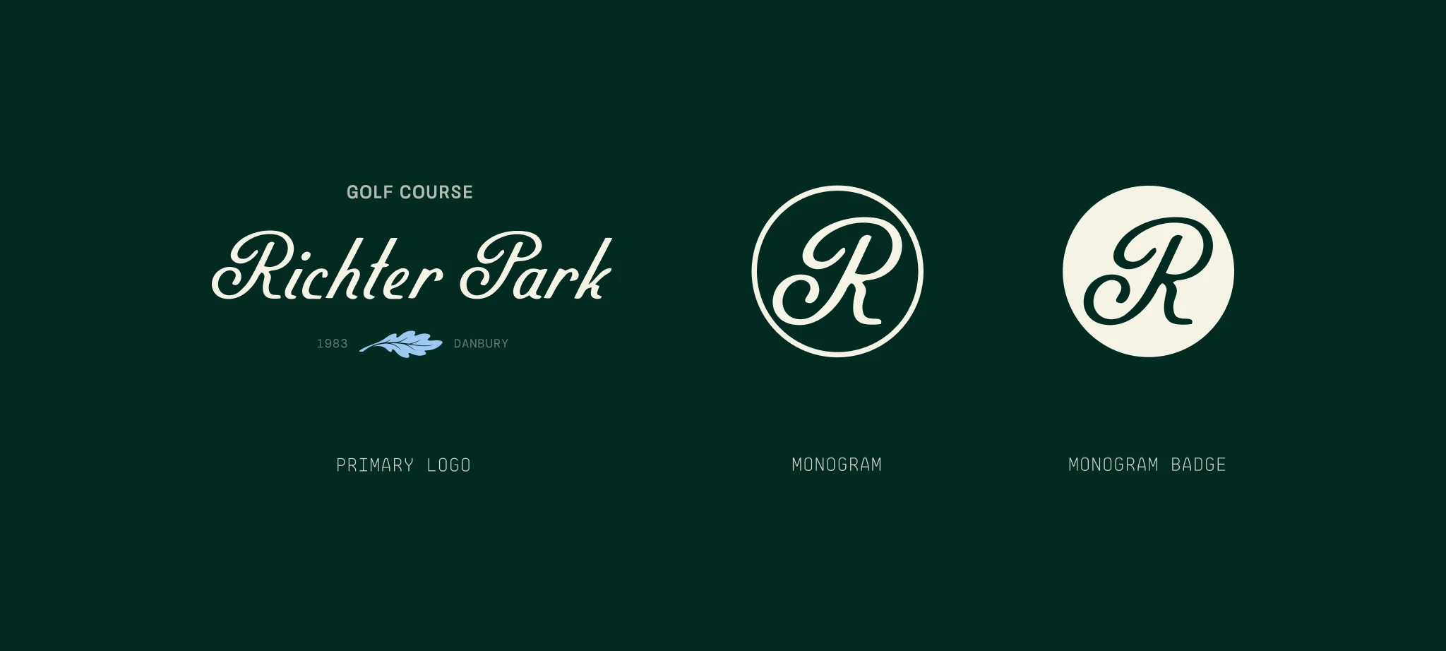
After Redesign
The positioning we landed on: Richter Park exists to make strategically excellent golf accessible to all, while responsibly stewarding the land for generations.
That single idea drove every design decision.
The brand needed to feel modern and confident without losing warmth. Expressive enough to stand out in a landscape of generic municipal marks and stiff private clubs. Grounded enough to carry real institutional weight.

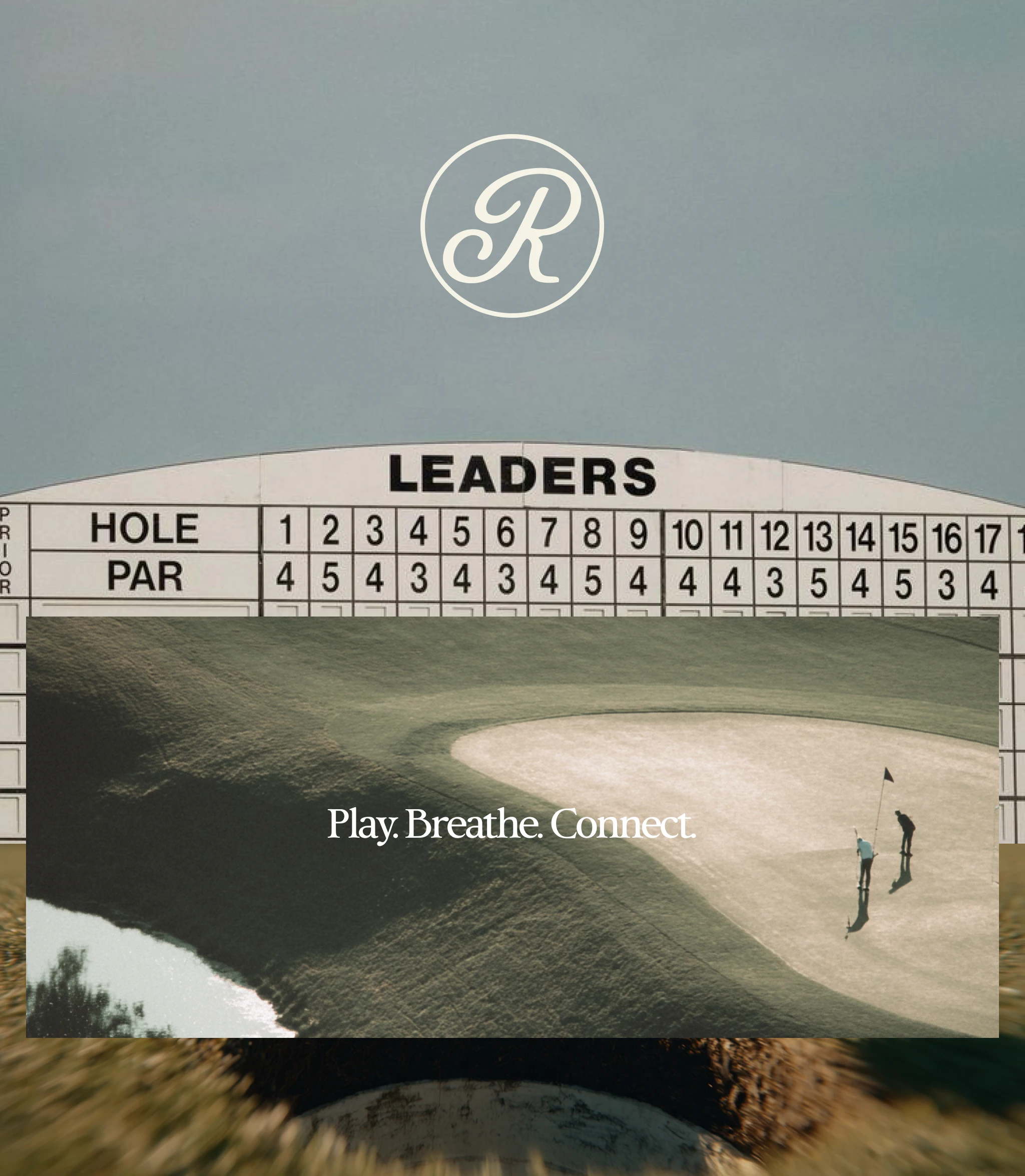
Imagery Direction
We positioned the identity in the open quadrant of the competitive landscape — modern and expressive — a space no local competitor is currently occupying. The redesign moves away from the dated crest-and-serif language common to the region and toward something that feels genuinely current, without being trendy.
The new identity centers on three values: Public Accessibility. Stewardship & Preservation. These became a filter for every design decision, from the mark to the signage hierarchy to the tone of the website copy.
Brand Expressions
The Visual System
The typographic system pairs a strong, characterful display face with a clean utilitarian partner — presence balanced by clarity. Authoritative without being stuffy. Readable across every surface from a scorecard to a billboard.
Confident, grounded, modern, accessible.
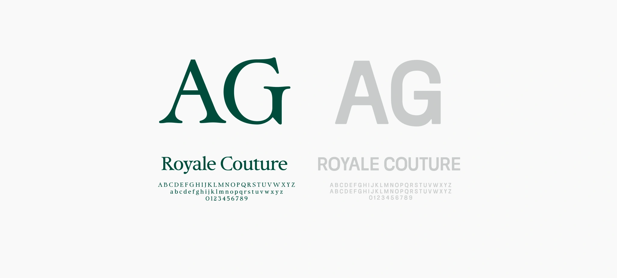
Fonts
The color palette draws from the land itself. Deep greens rooted in the course. Warm neutrals that echo the architecture and the Connecticut landscape across seasons. An accent that introduces energy without undermining the maturity of the system.
The graphic language takes cues from the course's topography — a mark system that can flex across physical and digital applications without losing coherence. No decorative flourish for its own sake. Every element earns its place.
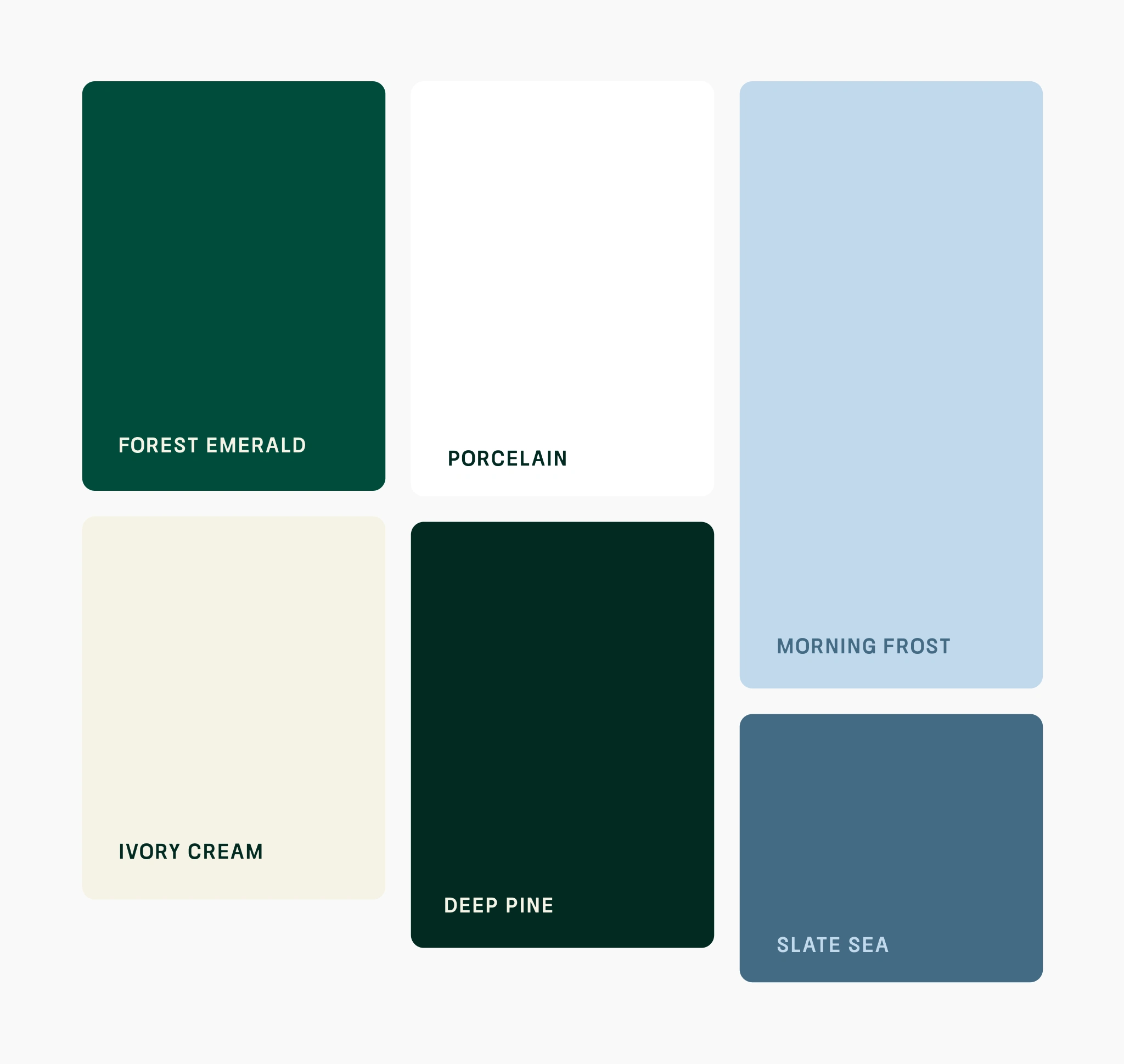
Color Palette
From the Course to the Clubhouse
The identity was built to work hard across every touchpoint — from the first impression on the web to the last thing a golfer sees walking off 18.
Signage was a priority. A course with real architectural character deserves wayfinding that respects it. The new system brings consistency and clarity while feeling native to the environment.
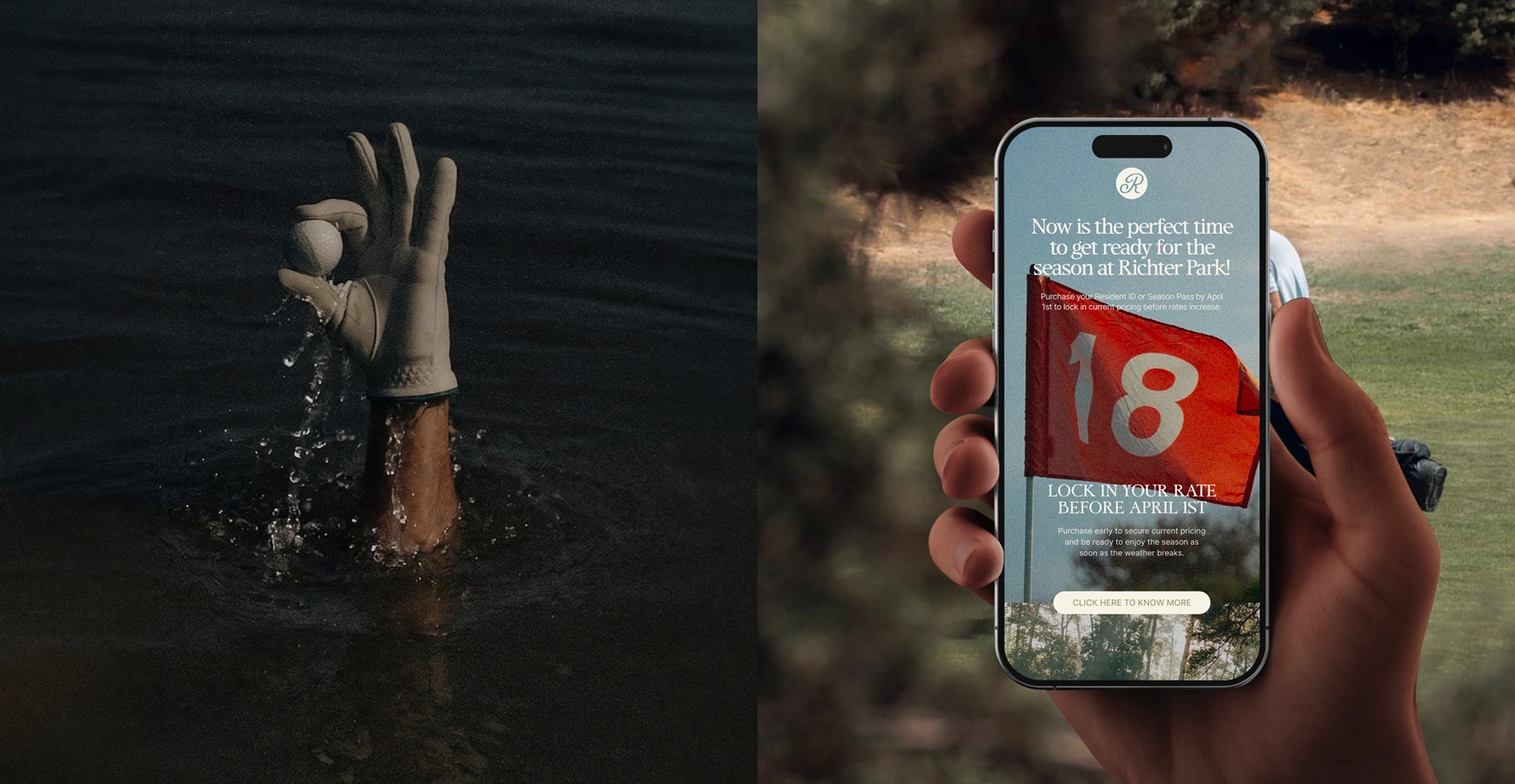
Newsletters
Hats and merchandise needed to hold up as standalone objects — things people actually want to wear off the course. The mark works at small scale and carries the same confidence at full size.
Business cards and print materials bring the professional standard up to match the course's actual quality. First impressions matter when you're courting event partners, city stakeholders, and serious players.
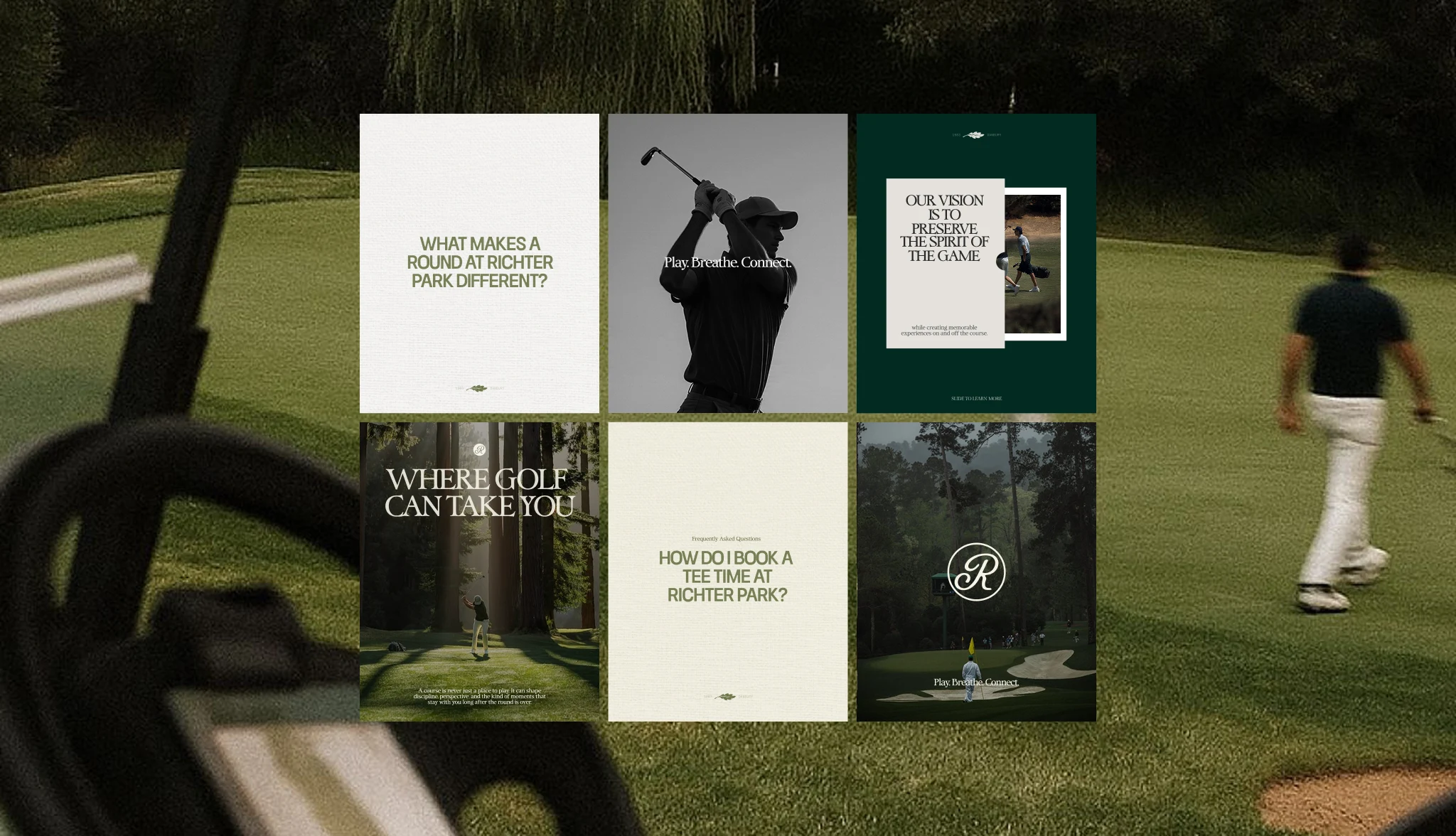
Social Media Content Creation
The website & social media content anchors the digital presence — built to communicate excellence and accessibility in equal measure. Clear course information, smart hierarchy, and a visual language that finally does justice to what Richter Park actually is.
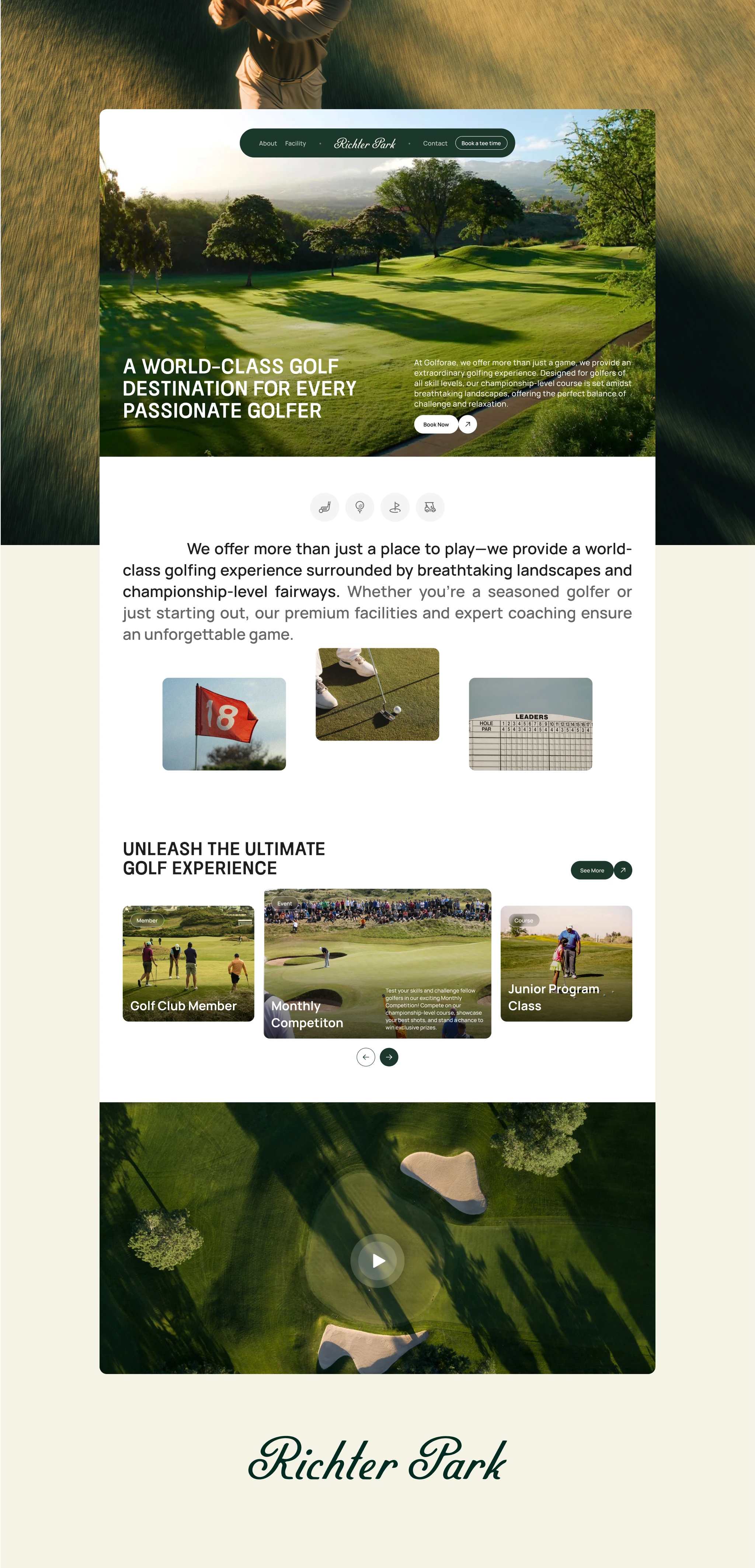
Website
This is a self-initiated concept project and is not affiliated with Richter Park.
Like this project
Posted Apr 15, 2026
A full brand redesign for Danbury's public golf course, repositioning it as a premier destination without losing its soul.
Likes
3
Views
37
Timeline
Mar 2, 2026 - Mar 23, 2026
Collaborators