
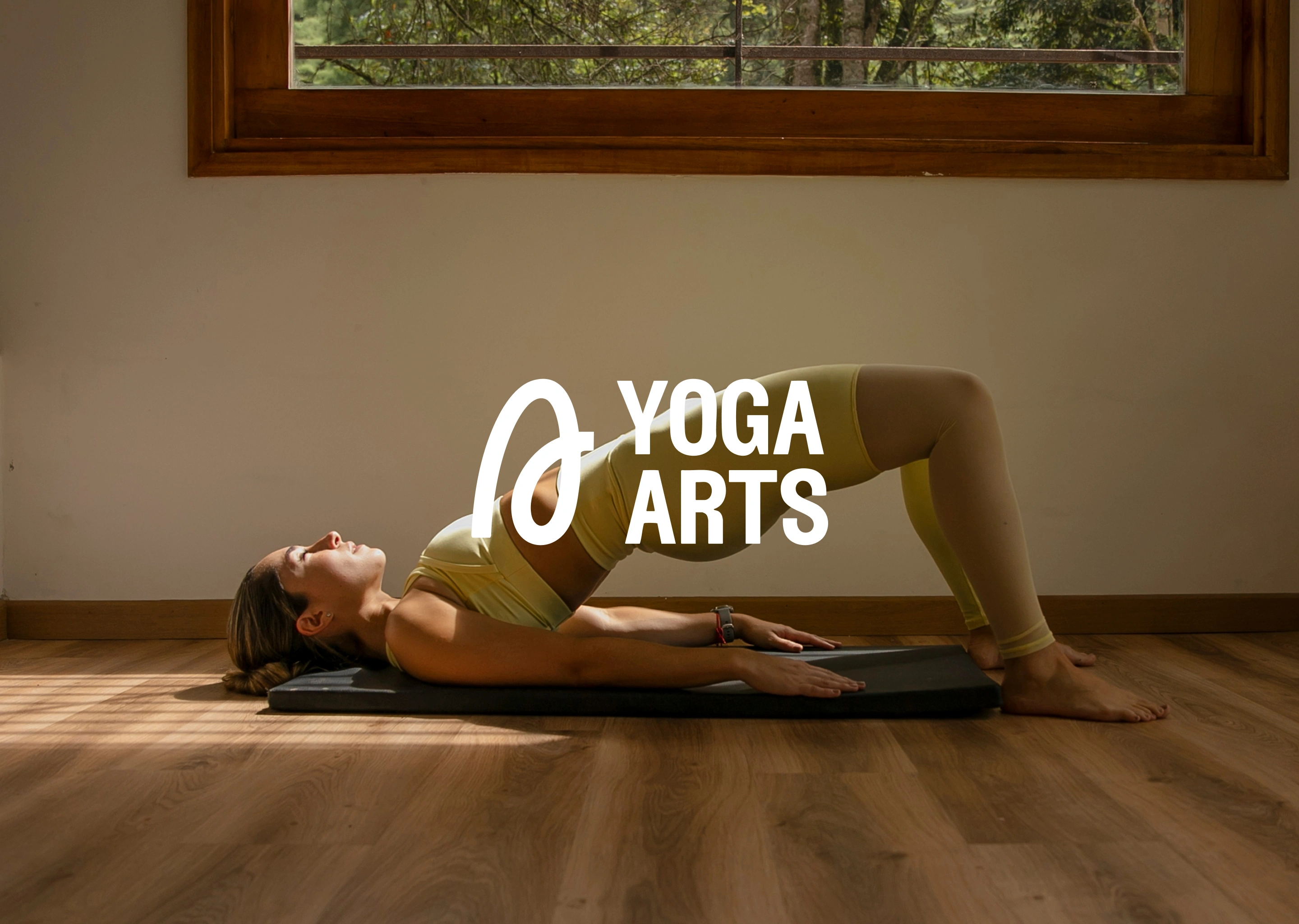
Intro
Our approach for Yoga Arts centers on people who are looking for more than just flexibility. They're after focus, clarity, and physical recovery through yoga. While the brand is primarily aimed at women, the visual language is designed to feel inclusive and welcoming to anyone who wants to perform better, recover faster, or feel more grounded.
The tone is clear and elevated, speaking to people who are driven but also open to growth and self-awareness.
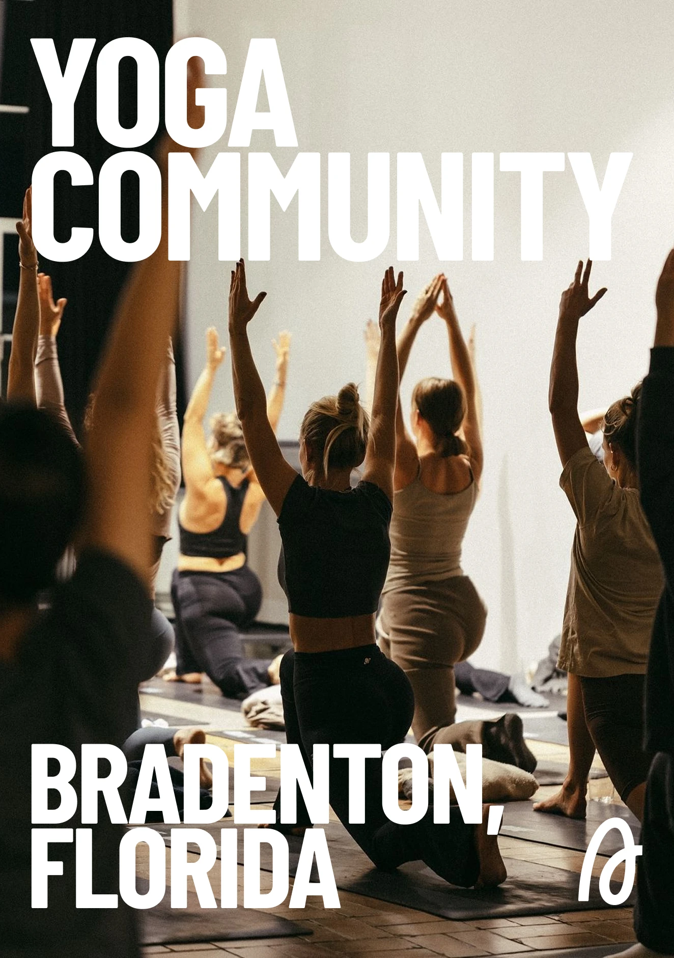
Promotional Banner
Colors
This palette evokes a sense of grounded energy and mindful focus. Earthy neutrals and oceanic blues create a soft yet strong aesthetic that feels approachable, mature, and calm. It’s designed to feel like a personal oasis—balanced and stable, but never boring.
The tone is clear and elevated, speaking to people who are driven but also open to growth and self-awareness.
Key Concepts
Grounded, restorative, modern, inclusive.
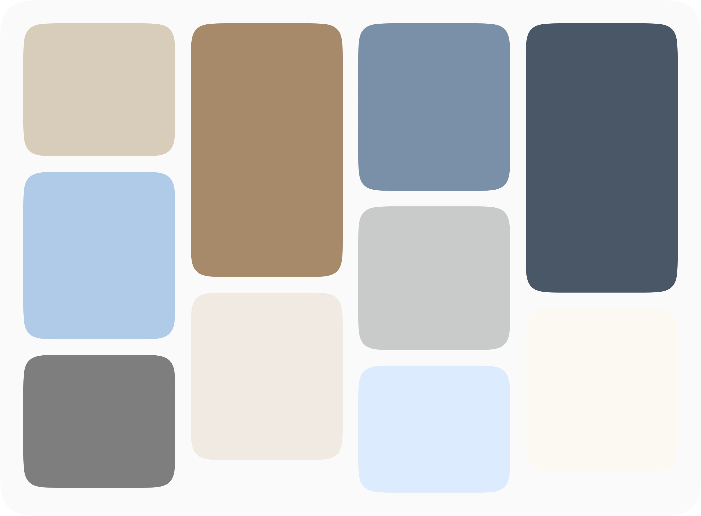
Color Palette
Typography
We focused on clean sans serif fonts—rounded, minimal, and modern. These typefaces support a fresh and inclusive identity, one that feels friendly and effortless without sacrificing clarity. There’s a natural softness in the forms, echoing breath, rhythm, and ease of movement.
Key Concepts
Soft, modern, minimal, inclusive.
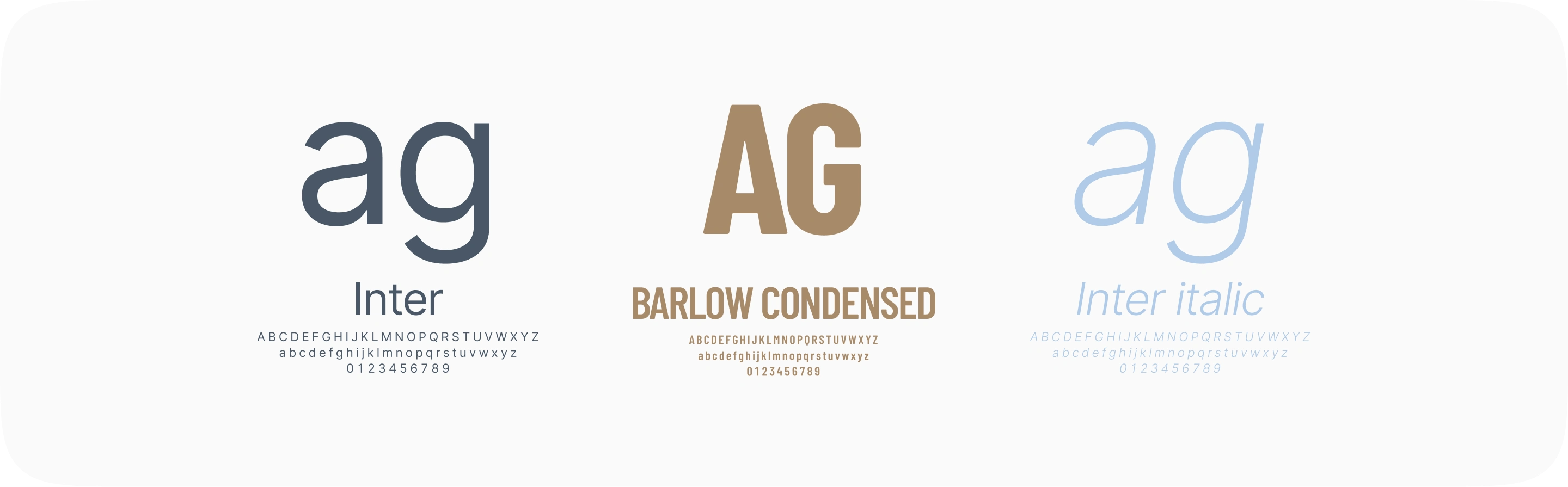
Typography - License Pending
Imagery
Real people in movement—individuals and groups in yoga sessions, exploring strength, flexibility, and mindfulness. The imagery feels grounded, approachable, and inspiring, highlighting how Yoga Arts supports not only performance but also personal growth and community.
Key Concepts
Progress, connection, presence, support.
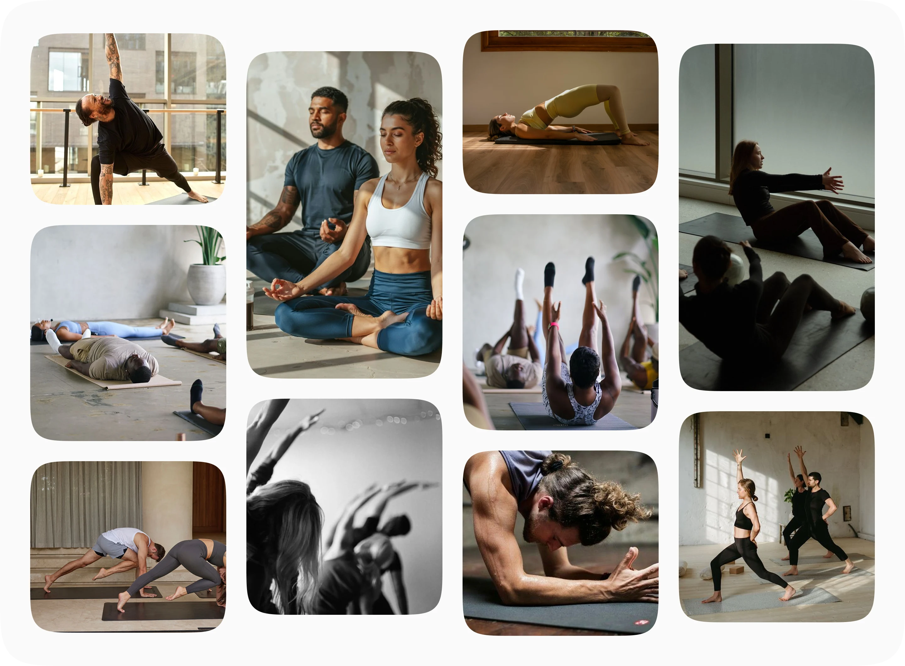
Photography - License Pending
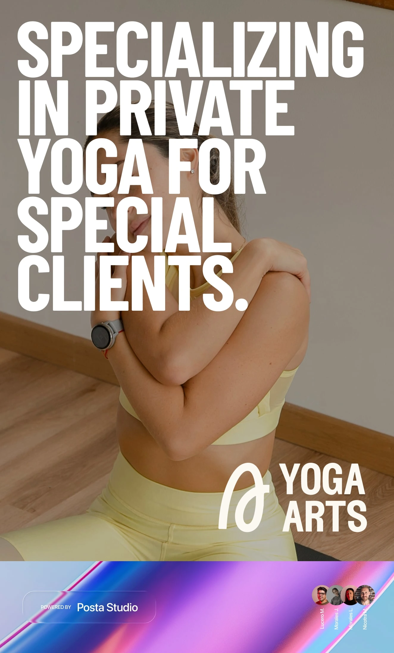
Promotional Banner
THANK YOU.
13 likes · 199 views · Aug 5, 2025
Designed a calming and empowering visual identity for Yoga Arts, a yoga space centered on recovery, focus, and growth.
Timeline
Jul 7, 2025 - Jul 28, 2025
Tags


Collaborators
