Pulse Jobs
Pulse Jobs is a leading recruitment platform for medical professionals who needed a website that simplified the end-to-end experience.
(Project undertaken while Head of Creative at Zeal Media Ltd.)
Goal
To re-architect and design the end-to-end experience for candidates applying for jobs with Pulse.

Homepage
Process
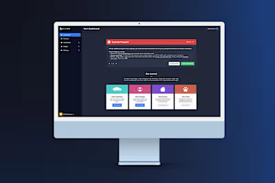
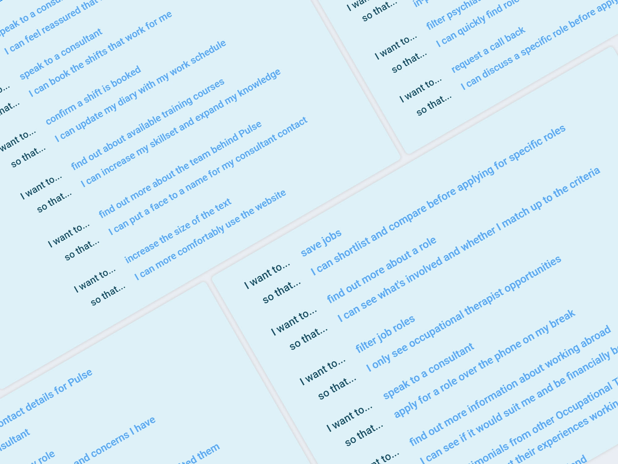
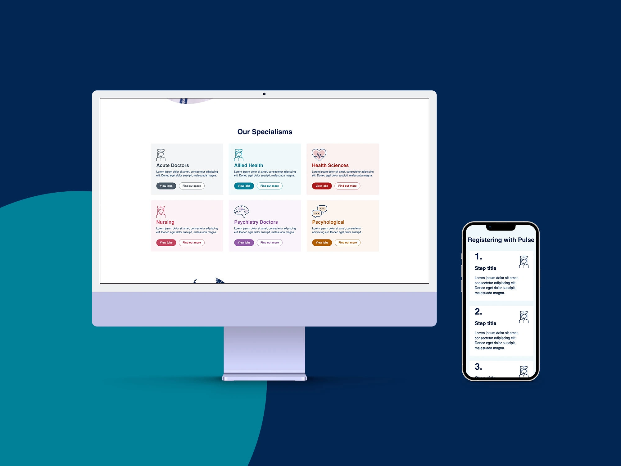
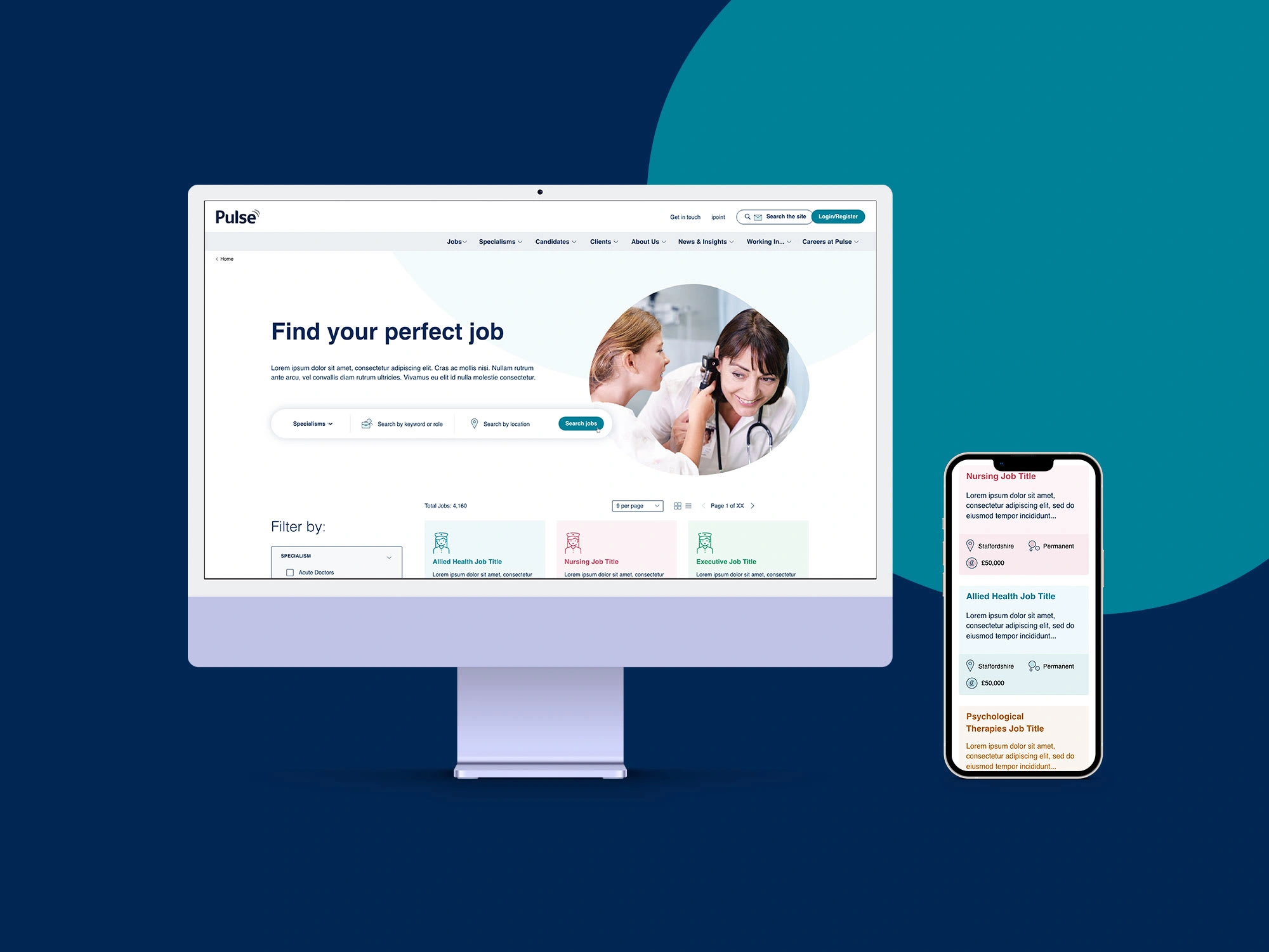
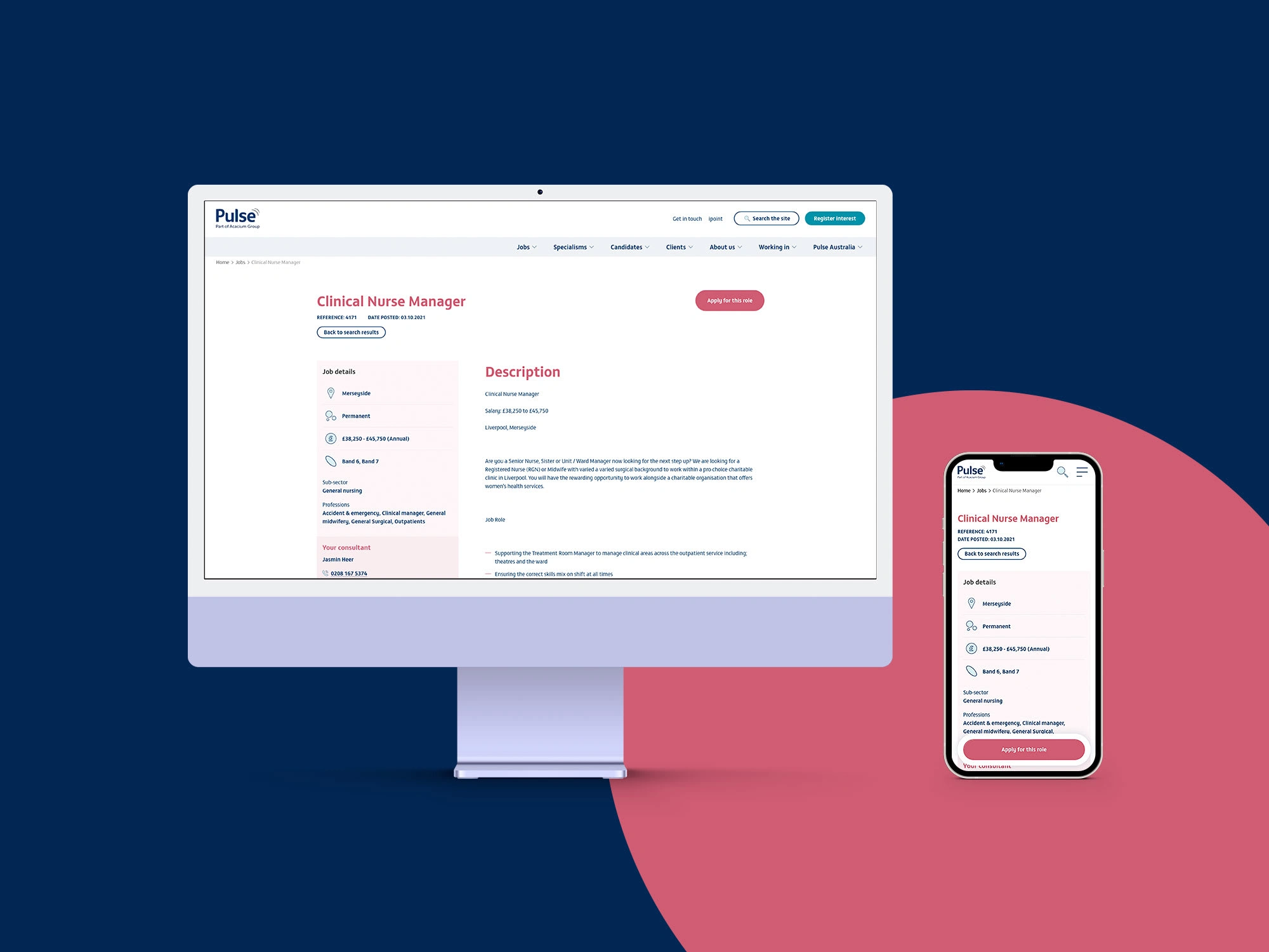
Undergoing extensive user personas, journeys, and flows we re-architected the platform including over 100 core pages to increase efficiency and speed at which candidates can register and apply for roles. The UI leans into the clinical nature of the services while adding friendly touches to reference the level of service offered. The key area of focus was how to differentiate the various specialties within Pulse, and so a colour range was developed that would allow for the differentiation of specific sectors across the interface, improving the legibility of content at a glance.
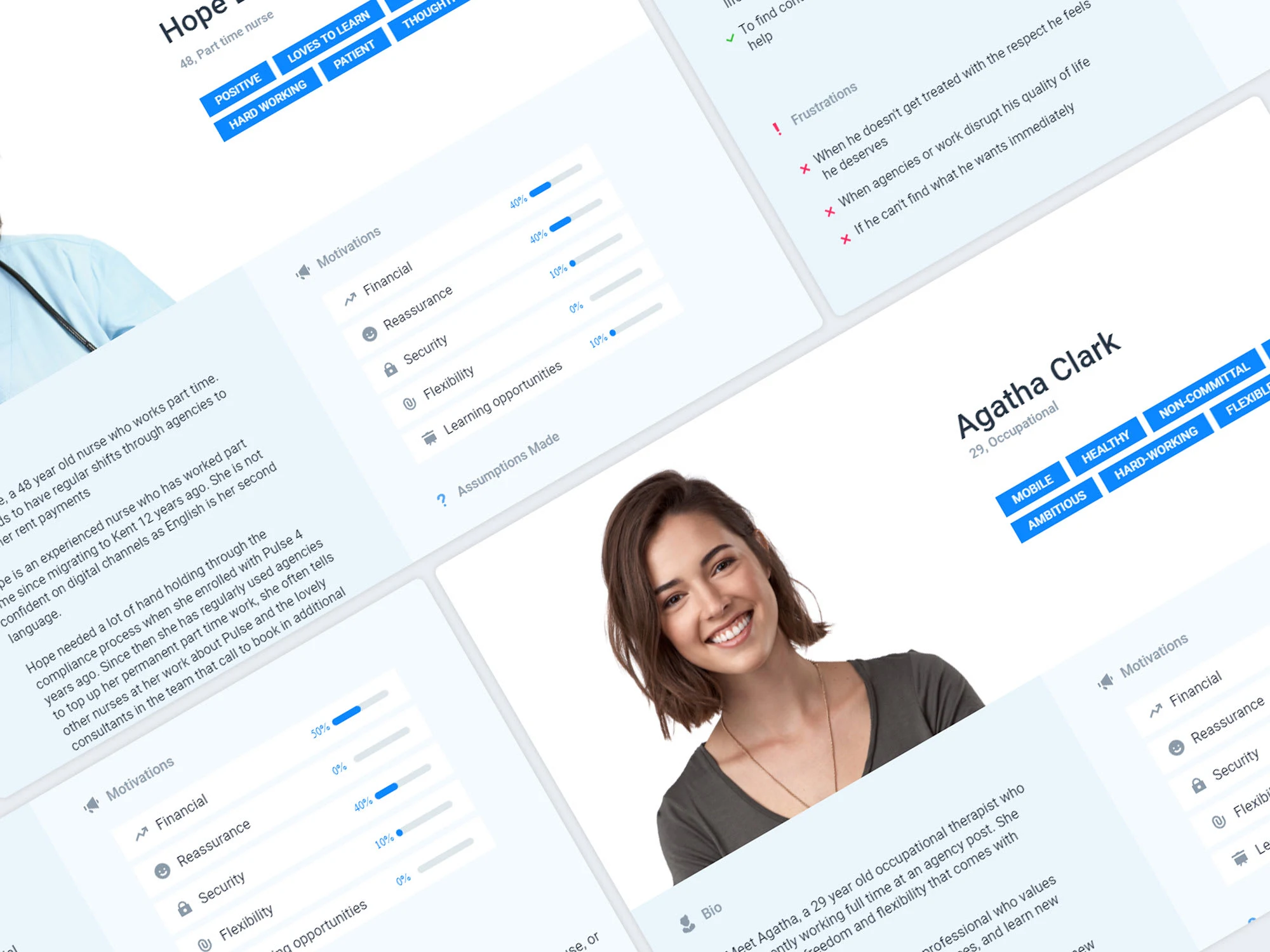
Personas
User Journeys
Like this project
Posted Oct 8, 2021
Likes
0
Views
14


