Conekta—Online Payments Startup
Conekta, a pioneering online payments startup in the Latin America market.
Conekta's portfolio includes some of the largest operating companies, ranging from global businesses to fast-paced startups that transact through its robust platform.
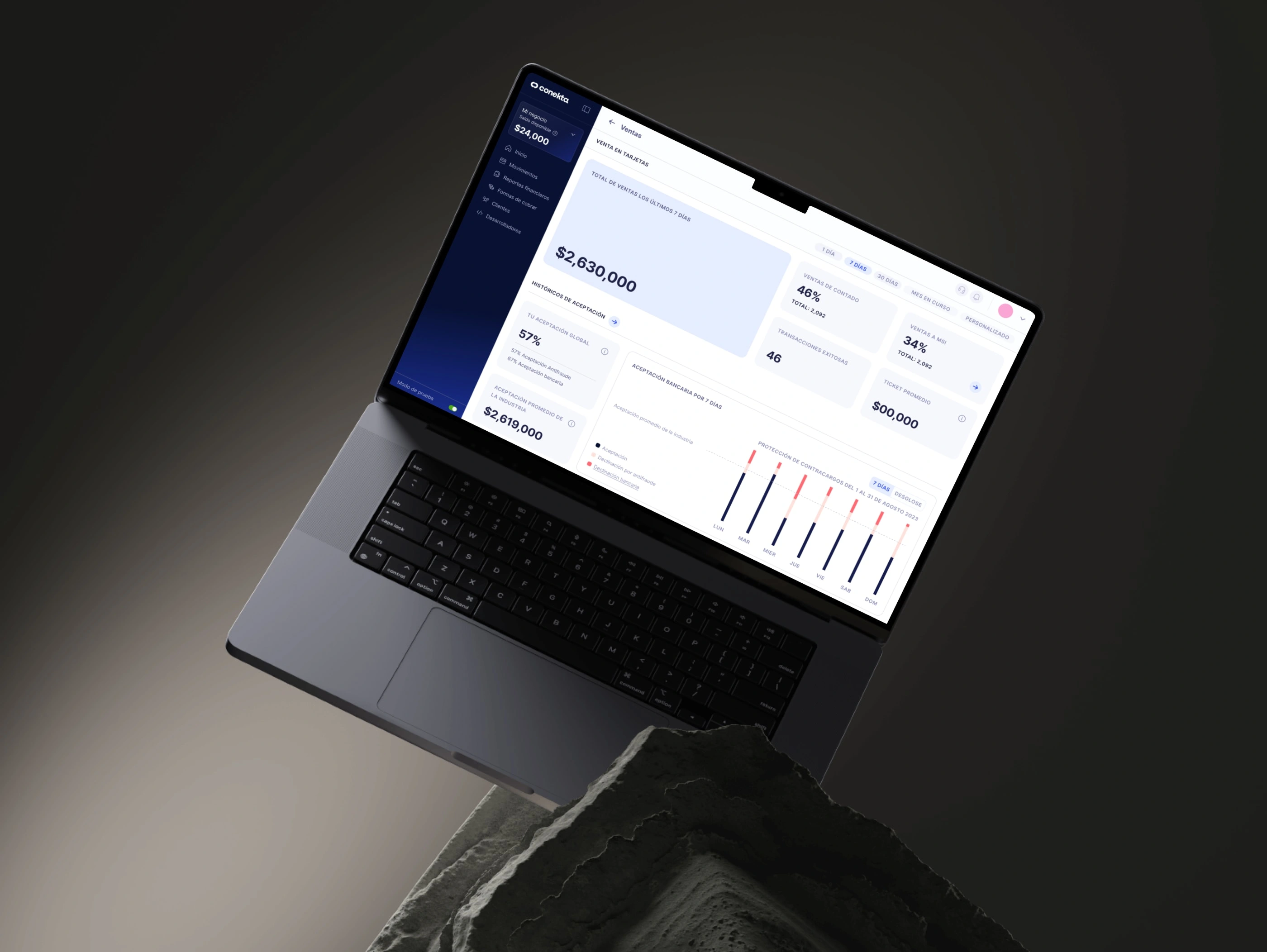
The first challenge, was to rebuild design trust within the company, as transversal relationships had deteriorated following unsuccessful launches and chaotic design dynamics.
I addressed this by rebuilding the team with correct profile fit, simplifying our way of work, improving cross-functional communication, and defining clear roles and responsibilities.
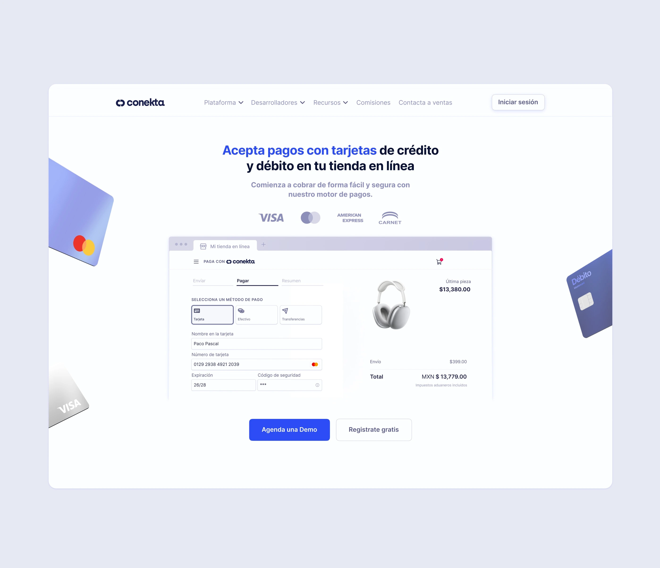
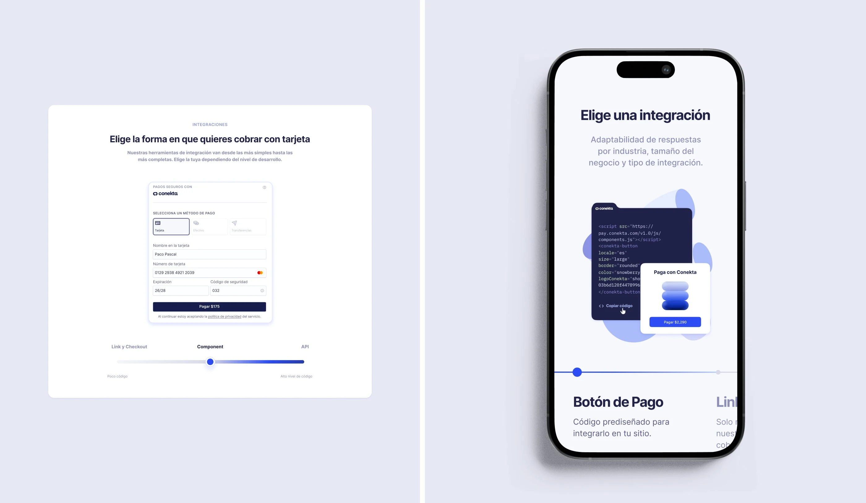
Also, by establishing a new brand framework, implementing design-ops infrastructure, and creating a mature yet simple design system (appropriate for our scale), we successfully revamped the entire visual language and product rollout.
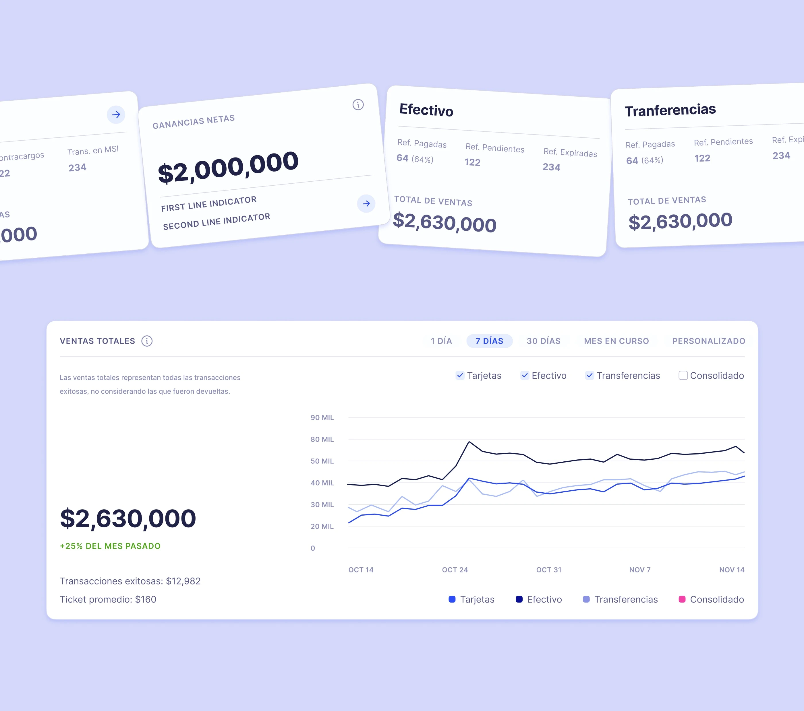
Among our initial successes was the implementation of scalable UI components that could be used across all our products. Conekta boasts a complex ecosystem that includes consumer interfaces, internal tools, technical documentation, and B2B enterprise dashboards.
The use of design tokens simplified the design implementation process. This not only increased our visual consistency but also accelerated our time to market.
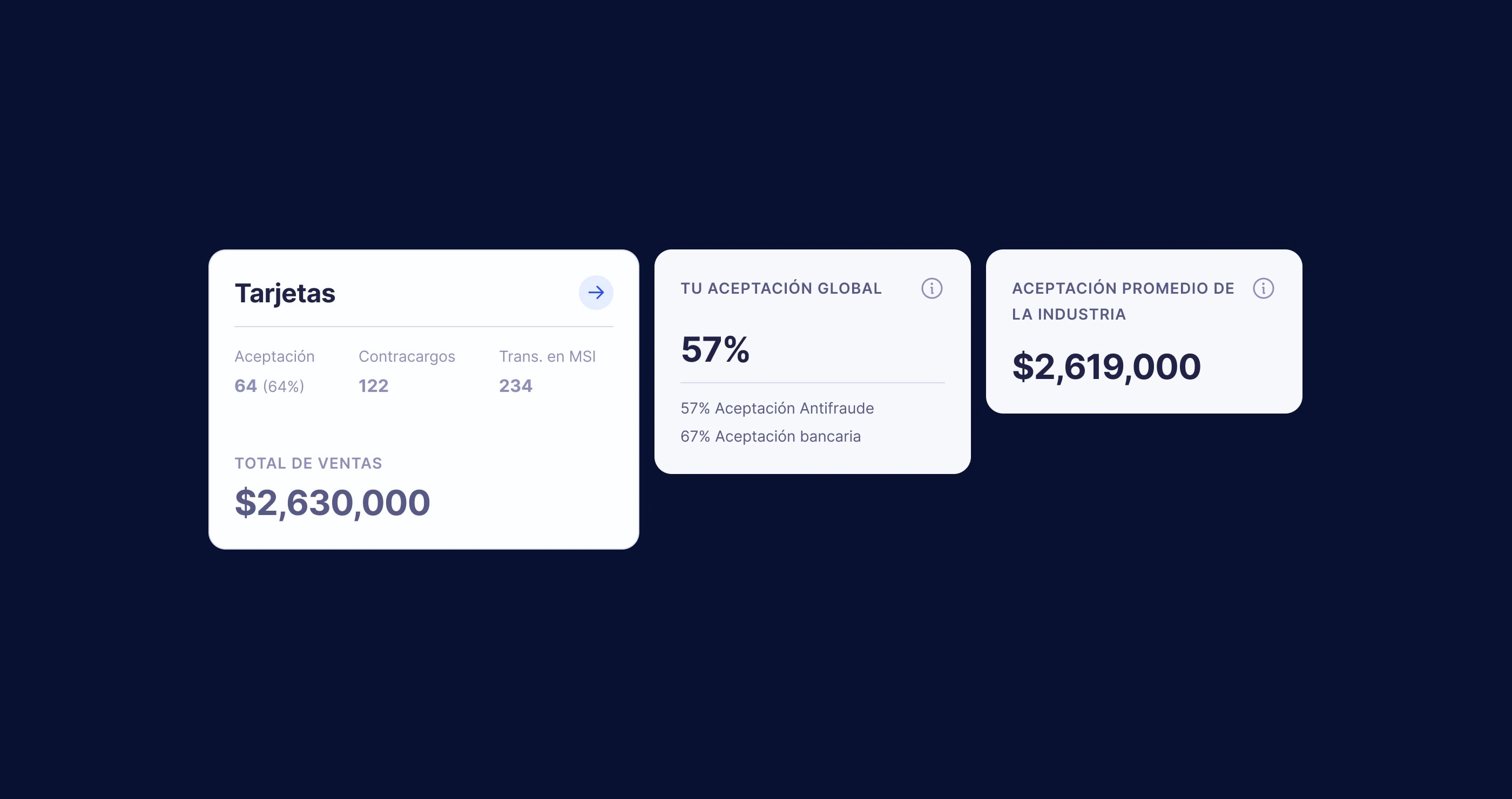
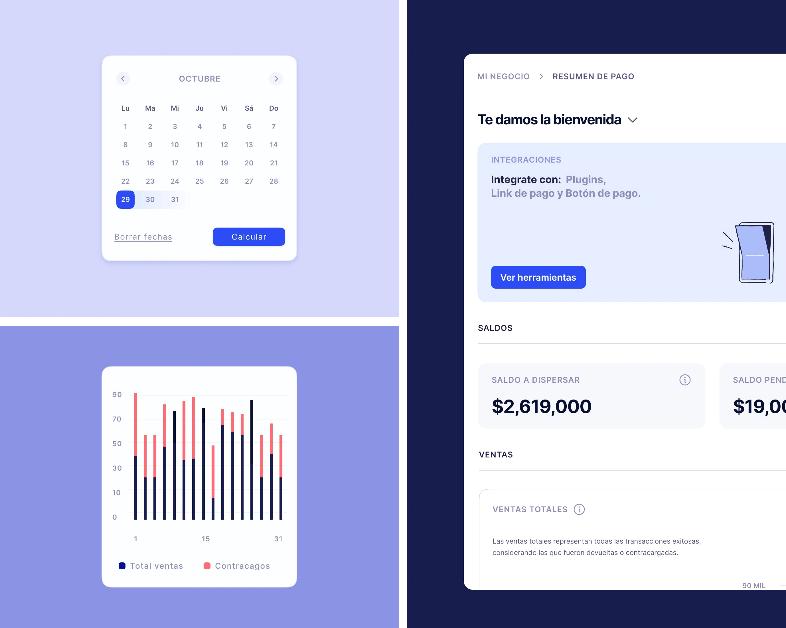
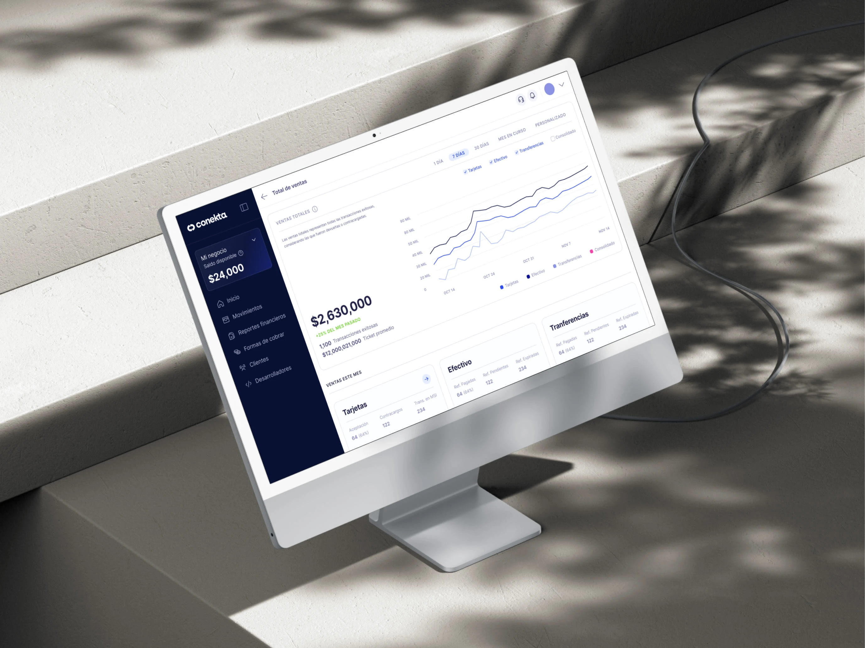
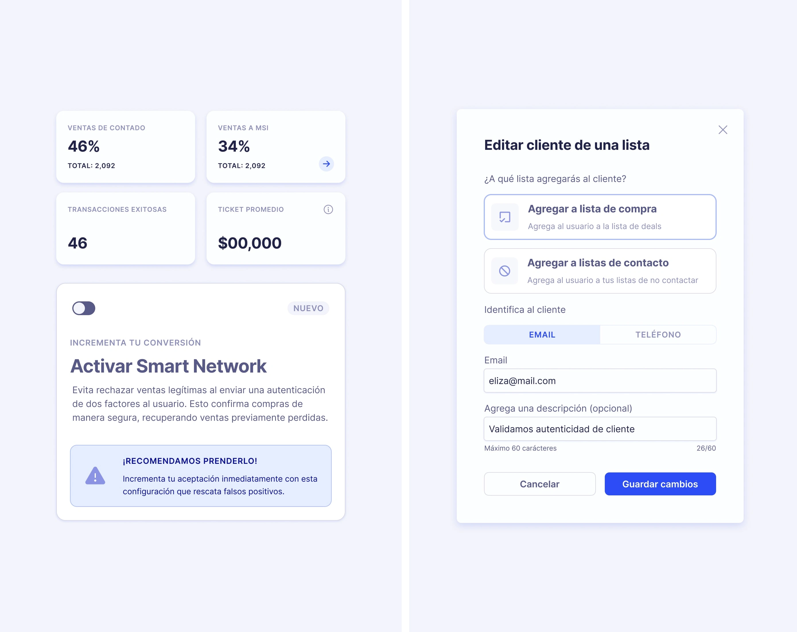
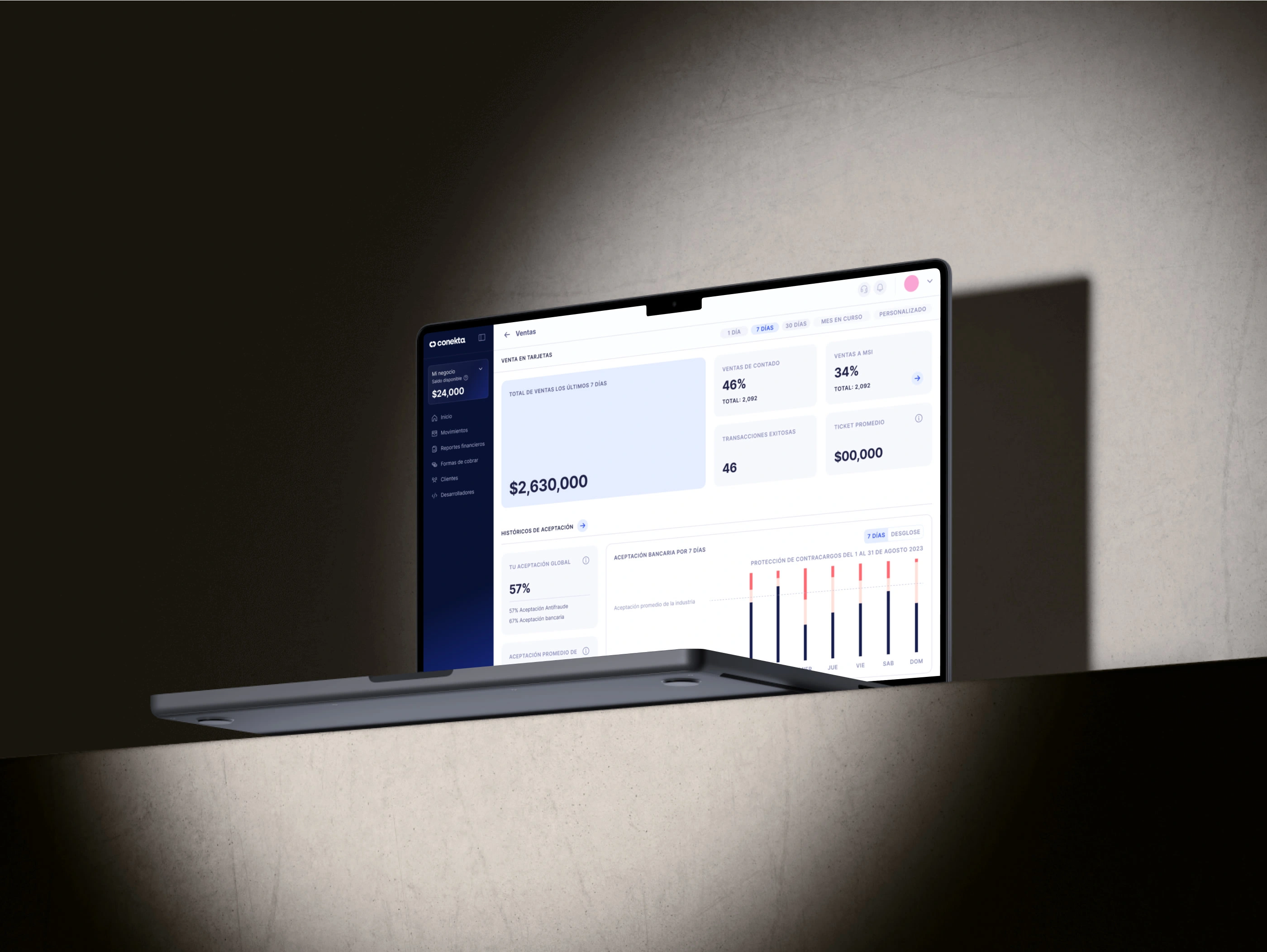
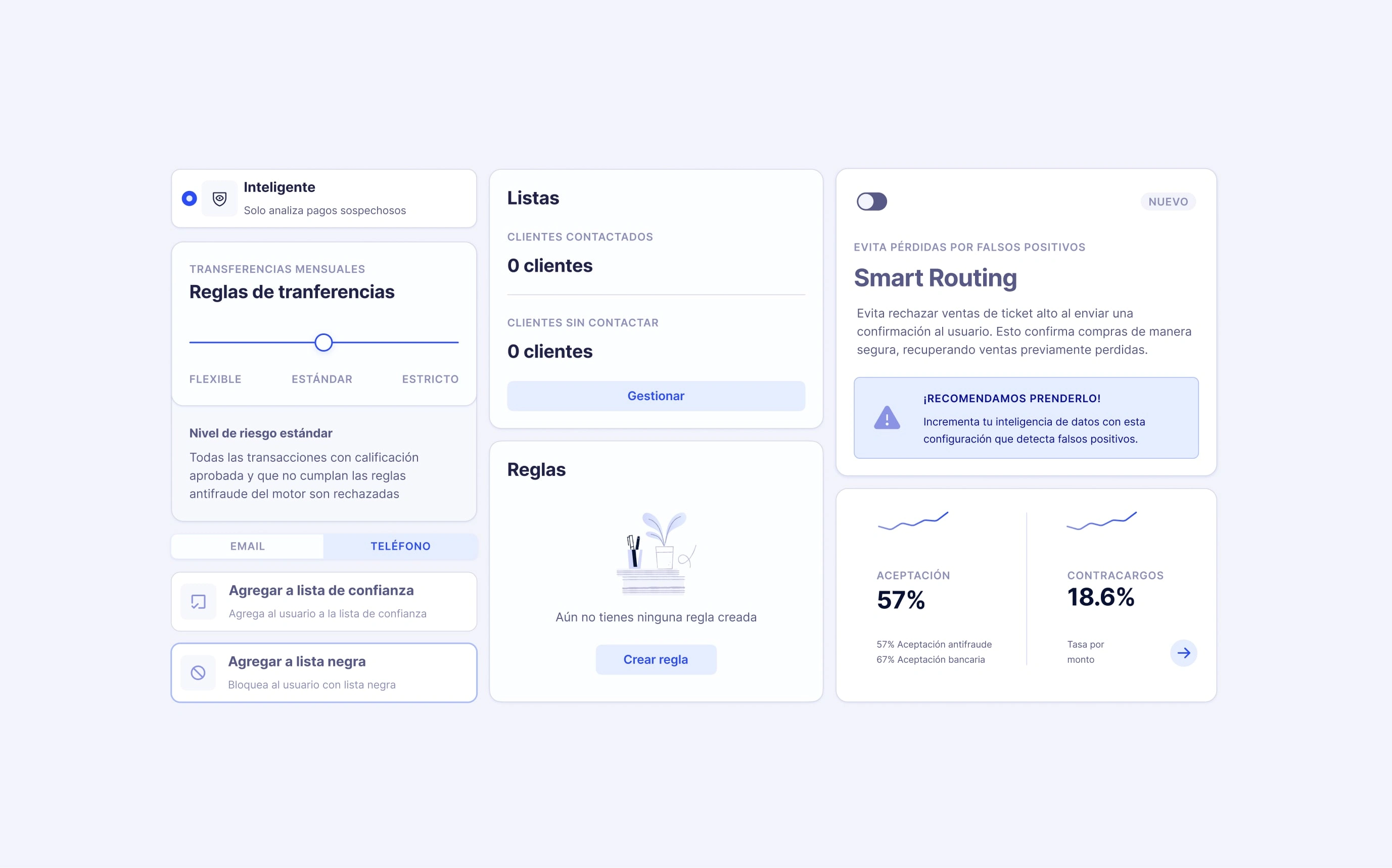
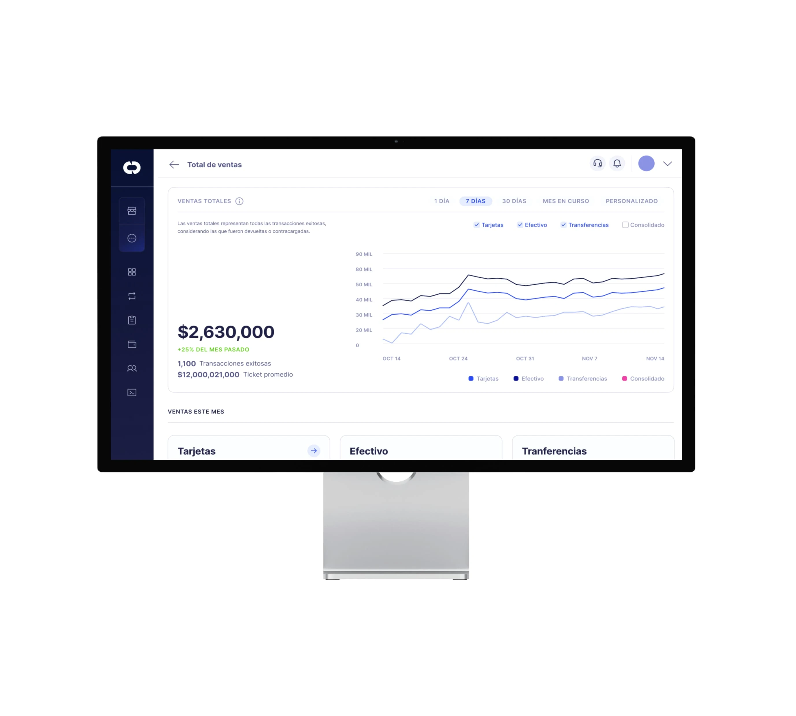
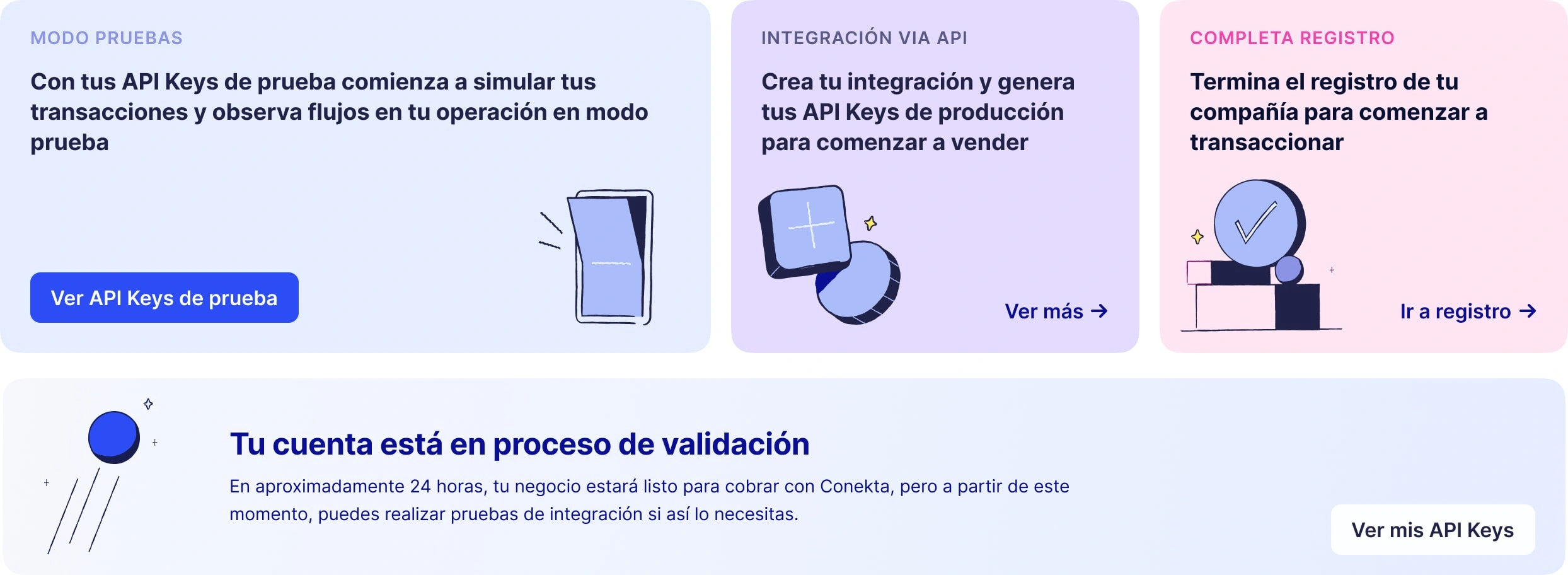
I developed a color system that emphasizes accessibility, accurate color interaction, and contrast. Its flexibility and scalability have been successfully applied to brand assets, illustrations, and semantic messaging in our interfaces.
This system maintains recognizability and our core identity, while providing enough depth for use across all our product touch-points.
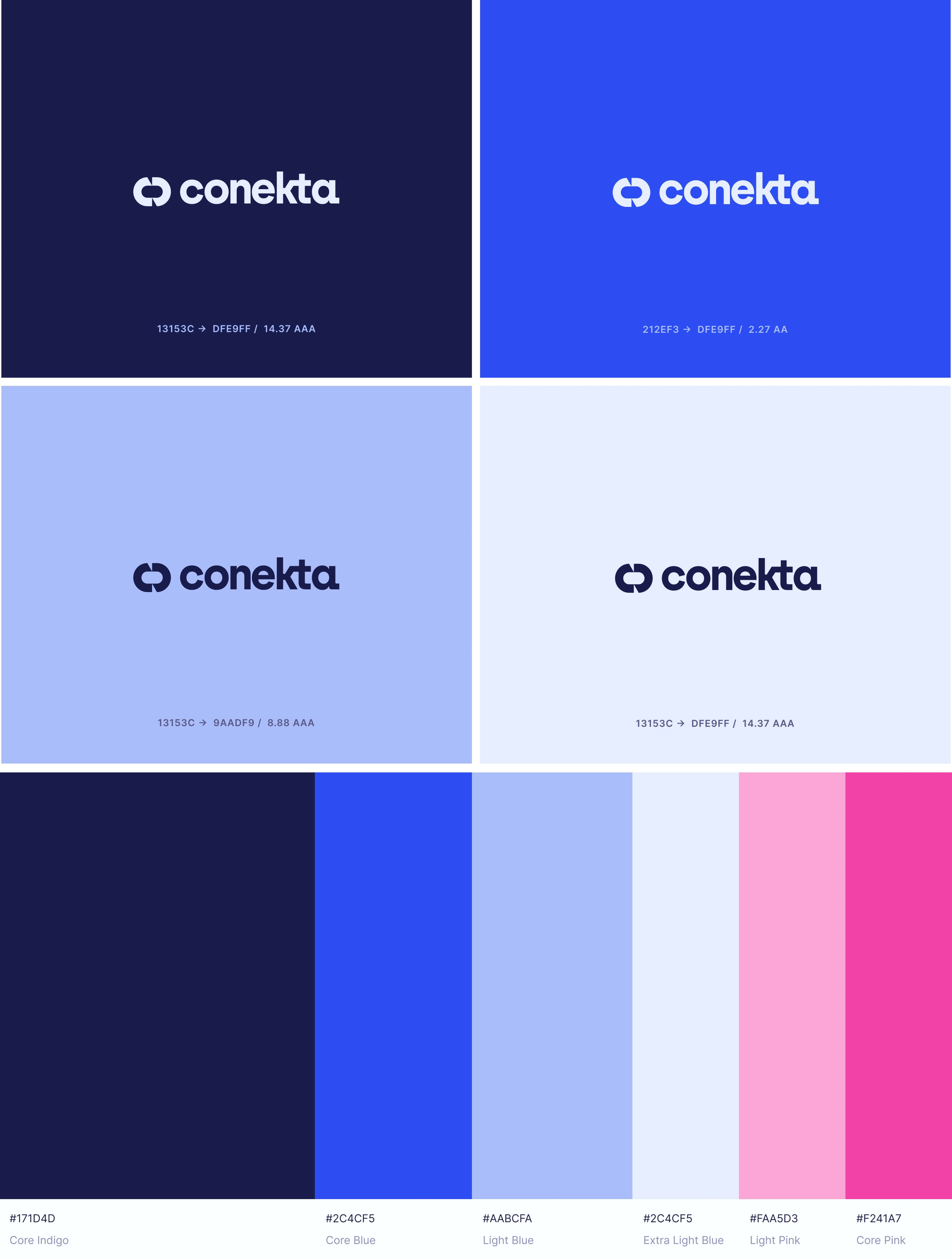

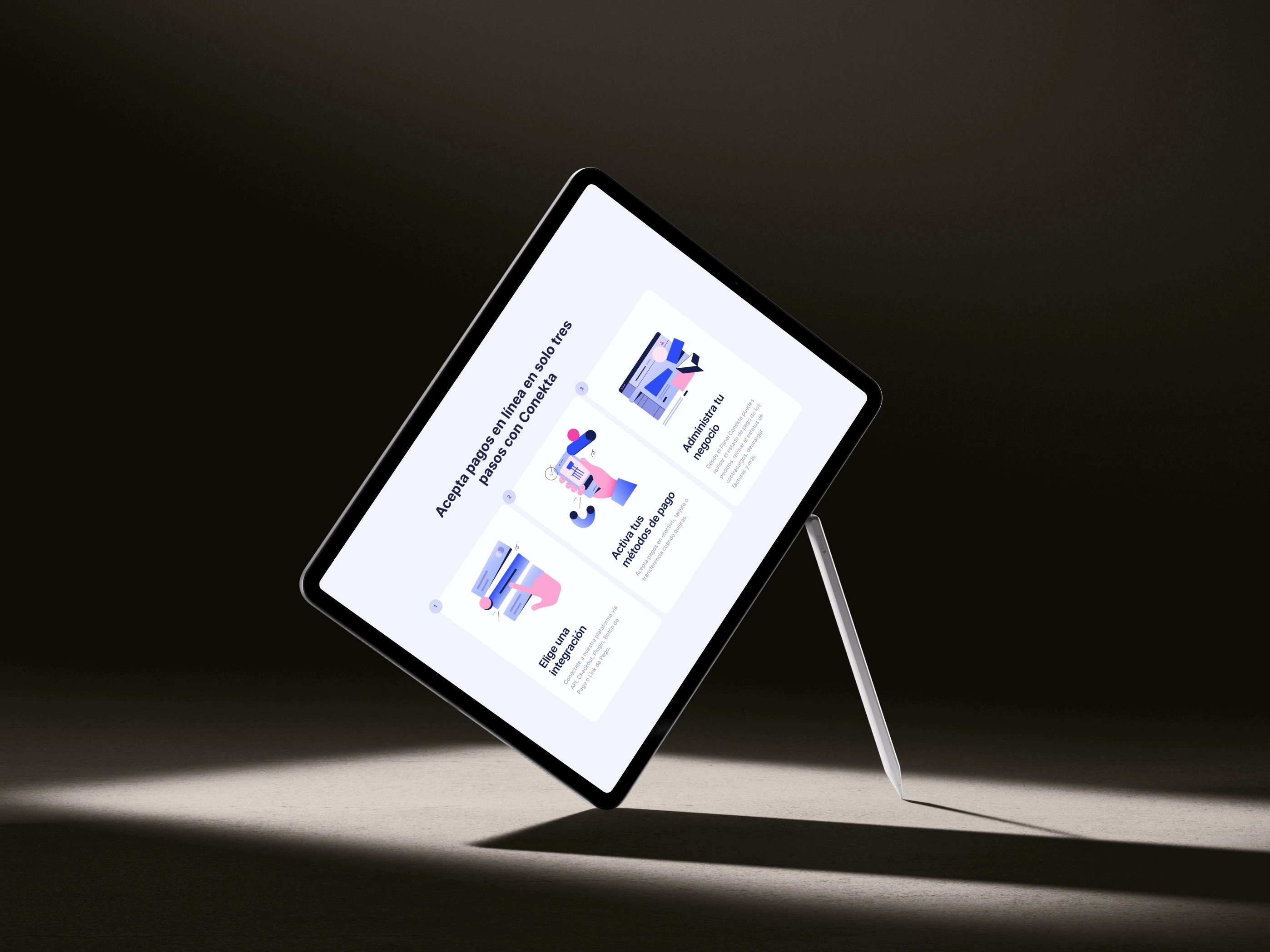
With the new color system distributed, we were able to expand our visual language and create a rich illustration framework and an strengthened library of assets.
We got cross-functional alignment with the help of brand strategy workshops, design sprints and internal interviews that surfaced our core values to translate it into our fresh visual approach for the next company stage.
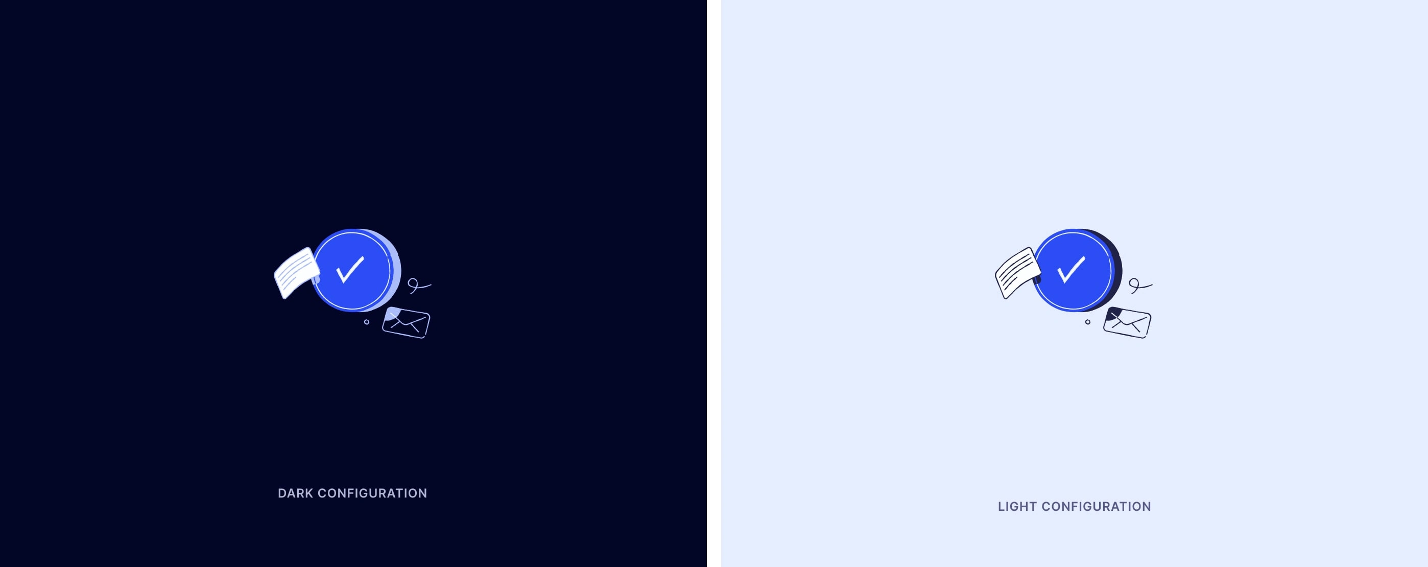
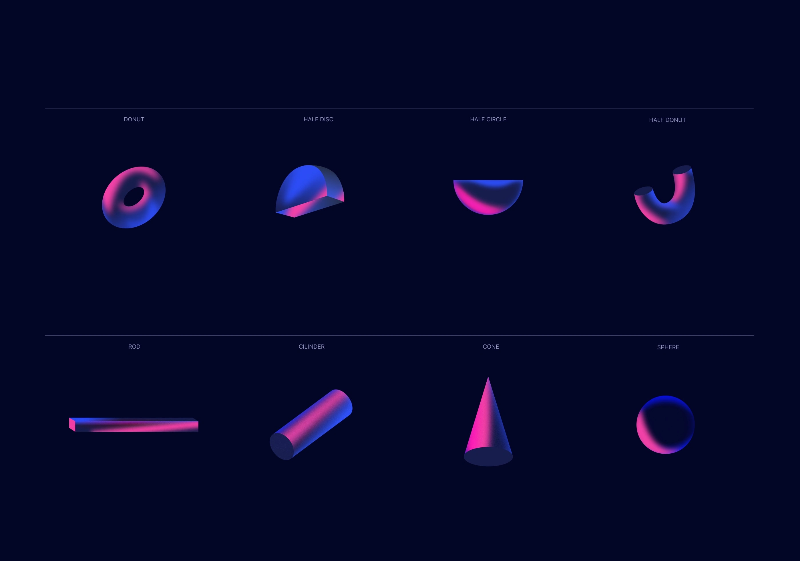
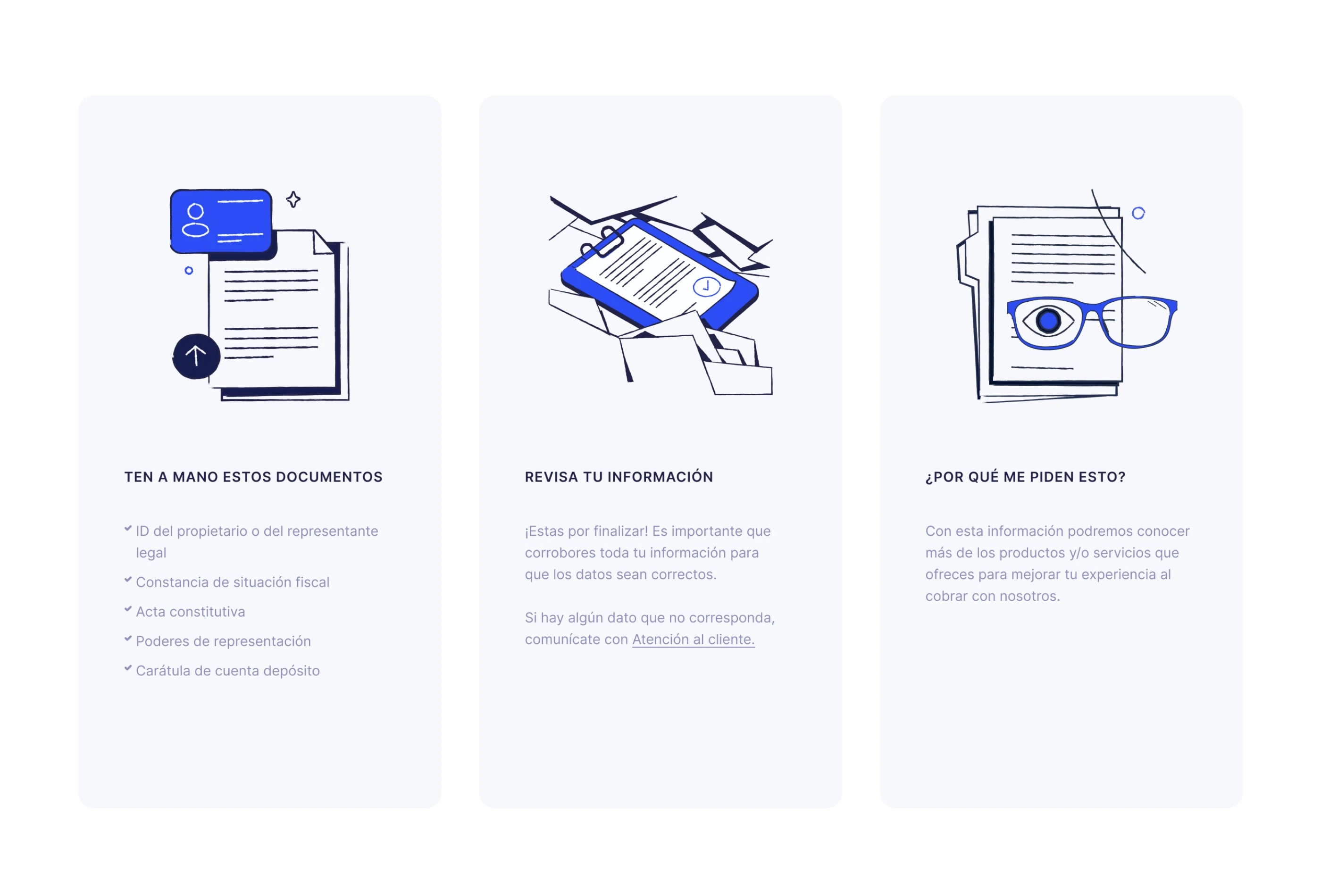
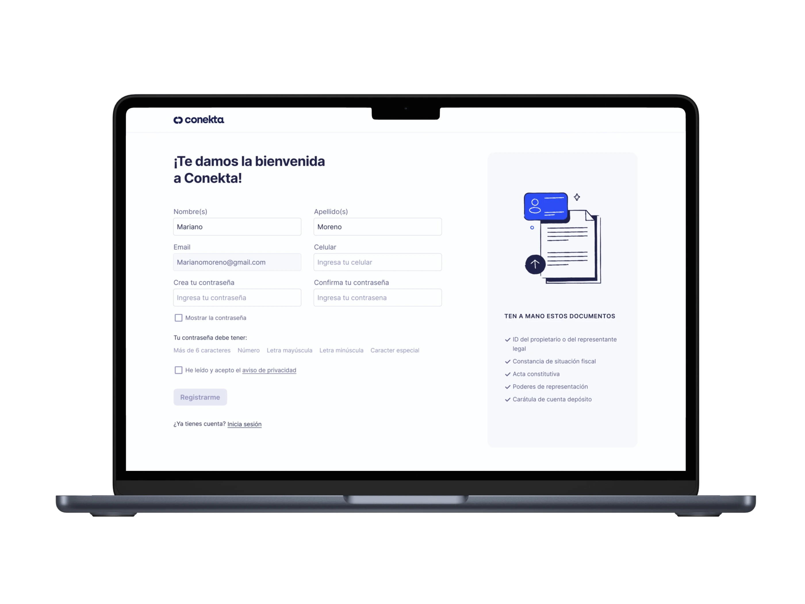
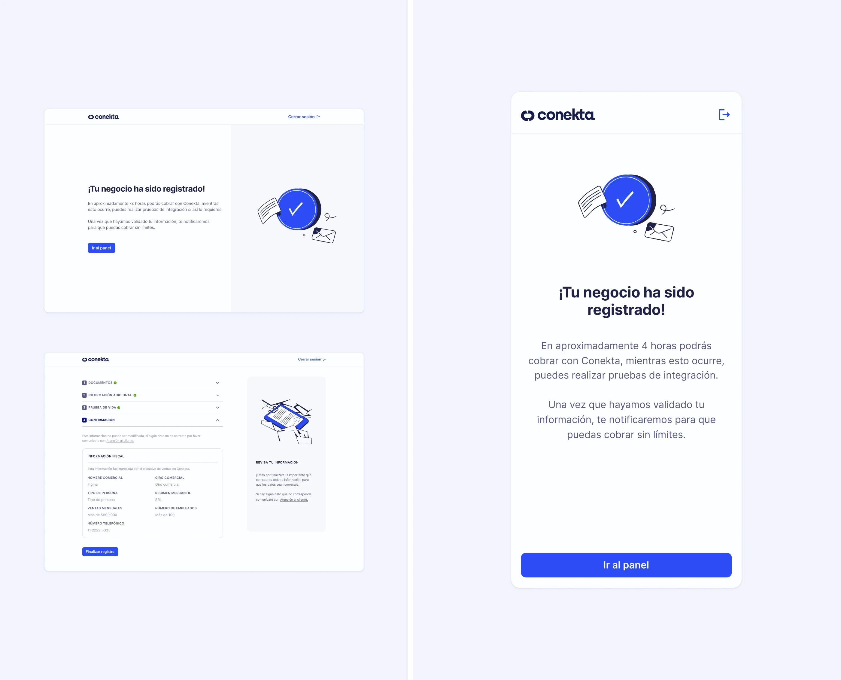
Our semantic illustrations have played a pivotal role in streamlining our product flows and interfaces. Meanwhile, our meticulously developed design framework and UI Kit have elevated performance across all key indicators.
Designed with adherence to best practices, scalability, and uniformity at their core, these resources have significantly boosted our onboarding conversion rate, enhanced our Net Promoter Score (NPS), and heightened engagement on our website.
Additionally, they have led to a noticeable decrease in support inquiries related to usability, demonstrating their effectiveness in improving user experience and operational efficiency as part of our brand and platform transformation.
Thanks for watching!
Like this project
Posted Mar 11, 2024
Successfully revamped the entire visual language, design system and product rollout cadence. Increased our visual consistency and accelerated our time to market
Likes
0
Views
19
Clients
Conekta

